Greenblack
A near-black with a whisper of green, reviewed honestly: where the green shows, the light that erases it, and the one room it was actually built for.

Jessica has spec'd whites and neutrals for more than 300 rooms and keeps a sample wall of painted drawdowns in her studio. Every color review is checked against real reader rooms in the comments and re-tested when a formula changes. About the testing process →
- 1Greenblack4
- 2Oyster Catch9
The Fast Verdict
Greenblack sits one notch darker than Iron Ore and one notch lighter than Tricorn Black, and Sherwin-Williams describes it about as plainly as a paint company ever does: black with a tinge of green undertone. That is exactly the deal — mostly black, occasionally green, depending entirely on the light in the room. It has no Color of the Year run and almost no real-world review history; it is a genuine sleeper that shows up mostly in kitchen-cabinet color roundups, not design blogs, and that quiet profile is the most honest thing about it.
Kitchen islands and lower cabinets · fireplace or accent walls with real daylight · exterior siding, shutters, and front doors · black-curious buyers who don't want the flatness of a true black
You want a well-documented, zero-undertone black · your room runs on cool LEDs with no warm lamps · you're painting all four walls of a small, dim room · you want a color with a long track record of reviews to lean on
- A genuine alternative to flat black — the green whisper is real, not marketing copy
- Nearly as deep as Tricorn Black (LRV 4 vs 3) without ever feeling like a void
- Excellent on cabinets — islands, lower runs, built-ins
- Reads convincingly as black under warm light, so it plays it safe most of the time
- Pairs cleanly with brass, matte black hardware, and light wood without much thinking
- The undertone is real: bright or cool light and cool LEDs will out the green whether you want that or not
- Thin real-world track record — few reviews, no famous rooms, no Color of the Year run to point to
- At LRV 4, a full small room with weak daylight can feel like a box rather than a moment
- Overshadowed by the better-documented Iron Ore and Tricorn Black in most black-paint comparisons
What Color Is Greenblack, Really?
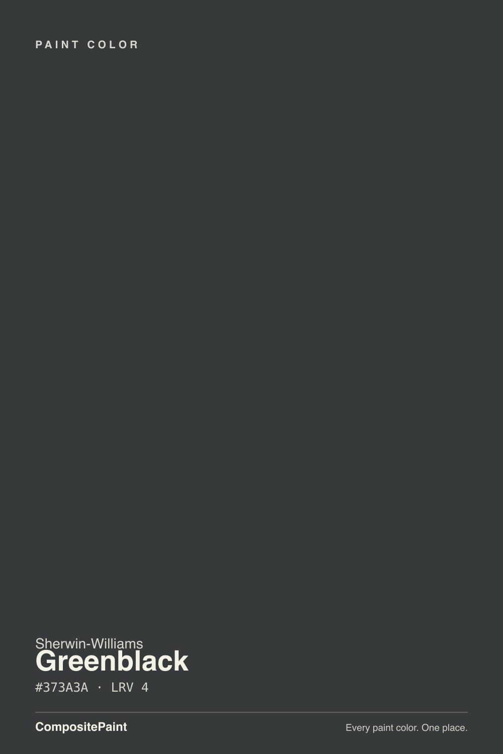
A near-black built on a genuine green whisper rather than the blue or brown undertone most "black" paints hide. The RGB values (55, 58, 58) are almost perfectly desaturated, but that tiny lift in the green channel is enough to read as cool charcoal-green in the right light instead of flat black. Sherwin-Williams files it as a Neutral, not a green, and that classification is accurate day-to-day — you will not walk into a Greenblack room and think "green" — but the undertone is real, not a marketing footnote, and it will show itself if you give it bright or cool light.
At LRV 4 it is genuinely deep — one point lighter than Tricorn Black (LRV 3), two points darker than Iron Ore (LRV 6) — which puts it in the same absorb-almost-everything category as the reference blacks in the Sherwin-Williams deck. That depth is why it reads convincingly as black most of the time: there simply isn't much light bouncing back to carry the green forward. It is also why a whole small room in it, with no real daylight, goes flat rather than moody — near-black colors need light in the room to have any depth to show.
Undertone in one line: green first, but only under bright or cool conditions — warm light and warm bulbs mute it back toward ordinary charcoal-black. If your sample looks like a plain black at 8pm and a smoky green-black at noon, that is the paint being honest, not inconsistent.
Where It Shines
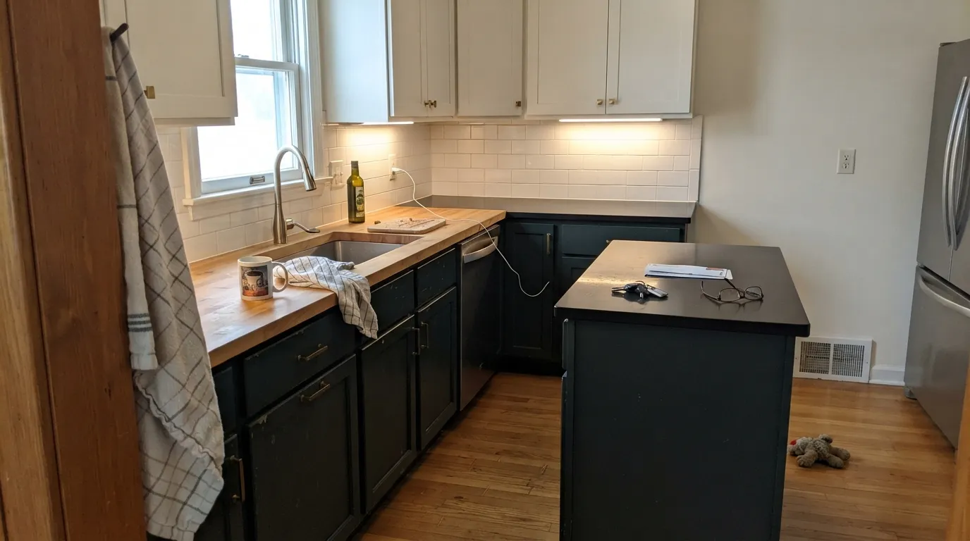
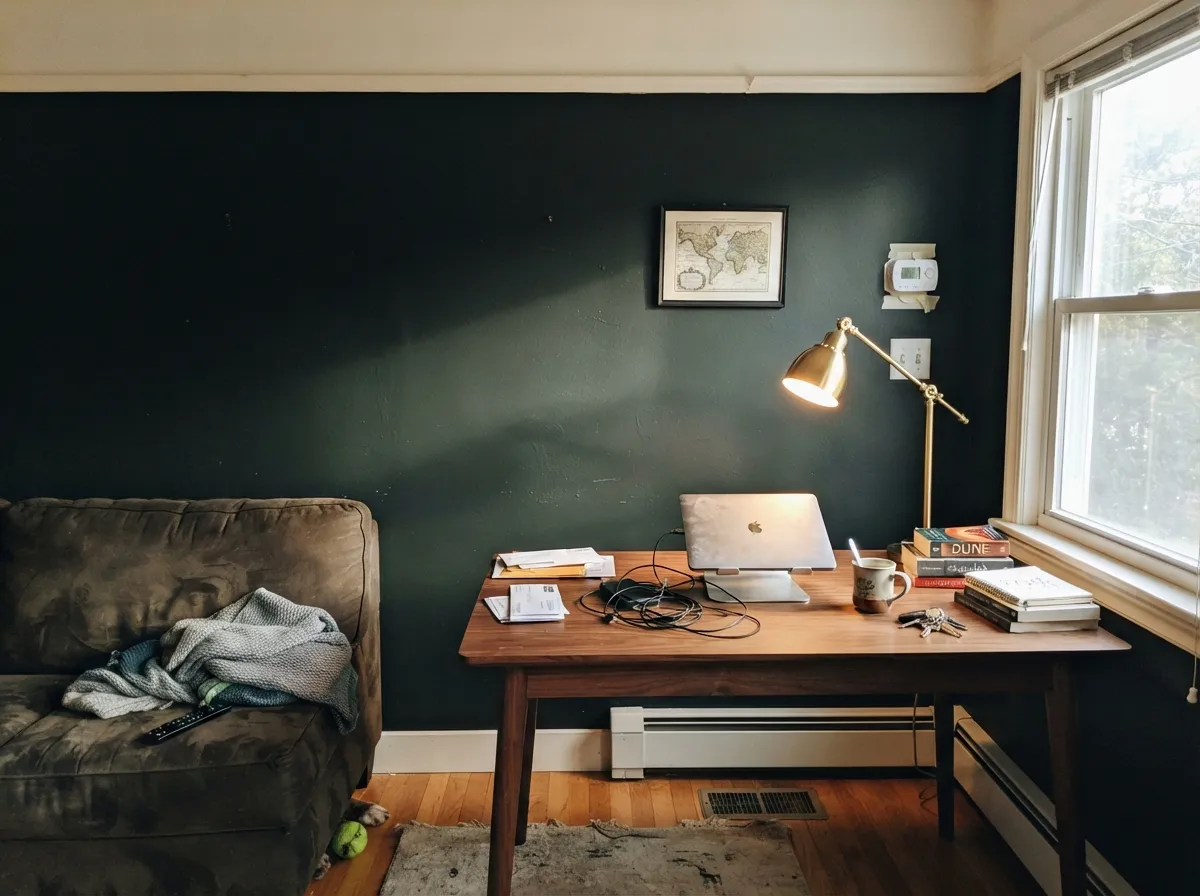
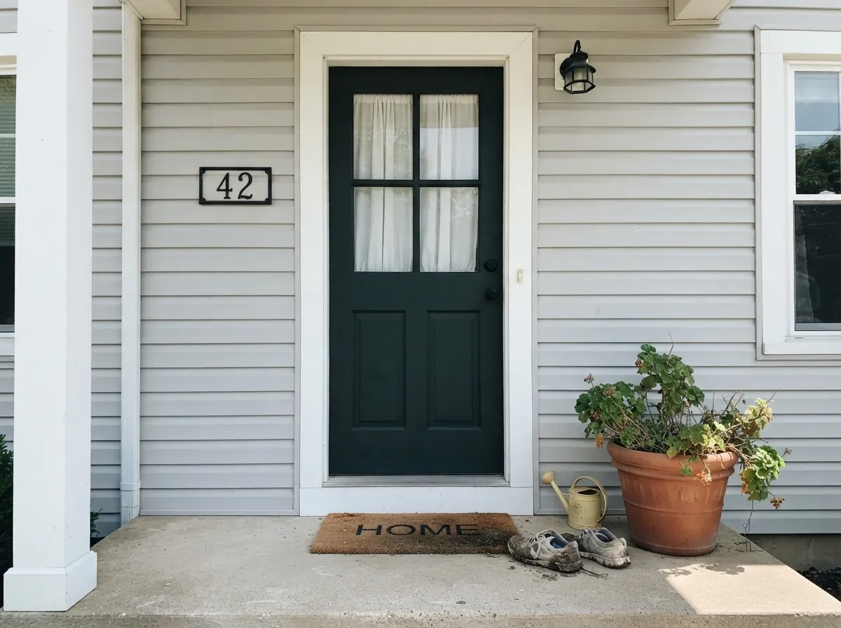
Every real source of documentation on this color — not design features, but cabinet-color spotlight blogs and comparison threads — points the same direction: cabinets. On an island or a run of lower cabinets, paired with a lighter upper or wall color, it reads as a deliberate near-black with just enough depth to avoid looking like ordinary flat black. Its second home is anywhere with real, consistent daylight to keep it alive: an accent or fireplace wall, exterior siding, a front door against light trim. Give it light and something lighter to sit next to, and it looks expensive without trying.
Where It Fails
There is no pile of one-star reviews for a color this quiet, but the physics and the sourced usage notes point to the same three predictable scripts. None of them are the paint's fault — but if your room matches one, sample it big before you commit a whole kitchen or bedroom to it.
Bright or cool daylight and cool LEDs are exactly the conditions that pull the green undertone forward — it is not a subtle accident, it is how the color is built. If the goal is a documented, zero-undertone black with no surprises, Iron Ore or Tricorn Black are the safer, better-tested picks.
Cool white LEDs sharpen the green tint into a slightly cold, almost sea-green cast at night instead of the smoky charcoal-black warm bulbs give. If the room runs on overhead cool LEDs and you are not adding a warm lamp, expect a color that reads colder than the chip suggested.
At LRV 4 the color reflects almost nothing, so a small room with weak daylight and this on every wall can feel like a box rather than a deliberate dark moment. It works because of the light around it — on an accent wall, on cabinets under can lights, on an exterior in full sun — not in isolation.
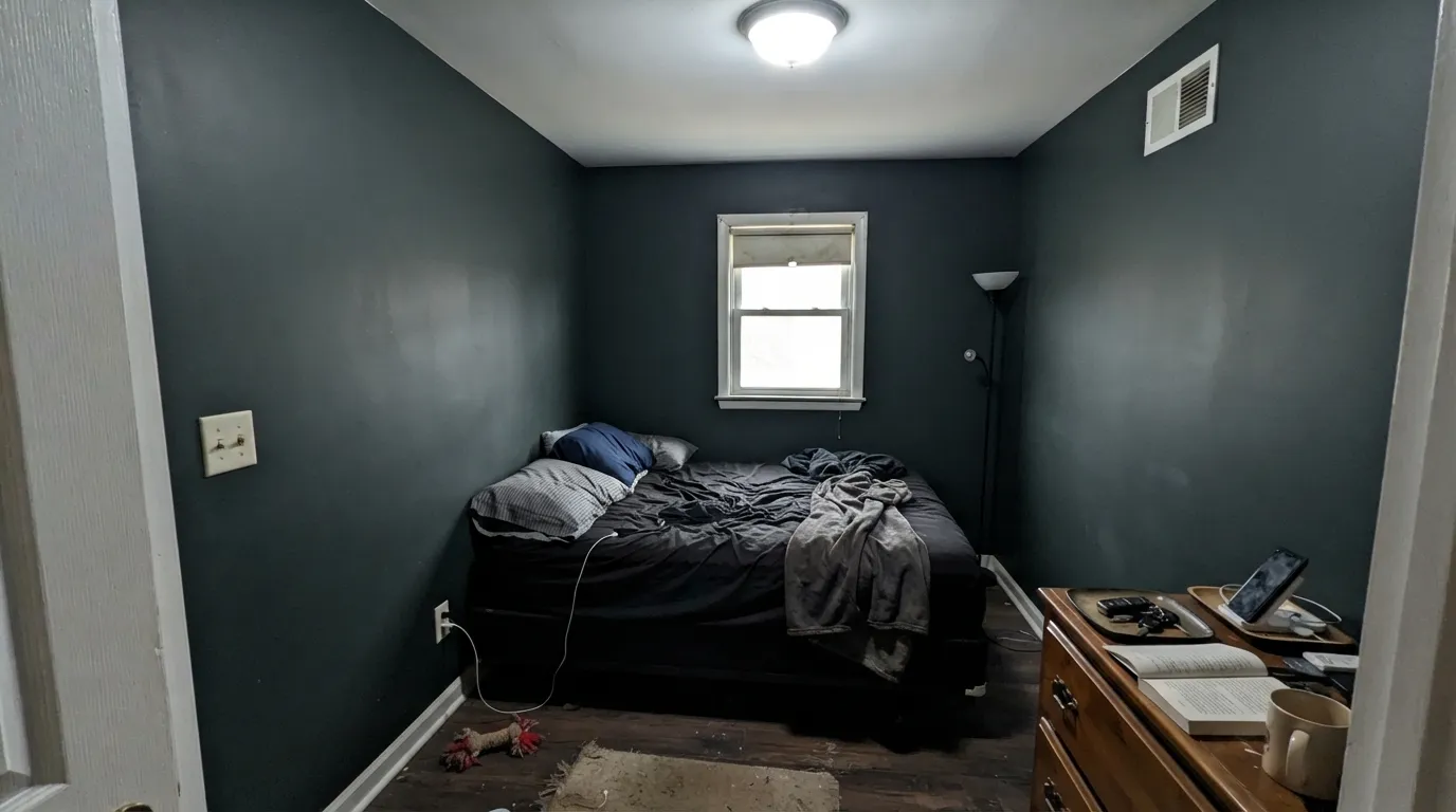
Room by Room
Islands and lower-cabinet runs are where nearly every real write-up of this color lives. Pair it with a warm white or Alabaster upper cabinet or wall, add brass or matte-black hardware, and use a semi-gloss cabinet enamel for durability.
In a room with an actual window nearby, it reads as a deliberate near-black statement rather than a dark hole. Matte finish hides wall texture and keeps the depth even.
It pairs cleanly with light wood, stone, and brick, and a crisp white trim keeps it looking intentional rather than just dark. Full sun reads it truer to black than indoor light does.
Small, low-traffic rooms with a warm lamp on are exactly where the green settles into a smoky, grown-up charcoal. Eggshell for durability where chairs and elbows scuff the wall.
A full bedroom needs warm 2700K lamps and enough light trim or ceiling contrast to keep it from feeling airless. Under cool overhead light it will read colder and flatter than you pictured.
Works well in a small, closed room when the light fixtures are warm and there is a light ceiling or mirror to bounce some brightness back. Satin or semi-gloss for moisture resistance.
Your Light Is the Risk
Warm midday sun softens the green tint and the color settles into an even, sophisticated near-black — the most flattering, most "black" it ever looks.
Cool, flat light is exactly what pulls the green forward, giving a moodier charcoal-green than a true black. Fine if you like that; disappointing if you wanted plain black.
Sharp and near-black in morning east light, settling darker by noon; west afternoon sun warms it slightly richer. It moves through the day like most undertone-carrying darks.
Warm 2700K bulbs mute the green into smoky charcoal-black. Cool white LEDs sharpen the green into a crisper, colder cast — the bulb decides which color you get at night.
Most complaints about Greenblack are a light mismatch. Upload a photo of your actual room and see it on your walls — then ask for the same wall in north light or evening lamps before you buy a single sample.
Need It From Another Brand?
Any paint counter can custom-tint Sherwin-Williams SW 6994 directly. If you would rather stay in one brand's own deck, these are the closest stock matches, measured as ΔE2000. Under 2 is a difference you will not see on the wall.
| Brand | Closest color | ΔE | LRV | |
|---|---|---|---|---|
| Behr | Stealth Jet780F-7 · Behr | 3.3 | 4 | Color page → |
| Benjamin Moore | Black Tar2126-10 · Benjamin Moore | 1.6 | 6 | Color page → |
| Valspar | Black HeronV120-3 · Valspar | 1.3 | 4.5 | Color page → |
| PPG / Glidden | Starless SkyPPG0995-7 · PPG / Glidden | 1.7 | 5 | Color page → |
| Glidden | Onyx Black00NN 05/000 · Glidden | 2.9 | 5 | Color page → |
| Dutch Boy | Rugged Green424-7DB · Dutch Boy | 4.3 | 4 | Color page → |
Similar Sherwin-Williams Colors
The nearest shades to Greenblack within Sherwin-Williams's own range, ranked by perceptual color distance — useful when you want the same look a touch lighter, darker, or warmer.
WCAG 2.1: AA is 4.5 : 1 for normal text, 3 : 1 for large text, AAA is 7 : 1.
Greenblack vs the Colors You're Also Considering
Every Greenblack sample board has the same rivals on it. The numbers show the real lightness gap — then it comes down to which risk you would rather live with.
Pick this for the extra whisper of green depth Iron Ore doesn't have — Greenblack is darker and a little more particular about its light.
Sherwin-Williams SW 7069 · LRV 6Iron OrePick this if you want a true neutral near-black with zero undertone risk — Iron Ore reads the same charcoal in every light.
Pick this if flat black feels too harsh — Greenblack's green whisper softens the edge without giving up the depth.
Sherwin-Williams SW 6258 · LRV 3Tricorn BlackPick this for the purest, most-documented black in the deck — no undertone, decades of track record.
Pick this for black-first drama with green only as an accent — Greenblack reads near-black in most rooms, Rosemary reads green.
Sherwin-Williams SW 6187 · LRV 12RosemaryPick this if you actually want to see green on the wall — Rosemary is a real, confident dark green, not a shadow of one.
Pick this for the deepest possible cabinet color — Pewter Green is a green with black in it, Greenblack is black with green in it.
Sherwin-Williams SW 6208 · LRV 12Pewter GreenPick this for a lighter, more forgiving cabinet green that still reads sophisticated in a dim kitchen.
Inside the brand, every close neighbor shares its LRV of 4, so the comparison is purely about which trace of color you want. Inkwell (SW 6992) at #31363A is darker and cooler with a blue lean. Jasper (SW 6216) at #343B36 and Rookwood Shutter Green (SW 2809) at #303B39 have more green in them than Greenblack does. Bohemian Black (SW 6988) and Black Swan (SW 6279) lean faintly purple. Greenblack sits in the middle as the most neutral of the group.
Across brands, Valspar Black Heron (V120-3) at LRV 4.5 and deltaE 1.29, and Benjamin Moore Black Tar (2126-10) at LRV 6 and deltaE 1.59, will look visually identical in normal room light. Diamond Vogel Grantsburg Gray (H101) and PPG and Glidden Starless Sky (PPG0995-7) sit in the same range.
Further out, Farrow and Ball Smelt Black (No. G18) at deltaE 2.06 and Behr Stealth Jet (780F-7) at deltaE 3.3 are very close but worth sampling first. Dutch Boy Rugged Green (424-7DB) at deltaE 4.26 is close but visibly different side by side, with more green in it.
Greenblack Coordinating Colors
The rule for coordinating with Greenblack: give it a lighter, warmer neighbor to bounce light back at it, and let its fellow darks stay a shade or two lighter so it keeps the deepest spot in the room. It layers naturally with the rest of Sherwin-Williams' near-black family and with real brass or matte-black hardware. These are the partners that keep showing up in the sourced pairings:
The Quiet Reputation Behind Greenblack
This is not a Color of the Year and it has never had a viral design-blog moment — and the honest thing to do is say so rather than invent a story it doesn't have. Sherwin-Williams' own description is almost matter-of-fact: black with a tinge of green undertone. Search for real coverage and what turns up is mostly cabinet-color spotlight posts and side-by-side comparison articles, not features or celebrity rooms.
That quiet profile is not a knock on the paint. It means Greenblack is being chosen deliberately, by people who specifically wanted a near-black with a green whisper rather than a flat black, and it means there is less crowd-tested feedback to lean on than for Tricorn Black or Iron Ore. Sample it generously before committing a whole kitchen or room to it — with a color this thinly documented, your own walls are doing more of the research than usual.
Greenblack With Wood Tones and Floors
Light wood does the most for this color. Pale or white oak floors and cabinetry give Greenblack the contrast it needs to read as a deliberate near-black rather than a dark blur, and the official guidance specifically calls out light wood, stone, and brick as its natural company.
Dark-on-dark is the pairing to watch. Walnut or espresso wood next to Greenblack can lose definition — two very dark tones sitting flush against each other read as one shapeless mass rather than a layered look. If the floor or trim is already dark, add a light rug, a lighter countertop, or a brighter wall nearby so the near-black has something to contrast against.
Three Ready Palettes Built on Greenblack
A color is never alone on the wall. These are complete combinations in the 60-30-10 pattern, with the reason each one holds together. Every one opens in the visualizer.
The classic two-tone kitchen: Greenblack on the island and lower run keeps enough green in the shadows to avoid a flat-black look, while Alabaster upper cabinets and walls give it the daylight it needs to hold its depth. Pure White trim keeps the edges crisp.
Try this palette in your roomA single accent wall of Greenblack against a warm White Dove trim keeps the green undertone from feeling isolated; Urbane Bronze adds a second warm dark note on a door or built-in without competing for attention.
Try this palette in your roomFull sun reads Greenblack closer to true black, so a sharp Extra White trim gives the contrast a near-black exterior needs; Iron Ore shutters layer in a second, slightly warmer dark without turning the facade into a single flat block of color.
Try this palette in your roomGreenblack FAQ
Is Greenblack actually green?
Not in the way a dark green paint is green — Sherwin-Williams classifies it as a Neutral, and day to day it reads as a near-black. The green is a real undertone, though, not a marketing detail: bright light and cool LED bulbs pull it forward, warm light and warm bulbs mute it back toward plain charcoal-black.
What is the difference between Greenblack and Iron Ore or Tricorn Black?
Depth and undertone. Tricorn Black (LRV 3) is the deck's purest, most neutral black. Iron Ore (LRV 6) is a warmer, more forgiving near-black with no visible undertone. Greenblack (LRV 4) sits between them in depth but carries a genuine green whisper the other two don't — pick it specifically because you want that whisper, not as a generic substitute.
Does it work on kitchen cabinets?
Yes — this is where the color has the most real documentation. Islands and lower-cabinet runs paired with a lighter upper cabinet or wall color is the pairing that shows up again and again. Use a semi-gloss cabinet enamel for durability.
What white or trim color goes with Greenblack?
A warm white like Alabaster or White Dove for a soft look, or a crisp white like Pure White or Extra White for sharper contrast. Both work; the choice is about how much contrast you want, not about avoiding a clash.
Is it good for an exterior or front door?
Yes. Full sun reads it closer to true black than indoor light does, and it pairs well with light wood, stone, and brick. A crisp white trim keeps a Greenblack door or siding job looking intentional rather than just dark.
How many coats does it need?
Expect at least two coats over a gray-tinted or deep-base primer; going over plain white drywall or cabinets without a tinted primer usually means three coats to get even, non-blotchy coverage at this depth.
Have you painted with Greenblack?
Rate it — one tap helps the next reader decide.
Ask a Question