Inkwell
Sherwin-Williams's quietest true near-black, reviewed honestly: the doors and islands where it turns sophisticated, the dim rooms where it turns into a void, and how it actually differs from Black Magic and Tricorn Black.

Jessica has spec'd whites and neutrals for more than 300 rooms and keeps a sample wall of painted drawdowns in her studio. Every color review is checked against real reader rooms in the comments and re-tested when a formula changes. About the testing process →
- 1Inkwell4
- 2Oyster Catch9
The Fast Verdict
Inkwell is Sherwin-Williams's least-talked-about true black — not because it's a bad color, but because it sits one deck number after Black Magic and one collection away from Tricorn Black, and on an actual wall almost nobody can tell the three apart. What you get is a clean, cool near-black with the barest whisper of blue and zero warm-brown creep: on a front door or a kitchen island, with real light hitting it, it reads sophisticated and deliberate. In a dim room with no lamps, it reads like a hole cut in the wall. Buy it for a door, an island, or a small lit room — not because the name sounded special.
Front doors and shutters · kitchen islands and cabinetry with good light · small rooms you plan to light on purpose · anyone who wants black without a hint of navy or brown creeping in
You already picked Tricorn Black or Black Magic — the difference won't show on your wall · you're painting a full exterior body on vinyl or composite siding · the room has no window and no plan for lamps · you're chasing a specific named trend, not just "a good black"
- A genuinely cool, clean near-black — no warm brown or green creeping in
- Front doors and cabinetry read custom and deliberate, not heavy
- Small, intentionally lit rooms take it beautifully
- LRV 4 holds its depth in every light — it will never wash out or look washed-out gray
- A safe pick when you want black and don't want to argue about which SW black is "the real one"
- Nearly indistinguishable from Black Magic and close to Tricorn Black once it's on a wall — the "why this exact chip" question is real
- Every roller mark and lap line shows; needs a sprayed or very careful finish
- A dim room with no supplemental light reads as a void, not a color
- Full sun on a full exterior body risks heat issues on vinyl or composite siding
What Color Is Inkwell, Really?
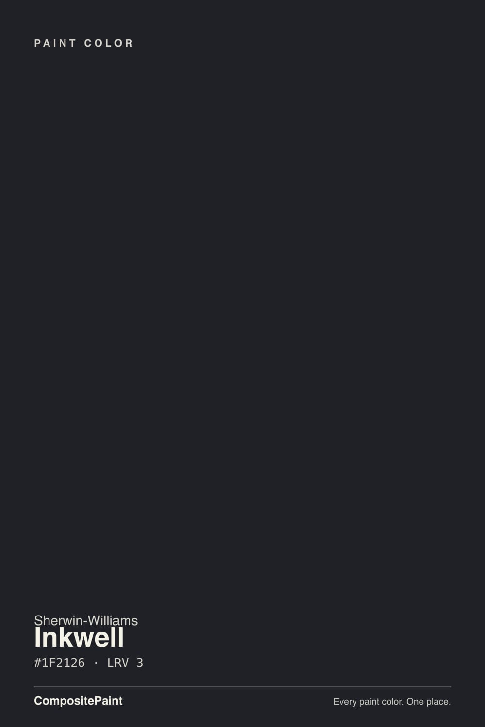
A cool, near-neutral black with the faintest blue lean — and almost no distance from its own deck neighbors. Sherwin-Williams runs a small cluster of anchor near-blacks back-to-back in the fan deck: Black Magic is SW 6991, Inkwell is SW 6992, and in our own color data their hex values are #1F2127 and #1F2126 — one point apart in the blue channel, both at LRV 4. That is not marketing spin; it is the literal deck data. If you have ever wondered why a paint store carries three or four "true blacks," this is why: every collection wants its own near-black to point to, even when the chip is functionally the same paint.
At LRV 4, Inkwell reflects almost nothing — it is at the very bottom of the scale, in the same company as Tricorn Black and Black Magic rather than the friendlier LRV 6–8 near-blacks like Iron Ore or Wrought Iron. That depth is exactly the point on a door or an island: it reads as unmistakable black, not dark gray. It is also why the color goes flat without help. A near-black this deep needs light bouncing off it — a window, a sconce, a pendant — to show any life at all; starve it of light and it just disappears.
Undertone in one line: cool, barely-there blue — never warm, never brown, never green. If your sample looks slightly navy at the edges in bright daylight, that is the faint blue bias doing exactly what it does; if it looks warm or brown, that is an incandescent bulb or reflected wood tone, not the paint itself.
Where It Shines
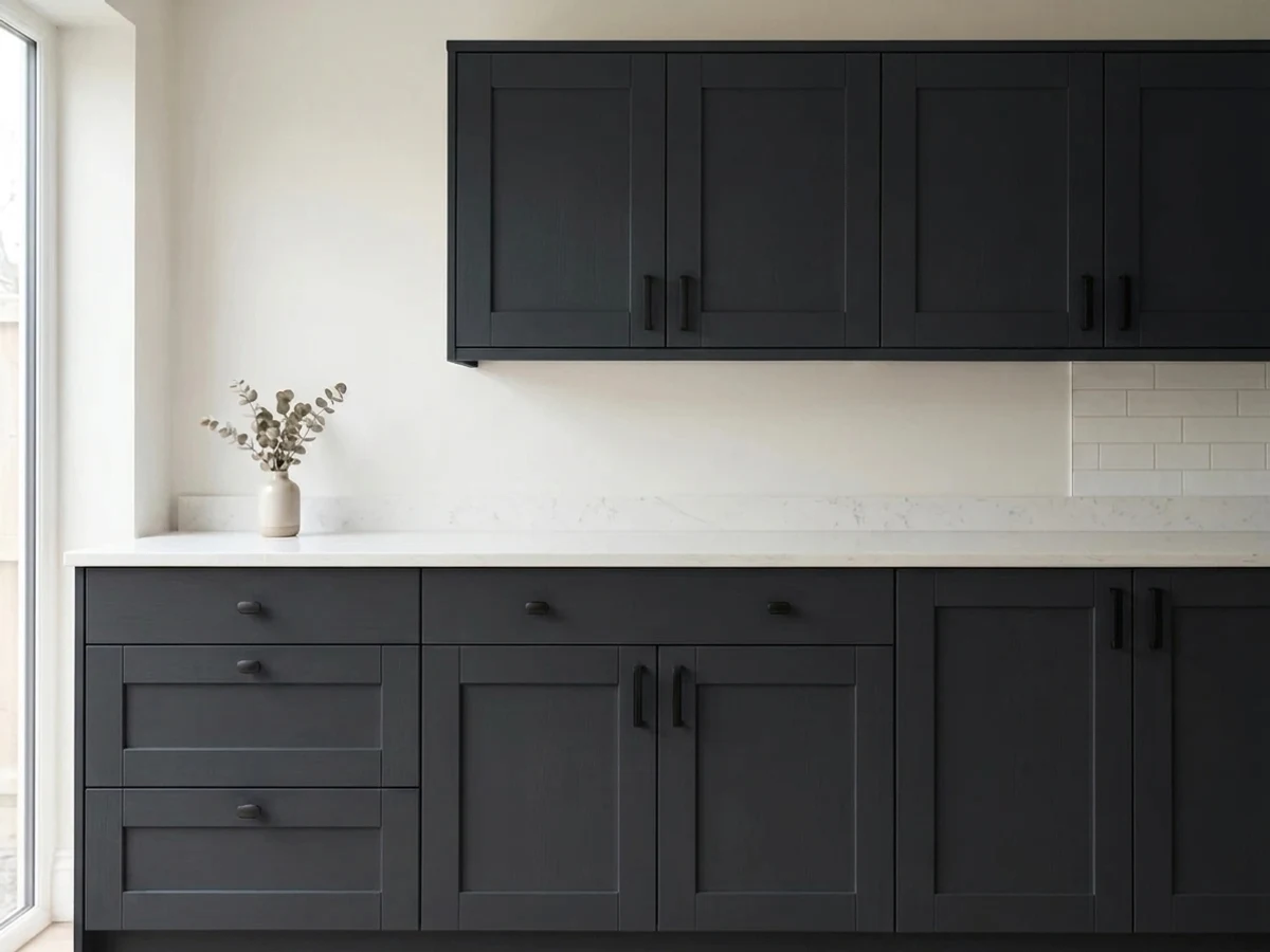
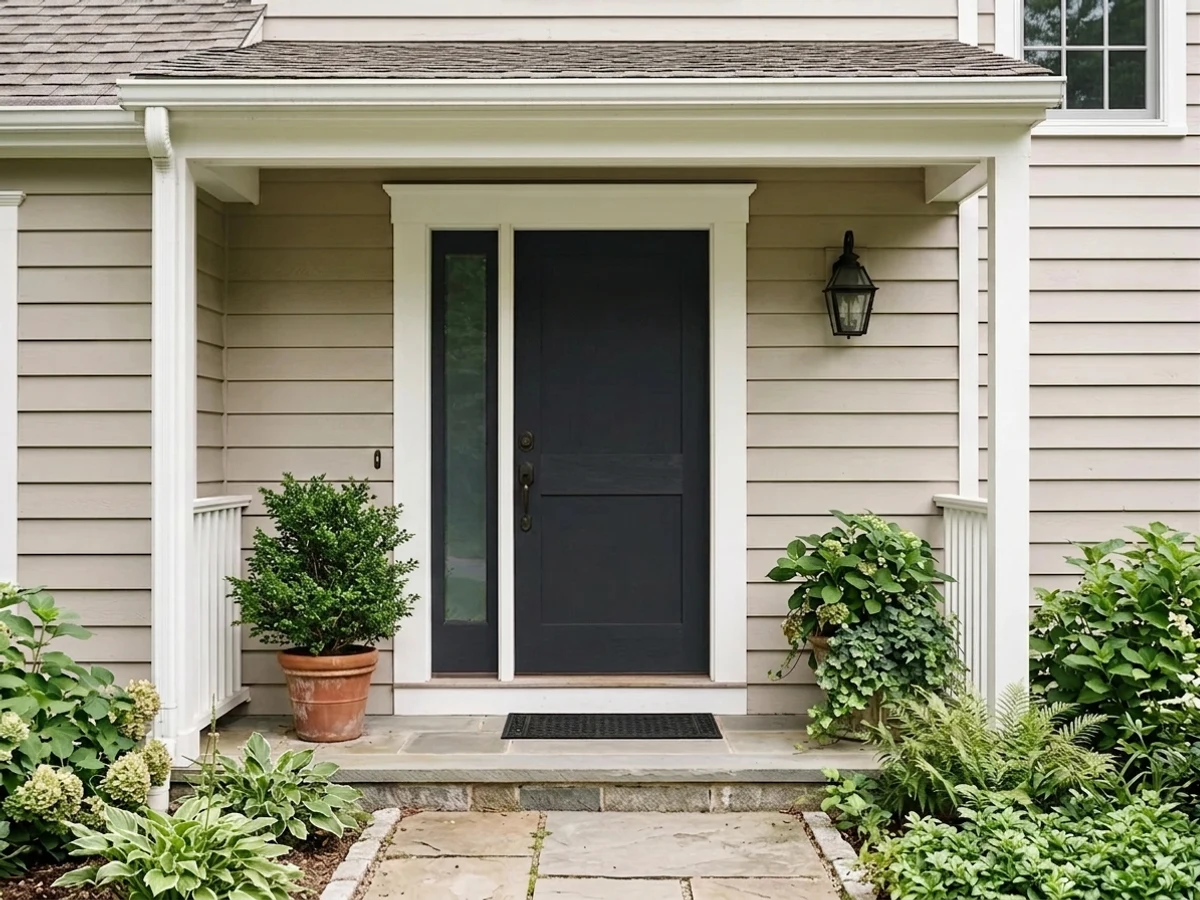
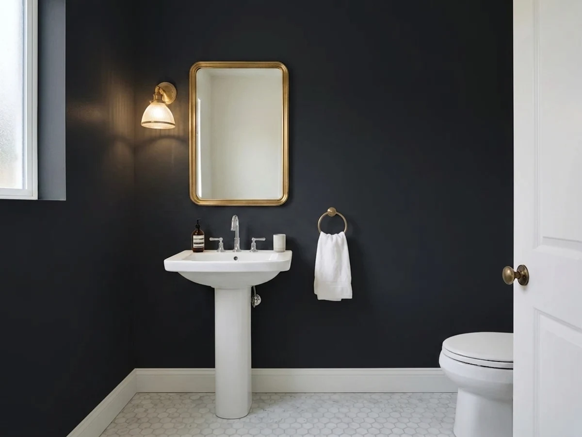
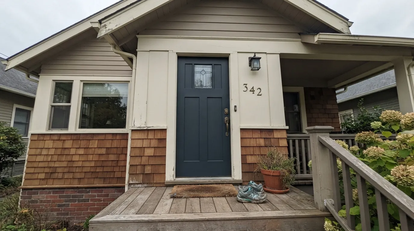
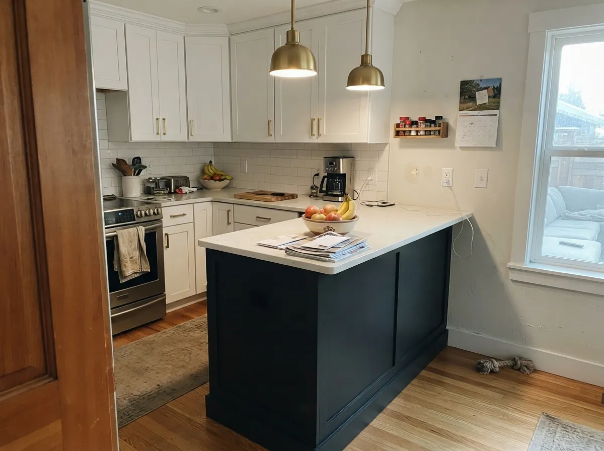
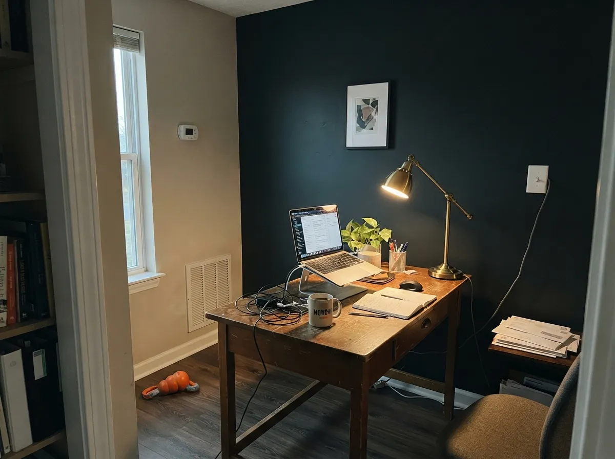
Inkwell earns its keep in small, deliberate doses with real light on it. On a front door under porch light or daylight it reads crisp and cool — no muddy brown, no accidental navy — which makes it a safe pick when you want black specifically and not "a very dark something else." Its second home is a kitchen island or a run of cabinetry: with a pale counter, brass or matte-black hardware, and enough ambient light in the room, it looks custom and expensive rather than heavy. Small, intentionally lit rooms — a powder room with a sconce, a desk nook with a lamp — are where it goes from "just black" to genuinely striking.
Where It Fails
Almost every disappointed story about Inkwell traces back to one of three setups, and all three are predictable before the first coat goes on. None of them are the paint's fault — but if your project matches one, this is not the right near-black for the job, or at least not without changes.
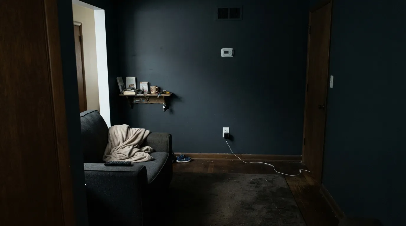
LRV 4 needs light bouncing off it to read as a color at all. Without a window nearby or a fixture turned on, an Inkwell wall goes flat and featureless — readers describe it as "a hole in the wall," and that is not an exaggeration; it is what near-zero reflectance looks like with nothing lighting it.
It won't, not to the eye. All three sit within a point or two of each other in LRV and hex value. If the whole reason you chose Inkwell specifically was to get a different black than the one your painter already had on the shelf, save yourself the special order — use what's in stock.
The darkest colors absorb the most heat, and many vinyl and composite siding manufacturers cap how low an LRV you're allowed to use before it voids the warranty — often well above LRV 4. Inkwell on a door, shutters, or trim is fine; Inkwell as the whole house on light-sensitive siding is a call to the manufacturer first.
Room by Room
Cool and clean with real daylight or porch light on it, no warm brown or accidental navy drift. Exterior door enamel in semi-gloss or gloss; brass or matte-black hardware both work.
Under pendant lights, with a pale counter and the rest of the kitchen bright, it reads custom rather than heavy. A full kitchen of Inkwell cabinets needs strong ambient lighting or it starts to feel like a cave.
A powder room with a sconce, a desk nook with a lamp: near-black in a small space that's lit on purpose is where this color performs best. Matte or eggshell keeps the surface soft rather than reflective.
Behind a headboard with warm bedside lamps, it's cozy and enveloping. With no lamp and only a north window, it goes dead flat by evening — plan the lighting before the paint.
One Inkwell wall behind a desk, lit by a warm desk lamp, anchors a small room without swallowing it. Leave the other walls lighter so the room still bounces daylight around.
Heat absorption at LRV 4 is real, and siding warranties often restrict how dark you can go. Save Inkwell for the door, shutters, or trim and let a lighter color carry the walls.
Your Light Is the Risk
A sconce, a desk lamp, a pendant over an island: light bouncing off it at close range brings out texture and the faint cool undertone reads as sophistication, not gloom.
In a truly dim corner with nothing lighting it, LRV 4 just vanishes into a flat void — it stops reading as a color at all. Plan the light before the paint.
In full sun the faint blue bias comes forward at edges and highlights, occasionally reading almost navy. In shade or overcast light it settles back to a true, cool black.
Warm bulbs soften it — a hair of warmth shows in the highlights, cozier at night. Cool LEDs sharpen the blue lean, which can read almost gunmetal after dark.
Most complaints about Inkwell are a light mismatch. Upload a photo of your actual room and see it on your walls — then ask for the same wall in north light or evening lamps before you buy a single sample.
Need It From Another Brand?
Any paint counter can custom-tint Sherwin-Williams SW 6992 directly. If you would rather stay in one brand's own deck, these are the closest stock matches, measured as ΔE2000. Under 2 is a difference you will not see on the wall.
| Brand | Closest color | ΔE | LRV | |
|---|---|---|---|---|
| Behr | Spade BlackBNC-38 · Behr | 1.3 | 3 | Color page → |
| Benjamin Moore | Black Knight2136-10 · Benjamin Moore | 2.1 | 5 | Color page → |
| Valspar | Forest Canopy5010-1 · Valspar | 4.5 | 3.7 | Color page → |
| PPG / Glidden | Starless SkyPPG0995-7 · PPG / Glidden | 3.9 | 5 | Color page → |
| Glidden | Onyx Black00NN 05/000 · Glidden | 4.1 | 5 | Color page → |
| Dunn-Edwards | BlackDEA002 · Dunn-Edwards | 4.2 | 4 | Color page → |
Similar Sherwin-Williams Colors
The nearest shades to Inkwell within Sherwin-Williams's own range, ranked by perceptual color distance — useful when you want the same look a touch lighter, darker, or warmer.
WCAG 2.1: AA is 4.5 : 1 for normal text, 3 : 1 for large text, AAA is 7 : 1.
Inkwell vs the Colors You're Also Considering
Every Inkwell sample board has the same rivals on it. The numbers show the real lightness gap — then it comes down to which risk you would rather live with.
Pick this for the cooler, barely-blue version, when your metals and fixtures already lean cool.
Sherwin-Williams SW 6258 · LRV 3Tricorn BlackPick this if you want the deck's true reference black — warmer and more perfectly neutral, with no blue lean at all.
Pick this when you're matching a swatch or fan deck specifically labeled Inkwell; otherwise it truly doesn't matter which you buy.
Sherwin-Williams SW 6991 · LRV 3Black MagicPick this if your painter or store already has it on the shelf — the two chips are close enough that no wall will show the difference.
Pick this for true black depth on a door or island, where Iron Ore would look like dark gray by comparison.
Sherwin-Williams SW 7069 · LRV 6Iron OrePick this for a whole-house near-black that still reads as paint, not a void, in a dim room — those extra few LRV points matter more than they sound.
The closest comparison is Tricorn Black (SW 6258, LRV 3). Both sit at the same LRV, so they are equally dark, but Tricorn is a more neutral black while Inkwell carries that faint blue. Choose Tricorn when you want pure, no-undertone black; choose Inkwell when you want a black with a cooler, slightly blue depth.
After the Storm (SW 9685, LRV 3) is also a blue-leaning near-black at the same LRV, but its blue is more pronounced, so it reads closer to a very dark blue than a black. If you want the blue to be clearly visible, After the Storm shows more of it; Inkwell keeps the blue quieter.
Weathervane (SW 2927, LRV 2) goes the other direction, a warm brown-black. Set beside Weathervane, Inkwell looks distinctly cooler, which is a useful pairing test if you are unsure which way your black leans.
Inkwell Coordinating Colors
The rule for coordinating with Inkwell is simple: keep it in small, deliberate doses and let the surrounding colors do the brightness work. It pairs cleanly with warm and true whites, tonal charcoals, and one near-navy for a family that reads deliberate instead of accidental. These are the partners that keep showing up in rooms where it works:
Inkwell's Deck Neighbors: The SW Near-Black Cluster
Sherwin-Williams keeps several near-identical anchor blacks in its deck, and Inkwell is one of them: our own color data puts it one point apart from Black Magic in the blue channel, both sitting at LRV 4, with sequential SKU numbers (SW 6991 and SW 6992). Tricorn Black, a separate long-running SW reference black, sits at the same LRV with a slightly warmer, more perfectly neutral hex. None of this is a flaw in any one of them — it's how a big paint deck works. Different collections and marketing moments each get "their own" black, even when the pigment underneath barely changes.
What that means practically: don't spend real time agonizing over which specific SW near-black to buy by name. Pick whichever your local store or painter has on hand, or whichever fan deck you're matching against an existing swatch. The visible difference on your actual wall, in your actual light, will be close to zero.
Inkwell With Wood, Brass, and Metal
Metals are the easy decision: unlacquered and antique brass both warm up beautifully against Inkwell's cool base, and matte black hardware simply disappears into it — fine if that's the look you want, frustrating if you wanted the hardware to read as a separate detail. Polished chrome and nickel read sharp and modern next to it, leaning into the color's cool lean rather than fighting it.
Wood is more forgiving here than it would be across a whole room, because Inkwell almost never gets used on four full walls. Pale white oak and walnut both sit comfortably next to a black door, island, or accent wall. Honey oak isn't the clash it would be with a saturated color like a mauve or a green — black doesn't have a strong complementary color to argue with — but it does throw the contrast into sharp relief, so expect the wood to read noticeably warmer and the black to read noticeably colder right at the seam where they meet.
Three Ready Palettes Built on Inkwell
A color is never alone on the wall. These are complete combinations in the 60-30-10 pattern, with the reason each one holds together. Every one opens in the visualizer.
A near-black door against a soft warm-white body is the classic high-contrast entry, and it works because White Dove is warm enough not to look sterile next to true black. Chelsea Gray shutters sit exactly between the two values, so the trio reads deliberate instead of just dark-and-light.
Try this palette in your roomPure White keeps the room bright enough that an LRV 4 island reads as a design choice, not a dark spot. Natural Cream on an accent wall or hutch brings in warmth without competing with either the white or the black.
Try this palette in your roomOne Inkwell wall behind the desk, lit by a lamp, anchors the room; Pale Oak on the other three walls keeps daylight bouncing around so the space doesn't go cave-like. Hale Navy on built-ins reads as close family to Inkwell without disappearing into it — close enough in depth, different enough in undertone to stay legible.
Try this palette in your roomInkwell FAQ
Is Inkwell black or navy?
Technically a near-black with a faint cool blue lean, not a navy. In bright daylight the blue can flash at the edges and highlights, but in normal indoor light it reads as black. If you actually want it to look distinctly blue, look at a true navy like SW Naval instead — Inkwell will always read black first.
What's the actual difference between Inkwell and Black Magic?
In our own deck data, almost none — both sit at LRV 4, and their hex values are one point apart in the blue channel. They're back-to-back in the Sherwin-Williams numbering, SW 6991 and SW 6992. If your painter already stocks one, use it; nobody will spot the substitution on a finished wall.
Is it good for kitchen cabinets or an island?
Yes, especially an island under real light, with a pale counter and brass or matte-black hardware to keep the room from feeling heavy. A full kitchen of Inkwell cabinets needs strong ambient lighting, or the room starts to feel like a cave rather than a design statement.
Can I use Inkwell on an exterior?
On a door, shutters, or trim, yes — it's a striking, clean near-black accent. On a full exterior body, be careful: LRV 4 absorbs a lot of heat, and some vinyl and composite siding manufacturers restrict how dark a color you can use before it voids the warranty. Check your siding's rated LRV limit before committing to a whole house.
How many coats does Inkwell need?
Plan on three coats minimum over a lighter existing color, with a gray- or black-tinted primer underneath. Going from a white wall to LRV 4 in two coats usually leaves faint patchy or translucent spots, especially near corners and under raking light.
Does Inkwell work in a room with little or no natural light?
Only with real supplemental lighting. In a dim room with no lamps, an LRV 4 color reads as a flat void rather than a color — it needs light bouncing off it to show any depth or undertone. Small, deliberately lit rooms (a sconce-lit powder room, a lamp-lit desk nook) are where it succeeds; a large room with a single dim overhead is where it becomes the "black hole" complaint.
Have you painted with Inkwell?
Rate it — one tap helps the next reader decide.
Ask a Question