Black Knight
The near-black with a blue secret, reviewed honestly: the light where it reads elegant charcoal-navy, the light where it goes muddy, and what to pick instead.

Jessica has spec'd whites and neutrals for more than 300 rooms and keeps a sample wall of painted drawdowns in her studio. Every color review is checked against real reader rooms in the comments and re-tested when a formula changes. About the testing process →
- 1Cordovan Brown0
- 2Black Knight5
The Fast Verdict
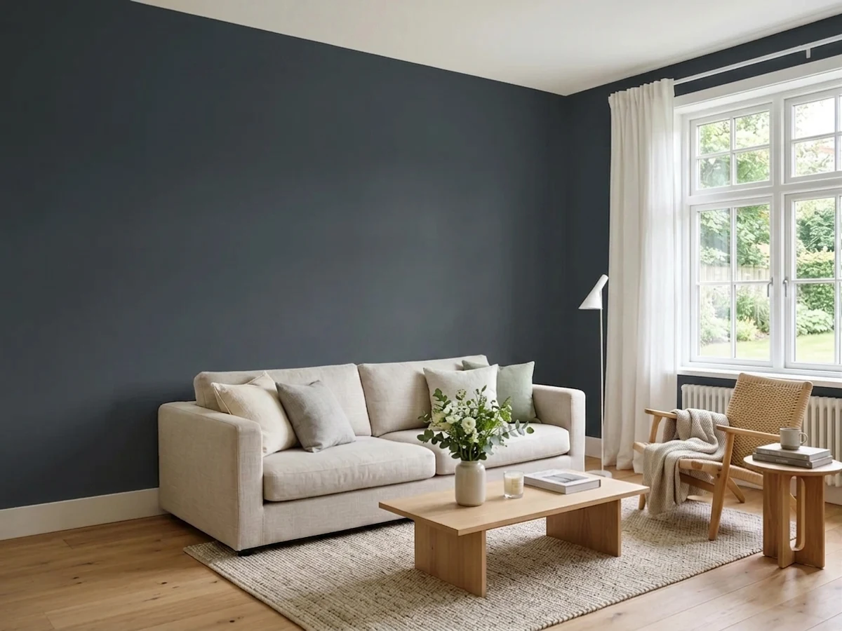
Black Knight is Benjamin Moore's answer to "can a black also be blue?" At LRV 5 it is dark enough to read as a true near-black from across most rooms, but the moment real daylight hits it — south or west sun especially — a genuine blue-charcoal steps forward, cooler and moodier than a brown-black and cleaner than a straight navy. It is a confident, modern near-black for anyone who finds jet black too flat and a full navy too obviously blue — but it needs a room willing to give it light, or it just reads as an ordinary dark gray.
Kitchen islands and cabinets with real daylight · a moody den, office or powder room · front doors and shutters on a light-colored house · anyone who wants black without warmth, and without full navy
Your room is small, north-facing and dim · you want a true warm or jet-neutral black with zero blue · you are covering all four walls of a windowless room · your look is warm and earthy, not cool and modern
- Reads as an elegant near-black, not a flat plain dark gray, once it has real light
- Blue undertone gives it a modern, cool mood without committing to a full navy
- At LRV 5 it holds its depth in both bright and moderate light better than lighter darks
- Small-room and accent-surface applications (island, vanity, door) look custom fast
- Pairs cleanly with brass, matte black hardware and light warm woods
- Goes flat and muddy in dim, north-facing rooms with no real light source
- Unforgiving of rushed technique — roller marks and lap lines show on near-black paint
- Reads ambiguous rather than definitively black or definitively navy, which some buyers dislike
- A big commitment on four walls in anything but a very well-lit room
What Color Is Black Knight, Really?
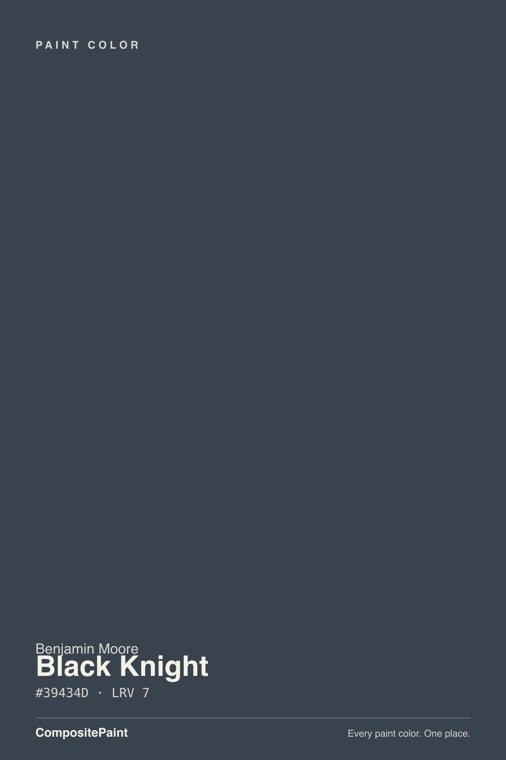
Black Knight sits in Benjamin Moore's near-black family at LRV 5 — dark enough to pass for black across most of a room, but the numbers give the trick away. Hex #39434D carries meaningfully more blue than red (RGB 57 / 67 / 77), and that gap is the fingerprint of a blue-charcoal rather than a true neutral black. In flat, dim light it reads as a straightforward dark charcoal; the moment it catches real daylight, the blue steps forward and the color visibly cools.
At LRV 5 it sits in the same depth band as Benjamin Moore's Wrought Iron (LRV 6) and Hale Navy (LRV 6) and Sherwin-Williams' Iron Ore (LRV 6) and Cyberspace (LRV 5) — all near-black, all built to swallow most of the light that hits them. What separates Black Knight from that group is how much blue it's carrying relative to its neighbors: more than the warm, greenish-neutral Wrought Iron, close to the genuinely blue Cyberspace, and just short of committing to a full navy the way Hale Navy does. It reads as "black, with a mood," not as a color you'd call blue on sight.
Undertone in one line: cool blue-charcoal, never warm, never green. If your sample looks like plain flat gray-black, your light is too dim to show the blue; if it looks openly navy, that's strong, warm afternoon sun pulling the undertone forward — both are the same paint, honestly reacting to the room.
Where It Shines
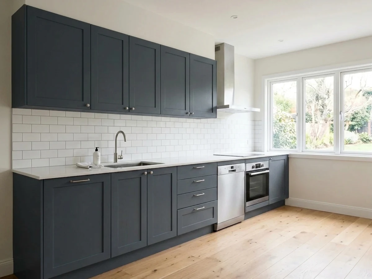
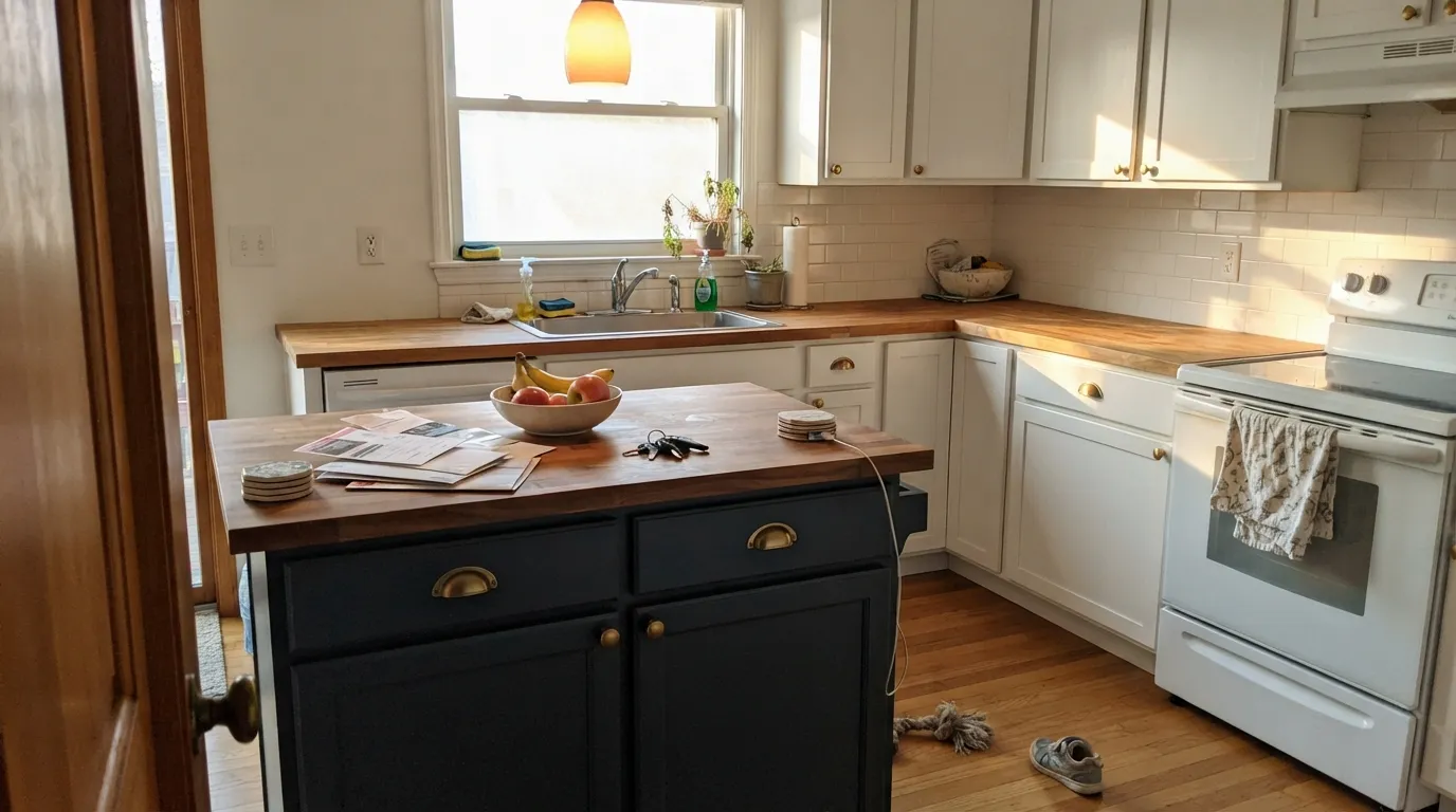
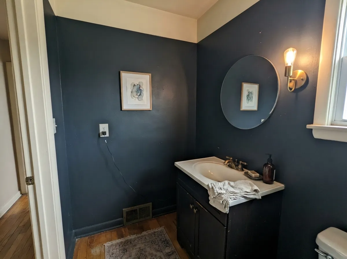
Give it real daylight — south or west exposure, a window it can actually catch — and Black Knight is a genuinely elegant modern near-black: cooler and more sophisticated than a flat, warm-black paint, with none of the obvious "navy wall" statement of a true blue. It is built for high-impact, low-square-footage jobs: a kitchen island against light perimeter cabinets, a front door on a white or pale-gray house, a small powder room drenched floor to ceiling. In every one of those, the near-black depth does the work and the blue undertone adds quiet dimension instead of shouting.
Where It Fails
Almost every regret story with a near-black like this comes from one of three predictable situations, and none of them are unique to Black Knight — they are the standard tax every deep, cool dark color charges. If your room matches one of these, sample big before you commit.
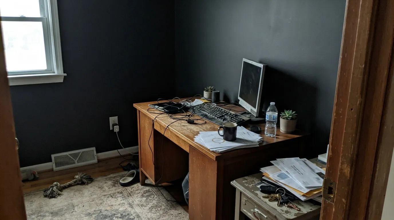
At LRV 5, this color needs light bouncing off it to show its personality. Starve it of daylight and it stops reading as an interesting blue-charcoal and just reads as a flat, muddy dark gray — the blue undertone that makes it worth choosing simply never shows up. If the room is dim, this becomes an expensive way to buy a plain dark gray.
Near-black paint is unforgiving about technique: roller stipple, lap marks and uneven nap texture all show up as visible sheen differences once the wall dries, even in matte. Use a high-quality microfiber roller, keep a wet edge, and plan on two full coats minimum over a gray-tinted primer — cutting corners here is the single most common complaint with any color this dark.
Black Knight sits deliberately between the two, and buyers who expected a flat, neutral black or an obvious navy blue are often thrown by how much it shifts with the light. If you want zero ambiguity, pick a warmer neutral black like Wrought Iron, or commit to an unmistakable navy like Hale Navy instead.
Room by Room
Against light perimeter cabinets or walls, a Black Knight island reads as a deliberate, modern anchor. It flatters brass and matte-black hardware equally, and the blue undertone keeps it from feeling like a flat black hole in the room. Satin, urethane-fortified cabinet enamel; two full coats.
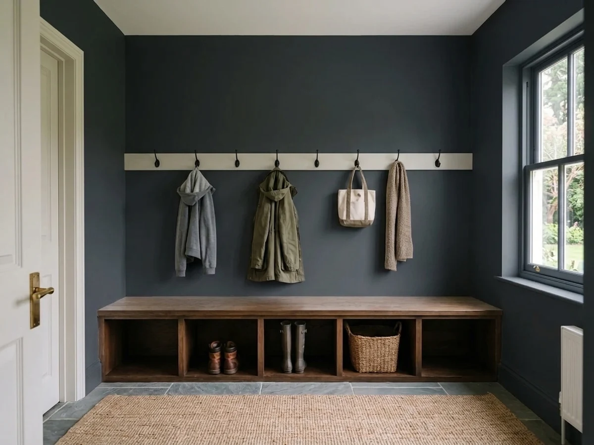
Small rooms take deep, cool color well, and a fully painted powder room in Black Knight with a warm brass mirror and a marble or wood vanity top reads custom and expensive. Give it one real light source — a sconce or a window — or the effect is lost.
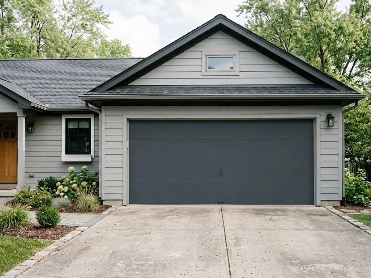
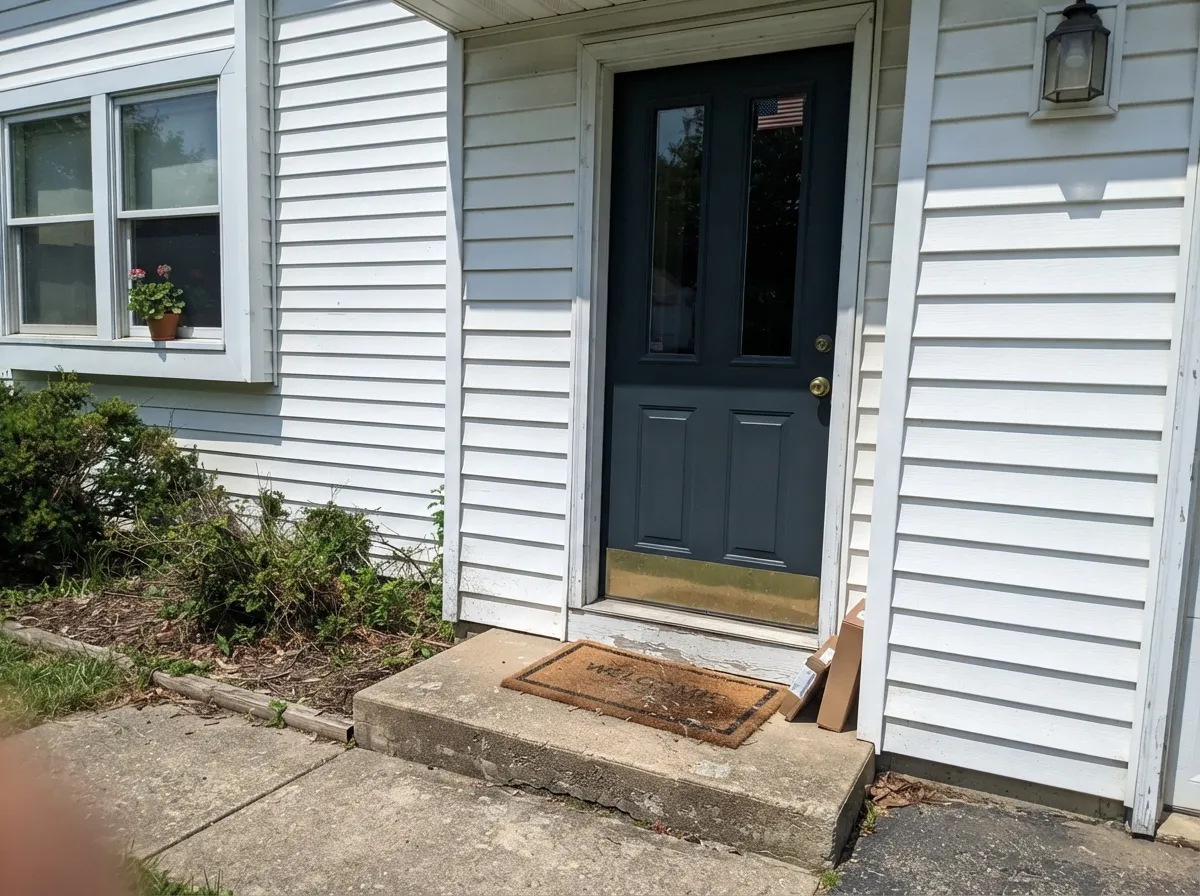
On a white, pale gray or cream house, a Black Knight front door reads crisp and current without the obvious statement of a bright color. Full exterior sun brings out the blue more than the interior sections above suggest, which is a feature here, not a flaw.
Cool and grounding with leather, walnut and brass lamp light, and better suited to this mood than a warm near-black would be. Needs at least one strong window or good task lighting; skip it in a windowless interior office.
A single Black Knight wall behind the headboard, with warm 2700K lamps and the rest of the room in a soft white, is dramatic without swallowing the space. Four walls of it in a smaller or dimmer bedroom is a much bigger commitment than the paint chip suggests.
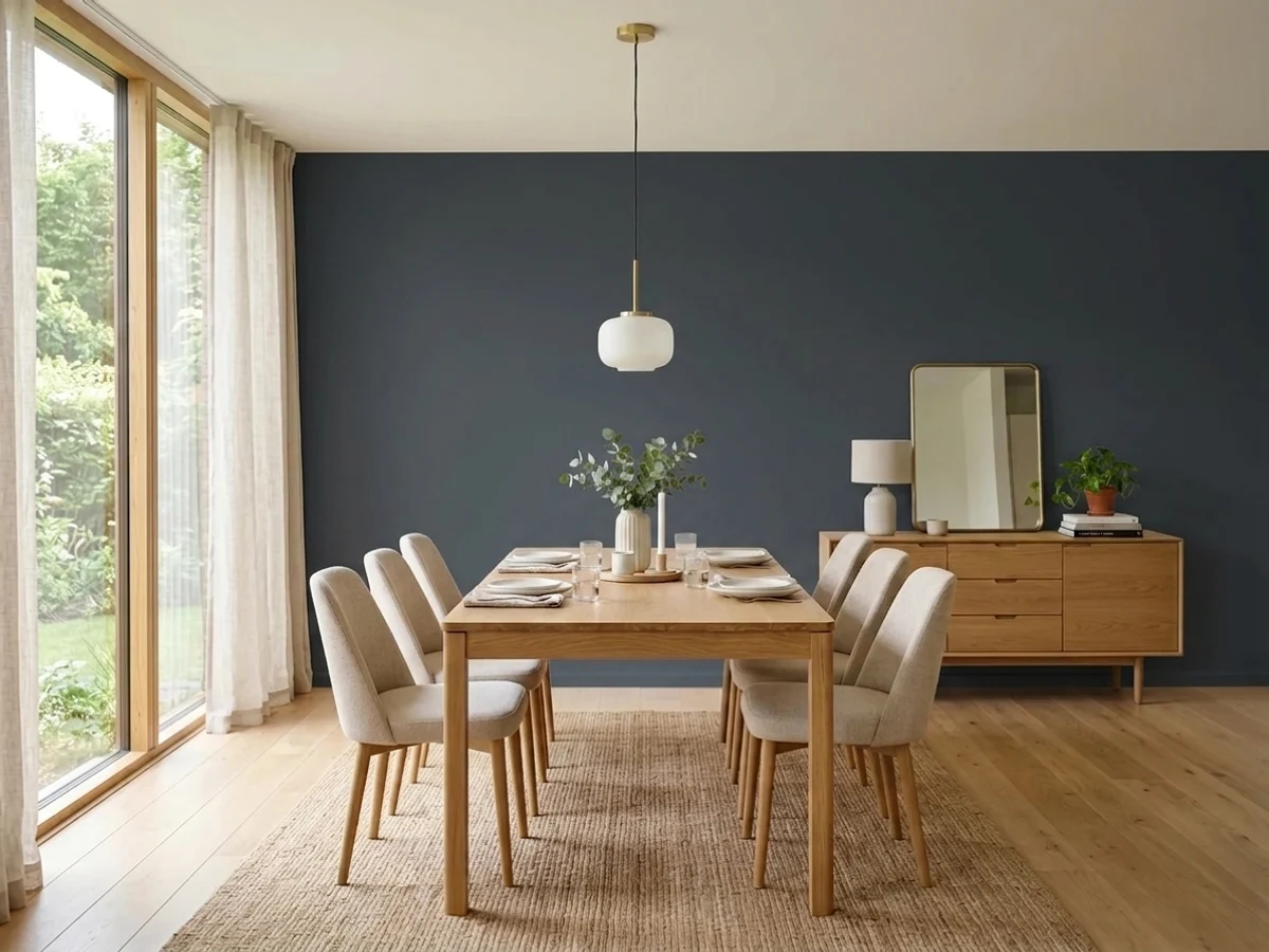
Works as a fireplace surround, built-in, or single accent wall in a room with strong south or west light; risky as the dominant wall color in an open-plan space that also has to negotiate with kitchen and dining sightlines.
Your Light Is the Risk
Strong daylight pulls the blue forward and the color reads as a confident charcoal-navy, not flat black. This is the light that makes the case for choosing it over a plain black.
Without a real light source, the blue never shows up and the wall reads as a plain, muddy dark gray. Fine if that's actually what you want; disappointing if you paid for the blue.
Cooler and flatter in the morning, visibly bluer and warmer-feeling by late afternoon. The swing is real — sample it at both ends of the day before committing on a big surface.
Warm 2700K lamps soften it toward a cozy near-black; cool white LEDs flatten it and make the blue read colder and more concrete-like. Choose the bulb on purpose.
Most complaints about Black Knight are a light mismatch. Upload a photo of your actual room and see it on your walls — then ask for the same wall in north light or evening lamps before you buy a single sample.
Need It From Another Brand?
Any paint counter can custom-tint Benjamin Moore 2136-10 directly. If you would rather stay in one brand's own deck, these are the closest stock matches, measured as ΔE2000. Under 2 is a difference you will not see on the wall.
| Brand | Closest color | ΔE | LRV | |
|---|---|---|---|---|
| Sherwin-Williams | Night WatchSW 9680 · Sherwin-Williams | 1.0 | 4 | Color page → |
| Behr | Spade BlackBNC-38 · Behr | 2.5 | 3 | Color page → |
| Valspar | Nocturnal Green5011-1 · Valspar | 1.2 | 3.3 | Color page → |
| PPG / Glidden | Starless SkyPPG0995-7 · PPG / Glidden | 3.7 | 5 | Color page → |
| Glidden | Onyx Black00NN 05/000 · Glidden | 4.4 | 5 | Color page → |
| HGTV Home by Sherwin-Williams | CaviarHGSW 6990 · HGTV Home by Sherwin-Williams | 4.0 | 3 | Color page → |
Similar Benjamin Moore Colors
The nearest shades to Black Knight within Benjamin Moore's own range, ranked by perceptual color distance — useful when you want the same look a touch lighter, darker, or warmer.
WCAG 2.1: AA is 4.5 : 1 for normal text, 3 : 1 for large text, AAA is 7 : 1.
Black Knight vs the Colors You're Also Considering
Every Black Knight sample board has the same rivals on it. The numbers show the real lightness gap — then it comes down to which risk you would rather live with.
Pick this if you're committed to the Benjamin Moore deck for the rest of the house.
Sherwin-Williams SW 7964 · LRV 7CyberspacePick this if your painter works in Sherwin-Williams — it lands in almost the identical spot, a blue-charcoal near-black at the same depth.
Pick this when you specifically want the cool blue mood — Iron Ore reads flatter and more neutral in every light.
Sherwin-Williams SW 7069 · LRV 6Iron OrePick this for a proven whole-house black that stays more neutral and carries far less blue.
Black Knight Coordinating Colors
The rule for coordinating with Black Knight is to stay light and warm everywhere it isn't: it needs a brighter, warmer neighbor to read as a deliberate anchor rather than a hole in the room. It sits comfortably next to other members of Benjamin Moore's near-black and navy family when you want to layer depth without adding a second undertone to reconcile. These are the partners that keep the color working:
Reading the LRV: Why This Near-Black Isn't a True Black
Benjamin Moore's deck lists Black Knight at LRV 5 with a hex of #39434D — and the RGB breakdown behind that hex (57 red, 67 green, 77 blue) is the real story of the color. A true neutral black keeps red, green and blue nearly equal; Black Knight's blue channel runs about 20 points above its red, which is a genuine, measurable cool cast, not a trick of the light. That is why it sits differently than Benjamin Moore's other near-blacks: warmer, greener darks like Wrought Iron keep their channels close together, while Black Knight leans the way a diluted navy would if you pushed it almost to black.
The practical result is a color that behaves like two different paints depending on the room. In flat, dim light, the eye can't resolve a 20-point channel gap and the wall simply reads dark gray. In strong daylight the gap becomes visible and the wall reads blue-charcoal. Both readings are honest — they are the same numbers, interpreted by two very different amounts of light.
Black Knight With Wood Tones and Metals
Warm woods do the heavy lifting here: honey oak, walnut, and butcher block all balance the coolness of Black Knight without a fight, because the warmth of the wood and the coolness of the paint sit on opposite ends of the same room and let each other be extreme. The one wood to watch is cool gray-washed or ashy oak — stacking two cool tones together can tip a small room toward feeling cold rather than dramatic.
On hardware, unlacquered brass and warm gold read as the classic, most-photographed pairing, softening the cool near-black with visible warmth. Matte black and dark bronze hardware work too, for a more monochrome, all-in-on-dark look. Polished chrome and nickel are the one combination to sample first — two cool metals-and-paint together can read stark rather than sophisticated.
Three Ready Palettes Built on Black Knight
A color is never alone on the wall. These are complete combinations in the 60-30-10 pattern, with the reason each one holds together. Every one opens in the visualizer.
White Dove and Revere Pewter keep the perimeter warm and light-reflective, so the Black Knight island reads as a deliberate anchor rather than a hole in the room; brass hardware ties the cool island back to the warm cabinetry.
Try this palette in your roomA fully drenched Black Knight powder room stays elegant instead of cave-like when the ceiling breaks to a soft cream; the Wrought Iron vanity keeps the near-black family in the room without adding a second undertone to reconcile.
Try this palette in your roomA white body keeps the whole facade bright, the Black Knight door supplies the modern near-black focal point, and Kendall Charcoal shutters echo the depth without competing with the door for attention.
Try this palette in your roomBlack Knight FAQ
Is Black Knight black or navy?
Neither, fully — it sits between them. At LRV 5 it reads as a near-black from across a room, but in real daylight the blue undertone comes forward and it reads as a genuine blue-charcoal. If you want a color that reads unambiguously black or unambiguously navy, this is not it.
Will it look different in a dim room?
Yes, and predictably so. Without a real light source, the blue undertone barely registers and the wall reads as a plain, flat dark gray. That is not a flaw in the paint — it is what every near-black color at this LRV does in low light. Sample it in your actual room before committing to four walls.
Is it good for kitchen cabinets or an island?
Yes — this is its strongest use. Against a lighter perimeter (white, cream, warm greige) a Black Knight island reads as a deliberate, modern anchor, and it pairs cleanly with both brass and matte-black hardware. Use a satin, urethane-fortified cabinet enamel and two full coats.
How many coats does it need?
Two full coats minimum over a gray-tinted primer, and technique matters more than usual: near-black paint shows roller stipple and lap marks that a mid-tone color would hide. A quality microfiber roller and a consistent wet edge are worth the extra care.
Does it work on an exterior front door?
Yes, reliably. On a white, pale gray or cream house it reads crisp and current, and full outdoor sun actually brings the blue forward more than interior light does — which reads as a feature on a door, not a flaw.
What white goes best with it?
A warm, soft white like White Dove keeps the pairing gentle; Swiss Coffee if you want an even creamier contrast. A stark, cool bright white will emphasize the blue in Black Knight rather than softening it — decide which effect you actually want before picking trim.
Have you painted with Black Knight?
Rate it — one tap helps the next reader decide.
Ask a Question