Black Magic
Sherwin-Williams' inkiest near-black, reviewed honestly: the rooms it makes, the rooms it swallows, and the sheen mistake that ruins it.

Jessica has spec'd whites and neutrals for more than 300 rooms and keeps a sample wall of painted drawdowns in her studio. Every color review is checked against real reader rooms in the comments and re-tested when a formula changes. About the testing process →

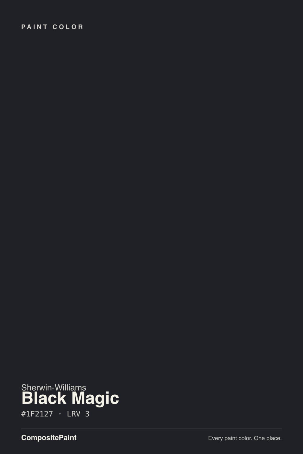
- 1Black Magic3
- 2Graphite8
The Fast Verdict
Black Magic is black with a little more depth than a flat, blunt black. At LRV 3 it gives nothing back, so it frames everything around it: white trim looks sharper, brass looks brighter, wood looks warmer. That same depth is the catch — it shows every roller mark, every patch, every fingerprint, and it will make a small dim room feel like a closed box. Get the sheen and the prep right and it is one of the best blacks Sherwin-Williams sells.
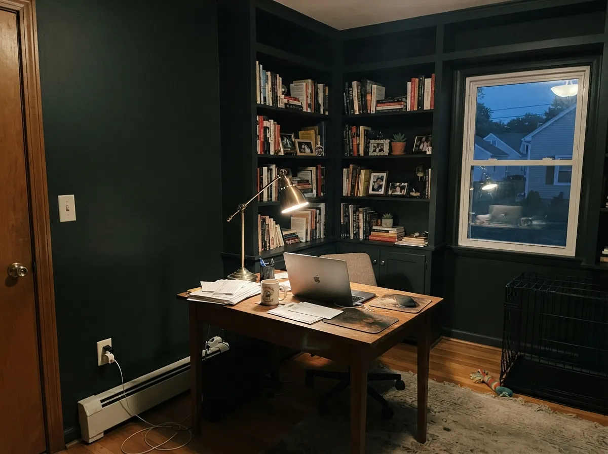
Front doors, shutters and window sashes · kitchen islands and lower cabinets · a study or dining room used mostly at night · black-and-white exteriors with white trim
Your room is small with one window · your walls are patched and wavy · you want low-maintenance cabinets · you need the space to feel bigger
- Deep enough to read as a real black, not a very dark gray
- Makes white trim, brass, and window glass look sharper
- Excellent on small surfaces: doors, shutters, sashes, islands
- Warm wood and natural stone look better next to it
- The faint blue lean keeps it from looking sooty in daylight
- LRV 3 gives nothing back — small dim rooms feel closed in
- Shows dust, smudges, and fingerprints, especially in flat sheen
- Every patch, seam, and roller lap shows in raking light
- Touch-ups almost always flash unless you re-coat the full surface
What Color Is Black Magic, Really?
Half the internet calls Black Magic a warm black and the other half calls it neutral, and both camps are arguing about almost nothing. Measured, it leans very slightly cool — a blue-violet whisper at about 11 percent saturation. That is faint enough that on a shaded wall you will never see it, and strong enough that in direct sun on a big surface the color looks inky rather than sooty. The one place the blue is obvious is in the can and on the wet wall: people who have rolled it report it looking distinctly blue going on, then drying black. That is normal. Do not panic on coat one.
LRV 3 is the number that actually runs this color. It means the paint returns roughly three percent of the light hitting it — the wall stops being a wall and becomes a hole in the room. Tricorn Black (SW 6258) sits at the same LRV, so the two behave identically in a dark corner; the difference only shows up in daylight, where Black Magic reads deeper and Tricorn reads flatter. Step up to Iron Ore (SW 7069) at LRV 6 and you have doubled the reflectance, which sounds trivial and is not: Iron Ore still reads black to guests but forgives drywall flaws Black Magic broadcasts.
Undertone in one line: a faint cool blue-violet that shows only in strong direct light — never brown, never green, and in shadow simply black.
Where It Shines
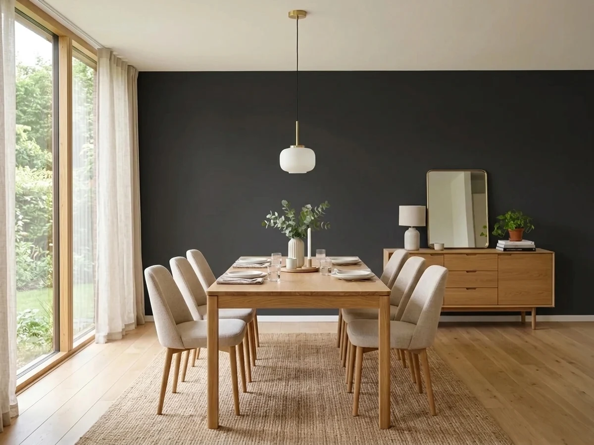
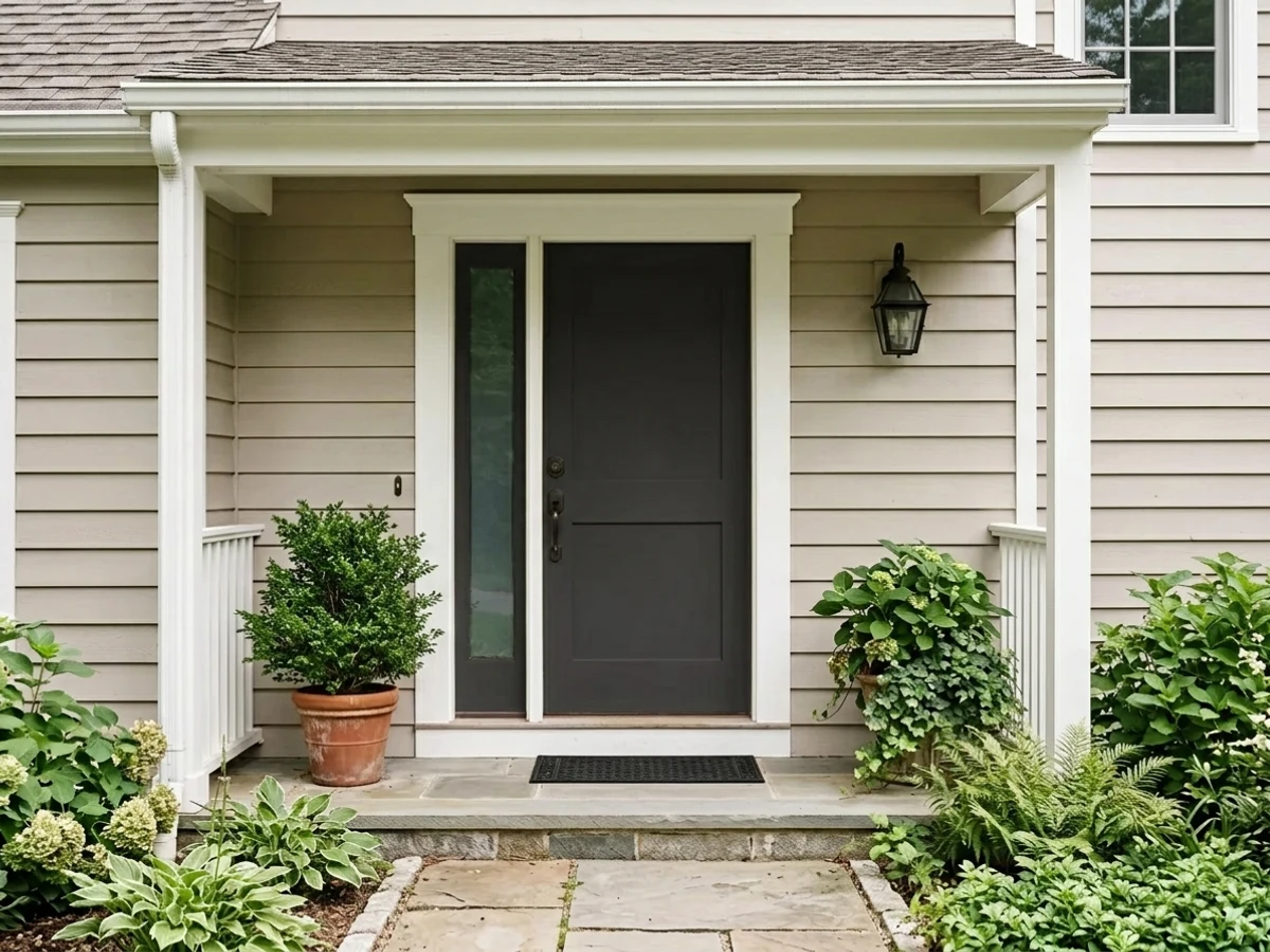
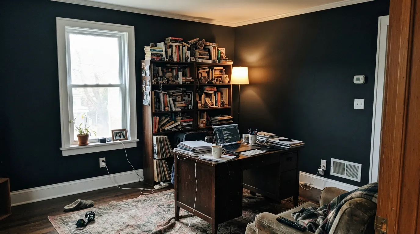
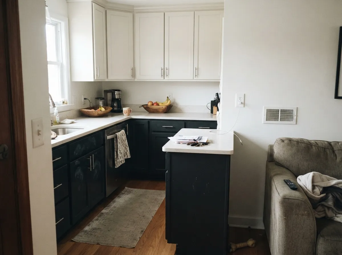
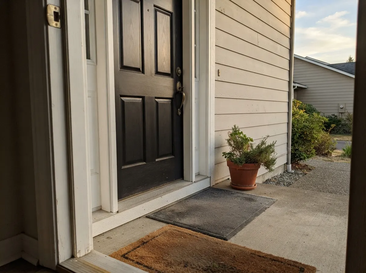
Black Magic is at its best framing things rather than surrounding you. A front door, a run of lower cabinets, an island, a study you use after dark — anywhere the black is the edge of the picture instead of the whole picture. Pair it with white trim and it does the work of two colors.
Where It Fails
The bad stories about this color are remarkably consistent, and none of them are about the color itself. They are about light, sheen, and what was under the paint. If your project matches one of these three, Black Magic will disappoint you no matter how many coats you roll.
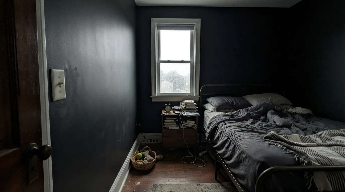
At LRV 3 there is no light coming back off the walls, so a small bedroom, office, or bath with a single window stops feeling cozy and starts feeling closed in — people describe the room as a box or a cave within a week. If you want dark but still want to breathe, drop to Peppercorn (SW 7674) at LRV 10, which still reads as a deep charcoal but leaves the corners visible.
This is the single most common regret with near-blacks. Matte black shows every speck of dust, every smudge, and every handprint — one homeowner with matte black walls put it plainly: touch the wall and there is a mark, and they wished they had used eggshell. Use eggshell on walls and satin on anything hands reach, and if you truly want flat, put it on a ceiling or a high accent wall only. For a lower-maintenance dark, Urbane Bronze (SW 7048) hides marks far better.
Late-afternoon sun skimming across a surface turns every filler spot, seam, nail head, and roller lap into a visible shadow, and at LRV 3 there is no color left to camouflage them. Skim-coat and sand properly, or move to Iron Ore (SW 7069), whose extra reflectance and slightly softer depth are genuinely more forgiving on imperfect walls and siding.
Room by Room
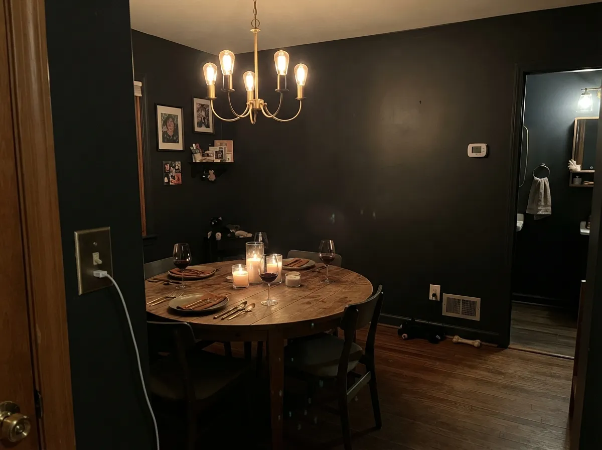
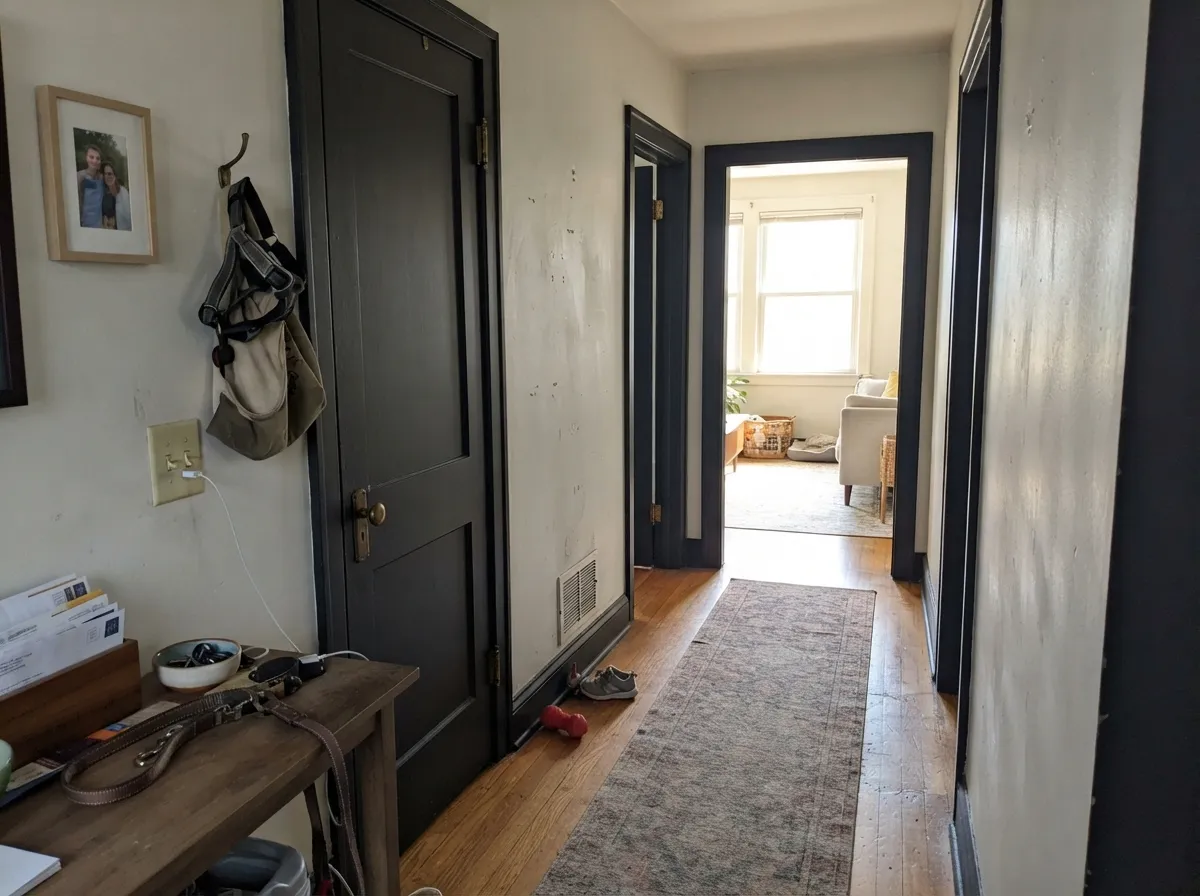
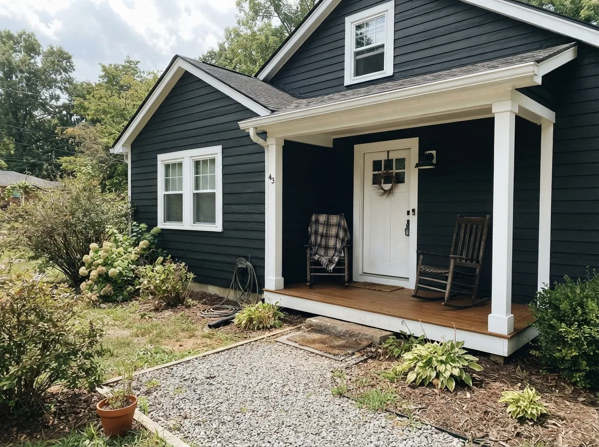
Your Light Is the Risk
Direct sun is the only place the inky lean shows. Sunlit planes look rich, shaded ones stay flat black.
Cool daylight suits the blue whisper and keeps the surface even — but the room will feel noticeably smaller.
2700K bulbs push it toward brown-black. 3000K to 3500K keeps it crisp. Lamps beat ceiling lights here.
Low sun across a wall or siding exposes every seam, filler spot, and lap mark. Prep decides the result.
Most complaints about Black Magic are a light mismatch. Upload a photo of your actual room and see it on your walls — then ask for the same wall in north light or evening lamps before you buy a single sample.
Need It From Another Brand?
Any paint counter can custom-tint Sherwin-Williams SW 6991 directly. If you would rather stay in one brand's own deck, these are the closest stock matches, measured as ΔE2000. Under 2 is a difference you will not see on the wall.
| Brand | Closest color | ΔE | LRV | |
|---|---|---|---|---|
| Behr | Spade BlackBNC-38 · Behr | 4.8 | 3 | Color page → |
| Benjamin Moore | Black2132-10 · Benjamin Moore | 0.7 | 5 | Color page → |
| Valspar | Tomcat8006-12G · Valspar | 1.3 | 3 | Color page → |
| PPG / Glidden | Starless SkyPPG0995-7 · PPG / Glidden | 4.1 | 5 | Color page → |
| Glidden | Onyx Black00NN 05/000 · Glidden | 3.2 | 5 | Color page → |
| Dutch Boy | True Black438-7DB · Dutch Boy | 1.0 | 3 | Color page → |
Similar Sherwin-Williams Colors
The nearest shades to Black Magic within Sherwin-Williams's own range, ranked by perceptual color distance — useful when you want the same look a touch lighter, darker, or warmer.
WCAG 2.1: AA is 4.5 : 1 for normal text, 3 : 1 for large text, AAA is 7 : 1.
Black Magic vs the Colors You're Also Considering
Every Black Magic sample board has the same rivals on it. The numbers show the real lightness gap — then it comes down to which risk you would rather live with.
Pick this for the deeper, inkier of the two in daylight.
Sherwin-Williams SW 6258 · LRV 3Tricorn BlackPick this for a straight black with no lean at all.
Pick this if warm browns in a black look muddy to you.
Sherwin-Williams SW 6990 · LRV 3CaviarPick this if you want a softer, browner black beside wood tones.
Tricorn Black (SW 6258) is the obvious comparison. Both sit at LRV 3, but Tricorn's #2F2F30 is a straight neutral black while Black Magic's #1F2127 is deeper in tone and carries the faint blue lean. Choose Tricorn if you want no undertone at all; choose Black Magic if you want a slightly inkier look.
After the Storm (SW 9685), #2A3037 at LRV 3, takes the blue much further and reads as a very dark blue-black rather than a black. Black Emerald (SW 2936) at LRV 1 and Weathervane (SW 2927) at LRV 2 are darker still, one green, one brown.
Across brands, Backdrop Hocus Pocus (BD-HP) at LRV 3 sits at a color difference of 0.8, which makes it the same color in practice. Valspar Tuxedo (8006-8G) at 2.21 is very close and worth sampling first. Benjamin Moore Black (PM-9) and Kompozit Silent Sea (0515) are near 4.6 to 4.8, close but visibly different side by side.
Black Magic Coordinating Colors
Black Magic is the contrast in any scheme it joins, so nearly everything else should be lighter than it. The reliable partners fall into two groups: clean whites that sharpen its edges, and warm neutrals that stop an all-black-and-white room from feeling cold. A single warm accent — a terracotta door, a deep green — is usually all the color a Black Magic scheme needs.
If you want a second dark in the same house, do not put it in the same sightline. Iron Ore on a garage door or a set of shutters reads as a deliberate softer black; Iron Ore on trim right beside Black Magic siding just looks like the paint ran out.
Black Magic on Exteriors
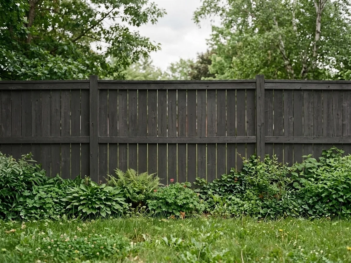
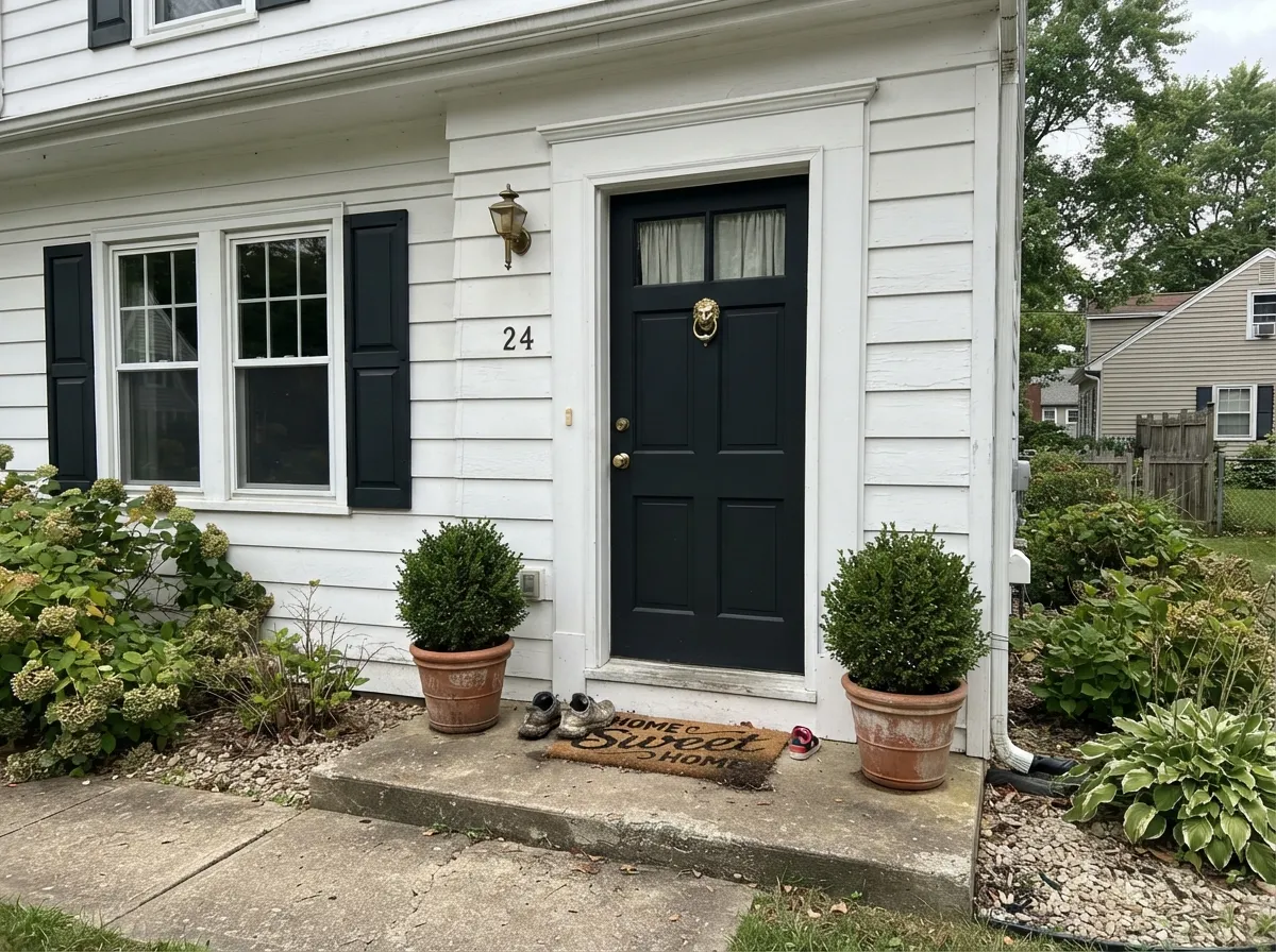
Outside is where this color is easiest to love and hardest to execute. Full sun is the only light strong enough to show the inky lean, so a black facade in Black Magic looks like a considered color rather than a shadow. White trim does the rest: at LRV 3 every window, corner board, and eave line gets drawn for you, which is why the black-body, white-trim house keeps working long after the trend cools.
The failures are all mechanical. Low afternoon sun rakes across lap siding and exposes seams, filler, and any place the previous coat was uneven, and there is no color depth left to hide them — budget the prep before you budget the paint. Dark bodies also run hot, which matters for vinyl and for anything with a manufacturer heat limit, so confirm the product and substrate guidance before a full-house job. Pollen and road dust sit visibly on a black wall, so the sunny street-facing side will need rinsing more often than a beige house ever did.
For a softer version of the same idea, put Black Magic on shutters, sashes, and the front door over a light body instead. It is the cheapest way to get the look with none of the heat or prep risk.
Black Magic on Cabinets and Doors
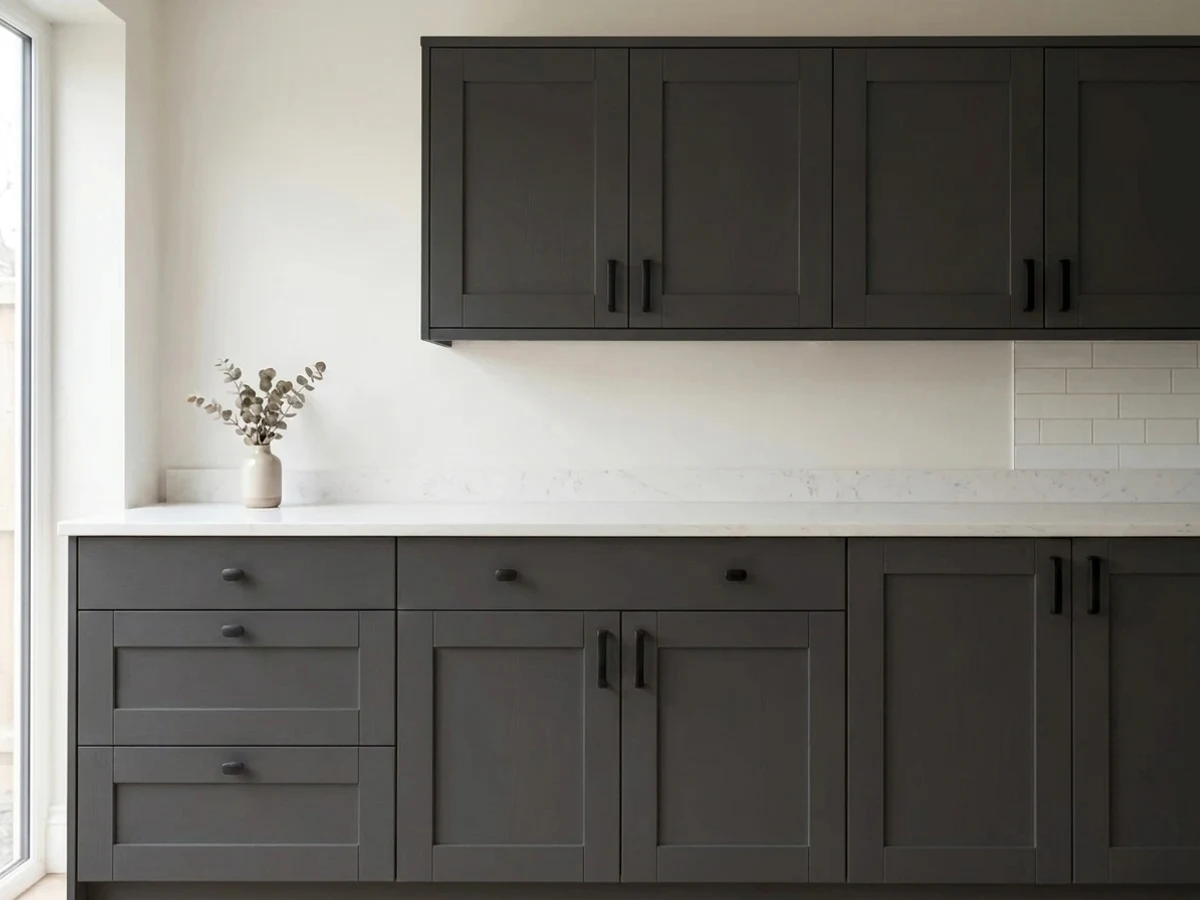
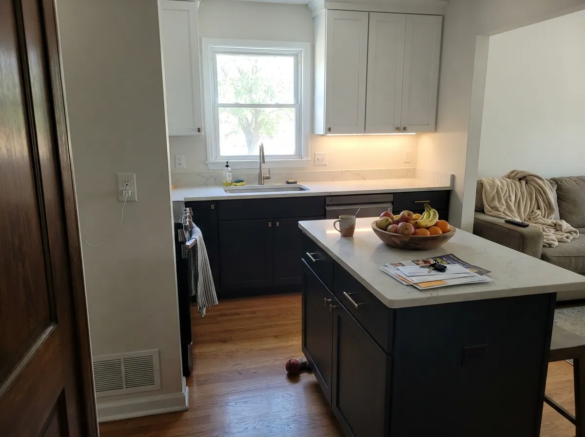
On cabinetry, Black Magic gives you the expensive-looking kitchen and the maintenance bill that comes with it. Homeowners who painted cabinets black overwhelmingly report the same three things: fingerprints around every handle, dust that shows within a day, and small chips along the door edges that read white against the black. None of that makes it a bad choice — it makes it a choice that needs satin sheen, a hard cabinet enamel, and hardware placed so hands land on metal instead of paint.
Keep the black low. Lowers and an island in Black Magic under Alabaster (SW 7008) uppers keeps the room bright at eye level while the dark base grounds it, and it is far easier to live with than a fully black kitchen. Interior doors are the low-risk version of the same move: semi-gloss Black Magic doors against a light wall change a hallway for the price of a gallon, and the doors get wiped down anyway.
One practical note on touch-ups. At LRV 3 a dab of paint over a scuff almost always flashes because the sheen never matches. Plan to re-coat the whole door or the whole panel rather than spot-fix, and keep a labeled quart from the same batch.
Three Ready Palettes Built on Black Magic
A color is never alone on the wall. These are complete combinations in the 60-30-10 pattern, with the reason each one holds together. Every one opens in the visualizer.
The black body carries 60 percent and the white trim draws every line on the house, which is the whole point of a dark facade. The deep green door is the 10 percent that keeps the scheme from reading as pure graphic black and white.
Try this palette in your roomShoji White is warm enough to keep the contrast from feeling surgical, so the trim reads as a frame instead of a fence. The terracotta door is the single warm note that stops an LRV 3 room from going cold at night.
Try this palette in your roomKeeping the black below the counter puts the mass where it grounds the room instead of shrinking it, and Alabaster uppers bounce the light back. Accessible Beige walls bridge the two so the kitchen does not read as a black-and-white photograph.
Try this palette in your roomBlack Magic FAQ
Is Black Magic warm or cool?
Faintly cool. It carries a blue-violet lean at about 11 percent saturation, which is why it looks inky rather than sooty in sunlight. Plenty of people describe it as a warm black, and they are not seeing things — at LRV 3 the undertone is so quiet that whatever sits next to it decides the temperature.
Why does my Black Magic look blue while I am painting?
Because it is blue, briefly. Wet paint exaggerates the blue-violet lean and it dries out to black — painters using the vinyl-safe version report the same thing and warn customers ahead of time so nobody panics. Judge the color when the second coat is fully cured, not on the wet wall.
Black Magic or Tricorn Black?
Both sit at LRV 3, so in a shaded room they are the same paint. In daylight Black Magic looks deeper and slightly inky while Tricorn Black stays a flat, neutral black. Choose Black Magic for a richer black on doors and exteriors, Tricorn if you want zero undertone anywhere.
Is it good for kitchen cabinets?
Yes for lowers and islands, with a warning. Black cabinets show fingerprints, dust, and every nick along the edges people grab — that is the number one complaint from homeowners who did it. Use a satin urethane-fortified cabinet enamel, keep the uppers light, and expect to wipe doors more often than you did with wood.
What sheen should I use on black walls?
Eggshell. Flat and matte look incredible in photos and terrible in a real house — dust and hand marks show instantly and touch-ups flash. Eggshell keeps most of the depth and can actually be cleaned. Save flat for a ceiling or a wall nobody touches.
What white trim goes with Black Magic?
Pure White (SW 7005) for the crispest modern edge, Alabaster (SW 7008) when you want the pairing softer and warmer. Do not mix two whites in the same sightline — against LRV 3 the difference between them is glaring. Natural wood trim is the third option and warms the scheme without adding a white at all.
Will a black exterior fade or get too hot?
Dark bodies absorb far more heat than light ones, which matters for vinyl siding and for anything with a heat limit, so check the product and substrate guidance before you commit. Fade resistance depends on the line you buy, not the color name — use a top-tier exterior acrylic and expect the sunniest wall to age first.
Have you painted with Black Magic?
Rate it — one tap helps the next reader decide.
Ask a Question