Caviar
The cooler, blue-leaning black in Sherwin-Williams' deck, reviewed honestly: where it earns its keep on cabinets and doors, the whole-room mistake that swallows a space, and how it actually compares to Tricorn Black.

Jessica has spec'd whites and neutrals for more than 300 rooms and keeps a sample wall of painted drawdowns in her studio. Every color review is checked against real reader rooms in the comments and re-tested when a formula changes. About the testing process →
- 1Caviar3
- 2Graphite8
The Fast Verdict
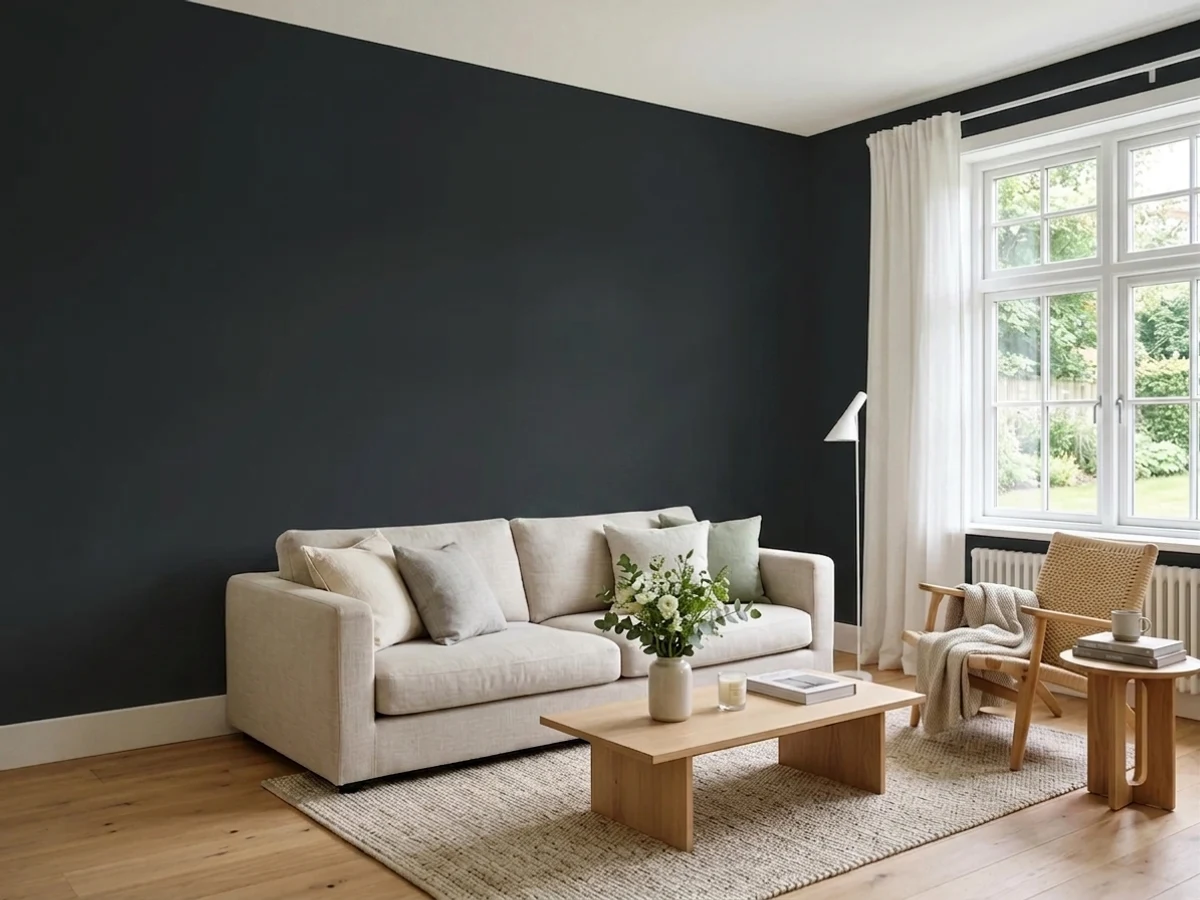
Caviar is Sherwin-Williams' cool-toned answer in a crowded lineup of near-blacks — the same bottom-of-the-deck LRV 3 depth as Tricorn Black, built on a visibly bluer, graphite-leaning base instead of a dead-neutral one. In small, defined doses — a kitchen island, a front door, a run of exterior trim — it looks confident and current. Painted across four ordinary walls in an ordinary room, it looks like exactly what LRV 3 promises: very little light coming back out.
Kitchen islands and cabinetry · front doors and exterior trim · a single accent wall in a room with real daylight · anyone who wants a black with a cool graphite edge instead of a dead-neutral one
You want a warm, brown-based dark (that's Urbane Bronze or Wrought Iron) · your room runs on one small window and no real daylight · you're painting all four walls without living with a big sample first · you actually want the industry-reference black, not a cooler variation on it
- A genuine near-black (LRV 3) with a distinct cool, graphite-blue edge instead of dead-neutral black
- Reads confident and clean on kitchen islands, cabinets, and front doors
- Full sun turns it a crisp, true black outdoors — a modern-exterior classic
- Pairs effortlessly with cool metals — black hardware, brushed nickel, chrome
- Small doses (a door, an island, one wall) deliver drama without a whole-room commitment
- LRV 3 makes a full room feel noticeably smaller and darker than the chip suggests
- Cool undertone argues with warm brass, golden oak, and terracotta
- Needs a tinted primer, or expect three-plus coats over white drywall
- Less name recognition than Tricorn Black, so it's easy for a painter to substitute the wrong black
What Color Is Caviar, Really?
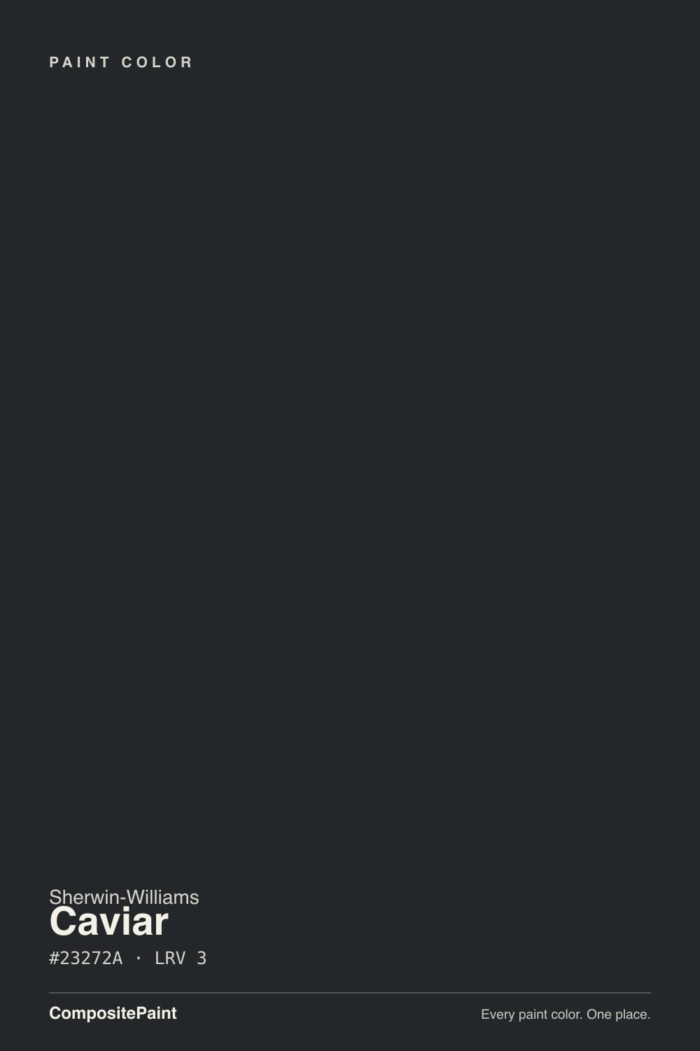
Caviar sits in the crowded back corner of Sherwin-Williams' black lineup, next to Tricorn Black and Iron Ore, and the number that separates it from its neighbors is buried in its own hex code. Its RGB reads 35, 39, 42 — the blue channel highest, green a close second, red the lowest. That is a genuinely cool, graphite-leaning black, not the dead-neutral black most people picture when they hear the word. Tricorn Black, by comparison, is nearly R-G-B equal, a true neutral. Caviar is the pick for someone who wants black with a whisper of blue-gray depth instead of flat ink.
At LRV 3 it sits at the very bottom of the deck, essentially tied with Tricorn Black for how little light it reflects — this is not a soft, forgiving black, it is a real one. That number is the whole practical story: a surface in Caviar absorbs almost everything the room's light throws at it, which is exactly why it works so well in small doses — a door, an island, a single wall — and turns punishing in large ones, like four walls in a room with one small window.
Undertone in one line: cool graphite-blue, never warm. If a sample looks like it is leaning brown or bronze on your wall, that is your lighting or your camera doing it, not the paint — for a genuinely warm black, look at Urbane Bronze or Wrought Iron instead.
Where It Shines
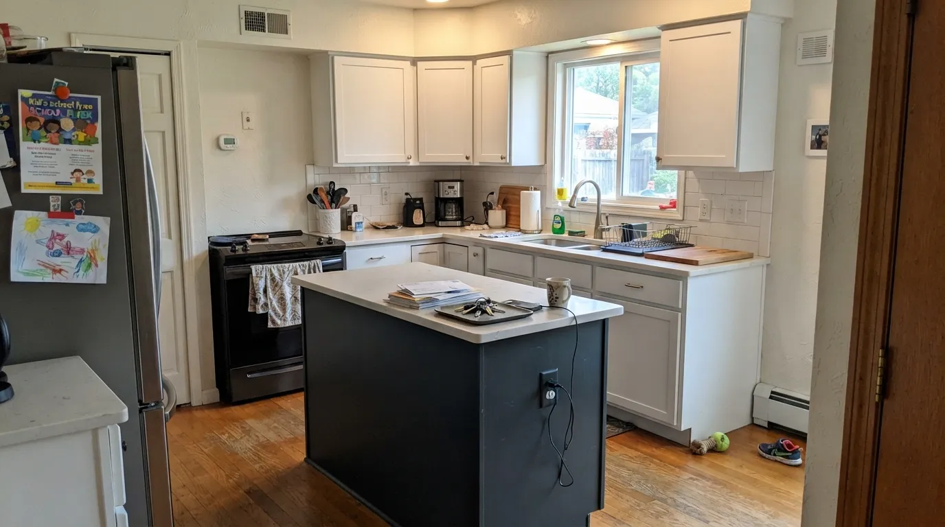
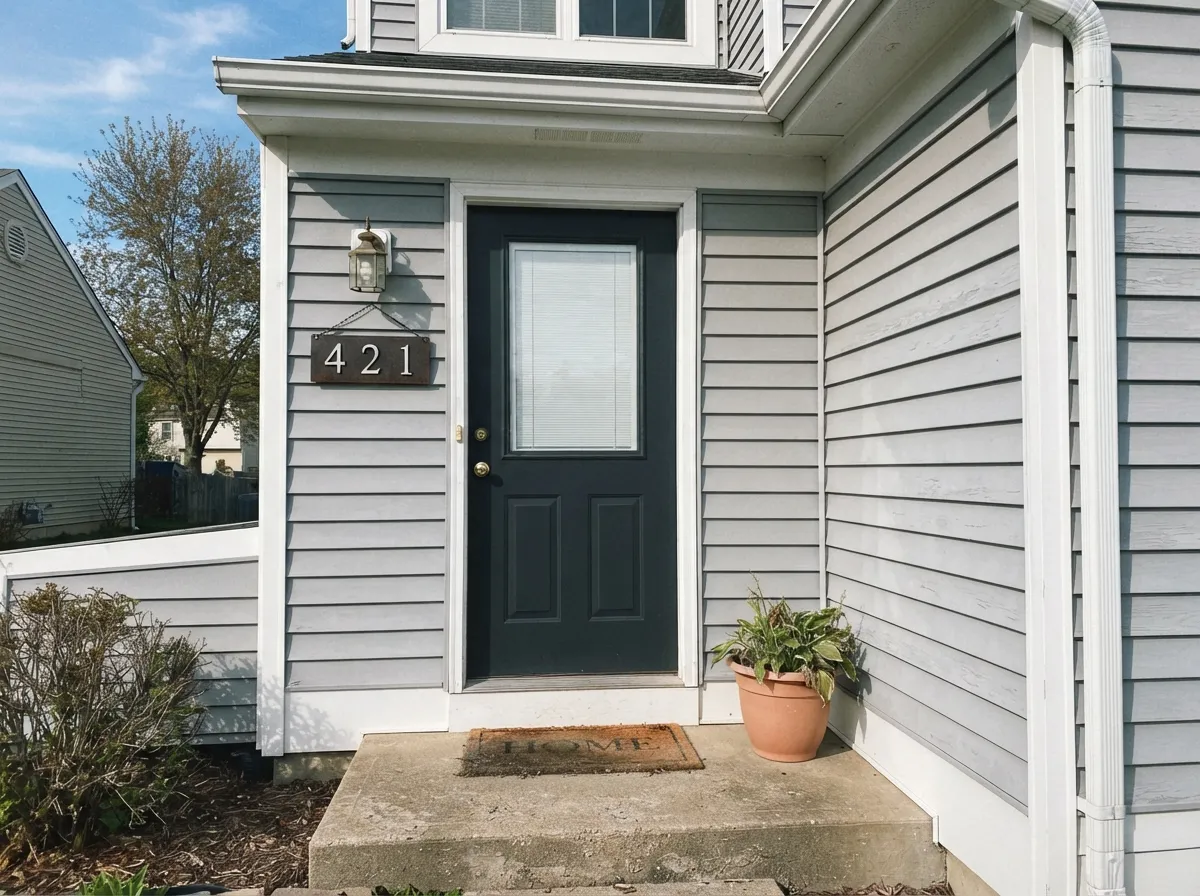
Give it a defined edge — a cabinet door, a piece of furniture, a front door, a run of exterior trim — and strong light, and Caviar earns its keep. It photographs best against clean whites and cool grays, where the small dose of black reads confident rather than heavy. Kitchen islands are its most common job for a reason: one dark anchor in an otherwise light room, with black or brushed-nickel hardware and pendant lights doing the rest of the styling work.

Where It Fails
Almost every regret story about Caviar comes from ignoring what LRV 3 actually means, and it is predictable before the first coat. None of it is the paint's fault — but if your plan matches one of these, sample big before you commit.
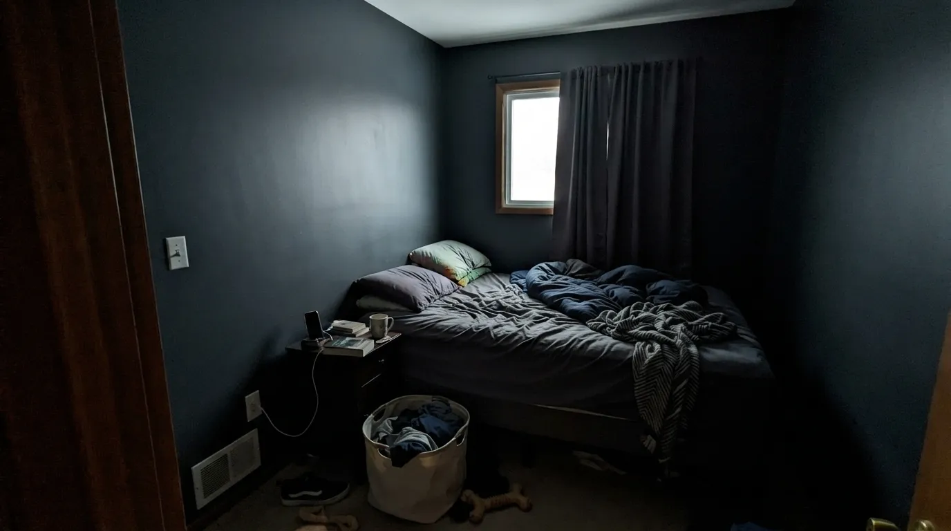
LRV 3 means the room absorbs almost every bit of light that hits it. A small bedroom or a windowless powder room done fully in Caviar can feel like a closet, not a mood. It works as a whole room only with real daylight — multiple windows or a skylight — and enough floor space that the walls aren't right on top of the furniture.
The name suggests something rich and food-adjacent; the paint itself is cool graphite-blue. Against golden oak, warm brass, or terracotta tile it can read slightly off-temperature instead of grounding the room. If your space runs warm, Urbane Bronze or Wrought Iron will sit easier.
Rolling Caviar straight over white drywall is the classic three-coat mistake — painters report needing three or four coats for even coverage without one. A gray- or black-tinted deep-base primer cuts that to two finish coats and saves a full day of work.
Room by Room
One dark anchor against white perimeter cabinets and a light counter is the modern-kitchen formula for a reason. Satin or semi-gloss shows the color's graphite depth without going glossy-plastic; cool hardware — black or brushed nickel — suits the undertone better than warm brass.
Full sun reads it as a true, confident black rather than the softer charcoal it can look like indoors. Pair with a light or mid-tone siding and it becomes the modern door everyone photographs; cool trim colors sit easier with it than warm ones.
A south- or west-facing room with good daylight and warm lamps at night can carry Caviar on the walls for a genuinely moody, book-lined feel. Skip it in a north-facing room with one small window.
As an accent wall behind the headboard, with everything else light and a lamp for evenings, it reads dramatic and calm. As all four walls in an average bedroom with average light, most owners find it heavier than the paint chip promised within the first week.
A single black vanity under a bright, well-lit mirror is an easy, reversible way to try the color without repainting a whole room. Satin holds up to water splashes better than a flat sheen.
Reserve it for rooms that are large, genuinely bright, and already have a plan for artificial light at night. In an average light-starved American bedroom or living room, it collapses the sense of space more than the chip lets on.
Your Light Is the Risk
Full sun on a cabinet door or front door brings out the cool graphite-blue depth instead of flattening it to a void — this is where Caviar looks intentional, not just dark.
Without strong daylight, LRV 3 reads as a flat black hole rather than a color — the classic 'the walls feel like they're closing in' complaint.
Cool morning light sharpens the blue-gray edge; warm afternoon sun softens it slightly, though at this depth the shift is subtle, not dramatic.
2700K warm bulbs pull it toward a softer charcoal-black; cool white LEDs keep the graphite-blue edge crisp. Either works — match it to the room's other warm or cool notes.
Most complaints about Caviar are a light mismatch. Upload a photo of your actual room and see it on your walls — then ask for the same wall in north light or evening lamps before you buy a single sample.
Need It From Another Brand?
Any paint counter can custom-tint Sherwin-Williams SW 6990 directly. If you would rather stay in one brand's own deck, these are the closest stock matches, measured as ΔE2000. Under 2 is a difference you will not see on the wall.
| Brand | Closest color | ΔE | LRV | |
|---|---|---|---|---|
| Behr | Spade BlackBNC-38 · Behr | 4.8 | 3 | Color page → |
| Benjamin Moore | Black2132-10 · Benjamin Moore | 0.7 | 5 | Color page → |
| Valspar | Tomcat8006-12G · Valspar | 1.2 | 3 | Color page → |
| PPG / Glidden | Starless SkyPPG0995-7 · PPG / Glidden | 4.4 | 5 | Color page → |
| Glidden | Onyx Black00NN 05/000 · Glidden | 3.5 | 5 | Color page → |
| Dutch Boy | True Black438-7DB · Dutch Boy | 0.8 | 3 | Color page → |
Similar Sherwin-Williams Colors
The nearest shades to Caviar within Sherwin-Williams's own range, ranked by perceptual color distance — useful when you want the same look a touch lighter, darker, or warmer.
WCAG 2.1: AA is 4.5 : 1 for normal text, 3 : 1 for large text, AAA is 7 : 1.
Caviar vs the Colors You're Also Considering
Every Caviar sample board has the same rivals on it. The numbers show the real lightness gap — then it comes down to which risk you would rather live with.
Pick this if you want that same LRV-3 depth with a whisper of blue-gray instead of flat neutral.
Sherwin-Williams SW 6258 · LRV 3Tricorn BlackPick this if you want the true, dead-neutral reference black instead of a cool-leaning variation.
Side-by-side comparison →Pick this when you want the deepest possible black, not a charcoal stand-in.
Sherwin-Williams SW 7069 · LRV 6Iron OrePick this for a whole-room black alternative that reflects roughly twice the light and is easier to live with on four walls.
The comparison most people make is Caviar against Tricorn Black SW 6258. Both sit at LRV 3, but the hex values separate them: Caviar is #23272A, with blue highest and red lowest, while Tricorn Black is #2F2F30, whose channels are nearly equal. Tricorn Black is therefore the neutral, true black of the two, and Caviar is the cooler, slightly inkier one. On a matte wall the difference is subtle. On a door, a cabinet, or anything with sheen, and especially in cool daylight, it is easy to see.
Other neighbors go further. Weathervane SW 2927 at LRV 2 (#2C201A) is a brown-black, and Black Emerald SW 2936 at LRV 1 (#12221D) is a green-black. Across brands, Valspar Tuxedo 8006-8G is a deltaE of 1.44 and visually identical in normal room light. Benjamin Moore Black PM-9 at 2.62 is very close but worth sampling, and Behr Beluga 770F-7 at 4.26 is close but visibly different side by side.
Caviar Coordinating Colors
The rule for coordinating with Caviar is simple: stay cool or neutral, and give it plenty of light around it. It pairs cleanly with crisp whites, soft warm-neutral grays, and cool metals — and can look slightly off-temperature next to anything strongly gold or orange-brown. These are the partners that keep showing up in rooms that work:
Caviar vs. Tricorn Black: Picking SW's Right Black
Sherwin-Williams sells more than a dozen near-blacks, and Tricorn Black (SW 6258) is the one that gets named by default — the reference true black, the one paint counters reach for first, the one most 'best black paint' lists lead with. Caviar lives one shelf over: the same LRV-3 depth, but built on a visibly cooler, blue-gray base instead of Tricorn's near-perfect neutral.
That makes Caviar less of a headline color and more of a working alternate — the one a designer reaches for when a room already has cool grays and black metal in it and the black needs to match that temperature exactly, rather than sit slightly warmer and more neutral the way Tricorn does. It has not had a Color-of-the-Year moment; it does one job — cabinets, doors, trim — reliably, which is its own kind of good.
Caviar With Wood Tones and Floors
Because the undertone is cool, the flooring question matters more than usual. Pale white oak, ash, gray-washed wood, and walnut all sit comfortably next to Caviar — their coolness or neutrality matches its temperature. Golden honey oak is the one genuine friction point: the floor's orange-yellow warmth and the paint's blue-gray coolness pull in opposite directions, and on a large surface like an island the mismatch is easy to see.
Countertops follow the same logic: white or gray quartz, marble, and soapstone all flatter it; warm butcher block works fine in small doses — a floating shelf, a cutting board — but a full butcher-block counter under a Caviar island asks the two surfaces to argue all day. When in doubt, hold the actual sample against the actual floor before ordering paint.
Three Ready Palettes Built on Caviar
A color is never alone on the wall. These are complete combinations in the 60-30-10 pattern, with the reason each one holds together. Every one opens in the visualizer.
Pure White keeps the room bright enough that LRV 3 stays livable instead of oppressive; Kendall Charcoal on the hood echoes the island's darkness without doubling the black, so the kitchen reads one true anchor, not two competing ones.
Try this palette in your roomAgreeable Gray gives the house a soft, warm-leaning body so Caviar's cool black doesn't fight it, and Extra White trim draws a crisp line around both — the modern-exterior formula that photographs well in any light.
Try this palette in your roomRepose Gray keeps three walls light enough that the room doesn't lose its sense of space; Alabaster trim frames the black wall crisply. This only works with a window on or near the black wall — check the room's actual daylight before committing the fourth wall.
Try this palette in your roomCaviar FAQ
Is Caviar warm or cool?
Cool. Its RGB values run bluest, not reddest, which puts it in graphite-black territory rather than warm coffee-black. Against warm oak or brass it can look slightly off-temperature; against cool metals and grays it disappears into the scheme the way a good black should.
How does Caviar compare to Tricorn Black?
Both sit at LRV 3, so they are equally dark. The difference is undertone: Tricorn Black is nearly neutral, its RGB channels almost equal, while Caviar leans visibly cooler and bluer. Use Tricorn for the industry-reference black; use Caviar for a slightly moodier, graphite-tinted version of the same depth.
Can I paint a whole room in Caviar?
Only with real daylight — multiple windows or a skylight — and a room large enough that the walls aren't inches from the furniture. At LRV 3 it absorbs almost all the light that hits it; in an average dim American bedroom, four walls of it reads more like a cave than a mood.
What primer does Caviar need?
A gray- or black-tinted deep-base primer, not a standard white one. Skipping it is the single most common complaint — expect three or four coats over white drywall without it, versus two with the right base. Ask for the deep base at the paint counter.
Does Caviar work on kitchen cabinets?
Yes — it is one of its best jobs. On an island or a full run of lower cabinets against white perimeter cabinets, satin or semi-gloss Caviar reads clean and current. Cool hardware — black, brushed nickel, chrome — suits its undertone better than warm brass.
Is it good for a front door?
Very good. Full outdoor sun reads it as a true, confident black rather than the softer charcoal it can look like indoors, and it pairs easily with most siding colors as long as the trim stays cool or neutral rather than warm.
Have you painted with Caviar?
Rate it — one tap helps the next reader decide.
Ask a Question