White
Benjamin Moore's plainest white, reviewed honestly: the rooms where having no undertone is the whole point, and the rooms where it turns cold and clinical.

Jessica has spec'd whites and neutrals for more than 300 rooms and keeps a sample wall of painted drawdowns in her studio. Every color review is checked against real reader rooms in the comments and re-tested when a formula changes. About the testing process →
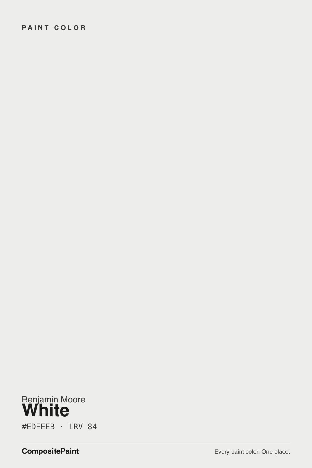
- 1First Star69
- 2Classic Gray74
- 3White84
- 4Chantilly Lace91
- 5Ultra Pure White97
The Fast Verdict
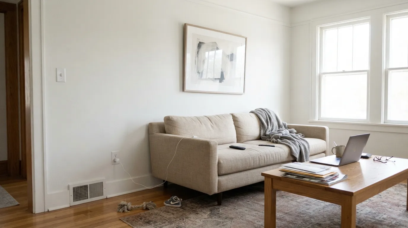
White OC-151 is what most people mean when they say "just white." There is almost no pigment in it, so it does not push a room warm or cool — it takes its cue from your floors, your stone and your window. That blankness makes it one of the best ceiling and trim whites Benjamin Moore sells, and a strong wall white in bright rooms that already have something worth looking at. In a dim north room, or against honey oak and travertine, the same blankness reads cold and a little clinical.
Ceilings over any wall color · Trim and doors in mixed warm-and-cool schemes · Whole-house walls in bright modern rooms · Rooms where art, stone and wood should lead
The room faces north and stays dim · Honey oak, travertine or almond trim is staying · You want a soft cream that feels cozy · Your trim will be a brighter white
- Genuinely neutral — never steers a room warm or cool
- The safest ceiling white over any wall color in the house
- Covers in two coats where the brightest whites need three
- Hides drywall seams and plaster waves better than near-100 whites
- Takes brass, chrome, black hardware, oak and walnut without arguing
- Goes cold and clinical in dim north-facing rooms
- Mirrors green bounce from lawns and trees in summer
- Reads gray and dull next to a brighter trim white
- Makes honey oak and travertine look more orange
What Color Is White, Really?
On paper this is a near-neutral: saturation of 8 percent, and a hue that points faintly yellow-green. In a real room that is not a color you can see — it is an absence. Where White Dove OC-17 has a grayed cream you can point at, and Decorator's White OC-149 has a blue-violet edge, OC-151 has almost nothing of its own. That is why Benjamin Moore calls it a clean canvas, and why it turns up in houses where the stone, the art and the wood are supposed to be the interesting part.
At LRV 84 it gives back most of the light in the room, but it is not one of the extreme bright whites. Tape it next to Chantilly Lace OC-65 at LRV 90 and OC-151 shows a little body — softer, very slightly grayer, and far kinder to drywall seams and old plaster than the near-100 whites, which broadcast every flaw. It also tends to cover in two coats where the brightest whites want three.
Undertone in one line: none you can name — a whisper of gray-green that only shows under cool 4000K bulbs. If your sample looks blue, green or dingy on the wall, that is the north window, the lawn outside, or the cream trim beside it doing the work, not the paint.
Where It Shines
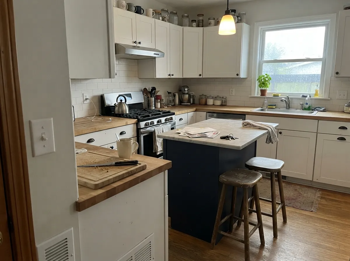
It shines wherever a white is supposed to disappear: overhead, on trim and doors, and on walls in rooms with enough daylight and enough going on that the paint's only job is to hold still. In modern kitchens, bright baths and art-heavy rooms it does that better than almost any white in the deck.
Where It Fails
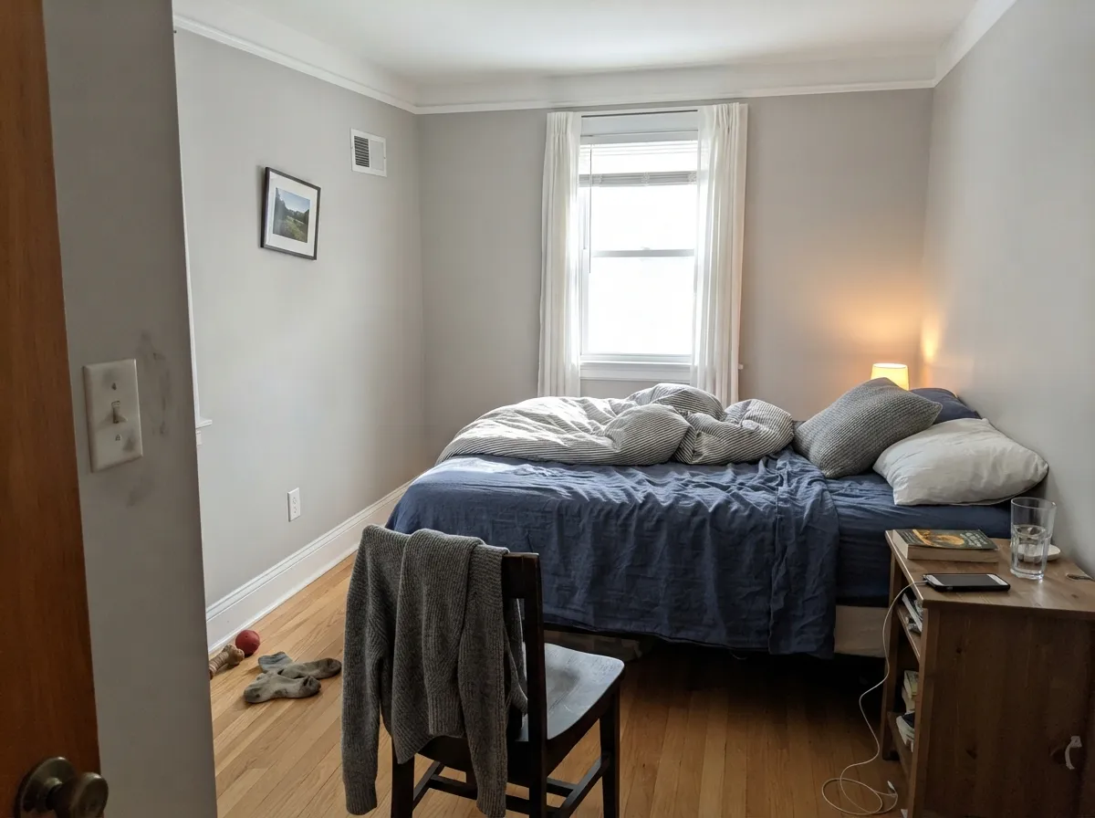
Almost every unhappy story about OC-151 comes from the same place: a white with no undertone has nothing to push back with, so the room writes on it. Three situations do it every time, and none of them get better with another coat.
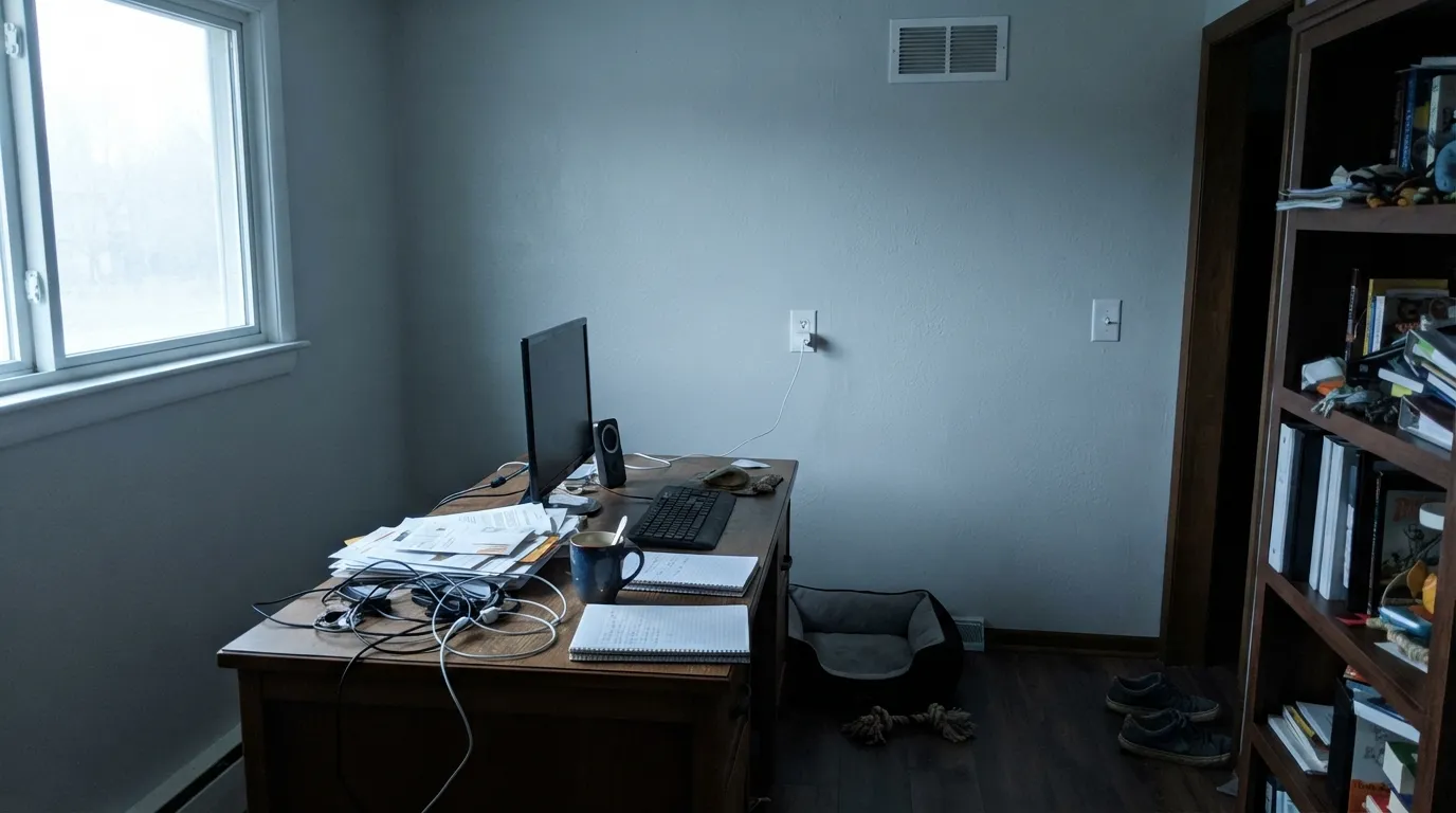
North light is cool and gray, and there is no warmth in this paint to meet it. Owners describe the result as gallery-like at best, cold and monastic at worst. If the room stays dim, use White Dove OC-17, or Swiss Coffee OC-45 when you want real cream.
Green light bounces off grass and leaves onto the wall, and a paint with this little pigment has nothing to absorb it. Sample in summer with the leaves out, not in March. Cloud White OC-130 at LRV 85 has just enough body to swallow the green.
Honey oak floors, travertine, almond trim: beside those, OC-151 flips cold and faintly blue, and it makes the wood look more orange than it is. Match the warmth instead — Cloud White OC-130, or Sherwin-Williams Alabaster SW 7008 if you are buying at SW.
Room by Room
A neutral white overhead does not tint the daylight falling onto your wall color, which is the entire job of a ceiling white. Flat sheen. Because it is neutral it works over warm and cool walls equally, so one ceiling color can run the whole house.
Semi-gloss. It gives clean edges against greige, navy or sage without adding a second undertone to the room. It also covers better than Chantilly Lace OC-65, which matters when you are cutting in hundreds of feet of casing.
Eggshell, and only if the room gets real light. Give it something to be blank against: Chelsea Gray HC-168 built-ins, a Hale Navy HC-154 door, black hardware. In a dim living room it goes hollow.
Satin on cabinets, sprayed if you can. It sits beautifully with white quartz, Carrara and stainless. With warm granite full of gold flecks it turns cold — Cloud White OC-130 is the safer cabinet white there.
A small room with white tile is exactly where LRV 84 earns its keep, and the neutrality means it will not fight chrome or brass. Watch your grout color, because the wall will echo it. Satin or a scrubbable eggshell.
As trim, fascia and window surrounds against dark siding it is crisp and dependable. As the whole body in full southern sun it can glare; a slightly lower-LRV white is easier on a big facade.
Your Light Is the Risk
Direct sun brings the faint yellow-green forward and the wall reads as plain, clean white all day.
Cool gray daylight with no warmth to meet it. Crisp if you wanted gallery walls, cold if you did not.
2700K lamps make it look almost cream. 4000K bulbs pull the green edge out, mostly on ceilings.
Lawn and leaves throw green light onto paint that has nothing to absorb it. Sample in summer.
Most complaints about White are a light mismatch. Upload a photo of your actual room and see it on your walls — then ask for the same wall in north light or evening lamps before you buy a single sample.
Need It From Another Brand?
Any paint counter can custom-tint Benjamin Moore OC-151 directly. If you would rather stay in one brand's own deck, these are the closest stock matches, measured as ΔE2000. Under 2 is a difference you will not see on the wall.
| Brand | Closest color | ΔE | LRV | |
|---|---|---|---|---|
| Sherwin-Williams | Extra WhiteSW 7006 · Sherwin-Williams | 1.0 | 86 | Color page → |
| Behr | Floral ScentPPL-34 · Behr | 1.0 | 85 | Color page → |
| Valspar | Tambourine8007-3B · Valspar | 0.8 | 86 | Color page → |
| PPG / Glidden | Snow StormPPG1172-1 · PPG / Glidden | 0.5 | 85 | Color page → |
| Glidden | Snow StormPPG1172-1 · Glidden | 1.0 | 85 | Color page → |
| Dutch Boy | White003W · Dutch Boy | 1.0 | 86 | Color page → |
Similar Benjamin Moore Colors
The nearest shades to White within Benjamin Moore's own range, ranked by perceptual color distance — useful when you want the same look a touch lighter, darker, or warmer.
WCAG 2.1: AA is 4.5 : 1 for normal text, 3 : 1 for large text, AAA is 7 : 1.
White vs the Colors You're Also Considering
Every White sample board has the same rivals on it. The numbers show the real lightness gap — then it comes down to which risk you would rather live with.
Pick this for true neutral, with no blue-violet edge in the white.
Benjamin Moore OC-149 · LRV 84Decorator's WhitePick this when the scheme is deliberately cool and a blue-white reads crisper.
Pick this for walls — Super White shows every seam and plaster wave.
Benjamin Moore OC-152 · LRV 87Super WhitePick this for trim and ceilings when you want the cleanest, coldest white.
Inside the brand, the differences are small but visible on a big surface. Ultra White CC-10, hex #ECEEEC at LRV 83, is a hair darker and a touch cooler. White Diamond OC-61, hex #ECEFEC at LRV 86, is brighter and reads cleaner on a ceiling. White Christmas 872, hex #ECEEEA at LRV 82, is the softest of the group. All of these live within four LRV points of each other, so pick by the job you need done rather than by the chip.
Across brands, C2 Whiteout C2-740 at a deltaE of 0.42 and PPG Snow Storm PPG1172-1 at 0.52 are effectively the same color. Dunn-Edwards Classic White DEHW08 at 0.62 is in the same group.
Sherwin-Williams Extra White SW 7006, hex #EEEFEA at LRV 86 and a deltaE of 1.01, is visually identical in normal room light, though it is slightly brighter on paper. Farrow and Ball Wevet No. 273, LRV 83 and a deltaE of 1.35, also sits in that visually identical band. Benjamin Moore sells through independent dealers, so bring the OC-151 code if you are cross-shopping.
White OC-151 Coordinating Colors
Because OC-151 has no undertone of its own, it will technically partner with anything. The schemes that look deliberate rather than accidental keep the neighbors cool to neutral: cool grays, charcoal, navy and black hardware all read crisp beside it, while warm creams and yellow-beiges make it look gray by comparison. These are the colors that come up beside it again and again.
White OC-151 on Ceilings and Trim
This is the job it does more often than any other, and the reason painters keep a can of it around. A ceiling white with a visible undertone tints the daylight that bounces down onto your walls, which quietly changes the wall color you spent weeks choosing. OC-151 has so little pigment that it does not do that, so it can run over greige in the hall, navy in the office and sage in the bedroom without changing any of them.
On trim the same neutrality is the point: clean edges against warm colors and cool colors alike, so you never have to swap trim whites room to room. One warning that costs people real money — do not put OC-151 walls under a brighter white trim. Next to Super White OC-152 or Chantilly Lace it looks gray and unwashed, and the fix is either the same color at two sheens or trim that is softer, never brighter.
White OC-151 With Wood Tones and Floors
White oak, pale ash, walnut and gray-washed floors all sit well against OC-151, because none of them are asking the wall for warmth. Cool LVP and porcelain tile are just as safe. This is the white to use when the floor is the modern part of the room and you want the walls to stay out of the conversation.
The floor that gives people trouble is orange-leaning honey oak, plus its relatives: golden maple, pine, travertine and 1990s builder oak cabinets. A neutral white does not meet that warmth halfway, so the floor looks more orange and the wall looks colder than it did on the chip. If that floor is staying, White Dove OC-17 softens it, Revere Pewter HC-172 works if you want walls with some color, and Balboa Mist OC-27 sits between the two. Tape a large sample low on the wall, right where it meets the floor, before you buy five gallons.
Three Ready Palettes Built on White
A color is never alone on the wall. These are complete combinations in the 60-30-10 pattern, with the reason each one holds together. Every one opens in the visualizer.
The white carries 60 percent of the room and stays silent, so the mid-gray built-ins can hold the middle without anything competing for attention. The near-black doors are the 10 percent that stops the whole scheme from reading unfinished.
Try this palette in your roomCabinets are the biggest painted surface in a kitchen, and a neutral white keeps quartz and stainless looking clean instead of yellowed. Stonington Gray is cool enough to agree with it, and the navy island is the single dark note that makes the white look intentional.
Try this palette in your roomA dark frame around every window is what keeps a neutral white facade from washing out in full sun, and near-black does it without adding a competing undertone. The blue door gives the entry one point of color in an otherwise black-and-white house.
Try this palette in your roomWhite FAQ
Is White OC-151 the same as Decorator's White?
No, though they sit two LRV points apart and get confused constantly. Decorator's White OC-149 carries a blue-violet lean that shows on a big wall, especially in north light. OC-151 is the more neutral of the two, which is why it is the safer pick when warm and cool finishes have to share a room.
Can I use it on kitchen cabinets?
Yes, in a satin urethane-fortified cabinet paint, sprayed if you can afford it. It looks its best with white quartz, Carrara, stainless and black or brass hardware. With gold-flecked warm granite or a honey oak floor it turns cold, and Cloud White OC-130 is the better cabinet white in that kitchen.
White OC-151 or Chantilly Lace for walls?
OC-151 in most houses. Chantilly Lace at LRV 90 is brighter and more modern, but it also shows every drywall seam, patch and wavy plaster line, and it often needs a third coat. OC-151 has just enough body to forgive an older wall while still reading white.
Why does my sample look green?
Because something outside is green. With saturation this low there is nothing in the paint to fight bounced light, so a lawn, a hedge or a tree right outside the window will land on the wall. Cool 4000K bulbs do the same thing at night. Move the sample to another wall and it will stop.
Will it look dull next to my existing trim?
If the trim is a brighter white, yes. Beside Super White OC-152 or Chantilly Lace, OC-151 walls read gray and slightly dirty. Either paint the trim OC-151 too and let the sheen change do the separating, or accept that the trim has to be the softer color, never the brighter one.
How many coats does it take?
Two over any existing light color, which is one of its practical advantages over the near-100 whites. Over a dark or saturated wall, prime first with a gray-tinted primer. Three finish coats of white over navy or red is the expensive way to learn that lesson.
Does it work on exteriors?
As trim, fascia and window surrounds against dark siding it is excellent and very common. As the full body color on a house that gets hard southern sun it can read glaring, since there is no pigment to soften the reflection. Walk a sample board around all four sides of the house before you commit.
Have you painted with White?
Rate it — one tap helps the next reader decide.
Ask a Question