Cracked Pepper
Behr's 2024 Color of the Year, reviewed honestly: why LRV 8 makes it a chameleon instead of a true black, the light that turns it violet, and what to pick instead.

Jessica has spec'd whites and neutrals for more than 300 rooms and keeps a sample wall of painted drawdowns in her studio. Every color review is checked against real reader rooms in the comments and re-tested when a formula changes. About the testing process →
- 1Cracked Pepper8
- 2Kendall Charcoal15
- 3Retreat21
The Fast Verdict
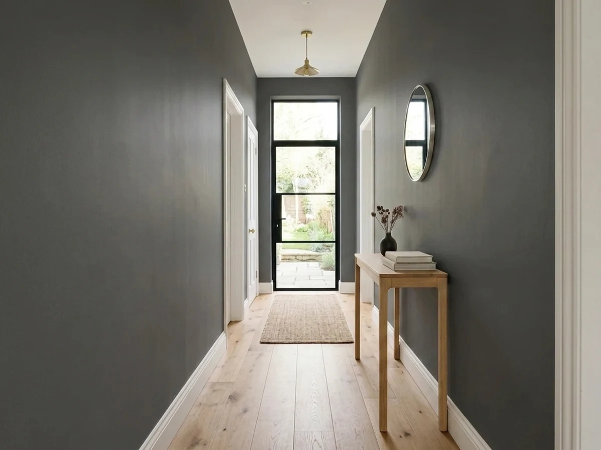
Cracked Pepper is the color that won Behr's 2024 Color of the Year, and the fastest way to misjudge it is to expect a flat true black. At LRV 8 it is a deep, cool charcoal with a blue-gray base that photographs almost navy in bright rooms and can flash a real violet cast in direct sun. Give it daylight or a warm lamp and it reads rich, current, and genuinely moody. Starve it of light and it just goes murky dark gray — the paint didn't change, the room did.
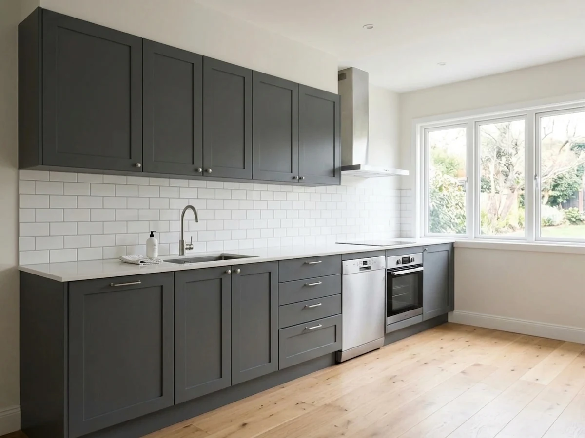
Kitchen islands and cabinets against white or wood · a front door, shutters, or exterior trim in real daylight · a powder room or accent wall that needs depth without going flat black · anyone chasing 2024's most talked-about black
You want an honest flat true black with zero undertone games · the room is genuinely dim with no daylight and no lamps · you're painting fine raised-panel trim without a real primer plan · you want a color nobody else's kitchen already has
- Genuinely earned its 2024 Color of the Year title — verified, not marketing spin
- Reads a real, moving charcoal-navy in daylight instead of flat dark
- Anchors white cabinets, trim, and facades without the starkness of a true black
- Sold across interior, exterior, and cabinet enamel lines — one color, whole project
- Dark enough that it doesn't fight warm or cool wood and trim
- Not a true black — LRV 8 shows real color where flat blacks show none
- Goes flat, murky dark gray in rooms without real daylight or lamps
- Home Depot reviews report cracking and thin coverage on detailed cabinet trim
- The violet flash in strong sun is unpredictable enough to need a same-wall sample first
What Color Is Cracked Pepper, Really?
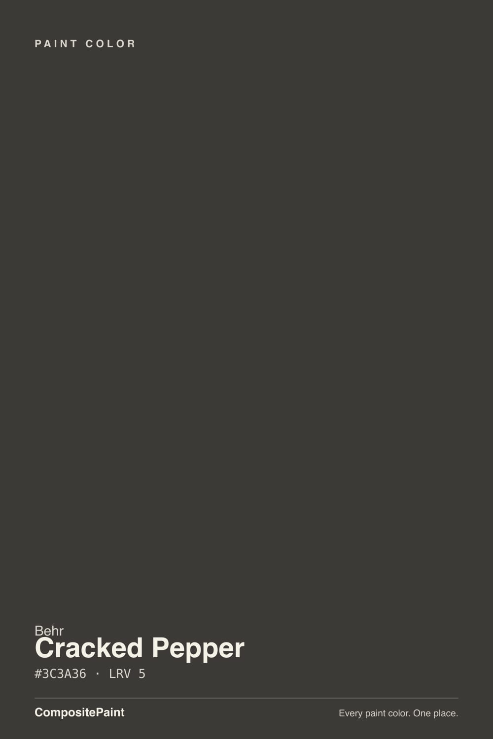
A soft, cool near-black with a blue-gray base — Behr's flagship color and its 2024 Color of the Year, confirmed on Behr's own Pro blog. Call it "soft black" rather than black: it is dark enough to anchor a room the way a true black does, but it carries real color underneath, and that color is what makes it interesting instead of just dark. Designers reach for it because it does the job of black — grounding white cabinets, giving a front door weight — without the flatness a true black can bring to a small room.
At LRV 8 it sits noticeably lighter than the deck's true blacks (Sherwin-Williams Tricorn Black is LRV 3, Behr's own Jet Black is LRV 5), and that gap is the whole personality. In bright, indirect daylight it reads a cool charcoal-navy. In strong, direct sun the blue base can shift visibly toward violet — real enough that paint bloggers photograph it next to gray-violet swatches to prove the point. In a dim room with no real light source, none of that shows: it just reads as plain dark gray, which is the single biggest disappointment reported by buyers who expected drama.
Undertone in one line: cool blue-gray, with a violet flash in strong direct sun — never warm, never brown. Owner photos taken under mixed artificial light sometimes read it slightly olive or teal; that is the room's bulbs talking, not a different can of paint.
Where It Shines
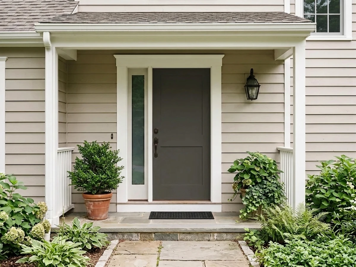
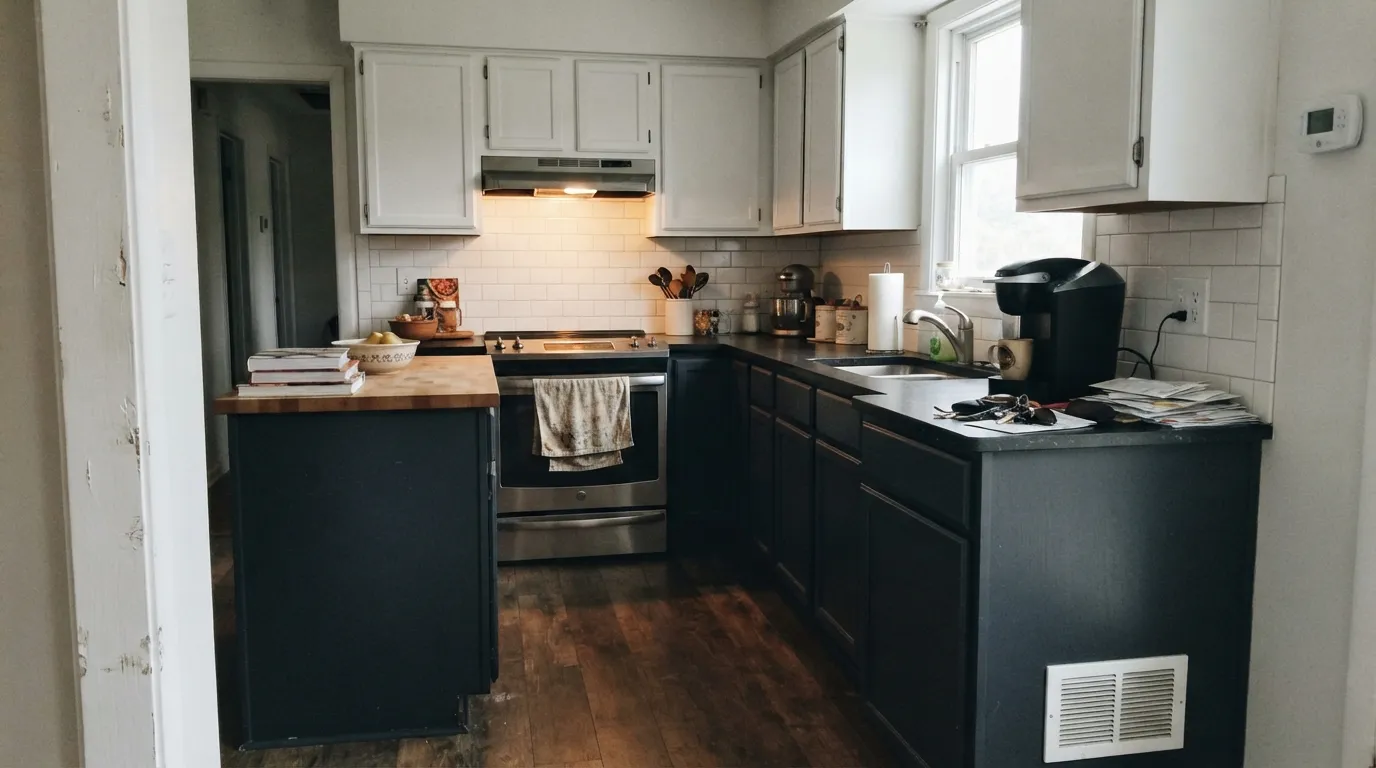
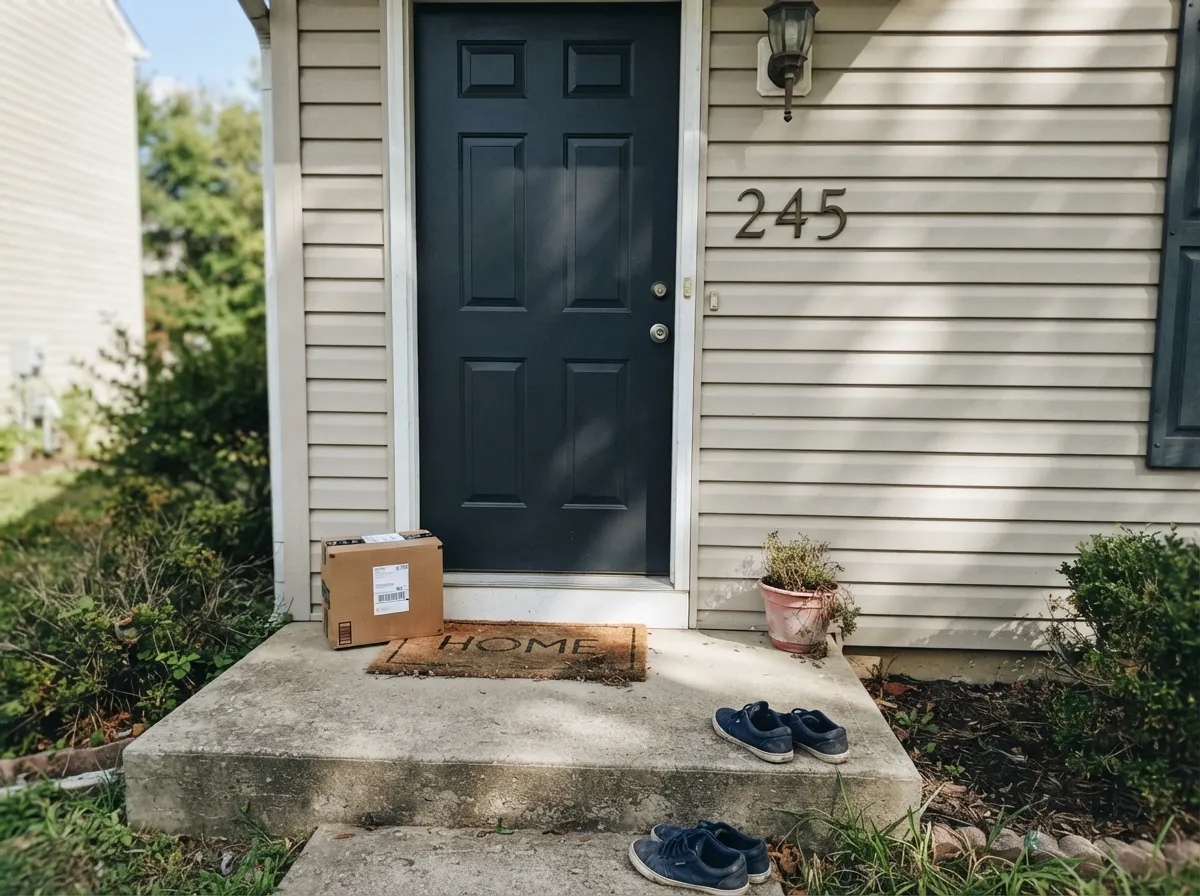
This is a color built to be the dark half of a contrast pair, and it is at its best exactly there: a black island against white perimeter cabinets, a black front door against a pale-neutral facade, a black vanity under a white powder-room wall. Real daylight is doing the work in every one of those combinations — it is what turns "just dark" into the cool, current charcoal-navy that made it Color of the Year. It scales from a single door to a whole kitchen without losing that character, and Behr sells it across interior, exterior, and cabinet-and-trim enamel lines, so the same can works the whole project.
Where It Fails
Almost every disappointed review of Cracked Pepper traces back to one of three predictable mismatches, and none of them are really the paint's fault.
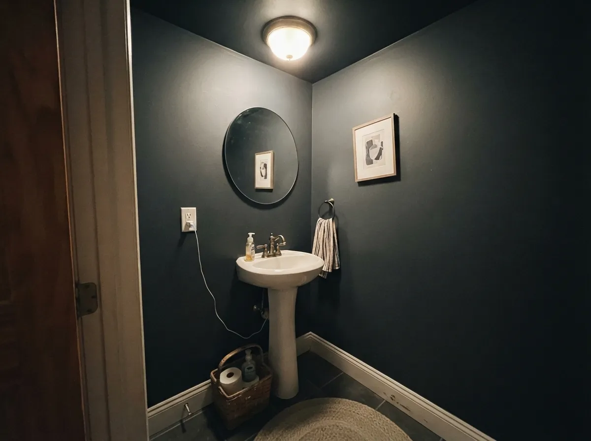
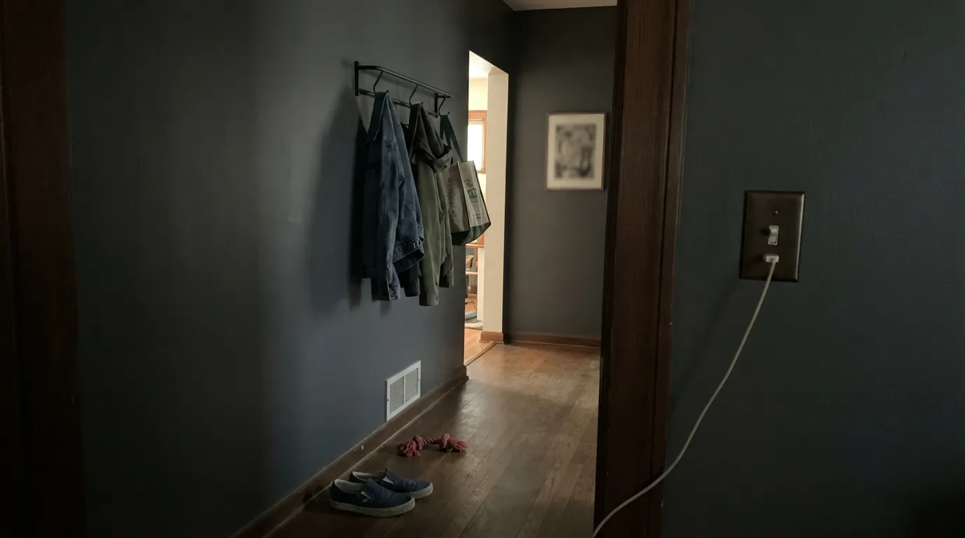
The chameleon effect needs a light source to work with — daylight, or at minimum a warm lamp. Without one, the blue-gray base never shows and the wall just reads flat, murky dark gray. Owners who painted a windowless powder room or a north-facing hallway with no fixtures report exactly this: it looks like plain dark paint, not the color they saw online.
At LRV 8, Cracked Pepper is not dark enough to be a flat true black, and in decent light you can see it: a cool charcoal-navy, not jet black. If you want zero undertone movement and the same dark in every light, go Tricorn Black (LRV 3) or Behr's own Jet Black (LRV 5) instead.
Home Depot's own reviews for the Cracked Pepper cabinet-and-trim enamel include reports of cracking where a raised panel meets its frame, plus thin coverage that needed a third coat over primed wood. This is a dark, saturated color asking a lot of the substrate — prime properly, follow the recoat window, and budget for three coats on detailed millwork rather than two.
Room by Room
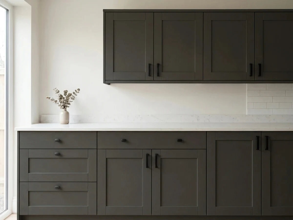
An island or full run of lower cabinets in Cracked Pepper against white or off-white uppers is the combination the color was built for. Satin cabinet enamel wipes clean; brass or matte-black hardware both read well against the cool base.
The color that made 2024's most photographed front doors. It reads its truest cool charcoal-navy in daylight and goes near-black by dusk — both look intentional. Semi-gloss holds up to weather and shows the sheen the color needs.
Owners who painted an entire house report it looking great in full sun. Walk the house at different times of day before committing — the shaded north side will read flatter and more plainly gray than the sun-hit sides, which is honest but worth expecting.
A satin vanity or a fully drenched small powder room under a real fixture is a weekend project that reads custom. Pair with a warm or cool white trim — either works, since the color is dark enough not to argue with either temperature.
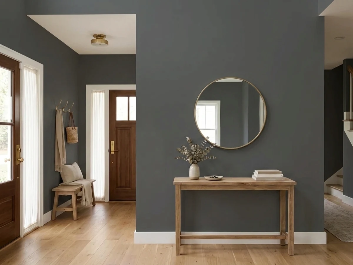
One accent wall or a den that gets afternoon light carries it well. A full room of four Cracked Pepper walls with no real daylight source is where the flat, murky version shows up — add lamps or keep it to one wall.
It can work on a headboard wall with warm 2700K lamps at night, but a bedroom that relies on morning light alone is a poor match — mornings are exactly when the chameleon effect is weakest. Treat it as an accent here, not a whole-room color.
Your Light Is the Risk
The cool blue-gray base shows fully without the harsh violet flash of direct sun. This is the color at its most photographed.
With no real light source the chameleon effect never engages — it just reads as plain flat dark gray. Test with your actual fixtures on.
Strong direct sun can push the cool base visibly toward violet for part of the day. Most owners like the movement; sample on the actual wall first if you don't want surprises.
2700K warm bulbs settle it into a near-black with a soft blue edge. Cool white LEDs can read slightly flatter and grayer — swap the bulb before you second-guess the paint.
Most complaints about Cracked Pepper are a light mismatch. Upload a photo of your actual room and see it on your walls — then ask for the same wall in north light or evening lamps before you buy a single sample.
Need It From Another Brand?
Any paint counter can custom-tint Behr PPU18-01 directly. If you would rather stay in one brand's own deck, these are the closest stock matches, measured as ΔE2000. Under 2 is a difference you will not see on the wall.
| Brand | Closest color | ΔE | LRV | |
|---|---|---|---|---|
| Sherwin-Williams | Perle NoirSW 9154 · Sherwin-Williams | 3.6 | 8 | Color page → |
| Benjamin Moore | French Beret1610 · Benjamin Moore | 1.4 | 9 | Color page → |
| Valspar | Muted Ebony4008-2C · Valspar | 1.6 | 8 | Color page → |
| PPG / Glidden | ObsidianPPG1035-7 · PPG / Glidden | 4.8 | 8 | Color page → |
| Glidden | Grey Metal00NN 10/000 · Glidden | 1.9 | 10 | Color page → |
| Dutch Boy | Dark and Stormy436-7DB · Dutch Boy | 1.4 | 9 | Color page → |
Similar Behr Colors
The nearest shades to Cracked Pepper within Behr's own range, ranked by perceptual color distance — useful when you want the same look a touch lighter, darker, or warmer.
WCAG 2.1: AA is 4.5 : 1 for normal text, 3 : 1 for large text, AAA is 7 : 1.
Cracked Pepper vs the Colors You're Also Considering
Every Cracked Pepper sample board has the same rivals on it. The numbers show the real lightness gap — then it comes down to which risk you would rather live with.
Pick this for the cooler, slightly lighter version, with more visible blue-gray movement once real light hits it.
Sherwin-Williams SW 7069 · LRV 6Iron OrePick this for the warmer, marginally darker near-twin that holds up better in shade and on an overcast exterior.
Pick this if you want depth that actually moves — daylight charcoal-navy, dusk near-black — instead of one flat dark note.
Sherwin-Williams SW 6258 · LRV 3Tricorn BlackPick this if you want an honest flat true black that stays the same dark in every light, no undertone games.
Side-by-side comparison →Pick this if you're already committed to Behr for the rest of the project and want the matching gallon.
Benjamin Moore 2124-10 · LRV 8Wrought IronPick this for Benjamin Moore's version of the exact same soft-black idea, sitting at essentially the same LRV.
Pick this for the one with the wider track record — the actual Color of the Year, with far more samples and real rooms to compare against.
Behr S-H-790 · LRV 6Black SuedePick this for Behr's other soft black — a hair darker, and it turns cool-teal in strong light instead of violet.
The most common matchup is against Sherwin-Williams Tricorn Black (SW 6258). Tricorn is darker, LRV 3 versus 5, and dead neutral, so it reads as a true, crisp black with no lean. Choose Tricorn for sharp modern exteriors, window sashes, and graphic contrast; choose Cracked Pepper when the black needs to feel softer and sit next to warm woods and creamy whites.
Within Behr, Limousine Leather (MQ5-05), LRV 4, is a touch darker and cooler, with a faint green-gray cast rather than warmth; it suits sleeker, more contemporary rooms. Havana Coffee (N210-7), also LRV 5, tips further brown, so in good light it reads as a blackened coffee color rather than a black.
Practically, the differences only show in bright rooms and at full-wall scale. On a front door or a shaded accent wall, all of these read simply as black, so pick by the light your room actually gets.
Cracked Pepper Coordinating Colors
The pairing rule is simple: Cracked Pepper is dark enough that it doesn't fight either warm or cool company, so the real decision is how much contrast you want. Crisp whites give it maximum drama; warm greiges soften the edge. These are the partners that show up again and again in real rooms:
Behr's 2024 Color of the Year
Cracked Pepper's Color of the Year title is real, not a claim we're taking secondhand — Behr's own Pro blog names it directly. It arrived as the paint industry's collective pick swung toward moody, expressive neutrals after years of safe greiges, and Behr's answer was a black that still moves with the light instead of sitting flat.
What makes it stick past its award year is the same thing that makes it occasionally frustrating: it is genuinely not one fixed color. Different rooms, different owners, different times of day all produce a slightly different Cracked Pepper — which is exactly why it keeps showing up in new before-and-after photos years after the title year ended, and why sampling it in your own room before committing still matters more than usual.
Cracked Pepper With Wood Tones and Floors
Near-blacks are the most wood-forgiving dark colors in any deck, and Cracked Pepper is no exception — at LRV 8, there just isn't enough visible color left for a cool undertone to clash the way it would on a pale gray. Honey oak, walnut, white oak, cherry: all of it reads fine against it, because the wood is doing the warm work and the paint is doing the dark work, and the two don't compete.
The one place to actually think it through is hardware and metal finishes, not flooring. Unlacquered brass and warm gold pop hard against the cool base — the classic black-island-brass-pull kitchen look. Matte black and aged bronze disappear into it more quietly, which is the point if you want the cabinet to read as one solid mass rather than a color plus accents.
Three Ready Palettes Built on Cracked Pepper
A color is never alone on the wall. These are complete combinations in the 60-30-10 pattern, with the reason each one holds together. Every one opens in the visualizer.
A warm greige perimeter keeps the kitchen from feeling like a black-and-white photograph, while the island carries all the contrast. Whisper White walls and trim give the black room to read as intentional depth, not just dark.
Try this palette in your roomA calm warm-white body lets the cool black door and shutters do all the talking. Crisper Behr White trim keeps the edges sharp; both whites are close enough in temperature to read as one clean facade.
Try this palette in your roomSmall rooms take a deep, saturated color well, and a full drench under a real light fixture is where Cracked Pepper's chameleon side shows off. Agreeable Gray in the hallway outside keeps the handoff from feeling like a jump cut.
Try this palette in your roomCracked Pepper FAQ
Is Cracked Pepper a true black?
No. At LRV 8 it is a soft, deep charcoal-black with a real cool blue-gray base underneath — closer to Iron Ore or Wrought Iron than to a flat true black like Tricorn Black (LRV 3). If you want zero color movement, pick one of the true blacks instead.
What's the actual undertone — blue, purple, or green?
Primarily cool blue-gray. In strong direct sun it can flash a real violet cast, which is where the color's reputation for being tricky comes from. Under mixed artificial light some owners photograph it looking faintly olive or teal — that is the room's bulbs, not a second undertone hiding in the can.
Is it actually 2024's Color of the Year?
Yes — confirmed directly on Behr's own Pro blog, not a secondhand claim. It is Behr's flagship 2024 pick and one of the most photographed near-blacks of the year.
Good for kitchen cabinets or an island?
Yes, and it's one of the color's best jobs — but read the fine print first. Home Depot's own reviews for the cabinet-and-trim enamel report cracking on raised-panel detail and thin coverage needing a third coat. Prime properly, respect recoat times, and budget three coats on detailed doors.
What white goes with Cracked Pepper?
Almost any clean white works, because the black is dark enough not to argue with warm or cool undertones the way a pale gray would. Whisper White or Silky White for warmth, Alabaster or Behr White for a crisper, more neutral pairing.
Does it work on a whole house exterior, or just the door?
Both, with one caveat: owners who painted an entire exterior report it looking great in full sun, but the shaded side of a house will read flatter and grayer than the sun-hit sides. Walk the house at different times of day with a large sample before committing to the whole thing.
Have you painted with Cracked Pepper?
Rate it — one tap helps the next reader decide.
Ask a Question