Silky White
Behr's quietest warm white, reviewed honestly: the cabinets and trim it was built for, the corner where the gray backbone turns cool, and what to buy instead if you want the brighter, more famous name.

Jessica has spec'd whites and neutrals for more than 300 rooms and keeps a sample wall of painted drawdowns in her studio. Every color review is checked against real reader rooms in the comments and re-tested when a formula changes. About the testing process →
- 1First Star69
- 2Classic Gray74
- 3Silky White83
- 4Chantilly Lace91
- 5Ultra Pure White97
The Fast Verdict
Silky White is not trying to be a star. It is a soft, creamy off-white with a gray backbone under the warmth — Behr's own copy calls it "freshly laundered linens," and that low-key, pressed-cotton feel is accurate. It never goes as bright as Polar Bear or as famous as White Dove, and that is fine: on cabinets, trim and whole-house walls with real daylight, it simply behaves, quietly, without asking for credit.
Kitchen cabinets with black or navy accents and brass hardware · whole-house walls in rooms with real daylight · bathrooms with brass fixtures · trim under a mid-tone wall color · anyone who wants a quiet warm white without picking the name everyone already picked
Your room is dim and north-facing · you want the brightest possible white on the chip · you are set on matching White Dove exactly, not something close to it · your fixtures are polished chrome or brushed steel
- Soft, calm warm white — creamy without tipping yellow
- Excellent cabinet white against black, navy and brass
- Quiet enough that no single wall in a house reads off from the rest
- Trim white that softens mid-tone walls instead of cutting them
- Reads convincingly true-white outdoors in full sun
- Goes flat and can flash faintly cool in dim north-facing corners
- Easy to confuse with Polar Bear or White Dove and end up disappointed by how muted it is
- Too quiet for a bright, high-contrast, gallery-white look
- Fights polished chrome and other cool, shiny metal finishes
What Color Is Silky White, Really?
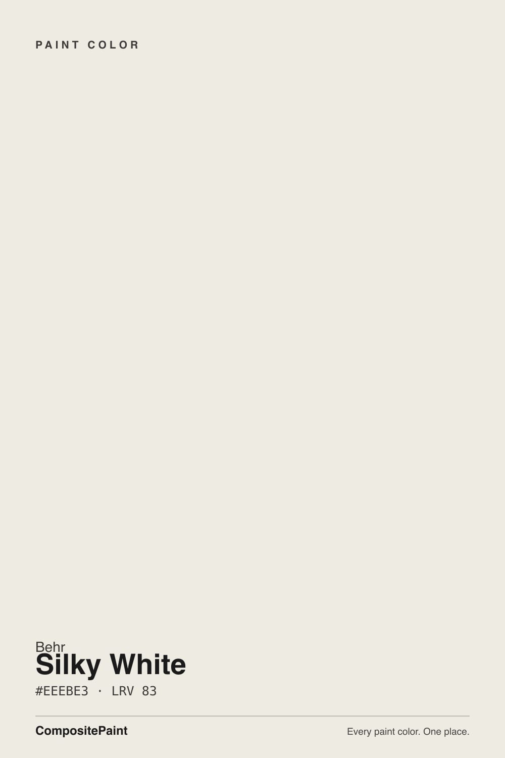
A light, softly warmed off-white built from two ingredients pulling in opposite directions: a few parts of yellow for warmth, a bit more gray behind it to keep that warmth from turning to cream. Behr's official line — "a smooth and natural white that evokes freshly laundered linens" — is doing more work than most brand copy: the name "Silky" is not about sheen (you still choose eggshell, satin or semi-gloss like any color), it is describing the soft, low-saturation, slightly powdery feel of the color itself, and that description holds up on the wall.
At LRV 83 it sits in the same neighborhood as the deck's other famous soft whites — Benjamin Moore White Dove (LRV 85) and Behr's own Polar Bear (LRV 86) — but it is a notch deeper and grayer than both, which is the whole personality difference. Polar Bear reads brighter and cleaner; Silky White reads quieter and slightly more muted, closer to a warm dove-gray than a true white. Put a chip of each side by side and Silky White is visibly the calmer, less assertive one.
Undertone in one line: warm cream base with a gray backbone — never pink, rarely blue. The one place the gray shows its hand is in shadowed, north-facing corners, where owners occasionally report a faint cool, almost bluish cast creeping into the darkest part of the wall. That is the gray base coming forward without any warm light to balance it, not a defect in the paint.
Where It Shines
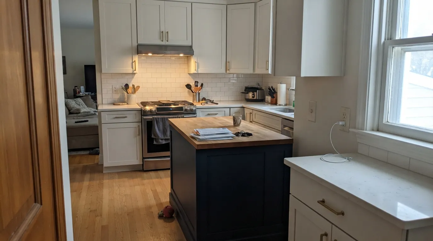
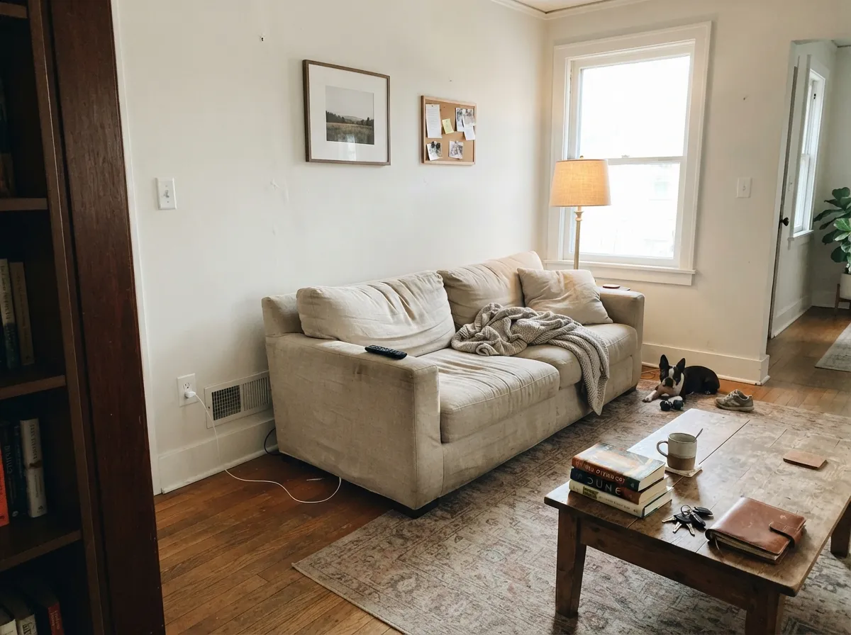
Give it real daylight and it earns its keep quietly. Cabinets are its strongest room: against black or navy island paint and brass hardware, Silky White reads clean and current without the stark, clinical edge a brighter white brings. Whole-house walls with decent daylight are its second home — it is soft enough to be restful in every room without one wall reading warmer or cooler than the next. Trim under a mid-tone wall color (a greige, a sage, a navy) softens the line the way a bright white cannot.
Where It Fails
Almost every disappointed review of Silky White comes from one of three predictable situations. None of them are the paint's fault — but if your room or your expectations match one of these, this is not your white.
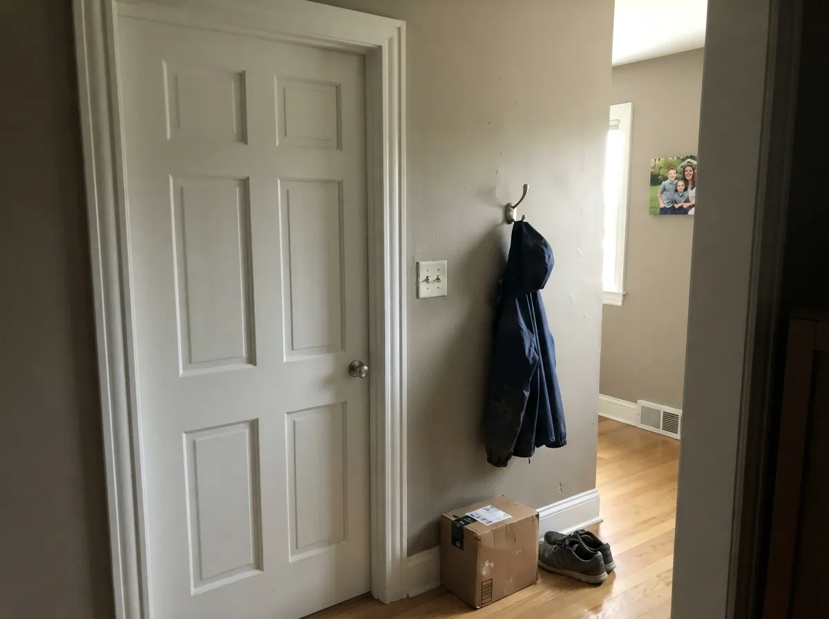
Cool north daylight has nothing warm to react with, so the gray backbone comes forward on its own, and in the darkest corners it can drift faintly cool, almost blue. It is not a dramatic shift, but in a room that already runs dim it reads flat and a little grim. Test a large sample on the darkest wall before committing a whole room.
The three sit close on paper — all mid-80s LRV, all warm-neutral whites — and shoppers who grab Silky White assuming it is Behr's version of White Dove are sometimes surprised by how much quieter and grayer it reads. It is a real, good color, just a different one. If you specifically want the brighter Behr option, buy Polar Bear; if you want the famous BM warmth, buy White Dove.
The warm base wants brass, black iron or aged bronze. Cool, shiny metals fight it and can make the wall look slightly dingy by contrast — the same trap that catches most warm whites in a chrome-and-marble bathroom.
Room by Room
A calm, un-loud backdrop for furniture and art in any room that gets real sun during the day. Eggshell on walls, semi-gloss on trim in the same color for a soft one-color room.
Behr itself pushes it for cabinetry, and the pairing with black or navy islands and brass pulls is where the color looks most deliberate. Semi-gloss or satin cabinet enamel; it wipes clean and hides handprints better than a brighter white.
Best in a near-monochromatic room — its softness gets overwhelmed if the rest of the palette is loud. Under warm 2700K lamps at night it turns gently cozy, the same way most warm whites do.
With brass fixtures and warm wood vanities it is quietly beautiful. With polished chrome or cool steel, or in a north-facing bathroom with little daylight, it can look washed-out — pick a brighter white there instead.
Semi-gloss Silky White trim under a mid-tone wall color softens the contrast the way White Dove does for Benjamin Moore. Fine as either a matching one-color trim or a step-up from darker walls.
Full sun reads it as convincingly true-white, brighter and crisper than it looks indoors. Dark gray roofing, black shutters and a navy or black front door give it the modern-farmhouse contrast it wants; avoid pairing it with cool gray stone accents, which push it toward looking dingy by comparison.
Your Light Is the Risk
Real warm sun keeps the cream and gray in balance — this is the light the color was built for, and where it looks most like the chip.
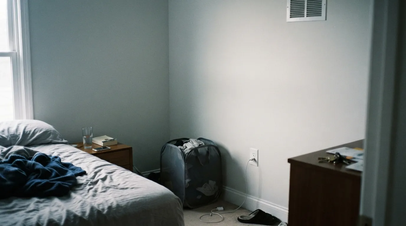
With no warm light to answer it, the gray base comes forward and shadowed corners can flash faintly cool. Sample the darkest wall first.
Warmer and creamier at the sun hours, quieter and more neutral the rest of the day — a gentle shift most owners barely notice.
2700K warm bulbs push it cozier and creamier at night; cool white LEDs flatten it back toward gray — swap the bulb before you swap the paint.
Most complaints about Silky White are a light mismatch. Upload a photo of your actual room and see it on your walls — then ask for the same wall in north light or evening lamps before you buy a single sample.
Need It From Another Brand?
Any paint counter can custom-tint Behr PPU7-12 directly. If you would rather stay in one brand's own deck, these are the closest stock matches, measured as ΔE2000. Under 2 is a difference you will not see on the wall.
| Brand | Closest color | ΔE | LRV | |
|---|---|---|---|---|
| Sherwin-Williams | CottonSW 9581 · Sherwin-Williams | 0.9 | 83 | Color page → |
| Benjamin Moore | Sand Dollar877 · Benjamin Moore | 1.3 | 82 | Color page → |
| Valspar | Pearly GatesV158 · Valspar | 1.0 | 82.1 | Color page → |
| PPG / Glidden | Linen RufflePPG1075-1 · PPG / Glidden | 0.5 | 83 | Color page → |
| Glidden | Linen RufflePPG1075-1 · Glidden | 0.5 | 83 | Color page → |
| Dutch Boy | Pristine Pearl021W · Dutch Boy | 0.5 | 84 | Color page → |
Similar Behr Colors
The nearest shades to Silky White within Behr's own range, ranked by perceptual color distance — useful when you want the same look a touch lighter, darker, or warmer.
WCAG 2.1: AA is 4.5 : 1 for normal text, 3 : 1 for large text, AAA is 7 : 1.
Silky White vs the Colors You're Also Considering
Every Silky White sample board has the same rivals on it. The numbers show the real lightness gap — then it comes down to which risk you would rather live with.
Pick this for a quieter, slightly grayer warm white with more presence on the wall.
Behr 75 · LRV 86Polar BearPick this if you want Behr's brighter, cleaner white — Polar Bear reads more crisp and less muted.
Pick this if you are buying from Behr and want the closest thing in that deck — expect a slightly quieter, grayer result.
Benjamin Moore OC-17 · LRV 85White DovePick this for the most-trusted warm white in the business, if brand of paint does not matter to you.
Arcade White GR-W08 at #EDEBE2 and LRV 83 is the closest neighbor in the Behr deck. On a wall the two are hard to separate, so pick whichever chip you already have. Jet White QE-01 at #F1EBE2 and LRV 84 is the brighter, slightly cleaner version and makes better trim over Silky White walls. First Snow DC-006 at LRV 82 is a hair deeper and quieter.
Smoky White BWC-13 at #ECECE4 carries less yellow, so side by side Silky White looks warmer and Smoky White looks more neutral.
Across brands, Dutch Boy Pristine Pearl 021W and Glidden Linen Ruffle PPG1075-1 both land at deltaE 0.5, which is a true match rather than a near one. Sherwin-Williams Cotton SW 9581 at deltaE 0.92 is the same story. Farrow and Ball Wevet No. 273 at deltaE 2.85 is very close but sample first, because Wevet trades the cream for a cooler, grayer cast.
Silky White Coordinating Colors
The rule for coordinating with Silky White is the same warm-side rule that governs every warm white: pair it with warm neutrals, brass and black, and keep polished cool metals at arm's length. These are the partners that show up again and again in rooms that work:
Where Silky White Fits in Behr's White Lineup
Behr does not have one flagship white the way Benjamin Moore has White Dove — it has a small cluster of similar soft, warm whites, and Silky White is the quietest one in that cluster. Polar Bear (LRV 86) is the brighter, more popular default, the one most often reached for when someone asks for "a Behr white that isn't stark." Ultra Pure White (LRV 92) and Behr's own White (LRV 88) sit further up, closer to true bright whites best kept to ceilings and trim. Blank Canvas (LRV 79) sits below Silky White, warmer and noticeably more peachy.
Silky White's honest position is in the gap between Polar Bear's brightness and Blank Canvas's cream — muted, gray-backed, and built to disappear into a room rather than announce itself. It has not won a Color of the Year award and it is not the color designers name-drop; it is the dependable, slightly-below-the-radar option for anyone who has already ruled out the flashier picks and wants something calmer.
Silky White With Wood Tones and Floors
Warm wood is the easy pairing: honey oak, walnut and butcher block all sit comfortably against Silky White because the color's cream base meets them halfway, the same trick that makes most warm whites forgiving over orange-leaning builder floors.
Cool gray or gray-washed floors are the one combination worth sampling first. Because Silky White already carries a gray backbone, a gray floor can pull the wall's warmth into relief and leave it reading slightly dingy by contrast rather than crisp. It is not a hard no — warm rugs and brass fixtures usually fix it — but test a large sample over the actual floor before committing a whole room.
Three Ready Palettes Built on Silky White
A color is never alone on the wall. These are complete combinations in the 60-30-10 pattern, with the reason each one holds together. Every one opens in the visualizer.
Navy and warm white on cabinets is the pairing Silky White does best; Even Better Beige on the walls shares the same warm-neutral base, so the wall-to-cabinet handoff never fights. Brass hardware finishes the look.
Try this palette in your roomOne color at two sheens keeps a small house feeling calm and continuous, the way the White Dove one-color trick works for Benjamin Moore. Hidden Gem's dark green-blue gives the house its one deep, deliberate note at the door.
Try this palette in your roomFull sun reads Silky White as convincingly true-white on siding, and the near-black shutters and navy door give it the dark-and-light contrast this look depends on. Avoid cool gray stone accents next to it — they push the white toward dingy by comparison.
Try this palette in your roomSilky White FAQ
Is Silky White warm or cool?
Warm, but quiet about it. It carries a soft yellow-cream base with a gray backbone holding it back, so it never reads bright or golden. In dim, north-facing corners the gray can show a faint cool cast — that is the same balancing act most soft warm whites do, just a touch more visible here because of the gray.
Silky White vs. Polar Bear — which one should I buy?
Buy Polar Bear if you want Behr's brighter, cleaner white; buy Silky White if you want something quieter and slightly grayer with more presence on the wall. They sit close on paper (LRV 86 vs. 83) but read as genuinely different in a room — Polar Bear is the crisper of the two.
Is it good for kitchen cabinets?
Yes — it is arguably the color's best job. Behr itself recommends it for cabinetry, and against black or navy islands with brass hardware it reads current and deliberate rather than plain. Use a semi-gloss or satin cabinet enamel.
What trim white goes with Silky White walls?
Silky White itself, in semi-gloss, is the safe default — matching walls and trim at different sheens avoids any brighter-white-makes-the-wall-look-dirty problem. If you want contrast, go a step darker rather than brighter.
Does it work on exteriors?
Yes. Full outdoor sun reads it as a convincing true-white, brighter than it looks indoors, and it pairs well with dark gray roofing, black shutters and a navy or black front door. Skip pairing it with cool gray stone, which makes the white look dingy by comparison.
How many coats does it take?
Two coats over any existing light color is standard. Going over a dark or saturated wall, prime first with a tinted primer — trying to cover navy or red with straight finish coats of a light white gets expensive fast.
Have you painted with Silky White?
Rate it — one tap helps the next reader decide.
Ask a Question