Blank Canvas
Behr's 2023 Color of the Year, reviewed honestly: the rosy flash most people miss, the trim mistake that ruins it, and what to buy instead.

Jessica has spec'd whites and neutrals for more than 300 rooms and keeps a sample wall of painted drawdowns in her studio. Every color review is checked against real reader rooms in the comments and re-tested when a formula changes. About the testing process →
- 1First Star69
- 2Classic Gray74
- 3Blank Canvas85
- 4Chantilly Lace91
- 5Ultra Pure White97
The Fast Verdict
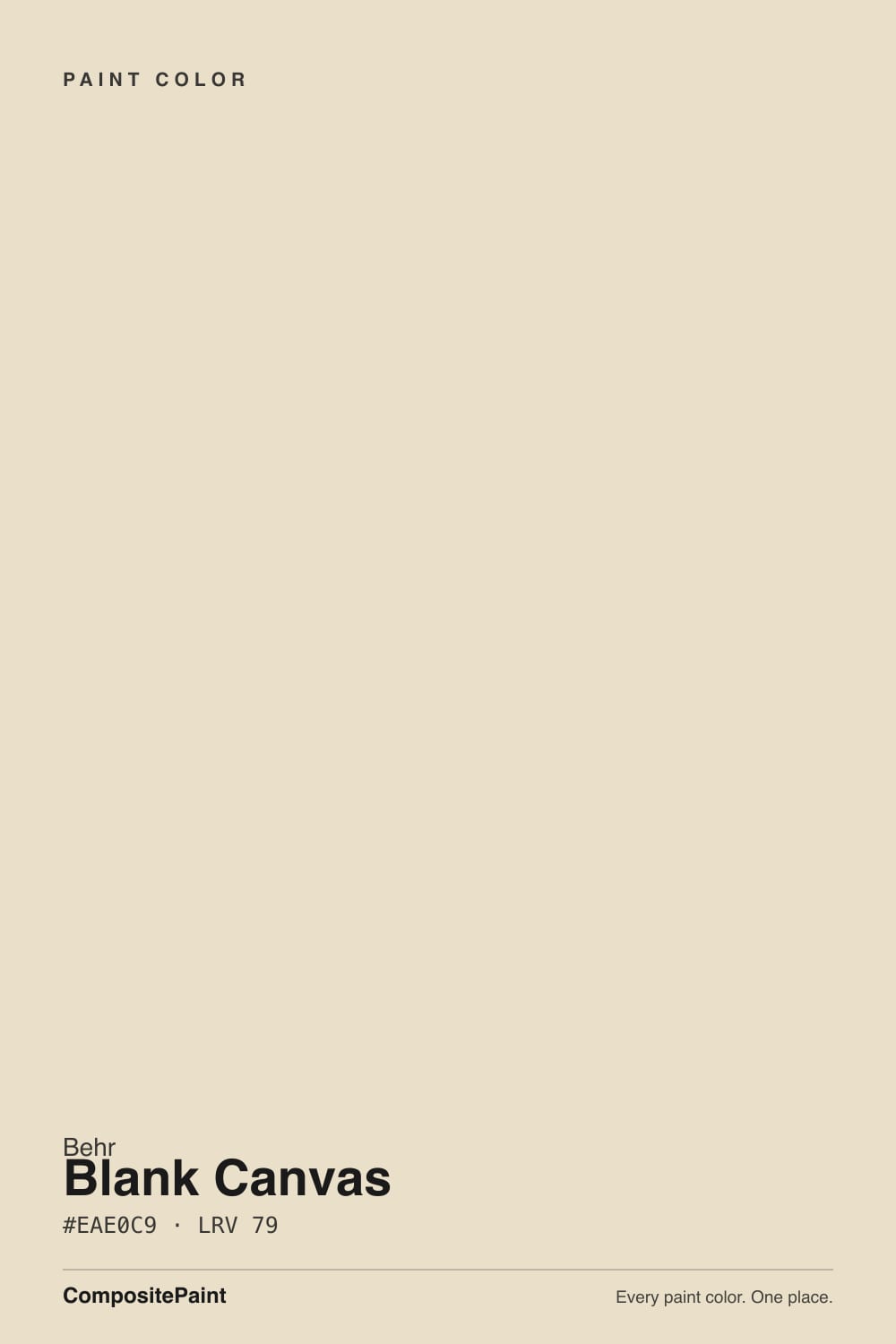
Blank Canvas is the warm white that pulled a lot of houses out of the gray era, and it earns the sales. Its warmth is red-orange rather than yellow, so it reads soft cream with a faint rosy glow instead of butter — kind to oak floors, forgiving over honey cabinets. Two things spoil it: bright white trim, which drops the walls a step and makes them look tan, and Behr's cheap flat, which flashes at the cut lines. Drench a room in it, or give it real contrast, and it is very hard to beat for the money.
Whole-house walls over oak or warm floors · rooms that felt cold in gray · cream cabinets with brass or black hardware · color-drenched rooms where the trim matches the walls
Your trim stays bright white and you want white walls · cool gray LVP or blue-gray tile · big windows onto a leafy green yard · you want a crisp modern gallery white
- Warm without a trace of yellow-green — reads cream, never custard
- LRV 85 keeps hallways, stairwells and small rooms bright
- Softens orange-leaning honey oak floors and cabinets instead of amplifying them
- Color-drenches beautifully: walls, trim and ceiling in one color, three sheens
- Stocked at Home Depot in every Behr line, mixed while you wait
- Flashes faintly peach in strong afternoon sun and under warm bulbs
- Loses the argument next to bright white trim — the walls read tan
- Picks up green from a leafy yard through large windows
- In Behr's cheaper flat lines the cut-in lines dry darker than the rolled field
What Color Is Blank Canvas, Really?
The warmth in Blank Canvas comes from the red-orange side, not the yellow side, and that one fact explains everything people say about it. Most creamy whites are built on yellow oxide and turn buttery the second real sun hits them. Blank Canvas instead carries a faint rosy warmth, which is why it looks cozy without ever looking like custard — and also why, in strong afternoon light or under warm bulbs, a few owners see a whisper of blush and start second-guessing themselves. It is a real effect, it is mild, and it is the price of the warmth.
At LRV 85 it throws back most of the light in the room, but it is clearly not a bright white. Behr sells it as its answer to Benjamin Moore White Dove (LRV 83), and that four-point gap is honest: Blank Canvas is a shade deeper and noticeably warmer, where White Dove leans grayer and quieter. Put it beside Behr's Ultra Pure White and the point becomes obvious — next to the brightest white in the deck, Blank Canvas stops reading as a white and starts reading as a very pale color.
Undertone in one line: warm cream with a rose drop — never yellow-green, never gray. If your walls look tan, that is the bright white trim beside them; if they look faintly green, that is the yard outside the window.
Where It Shines
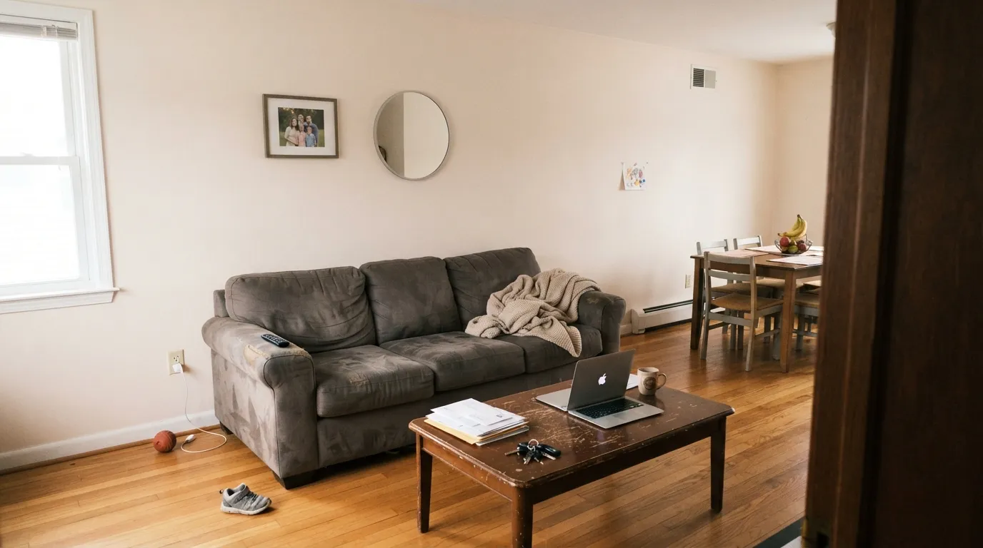
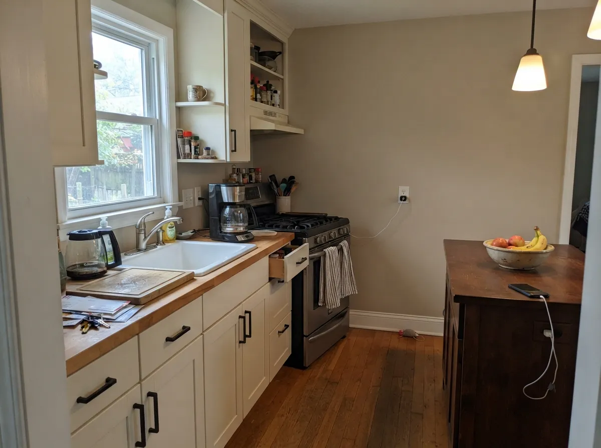
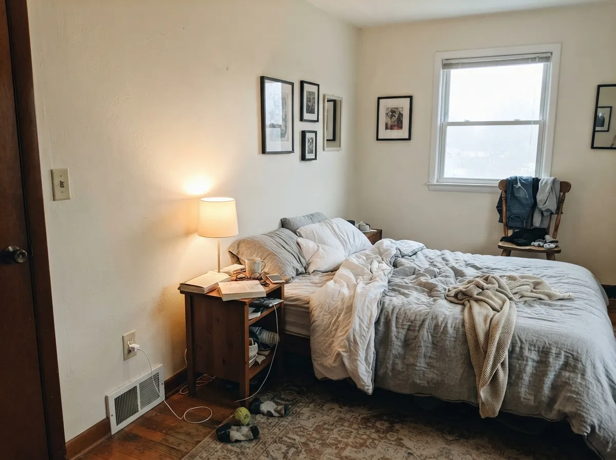
Give it warm floors and a normal amount of daylight and it does exactly what a whole-house white should: brightens without glaring, and makes oak, brass and linen look intentional. Kitchens are its second home, where cream cabinets with black or brass hardware read custom instead of builder-grade.
Where It Fails
Nearly every unhappy Blank Canvas story traces back to one of three situations, and all three are visible in a large sample before you buy gallons. None of them are the paint's fault — but if your room matches one, this is not your white.
This is the most common complaint by a mile: Blank Canvas walls against existing bright white casings, and the walls suddenly look tan, dingy, or like a color nobody chose. Owners describe it as "too white to be a color, too beige to be white." Either drench the room — same color on walls, trim and ceiling, only the sheen changing — or commit to a wall color with actual body, like Behr Cotton Knit (PPU7-11, LRV 74).
Warm off-whites act like a screen for whatever is outside, and green foliage bouncing through a large window turns Blank Canvas murky and slightly olive on the wall facing the glass. It is the single weirdest complaint people post and it is real. In a room like that use a cleaner, higher-reflectance white that takes less color on, such as Behr Whipped Cream (DC-001, LRV 91).
The flip side of the rosy warmth: put it above gray-blue plank flooring or gray shower tile and the wall reads peachy while the floor reads icy, and neither one looks right. Nothing fixes it except changing the paint. Behr Cameo White (MQ3-32) sits at the same LRV of 85 with a gray drop instead of a rose one, so it agrees with cool floors.

Room by Room
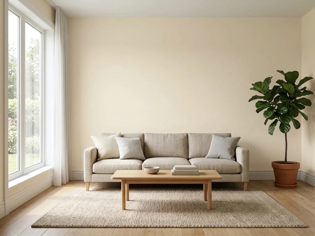
With any real daylight it is a calm, warm backdrop that flatters wood furniture and leather. Eggshell on walls; take the same color onto the trim in semi-gloss and the room reads finished rather than builder-white.
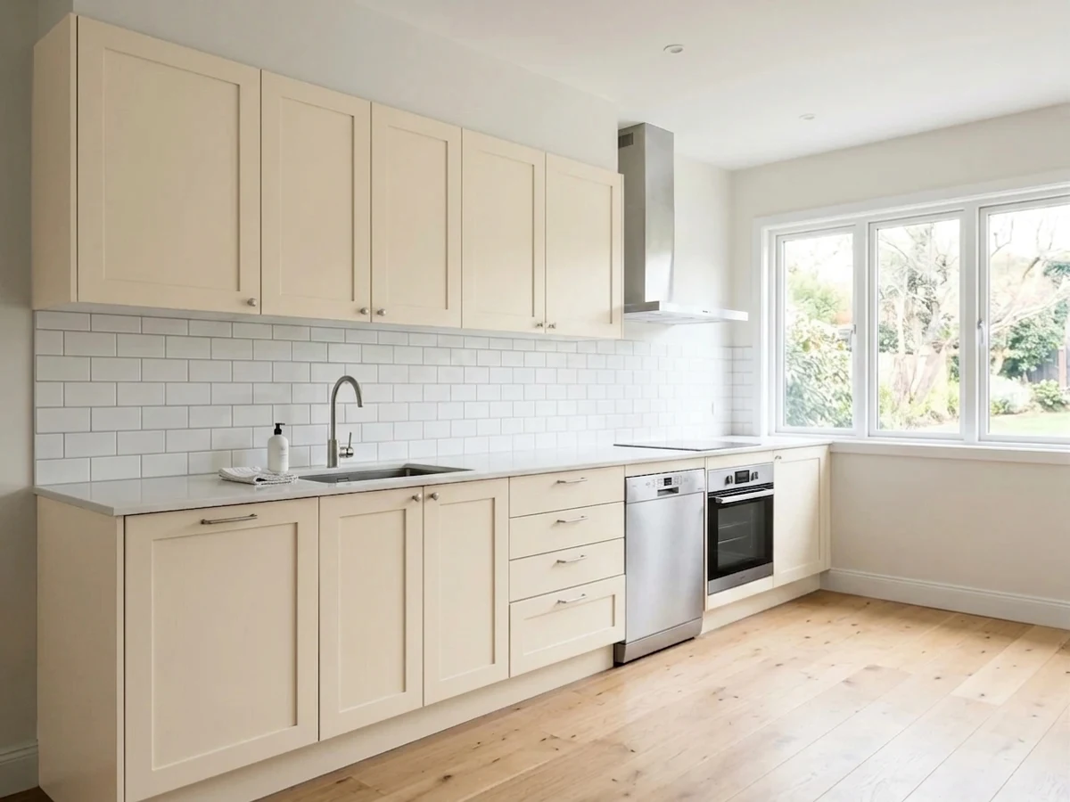
Cream cabinets in satin with brass or matte black hardware, over warm quartz or butcher block, is what this color was made for. One caution: beside a stark white refrigerator or range, the cabinets will plainly read cream — that contrast is permanent, so sample a door front against the appliance first.
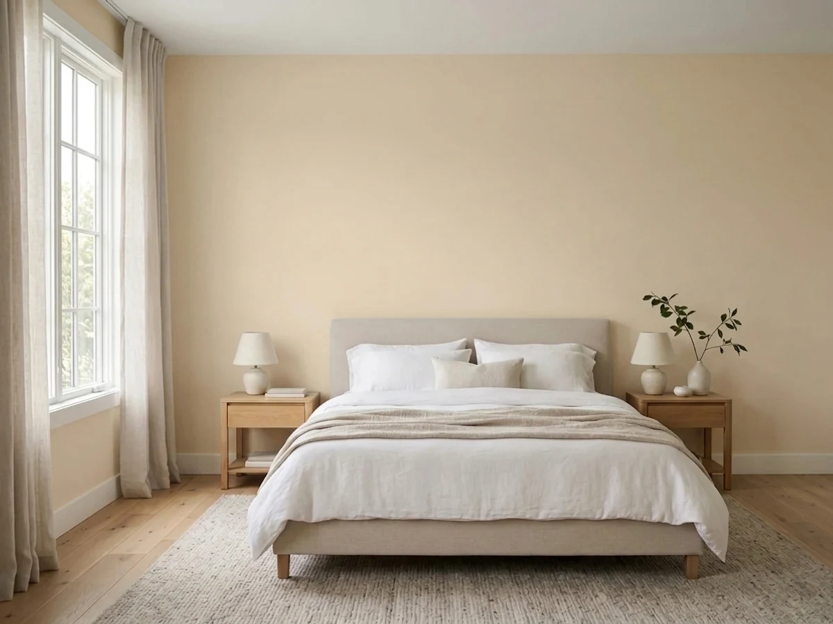
Under 2700K lamps the rosy warmth deepens and the room gets genuinely cozy. Pair with Behr Perfect Taupe (PPU18-13, LRV 42) on a headboard wall if you want one darker note without going dramatic.
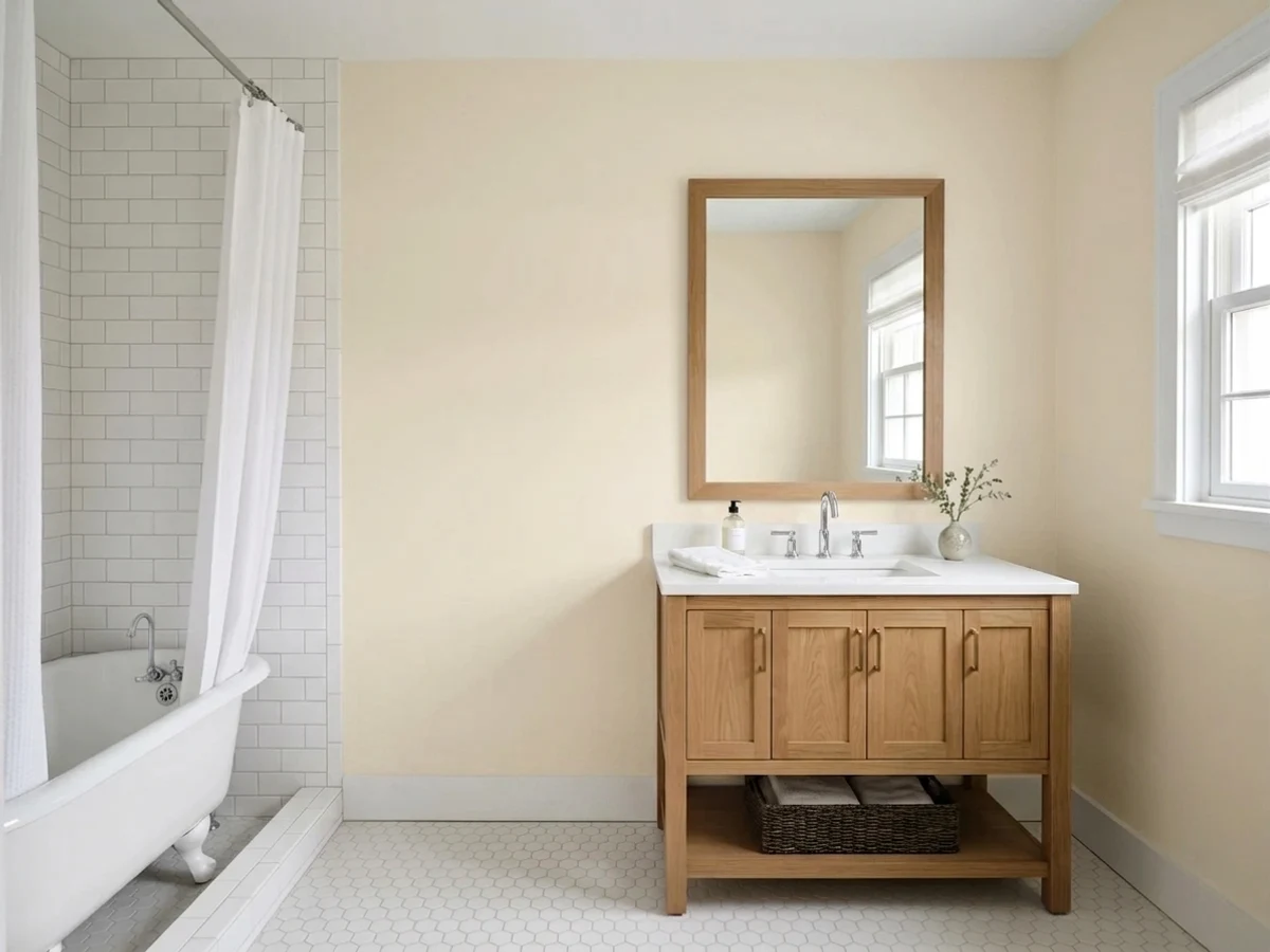
Warm marble, travertine, wood vanities and brass: excellent. Blue-gray subway tile or gray porcelain: it fights, and the wall flashes peach against it. Use satin or a bath-rated eggshell for wipe-down.
The safest way to use this color is on everything: flat on the ceiling, eggshell on walls, semi-gloss on trim and doors. The sheen change alone separates the planes, and you never have to solve the bright-white-trim problem. Your doors will read cream, not white — that is the whole point.
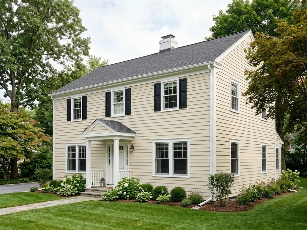
In full sun it reads close to white from the street and keeps its warmth in shade and at dusk, which is exactly what stark whites fail to do. Frame it with Behr Cracked Pepper (PPU18-01, LRV 8) on shutters and trim. Flat or low-lustre on siding hides wall imperfections.
Your Light Is the Risk
Cool north daylight cancels the rosiness and leaves a clean soft cream. This is where it beats every gray.
Warm sun all day pushes it toward soft tan, with a blush cast by late afternoon. Most people like it; sample anyway.
2700K bulbs deepen the cream nicely. 4000K LEDs flatten it to plain off-white — swap bulbs, not paint.
A big window full of leaves bounces green onto the wall and the cream goes murky. Test on that exact wall.
Most complaints about Blank Canvas are a light mismatch. Upload a photo of your actual room and see it on your walls — then ask for the same wall in north light or evening lamps before you buy a single sample.
Need It From Another Brand?
Any paint counter can custom-tint Behr DC-003 directly. If you would rather stay in one brand's own deck, these are the closest stock matches, measured as ΔE2000. Under 2 is a difference you will not see on the wall.
| Brand | Closest color | ΔE | LRV | |
|---|---|---|---|---|
| Sherwin-Williams | Greek VillaSW 7551 · Sherwin-Williams | 0.9 | 84 | Color page → |
| Benjamin Moore | Arbor WhiteES-01 · Benjamin Moore | 0.8 | 85 | Color page → |
| Valspar | Cream Delight7002-14 · Valspar | 0.8 | 84.9 | Color page → |
| PPG / Glidden | AccoladePPG1208-1 · PPG / Glidden | 0.5 | 85 | Color page → |
| Glidden | Candlelit BeigePPG1207-1 · Glidden | 0.4 | 85 | Color page → |
| Dutch Boy | Pristine Pearl021W · Dutch Boy | 1.3 | 84 | Color page → |
Similar Behr Colors
The nearest shades to Blank Canvas within Behr's own range, ranked by perceptual color distance — useful when you want the same look a touch lighter, darker, or warmer.
WCAG 2.1: AA is 4.5 : 1 for normal text, 3 : 1 for large text, AAA is 7 : 1.
Blank Canvas vs the Colors You're Also Considering
Every Blank Canvas sample board has the same rivals on it. The numbers show the real lightness gap — then it comes down to which risk you would rather live with.
Pick this when you want visible warmth and a rosy, lived-in cream.
Behr 12 · LRV 80Swiss CoffeePick this for a quieter, whiter off-white that flashes far less.
Pick this in dim rooms that need every point of reflectance back.
Behr PPU8-14 · LRV 75Silky BambooPick this when Blank Canvas washes out in a bright south-facing room.
Behr makes several near-twins, and the differences come down to depth and lean. Silky Bamboo (PPU8-14, LRV 75) is the closest everyday alternative. It is a few points deeper and a touch softer, so it shows slightly more body on the wall; choose it if Blank Canvas washes out in your bright south-facing room, and keep Blank Canvas for dimmer spaces that need every point of reflectance.
Ivory Stone (QE-17, LRV 75) leans a hair more beige. In side-by-side samples it looks like Blank Canvas with a little more tan, which suits earthier palettes with stone and terracotta.
Antique White 1823 (1823, LRV 76) shifts slightly greener, reading a bit more muted and traditional. It favors classic trim-and-wainscot rooms, while Blank Canvas stays peachier and more current. In all three cases the practical gap is small; sample two at most, not all four.
Blank Canvas Coordinating Colors
The rule with Blank Canvas is to stay on the warm side and choose partners with more depth than it has, not more brightness. It coordinates happily with warm greiges, soft taupes, near-blacks and deep navy, and it argues with icy blues, cool grays and blue-gray stone. These are the Behr partners that actually hold up next to it:
Blank Canvas on Cabinets and Trim
Cabinets are where this color quietly outperforms its price. A cream cabinet hides fingerprints, splash marks and the grubby ring around a handle far better than a bright white does, and Blank Canvas is warm enough to sit comfortably against oak floors, butcher block and warm quartz without looking like a compromise. Brass pulls flatter it; matte black gives it the sharper, more current look. Prep decides everything: degrease, sand, and use a bonding primer, then two thin coats of a cabinet enamel in satin.
On trim the picture is different, because trim is where most Blank Canvas regret is born. It works beautifully as trim under a deeper wall color — greige, sage, navy — where its softness keeps the contrast from cutting. It does not work as a wall color under someone else's bright white trim. If your casings and baseboards are already Ultra Pure White and you are not repainting them, either accept that the walls will read as a warm color, or pick a wall color with enough depth to look chosen rather than faded.
Blank Canvas With Gray Floors and Cool Tile
This is the question that decides the color for a lot of houses, because so much recent flooring is gray. Gray-brown LVP with a warm cast is fine — the two meet in the middle and the room reads soft. Genuinely cool, blue-leaning gray plank or gray porcelain tile is the problem: the floor pulls the rose out of the wall, the wall pushes the blue out of the floor, and the room ends up looking slightly off in a way most people cannot name.
Before you decide, tape a large sample low on the wall so it touches the floor, and look at it at night with the lights on, not just at midday. If it reads peachy against the plank, stop there. Behr Cameo White (MQ3-32) is the straight swap at the same LRV of 85 with a gray drop instead of a rosy one, and Behr Cotton Knit (PPU7-11, LRV 74) is the move if you want something with a little more body that still stays warm enough for wood furniture.
Three Ready Palettes Built on Blank Canvas
A color is never alone on the wall. These are complete combinations in the 60-30-10 pattern, with the reason each one holds together. Every one opens in the visualizer.
This is the crisp-contrast route: 60 percent cream walls, 30 percent bright white trim, 10 percent deep navy at the door. Go in knowing the trim will win — the walls will plainly read as a warm color, which is the trade you are making for defined edges.
Try this palette in your roomVintage Linen (LRV 71) sits just under the cabinets on the same warm base, so the wall-to-cabinet handoff is soft instead of striped. The near-black island supplies the single dark note and gives brass or matte black hardware something to answer to.
Try this palette in your roomOutside, full sun lifts Blank Canvas close to white, so it needs a hard dark frame to look deliberate rather than faded. Perfect Taupe on the garage doors keeps that big flat plane from competing with the front door for attention.
Try this palette in your roomBlank Canvas FAQ
Is Blank Canvas white or cream?
On a chip it looks white. On four walls it reads cream. At LRV 85 with a clear warm lean, a whole room of it is unmistakably a warm color, not a neutral white. If someone in your house expects white walls, show them a two-foot sample before you buy gallons.
Does Blank Canvas look pink or peach?
Sometimes, mildly. The undertone is red-orange, so in strong afternoon sun, under 2700K bulbs, or above cool gray flooring you can catch a soft blush. It never turns actually pink. If any hint of rose bothers you, Behr Cameo White (MQ3-32) is the same lightness without it.
What trim white goes with Blank Canvas?
Two honest answers. Behr Ultra Pure White gives crisp, obviously-white trim — but it drops the walls a visible step toward tan. The alternative most people end up happier with is Blank Canvas itself in semi-gloss, so nothing competes and the sheen does the separating.
Blank Canvas or Behr Swiss Coffee?
Swiss Coffee (12) is the quieter, whiter one; Blank Canvas is warmer and rosier and shows more character on a big wall. Choose Swiss Coffee for a bright kitchen or anywhere you want the white to disappear. Choose Blank Canvas when the room felt cold and you want the walls to add warmth.
Is it really the Behr version of White Dove?
It is the closest Behr gets, and Behr positions it that way, but they are not twins. White Dove (OC-17, LRV 83) is a touch lighter and its warmth is grayed down. Blank Canvas is warmer and rosier. If you loved White Dove for how quiet it was, you will notice the difference.
Why are my cut-in lines darker than the rolled walls?
That is flashing, and it is a common complaint with Behr's cheaper flat paint in this color, not a tinting error. Keep a wet edge, cut and roll the same wall in one session, and roll as close to the corners as the frame allows. Two full coats of Behr Dynasty, Marquee or Scuff Defense in eggshell fixes it; extra coats of the budget flat usually do not.
Does it work on kitchen cabinets?
Yes, and it is one of the better cream cabinet colors at this price. Use a cabinet-rated enamel in satin, degrease and prime first, and test a door against your countertop and your appliances. Warm quartz, butcher block and brass all agree with it; a stark white fridge beside it will always look whiter.
Have you painted with Blank Canvas?
Rate it — one tap helps the next reader decide.
Ask a Question