Starless Night
The near-black navy home-theater owners keep finding on their own, reviewed honestly: where it swallows light on purpose, the room where that backfires, and what to pick instead.

Jessica has spec'd whites and neutrals for more than 300 rooms and keeps a sample wall of painted drawdowns in her studio. Every color review is checked against real reader rooms in the comments and re-tested when a formula changes. About the testing process →
- 1Starless Night6
- 2Waterloo13
- 3Charcoal Blue19
The Fast Verdict
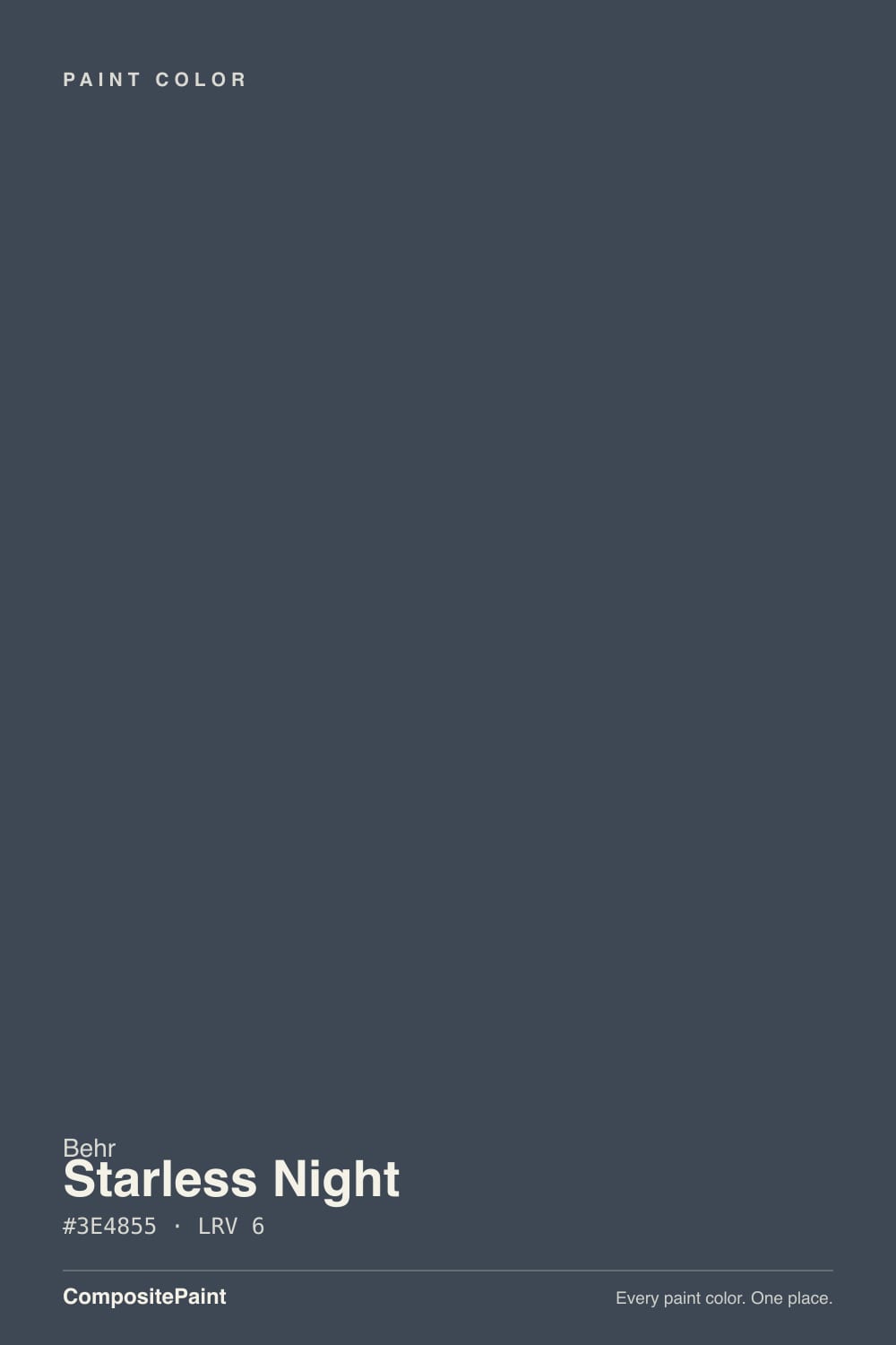
Starless Night is Behr's answer to a specific question: what if a navy just kept going until it stopped reading as blue at all? At LRV 6 it sits in true near-black territory — a cool, slate-toned navy that most rooms will see as black, not blue. It has no Color-of-the-Year fame and no design-blog buzz; its real fans are people solving a problem — a home theater that needs to eat light, a bedroom that wants to feel like dusk — not people chasing a trend.
Home theaters and media rooms · moody accent walls with layered lamp light · cabinets, doors, and trim that want near-black drama · anyone who wants navy's cool undertone without ever seeing much blue
You want a wall that visibly reads blue, not black · your only light source is a single north window · you're relying on warm 2700K bulbs to carry the color at night · you want an airy, expansive room, not a cocooned one
- Genuinely does what plain matte black can't: eats light without going flat or chalky
- Real niche following among home-theater owners, not a manufactured trend
- Cool slate undertone stays consistent — no warm or purple drift anywhere in its range
- Works equally well as a wall, cabinet, door, or exterior trim color
- Reads as expensive near-black rather than heavy or muddy at LRV 6
- Reads as black, not blue, in anything short of strong direct light
- Absorbs light aggressively — a poor choice for a small room with one window
- Warm 2700K bulbs erase the undertone completely after dark
- Committing four full walls to LRV 6 is a bigger swing than a mid-depth navy
What Color Is Starless Night, Really?
Starless Night is a deep, cool-toned navy that sits so far into near-black territory it is more often read as black than blue. It carries the numbered PPU14-20 code from Behr's Premium Plus Ultra deck, not a name from a curated seasonal collection, and that shows: this is a workhorse color Behr never pushed hard, and the people who found it did so searching for a specific job, not seeing it in a magazine.
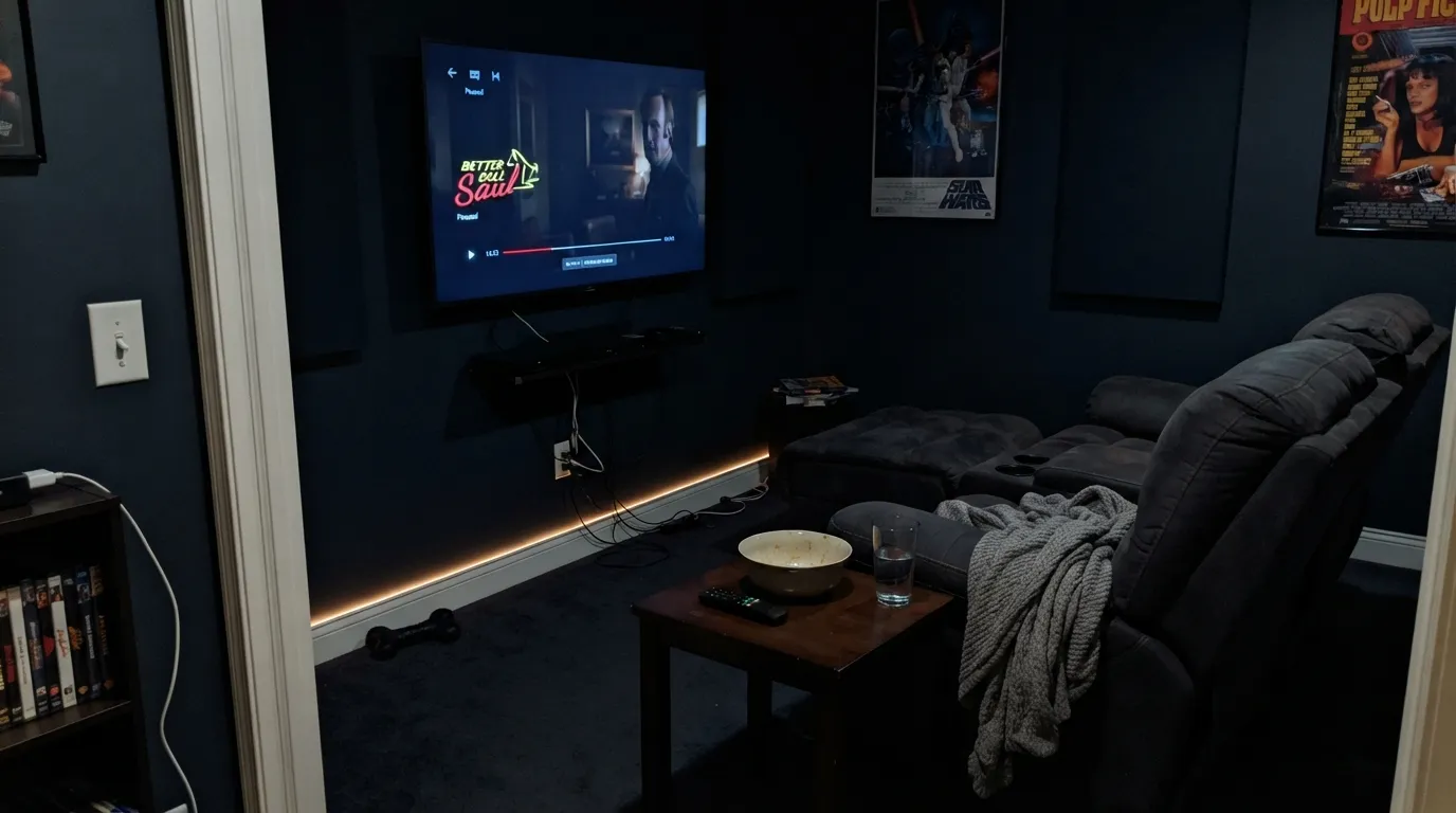
At LRV 6 it sits in the same near-black band as Benjamin Moore's Hale Navy and Sherwin-Williams' Iron Ore — a depth where undertone only shows up under real, direct light. Its actual niche fame comes from an unexpected place: home-theater and media-room forums, where owners weigh it directly against flat black paint for dedicated screening rooms. One owner's line sums up why it wins that comparison: light refuses to bounce off it, and it still looks more distinctive than plain matte black. That is a real, specific use case, not a marketing line, and it tells you exactly what this color is built for.
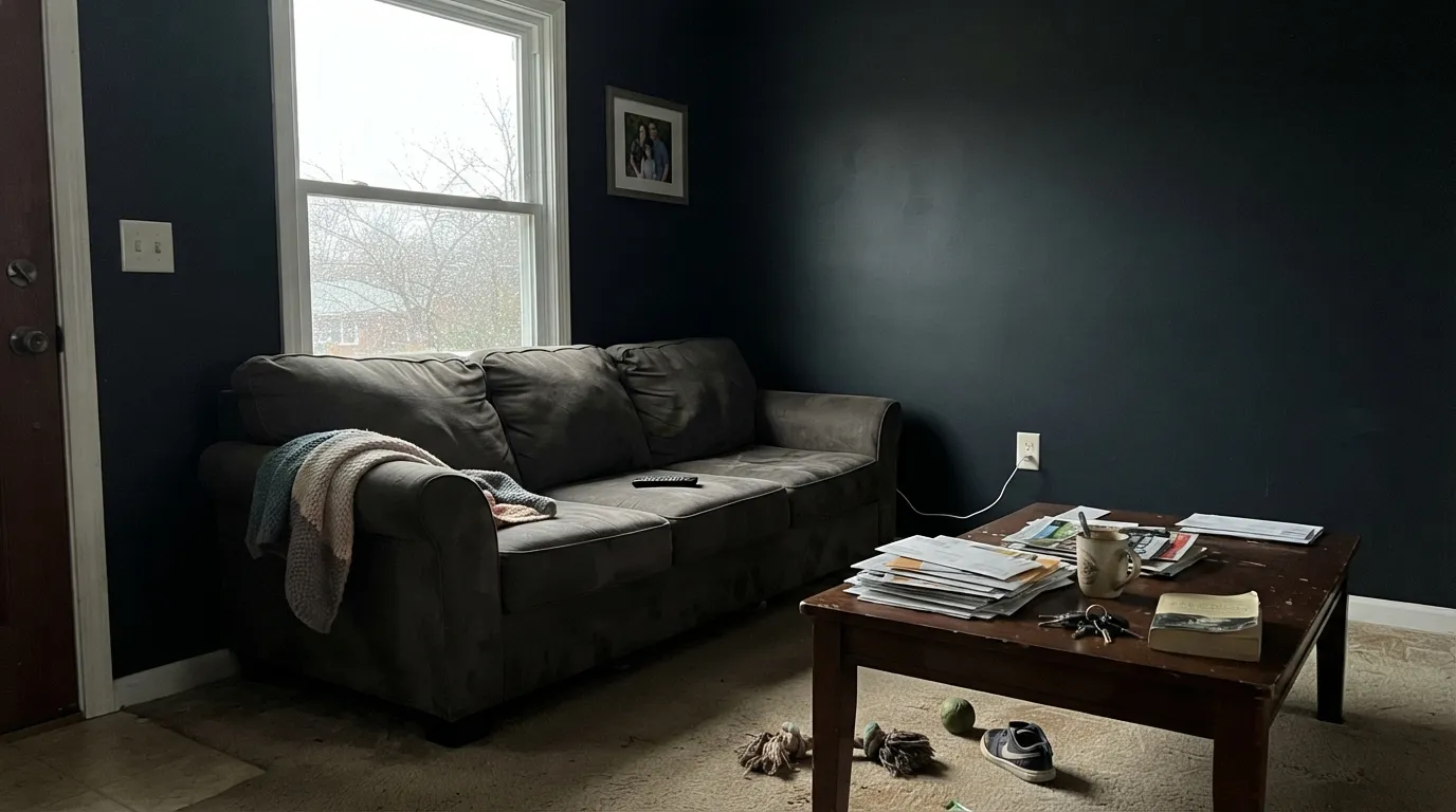
Undertone in one line: cool slate-blue, with no warm shift anywhere in its range. Give it strong, direct light and the navy is unmistakable; give it anything less — an overcast afternoon, a lamp-lit evening, a north-facing wall — and it reads as flat black. That is not really a flaw so much as the whole personality: Starless Night is a navy for people who wanted a black with a pulse, not a black for people who wanted a visible navy.
Where It Shines
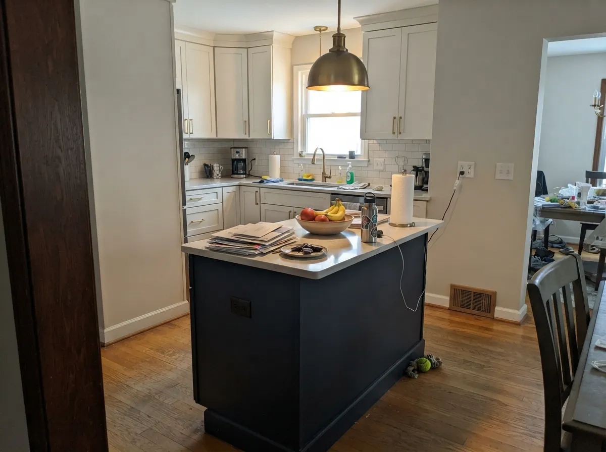
It does one job extremely well: eating light. In a home theater or media room with the shades drawn, matte Starless Night on the walls and ceiling kills reflections off the screen in a way plain matte black struggles to match without looking dead — the cool undertone keeps it from reading chalky under a projector bulb. Its second life is the moody accent wall or the near-black cabinet, island, or door, where a whisper of blue under strong light reads as intentional and expensive rather than simply dark.
Where It Fails
Nearly every disappointed review of Starless Night comes down to a mismatch between what the buyer pictured and what LRV 6 actually delivers. None of these are the paint failing — they are the paint being exactly as dark as its number says, in a room that was not built for that.
On the chip, in bright showroom light, the blue is obvious. On four walls under ordinary daylight it reads as a near-black — the same story every LRV-6 color tells. If your goal is a wall people clock as "blue" from across the room, step up to a mid-depth navy like Van Deusen Blue (LRV 11) instead.
Behr sells this color on the idea that a dark wall can make a room feel bigger, but that trick needs real light bouncing around to work. In a windowless powder room or a hallway with one small opening, LRV 6 just absorbs what little light exists and the room reads like a cave, not a cocoon. Bring in strong overhead light or skip this color for anything under about 100 square feet with poor daylight.
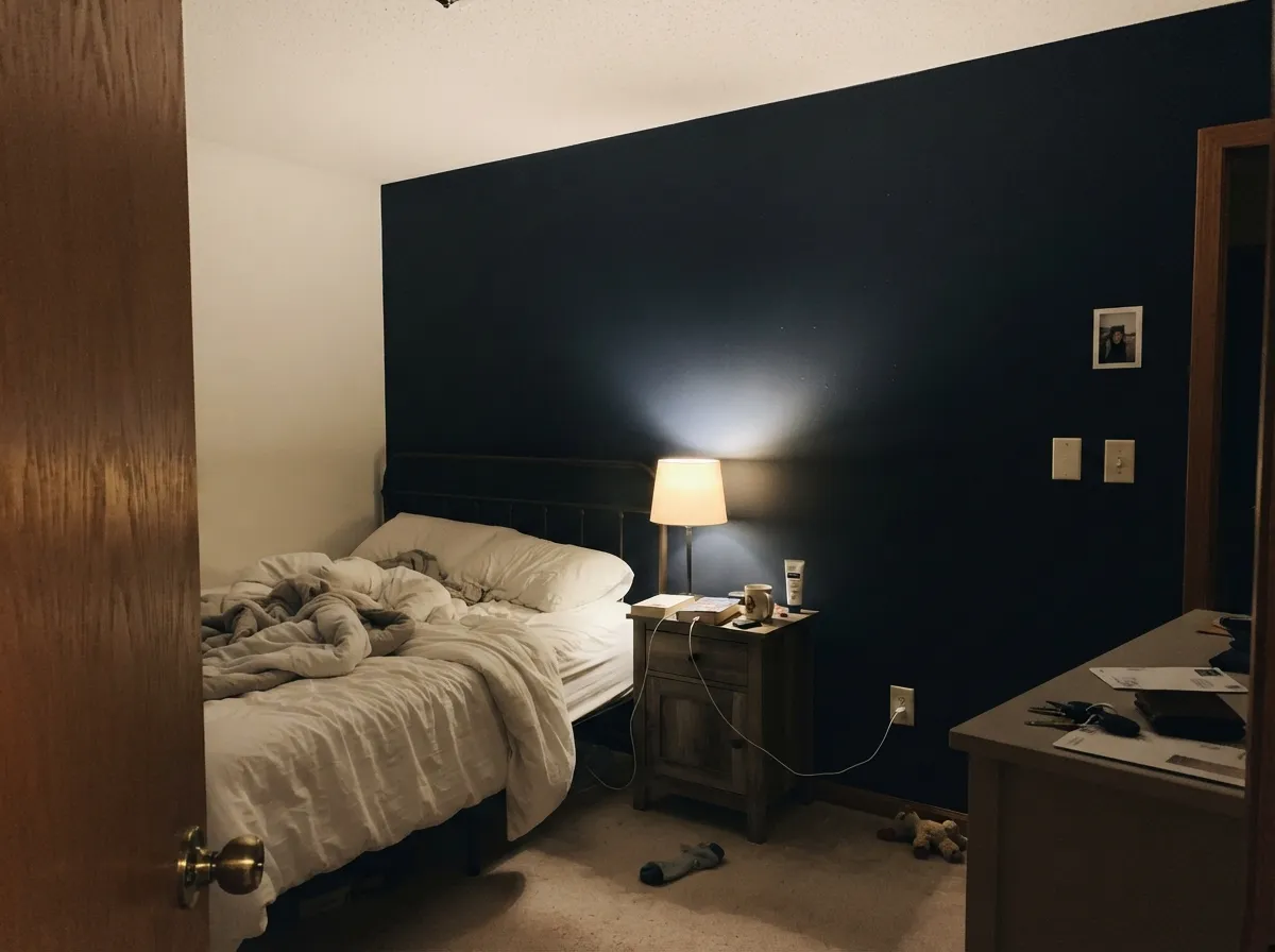
Warm lamp light pushes almost any dark neutral toward black, and Starless Night already starts closer to black than most navies — the combination erases the slate-blue completely by evening. If you want the color to still read as navy after dark, aim cooler-temperature accent light directly at the wall rather than relying on ambient warm lamps.
Room by Room
The reason this color has any real following. Matte finish on walls and ceiling minimizes light bounce off the screen better than most true blacks manage, and the faint slate undertone keeps it from looking flat or chalky under a projector. Pair with blackout curtains and low-wattage accent lighting.
One wall in Starless Night behind the headboard, with a warm-white ceiling and trim, gives a genuinely restful, dusk-like feel — but plan for a reading lamp aimed at the wall, or the color simply disappears into the dark once the overhead light is off.
Arguably its most forgiving job: an island, a pantry door, or an interior front door in semi-gloss Starless Night reads as sophisticated near-black hardware bait, and the smaller surface area means the light-dependence that trips up whole rooms barely registers.
The exact room where LRV 6 backfires. Without a strong overhead fixture the space just goes dark and small, not dramatic. If you love the color here, add real wattage before committing — a single vanity bulb will not be enough.
Behr sells this in an exterior satin enamel specifically for doors and trim, and full outdoor daylight is exactly the strong, direct light this color needs to read as navy instead of black. Pair with a lighter warm-white or greige body color so the door reads as a deliberate dark accent.
Whole-room coverage works if the room has multiple windows and real afternoon sun; without that, the walls flatten to black and the room loses depth rather than gaining drama. This is a color for rooms with light to spare, not rooms trying to compensate for a lack of it.
Your Light Is the Risk
Strong, direct light — a big south window, a bright vanity bulb, outdoor sun — is the only light that reliably shows the slate-blue instead of plain black.
An overcast sky or a shaded interior wall reads Starless Night as near-black with no visible blue at all. Fine if you wanted black; a letdown if you wanted navy.
Flat charcoal-black at midday, it deepens toward a faint indigo as the sun lowers and light rakes across the wall at an angle — subtle, but real.
2700K lamps push it to flat black with zero blue left. Cooler 3000K–4000K light aimed at the wall keeps a whisper of slate visible — the difference matters if you want the color, not just the darkness.
Most complaints about Starless Night are a light mismatch. Upload a photo of your actual room and see it on your walls — then ask for the same wall in north light or evening lamps before you buy a single sample.
Need It From Another Brand?
Any paint counter can custom-tint Behr PPU14-20 directly. If you would rather stay in one brand's own deck, these are the closest stock matches, measured as ΔE2000. Under 2 is a difference you will not see on the wall.
| Brand | Closest color | ΔE | LRV | |
|---|---|---|---|---|
| Sherwin-Williams | Sea SerpentSW 7615 · Sherwin-Williams | 3.3 | 7 | Color page → |
| Benjamin Moore | Blue Note2129-30 · Benjamin Moore | 2.7 | 9 | Color page → |
| Valspar | Night View4007-4C · Valspar | 3.6 | 6.6 | Color page → |
| PPG / Glidden | Midnight HourPPG1038-7 · PPG / Glidden | 4.6 | 6 | Color page → |
| Glidden | Midnight HourPPG1038-7 · Glidden | 4.3 | 6 | Color page → |
| Dutch Boy | Navigation432-7DB · Dutch Boy | 3.3 | 7 | Color page → |
Similar Behr Colors
The nearest shades to Starless Night within Behr's own range, ranked by perceptual color distance — useful when you want the same look a touch lighter, darker, or warmer.
WCAG 2.1: AA is 4.5 : 1 for normal text, 3 : 1 for large text, AAA is 7 : 1.
Starless Night vs the Colors You're Also Considering
Every Starless Night sample board has the same rivals on it. The numbers show the real lightness gap — then it comes down to which risk you would rather live with.
Pick this if you're already buying Behr and don't want to special-order a second brand for the same color.
Sherwin-Williams SW 7964 · LRV 7CyberspacePick this if your painter works in Sherwin-Williams — the hex is nearly identical, and it carries the same "needs real light" caveat.
Pick this for more drama and less blue — Starless Night commits further toward black.
Benjamin Moore HC-154 · LRV 6Hale NavyPick this for a navy that still reads clearly blue at the same depth — Hale Navy carries more visible color at LRV 6.
Within Behr, Club Navy QE-56 at LRV 6, hex #3D4955, is the closest neighbor and reads a touch bluer. Stiletto T11-2 at LRV 6, hex #424752, drops nearly all the blue and lands as a warm-leaning charcoal. Black Sapphire PPU15-19 at LRV 6, hex #434555, shifts toward violet, and Dark Night PPF-58 at LRV 7 is a shade lighter and softer. Nocturne Blue HDC-CL-28 at LRV 7 is the teal alternative, with a hue of 201 degrees against 214 here.
Across brands, Dunn-Edwards Parisian Night DEA184 at deltaE 0.49 is effectively the same color. Rodda Deep Plunge R089 at deltaE 1.85 is visually identical in normal room light. Benjamin Moore Blue Note 2129-30 at deltaE 2.72 and C2 Espionage C2-742 at deltaE 2.99 are very close, worth sampling first. Sherwin-Williams Sea Serpent SW 7615 at deltaE 3.3 and Farrow and Ball Hague Blue No. 30 at deltaE 3.36 are close but visibly different side by side.
Starless Night Coordinating Colors
The rule for coordinating with Starless Night: give it a genuinely light partner, because nothing about this color is going to brighten a room on its own. It pairs cleanly with warm whites and creams, holds its own next to true blacks without competing, and reads as a deliberate near-black rather than a mistake when the rest of the palette is bright:
The Real Story: A Home-Theater Color, Not a Trend Color
Starless Night has never been a Color of the Year and it does not show up in design-blog roundups the way Hale Navy or Naval do. Its numbered PPU14-20 code — part of Behr's Premium Plus Ultra deck rather than a curated seasonal collection — is a giveaway: this is a workhorse color Behr never marketed hard.
Its actual fame, such as it is, comes from AV and home-theater forums, where owners specifically weigh it against flat black paint for dedicated media rooms. The consistent verdict: it absorbs light at least as well as a true black while looking more intentional and less dead once the lights come up, because the slate-blue undertone gives it a faint sense of depth that plain black lacks. That is a small, honest reputation built on a real use case, not hype — and it is worth trusting more than a bigger name with less specific praise.
Starless Night With Wood Tones and Floors
Because the undertone is cool and barely visible most of the time, Starless Night is unusually forgiving of wood tone — it does not fight orange the way a warmer near-black would. Walnut, espresso, and black-stained floors disappear into it in the best way, reading as one continuous dark plane in a media room or a moody hallway.
Honey oak and golden-toned wood do not clash with it exactly, but they do compete for attention: the warm floor pulls focus and the cool near-black wall can read like an afterthought rather than a deliberate choice. If the floor is staying golden, treat Starless Night as an accent — a door, an island, one wall — rather than the whole room.
Three Ready Palettes Built on Starless Night
A color is never alone on the wall. These are complete combinations in the 60-30-10 pattern, with the reason each one holds together. Every one opens in the visualizer.
A near-monochrome dark box kills reflections for screen contrast; Iron Ore trim keeps the room seamless instead of breaking it with a white line, and Kendall Charcoal — one real step lighter — keeps shelving edges visible once the lights are down.
Try this palette in your roomOne dark wall, not four, keeps the room from disappearing into shadow; White Dove reflects the light the headboard wall needs to read blue instead of black, and Cinnamon Slate's warmth stops the room from feeling cold once the lamps go on.
Try this palette in your roomA near-black island under strong kitchen task lighting is exactly the direct-light situation this color needs; warm Swiss Coffee cabinets and a soft Worldly Gray wall keep the rest of the room bright enough that the island reads as a deliberate anchor, not a dead spot.
Try this palette in your roomStarless Night FAQ
Is Starless Night navy or black?
Technically navy — Behr classifies it in the blue family and it does carry a cool, slate-blue undertone — but at LRV 6 most people will see it as black in ordinary room light. You need strong, direct light to see the blue clearly. If you specifically want a wall people recognize as "blue," this is darker than most buyers expect.
Why do people use it in home theaters?
Because it eats light better than a lot of true blacks do. Owners report that it reflects less than standard matte black paint while still looking intentional rather than flat, which matters for screen contrast in a dark room. It is a real, if niche, use case — not a marketing claim.
What sheen should I use?
Matte or flat on walls — a shinier finish on a color this dark shows every roller mark and light flash. Satin or semi-gloss is fine, even better, on trim, doors, and cabinets, where the smaller surface and different lighting angle hide the flashing that plagues dark flat walls.
Will it look purple or teal instead of navy?
No — the undertone stays a consistent cool slate-blue across its range; it does not drift toward purple or green the way some near-black colors do. The risk with this one is not a wrong undertone, it is no visible undertone at all once the light drops.
Does it work on a front door?
Yes, and it is one of its more forgiving jobs — Behr sells it in an exterior satin enamel for exactly this. Outdoor daylight is strong and direct, which is the light this color needs to read as navy instead of black, and a satin door sheen reflects just enough to keep it from going flat.
What's a safer alternative if I'm nervous about it going too dark?
Van Deusen Blue (Benjamin Moore, LRV 11) or Blue Note (Benjamin Moore, LRV 9) hold their blue identity in more ordinary light while still reading as a deep, sophisticated navy — less commitment than LRV 6, most of the mood.
Have you painted with Starless Night?
Rate it — one tap helps the next reader decide.
Ask a Question