Very Navy
Behr's deep, near-black navy reviewed honestly: the door and cabinet looks it was built for, the room where it just goes black, and what to pick instead.

Jessica has spec'd whites and neutrals for more than 300 rooms and keeps a sample wall of painted drawdowns in her studio. Every color review is checked against real reader rooms in the comments and re-tested when a formula changes. About the testing process →
- 1Very Navy6
- 2Waterloo13
- 3Charcoal Blue19
The Fast Verdict
Very Navy is Behr's quiet answer to the navy-front-door trend: deep enough (LRV 6) to sit right at the edge of black, blue enough in real daylight to never be mistaken for it. There is no Color of the Year story here and no design-blog cult following — it is simply a dependable, grounded navy Behr sells for doors, shutters, cabinets and the occasional brave accent wall, and it does that job without drama.
Front doors and shutters · a kitchen island or full cabinet run · a den or dining room built for evening use · exterior trim that needs real depth
You're painting all four walls of a room with one small window and no lamp plan · you want a color that still reads clearly blue in shade · you're going over a light color with a single coat · you want a famous, trend-driven navy story
- Reads as a true, grounded navy rather than a straight black at near-black depth
- Behr's go-to door, shutter and cabinet dark — built and marketed for exactly that job
- Holds up well outdoors in Behr's better exterior lines against sun and weather
- Pairs cleanly with almost any white or warm-neutral trim without a lot of second-guessing
- No trend timestamp to worry about — it's a classic navy, not a viral color
- LRV 6 means it needs real light — dim rooms lose the blue and just read black
- One coat over a lighter existing color will not hide it; budget for a tinted primer and two coats
- Not the color if you want a bright, saturated ink-blue — the charcoal cast mutes it on purpose
- Sources disagree slightly on the exact undertone, which mostly means: your light will decide, not the chip
What Color Is Very Navy, Really?
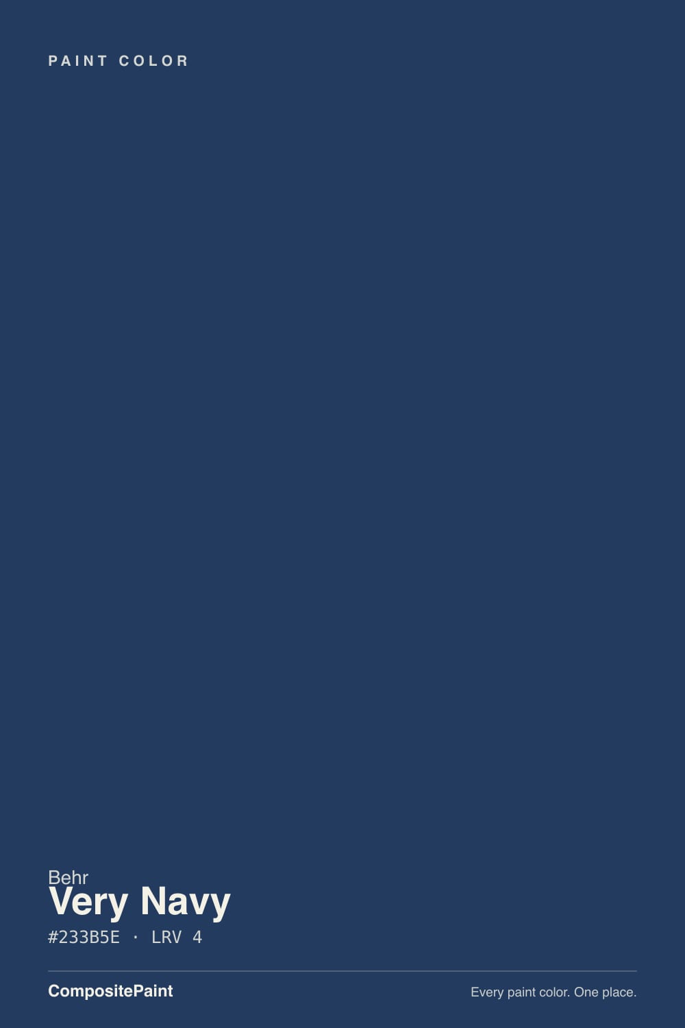
A deep navy with a charcoal-gray cast — that graying is the whole character. At LRV 6 it sits right where blue starts to disappear into black, and most "very dark blue" paints at this depth either go full ink (loud, almost purple in some light) or lose the blue entirely and just read as black. Very Navy splits the difference: enough gray mixed in to feel grounded and mature, enough blue pigment left to still say "navy," not "black," once real light hits it.
Behr sells it specifically as a cabinet, door and trim color, and that positioning is accurate — it is not marketed or reviewed as a whole-house wall statement, and the deck data backs that up. At LRV 6, a room painted floor-to-ceiling in this color needs to supply its own light; the paint will not bounce much back. On a door, a shutter, or an island, that same depth reads as intentional and expensive rather than cave-like, because the surrounding trim, counters or siding are doing the reflecting.
Undertone in one line: cool-leaning blue, muted by a charcoal-gray base — not a pure saturated indigo. Under warm 2700K light it can drift toward a soft blue-black; under daylight or cooler bulbs the blue reads clearly. Paint retailers and color-match sites disagree slightly on the exact undertone lean (some call it neutral, some blue-green), which is itself the tell: this is a color whose identity depends on the light more than most, because there is so little LRV for light to work with.
Where It Shines
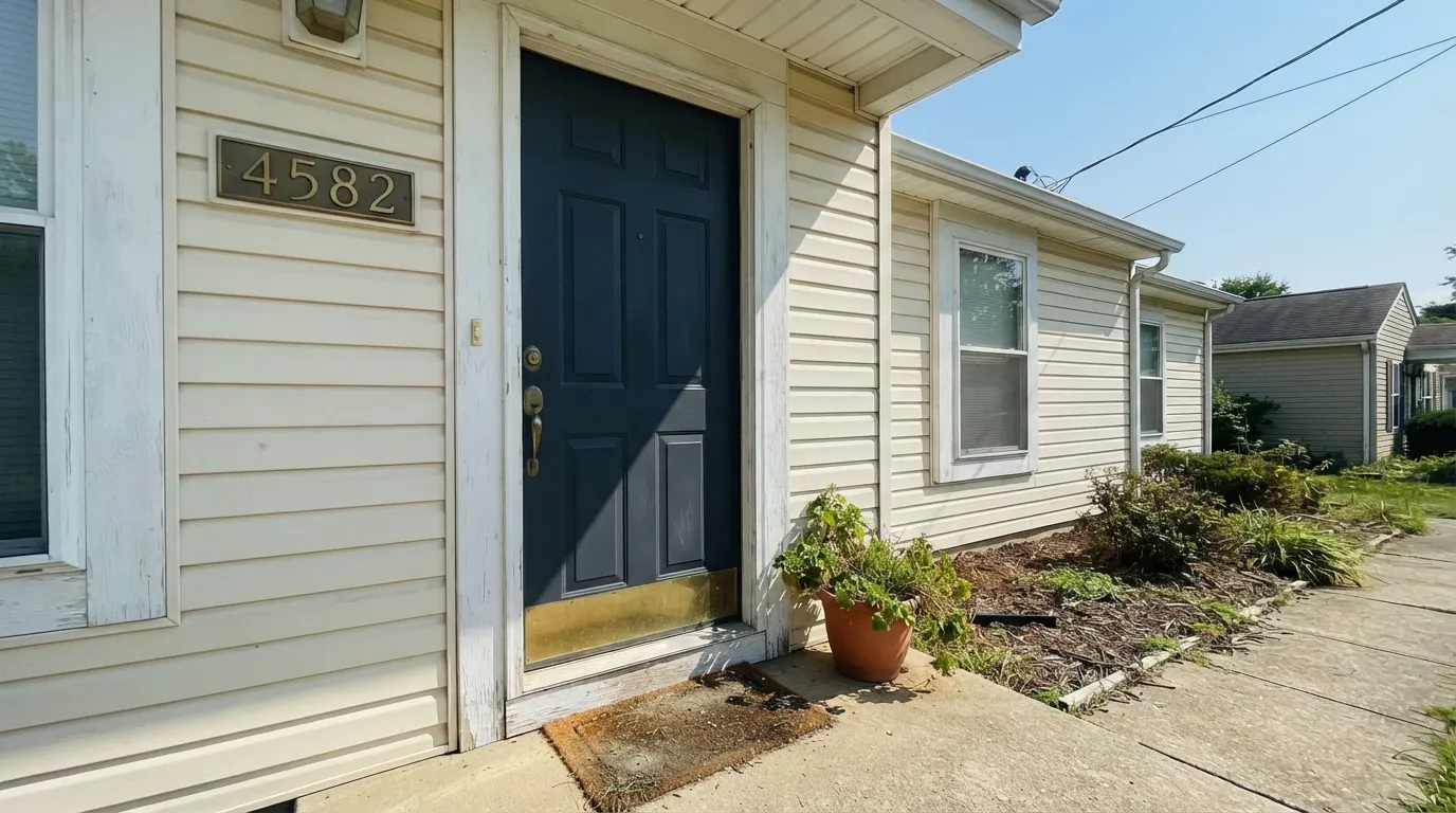
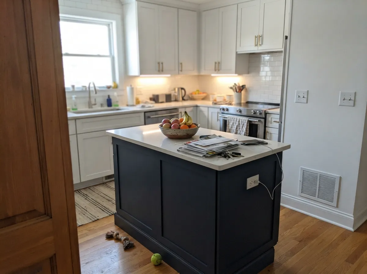
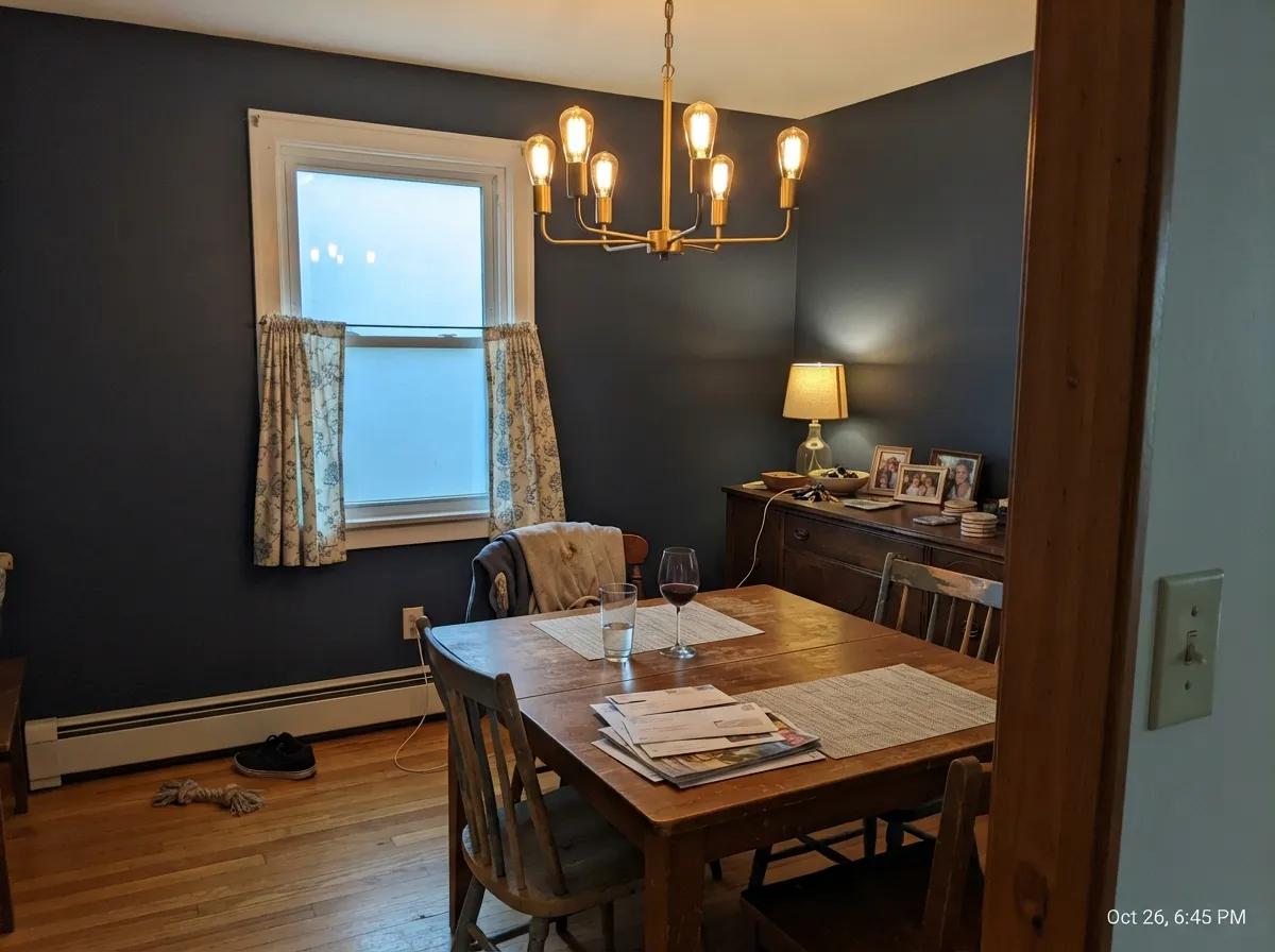
Give it a job with real light hitting it — a sunlit front door, an island under kitchen pendants, cabinet doors catching window light — and it looks like a considered, expensive choice rather than a dark accident. It is also genuinely good outdoors: Behr's better exterior lines (Marquee, Dynasty) are built to hold saturated dark colors like this against sun and weather, so a navy door or shutter set stays true instead of chalking out in a season.
Where It Fails
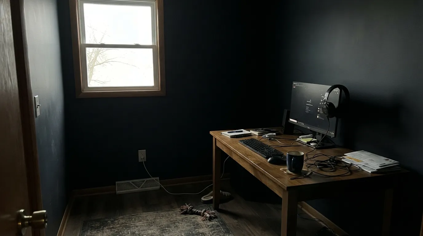
The complaints about Very Navy follow a short, predictable list, and all of them trace back to the same fact: LRV 6 leaves almost nothing to work with once the room's own light runs out.
A small room with one north window and no lamp plan turns Very Navy into a flat black box by early afternoon. The blue was never gone — there just wasn't enough light left to carry it. This is a door-and-accent color first; commit whole walls only if the room genuinely has light to spare.
Near-black colors this saturated do not hide a beige or white wall in a single pass — expect ghosting and uneven sheen where the old color shows through. Tint the primer gray, plan on two full coats, and budget the extra can before you start, not after the first disappointing coat dries.
Because the graying is deliberate, Very Navy will never look like a jewel-tone or a Pantone-poster blue — it reads more grounded and charcoal than vivid. If you're picturing a crisp, bright navy that pops even in shade, look at a lighter, less-grayed option instead; this one earns its blue in daylight, not shadow.
Room by Room
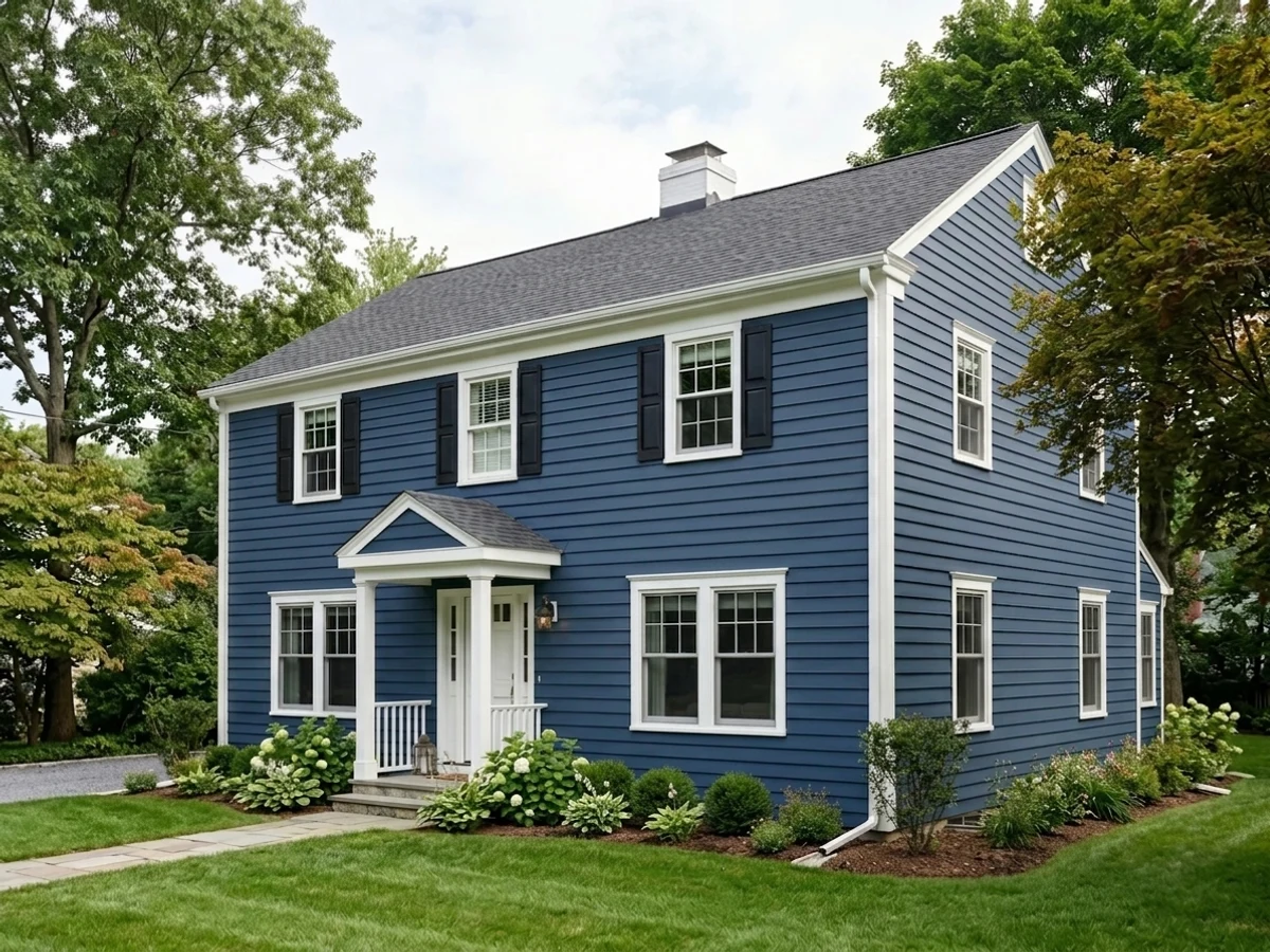
The classic use, and the one Behr built the color for. Semi-gloss Very Navy against a white or light-neutral house reads instantly as a considered upgrade, and full sun keeps the blue honest instead of letting it slide toward black.
Under-cabinet and pendant lighting solve the depth problem for you, so an island or full cabinet run in satin Very Navy against white perimeter cabinets is one of the safer near-black moves in a kitchen. Brass and unlacquered hardware both look good against it.
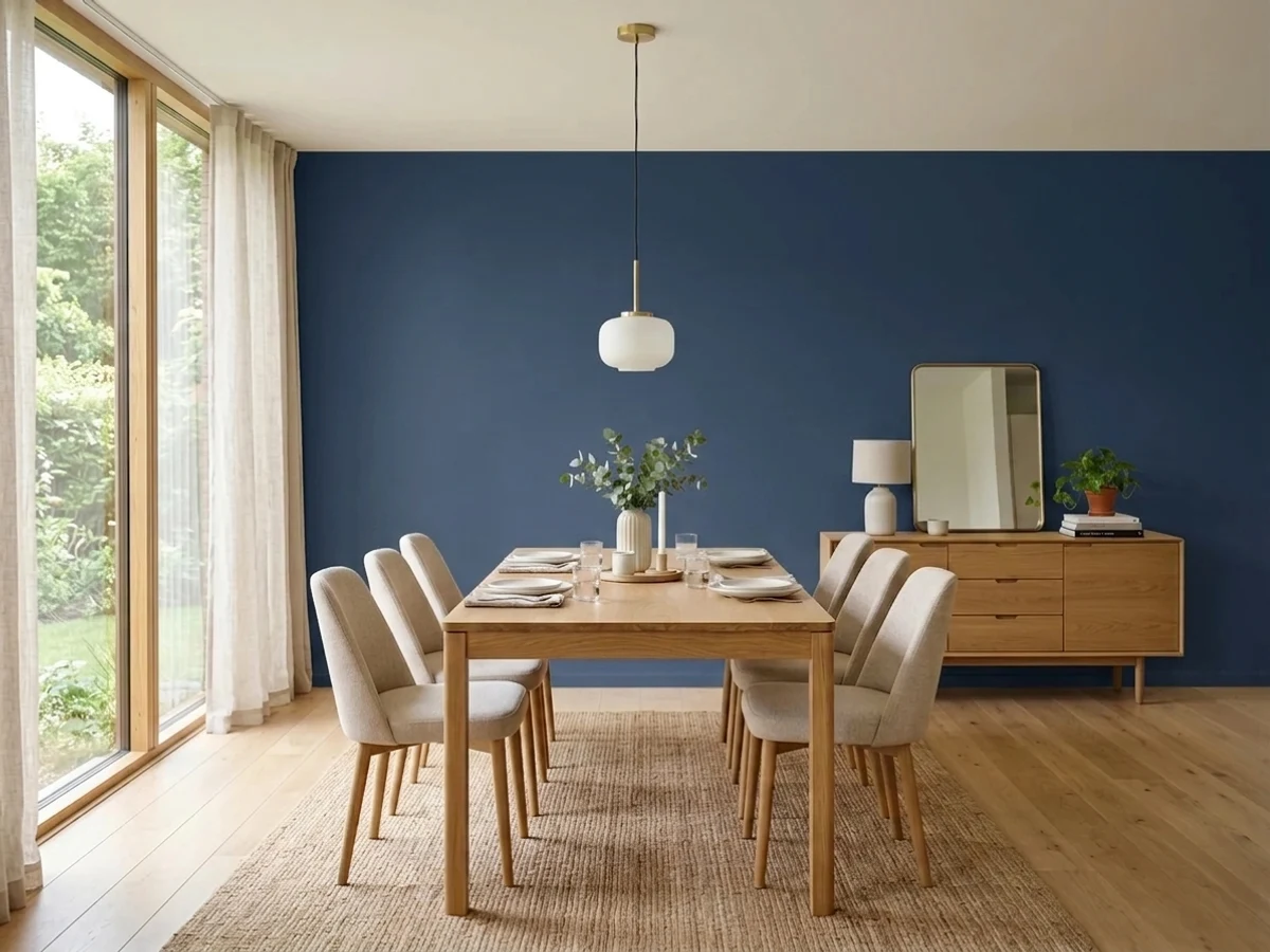
A room you mostly use at night, with warm lamp light and a chandelier, is exactly where this color earns its keep — dramatic without feeling like a mistake in daylight photos. A daytime-only room with weak natural light is the wrong fit.
One wall behind the headboard works, especially with warm bedding and lamps. Four walls asks a lot from LRV 6 unless the room has strong south or west light — test big before committing to the whole box.
Pairs cleanly with white, gray or greige siding, and Behr's premium exterior lines are formulated to hold saturated dark colors like this against UV and weather without the color visibly fading in a year or two.
In a bright, south-facing room with big windows it can be a genuinely striking backdrop for art and wood furniture. In an average builder-grade room with modest windows, this is the fastest way to end up with the "why does it just look black" complaint.
Your Light Is the Risk
Full sun on a door or a window-lit cabinet run is where the blue is unmistakable — this is the light that keeps it from reading as plain black.
With no light to bounce, LRV 6 collapses toward flat black. Fine if that's the look you want; disappointing if you were expecting blue on the wall.
Morning or afternoon direct sun brings out a clean, cool blue for a few hours; the rest of the day it settles back into a quiet charcoal-navy.
Warm 2700K lamps push it toward a soft blue-black, cozy but harder to read as "navy." Cooler LEDs or daylight bulbs keep the blue more distinct after dark.
Most complaints about Very Navy are a light mismatch. Upload a photo of your actual room and see it on your walls — then ask for the same wall in north light or evening lamps before you buy a single sample.
Need It From Another Brand?
Any paint counter can custom-tint Behr M500-7 directly. If you would rather stay in one brand's own deck, these are the closest stock matches, measured as ΔE2000. Under 2 is a difference you will not see on the wall.
| Brand | Closest color | ΔE | LRV | |
|---|---|---|---|---|
| Sherwin-Williams | Sea SerpentSW 7615 · Sherwin-Williams | 4.4 | 7 | Color page → |
| Benjamin Moore | Gentleman's Gray2062-20 · Benjamin Moore | 3.5 | 7 | Color page → |
| Valspar | Blue FedoraV111-6 · Valspar | 3.3 | 6.2 | Color page → |
| Dutch Boy | Navigation432-7DB · Dutch Boy | 4.4 | 7 | Color page → |
| Dunn-Edwards | Parisian NightDEA184 · Dunn-Edwards | 2.2 | 6 | Color page → |
| Farrow & Ball | Hague BlueNO. 30 · Farrow & Ball | 4.2 | 7 | Color page → |
Similar Behr Colors
The nearest shades to Very Navy within Behr's own range, ranked by perceptual color distance — useful when you want the same look a touch lighter, darker, or warmer.
WCAG 2.1: AA is 4.5 : 1 for normal text, 3 : 1 for large text, AAA is 7 : 1.
Very Navy vs the Colors You're Also Considering
Every Very Navy sample board has the same rivals on it. The numbers show the real lightness gap — then it comes down to which risk you would rather live with.
Pick this if you're already buying Behr for the door or cabinets — no reason to switch brands for an equivalent color.
Sherwin-Williams SW 6244 · LRV 4NavalPick this if your painter works in Sherwin-Williams — it's the closest cross-brand twin: same near-black depth, same true-blue read.
Pick this for the deepest, most dramatic version — next to Very Navy, Hale Navy can look almost slate-gray.
Benjamin Moore HC-154 · LRV 6Hale NavyPick this for a navy that still reads clearly blue in a room with weaker light — Very Navy needs more light to earn its keep.
Pick this when you want a door or accent that reads nearly black from the street, not a soft daytime blue.
Benjamin Moore HC-156 · LRV 11Van Deusen BluePick this if even Hale Navy feels heavy — it's a proper navy at a genuinely livable mid-depth, easy on four walls.
Pick this when the whole point is that it reads blue, not just dark — Wrought Iron never will.
Benjamin Moore 2124-10 · LRV 6Wrought IronPick this if you want the same near-black drama without a blue undertone to manage — Wrought Iron reads as soft charcoal in almost any light.
Dark Navy S530-7, #273B62 at LRV 4, is the closest neighbor in the line. It leans very slightly more violet, but on a wall the two are hard to tell apart. Midnight Dream 570F-7, #1E3956 at LRV 4, is quieter and closer to true ink. Nocturnal Sea 570D-7, #173F67 at LRV 5, is the most saturated of the group and reads as an obvious blue rather than a near-black, so pick it if you want the color to announce itself.
Across brands, Benjamin Moore Symphony Blue 2060-10 at LRV 6 is the closest swap, with a color difference of 0.93, small enough that almost nobody would call them different. Dutch Boy Anchor's Away 140-7DB sits at 2.38, very close but worth sampling first. Kompozit Star-Studded 0620 at 4.31 and Hirshfield's Newport Indigo H0061 at 4.51 are close but visibly different side by side.
Very Navy Coordinating Colors
The rule for coordinating with Very Navy is simple: give it a genuinely light, reflective partner, because it will not supply any light itself. Crisp whites, warm off-whites and mid-tone greiges all do the job; another dark color next to it usually just reads as a wall of shadow rather than intentional contrast. These are the partners that keep showing up in doors, kitchens and dining rooms that work:
The Honest Story: A Workhorse, Not a Headline
Very Navy has no Color of the Year moment and no viral design-blog feature behind it — it is simply one of Behr's standard deep navies, sold for doors, shutters, cabinets and trim the way every major brand keeps a near-black navy in its lineup. That is not a knock. Colors like this earn their keep quietly: painters reach for them year after year for front doors and kitchen islands precisely because they are dependable, not because they are having a moment.
If you came here hoping for a famous backstory, there isn't one to report honestly. What you get instead is a well-behaved, near-black navy that Behr formulates well in its exterior lines, pairs easily with almost any trim white, and does not carry the repaint risk of a trend color that might date itself in five years.
Very Navy With Wood Tones and Metals
On a front door or an island, the metal hardware does more visual work than the wood does. Brass and warm gold read rich and traditional against the near-black blue; matte black hardware disappears into it a little, which some owners like for a minimal look and others find too flat — brushed nickel sits in between. Unlacquered brass that will patina over time is a popular pairing precisely because the aging metal keeps changing against a color that otherwise won't.
For wood — a kitchen island base, a dining table, exterior siding — mid-tone and dark woods (walnut, stained oak, cedar) sit comfortably next to Very Navy without a fight. Very pale, blond woods can look slightly cool or gray by contrast; it's not a clash, but it's worth a sample next to the actual floor or table before committing to the pairing.
Three Ready Palettes Built on Very Navy
A color is never alone on the wall. These are complete combinations in the 60-30-10 pattern, with the reason each one holds together. Every one opens in the visualizer.
A crisp white trim keeps the near-black door reading sharp instead of muddy, and a warm off-white body color underneath keeps the whole facade from feeling stark. All three colors come from the same Behr deck, so a painter can match everything off one card.
Try this palette in your roomA warm trim white keeps a near-black room from feeling cold, and a warm greige in the next room over gives the eye a soft, lit hand-off instead of a hard wall of dark. Best with a dimmer on the chandelier — this scheme wants lamp light, not overheads.
Try this palette in your roomWhite perimeter cabinets do the reflecting the navy island can't, so the room stays bright while the island reads as the anchor piece. A warm beige wall keeps the whole kitchen from feeling like two competing cool tones.
Try this palette in your roomVery Navy FAQ
Is Very Navy warm or cool?
Cool-leaning overall, but muted by a charcoal-gray base rather than a pure saturated blue. Under warm 2700K bulbs it can drift toward a soft blue-black; under daylight or cooler light the blue reads clearly. Color-match sites disagree slightly on the exact undertone lean — in practice, your room's light decides more than the chip does.
Is Very Navy basically black?
At LRV 6 it sits right at the edge, and in a dim room with no lamps it can look black to the eye. With real daylight or warm accent lighting on it, it holds a clearly visible navy blue — it just needs some light to prove it.
What trim color goes with a Very Navy front door?
A clean white — Behr White or a similar crisp trim white — is the classic pairing and keeps the door reading sharp rather than muddy. A warm off-white body color underneath softens the contrast if stark white feels too severe for the house.
Can I use it on kitchen cabinets?
Yes — it's one of the colors Behr specifically markets for cabinets, doors and trim. Use a satin or semi-gloss cabinet-rated enamel, prime with a gray-tinted primer over any lighter existing color, and pair it with white or light perimeter cabinets so the kitchen keeps enough reflected light.
How many coats does it need?
Plan on two full coats minimum over a lighter existing color, with a gray-tinted primer first. Going straight over white or beige with a single coat is the most common source of disappointment with any color this deep.
Does it hold up on an exterior door or shutters?
Yes — Behr's better exterior lines (Marquee, Dynasty) are built to keep saturated dark colors like this from fading or chalking against sun and weather. A quality exterior formula matters more here than with a pale color, since fading shows up faster on a deep, saturated navy.
Have you painted with Very Navy?
Rate it — one tap helps the next reader decide.
Ask a Question