Hague Blue
Farrow & Ball's most famous dark blue, reviewed honestly: the green undertone that keeps it from going flat black, the light it needs, and what to pick instead.

Jessica has spec'd whites and neutrals for more than 300 rooms and keeps a sample wall of painted drawdowns in her studio. Every color review is checked against real reader rooms in the comments and re-tested when a formula changes. About the testing process →
- 1Nightlife2
- 2Hague Blue7
- 3Waterloo13
- 4Charcoal Blue19
The Fast Verdict
Hague Blue is the dark blue people mean when they just say "the Farrow & Ball blue." On the chip it reads as a rich, near-black teal-navy, but underneath the blue sits a quiet green pigment, and that green is the whole trick — it keeps the paint from collapsing into the cold, flat black most LRV 7 darks turn into. In real light it visibly moves through the day: distinctly navy in the morning, greener at midday, close to black-blue by evening. It has become the reflex answer for kitchen islands, front doors and paneled studies, and it earns that reputation — but at LRV 7 it needs real daylight or real lamps to prove it, and buyers who wanted an obvious, unmistakable navy sometimes end up with what reads as a very dark, warm charcoal instead.
Kitchen islands and cabinets under warm wood and brass · front doors, railings and ironwork · paneled studies, libraries and home offices · powder rooms and small drenched spaces · dining rooms lit by lamps and candles
You want an obvious, unmistakable navy · your room is dim, north-facing and short on lamps · you're choosing between this and Railings or Off-Black without comparing real chips side by side · you need a cheap gallon
- A genuine teal-navy, not a flat black — the green keeps it alive even in mediocre light
- Outstanding on kitchen islands and cabinets against warm wood and brass
- One of the best-behaved F&B darks for front doors and exterior ironwork
- Drenched small rooms (study, powder room) look finished with one color decision
- Visibly shifts through the day — most owners who buy it for this love it
- LRV 7 gives almost nothing back — a dim room just gets dimmer
- The green undertone means it is not a clean, obvious navy, and that disappoints some buyers
- Easy to confuse with Railings or Off-Black when specifying without comparing real chips
- Farrow & Ball pricing, plus a dark-tinted primer coat you cannot skip
What Color Is Hague Blue, Really?
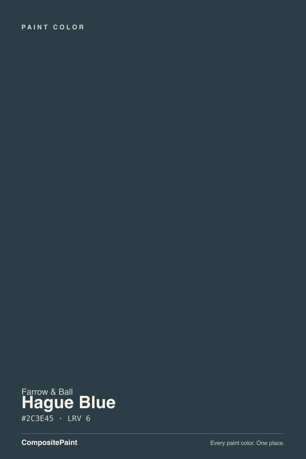
A deep teal-navy built on a quiet green base — Farrow & Ball's own literature calls it a rich, dark blue with a green undertone, and that green is doing more work than the name lets on. Most near-black blues go one of two ways: cold and flat, or so dark they read as plain black. Hague Blue does neither, because the green keeps a trace of warmth moving under the blue even in weak light. It has been in the core range for decades and has quietly become the brand's best-known dark blue — the color designers and kitchen fitters reach for first when a client asks for "that Farrow & Ball blue" without naming one.
At LRV 7 it is genuinely close to black — it reflects almost nothing back into the room, so the light you give it is the color you get. That is the number-one surprise in owner accounts: the navy you saw on the sample in daylight reads as a near-black blue by evening, and a north-facing room without real lamps can lose the color almost entirely. Farrow & Ball's own color consultant Patrick O'Donnell has pointed to the green note as the reason it still works in north-facing rooms better than a straight navy would — the green keeps it from turning chilly the way a colder blue-black does. It is not a free pass on light, but it is a real advantage over its rivals.
Undertone in one line: blue-green first, true black second, and never a clean, uncomplicated navy. That distinction matters because Hague Blue sits in a crowded F&B family of near-black darks — Off-Black, Railings, and this one all hover around the same LRV — and they are not interchangeable. Off-Black is a soft, warm black with barely any color in it; Railings is a blue-black that only flashes blue in strong light; Hague Blue is the one that stays visibly teal-green even in ordinary light. If a sample looks plain black, you probably have the wrong can.
Where It Shines
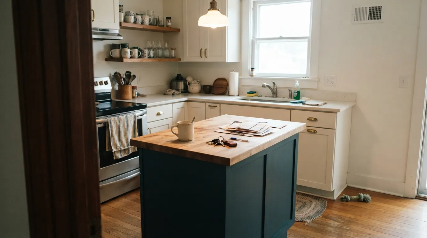
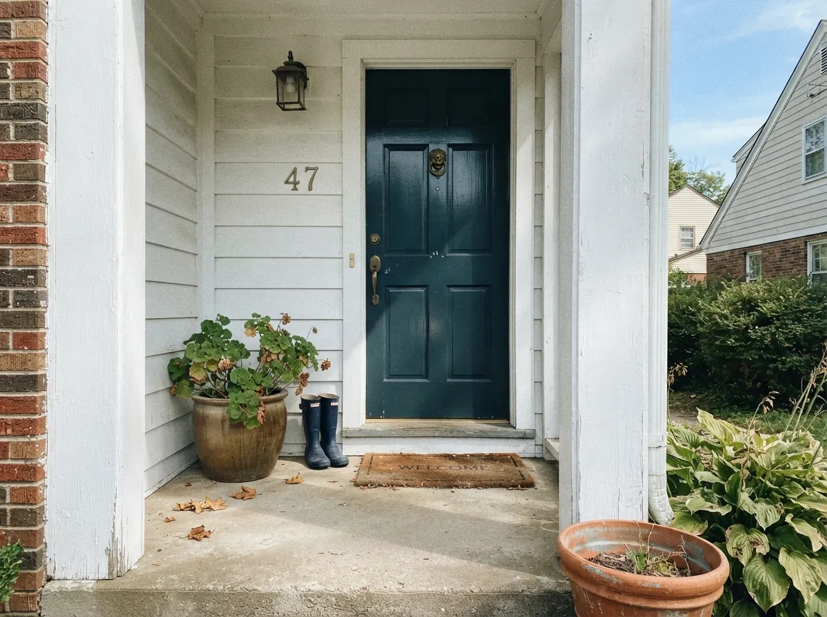
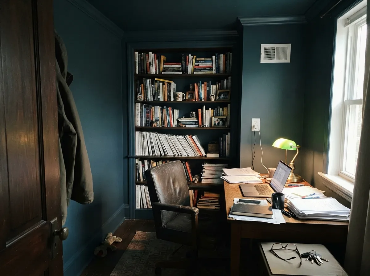
This color is built for the rooms that made it famous. On a kitchen island or lower cabinet run under warm white uppers, butcher block and brass, it reads custom and expensive rather than heavy — British Standard by Plain English used it on chef Skye Gyngell's London kitchen cabinetry, and it keeps turning up in kitchen remodels that want moody without going full black. On a front door in Full Gloss it gives the wet, saturated depth that separates a hand-painted door from a sprayed builder one, and the green keeps it from reading like plain black enamel from the street. Its other natural home is the small, enveloping room — a paneled study, a home library, a powder room — where walls, trim and ceiling all going the same color dissolves the corners and makes a small space feel deliberate instead of cramped.
Where It Fails
Almost every regret story about Hague Blue comes down to one of three mismatches, and all three are predictable before the first coat goes on. None of them are the paint's fault — but if your room or your expectations match one of these, sample it before you commit a whole kitchen to it.
Hague Blue is a teal-navy with real green in it, not a straight blue. On a chip under store lighting it can look like plain navy or even black; on four walls or a full run of cabinets the green undertone is unmistakable. If you want a color nobody could argue with — clearly, only blue — this one will read "off" to you. Benjamin Moore Hale Navy or Sherwin-Williams Naval are the straighter answer.
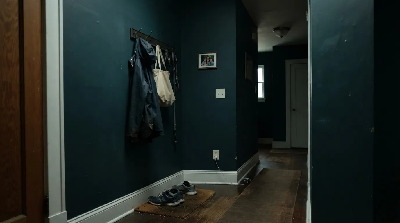
At LRV 7 the paint gives almost nothing back, and the green undertone helps but does not rescue a north-facing room with a single small window and the overhead light off. Owners who sampled it in a sunlit showroom and then painted a dark hallway report a flat, lightless navy-black with none of the color they saw. Lamps at two or three heights, a pale ceiling, and a dimmer are part of the paint job, not an afterthought.
Blue and orange sit opposite each other on the wheel, so warm honey-oak floors and yellow-toned oak trim exaggerate each other against Hague Blue: the floor reads more orange, the walls read flatter and less green. It is not a dealbreaker with a rug and the right hardware, but a builder-oak kitchen is the one situation where this color needs the most planning, not the least.
Room by Room
Islands and lower cabinet runs under warm white uppers are Hague Blue's signature job. It flatters brass, butcher block and marble, and the depth hides fingerprints and daily wear far better than a flat black would. Modern Eggshell or a satin cabinet enamel; antique brass or unlacquered hardware keeps it from reading cold.
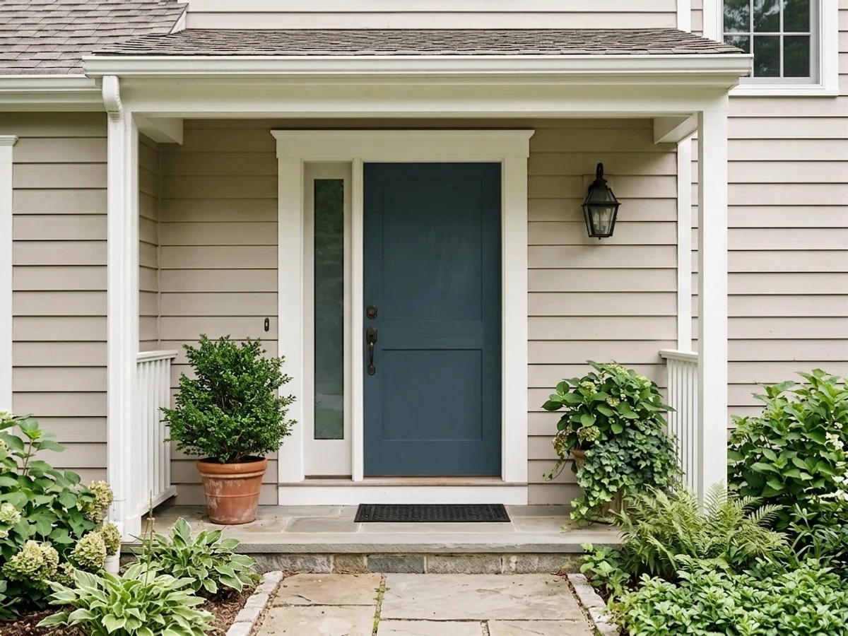
Full Gloss gives the saturated, wet-looking finish this color is known for on a front door, and the green keeps it from reading as plain black enamel in full sun. Farrow & Ball's Exterior Eggshell is the matching choice for railings, gates and window frames. Direct sun and a covered porch both flatter it; expect the color to shift noticeably through the day.
Drenched — walls, trim and ceiling all in Hague Blue at different sheens — a small study stops feeling like a leftover room and starts feeling designed. Built-ins painted the same color disappear behind the books on the shelves. Pair with leather, walnut and brass lamp light; skip it if the room doubles as a bright daytime workspace with no lamps.
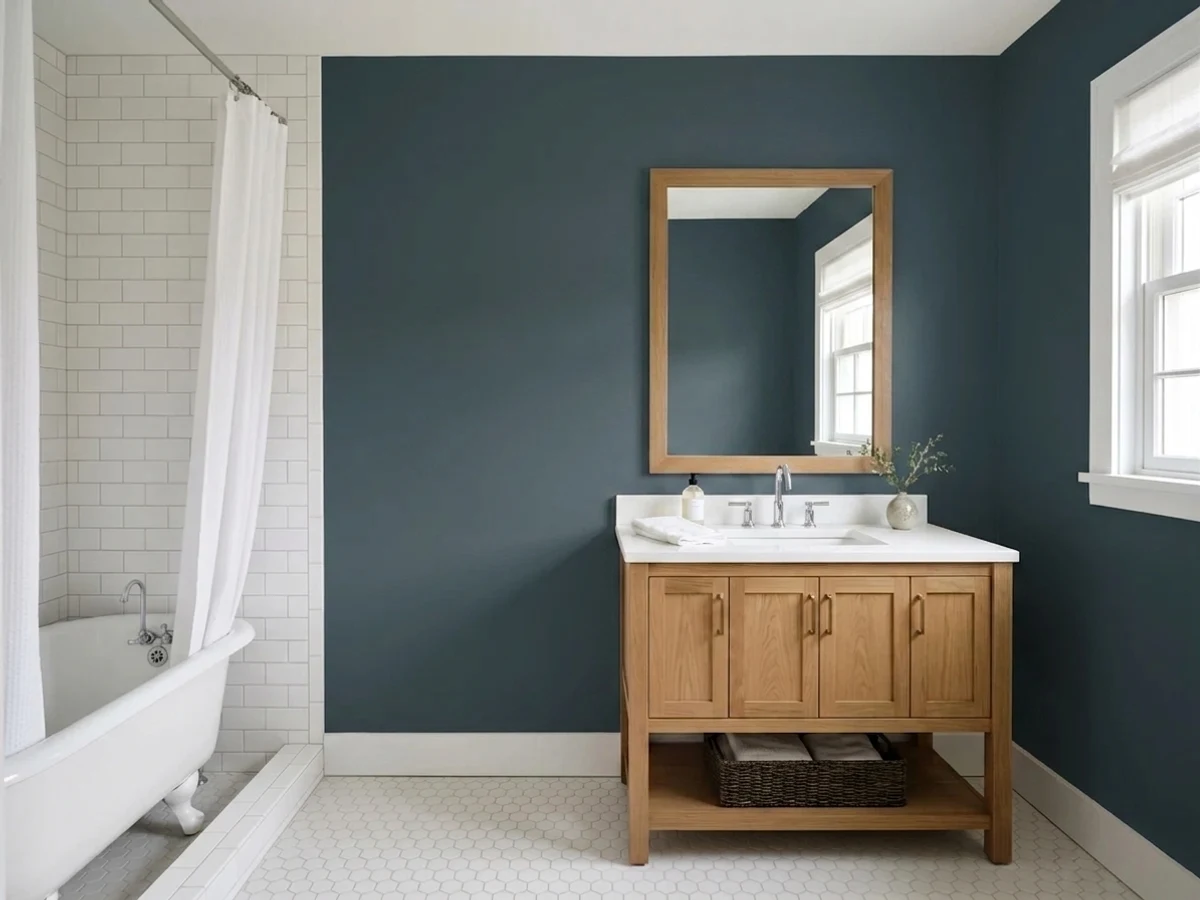
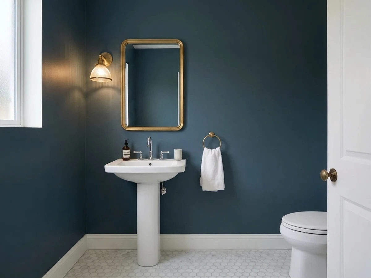
Small, low-traffic and often lit by a single sconce, a powder room takes this depth of color easily. Drenching all four walls in Estate Emulsion with a Modern Eggshell door reads finished in one weekend, and the enclosed space means the light-dependence that worries a bigger room barely matters here.
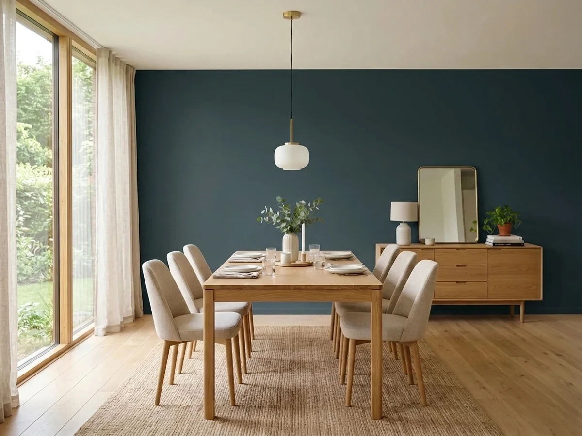
Dining rooms are used after dark, which is exactly when Hague Blue's near-black depth stops being a risk and becomes the point. Candles, brass, a walnut table and warm 2700K bulbs on a dimmer bring the green-blue forward and make the room feel like a restaurant booth. A dining room that only sees midday light will read flatter and less colorful.
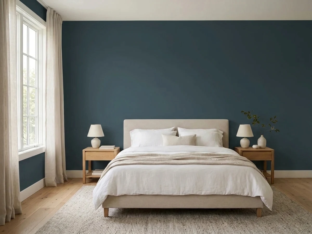
It makes a genuinely restful, enveloping bedroom, and the green undertone is a real asset in a north-facing room where a colder navy would feel chilly. It fails as a single accent wall against three pale ones — the color needs the whole room, or at least the headboard wall plus trim, to read as intentional rather than unfinished.
Your Light Is the Risk
Real sun is where the green comes forward and the color is unmistakably teal-navy, not black. Sample here first.
Weak or north light drains the color to a flat, near-black navy with little of the green left to see. Lamps are part of the job.
Distinctly navy in morning light, greener at midday, close to black-blue by evening — the same paint, three different moods.
2700K lamps pull it toward a soft, warm charcoal-navy at night. Cool 4000K LEDs push it colder and closer to plain black.
Most complaints about Hague Blue are a light mismatch. Upload a photo of your actual room and see it on your walls — then ask for the same wall in north light or evening lamps before you buy a single sample.
Need It From Another Brand?
Any paint counter can custom-tint Farrow & Ball No. 30 directly. If you would rather stay in one brand's own deck, these are the closest stock matches, measured as ΔE2000. Under 2 is a difference you will not see on the wall.
| Brand | Closest color | ΔE | LRV | |
|---|---|---|---|---|
| Sherwin-Williams | Sea SerpentSW 7615 · Sherwin-Williams | 0.8 | 7 | Color page → |
| Behr | Dark NightPPF-58 · Behr | 2.2 | 7 | Color page → |
| Benjamin Moore | Blue Note2129-30 · Benjamin Moore | 1.3 | 9 | Color page → |
| Valspar | Rogue Blue5009-2 · Valspar | 1.7 | 7.2 | Color page → |
| PPG / Glidden | CavalryPPG1041-7 · PPG / Glidden | 3.0 | 7 | Color page → |
| Glidden | CavalryPPG1041-7 · Glidden | 2.5 | 7 | Color page → |
Similar Farrow & Ball Colors
The nearest shades to Hague Blue within Farrow & Ball's own range, ranked by perceptual color distance — useful when you want the same look a touch lighter, darker, or warmer.
WCAG 2.1: AA is 4.5 : 1 for normal text, 3 : 1 for large text, AAA is 7 : 1.
Hague Blue vs the Colors You're Also Considering
Every Hague Blue sample board has the same rivals on it. The numbers show the real lightness gap — then it comes down to which risk you would rather live with.
Pick this when you want the color to be unmistakable in ordinary light — the green in Hague Blue keeps it visibly teal-navy where Railings goes quiet.
Farrow & Ball No. 31 · LRV 6RailingsPick this if you want a soft black that only hints at blue — Railings reads charcoal-black most of the time and needs strong light to show any color at all.
Pick this for the more unusual, sophisticated green-blue that reads as a color choice, not just a dark blue.
Benjamin Moore HC-154 · LRV 6Hale NavyPick this if you want a clean, no-argument navy with no green pulling it toward teal.
Side-by-side comparison →Pick this for the daylong color shift and the green complexity Naval doesn't have.
Sherwin-Williams SW 6244 · LRV 4NavalPick this for the definitive, no-doubt navy off a shelf your painter already stocks.
Pick this for the deepest, most dramatic version of this color story — Van Deusen Blue is a genuinely lighter, easier color.
Benjamin Moore HC-156 · LRV 11Van Deusen BluePick this if Hague Blue's LRV 7 feels like too much commitment — same blue-green family, five points more light to work with.
Against Stiffkey Blue (No. 281), LRV 7, Hague Blue is the greener, more teal of the two. Stiffkey is a truer, more purple-leaning navy, so it reads more classically blue where Hague tips toward petrol. If you want unmistakable navy, choose Stiffkey; if you want depth with a green undercurrent, choose Hague.
Black Blue (No. 95), LRV 5, is darker and closer to black, with less of the visible blue-green character. It is the pick when you basically want a soft black that only hints at blue, whereas Hague keeps more recognizable color.
Compared with Benjamin Moore's Hale Navy (HC-154), LRV 6, Hague sits at a similar darkness but leans distinctly greener and cooler, while Hale Navy is a warmer, more straightforward navy. Test both on the actual wall, since at these low LRVs the difference is subtle until the light hits them.
Hague Blue Coordinating Colors
Hague Blue takes crisp whites well — they sharpen the contrast and let the green come forward — and it takes warm woods, brass and ochre even better, which is why kitchens keep pairing it with butcher block and warm off-white uppers rather than stark modern ones. These are the partners that keep showing up in rooms that work:
Hague Blue vs. Railings vs. Off-Black: Telling F&B's Darks Apart
All three sit at nearly the same punishing LRV, and all three get requested by people who just say "the dark Farrow & Ball color" without knowing there is a choice to make. They are not interchangeable. Off-Black is the softest of the three — a genuinely warm black with almost no competing undertone, the one to pick when you want dark without any color argument at all.
Railings is built on blue, but that blue is conditional: in bright daylight next to a crisp white it can pass for a very dark navy, while in a lamplit room with warm trim it settles into a plain, soft charcoal with no blue visible at all. Hague Blue is the one that holds its color most reliably — the green undertone keeps it visibly teal-navy in ordinary daylight, not just in ideal conditions. If a room needs to read unmistakably as a color rather than a shade of black, this is usually the safer bet of the three.
Hague Blue With Wood, Brass and Floors
Warm wood is this color's best friend. Walnut, oiled oak and butcher block meet the green in Hague Blue halfway, which is exactly why it has become a default kitchen island color — the wood keeps the near-black from feeling severe. Pale white oak and gray-washed floors work too, in a cooler, more modern register; plan on warm textiles nearby to keep the room from feeling clinical.
Honey oak and yellow-toned builder trim are the one real risk. Blue and orange are complements, so a golden floor under Hague Blue cabinets or walls tends to look more orange than it did before, and the paint reads flatter in return. A large rug or a stain refresh solves most of it; if the honey oak is staying and can't be addressed, Van Deusen Blue's lighter LRV is the easier color to live with over it.
Metal hardware is the fastest way to warm the color up or cool it down. Unlacquered and antique brass are the classic match and the reason so many Hague Blue kitchens photograph as inviting rather than moody-cold. Matte black and aged bronze disappear into it on doors and built-ins. Polished chrome and nickel pull in the opposite direction — they read cold against the green and can make the whole color feel more like plain black than intended.
Three Ready Palettes Built on Hague Blue
A color is never alone on the wall. These are complete combinations in the 60-30-10 pattern, with the reason each one holds together. Every one opens in the visualizer.
White Dove uppers keep the kitchen bright enough for the LRV 7 island to read as a deliberate statement rather than a dark hole. Hay's warm ochre is the note that keeps the room from going cold and monochrome — one mustard barstool or a set of woven shades does the whole job. Brass or unlacquered hardware ties it together.
Try this palette in your roomA crisp, cool white body makes the green in Hague Blue read clearly instead of muddying toward plain black, and gloss on the door gives it the wet, saturated depth the color is known for. Wrought Iron on the lanterns and hardware is close enough in depth to feel coordinated without competing with the door for attention.
Try this palette in your roomOne color at three sheens removes every hard edge in a small study, which is what makes a drenched room feel bigger rather than boxed in. Cinnamon Slate's warm brown-red is the one note the scheme needs — on a leather club chair it reads like the room was furnished around the paint, not the other way around.
Try this palette in your roomHague Blue FAQ
Is Hague Blue navy or green?
Both, in the right light — it is a teal-navy built on a green undertone, not a straight navy and not a straight green. In bright daylight the green is easy to see; under warm lamps or in dim light it settles into a very dark, warm navy-black. If you need an unambiguous navy with zero green in it, this is not that color.
Which Farrow & Ball finish should I use?
Estate Emulsion is the classic chalky matte for low-traffic walls and ceilings; Modern Emulsion is tougher and better for kitchens and hallways. Estate Eggshell or Modern Eggshell go on cabinets, trim and doors — Modern Eggshell if you want more durability and a slightly higher sheen. Full Gloss is the traditional finish for a front door.
Is it good for kitchen cabinets and islands?
It is one of Hague Blue's best jobs. Against warm wood, butcher block and brass it reads custom and timeless, and the depth hides fingerprints better than a flat black. Use Modern Eggshell or a proper cabinet-grade enamel, and plan on antique or unlacquered brass hardware rather than chrome to keep it warm.
Will it work in a north-facing room?
Better than most near-black darks, because the green undertone keeps it from feeling as cold and flat as a straight navy or blue-black would. It is still LRV 7, though — it will not read as a bright color, and it needs a real lamp plan to avoid going lifeless by late afternoon. Sample it on the actual wall before committing a whole room.
What is the difference between Hague Blue and Railings?
Both sit around the same very dark LRV, but they read differently on the wall. Railings is filed as a black and only flashes blue in strong light — most of the time it reads as a soft charcoal. Hague Blue is built to stay visibly teal-green even in ordinary light, which is why it is usually the pick when someone specifically wants a dark blue rather than a soft black.
Do I need a special primer?
Yes — use a dark-tinted primer or undercoat under Hague Blue, as Farrow & Ball recommends for its darkest colors. Rolling this depth of color straight over a light wall means extra coats and patchy, uneven coverage. A dark-tinted undercoat plus two finish coats is the whole job.
Have you painted with Hague Blue?
Rate it — one tap helps the next reader decide.
Ask a Question