Railings
Farrow & Ball's best-selling soft black, reviewed honestly: the light that brings the blue out, the rooms where it just reads charcoal, and what to pick instead.

Jessica has spec'd whites and neutrals for more than 300 rooms and keeps a sample wall of painted drawdowns in her studio. Every color review is checked against real reader rooms in the comments and re-tested when a formula changes. About the testing process →
- 1Railings7
- 2Pewter Green12
- 3Retreat21
The Fast Verdict
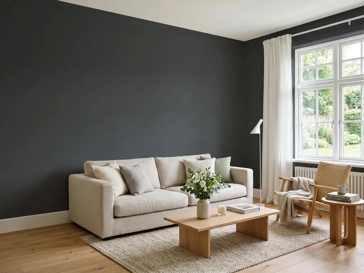
Railings is black with the hard edge sanded off. Farrow & Ball files it under black, but it is built on blue, and that blue is what keeps a dark room from feeling like a hole in the wall. In a dining room lit by lamps and candles it goes velvety and expensive; in a dim north room with one window it collapses into a flat, lightless charcoal and the blue never turns up at all. Buy it for the softness, not for the navy — and sample it on two walls before you commit.
Dining rooms you actually use after dark · kitchen islands and cabinets · front doors, railings and ironwork · studies, libraries and small powder rooms · anyone who wants black without the hard edge
Your room is dim, north-facing and has one small window · you want an obvious navy · your walls take daily scuffs and you plan on chalky matte · you need a cheap gallon
- Black without the hard, flat edge — the blue keeps depth in the dark
- Drenched small rooms (dining, powder, study) look expensive with one decision
- Outstanding on front doors and ironwork, which is what it was made for
- Reads as a soft charcoal or a near-navy depending on your trim — two colors in one can
- Cabinet-friendly: hides handprints and edge wear far better than a true black
- LRV 7 gives nothing back — a dim room just gets dimmer
- The blue is conditional; plenty of owners never see it
- Chalky matte marks and burnishes where real life touches it
- Farrow & Ball pricing, plus a dark-tinted primer coat you cannot skip
What Color Is Railings, Really?
A soft black built on blue. Farrow & Ball puts Railings on its black chart and describes it as more blue than black — the point is that the blue takes the deadness out. Straight blacks flatten in low light and swallow the shape of a room; Railings holds a little color in the dark, so corners still read as corners. It is named after the ironwork it was made to suit, which tells you where it came from: gates, railings, front doors, window frames. The walls came later, and they came fast — it is now one of the most-specified darks the brand sells.
At LRV 7 it is genuinely near-black. That number matters more than the undertone: a wall in Railings reflects almost nothing back into the room, so whatever light you have is what you get. Big windows, pale floors, a white ceiling and real lamps make it look rich. One north window and a dark floor make it look dim. This is the single decision that separates the people who love this color from the ones who repaint.
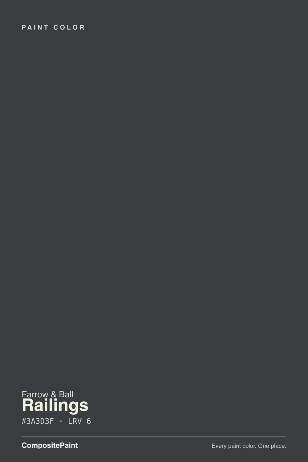
Undertone in one line: blue-gray, and conditional. On the chip it looks like plain graphite; on a wall in daylight, next to a crisp white, the blue steps forward and it can pass for a very dark navy. Under warm bulbs and cream trim the same paint reads as a warm charcoal-black. Both are the paint being honest about the room.
Where It Shines
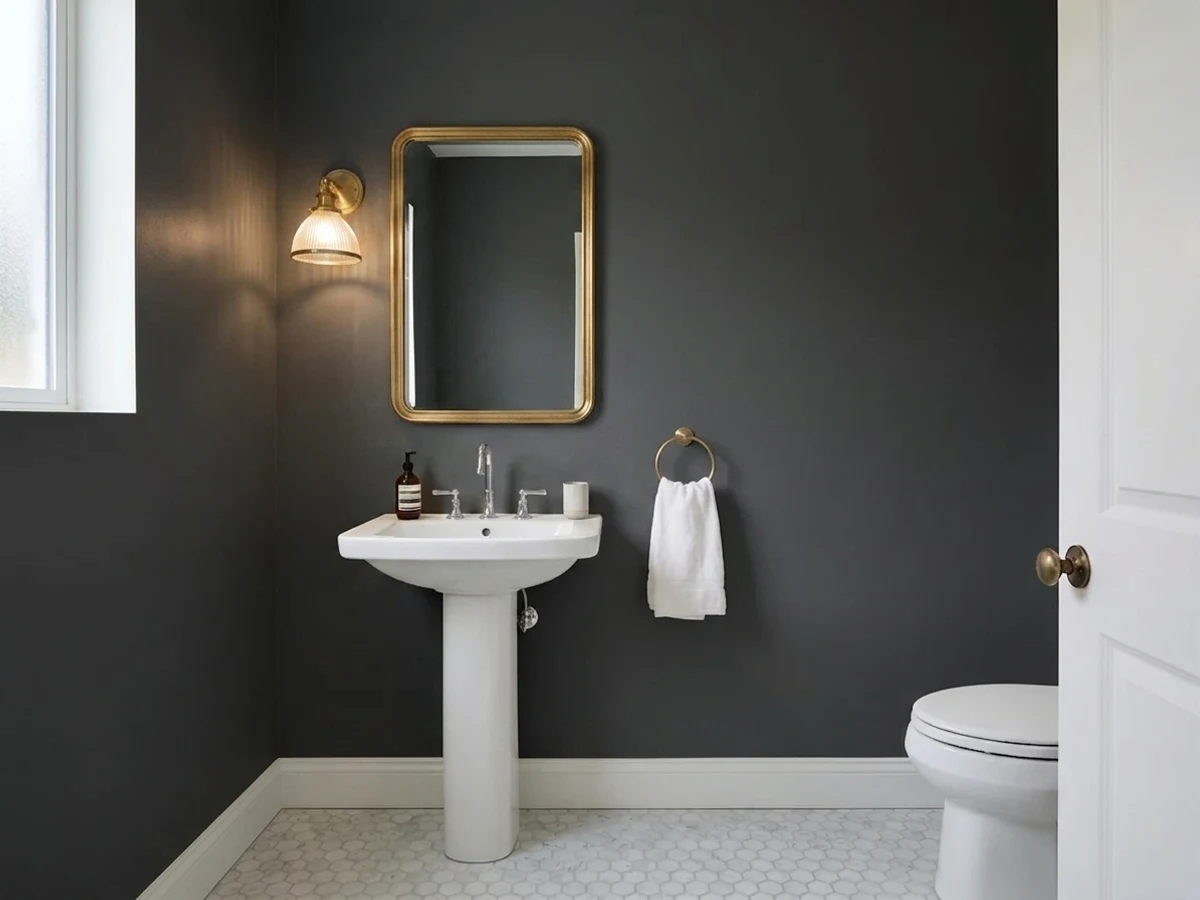
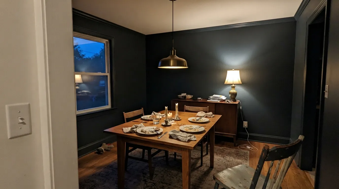
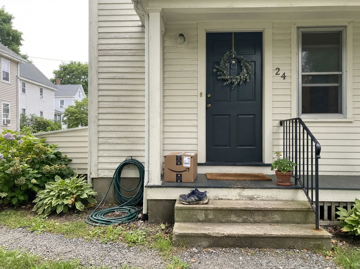
This color is at its best in rooms you use at night and in rooms small enough to wrap. A dining room drenched in Railings — walls, trim, ceiling, one sheen change — stops being a leftover square of the house and starts feeling like a restaurant booth: candles, brass, a walnut table, and skin tones that look good because nothing is bouncing glare around. Powder rooms and small studies take it the same way. Its other home is the one it was named for: on a front door in full gloss, or on railings and window frames, where the depth reads handsome from the street and the blue keeps it from looking like cheap black enamel.
Where It Fails
The complaints about Railings are remarkably consistent, and all three are predictable before you open a can. None of them are the paint's fault — but if your room matches one, sampling bigger will only confirm it faster.
This is the number-one surprise in owner threads: someone paints a sample expecting the navy-black they saw online and reports a plain charcoal with no blue in it at all. The blue is conditional — it needs real daylight, cool light, or a crisp white next to it to show. In a lamplit room with cream trim, Railings reads as a warm-gray black and nothing more. Decide which version you actually want, then set the trim and bulbs to get it.
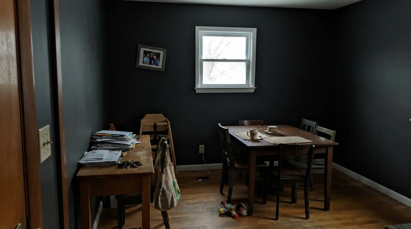
At this depth the paint gives nothing back. In a north-facing room with a single window, Railings does not read moody — it reads dim, and by four in the afternoon it reads smaller too. The fix is light, not paint: lamps at two or three heights, a white or pale ceiling, a light rug. If you cannot add light, this is the wrong depth for that room.
Farrow & Ball's Estate Emulsion is beautiful and only gently wipeable — not washable — and dark chalky matte is the worst combination for marks: every scrub burnishes a shiny patch, and touch-ups flash. On any wall that meets chair backs, hands or a hallway, use Modern Emulsion or Dead Flat, both of which are built to be scrubbed. And prime with a dark-tinted undercoat; over a light wall, this color goes patchy and thin without one.
Room by Room
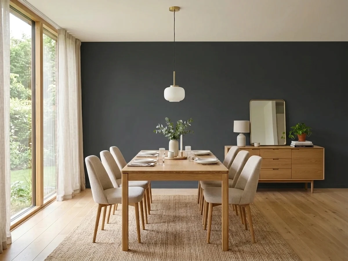
Dining rooms are used at night, which is exactly when a near-black stops being a risk and starts being the point. Drench it — walls, trim and ceiling — and the room reads deliberate instead of like one dark accent wall. Warm 2700K bulbs on a dimmer, candles, brass, a walnut or oak table. Dead Flat on the walls if you want the chalky look with real scrub resistance.
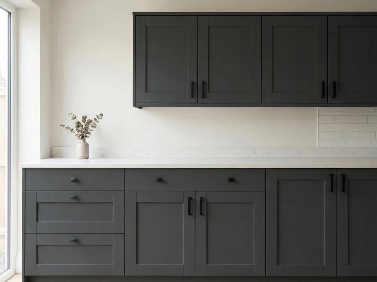
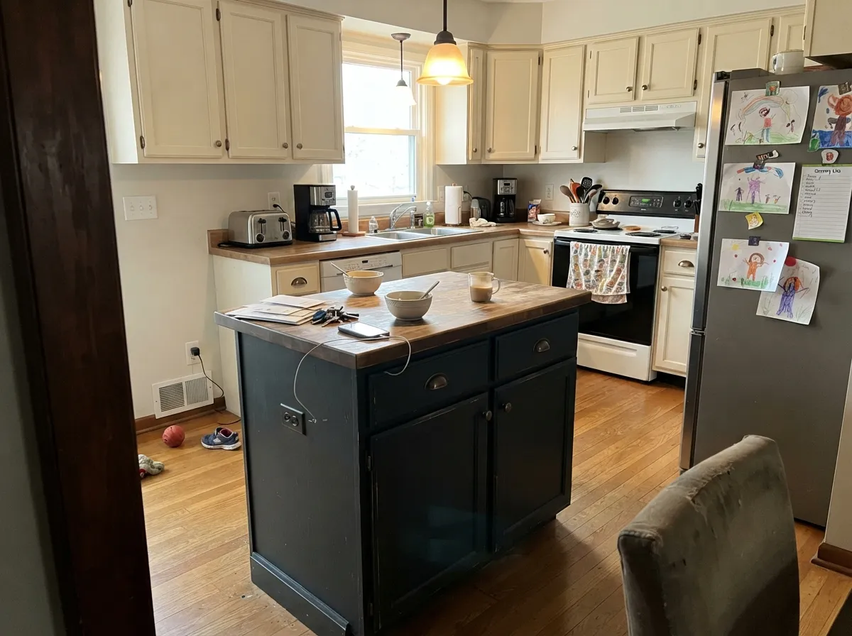
One of its most reliable jobs. An island or the lower run in Railings under warm off-white uppers gives a kitchen a point of view without going full black box — and warm white cabinets above pull Railings toward warm gray rather than blue. Modern Eggshell or a satin cabinet enamel; antique brass hardware keeps the blue from reading cold.
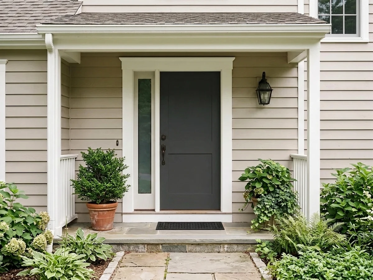
The color was named for this. Full Gloss on a front door gives the deep, wet-looking finish that separates a painted door from a sprayed builder one, and F&B's Exterior Eggshell is rated to resist flaking and fading for up to six years on wood and metal when the prep is done properly. Owners with west-facing doors report it holding up through full afternoon sun.
Rooms that never need to feel bright are easy wins. Built-ins in Railings with books in front of them look like joinery, not paint. Screens read better against a dark wall, and lamplight does the rest. Modern Eggshell on shelving, flat on the walls.
It makes a genuinely restful bedroom because there is nothing to look at — but half-measures fail here. One dark wall behind the bed with three pale ones looks unfinished; the whole room in Railings with cream linen and two lamps looks intentional. Keep the bedding warm white, not bright white, unless you want the blue up front.
A living room in Railings is beautiful in a house with big windows and pale floors, and gloomy in a standard room with one window and a dark carpet. This is the room where people most often over-reach with it. If you want the mood without the risk, put it on the fireplace wall, the built-ins or the interior doors and leave the walls warm.
Your Light Is the Risk
Real sun is where it stops being a black hole: the blue comes forward and you can see the wall has color in it. Sample here first.
Cool but weak light drains it to a flat lightless charcoal, and the room reads smaller by mid-afternoon. Lamps or a lighter color.
Cooler and bluest in morning light, warmer and more graphite as the sun drops. Golden hour on a west wall is its most flattering hour.
2700K lamps mute the blue and give a soft warm black — the cozy version. Cool 4000K LEDs push it navy and can read cold and hard.
Most complaints about Railings are a light mismatch. Upload a photo of your actual room and see it on your walls — then ask for the same wall in north light or evening lamps before you buy a single sample.
Need It From Another Brand?
Any paint counter can custom-tint Farrow & Ball No. 31 directly. If you would rather stay in one brand's own deck, these are the closest stock matches, measured as ΔE2000. Under 2 is a difference you will not see on the wall.
| Brand | Closest color | ΔE | LRV | |
|---|---|---|---|---|
| Sherwin-Williams | CyberspaceSW 7076 · Sherwin-Williams | 1.3 | 6 | Color page → |
| Behr | Ink BlackN490-7 · Behr | 0.6 | 7 | Color page → |
| Benjamin Moore | Raccoon Fur2126-20 · Benjamin Moore | 0.3 | 8 | Color page → |
| Valspar | Blindfold4007-2C · Valspar | 1.0 | 6.7 | Color page → |
| PPG / Glidden | Black ForestPPG1012-7 · PPG / Glidden | 2.0 | 7 | Color page → |
| Glidden | Black ForestPPG1012-7 · Glidden | 2.0 | 7 | Color page → |
Similar Farrow & Ball Colors
The nearest shades to Railings within Farrow & Ball's own range, ranked by perceptual color distance — useful when you want the same look a touch lighter, darker, or warmer.
WCAG 2.1: AA is 4.5 : 1 for normal text, 3 : 1 for large text, AAA is 7 : 1.
Railings vs the Colors You're Also Considering
Every Railings sample board has the same rivals on it. The numbers show the real lightness gap — then it comes down to which risk you would rather live with.
Pick this when you want the dark to carry a little blue so it does not go flat in low light.
Farrow & Ball No. 57 · LRV 7Off-BlackPick this if you want a soft black with almost no undertone arguing — it is the straighter, quieter black of the two.
Side-by-side comparison →Pick this for the softer, bluer read and the Farrow & Ball finishes that come with it.
Sherwin-Williams SW 7069 · LRV 6Iron OrePick this if you want the same depth off a shelf your painter already stocks — same LRV 7, a touch grayer and more neutral.
Off-Black (No. 57) at LRV 7 is the closest comparison. It carries a warmer, faintly green-brown base, so it feels softer and more vintage, while Railings stays cooler with its blue-gray lean. Choose Off-Black for a mellow, aged black and Railings when you want a crisper edge, especially on exteriors.
Pitch Black (No. 256) at LRV 5 is a deeper, more true black with less discernible undertone. Next to it, Railings looks slightly lifted and cooler. If you want the darkest, most absolute black, go Pitch Black; if you want depth with a hint of ink and life, stay with Railings.
Black Blue (No. 95) at LRV 5 leans much further into blue. It is the pick when you actually want a navy-black to read as blue, whereas Railings keeps that blue as a barely-there suggestion.
Railings Coordinating Colors
Coordinating with Railings comes down to one fork in the road: warm partners or cool ones. Warm whites and beiges make it read as a soft charcoal-black and keep a dining room cozy; a crisp cool white sharpens it and lets the blue show. Both are correct — they are just different rooms. Beyond the whites, it takes ochre, olive and warm wood far better than it takes anything pastel or icy. These are the partners worth sampling next to it:
Why It Is Called Railings — and Why That Still Matters
Railings is named for the ironwork it was made to suit: gates, area railings, boot scrapers, window frames. That origin explains the recipe. A true black on metal in daylight goes hard and graphic — it reads as a silhouette, and every ding shows as a bright scratch. A blue-black keeps a little depth in it, so railings and joinery look like objects rather than cutouts, which is why so much traditional metalwork was never quite black in the first place.
Outdoors it still does that job better than almost anything. On a front door in Full Gloss it gives the deep, wet-looking finish that separates a hand-painted door from a factory one, and Farrow & Ball's Exterior Eggshell is formulated to flex with the weather and resist flaking, peeling and fading for up to six years when the prep follows their instructions. Owners with west-facing doors that take full afternoon sun report it holding its color through a season without visible fade — which is not something every dark exterior color survives.
The interior career came later and is now the bigger one: it has become one of the brand's most-recommended darks for dining rooms, kitchen islands and drenched small rooms. Worth remembering that its exterior temperament — tough, handsome, happiest where light hits it — is still the same paint indoors.
Railings With Wood Tones, Metals and Floors
Wood decides how warm this color looks. Walnut, oiled oak and old pine are its natural company — the brown warmth meets the blue halfway and the room reads rich rather than cold. Pale white oak and gray-washed floors are the modern route and work well, though they push the whole scheme cooler, so plan on warm textiles. Orange-leaning honey oak is the one to test properly: blue and orange sit opposite each other, so each side exaggerates the other, and a honey-oak floor under Railings walls can read distinctly more orange than it did before you painted. A large rug fixes most of it.
Metals are the fastest lever you have. Antique and unlacquered brass warm the blue and are the reason so many Railings kitchens look inviting rather than severe. Aged bronze and black hardware disappear into it, which is right for doors and joinery. Polished chrome and cool nickel do the opposite — they pull the blue forward and give the color a hard, cold edge. If your sample looks colder than you wanted, swap the hardware before you swap the paint.
One practical note on floors: a dark floor plus Railings walls plus a dark ceiling is where rooms go wrong. Keep at least one horizontal plane light — a pale rug, a warm white ceiling, a light stone hearth — and the depth reads deliberate instead of heavy.
Three Ready Palettes Built on Railings
A color is never alone on the wall. These are complete combinations in the 60-30-10 pattern, with the reason each one holds together. Every one opens in the visualizer.
Walls and trim in one dark color remove every contrast line, so a small dining room stops feeling boxed in. The warm ceiling is the escape valve — Cloud White keeps the room from reading like a lid closed over the table — and one ochre note in the textiles is what stops the whole scheme from going monochrome and cold. Brass, candles and warm wood do the rest.
Try this palette in your roomThis is the version designers keep landing on: warm off-white cabinets and warm beige walls pull the warm gray out of Railings instead of the blue, so the island reads grounded rather than icy. The 84-to-6 LRV gap does the work — nothing else in the room needs to be a color. Antique brass, not chrome.
Try this palette in your roomThe heritage combination, updated: a warm white body with blue-black joinery. Full sun flattens most blacks into a hard rectangle, and the blue in Railings is what keeps the door looking like painted wood instead of a hole. Pale Oak on the porch ceiling and garage door gives the facade a middle step so the door stays the only strong note.
Try this palette in your roomRailings FAQ
Is Railings blue or black?
Both, depending on your room — and that is the honest answer, not a dodge. Farrow & Ball sells it as a black and describes it as more blue than black. In bright daylight, against a crisp white, most people see a very dark blue. In a dim room with warm bulbs and cream trim, the same paint reads as a soft charcoal-black with no blue at all. If you need it to read blue, pair it with a cool white and put it where the sun lands.
What trim white goes with Railings?
Pick the white to pick the version of the color you want. A warm white like Cloud White (LRV 85) or Swiss Coffee (LRV 84) softens the contrast and pushes Railings toward warm charcoal. A crisp cool white like Chantilly Lace (LRV 92) sharpens the edge and brings the blue forward. The third option is no white at all: trim in Railings at a different sheen, which is what makes drenched rooms look finished.
Is Railings too dark for a dining room?
Rarely, because dining rooms are night rooms — they are the one place where LRV 7 is an advantage rather than a tax. What ruins it is not darkness but flat overhead light: one bright ceiling fixture on a dark room looks like a waiting area. Put the light on a dimmer, add a lamp or sconces, use candles, and keep the table and floor warm-toned.
Which Farrow & Ball finish should I use?
Estate Emulsion is the chalky classic but it is only gently wipeable, so save it for ceilings and low-traffic walls. Dead Flat gives the same flat look and is scuff-resistant and scrubbable — the right pick for dining rooms and studies. Modern Emulsion is the toughest wall option for hallways and kitchens. Modern Eggshell goes on cabinets, doors and joinery; Full Gloss on a front door.
Do I need a special primer under Railings?
Yes — use a dark-tinted primer or undercoat, which Farrow & Ball specifies for this depth. Rolling a near-black straight over a light wall is how people end up on coat four with patchy, uneven color. Two finish coats over a grey or dark undercoat is the whole job; skipping the undercoat costs more paint than it saves.
Can I get Railings color-matched at another paint store?
Most stores will match it, and a good match lands close on the chip. Two honest caveats: near-blacks are the hardest colors to match well, because tiny pigment differences show up as a temperature shift across a whole wall; and part of what you are buying from Farrow & Ball is the finish range — Dead Flat, Modern Emulsion, Full Gloss — which the match does not come with. Buy one real sample pot before deciding either way.
Have you painted with Railings?
Rate it — one tap helps the next reader decide.
Ask a Question