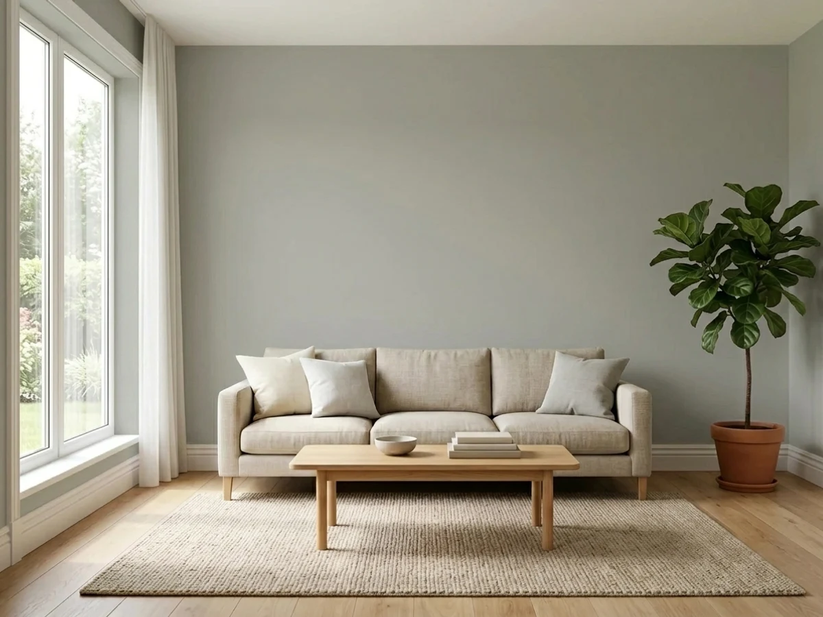
 1
1PigeonNo. 25 · LRV 34
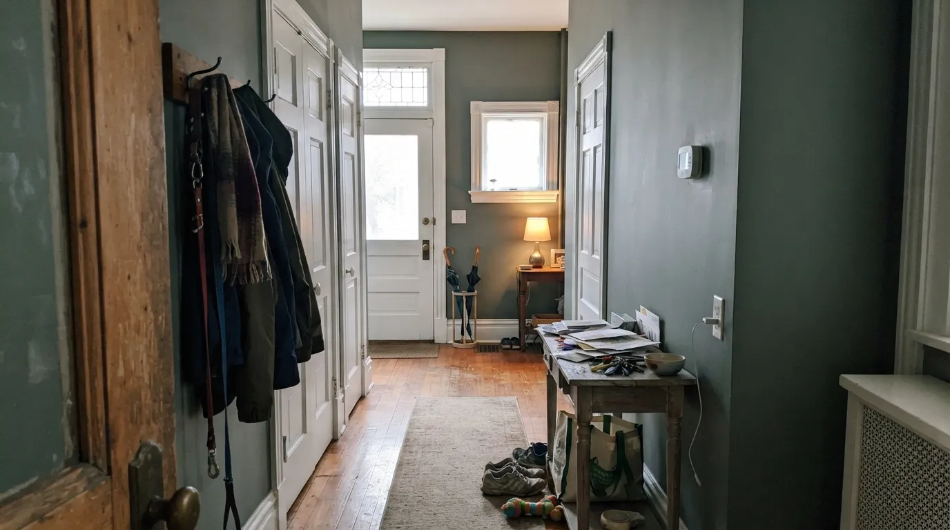
Mid blue-green-gray; F&B's signature kitchen-island and built-in color.
10 curated grays with undertones, LRV, and the honest reasons why, plus the full 34-color gray deck below.
Don't want to compare 34 grays? These four cover most real projects.
Pale F&B blue; the brand's most-cited bedroom and bathroom soft blue
Mid blue-green-gray; F&B's signature kitchen-island and built-in color
The light warm-neutral that anchors most F&B trim/wall pairings
F&B's softer alternative to Pitch Black; the editorial near-black for trim
Numbered and curated. Tap any color for its full review, or see it on your own walls in the visualizer.
1Mid blue-green-gray; F&B's signature kitchen-island and built-in color.
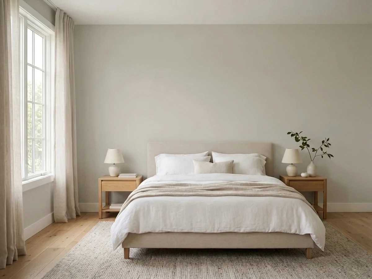 2
2The light warm-neutral that anchors most F&B trim/wall pairings.
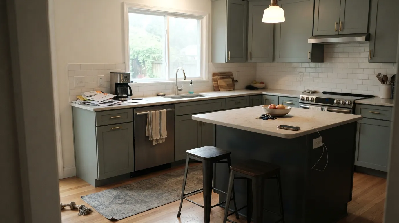 3
3Soft blue-green-gray; F&B's quiet alternative to Inchyra Blue.
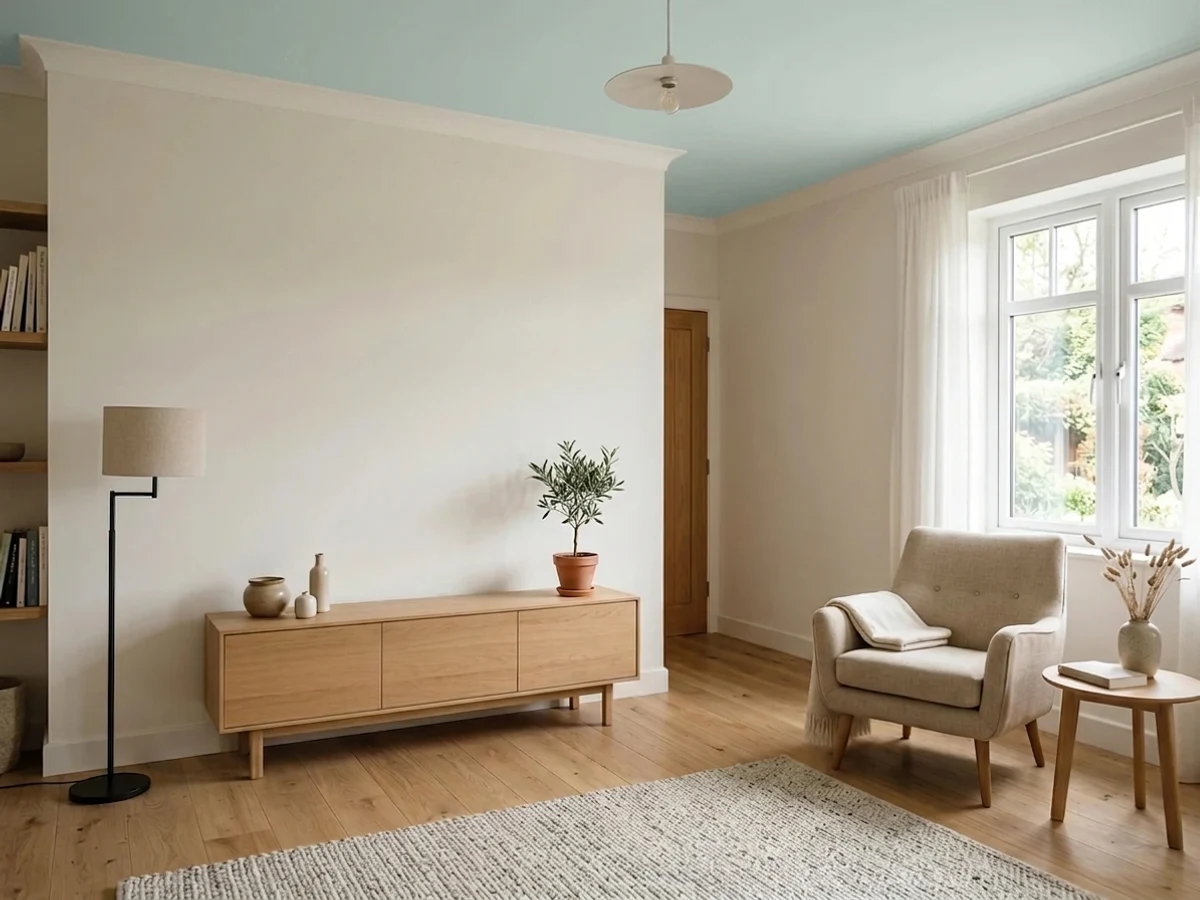 4
4Pale F&B blue; the brand's most-cited bedroom and bathroom soft blue.
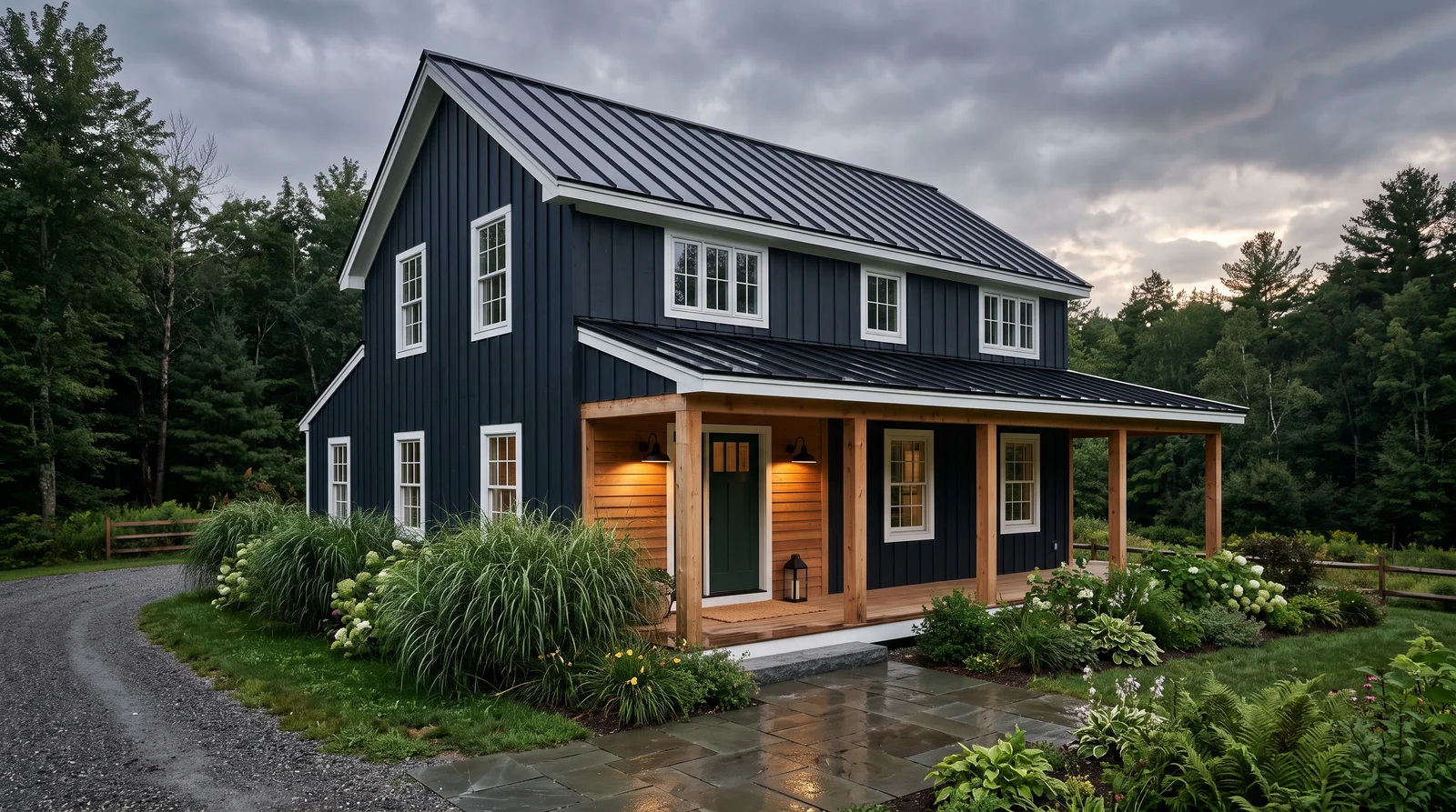 5
5Black-blue F&B pushes for front doors and external woodwork.
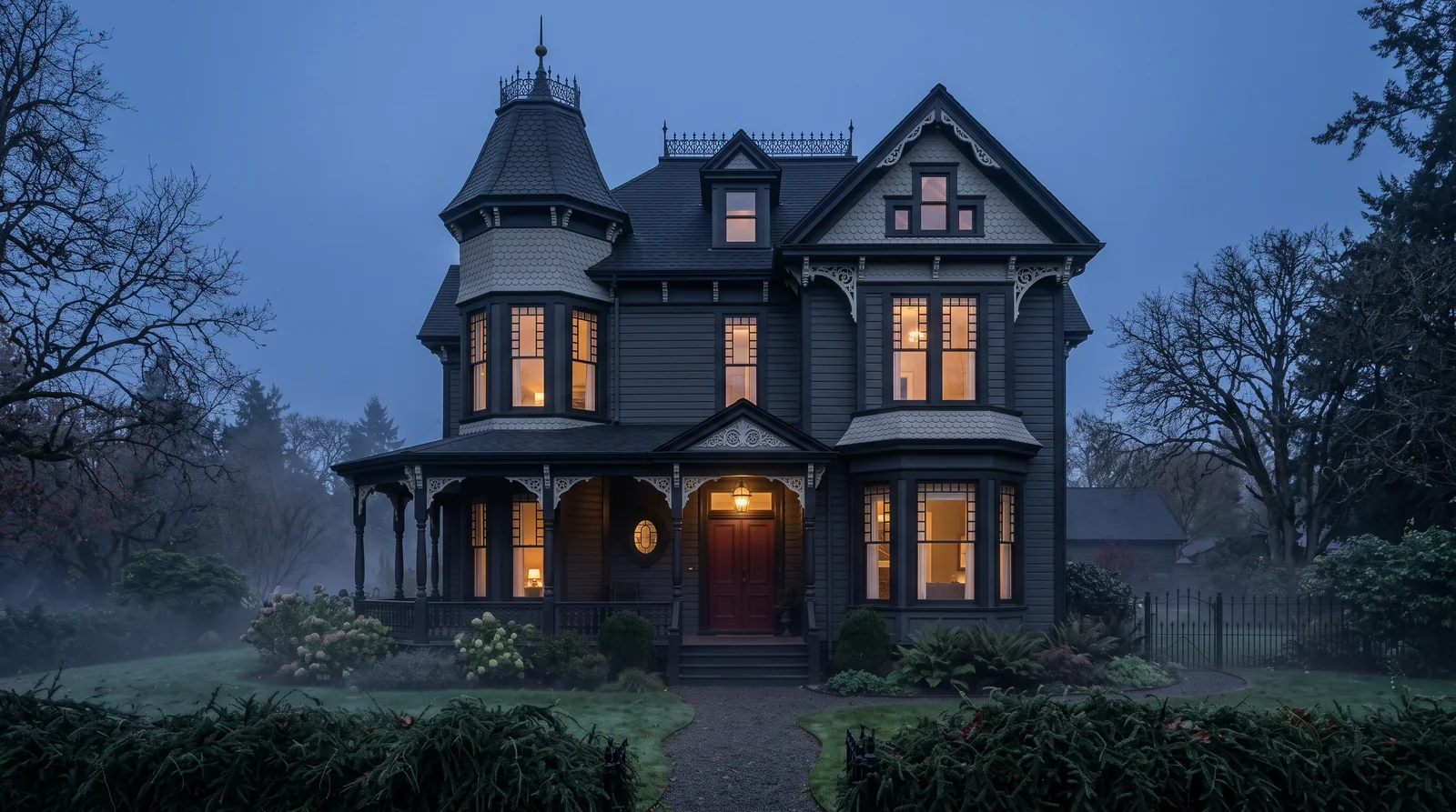 6
6The cult charcoal-gray that made F&B famous in US design press.
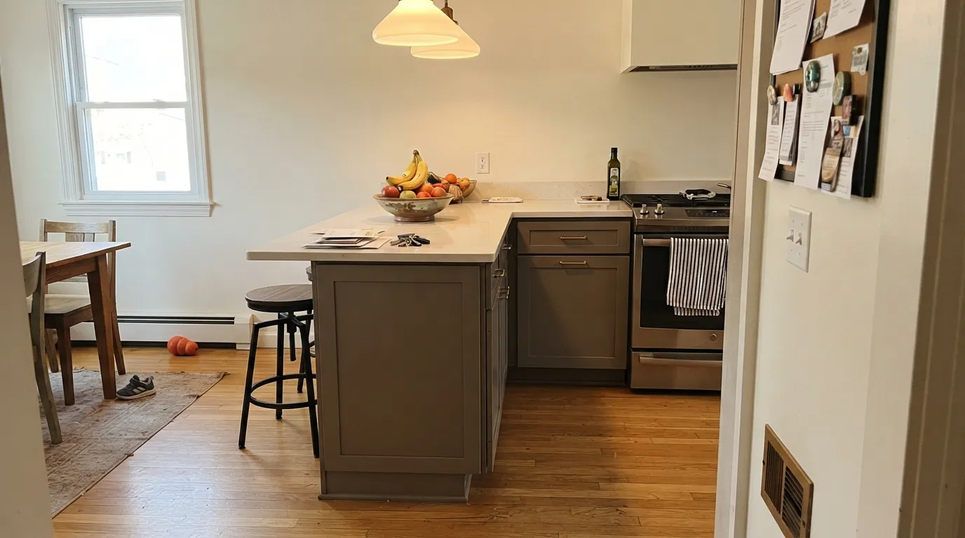 7
7The mid-charcoal F&B markets opposite SW Peppercorn.
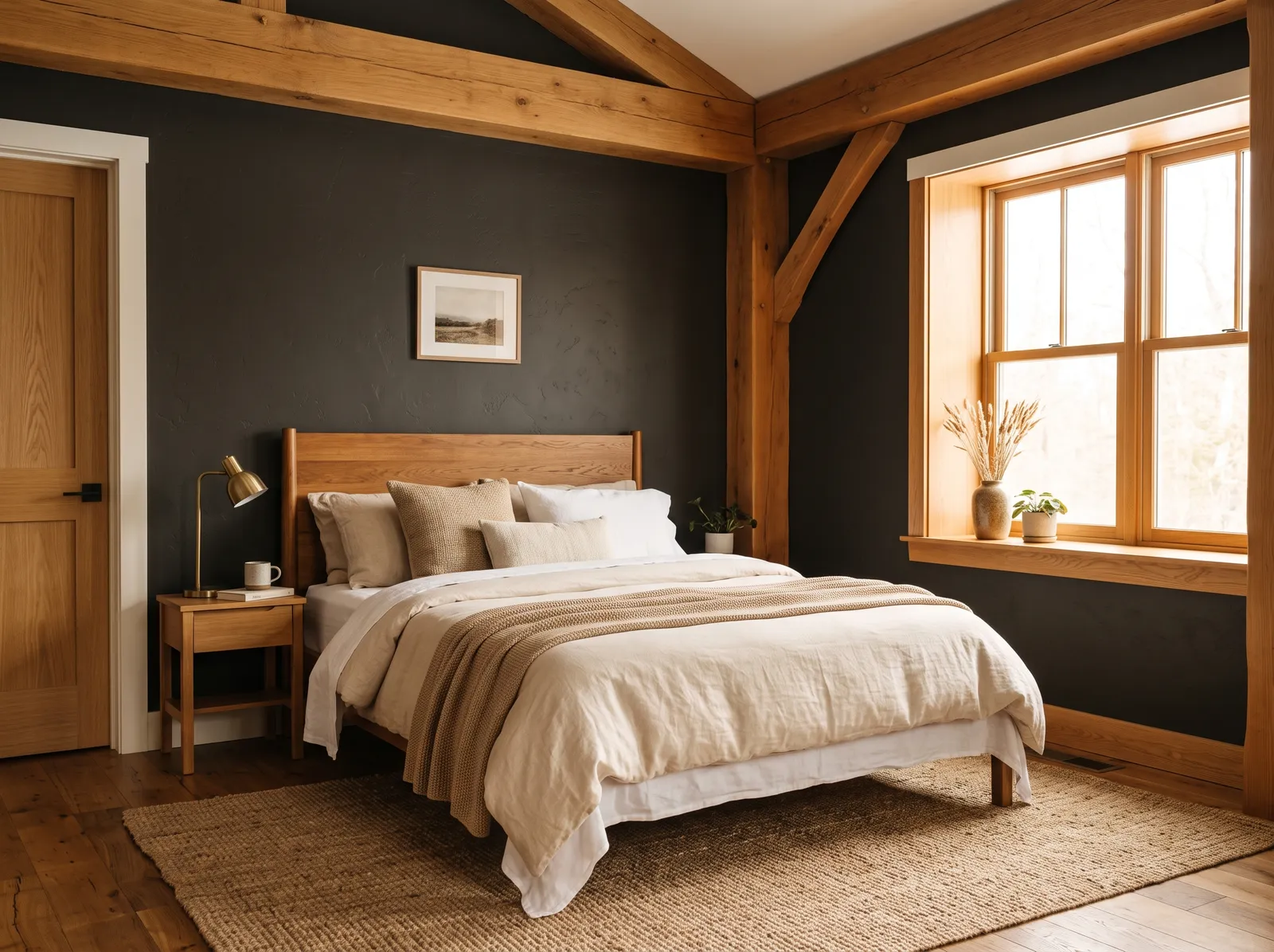 8
8F&B's softer alternative to Pitch Black; the editorial near-black for trim.
 9
9Deep cool gray; F&B's Down Pipe alternative with a softer cast.
The most common gray-buyer regret is a surprise undertone on the wall. Start from the direction the color leans, not the chip alone.
Farrow & Ball grays are rarely a flat, neutral gray. They carry quiet undertones that pull the color toward green, blue, or a soft warm putty depending on the light. You see this in names like Teresa's Green (No. 236) and Lichen (No. 19), which read as gentle gray-greens, and Parma Gray (No. 27) and Oval Room Blue (No. 85), which lean blue. Even the near-whites like Blackened (No. 2011) sit on the cool side of gray rather than going stark.
This is the trade-off with this brand. The high pigment depth means the colors shift through the day, looking calm and gray in soft light and showing their undertone in bright sun. If you want a gray that never moves, this brand is not it. If you want a gray with a bit of life, this slice of 21 colors is built for that.
The whole Farrow & Ball gray range by depth. LRV is the number to trust: the same gray looks two steps darker on a wall than on a chip.
LRV is the light reflectance value. It runs from 0 (black) to 100 (pure white), and it tells you how light or dark a color will feel on the wall. This gray slice runs from 6 at the darkest to 71 at the lightest, so you can go from an airy near-white down to a deep, almost-black gray.
For bright, open rooms the high end works well. Blackened (No. 2011) at LRV 71 and Borrowed Light (No. 235) at LRV 70 keep walls light and cool. The mid-range, like Parma Gray (No. 27) at 51 or Worsted (No. 284) at 63, gives you color you can read without dimming the room. The deep end, like Card Room Green (No. 79) at 27 and the darkest colors near LRV 6, is for drama, accent walls, and rooms where you want a cocooning feel rather than brightness.
Stuck between two? These head-to-heads settle the ones people actually can't pick between.
Each room page shows gray picks from every US brand side by side, so you can compare in context.
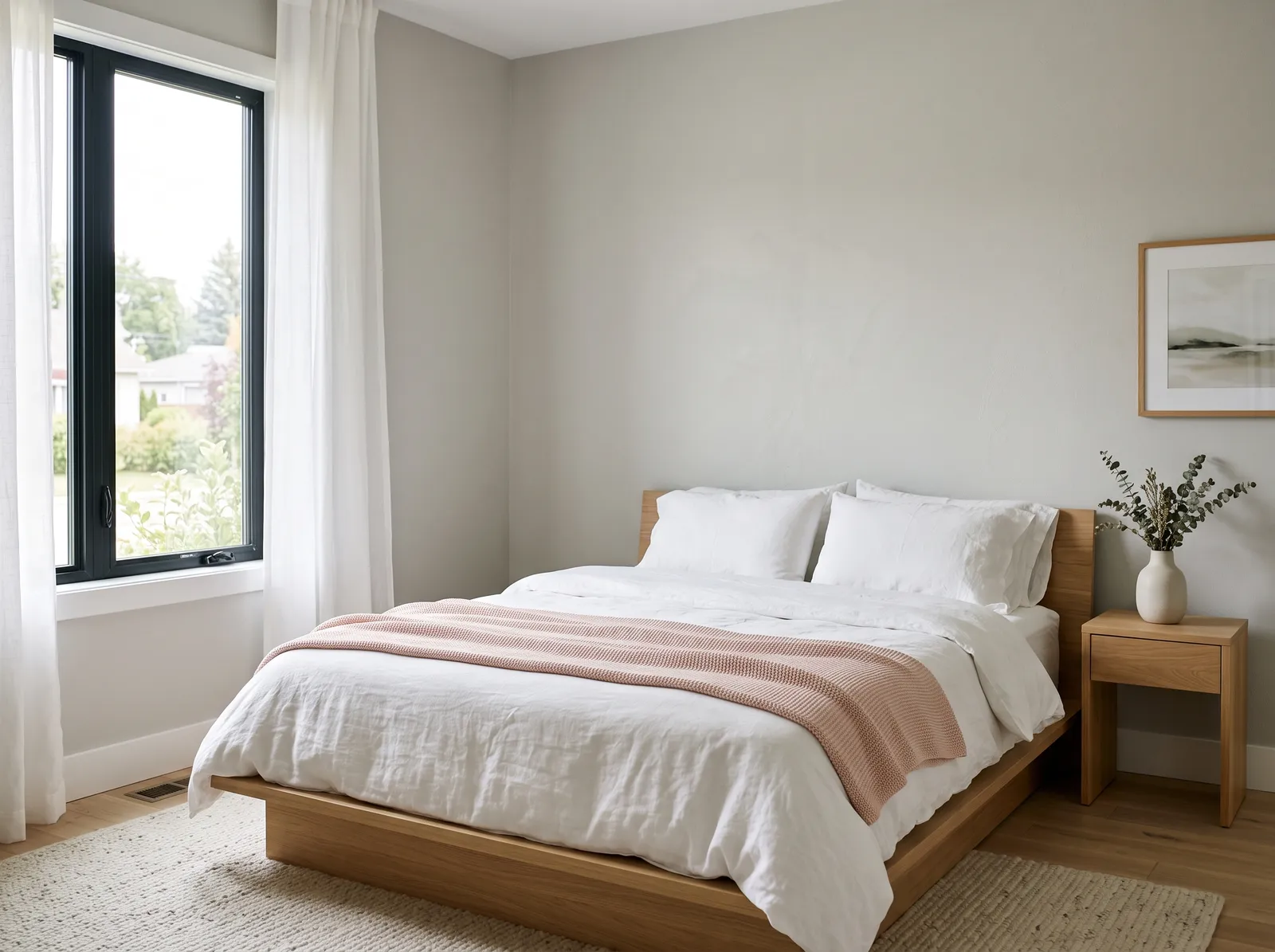
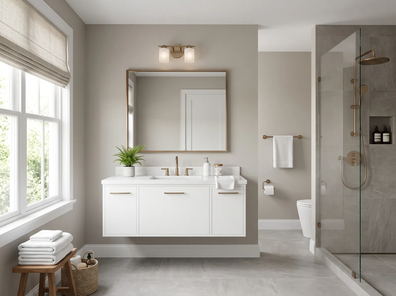
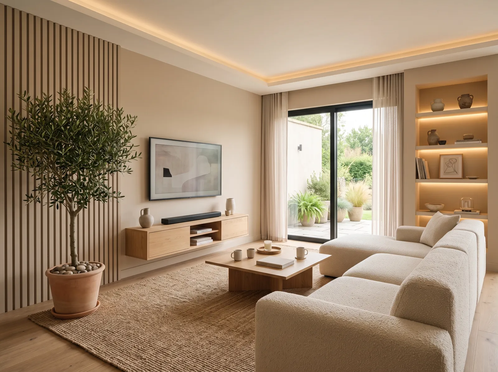
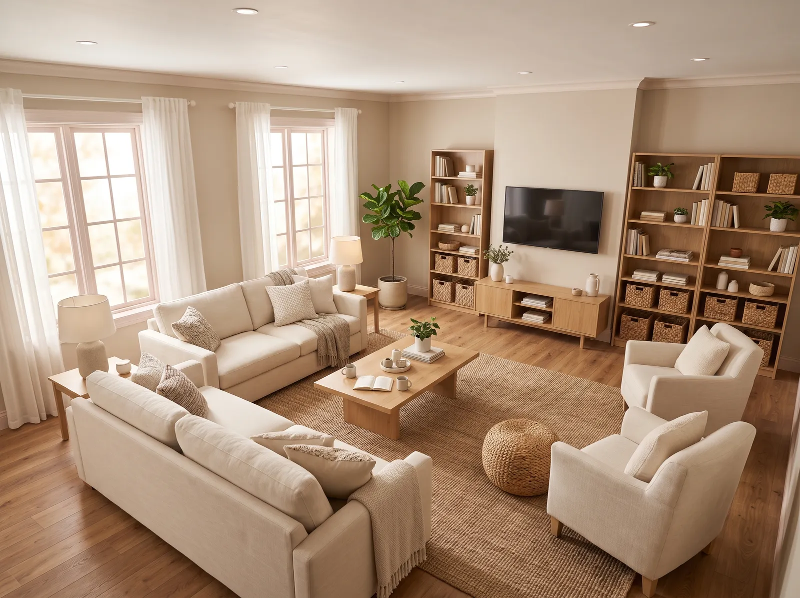
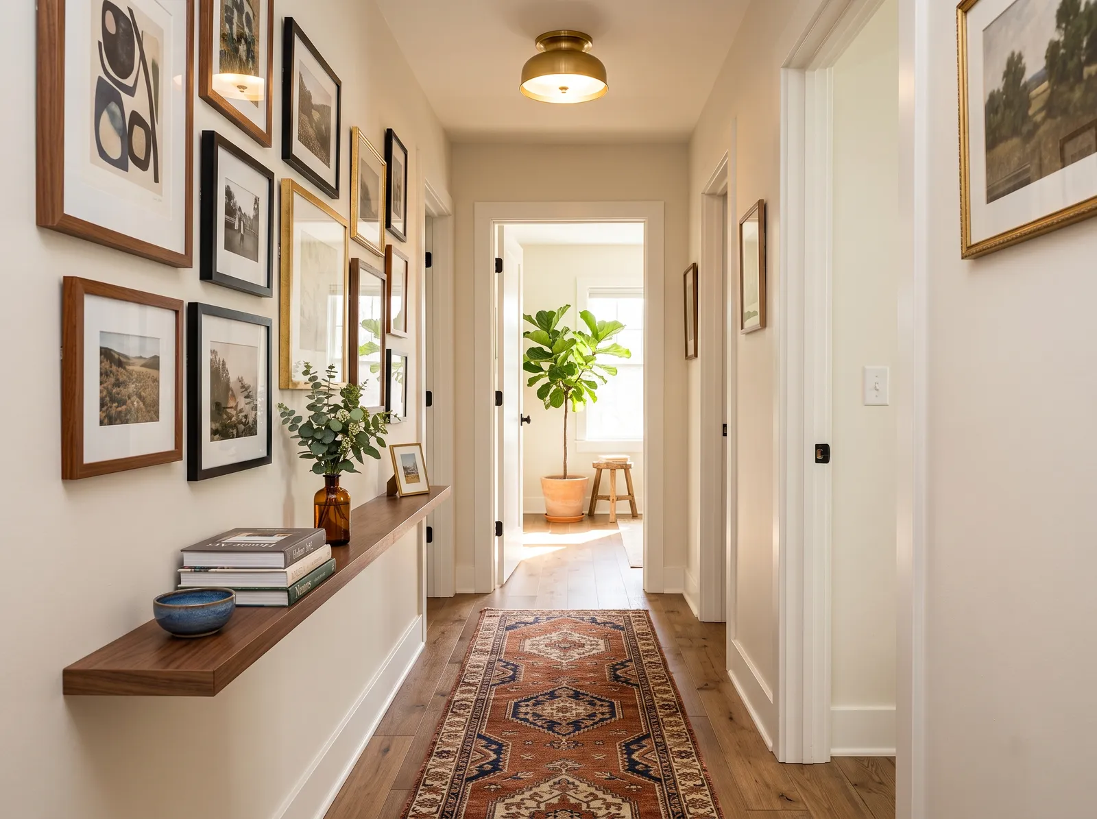
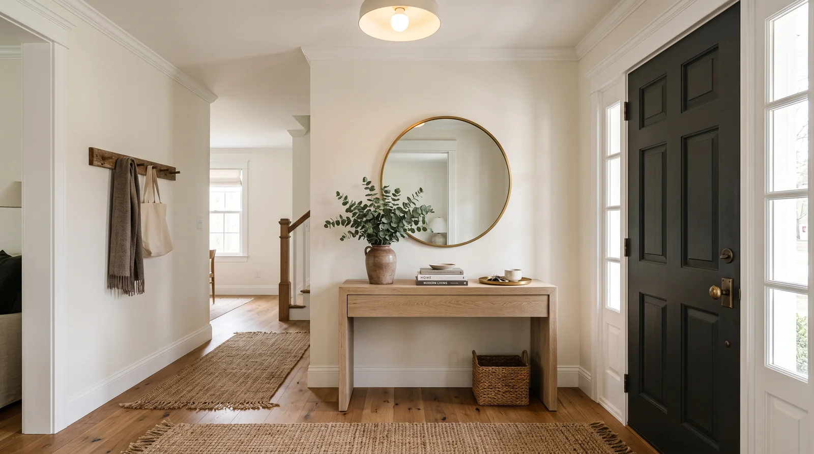
The light grays in this slice are easy living-room and bedroom colors. Borrowed Light (No. 235) and Blackened (No. 2011) keep a north-facing room from feeling cold while still reading as a clean gray. They also work as a quiet whole-house base coat that lets furniture and art stand out.
The mid and deep colors earn their keep in rooms where you want mood. Parma Gray (No. 27) and Oval Room Blue (No. 85) suit dining rooms, studies, and entries. The darkest grays and Card Room Green (No. 79) are strong picks for a library, a powder room, or a feature wall. Match the finish to the job: Estate Emulsion for a chalky matt wall, Modern Emulsion where you need a washable surface, and Estate or Modern Eggshell for trim, doors, and metal.
Every Farrow & Ball gray, grouped by undertone, warm to cool. Filter by depth or change the order.
Hex values are display approximations from Farrow & Ball's published swatch tools, not a physical sample under controlled lighting. Order a brand-direct sample before specifying.
Upload a photo of the room. We paint it in the gray you chose with your light and your floor, and you can swap colors until one holds.
Farrow & Ball is a British premium import. You buy it through the brand's own showrooms and authorized stockists, and it runs around $100 or more per gallon, roughly two to three times mainstream paint. There is no off-the-shelf gray gallon: the color is mixed to order from the curated deck of about 132 numbered colors, so always buy a sample pot and test it on your own wall before committing.
If the price or availability is a problem, the exact color values can be cross-matched. Any well-stocked US paint store can color-match a Farrow & Ball gray into another brand's base, and you can do the reverse too. The featured Kompozit deck can be matched to these same gray targets, which lets you keep the look while choosing a more available or affordable can. Just know that a cross-match copies the color, not the finish or the way Farrow & Ball's pigments shift in the light, so test the match in your room before you paint the whole space.
How many gray colors each brand carries, drawn with that deck's own grays from light to dark. Pick your store first, then the color. Every brand equal, no favorites.
Because these grays carry undertones, pair them with trim that respects the same temperature. The cooler grays like Parma Gray (No. 27) and Oval Room Blue (No. 85) look crisp against a soft off-white trim rather than a bright builder white. For ceilings, a lighter member of the same slice keeps the room cohesive: Blackened (No. 2011) or Borrowed Light (No. 235) over a deeper wall reads calm and intentional.
For coordinating accents, lean into the undertone instead of fighting it. A green-leaning gray like Teresa's Green (No. 236) or Lichen (No. 19) pairs naturally with warm wood and brass. A blue-leaning gray like Oval Room Blue (No. 85) sits well with deeper navies and the brand's well-known darks for a layered, tonal scheme.
Pigeon (No. 25) — Mid blue-green-gray; F&B's signature kitchen-island and built-in color. Borrowed Light and Ammonite and Off-Black round out the short list most people choose from.
Not usually. Most of these grays carry an undertone that pulls toward green, blue, or soft warm putty. Teresa's Green (No. 236) and Lichen (No. 19) lean green, while Parma Gray (No. 27) and Oval Room Blue (No. 85) lean blue. If you want a dead-neutral gray that never shifts, test carefully first.
LRV is light reflectance value, a 0 to 100 scale where higher numbers reflect more light. In this slice it runs from 6 at the darkest to 71 at the lightest. Use the high end, like Blackened (No. 2011) at 71, for bright airy rooms, and the low end for deep, cozy, dramatic spaces.
Farrow & Ball is a British premium import sold through its own showrooms and authorized stockists, and it costs around $100 or more per gallon, roughly two to three times mainstream paint. You pay for high pigment depth and the way the colors shift with the light. Many buyers cross-match the color into a more affordable brand to manage the cost.
Yes. Any well-stocked US paint store can color-match these grays into another brand's base, and you can match them to the featured Kompozit deck as well. A cross-match copies the color but not the original finish or pigment behavior, so always test the matched sample on your own wall.
For walls, Estate Emulsion gives a chalky matt look and Modern Emulsion is the washable option. For trim, doors, and metal, use Estate Eggshell or Modern Eggshell. Dead Flat and Full Gloss are also available for specific effects.
No. Farrow & Ball does not run a Color of the Year and openly rejects the concept. Instead they release new colors and trend predictions each year, so choose your gray based on your room and light rather than a single annual pick.
Ask a Question