CP

Room Colors · Gray Entryway

8 Best Gray Entryway Paint Colors for 2026
ideas, combinations, and real rooms

8 curated picks from real gray entryways — with the exact colors, honest reasons why, and the combinations that hold the room together.

Jessica Williams
Jessica Williams· Color Stylist & Interior Editor

Former interior stylist who can spot a green undertone from across a room. Jessica writes the color and mood pieces — what to choose, what pairs, and why your "white" looks pink.

The Fast Answer

Don't want to read 8 picks? These four are the safe answers.

Kompozit · Slate Minimalist Foyer · LRV 11
Cool slate gray walls paired with warm oak accents create a tailored, serene, and sophisticated entrance.
Behr · Charcoal Accent Hallway · LRV 34
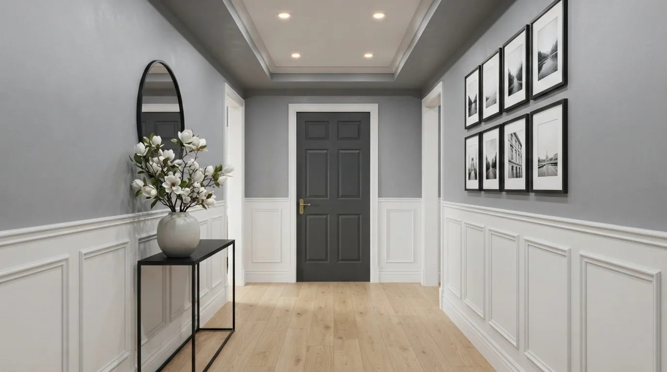
Crisp white wainscoting and cool gray walls frame a dramatic charcoal door for an instantly tailored first impression.
PPG / Glidden · Misty Morning Foyer · LRV 70
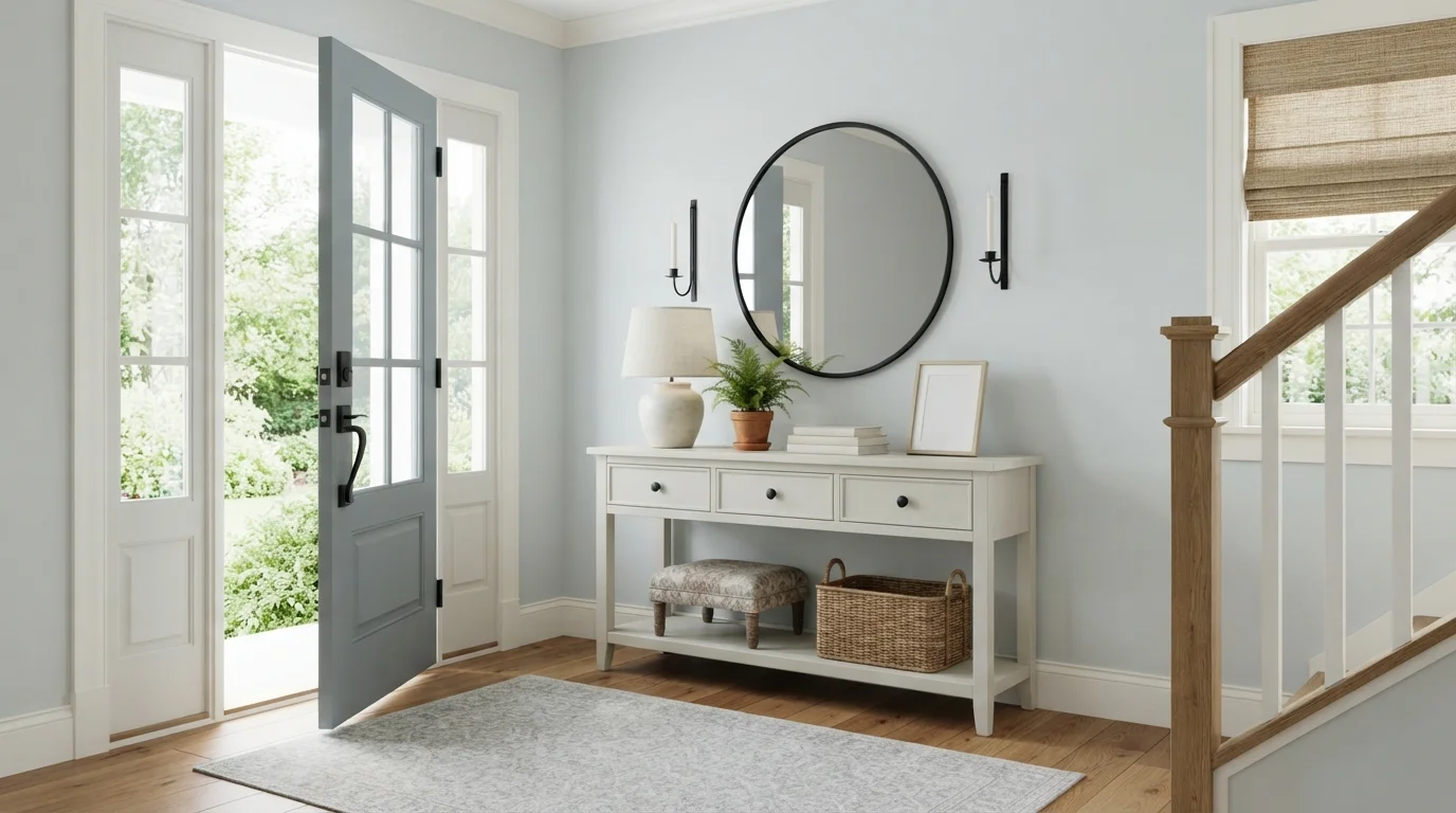
Step into a serene entryway filled with cool misty walls, soft slate woodwork, and sunny honey-toned wood floors.
Glidden · Tailored Slate Gallery · LRV 25
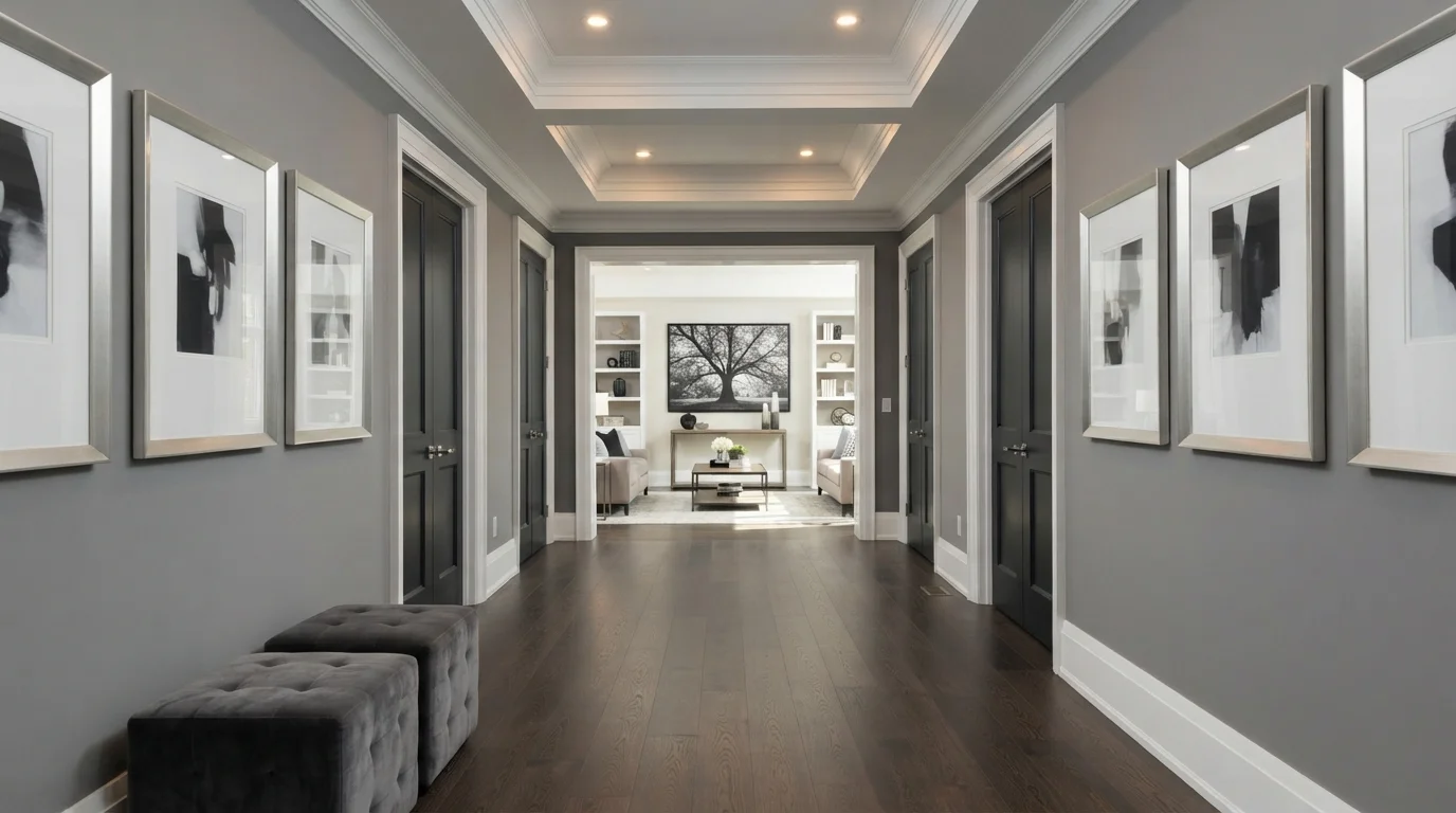
Cool slate-gray walls meet dark hardwood and crisp white trim for a sleek, gallery-inspired hallway.
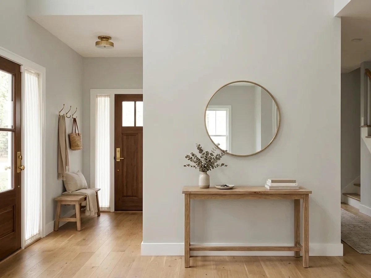
Room painted in Repose Gray
Repose Gray
Try it in your room →
Top picks · see them in a room

Top Picks for the Gray Entryway

Tap a shade to see the gray entryway in it, then try it on your own room.

Repose Gray
Sherwin-Williams

It instantly makes your entryway feel bright, welcoming, and open to guests.

SEE IT IN YOUR ROOM →

Gray Entryway Color Trends 2026 — What's In, What's Out

On the Way Out
  • Icy Blue-Gray EverythingFlat, cool-toned gray that can feel sterile at a front door is losing ground to warmer, more welcoming gray tones.
  • Matching Gray Walls And Cool Chrome FixturesCool gray walls paired with chrome light fixtures read dated next to 2026's warmer brass and matte black hardware.
  • Pale Gray With No ContrastA single pale gray with no darker trim or door contrast feels flat compared to today's more layered entryway color schemes.

The 8 Best Gray Entryway Paint Colors

Every pick below is a real rendered gray entryway, not a chip. The lead color first; the swatches are the full scheme in the photo — walls, furniture, textiles, accent.

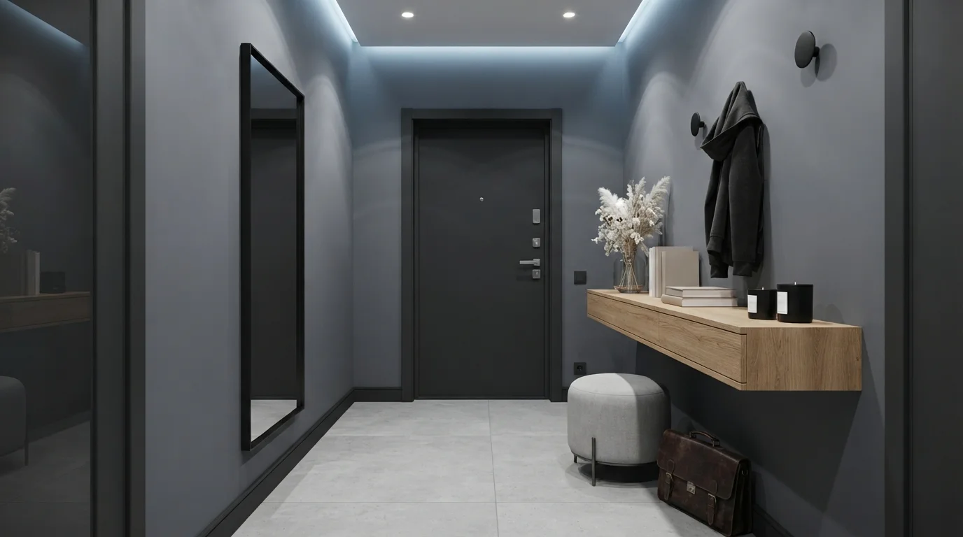
Slate Minimalist Foyer — gray entryway painted in Thunderstorm
1ThunderstormKompozit · Slate Minimalist Foyer

Cool slate gray walls paired with warm oak accents create a tailored, serene, and sophisticated entrance.

Slate gray is a deep, cool-toned charcoal with a quiet edge. In this entryway, that smooth gray covers the walls and pairs with a matching dark door and a soft light-gray ottoman. The space feels refined, quiet, and wonderfully modern. This combination works because the pale stone floor and natural wood console balance out the deeper wall tones, keeping the compact hall from feeling too dark. It is perfect for anyone who loves crisp, clutter-free style with a moody hotel-like finish.

Walls · Kompozit
Trim · Benjamin Moore
Desk · Dunn-Edwards
Chair · Behr
Ceiling · Behr
SEE THUNDERSTORM ON YOUR WALLS →
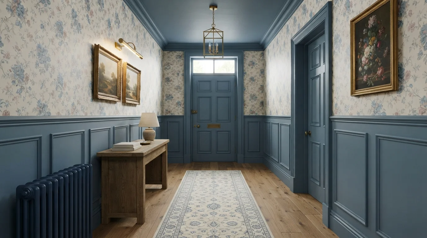
Charcoal Accent Hallway — gray entryway painted in Smokey Lilac
2Smokey LilacBehr · Charcoal Accent Hallway

Crisp white wainscoting and cool gray walls frame a dramatic charcoal door for an instantly tailored first impression.

Cool gray is a calm, balanced neutral that brings instant polish to any space. In this hallway, upper gray walls sit above crisp white box wainscoting, anchored by a deep charcoal interior door and a slim black console table. The room feels graceful, serene, and beautifully structured. The pairing works effortlessly because bright white moldings give the soft gray walls clean definition while the dark door adds grounding contrast. It is perfect for anyone wanting a sophisticated, timeless entryway that feels both tailored and inviting.

Walls · Behr
Trim · Dunn-Edwards
Accent · Behr
Ceiling · PPG / Glidden
Table · Kompozit
SEE SMOKEY LILAC ON YOUR WALLS →
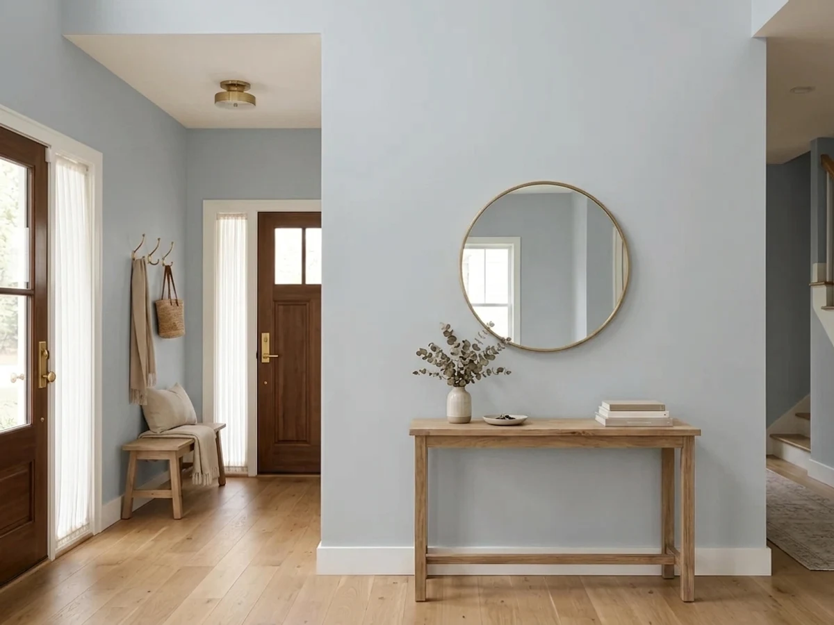
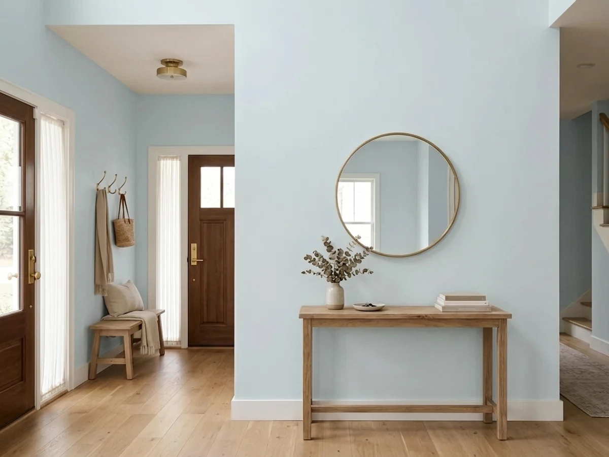
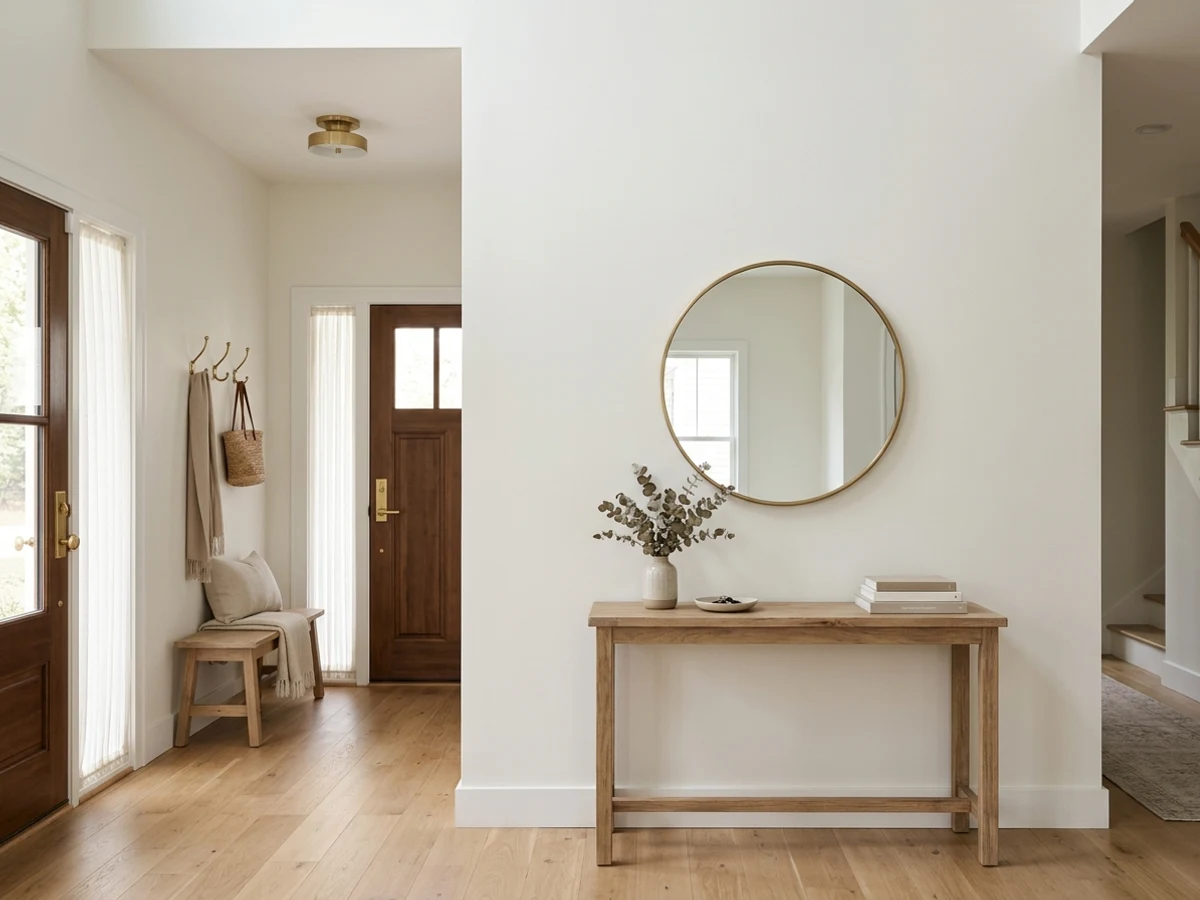
Misty Morning Foyer — gray entryway painted in Sea Frost
3Sea FrostPPG / Glidden · Misty Morning Foyer

Step into a serene entryway filled with cool misty walls, soft slate woodwork, and sunny honey-toned wood floors.

Misty grey is a soft, pale neutral with a whisper of cool calm. In this entryway, delicate light grey coats the walls, perfectly framing a slate-grey console table and matching divided-light front door. The space feels instantly peaceful, clean, and collected the moment you step inside. This pairing works because the cool grey tones balance effortlessly against the rich, warm oak floors. It is the perfect look for anyone who loves breezy, timeless transitional style with a quiet touch of elegance.

Walls · PPG / Glidden
Door · Glidden
Trim · Rodda
Accent · C2 Paint
Table · Sherwin-Williams
SEE SEA FROST ON YOUR WALLS →
Tailored Slate Gallery — gray entryway painted in Silversmith Grey
4Silversmith GreyGlidden · Tailored Slate Gallery

Cool slate-gray walls meet dark hardwood and crisp white trim for a sleek, gallery-inspired hallway.

Slate gray is a smooth, balanced medium gray with a modern edge. In this hallway, cool gray coats the walls while bright white trim frames the cased openings and deep charcoal defines the interior doors. The space feels polished, serene, and delightfully structured. The combo works because the sharp white molding and rich dark wood floors create strong contrast that keeps the gray walls feeling crisp and intentional. It is an ideal look for anyone wanting an upscale, contemporary entry that feels like a private art gallery.

Walls · Glidden
Trim · Dunn-Edwards
Accent · Valspar
Doors · Valspar
Floor · Behr
SEE IT ON YOUR WALLS →
Minimalist Modern Entry — gray entryway painted in Burnt Ember
5Burnt EmberBenjamin Moore · Minimalist Modern Entry

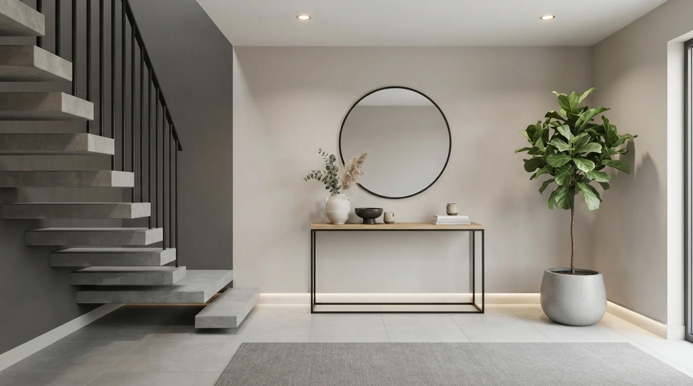
Soft recessed lighting and rich charcoal tones create a quiet, modern entryway that feels instantly grounding.

Deep taupe is a muted, earthy gray with a hint of warm brown. In this entryway, that rich taupe anchors the main focal wall behind the slim black console table, while pale greige coats the surrounding walls and staircase. The room feels incredibly serene, tidy, and sophisticated. The combo works because the deep wall contrasts crisp black metal frames and lush green leaves without overwhelming the space. It is perfect for anyone who loves sleek, uncluttered modern design with a warm, welcoming vibe.

Walls · Benjamin Moore
Walls · Clare
Rug · C2 Paint
Plant · Glidden
Table · Behr
SEE BURNT EMBER ON YOUR WALLS →
Moody Charcoal Entryway — gray entryway painted in Ambler Slate
6Ambler SlateBenjamin Moore · Moody Charcoal Entryway

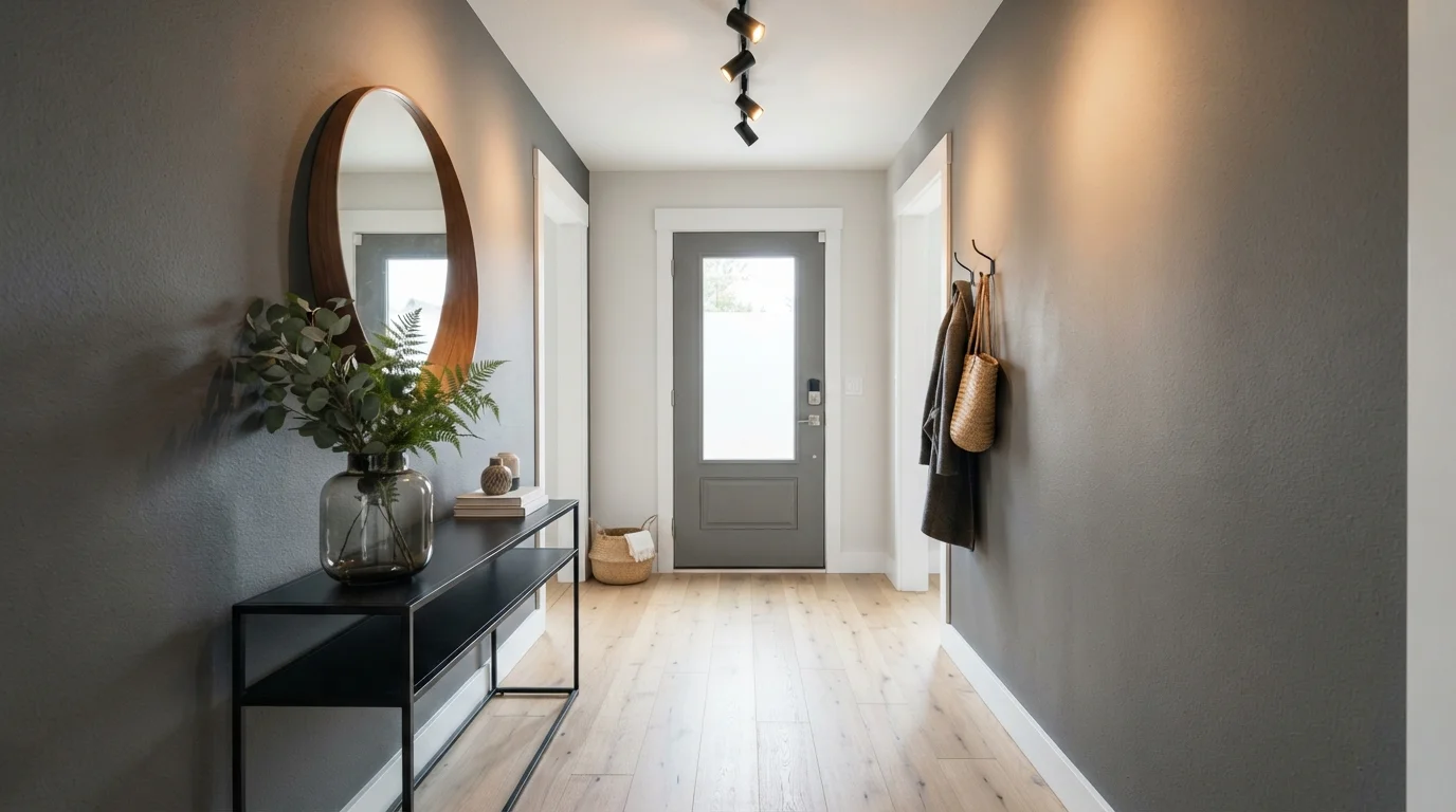
Deep charcoal textured walls pair with crisp white trim and pale wood floors for a calm, sophisticated entrance.

Charcoal is a deep, velvety dark gray with a sophisticated modern edge. In this entryway, cloudy slate-colored walls wrap the hall, sharply framed by crisp white baseboards and door moldings. A slender black console table and warm round wood mirror sit over pale blonde wood flooring. The space feels quiet, sleek, and dramatically welcoming. The sharp contrast between deep dark walls and bright white trim keeps the narrow hallway feeling open and structured. It is a fantastic choice for modern design lovers.

Walls · Benjamin Moore
Trim · C2 Paint
Ceiling · Behr
Floor · Sherwin-Williams
Table · Valspar
SEE AMBLER SLATE ON YOUR WALLS →
Moody Slate Entryway — gray entryway painted in Improbable
7ImprobableGlidden · Moody Slate Entryway

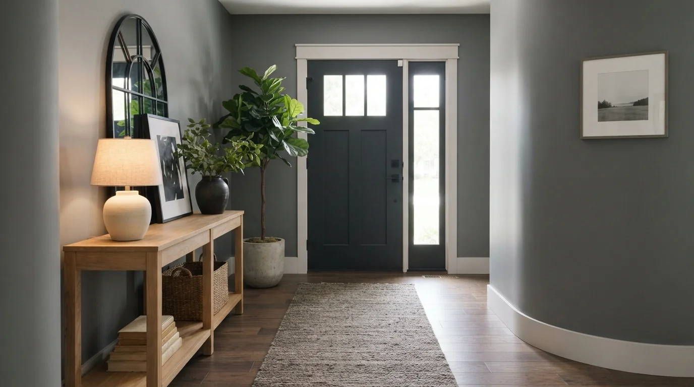
Soft lamp glow and rich gray walls welcome you home into a quiet, deeply grounding entryway.

Slate gray is a rich, smoky neutral with an understated presence. In this entryway, cool gray covers the walls, contrasted by bright white door casing and baseboards. A black front door anchors the far end, while the light wood console table and textured woven runner keep everything grounded. This combination works because the warm wood tones and gentle lamp light balance the deeper wall paint. It is ideal for anyone who wants an intimate, design-forward foyer that feels peaceful from the moment you step inside.

Walls · Glidden
Trim · Sherwin-Williams
Accent · Valspar
Table · Dunn-Edwards
Rug · C2 Paint
SEE IMPROBABLE ON YOUR WALLS →
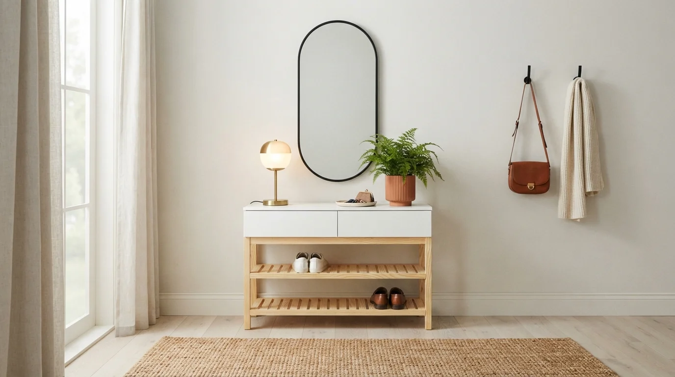
Sleek Greige Entryway — gray entryway painted in Lazy Afternoon
8Lazy AfternoonGlidden · Sleek Greige Entryway

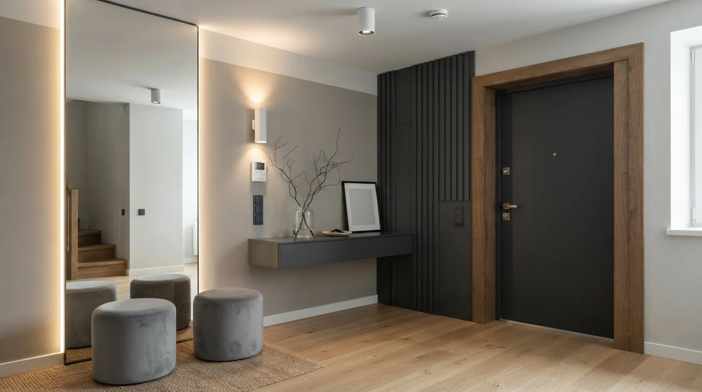
Soft greige walls and glowing linear light create a calm, organized entrance that welcomes you home in style.

Greige is a balanced blend of warm beige and modern grey. In this entryway, soft greige covers the geometric accent walls, paired with a deep charcoal front door, a floating console, and plush grey velvet ottomans. The room feels incredibly calm, tidy, and sophisticated. The combination works because the deep charcoal adds crisp contrast against the soft wall tones while warm lighting keeps everything inviting. It is perfect for anyone who loves minimalist style and wants a polished, clutter-free first impression.

Walls · Glidden
Accent · Benjamin Moore
Walls · Behr
Trim · Benjamin Moore
Chair · Behr
SEE LAZY AFTERNOON ON YOUR WALLS →

Gray Entryway Wall Color Combinations

A wall color never works alone. These are the full schemes from the rooms above — the lead color first, then the supporting colors that make the photo work.

Slate Minimalist Foyer
WallsThunderstormTrimBlack InkDeskTan Plan
Walls
Thunderstorm · · LRV 11
Trim
Black Ink · · LRV 4
Desk
Tan Plan · · LRV 37

Cool slate gray walls paired with warm oak accents create a tailored, serene, and sophisticated entrance.

TRY THIS PALETTE →
Charcoal Accent Hallway
WallsSmokey LilacTrimCrystal BellAccentObsidian Stone
Walls
Smokey Lilac · · LRV 34
Trim
Crystal Bell · · LRV 86
Accent
Obsidian Stone · · LRV 5

Crisp white wainscoting and cool gray walls frame a dramatic charcoal door for an instantly tailored first impression.

TRY THIS PALETTE →
Misty Morning Foyer
WallsSea FrostDoorPachydermTrimTinted or Not?
Walls
Sea Frost · · LRV 70
Door
Pachyderm · · LRV 31
Trim
Tinted or Not? · · LRV 90

Step into a serene entryway filled with cool misty walls, soft slate woodwork, and sunny honey-toned wood floors.

TRY THIS PALETTE →
Tailored Slate Gallery
WallsSilversmith GreyTrimCrystal BellAccentTuxedo
Walls
Silversmith Grey · · LRV 25
Trim
Crystal Bell · · LRV 86
Accent
Tuxedo · · LRV 2

Cool slate-gray walls meet dark hardwood and crisp white trim for a sleek, gallery-inspired hallway.

TRY THIS PALETTE →

Feather Gray is the easiest to build a scheme around: keep trim, doors, and any coat closet millwork in a crisp white semi-gloss, and let a natural or medium-oak console table or floor carry the warmth so the room doesn't go cold. Hinting Blue leans the same direction but reads slightly cooler and blue-grounded — pair it with black hardware and a black front door (seen from inside) for contrast, or with warm wood tones the same way as Feather Gray if you want the blue undertone to stay quiet.

For the dramatic picks, contrast is the whole strategy. Cracked Pepper and Dark Shadows both want bright white trim in semi-gloss so the millwork reads as a hard edge against the wall rather than blending into it, plus brass or matte black hardware depending on whether the rest of the house runs warm or cool metals. Fired Bronze, being warmer and more brown-leaning than true charcoal, pairs naturally with warm wood floors and brass fixtures instead of white-and-black contrast. Pointed Fir's green-gray undertone is the one that wants to be paired with actual wood and plant life nearby — a wood bench or live greenery in the entry reinforces the earthy read instead of fighting it.

More Entryway Color Ideas

Set on a color family already? Each page has its own real rooms and picks.

Light or Dark Gray Entryway Colors?

Go Light (LRV 60+) If…

The room is small, faces north, or has to work at every hour. Light warm colors make it feel bigger and stay calm in evening light — the light you actually live in.

Go Dark (LRV Under 20) If…

You want the cocoon effect and the room has real daylight. Dark works best on one feature wall — or fully color-drenched in a large room with good windows.

Light and dark gray solve two different entryway problems, and the LRV numbers tell you which one you're solving. Hinting Blue at LRV 68 and Feather Gray at LRV 58 both sit in the range that keeps a foyer with one sidelight window or a small transom from feeling like a closet — they reflect enough of what little light comes in that the walls never go flat or gray-on-gray with the shadows. If your entry has no window at all and only borrows light from an adjacent room, stay in this range; a deep gray with nothing to bounce off of will read closer to black than to a designed color.

The darker picks — Cracked Pepper, Dark Shadows, and the warmer Fired Bronze — earn their place differently. Entryways are the one room in the house where designers regularly go dark on purpose, because nobody stands in a foyer for an hour the way they sit in a den; a moody color that would feel oppressive over a couch reads as a confident, jewel-box moment in a room you pass through in ten seconds. That trade only works if the entry gets real light from somewhere — an open sightline to a bright living room, a transom, a glass door panel — so the dark color has something to play against instead of just swallowing the space whole.

VISUALIZE YOUR SPACE

See It. Love It.
Paint It.

Upload one photo of your gray entryway and try every color on this page on your own walls — in your own light, before you buy a drop of paint.

Drag the slider to compare
gray entryway before paintinggray entryway painted in Repose GrayRepose GrayBefore

Where Color Should Stop In A Small Entry

An entryway rarely has four full walls to itself — it's usually an open sightline into a hallway, stairwell, or living room, which means the paint color's edges matter as much as the color itself. Carry a light pick like Feather Gray or Hinting Blue around any inside corner it touches rather than stopping it at an arbitrary doorway; a hard stop mid-wall reads as a patch job, not a design choice.

For the darker picks, the opposite logic applies: contain them. Cracked Pepper or Dark Shadows work as a deliberate statement when they're bounded by an actual architectural line — a doorway, a change in ceiling height, the run of a staircase — because that boundary is what keeps the color feeling chosen rather than accidental. If your entry bleeds directly into an open-concept living area with no natural stopping point, that's a sign to reach for one of the lighter picks instead, since a dark color with nowhere to end will just darken the room it opens into as well.

Coat closet doors are worth deciding on purpose rather than defaulting to trim white. Painting them the same wall color as a light pick keeps a small entry feeling continuous and larger; painting them white against a dark pick like Fired Bronze gives the room a second layer of contrast without adding a second color to shop for.

Sheen Matters More Here Than In Any Other Room

Entryways take more physical abuse than almost any wall in the house — shoulder bags, umbrellas dripping onto baseboards, kids dragging backpacks, wet boots kicked off against the wall. A flat finish that looks perfect on day one will show scuff marks and grime within a season. Run walls in satin or eggshell across all six of these picks; both hold up to a damp cloth without going shiny under hallway light the way a full satin-in-direct-sun living room wall would.

Trim and any door casing should go a step glossier — semi-gloss — regardless of which wall color you land on. That's not just a durability call; the sheen jump between a satin wall and semi-gloss trim is what makes the trim line read crisply, and that crispness is doing real work on the darker picks like Cracked Pepper and Dark Shadows, where a flat, low-contrast trim edge would make the whole room feel like it's closing in rather than framed.

The Mistake That Undoes A Dark Entryway Pick

The most common way a dark gray entryway goes wrong isn't the color itself, it's committing to Cracked Pepper or Dark Shadows in a foyer with no light source at all — no window, no sidelight, no open sightline to a bright room. Design advice that says deep gray makes small, unlit entries feel cave-like is correct: without something for the color to reflect, a near-black wall just reads as an absence of light rather than a design choice. If that's your entry, Feather Gray or Hinting Blue will do the job the dark picks can't.

The second mistake is matching the wrong undertone to existing flooring. Fired Bronze's warmth clashes fast against cool gray porcelain tile or a gray-stained floor; Hinting Blue's cool cast can look muddy over warm honey-toned hardwood. Bring a sample of the actual floor finish when you're comparing chips, not just a photo of it, since undertone mismatches are far easier to catch in person than they are to guess from memory.

About Gray Entryway Paint Colors

Gray works harder in an entryway than almost anywhere else in the house, because it has to do two jobs at once: read as neutral enough to connect to whatever rooms open off it, and still make a first impression before anyone sits down. That's why the picks that read well here split into two clear camps. Hinting Blue (Sherwin-Williams SW 6519, LRV 68) and Feather Gray (Benjamin Moore 2127-60, LRV 58) are both light, high-reflectance grays built to bounce back whatever daylight a foyer gets — Feather Gray in particular is the one to reach for when the entry is tight and boxed in, since a pale, low-saturation gray reads as more square footage than it has.

The other half of the lineup is the entryway's version of a statement coat: Cracked Pepper and Dark Shadows (both Behr) go near-black and charcoal, Fired Bronze (Dunn-Edwards) leans warm and bronzed rather than cool, and Pointed Fir (Hirshfield's) pulls gray toward a muted, earthy green. None of these are safe choices in the way a hallway color needs to be safe — they're chosen because an entryway is a room people pass through, not linger in, so a color that would feel heavy in a living room reads as dramatic and intentional here instead.

What ties the whole page together is that every one of these is a real, mixable paint — you can walk into any Sherwin-Williams, Benjamin Moore, Behr, Dunn-Edwards, or Hirshfield's location (or have Behr and Dunn-Edwards colors cross-matched anywhere else) and get a gallon tinted to spec. The choice isn't between good and bad grays; it's between a foyer that opens up the house behind it and one that closes the front door behind a deliberate, dark first room.

The Questions Everyone Asks

What color should I paint my gray entryway?

If you want one answer, start with the safe picks above — Thunderstorm, Smokey Lilac, Sea Frost, Silversmith Grey. They read well in any light and survive furniture changes. Then check the light: strong afternoon sun wants a step cooler, a north-facing room wants a step warmer.

what color should i paint a gray entryway

For a small or dim entryway, Feather Gray by Benjamin Moore (2127-60, LRV 58) or Hinting Blue by Sherwin-Williams (SW 6519, LRV 68) are the safer picks — both reflect enough light to keep the space feeling open. If your entry gets real daylight from a sidelight, transom, or open sightline to a bright room, a deeper option like Cracked Pepper or Dark Shadows by Behr makes a much stronger first impression.

is dark gray okay for a small entryway

Only if there's a real light source. Deep grays like Cracked Pepper or Dark Shadows absorb light rather than bounce it, and in a small entry with no window that reads as cave-like, not cozy. If your foyer borrows light from an adjacent room or has a transom or sidelight, dark works because guests pass through in seconds rather than sitting in the room — otherwise stay with a higher-LRV pick like Feather Gray.

what color trim goes with gray entryway walls

Bright white semi-gloss is the standard pairing for any of these picks, since the sheen jump from a satin or eggshell wall to semi-gloss trim keeps the edge crisp. On lighter walls like Hinting Blue or Feather Gray, white trim keeps things airy; on darker picks like Cracked Pepper or Fired Bronze, that same white trim is what stops the room from feeling boxed in, giving the eye a clean line to land on.

should the entryway be lighter or darker than the rest of the house

There's no rule that it has to match. Entryways are one of the few rooms designers regularly paint darker than the surrounding house on purpose — a pick like Fired Bronze or Dark Shadows creates a deliberate transition moment precisely because it contrasts with a lighter living room beyond it. If the entry is small and dim with no independent light source, though, lean lighter than the rest of the house instead, using Feather Gray or Hinting Blue to keep it from feeling like a bottleneck.

what paint sheen should i use in an entryway

Satin or eggshell on the walls, semi-gloss on trim and doors. Entryways take more abuse than almost any other room — wet boots, bags, umbrellas — so a wipeable satin or eggshell holds up better than flat paint over a season of use. This applies across all six picks here; the sheen choice doesn't change with the color, only the trim contrast does.

What two-color combination works best in a gray entryway?

The reliable pattern is a quiet main color plus one deep accent on a single wall. Keep trim and ceiling in one warm white so the two colors are the only event in the room — the combination cards above show complete schemes from real rooms.

What colors make a gray entryway look bigger?

High-LRV, slightly warm colors — LRV 60–75 is the sweet spot. Paint the walls and trim close to the same light color so the corners blur, and keep the ceiling white. Stark cool white actually works against you; it creates hard shadows that show the room's edges.

Ask a Question

Jessica Williams

Not sure what's right for your gray entryway?

Ask Jessica below — every question gets a real reply, usually within a day.