Room Colors · Neutral Entryway
8 Best Neutral Entryway Paint Colors for 2026
ideas, combinations, and real rooms
8 curated picks from real neutral entryways — with the exact colors, honest reasons why, and the combinations that hold the room together.

Former interior stylist who can spot a green undertone from across a room. Jessica writes the color and mood pieces — what to choose, what pairs, and why your "white" looks pink.
The Fast Answer
Don't want to read 8 picks? These four are the safe answers.

Top Picks for the Neutral Entryway
Tap a shade to see the neutral entryway in it, then try it on your own room.
Neutral Entryway Color Trends 2026 — What's In, What's Out


- Flat Greige Everything — The cool, in-between greige that filled entryways for years now reads generic next to warmer tans and creams.
- Cool Gray Front Doors With Neutral Walls — Pairing neutral walls with a cool blue-gray front door feels mismatched as entryways shift toward all-warm palettes.
- Beige Paired With Chrome Light Fixtures — Cool chrome fixtures against warm neutral walls clash with 2026's move toward brass and matte black hardware.
The 8 Best Neutral Entryway Paint Colors
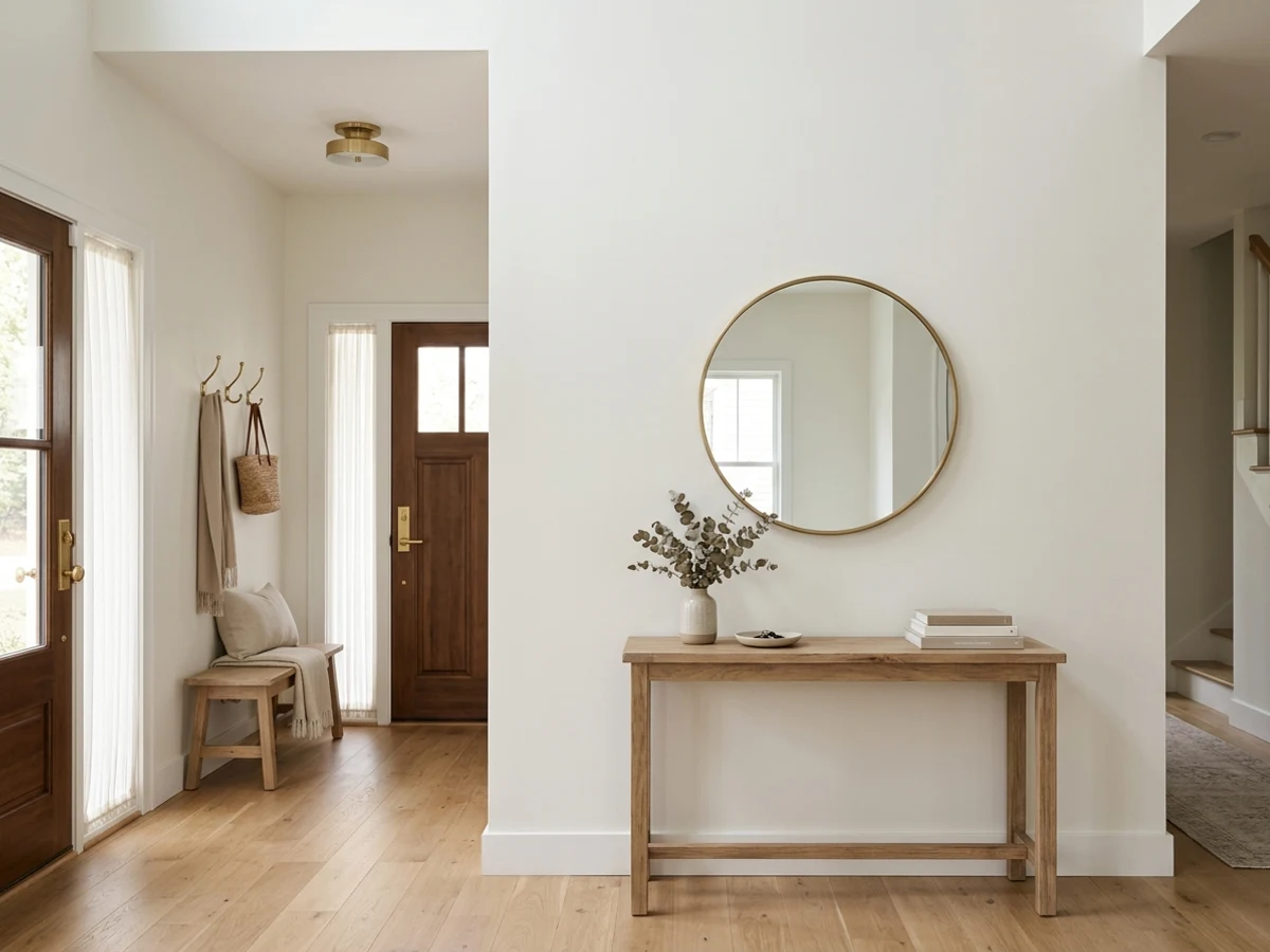
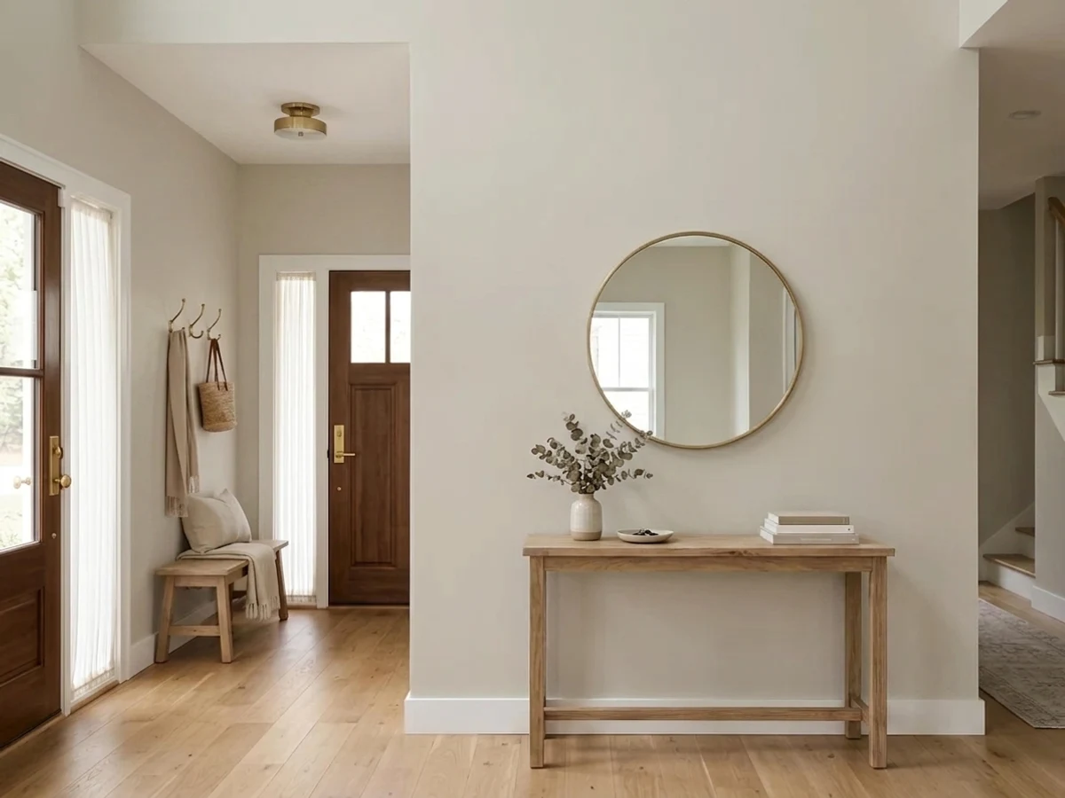
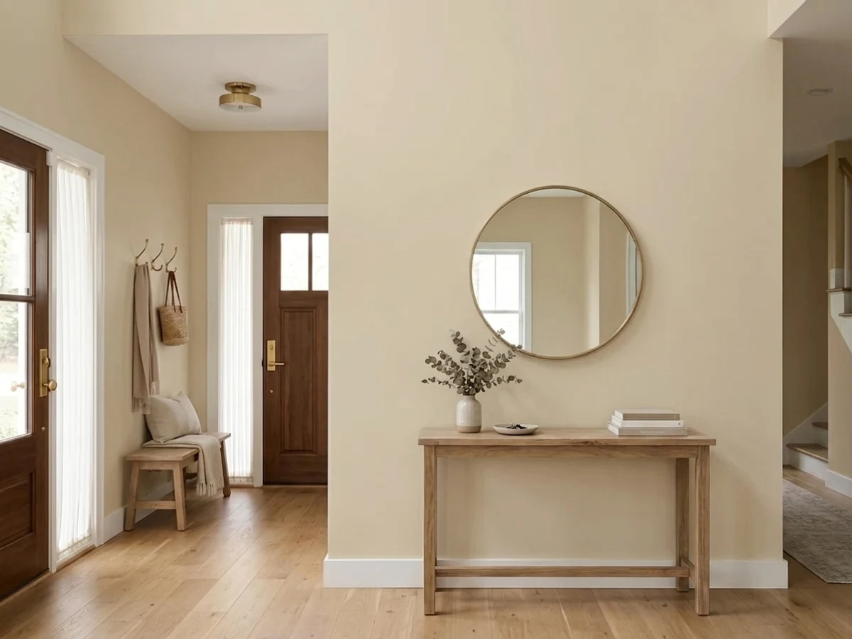
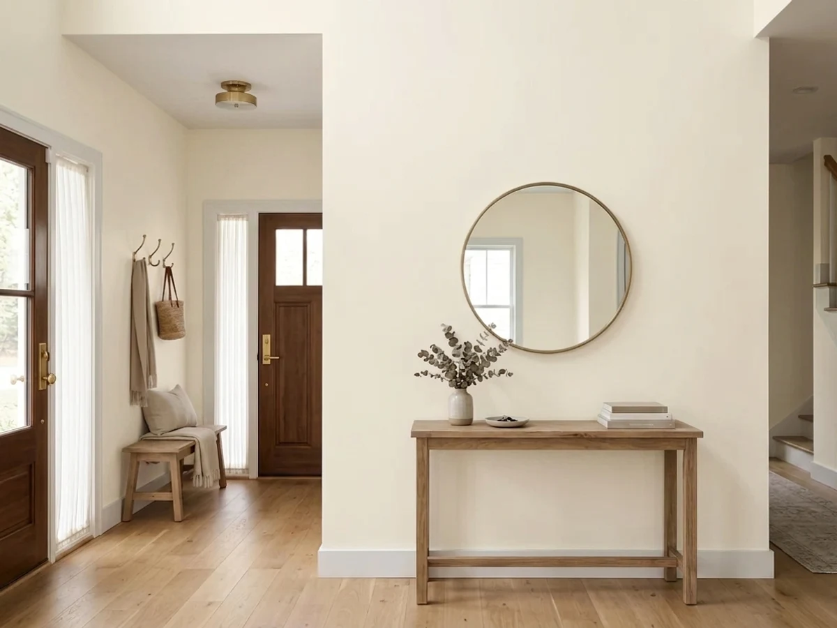
Every pick below is a real rendered neutral entryway, not a chip. The lead color first; the swatches are the full scheme in the photo — walls, furniture, textiles, accent.

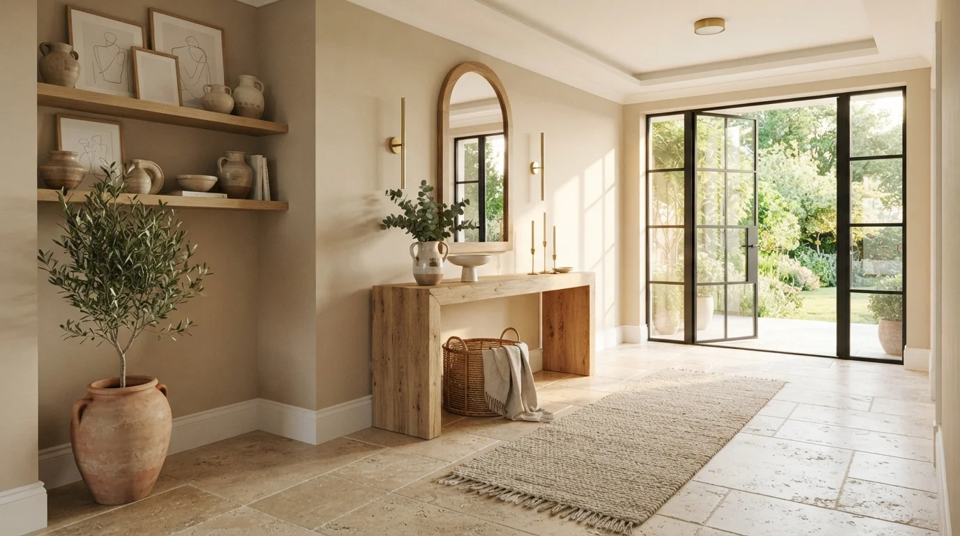
Golden afternoon sunlight warms soft stone walls, earthy wood accents, and breezy glass doors for a tranquil welcome.
Sandstone beige is a creamy, sun-baked neutral with a soft glow. In this entryway, gentle sandy beige covers the walls, creating an open backdrop for a thick oak console table, matching arched mirror, and textured runner rug. The whole room feels grounded, calm, and naturally bright. Pairing warm neutral walls with organic raw wood, clay pots, and stone flooring works because natural materials always fit seamlessly together. It is perfect for anyone wanting a relaxed, nature-inspired entrance.
SEE DESERT SUEDE ON YOUR WALLS →
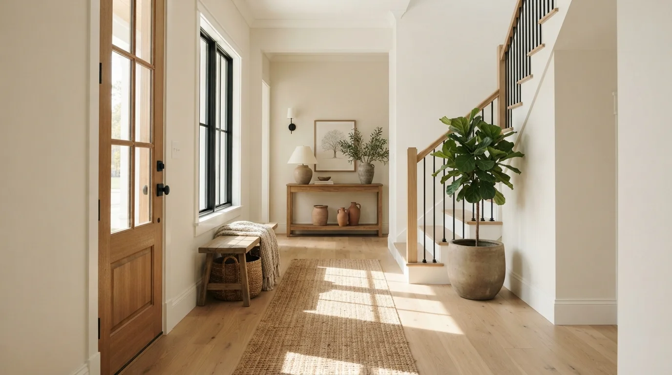
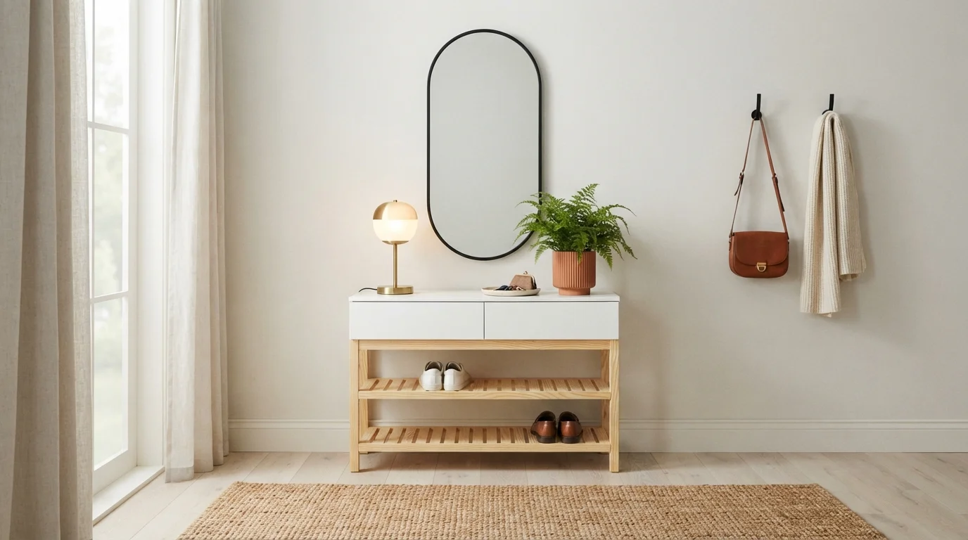
Warm sunlight washes over soft linen walls, textured jute, and leafy greens for an effortlessly welcoming entrance.
Creamy linen is a soft, sun-warmed off-white that feels instantly inviting. In this entryway, it blankets the tall walls, complementing a natural jute runner, light oak furniture, and textured ceramic pottery. The whole space feels peaceful, relaxed, and bathed in golden warmth. Natural wood tones and vibrant leafy branches balance the pale walls, keeping the bright lighting soft rather than stark. It is the perfect welcoming look for anyone who loves an airy, organic vibe right when walking through the front door.
SEE IT ON YOUR WALLS →
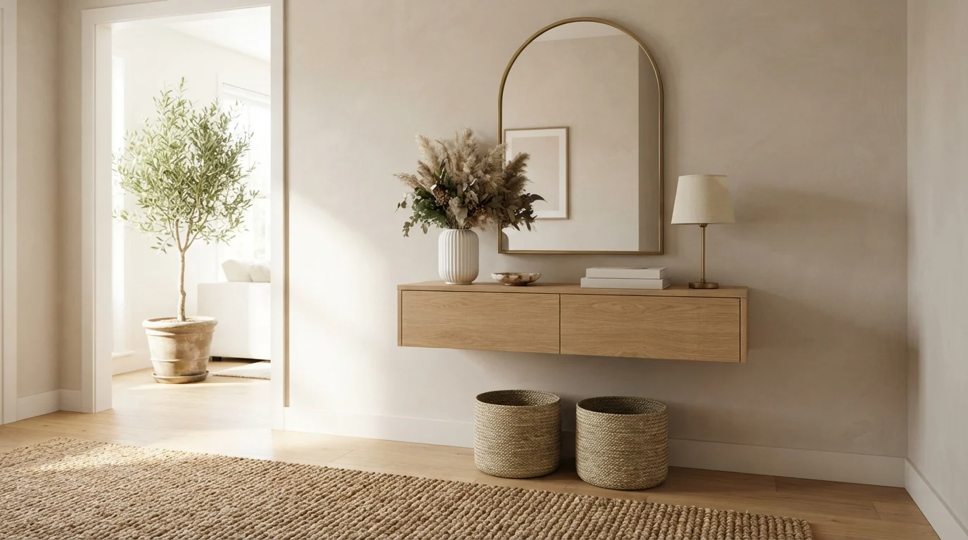
Soft textured beige walls and light natural oak create a soothing, sunlit welcome right at the front door.
Warm sandy beige is a soft, sun-kissed neutral with an earthy character. In this entryway, that creamy shade wraps the textured walls, setting a quiet backdrop for the floating oak console, woven baskets, and brass-trimmed mirror. The space feels calm, uncluttered, and effortlessly inviting from the moment you step inside. This combination works because raw wood tones and woven fibers naturally harmonize with soft sand walls to build rich texture without busy color. It is a fantastic choice for anyone who loves relaxed organic minimalism.
SEE MERINO ON YOUR WALLS →
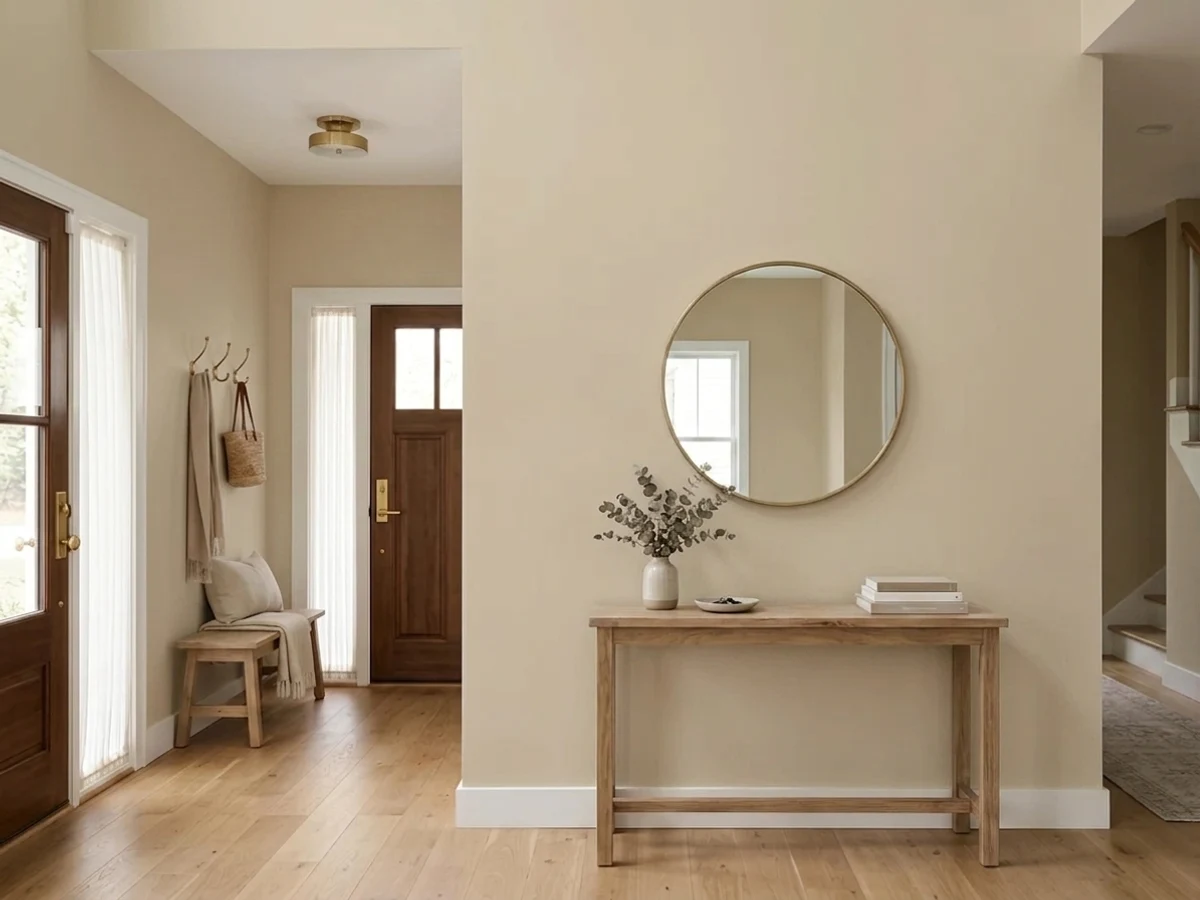
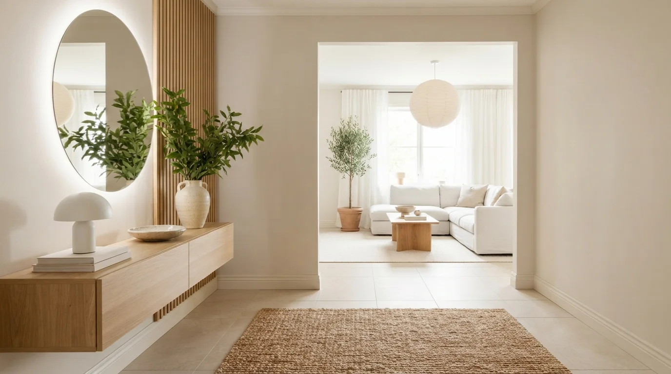
Soft sunlit creamy walls combine with natural blonde oak slats and glowing rounded lights to create a tranquil sanctuary.
Creamy beige is a soft, sun-drenched neutral with gentle warmth. In this space, the walls are painted in a soothing warm cream, paired with crisp off-white baseboards and light oak wood accents. The whole room feels deeply tranquil and inviting from the moment you step inside. This combination works beautifully because the earthy wood tones and glowing ambient lighting bring out the cozy side of the neutral backdrop. It is a wonderful look for anyone who loves Japandi style, clean lines, and peaceful, clutter-free spaces.
SEE WATER CHESTNUT ON YOUR WALLS →
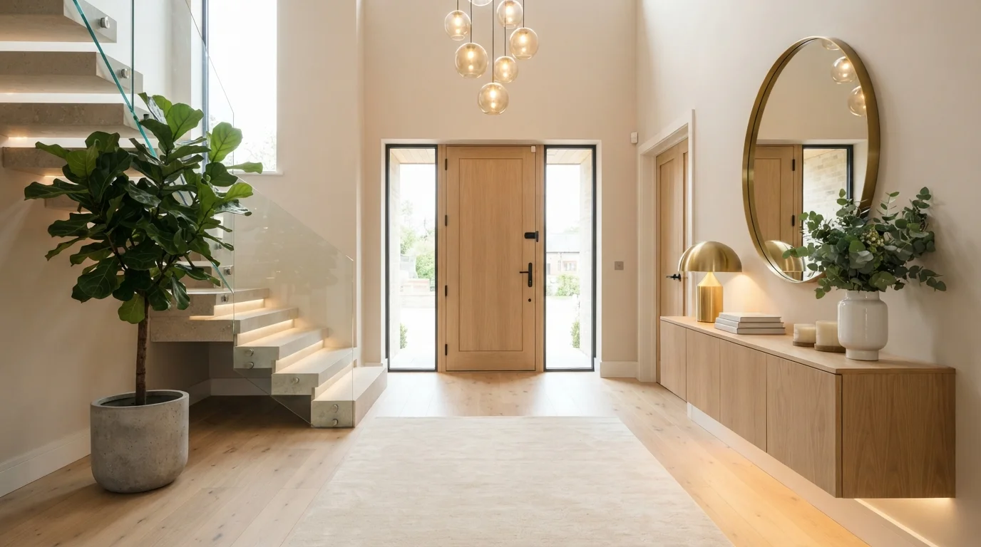
Soft warm lighting and pale oak tones welcome you into a calm, glowing space right at the front door.
Cream is a soft, comforting off-white with gentle warmth. In this entryway, quiet creamy walls create a relaxing backdrop for smooth light oak cabinetry, concrete planters, and a plush ivory area rug. The space feels instantly welcoming, serene, and grounded the moment you walk through the door. The combination works seamlessly because pale neutrals let the warmth of natural wood and soft ambient light take center stage. It is perfect for anyone who loves clean Scandinavian simplicity and cozy modern design.
SEE HAZELNUT CREAM ON YOUR WALLS →
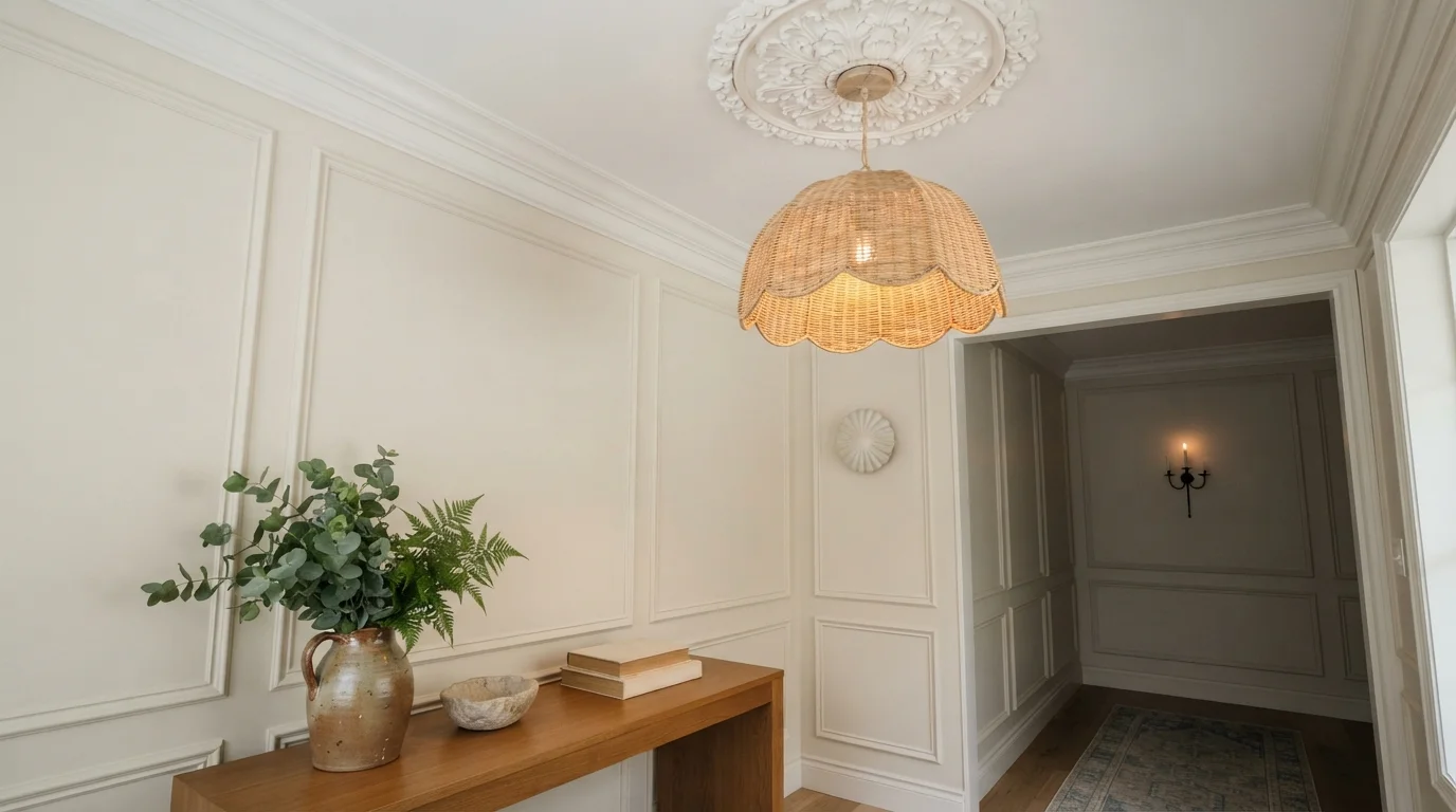
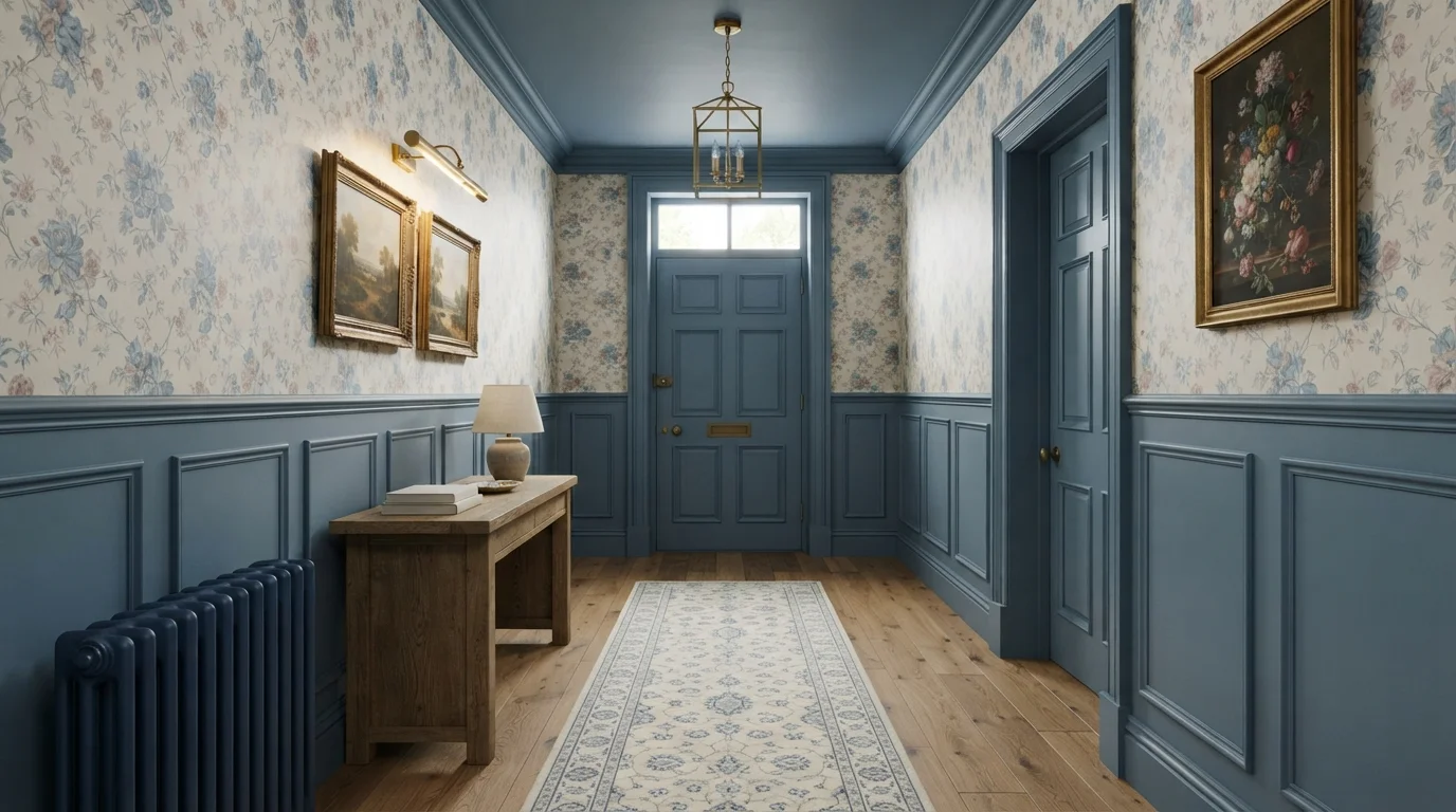
Soft cream walls blend with woven textures and delicate moldings to create an instantly serene, welcoming entryway.
Warm cream is a gentle, buttery off-white with a soft glow. In this space, creamy paint wraps the paneled walls, set off by slightly lighter off-white ceiling trim and plaster molding. A woven wicker light fixture and an earthy ceramic vase filled with greenery anchor the space in natural elements. The room feels completely calm, airy, and welcoming. This pairing works because soft neutrals let tactile organic materials stand out without visual clutter. It is ideal for anyone who wants their home to feel peaceful the moment they walk through the door.
SEE NATURAL WICKER ON YOUR WALLS →
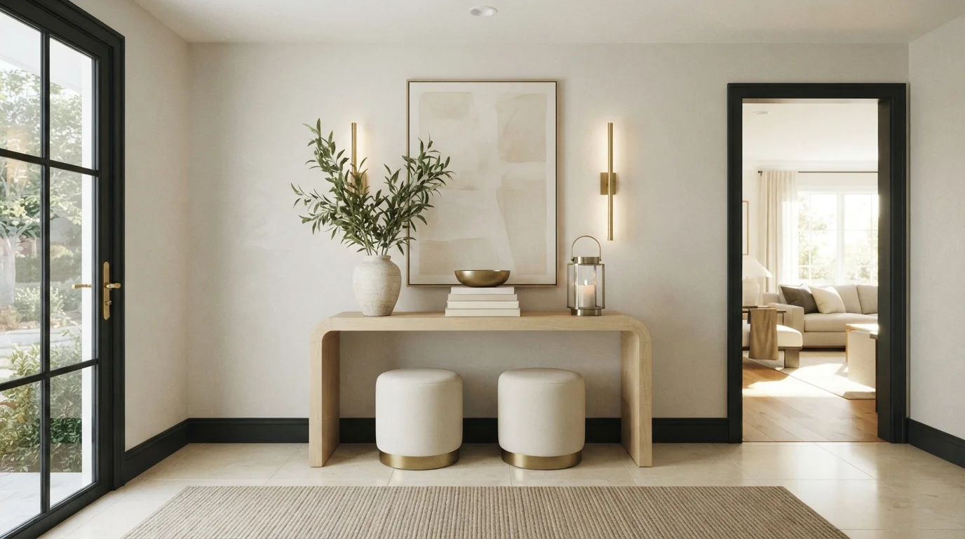
Soft glowing light washes over neutral tones, natural greenery, and sleek brass accents for a calm, welcoming entry.
Warm alabaster is a gentle, creamy off-white with plenty of welcoming glow. In this space, the walls wear this soft cream tone, paired with a pale wood console table, ivory upholstered ottomans, and a natural woven rug. The whole room feels bright, peaceful, and instantly grounding the second you walk through the door. Keeping the backdrop light lets the rich brass fixtures and organic leafy branches stand out naturally. It is perfect for anyone who loves a clean, quiet look that still feels inviting.
SEE CRYSTAL ON YOUR WALLS →
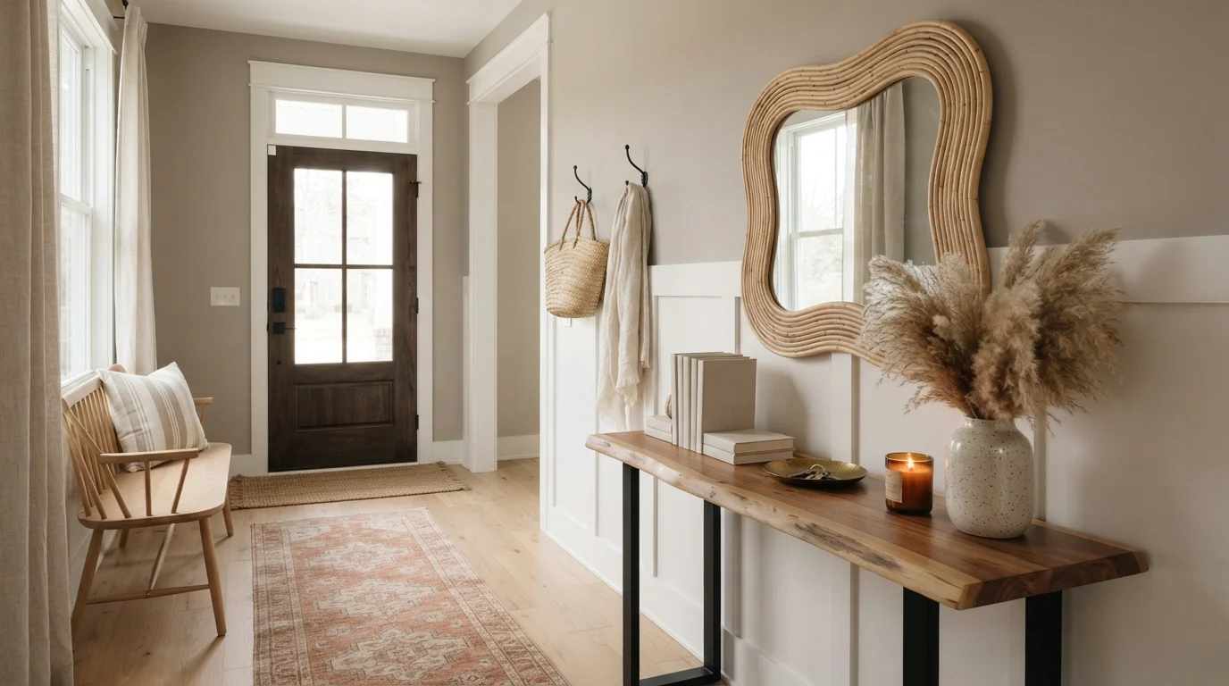
Soft taupe walls paired with earthy wood tones and textured accents create an instantly welcoming, grounded entryway.
Taupe is a soothing blend of warm beige and quiet gray. In this entryway, gentle taupe coats the walls and board-and-batten paneling, framed by crisp white baseboards and a rich live-edge wood console. Natural textures like a wavy rattan mirror, dried pampas grass, and a terracotta-toned vintage runner bring the space to life. The whole hallway feels relaxed, tidy, and effortlessly welcoming. The combo works because organic woods and woven fibers naturally balance the muted wall color. It is perfect for anyone who loves an earthy, nature-inspired home.
SEE YOUNG COLT ON YOUR WALLS →Neutral Entryway Wall Color Combinations
A wall color never works alone. These are the full schemes from the rooms above — the lead color first, then the supporting colors that make the photo work.
Golden afternoon sunlight warms soft stone walls, earthy wood accents, and breezy glass doors for a tranquil welcome.
TRY THIS PALETTE →Warm sunlight washes over soft linen walls, textured jute, and leafy greens for an effortlessly welcoming entrance.
TRY THIS PALETTE →Soft textured beige walls and light natural oak create a soothing, sunlit welcome right at the front door.
TRY THIS PALETTE →Soft sunlit creamy walls combine with natural blonde oak slats and glowing rounded lights to create a tranquil sanctuary.
TRY THIS PALETTE →The easiest combination in a neutral entryway is a warm wall color against a wood floor or staircase, and Manchester Tan (HC-81) is the one built for that pairing — it sits close enough to typical oak and walnut undertones that it doesn't fight the floor, and standard white trim keeps the stairs and door casing crisp against it. Kilim Beige (SW 6106) pairs the same way but reads a shade richer, so it works best with darker wood tones or wrought-iron stair rails rather than pale floors, where it can start to look heavy.
For a cooler, more architectural look, run Wickham Gray (HC-171) on the walls with a black front door or dark hardware and keep the trim a clean white — the contrast is what makes this combination work, not the gray on its own. If the entry opens directly into another room, use one of the higher-LRV picks as the connector: Greek Villa (SW 7551) or White Sand (964) on the entry walls, carried onto the trim or ceiling of the adjoining hallway, keeps the transition from one space to the next feeling seamless instead of like two separate paint jobs stopped at a doorway.
More Entryway Color Ideas
Set on a color family already? Each page has its own real rooms and picks.
Light or Dark Neutral Entryway Colors?
Go Light (LRV 60+) If…
The room is small, faces north, or has to work at every hour. Light warm colors make it feel bigger and stay calm in evening light — the light you actually live in.
Go Dark (LRV Under 20) If…
You want the cocoon effect and the room has real daylight. Dark works best on one feature wall — or fully color-drenched in a large room with good windows.
Most entryways are either boxed-in with no window or a narrow pass-through with one small sidelight, so the light-vs-dark decision usually comes down to how much daylight actually reaches the walls. If yours has no window, skip a true bright white — with nothing to bounce off of, it goes flat and gray under artificial light instead of feeling fresh. Greek Villa (LRV 84) and Gentle Cream (LRV 76) are built for exactly this problem: both carry enough warmth to stay inviting under a single overhead fixture or sconces, where a colder white would feel sterile.
If the entryway gets some daylight — a transom over the door, a sidelight, or it opens straight into a sunny living room — you can go a step deeper without losing brightness. Manchester Tan (LRV 53) and Kilim Beige (LRV 49) both read as cozy rather than dim in that kind of light, and a deeper neutral in a foyer with good light actually reads more intentional than another pass at builder-basic white. Save the very darkest option here, Kilim Beige, for entries with at least a little natural light or a strong artificial source aimed at the walls — in a truly dark, windowless hall it will read muddy rather than warm.
See It. Love It.
Paint It.
Upload one photo of your neutral entryway and try every color on this page on your own walls — in your own light, before you buy a drop of paint.

Revere PewterBeforeSheen Matters More Here Than In Almost Any Other Room
An entryway takes more physical abuse than any other wall surface in the house — shoulder bags, wet umbrellas, kids' backpacks, dog leashes, and dirty shoes all make contact with it daily. Flat or matte finishes, even in a great color like Gentle Cream or Muslin, will scuff and become impossible to wipe clean within a year in a busy household.
Eggshell or satin is the right call for entryway walls in almost every case — it holds up to spot-cleaning without showing every roller mark the way semi-gloss does on a large wall. Save semi-gloss or gloss for the trim, door, and any wainscoting, where the harder finish resists scuffs from shoes and bag straps at the exact height they hit.
Think About What's Visible From The Front Door, Not Just The Entryway Itself
An entryway rarely exists as its own sealed box — most open directly onto a staircase, a hallway, or the edge of a living room, so the color decision is really a decision about what a visitor sees in one glance from the front step. If the entry is small but opens into a larger, brighter room, a deeper neutral like Kilim Beige or Manchester Tan on just the entry walls can look intentional rather than cramped, because the eye reads past it into the lighter space beyond.
If the entryway is the dominant sightline — a two-story foyer, or a hall that runs the length of the house — lean toward the lighter end of this list, like Greek Villa or White Sand, so the color doesn't visually shrink the whole run of hallway.
The Two Mistakes That Show Up Most In Neutral Entryways
The first is picking a bright, cool white for a windowless entry because it feels like the safe, neutral option. Without daylight to activate it, cool white goes flat and slightly gray under a single overhead bulb — it's the single most common regret in dark hallway paint threads. A warm off-white like Greek Villa or Gentle Cream solves the same brightness problem without the flat, institutional look.
The second mistake is choosing a beige or gray in isolation from the floor. Wickham Gray's cool undertone can clash with warm honey-toned hardwood, and Manchester Tan's warmth can look muddy against cold gray-toned tile. Always test the actual pick against the actual floor in the entryway itself, not against a sample board in a different room, since entryway floors are often a different material than the rest of the house.
About Neutral Entryway Paint Colors
An entryway is the one room every visitor judges before they've even taken off their coat, and it's also the room seen in the worst light conditions — a quick flash of morning sun through the door, then whatever the overhead fixture throws at night. Neutral works here because it holds up across both. Manchester Tan (Benjamin Moore HC-81, LRV 53) is the classic choice when there's real wood flooring or a wood staircase to play off — it reads warm and grounded rather than flat gray-beige, and it doesn't fight with honey or walnut tones underfoot. Kilim Beige (Sherwin-Williams SW 6106, LRV 49) sits in the same warm-neutral family but leans a shade deeper, which suits an entryway with a console table, mirror, and layered decor rather than a bare hallway.
For entryways that are tight on natural light — no sidelight windows, just the front door and a hall opening — the higher-LRV picks do more work. Greek Villa (SW 7551, LRV 84) is a warm off-white that still bounces enough light to keep a boxed-in foyer from feeling like a closet. Gentle Cream (Benjamin Moore OC-96, LRV 76) and Feather Down (Benjamin Moore 953, LRV 73) sit just below it, giving a softer, less stark version of the same brightening effect. White Sand (Benjamin Moore 964, LRV 67) is the pick built specifically for narrow halls — it's warm enough not to feel clinical but light enough to keep a pinch-point entry from closing in.
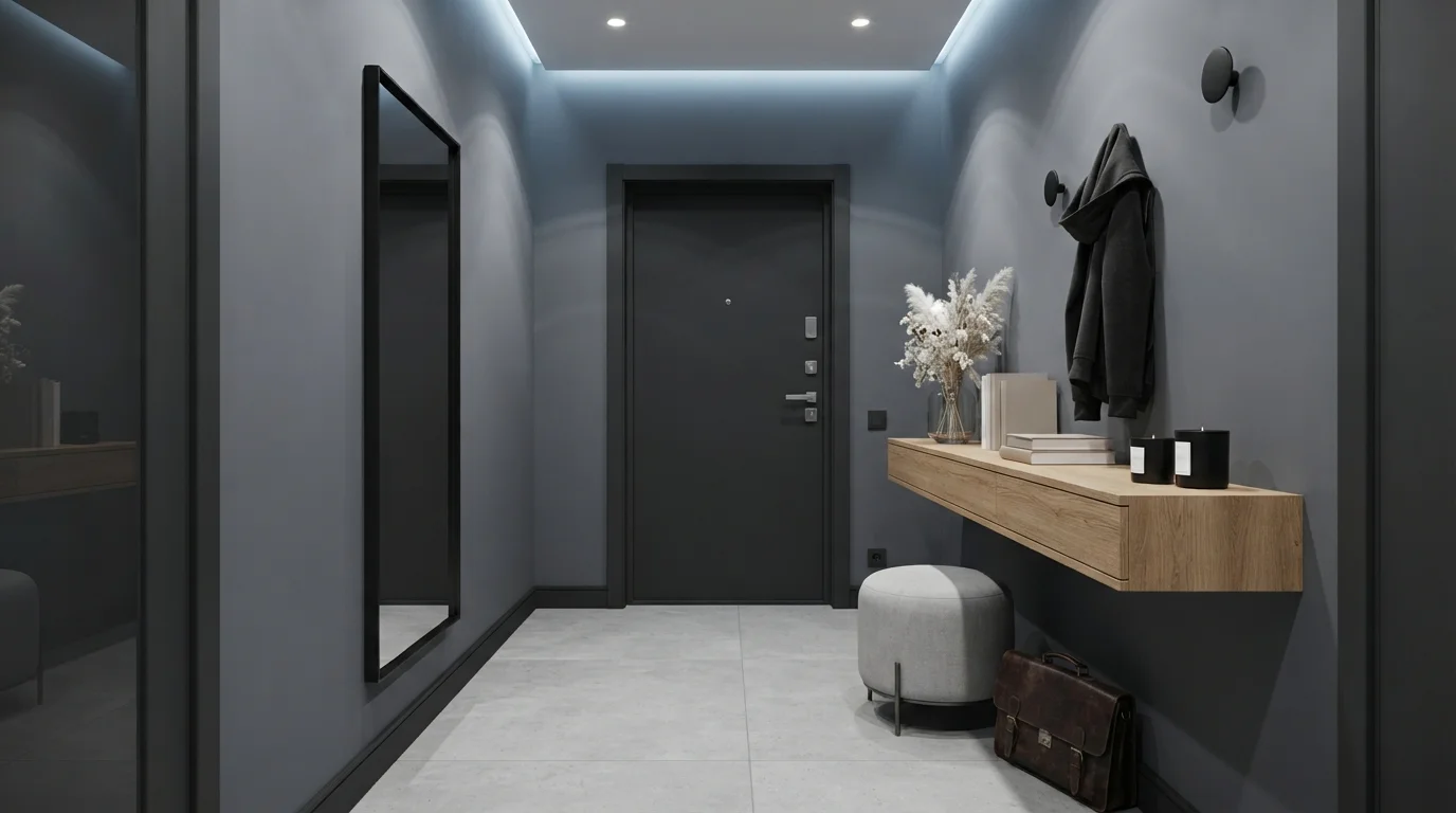
Wickham Gray (Benjamin Moore HC-171, LRV 60) is the outlier on this list and worth calling out on its own: it's a cool, crisp neutral rather than a warm one, which makes it the pick for entryways with black hardware, a dark front door, or a more modern console setup. Muslin (Benjamin Moore 1037, LRV 67) goes the other direction — an earthy, almost stone-like neutral that works well when the entry has natural materials like jute rugs, rattan, or unfinished wood.

The Questions Everyone Asks
What color should I paint my neutral entryway?
If you want one answer, start with the safe picks above — Desert Suede, Varnished Ivory, Merino, Water Chestnut. They read well in any light and survive furniture changes. Then check the light: strong afternoon sun wants a step cooler, a north-facing room wants a step warmer.
what color should I paint a small entryway?
Go with a warm, high-LRV neutral rather than a stark white. White Sand (Benjamin Moore 964, LRV 67) was picked for exactly this — it keeps a narrow entry feeling open without the flat, cold look a bright white gets in low light. Greek Villa (Sherwin-Williams SW 7551, LRV 84) works the same way if you want something a touch brighter and slightly warmer.
should an entryway be lighter or darker than the rest of the house?
There's no fixed rule, but light levels should decide it. If your entryway gets little or no natural daylight, stay in the LRV 60s-80s range — Gentle Cream (OC-96) or Feather Down (953) — so it doesn't go dim under artificial light. If it gets real daylight from a sidelight or transom, a deeper warm neutral like Manchester Tan (HC-81) or Kilim Beige (SW 6106) reads cozy instead of cave-like.
should my entryway match my living room paint color?
It doesn't have to match exactly, but it should relate. Since most entryways open directly into another room, an abrupt color change at the doorway can look unfinished. A safer approach is choosing a neutral from the same warm or cool family as the adjoining room — for example, running Manchester Tan through both spaces, or using Greek Villa in the entry as a lighter cousin to a beige living room.
what's the best paint color for an entryway with no windows?
Skip true white — with no daylight to activate it, it reads flat and slightly gray under a bulb. Greek Villa (SW 7551, LRV 84) and Gentle Cream (OC-96, LRV 76) are both warm off-whites built to look bright and inviting under artificial light alone, which is the real test for a windowless entry.
what sheen should I use for entryway walls?
Eggshell or satin. Entryways take constant contact from shoes, bags, and wet coats, so flat paint scuffs fast and can't be wiped clean. Eggshell holds up to spot-cleaning without showing roller marks the way a higher-gloss finish would on a large wall. Reserve semi-gloss for the trim, door, and any wainscoting, where the harder finish resists scuffs at shoulder and shoe height.
What two-color combination works best in a neutral entryway?
The reliable pattern is a quiet main color plus one deep accent on a single wall. Keep trim and ceiling in one warm white so the two colors are the only event in the room — the combination cards above show complete schemes from real rooms.
What colors make a neutral entryway look bigger?
High-LRV, slightly warm colors — LRV 60–75 is the sweet spot. Paint the walls and trim close to the same light color so the corners blur, and keep the ceiling white. Stark cool white actually works against you; it creates hard shadows that show the room's edges.


Ask a Question