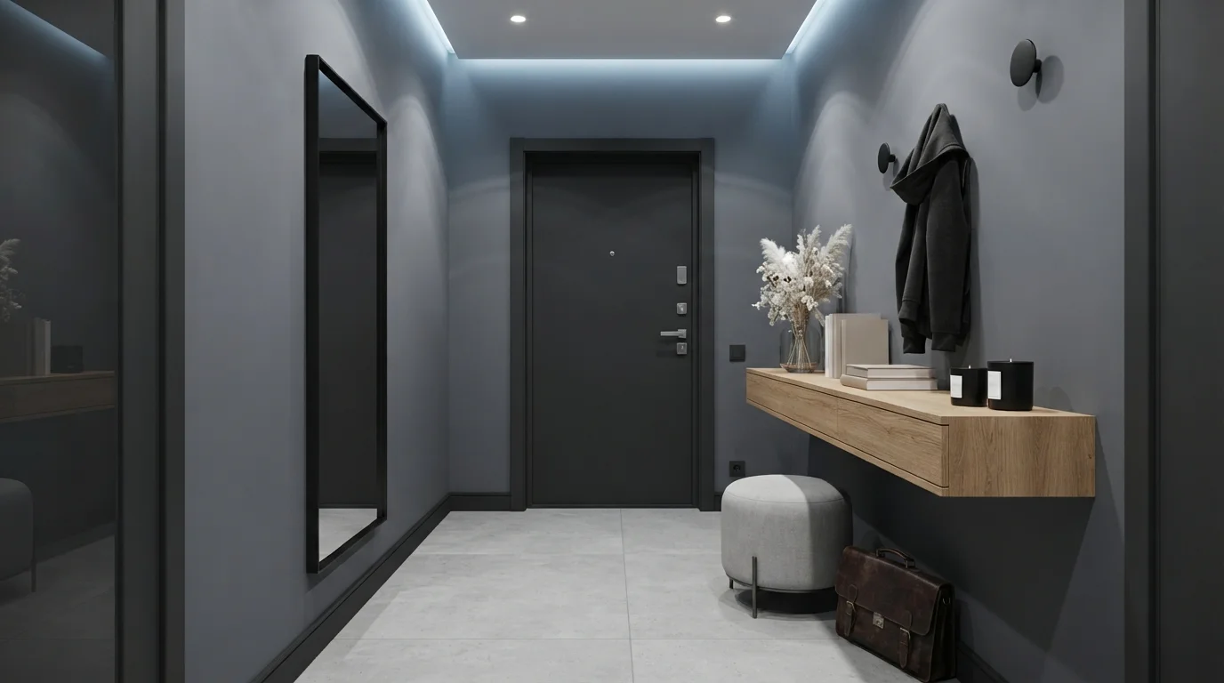
Room Colors · Blue Entryway
8 Best Blue Entryway Paint Colors for 2026
ideas, combinations, and real rooms
8 curated picks from real blue entryways — with the exact colors, honest reasons why, and the combinations that hold the room together.

Former interior stylist who can spot a green undertone from across a room. Jessica writes the color and mood pieces — what to choose, what pairs, and why your "white" looks pink.
The Fast Answer
Don't want to read 8 picks? These four are the safe answers.

Top Picks for the Blue Entryway
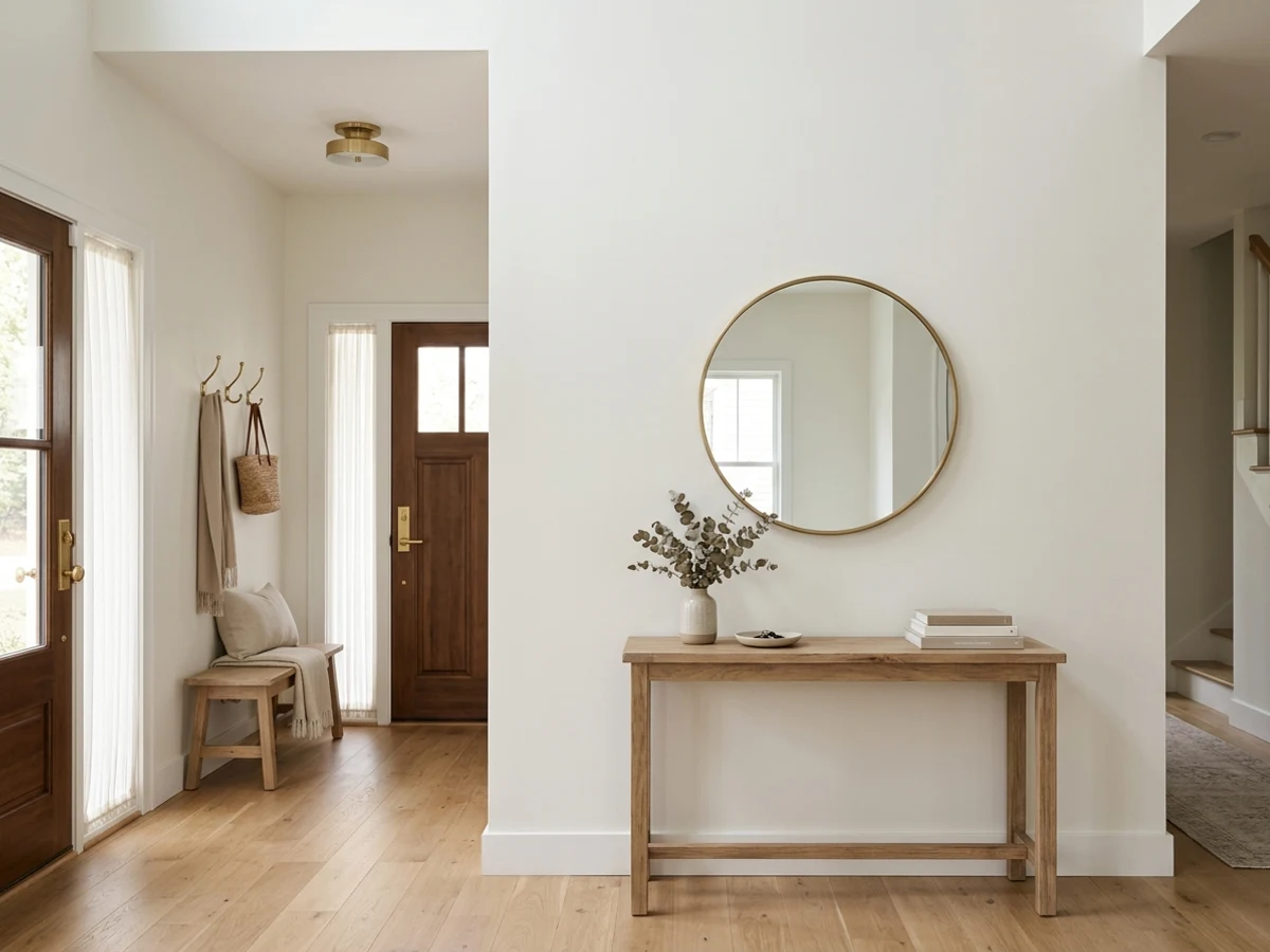
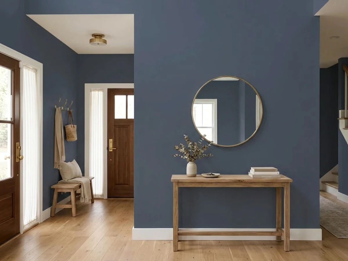
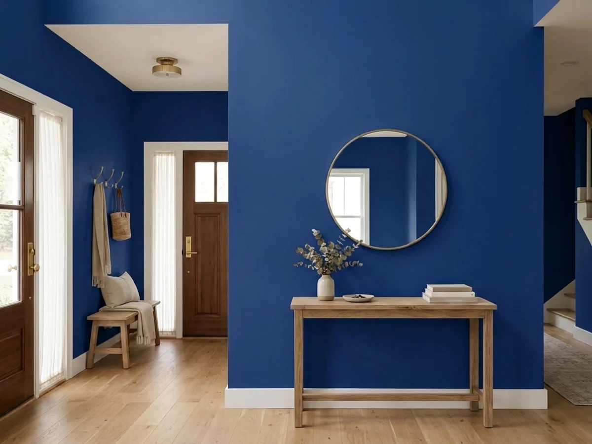
Tap a shade to see the blue entryway in it, then try it on your own room.
Blue Entryway Color Trends 2026 — What's In, What's Out


- Cool Greige Foyers — The flat, blue-gray greige that filled builder-grade entryways for a decade reads dated next to 2026's warmer, more saturated blue choices.
- One Timid Accent Wall — Painting a single pale-blue accent wall while leaving everything else white feels like a half-measure compared to 2026's full-room color commitment.
- Icy Powder Blue — Washed-out, high-LRV powder blue is losing ground in entryways to deeper, more confident navy and cobalt tones for 2026.
The 8 Best Blue Entryway Paint Colors
Every pick below is a real rendered blue entryway, not a chip. The lead color first; the swatches are the full scheme in the photo — walls, furniture, textiles, accent.

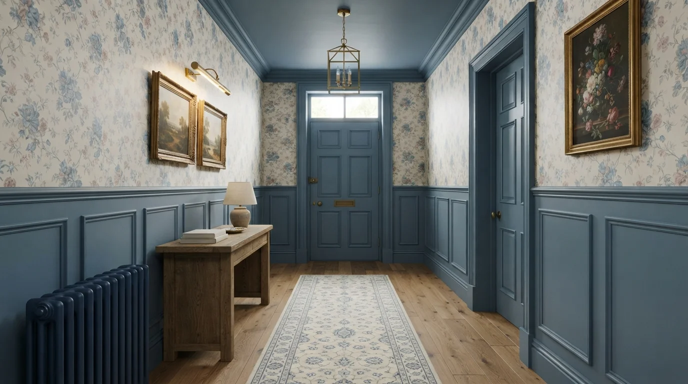
A comforting slate blue wraps the wainscoting and ceiling, framing vintage floral prints with warm, timeless English character.
Slate blue is a dusty, medium-toned blue with a gentle vintage feel. In this entry hall, cornflower blue covers the lower wood paneling, front door, and ceiling, balanced by sweet floral wallpaper and a honey-oak console table. The whole space feels snug, nostalgic, and wonderfully welcoming. This pairing works because the steady blue base grounds the delicate pattern while warm wood floors and brass accents keep the hall cozy. It is perfect for anyone looking to bring classic cottage warmth to their entryway.
SEE BELVEDERE BLUE ON YOUR WALLS →
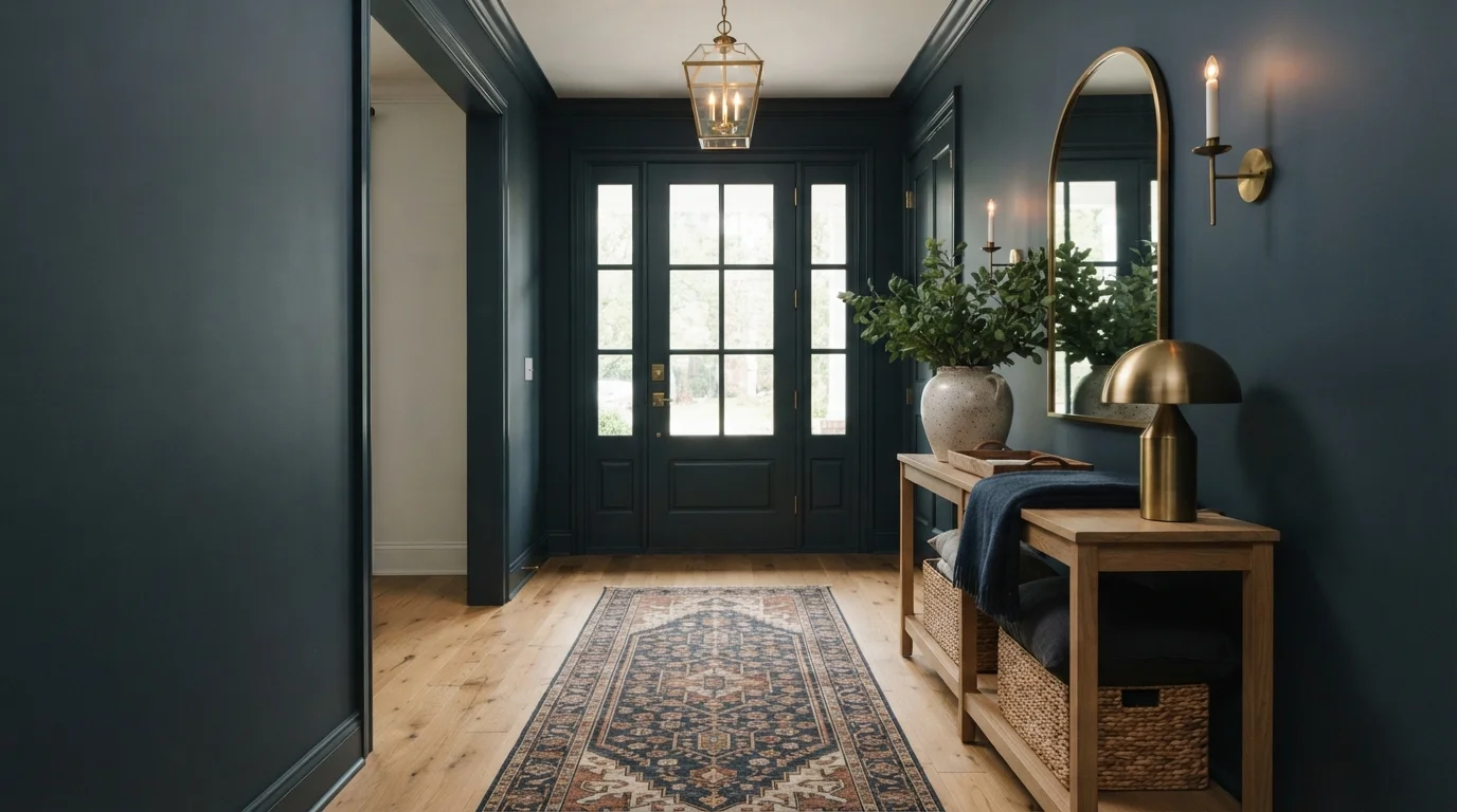
Deep jewel-toned walls paired with glowing brass fixtures and natural oak create an instantly warm, dramatic welcome.
Deep navy is a rich, moody blue with subtle dark teal depths. In this entryway, saturated navy blankets the walls, baseboards, and front door, set off by a natural wood console table, woven storage baskets, and an intricate vintage runner. The space feels incredibly snug, grounded, and welcoming. This look works because the warm golden wood tones and polished brass accents glow brightly against the dark backdrop. It is ideal for anyone looking to make a bold, stylish first impression in a small foyer.
SEE IT ON YOUR WALLS →
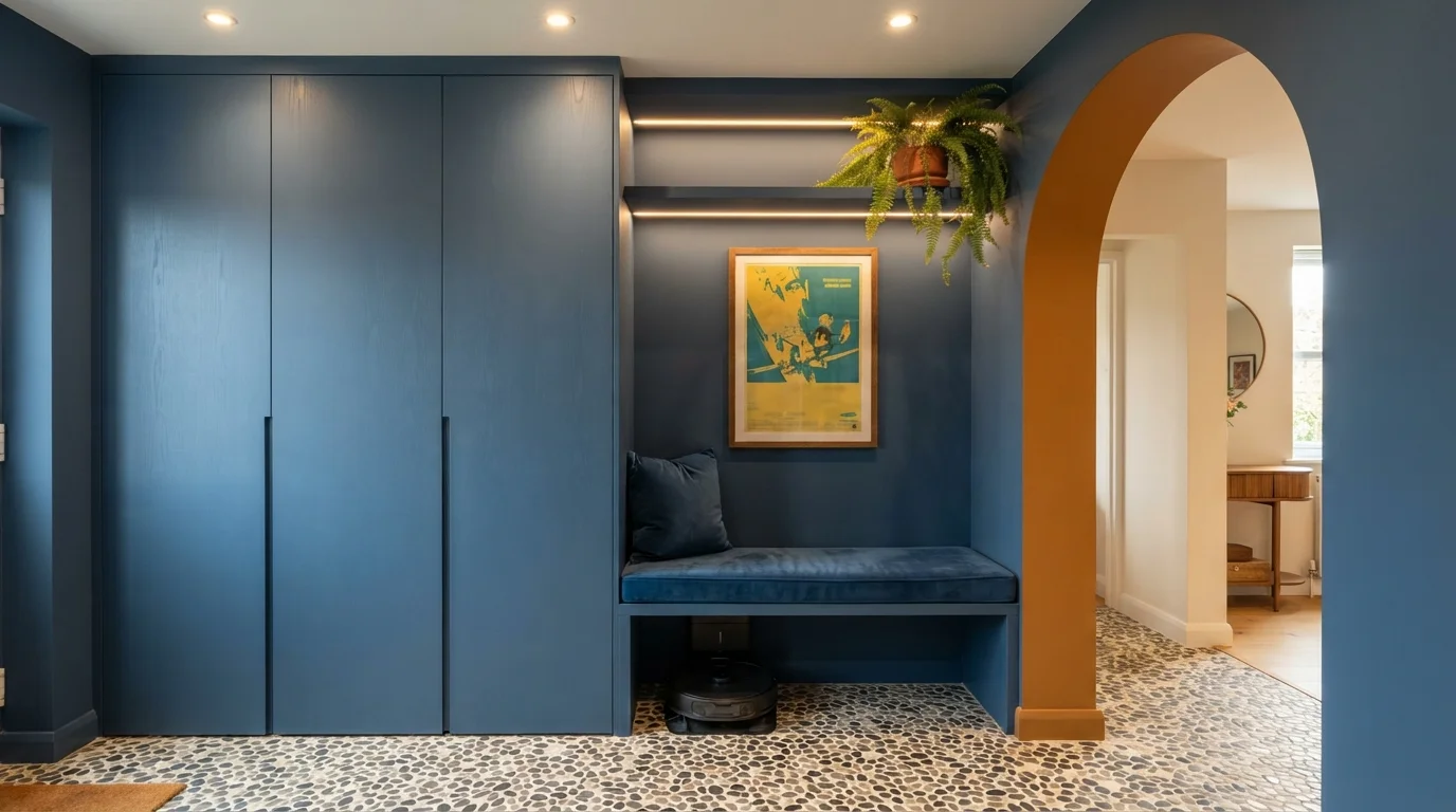
Deep blue built-in storage pairs with rich mustard accents and graphic pebble floors for an artful, welcoming arrival.
Slate blue is a saturated, moody denim shade with classic appeal. In this entryway, seamless blue covers the tall storage cabinets, seating bench, and nook walls, while a warm mustard yellow frames the neighboring doorway. The room feels cozy, tailored, and full of personality. The combo works because the warm golden accent directly contrasts the cool blue surfaces, bringing instant life to the corner. This look is ideal for anyone who loves dramatic color drenched spaces that maximize smart storage.
SEE DOWNPOUR BLUE ON YOUR WALLS →
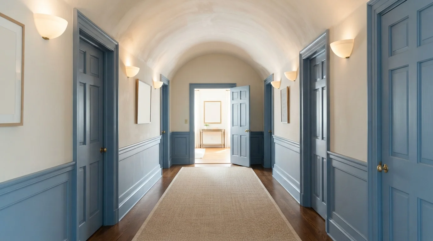
Crisp cornflower blue trim and soft cream walls bring a timeless, storybook charm to this arched hallway.
Cornflower blue is a breezy, medium-slate blue with classic European flair. In this hallway, rich blue covers the detailed door casings, paneled doors, and lower wainscot trim, while the vaulted ceiling and upper walls stay a warm, glowing cream. The space feels calm, welcoming, and refined. This combo works because the bold blue frames add architectural structure without darkening the hall, letting the creamy walls keep everything bright. It is perfect for anyone wanting historic character with a fresh, cheerful feel.
SEE CREAMY WHITE ON YOUR WALLS →
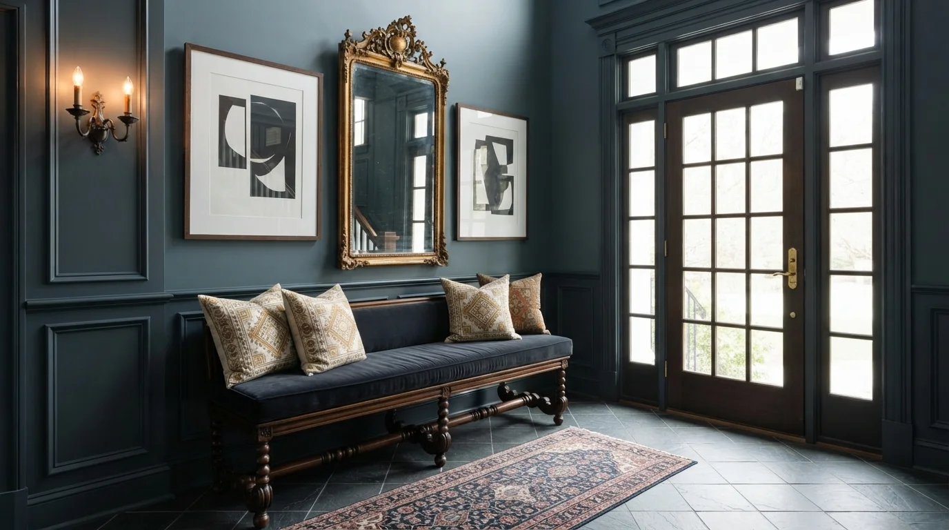
Rich slate blue walls and antique gold accents create an instantly dramatic entrance full of historic charm.
Slate blue is a deep, smoky blue-gray with cool, shadowy depth. In this entryway, that moody shade covers both the upper walls and the floor-to-ceiling box molding, framed by a dark velvet bench and a rich Persian rug. The space feels stately, intimate, and deeply grounded. The look works because the antique gilded mirror and glowing candle sconce pop with warm contrast against the cool background. It is perfect for anyone wanting to make a bold, historic first impression.
SEE BEDTIME BLUE ON YOUR WALLS →
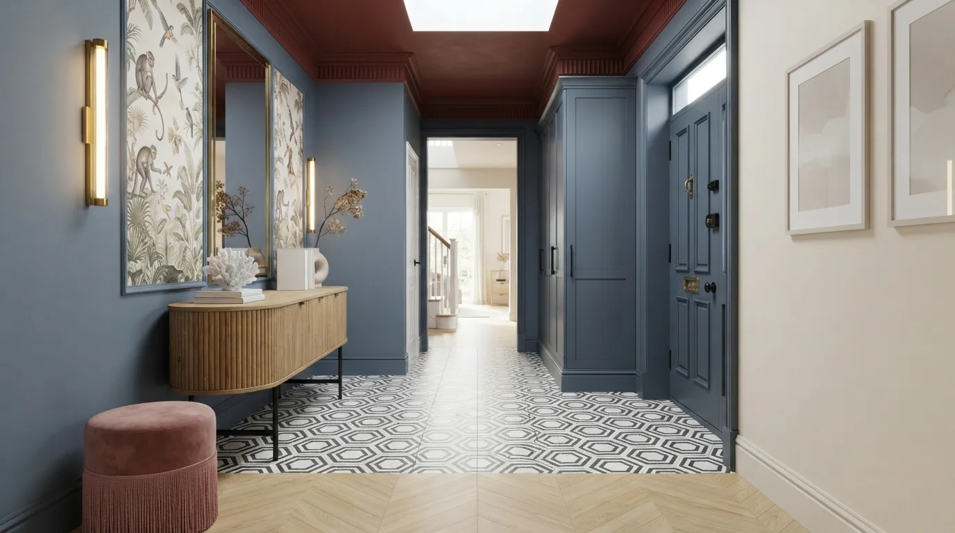
Deep slate blue pairs with rich brick red and warm wood to create an expressive, welcoming entrance.
Slate blue is a cool, muted denim shade with a grounded feel. In this foyer, that smoky blue wraps the entry door, surrounding walls, and floor-to-ceiling closet panels, while a deep brick red warms up the ceiling overhead. A cream sidewall and natural wood console keep the space feeling balanced and chic. The combination works because the cool blue and warm rust-red balance each other out for rich contrast without feeling chaotic. It is perfect for design lovers who want an unforgettable first impression.
SEE INFAMOUS ON YOUR WALLS →
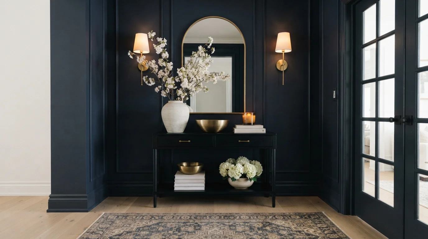
Deep navy paneled walls paired with glowing brass sconces and crisp white blossoms create a dramatic, welcoming first impression.
Midnight blue is a deep, dramatic navy with timeless elegance. In this entryway, that rich navy wraps the paneled walls and doorway trim, anchoring a tailored black console table and a soft patterned runner rug. The whole foyer feels snug, luxurious, and instantly grounding the minute you step inside. Warm brass sconces and overflowing white blooms pop effortlessly against the dark backdrop to keep the mood bright. It is the perfect choice for anyone wanting a bold, unforgettable entrance to their home.
SEE NIGHTLIFE ON YOUR WALLS →
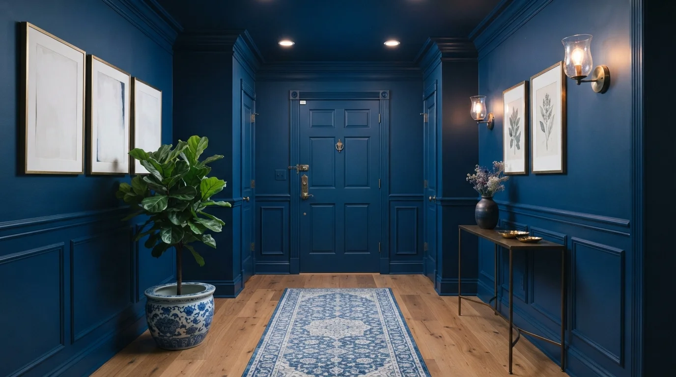
Immerse your foyer in velvety deep blue paint from floor to ceiling for a stunning, enveloping first impression.
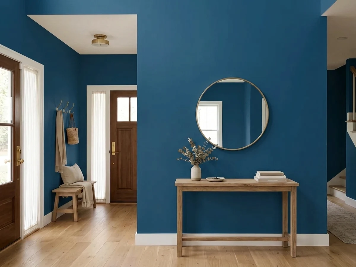
Deep royal blue is a rich, saturated navy that commands attention. In this entryway, vibrant blue covers every surface, from the paneled walls and high baseboards to the door and ceiling. The space feels dramatic, tailored, and wonderfully intimate the moment you step inside. This total color drench works because the warm wood floors and bright leafy greenery break up the monochrome depth, keeping the hallway grounded. It is a stunning look for anyone wanting to make an unforgettable design statement right at the front door.
SEE NOCTURNAL SEA ON YOUR WALLS →Blue Entryway Wall Color Combinations
A wall color never works alone. These are the full schemes from the rooms above — the lead color first, then the supporting colors that make the photo work.
A comforting slate blue wraps the wainscoting and ceiling, framing vintage floral prints with warm, timeless English character.
TRY THIS PALETTE →Deep jewel-toned walls paired with glowing brass fixtures and natural oak create an instantly warm, dramatic welcome.
TRY THIS PALETTE →Deep blue built-in storage pairs with rich mustard accents and graphic pebble floors for an artful, welcoming arrival.
TRY THIS PALETTE →Crisp cornflower blue trim and soft cream walls bring a timeless, storybook charm to this arched hallway.
TRY THIS PALETTE →Navy Blue by Behr and Encore by Valspar both go classic against bright white trim and a white paneled door — the high-contrast line between wall and trim keeps a dark, small entryway from feeling like it's closing in, and it's the safest pairing if you're not sure yet. Brilliant Blue by Benjamin Moore has enough saturation to hold its own against natural wood tones — a stained oak or walnut console and floor read warm next to it instead of competing, and brass or matte black hardware both work since the wall itself is doing the bold work.
For the full-commitment entries, Hale Navy or Nightlife by Portola Paints pair best with a single warm material rather than more color — a runner rug in rust or ochre, a brass light fixture, or a natural wood bench — so the room has one point of warmth against all that depth. Time's Current by Valspar leans similarly deep and reads best with black or aged-brass hardware rather than polished chrome, which can look cold against a wall that dark.
More Entryway Color Ideas
Set on a color family already? Each page has its own real rooms and picks.
Light or Dark Blue Entryway Colors?
Go Light (LRV 60+) If…
The room is small, faces north, or has to work at every hour. Light warm colors make it feel bigger and stay calm in evening light — the light you actually live in.
Go Dark (LRV Under 20) If…
You want the cocoon effect and the room has real daylight. Dark works best on one feature wall — or fully color-drenched in a large room with good windows.
Because most entryways are small, narrow, and lit by whatever spills in from a front door sidelight or a single overhead fixture, the LRV number matters more here than in almost any other room. Anything under about LRV 8 — Navy Blue at 4, Encore at 6 — will read as near-black once the sun sets and the entry light is the only source in the room. That's the intended effect for a foyer meant to feel like a jewel box, but it's a mistake in an entry with no window at all, where the walls can disappear into the dark and make the space feel smaller instead of richer.
See It. Love It.
Paint It.
Upload one photo of your blue entryway and try every color on this page on your own walls — in your own light, before you buy a drop of paint.

Hale NavyBeforeSheen For A High-Traffic Entry
Entryway walls take more abuse than almost any other wall in the house — bags, coats, dog leashes, and shoulder height scuffs from everyone who passes through. A satin or eggshell finish holds up to a damp cloth in a way flat paint doesn't, and it's worth the extra sheen even on a dark color like Navy Blue or Encore, where flat paint shows every scuff as a lighter mark.
On the trim and door, go semi-gloss regardless of which blue you pick — it's the surface hands actually touch, and it wipes clean. If you're painting a full wall in Hale Navy or Time's Current, satin keeps the depth of the color without the glare a higher sheen would throw back under a bright entry fixture.
Where To Put The Blue
Most entryways don't need every wall painted — the wall facing the front door, or the run of wall going up a staircase, does the job on its own and keeps the paint bill and the drama contained. That's especially true for the darkest picks here: Navy Blue at LRV 4 or Nightlife's velvety near-black reads as a deliberate accent on one wall, but can feel oppressive wrapped around a small windowless box on all four sides.
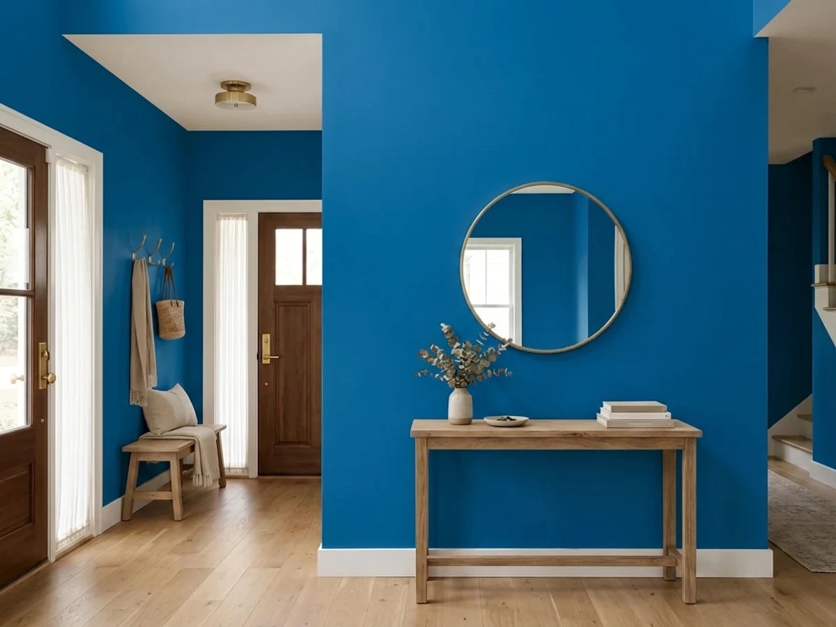
Brilliant Blue is the one pick on this list that can reasonably go on every wall in a small entry, since its higher LRV keeps the space from feeling sealed off even without a lot of natural light reaching it.
Mistakes To Avoid With A Blue Entryway
The most common mistake is picking a deep blue like Encore or Navy Blue for an entry with no window and no strong overhead light — without light to bounce off it, the color goes flat and dark instead of reading as a rich navy, and it can look more like an unfinished dark gray than an intentional design choice. Test a sample square at the actual time of day you use the front door most, not just at noon.
The second mistake is matching the blue too closely to a blue front door or blue exterior trim — when the interior wall and the door sightline are nearly the same hue, the transition from outside to in disappears and the entry loses the moment it's supposed to create. Pick one plane — door or interior wall — to carry the blue, and keep the other neutral.
About Blue Entryway Paint Colors
An entryway is the one room nobody sits in for long — you pass through, drop your keys, hang a coat, and move on. That's exactly why deep, saturated blues work here in a way they might struggle to in a bedroom or living room. Navy Blue by Behr (S-H-580, LRV 4) and Encore by Valspar (8002-45G, LRV 6) both sit near the black end of the scale. An LRV that low absorbs almost all the light that hits it, which reads as drama in a space you're in for thirty seconds rather than the cave problem it would create in a room you live in all evening.
Brilliant Blue by Benjamin Moore (2065-30, LRV 15) is the outlier on this list. It's still a saturated, confident blue, but at LRV 15 it holds its color under a hallway light fixture instead of flattening to near-black the way Navy Blue or Nightlife by Portola Paints can once the sun goes down. That extra reflectance matters most in entries with a single sidelight window or none at all — Brilliant Blue keeps enough light bouncing around that the color still reads as blue, not as a dark blob by the door.
Hale Navy and Time's Current by Valspar are for the house that wants the entry to be a design moment rather than a passthrough — a front door wall or a stair hall painted floor to ceiling in one deep, glossy color, with everything else in the house staying neutral. That's a different bet than picking Brilliant Blue for brightness: it works because an entryway is contained, so the drama doesn't leak into rooms where you'd tire of it.
The Questions Everyone Asks
What color should I paint my blue entryway?
If you want one answer, start with the safe picks above — Belvedere Blue, Wishing On A Star, Downpour Blue, Creamy White. They read well in any light and survive furniture changes. Then check the light: strong afternoon sun wants a step cooler, a north-facing room wants a step warmer.
what color should I paint a dark entryway with no windows
Go with the highest-LRV option that still feels bold rather than the darkest one. Brilliant Blue by Benjamin Moore (2065-30, LRV 15) holds its color under artificial light in a way Navy Blue (LRV 4) or Encore (LRV 6) can't — those two need real daylight to read as blue instead of near-black once the sun sets.
is navy too dark for a small entryway
Not if the entry gets some daylight and you keep the trim white for contrast. Navy Blue by Behr (S-H-580) at LRV 4 reads as intentional drama, not gloom, in a five-second passthrough space — the problem only shows up if the entry has zero windows and dim lighting, where it can look flat instead of rich.
what color trim goes with a blue entryway
White trim is the safest and most classic pairing with any deep blue on this list, including Navy Blue and Encore — the contrast keeps a dark wall from feeling like it's closing in. If you're going lighter with Brilliant Blue, warm wood trim or a soft white both work since the wall already carries the color.
should the front door match the entryway wall color
No — pick one to carry the blue, not both. If the interior wall is Hale Navy or Time's Current, keep the door a neutral or a contrasting color so there's still a visible transition from outside to in. A blue door with a blue interior wall can make the entry read as one flat plane instead of a considered space.
what sheen should I use for entryway walls
Satin or eggshell, not flat. Entryway walls take more scuffing from bags, coats, and shoulders than almost any other room, and flat paint shows every mark as a lighter smudge — especially visible on a dark color like Encore or Navy Blue. Save semi-gloss for the trim and door, where hands actually touch.
What two-color combination works best in a blue entryway?
The reliable pattern is a quiet main color plus one deep accent on a single wall. Keep trim and ceiling in one warm white so the two colors are the only event in the room — the combination cards above show complete schemes from real rooms.
What colors make a blue entryway look bigger?
High-LRV, slightly warm colors — LRV 60–75 is the sweet spot. Paint the walls and trim close to the same light color so the corners blur, and keep the ceiling white. Stark cool white actually works against you; it creates hard shadows that show the room's edges.

Ask a Question