Brilliant Blue
Benjamin Moore's almost-electric blue, reviewed honestly: the entryway it was made for, the rooms it overwhelms, and the paint job nobody warns you about.

Jessica has spec'd whites and neutrals for more than 300 rooms and keeps a sample wall of painted drawdowns in her studio. Every color review is checked against real reader rooms in the comments and re-tested when a formula changes. About the testing process →
- 1Anchors Aweigh3
- 2Hale Navy8
- 3Brilliant Blue15
- 4Wolf Gray21
- 5Resolute Blue40
The Fast Verdict
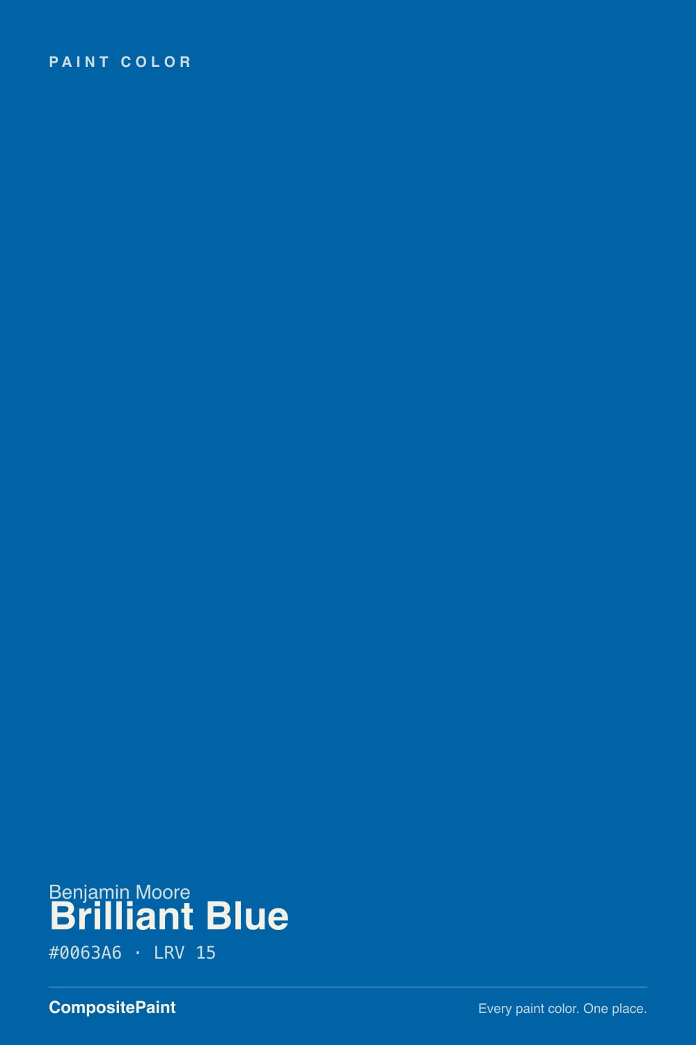
Brilliant Blue is not a navy and never pretends to be. It is a clean, fully saturated cerulean with essentially no gray in it — Benjamin Moore's own description reaches for the word electric — which makes it the loudest color most people will ever consider putting on a wall. At LRV 15 it is dark and vivid at the same time, a combination that reads spectacular on one entry wall or in a drenched powder room and exhausting across a whole living room. Buy it for a small brave surface, not for square footage.
Entryways and foyers that should announce something · powder rooms drenched top to bottom · one accent wall in an office or media room · front doors · islands, vanities and mudroom lockers · playrooms
You actually wanted a navy · the room is small, dim and north-facing · you want a calm bedroom · your trim will stay builder off-white · you repaint often and hate priming
- A truly clean blue — no gray, no purple, no navy murk
- Small rooms it can own: entries, powder rooms, mudrooms
- Dark enough (LRV 15) to feel serious, bright enough to feel alive
- Excellent on a front door, where full sun flatters the chroma
- Reads deliberate and designed in a house full of grayed neutrals
- Not a navy — the most common reason people are disappointed
- Overwhelming on four walls, especially in small or dim rooms
- Bounces a blue cast onto white ceilings and trim
- Needs a tinted foundation coat and coats on top — touch-ups flash
What Color Is Brilliant Blue, Really?
A clean, full-chroma blue from Benjamin Moore's Color Preview deck — the collection where the saturated deeps live. That word saturated is the whole story. Most colors that sell well in 2026 are grayed down until they behave like neutrals; Brilliant Blue has almost no gray in it at all, which is why it looks like a different species next to the muted blues on the same fan deck. Benjamin Moore's own catalog description reaches for the word electric, and on a wall that is exactly the right word.
At LRV 15 it is genuinely dark — the same value range as a charcoal — but it behaves nothing like one. A charcoal recedes; high chroma does the opposite, so this blue stays forward and loud even at low light reflectance. Dark and loud at once is a rare and difficult combination, and it is the reason the color is a hero on one wall and a headache on four. Expect the wall to land a step deeper and considerably more intense than the chip, because the saturation effect that surprises people with ordinary paint colors is much stronger with a color carrying this much pigment.
Undertone in one line: clean blue with the faintest green lean — never purple, never gray, never navy. If your sample looks nearly black, the room has no light to give it; if it looks like a road sign, that is cool LED bulbs cranking the chroma. Both versions are the same paint being honest about the room.
Where It Shines
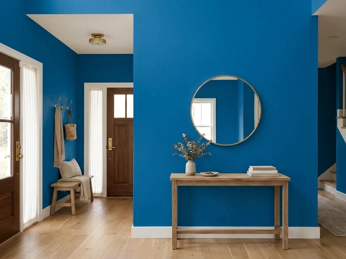
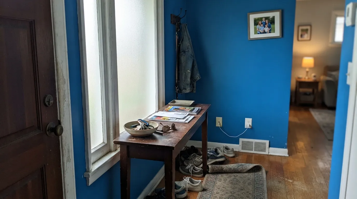
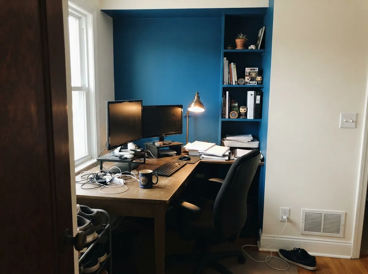
This color is built for the short visit. Designer Caitlin Murray of Black Lacquer Design used it exactly the right way — as a punchy accent in a small foyer, with one or two other bright notes in the art or rug and everything else kept neutral — and that is the template. An entry, a powder room, one wall of built-ins behind a desk: places you pass through or spend twenty minutes in, where a jolt of clean blue reads as confidence rather than noise. Give it crisp white trim, brass or matte black hardware, and one warm material (terracotta, rust, walnut, leather) so the room does not go corporate, and it looks like a decision somebody made on purpose.
Where It Fails
The regret stories about a color like this follow three scripts, and all three are predictable before you open the can. Two are about expectations and one is about the paint job itself — and that third one catches more people than either color mistake.
This is the single biggest mismatch. Shoppers see a dark blue chip, think moody library, and get a clean cerulean that reads closer to a team color than to a study. Navy is grayed and quiet; Brilliant Blue is neither. If the picture in your head involves leather chairs and low lamplight, you want Hale Navy (LRV 6) or the deeper true blue of Benjamin Moore Blue 2066-10 (LRV 6) instead.
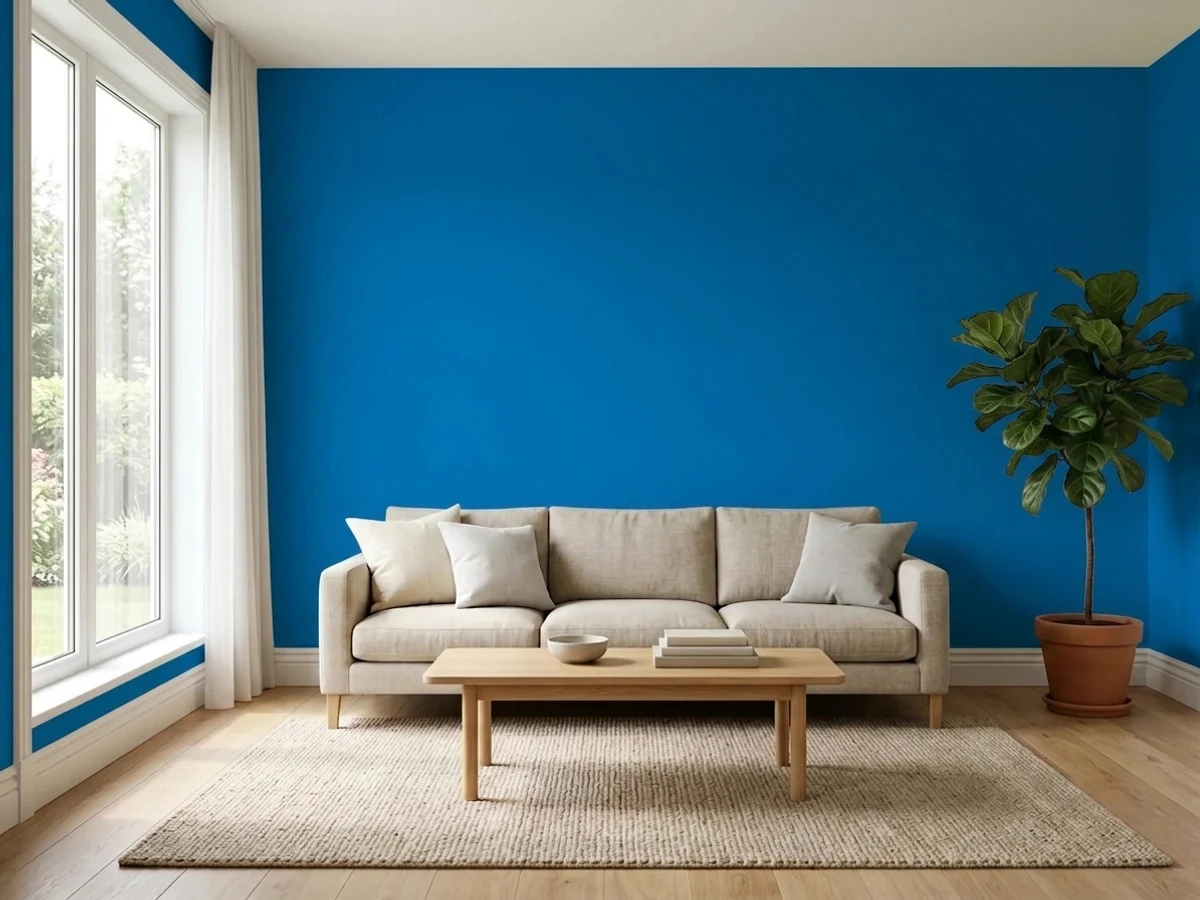
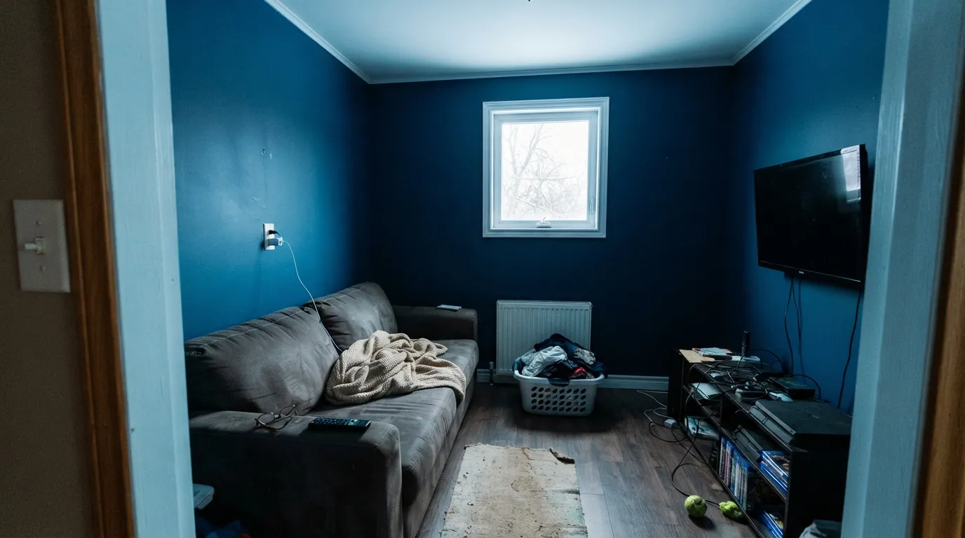
Chroma multiplies with area. What looks energizing on a sample board becomes relentless across a whole small room, and with no gray in the mix there is nothing to soften it — the color bounces onto the ceiling and gives your white trim a faint blue cast, so the crisp edges you were counting on look tinted instead. Add a north window and no lamps and it stops being electric and just goes heavy and cold. One wall, or a room you are only in for a few minutes.
Saturated blues are built with heavy phthalo colorant in a clear or deep base, and clear bases hide badly. Benjamin Moore's own guidance for deep colors is to use a tinted foundation coat first — Aura Color Foundation — and then plan on two finish coats over it, not two coats total. Skip that and you get roller-lap streaking, patchy sheen, and touch-ups that flash a visibly different shade six months later. This is not a wing-it weekend color.
Room by Room
A small entry is the ideal dose: you see it, you register it, you move on. Eggshell on the walls, a crisp white on trim and ceiling, and one warm note in the rug or a console so it does not read like an office lobby. Works even better if the rooms beyond stay quiet — the blue is the sneak peek, not the whole house.
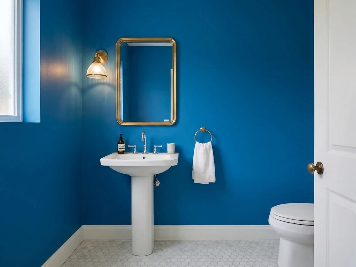
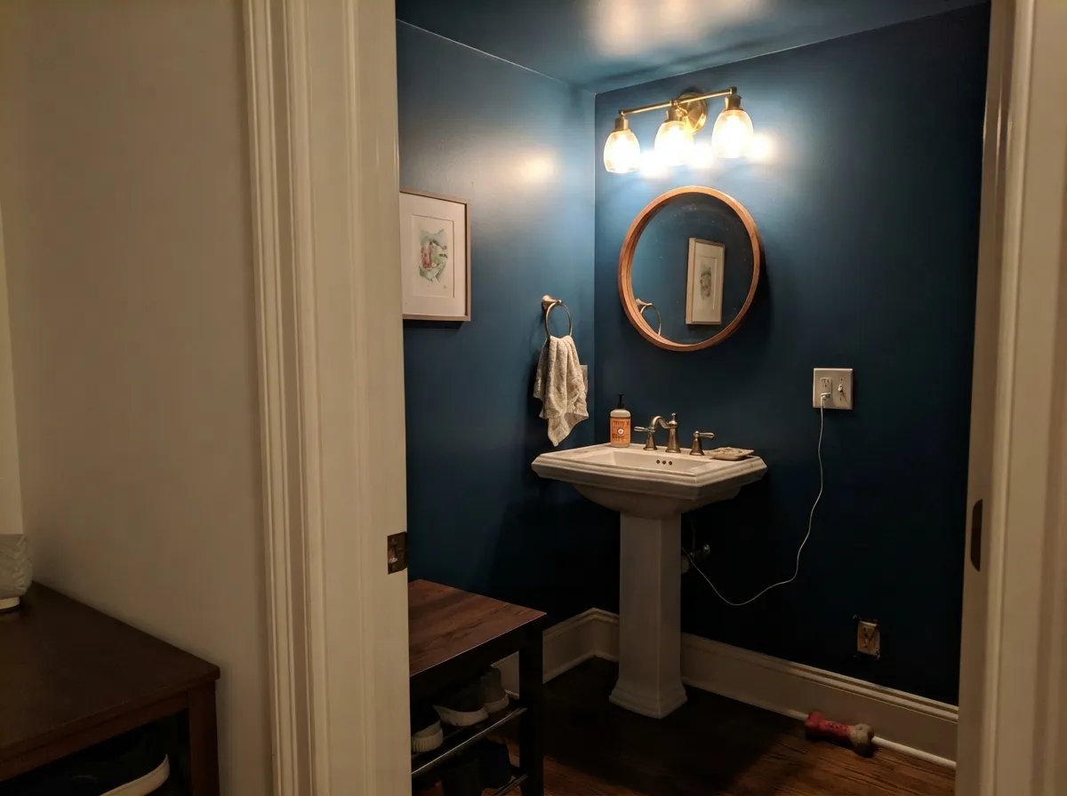
The one place drenching this color is genuinely a good idea. Tiny rooms take big color well because you are never in them long enough to tire of it, and the lack of natural light matters less when the fixture is right over the mirror. Satin on the walls and ceiling, brass or matte black hardware, and a mirror large enough to break up the field.
Behind a desk or a wall of built-ins it is excellent: the depth reads focused on camera and the chroma keeps a windowless room from feeling gray. Keep the other three walls in a soft white and let the blue carry the shelves. A media room can take more of it, because you want the light down anyway.
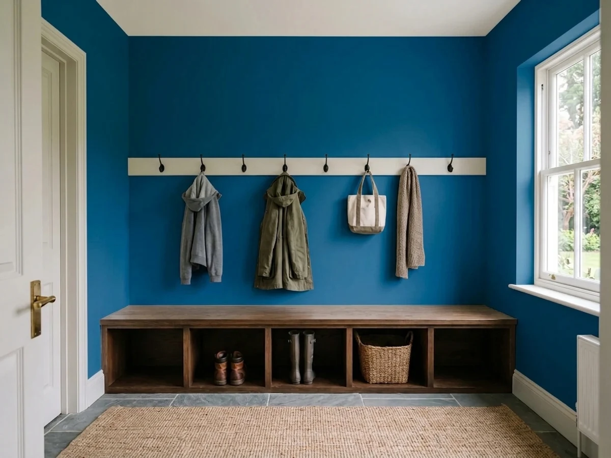
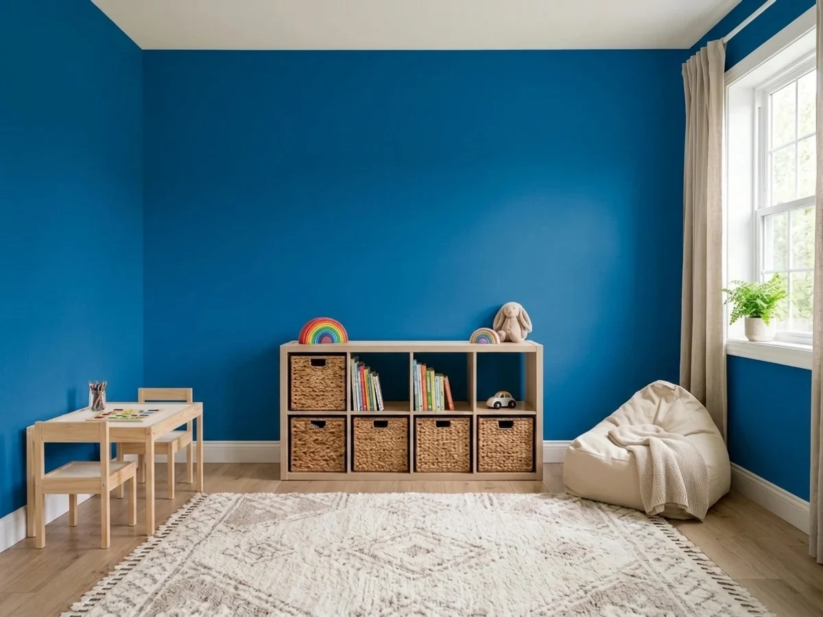
Bright clean blue is a good fit for rooms that are supposed to be energizing: playrooms, bunk-room walls behind the beds, mudroom lockers and benches in satin. A bedroom is the opposite job. This color has no warmth to fall back on at night, and early east sun on four blue walls is not what anyone wants to wake up to.
A Brilliant Blue island under white uppers is a strong, deliberate look, especially with butcher block or walnut on top and brass pulls. Whole kitchen walls in it fight everything — appliances, food, the backsplash. Use a satin urethane-fortified cabinet enamel and prime properly; saturated blue over a factory white cabinet needs the tinted foundation coat as much as any wall does.
Full sun is actually the light this color handles best, so a Brilliant Blue front door on a white, pale gray or brick house is a genuinely good use of it — vivid without going purple or chalky the way cheaper blues do. On a whole facade it is far too much, and on shutters it competes with itself. Door and door alone, in an exterior satin.
Your Light Is the Risk
Strong sun is the light a full-chroma blue was made for: it stays clear and vivid instead of collapsing toward black. This is where the color earns the name.
At LRV 15 with no gray to fall back on, north light leaves it heavy, cold and close to inky. Everything in the room picks up the cast. Add lamps or pick a lighter blue.
Morning east light is when it is at its most electric. Late warm west sun is the one hour it softens, reading deeper and more royal before dropping toward ink at dusk.
2700K lamps take the edge off and push it toward a softer royal blue — the friendliest version at night. Cool 4000K LEDs crank the chroma straight back up and make it read like a corridor.
Most complaints about Brilliant Blue are a light mismatch. Upload a photo of your actual room and see it on your walls — then ask for the same wall in north light or evening lamps before you buy a single sample.
Need It From Another Brand?
Any paint counter can custom-tint Benjamin Moore 2065-30 directly. If you would rather stay in one brand's own deck, these are the closest stock matches, measured as ΔE2000. Under 2 is a difference you will not see on the wall.
| Brand | Closest color | ΔE | LRV | |
|---|---|---|---|---|
| Sherwin-Williams | Hyper BlueSW 6965 · Sherwin-Williams | 2.3 | 10 | Color page → |
| Behr | Mondrian BlueMQ4-58 · Behr | 3.1 | 12 | Color page → |
| Valspar | Biro Blue8001-43G · Valspar | 1.3 | 12 | Color page → |
| PPG / Glidden | Cobalt StonePPG1241-7 · PPG / Glidden | 1.0 | 12 | Color page → |
| Glidden | Cobalt StonePPG1241-7 · Glidden | 1.2 | 12 | Color page → |
| Dunn-Edwards | LapisDE5846 · Dunn-Edwards | 2.6 | 10 | Color page → |
Similar Benjamin Moore Colors
The nearest shades to Brilliant Blue within Benjamin Moore's own range, ranked by perceptual color distance — useful when you want the same look a touch lighter, darker, or warmer.
WCAG 2.1: AA is 4.5 : 1 for normal text, 3 : 1 for large text, AAA is 7 : 1.
Brilliant Blue vs the Colors You're Also Considering
Every Brilliant Blue sample board has the same rivals on it. The numbers show the real lightness gap — then it comes down to which risk you would rather live with.
Pick this for slightly more light in the room and a touch more brightness in the blue itself.
Sherwin-Williams SW 6965 · LRV 10Hyper BluePick this if your painter works in Sherwin-Williams — it is the same clean, saturated idea, a genuine step darker at LRV 10.
Pick this when you want people to notice the color, not just feel it.
Benjamin Moore HC-154 · LRV 6Hale NavyPick this if what you actually pictured was a moody navy room — grayed, quiet, and safe across four walls.
Brilliant Blue Coordinating Colors
Benjamin Moore's own coordinating list for 2065-30 is unusually blunt: four whites and nothing else. That tells you how the color wants to be used — as the only voice in the room, framed by something clean. Beyond the whites, the partners that actually work are a true gray for the rooms next door, one grounded dark for weight, and one earthy warm note so the scheme does not read like signage. Warm woods matter too: walnut, leather and rattan flatter it, while orange-toned honey oak floors and this blue argue loudly, since warm orange sits almost directly opposite it on the wheel.
The partners below are the ones worth sampling together. Note that White Dove is on the list as a choice, not a default — a warm white next to this much chroma reads creamy, which is either a nice softening or exactly the wrong look depending on what you are after.
Why a Saturated Blue Is a Different Kind of Paint Job
Most paint colors are mixed into a white base that already hides the wall for you. Colors this clean cannot be — the white would kill the chroma — so they are mixed into a clear or deep base loaded with phthalo blue colorant, and clear bases have very little hiding power of their own. That single fact explains almost every complaint people have about painting a bright blue: streaks, patchy sheen, a second coat that still shows the roller path, and touch-ups that dry a visibly different shade.
The fix is the one Benjamin Moore publishes for its own deep colors: prime with a tinted foundation coat, then put two finish coats on top of it. That is three passes, not two, and the foundation coat is what makes the difference between a wall that looks sprayed and a wall that looks rolled twice. Budget for it before you fall in love with the color.
Two more field notes. Skip flat and matte sheens here — saturated deeps burnish where anything touches them, and a flat blue wall picks up shiny marks from a vacuum or a shoulder that you cannot wipe away. Eggshell on walls, satin on doors, vanities and cabinets, semi-gloss on the trim. And keep a labeled quart of the exact batch: with a color this saturated, a fresh mix a year later will not match a touch-up invisibly, so you want paint from the same can.
Cobalt's Moment — And Whether This Blue Dates
Bright saturated blue is having a fashion moment: cobalt was called the biggest color trend of spring 2026 on runways and red carpets, and that energy always arrives in interiors a season or two later. Brilliant Blue has been sitting in the Color Preview deck the whole time, waiting for it.
The honest caveat is that interiors and fashion are not moving together here. The dominant 2026 direction in paint is toward muted, mineral, gray-and-green-leaning blues, and several designer round-ups this year list vivid turquoise and hard primary blues among the colors to avoid, on the grounds that a flat, highly saturated blue is harder to live with than a nuanced one. Where the two views agree is dosage: saturated mid-blues are recommended on one wall or in one small room, with everything around them kept soft.
So treat this as what it is — a deliberate accent color, not a neutral in disguise. It will not age into the background the way a greige does, and covering it later means a tinted primer and two more coats. That is a fair price for an entry that people remember, and a bad one for a living room you will get tired of.
Three Ready Palettes Built on Brilliant Blue
A color is never alone on the wall. These are complete combinations in the 60-30-10 pattern, with the reason each one holds together. Every one opens in the visualizer.
Benjamin Moore's own coordinating list for this color is nothing but crisp whites, and Chantilly Lace at LRV 92 is the sharpest of them — the contrast is what keeps the blue looking intentional. The terracotta note is the part most people skip: one warm, earthy surface stops a clean cerulean entry from reading corporate.
Try this palette in your roomDove Wing is one of Benjamin Moore's four listed partners for this color, and it is the softer choice — slightly less glare against the blue than a bright white, which matters in a room this small. Kendall Charcoal on the vanity gives the scheme one grounded dark note so the blue is the only loud thing in the room; brass fixtures and a marble top finish it.
Try this palette in your roomStonington Gray is a true gray with no beige in it, so it holds its own next to a cool blue instead of turning muddy the way a warm greige would. White Dove trim is the deliberate softening move here: against this much chroma a warm white reads gently creamy rather than dingy, and it keeps a working room from feeling clinical.
Try this palette in your roomBrilliant Blue FAQ
Is Brilliant Blue a navy?
No, and this is the most important thing to know before you buy it. Navy is a grayed, muted dark blue that sits back in a room. Brilliant Blue is fully saturated with almost no gray in it, so even at LRV 15 it stays bright and forward. If you want the navy look, Hale Navy (LRV 6) is the safer pick.
Will it make a small entryway feel smaller?
Smaller, yes — but a small entry is one of the few places that is fine. You pass through in seconds, and the tighter the space the more a bold color reads as a decision rather than a mistake. Keep the ceiling and trim in a crisp white so the room still has edges, and let the rooms beyond stay quiet.
What white trim goes with Brilliant Blue?
Crisp and clean beats warm. Benjamin Moore's own coordinating picks for this color are all clear whites, and Chantilly Lace (LRV 92) gives the sharpest edge; Dove Wing (LRV 76) is the softer version for a small room. A warm white like White Dove (LRV 85) reads distinctly creamy beside this much blue — lovely if you want that contrast, wrong if you wanted crisp.
How many coats does Brilliant Blue take?
Plan on a tinted foundation coat plus two finish coats. Saturated blues are mixed in a clear or deep base that hides poorly on its own, and Benjamin Moore's guidance for deep colors is to prime with a tinted foundation such as Aura Color Foundation first. Skipping it is how people end up with roller streaks, patchy sheen and touch-ups that flash.
Is it too much for a bedroom?
For most people, yes. The color has no warmth to fall back on when the light drops, and morning east sun on four saturated blue walls is genuinely jarring to wake up to. If you want blue in a bedroom, use it on one wall behind the headboard with soft white everywhere else, or step down to Honolulu Blue (LRV 62).
Does Brilliant Blue work on a front door?
It is one of its best uses. Full sun is the light that flatters high chroma, so the door stays clear and vivid instead of going chalky or purple the way muddier blues can. Use an exterior satin, keep the rest of the facade neutral, and it reads as a deliberate accent rather than a whole-house commitment.
Have you painted with Brilliant Blue?
Rate it — one tap helps the next reader decide.
Ask a Question