Dove Wing
The warm white people pick when White Dove feels too plain, reviewed honestly: the rooms it saves, the trim that ruins it, and when it flashes peach.

Jessica has spec'd whites and neutrals for more than 300 rooms and keeps a sample wall of painted drawdowns in her studio. Every color review is checked against real reader rooms in the comments and re-tested when a formula changes. About the testing process →
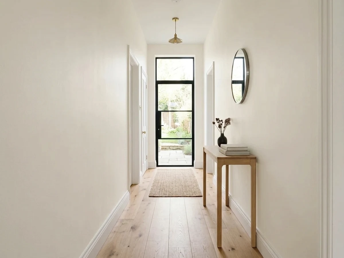
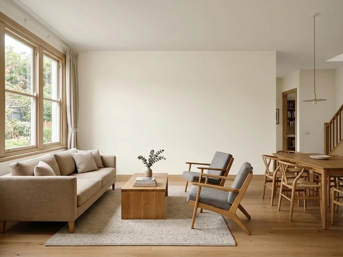
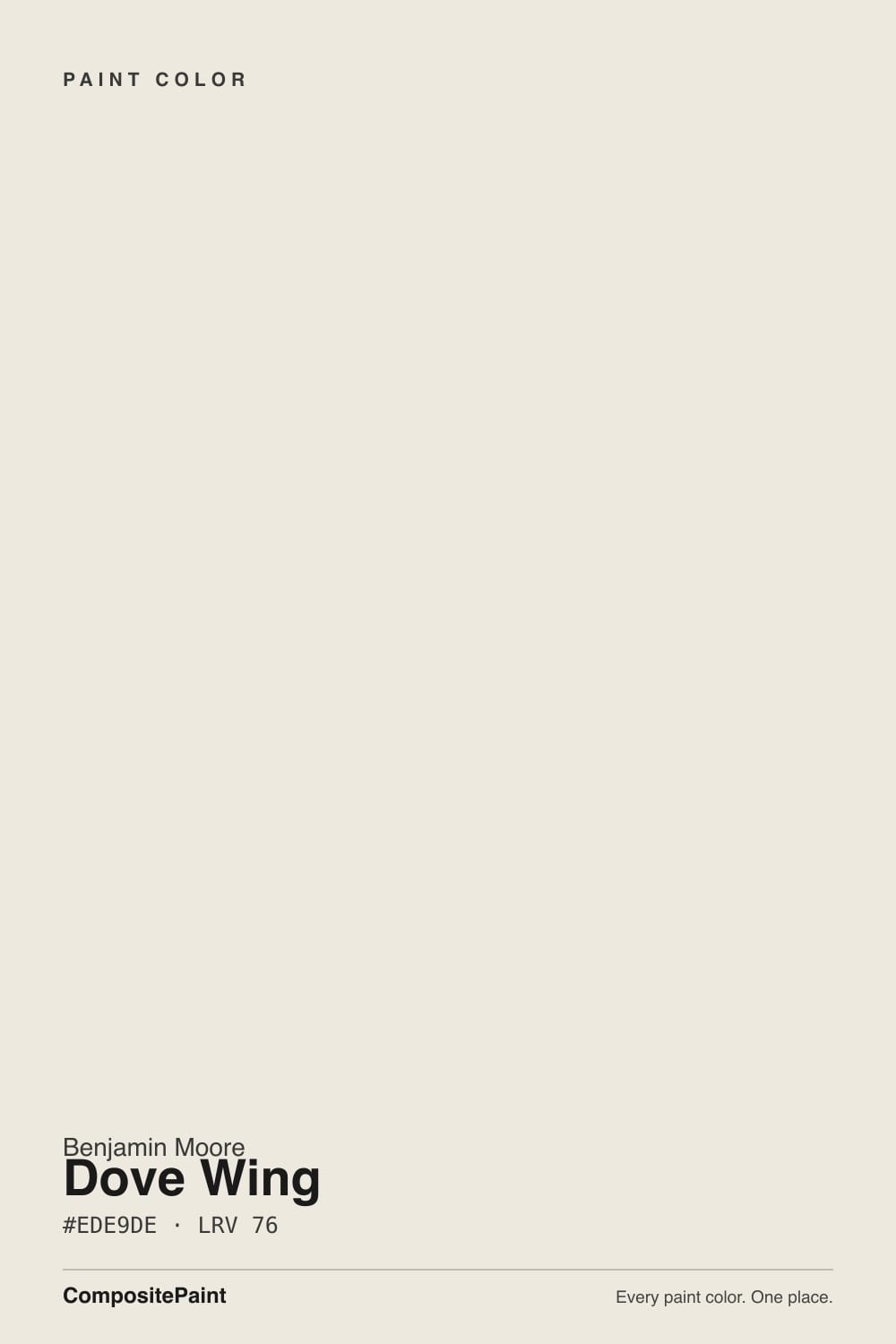
- 1Titanium68
- 2Eider White73
- 3Dove Wing78
- 4White Dove83
- 5Chantilly Lace91
The Fast Verdict
Dove Wing is the soft cream white that makes a cold room feel lived-in. It is a real off-white, not a bright white, so it always looks a little shaded and warm on the wall. That warmth is the whole point in north-facing rooms and next to oak floors.
The catch is contrast: leave a cool builder-white ceiling or old trim next to it and the walls immediately look dirty.
North-facing rooms that feel cold · whole-house walls over oak or walnut floors · cabinets with brass and warm counters · traditional trim, doors and siding
Your ceiling and trim stay a cool builder white · you want a crisp gallery-white look · your floors and counters are cool gray · strong west sun fills the room every afternoon
- Warms up north light without ever going butter-yellow
- Reads white from across the room, soft and creamy up close
- Hides scuffs and handprints better than any bright white
- Flatters oak, walnut, brass and cream-veined stone
- One color can run walls, trim, cabinets and siding
- Looks dingy next to a cool builder-white ceiling or trim
- Can flash peach in strong west afternoon sun
- Turns visibly cream under 2700K bulbs at night
- Too soft for a crisp, modern, high-contrast look
What Color Is Dove Wing, Really?
Dove Wing is a warm off-white with a genuine cream cast, and it does not pretend otherwise. Its hue sits in the yellow-orange band, but the useful detail is the red side of that: there is measurably more red than green in the mix, which is why the wall can look faintly peachy in strong sun where a straight cream white would only look yellow. That extra drop of red is the whole difference between this and White Dove, and it is why the two colors behave nothing alike even though the names get swapped constantly.
At LRV 76 it reflects about three quarters of the light in the room, which is bright enough to read as white from the doorway and clearly not bright enough to read as white next to real white. Put it beside Chantilly Lace OC-65 at LRV 92 and Dove Wing shows its body immediately: it looks soft, shaded, almost tinted. Against White Dove OC-17, which sits in the mid-80s, the gap is smaller but still visible on a wall. Think of Dove Wing as the deepest color you can use and still honestly call the room white.
Undertone in one line: warm cream with a faint red edge — never gray, never green, and only pink when the afternoon sun forces it.
Where It Shines
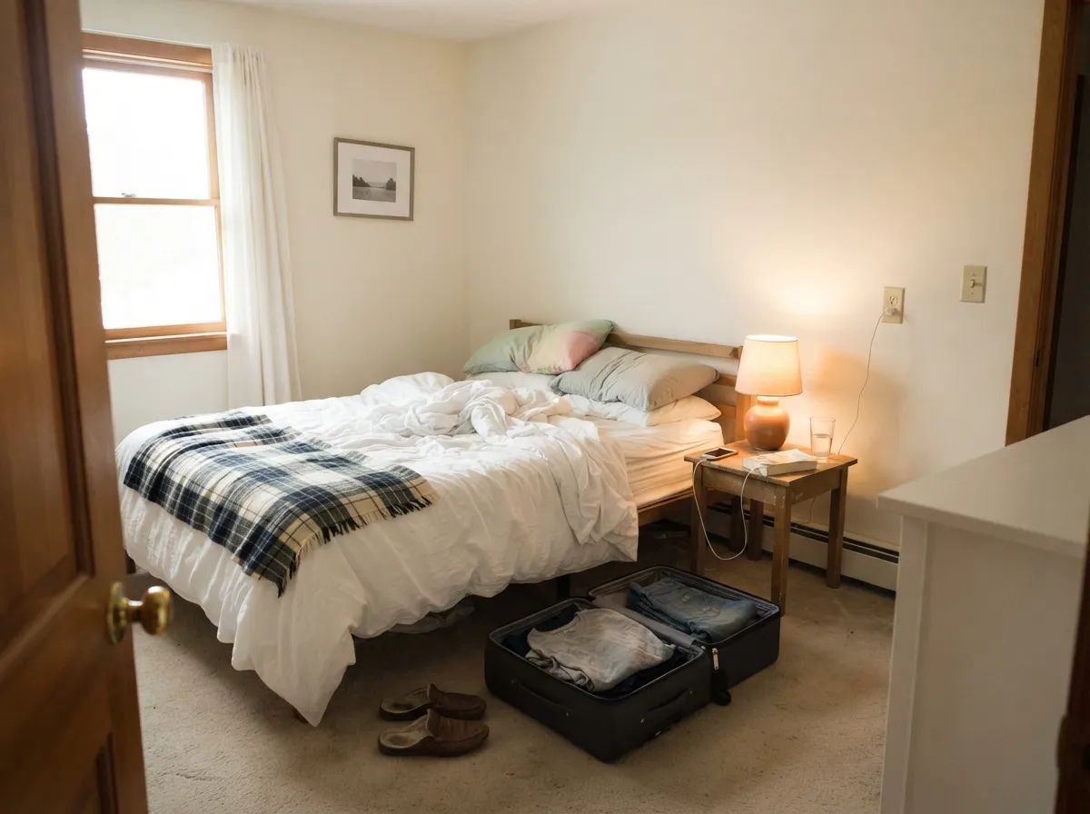
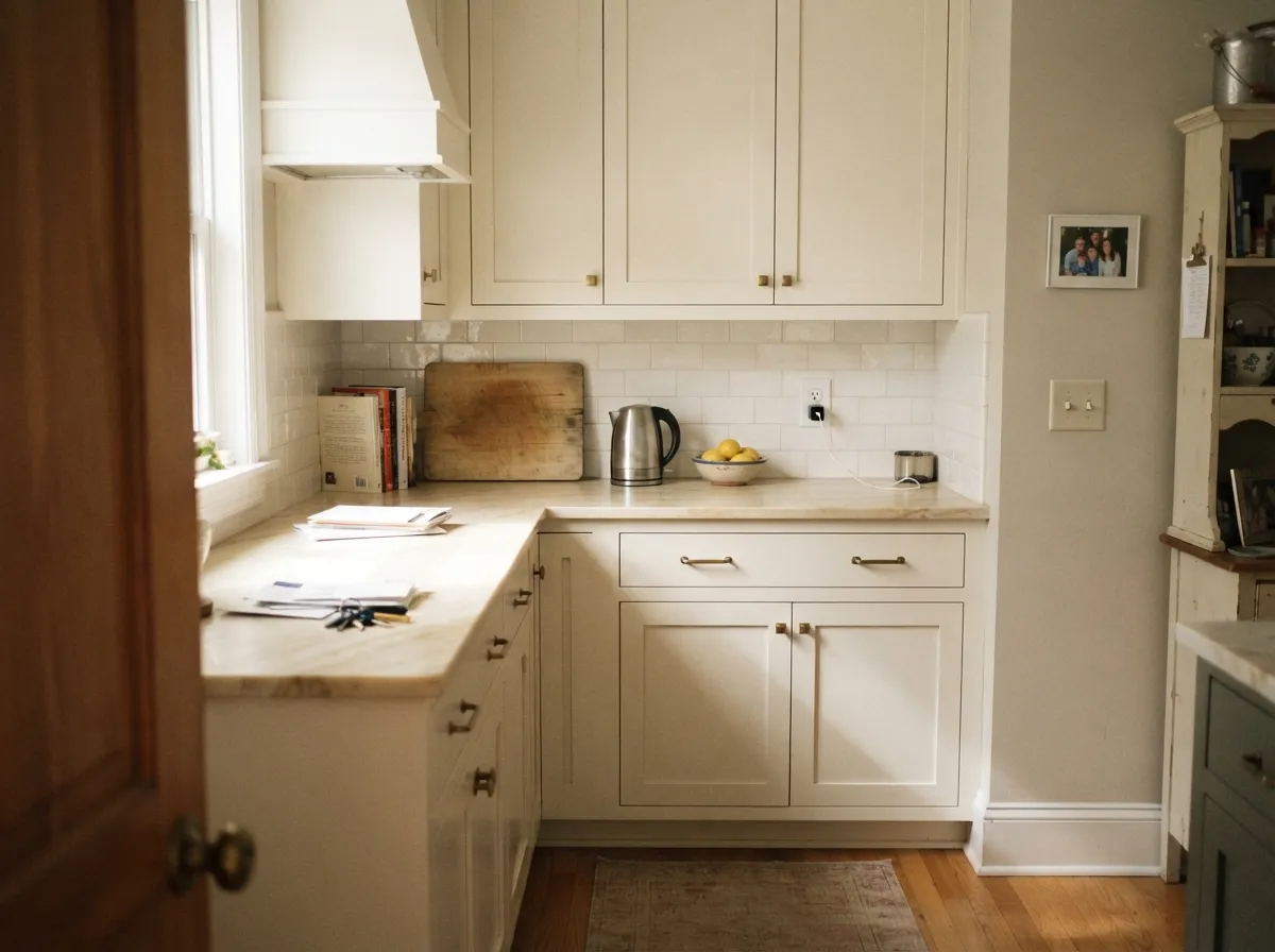
Its best trick is fixing cold light. In a north-facing room, on oak or walnut floors, with brass and warm stone, Dove Wing does what a bright white cannot — it keeps the room reading light while making it feel warm instead of clinical.
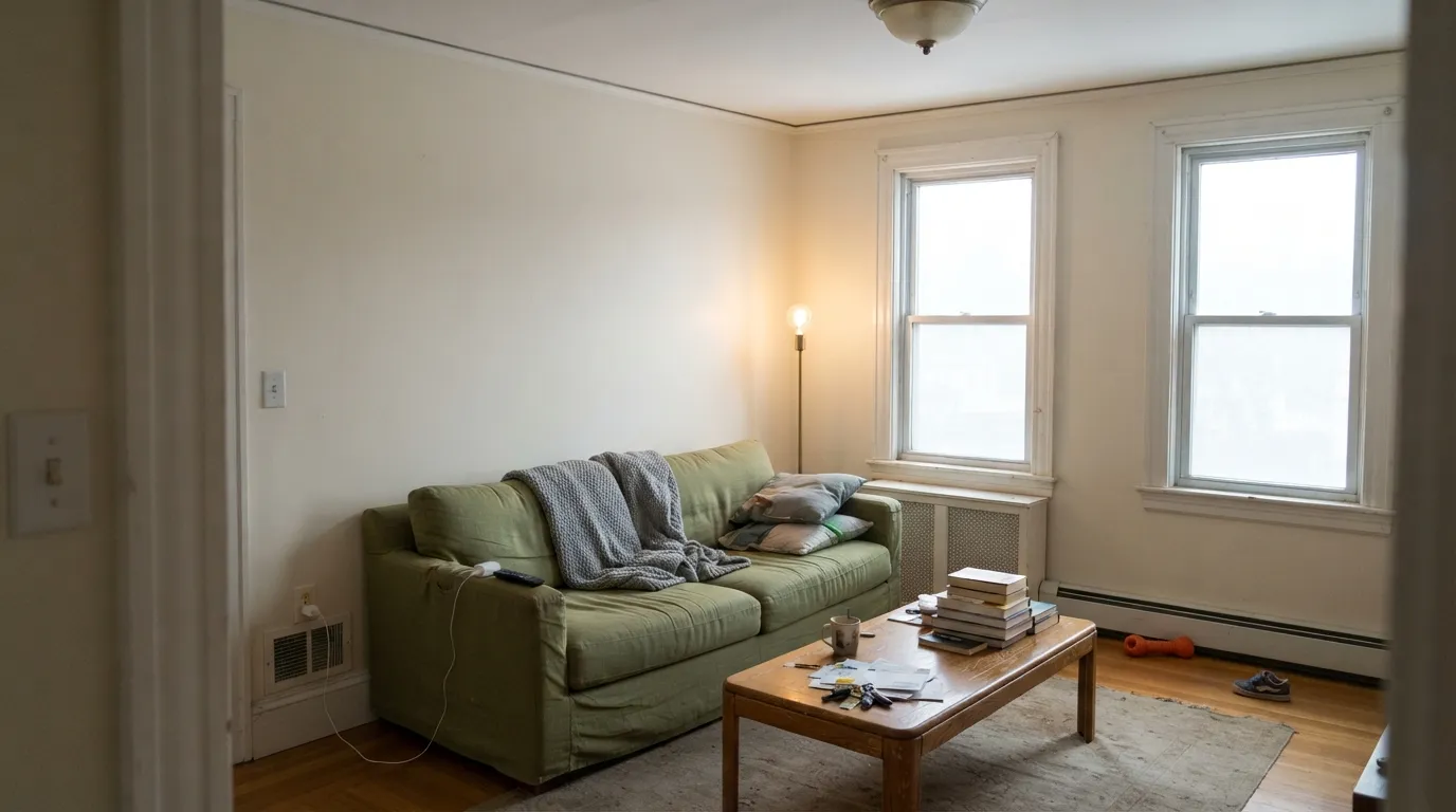
Where It Fails
The bad Dove Wing stories are almost never about the paint being ugly. They are about what sits next to it. Three situations account for nearly every complaint, and all three are visible on a sample board before you buy a gallon.
This is the number one regret. Dove Wing at LRV 76 sits next to a cool white ceiling in the low 90s and the walls read dingy — people describe it as looking like the room needs a wash. The fix is repainting the trim and ceiling in a warm bright white like Chantilly Lace OC-65, or skipping Dove Wing and using White Dove OC-17 on the walls instead.
The red side of the undertone comes forward when warm low sun rakes across the wall, and Dove Wing can flash peach or pale pink for an hour or two. If that room is the one you sit in every evening, use Classic Gray OC-23 instead — nearly the same lightness, but cooler, so the sun cannot pull anything pink out of it.
Gray-toned LVP, blue-gray tile and cool quartz all sit at the opposite temperature and push Dove Wing toward yellow-beige. The wall stops looking like a white and starts looking like an old one. With a cool gray floor package, pick a neutral white — Chantilly Lace OC-65 or Sherwin-Williams Pure White SW 7005.
Room by Room
This is the room Dove Wing was made for: north or east exposure, wood floors, real furniture. Eggshell on walls, and put the same color on the trim in semi-gloss if your existing woodwork is already off-white. With mid-tone oak and brass lamps it looks finished on day one.
Under 2700K bulbs it deepens into a soft cream at night, which most people read as cozy. Pair it with Palladian Blue HC-144 on a headboard wall if you want one quiet color note. Skip it if your bedding and curtains are cool bright white — the walls will look yellowed by comparison.
On cabinets it is softer and more forgiving than a bright cabinet white, and satin wipes clean around the handles. It loves brass hardware, butcher block and cream-veined stone. Check it against your backsplash first: a cool white subway tile makes the doors look cream, not white.
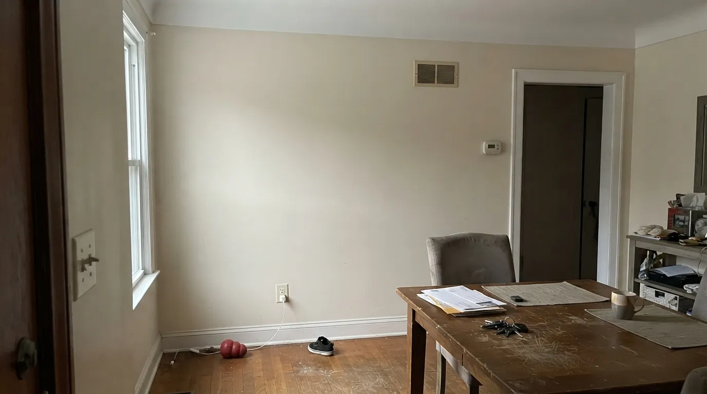
At LRV 76 it keeps windowless hallways from going dark while staying warm enough to flow into every room. Use it wall to wall, then change only the sheen at the trim. This is where paying for a real off-white instead of builder white shows.
Semi-gloss Dove Wing under Revere Pewter HC-172 or Edgecomb Gray HC-173 walls gives soft, traditional woodwork instead of a hard white line. Do not use it as trim under walls that are lighter than it — the trim will disappear.
Full sun lifts it and it reads as a warm traditional white on siding, not glaring. Black or charcoal shutters and trim — Wrought Iron 2124-10 or Kendall Charcoal HC-166 — give it the contrast it needs. Do not paint the front door Dove Wing; at this lightness it vanishes into the trim.
Your Light Is the Risk
Cool daylight cancels part of the cream and leaves a soft, warm white. This is the reason to buy it.
All-day warm sun pushes it past white into pale cream. Fine if you want cream — a surprise if you wanted white.
Low raking sun pulls the red side forward and the wall can go faintly peach for an hour.
2700K bulbs deepen the cream noticeably. 3000K to 3500K keeps it close to its daytime face.
Most complaints about Dove Wing are a light mismatch. Upload a photo of your actual room and see it on your walls — then ask for the same wall in north light or evening lamps before you buy a single sample.
Need It From Another Brand?
Any paint counter can custom-tint Benjamin Moore 960 directly. If you would rather stay in one brand's own deck, these are the closest stock matches, measured as ΔE2000. Under 2 is a difference you will not see on the wall.
| Brand | Closest color | ΔE | LRV | |
|---|---|---|---|---|
| Sherwin-Williams | Ivory LaceSW 7013 · Sherwin-Williams | 1.9 | 79 | Color page → |
| Behr | ShoelaceOR-W13 · Behr | 1.5 | 78 | Color page → |
| Valspar | Hint of CreamM213 · Valspar | 1.0 | 78.7 | Color page → |
| PPG / Glidden | Enduring IcePPG1102-1 · PPG / Glidden | 0.9 | 80 | Color page → |
| Glidden | Dogwood BlossomPPG14-24 · Glidden | 0.9 | 79 | Color page → |
| Dutch Boy | Antiquated Lace017W · Dutch Boy | 1.5 | 79 | Color page → |
Similar Benjamin Moore Colors
The nearest shades to Dove Wing within Benjamin Moore's own range, ranked by perceptual color distance — useful when you want the same look a touch lighter, darker, or warmer.
WCAG 2.1: AA is 4.5 : 1 for normal text, 3 : 1 for large text, AAA is 7 : 1.
Dove Wing vs the Colors You're Also Considering
Every Dove Wing sample board has the same rivals on it. The numbers show the real lightness gap — then it comes down to which risk you would rather live with.
Pick this when you want visible warmth and a softer, cozier wall.
Benjamin Moore OC-17 · LRV 85White DovePick this for a brighter, safer white that survives bright trim next to it.
Pick this if the room is cold and you want the warmth to show.
Benjamin Moore OC-23 · LRV 74Classic GrayPick this same lightness, cooler and calmer — no peach in west sun.
Within Benjamin Moore, Glacier White OC-37 is the closest everyday alternative. At LRV 80 it is a touch lighter than Dove Wing, and on the wall it reads a shade cleaner and less creamy. Pick Glacier White if you want the same general warmth with slightly more brightness in a dim room; pick Dove Wing when you want the walls to feel a bit more shaded and substantial.
Snow on the Mountain 1513 sits higher still at LRV 83, so it behaves more like a soft true white and less like an off-white. In a sunny south-facing space it stays white-looking where Dove Wing turns visibly cream.
Floral White OC-29, LRV 80, splits the difference: it is close in depth to Glacier White but shares Dove Wing's soft character. If you are torn, sample Dove Wing and Floral White side by side; the difference only becomes clear in your own light.
Dove Wing Coordinating Colors
Everything that partners well with Dove Wing lives on the warm side. It sits comfortably with warm greiges, oak and walnut, brass, and deep navies or charcoals. What it argues with is anything cool and crisp: icy blues, blue-gray stone, and cool builder whites. These are the partners that come up again and again in real rooms:
Dove Wing on Cabinets and Trim
On cabinets Dove Wing does something bright whites cannot: it stays quiet. Doors and drawer fronts catch light from every angle, and a high-LRV white shows every knuckle mark and every shadow line. At LRV 76 the color absorbs enough light to keep the run of doors looking calm, and it hides day-to-day wear around the pulls. Use a urethane-fortified cabinet enamel in satin, not wall paint.
The pairing that decides it is the backsplash. Warm stone, cream zellige, unlacquered brass and butcher block all sit right with it. Cool white subway tile and gray-white quartz do not — the cabinets will read cream against them, which some people love and others call yellow. Order a sample door or paint a spare drawer front and hold it against the actual counter before you strip a whole kitchen.
As trim, Dove Wing only works under walls that are deeper than it. Under Revere Pewter HC-172 or Edgecomb Gray HC-173 it gives soft traditional woodwork; under a lighter white it simply disappears.
The Dove Wing Ladder: Lighter and Darker
Most people who search for Dove Wing are really deciding how warm and how deep to go, so it helps to see the whole ladder in one place. Going up from Dove Wing at LRV 76: White Dove OC-17 in the mid-80s is the brighter, more neutral version, and Chantilly Lace OC-65 at LRV 92 is a true bright white with no cream at all. Going down: Pale Oak OC-20 near LRV 69 is the same warmth with a touch of gray, and Edgecomb Gray HC-173 near LRV 63 is where the color stops reading white and starts reading greige.
Use the ladder for whole-house planning rather than picking one winner. Chantilly Lace on the trim, Dove Wing on the main walls, Pale Oak or Edgecomb Gray in the rooms you want to feel cozier, and one deep color like Hale Navy HC-154 for doors and built-ins gives you a house that flows without a single hard color change. Everything on that list shares a warm base, which is the actual reason the transitions look planned.
Three Ready Palettes Built on Dove Wing
A color is never alone on the wall. These are complete combinations in the 60-30-10 pattern, with the reason each one holds together. Every one opens in the visualizer.
Dove Wing carries every wall at 60 percent, and Chantilly Lace at LRV 92 is bright enough to read as crisp woodwork without turning the walls dirty. The navy door is the single dark note that keeps an all-white house from looking unfinished.
Try this palette in your roomCabinets are the 60 percent surface here, and Pale Oak shares Dove Wing's warm base one step deeper, so the wall-to-cabinet handoff reads intentional instead of mismatched. Kendall Charcoal grounds the island and makes brass hardware look expensive.
Try this palette in your roomWhite Dove is only about nine LRV points brighter, so the trim reads clean but soft — the low-contrast version of the same room. Palladian Blue is the one cool note that stays restful next to cream instead of fighting it.
Try this palette in your roomDove Wing FAQ
Is Dove Wing actually a white, or is it a greige?
It is a white, but the deepest kind you can still call one. At LRV 76 it reads white from across the room and creamy up close. It has no gray-green in it, so it never tips greige the way Revere Pewter or Edgecomb Gray do.
Why does my Dove Wing look pink?
There is slightly more red than green in the mix, and low warm sun exaggerates it, so west-facing walls can flash peach in the late afternoon. Cool gray floors make it worse by contrast. If that hour matters to you, switch to Classic Gray OC-23, which sits at almost the same lightness without the red.
Dove Wing or White Dove?
White Dove is brighter and more forgiving, and it is the better pick if any surrounding white is staying put. Dove Wing is warmer and softer, and it wins in cold north rooms and against orange-toned oak floors. If you cannot decide, sample both on the same wall — the gap is obvious side by side and invisible on a chip.
Does Dove Wing look dirty next to white trim?
It can, and this is the single most common complaint. Against a cool builder-white ceiling it looks washed out. Against a warm bright white like Chantilly Lace OC-65 it looks soft and intentional. The trim you already have decides this, so check it before you buy paint.
Can I paint the ceiling Dove Wing too?
Yes, in flat, and it is a good idea when the walls are Dove Wing. One color overhead keeps the ceiling from cutting a cold white line across a warm room. Over a deeper wall color it also works as a softer alternative to stock ceiling white.
Is Dove Wing good for a north-facing room?
This is its best room. North light is cool and gray, and it cancels part of the cream so the wall lands as a soft warm white rather than a yellow one. Add 2700K to 3000K bulbs and the room stays warm after dark.
How many coats over an existing beige or tan wall?
Two coats over most light beiges, because Dove Wing is close enough in depth to cover without a fight. Over anything dark or saturated, prime first — a white at LRV 76 has very little hiding power and you will spend three coats learning that.
Have you painted with Dove Wing?
Rate it — one tap helps the next reader decide.
Ask a Question