White Down
The quietest cream white in Benjamin Moore's own catalog, reviewed honestly: the afternoon light where it glows, the north room where it goes dingy, and why almost nobody talks about it.

Jessica has spec'd whites and neutrals for more than 300 rooms and keeps a sample wall of painted drawdowns in her studio. Every color review is checked against real reader rooms in the comments and re-tested when a formula changes. About the testing process →
- 1Agreeable Gray60
- 2Pale Oak69
- 3White Down77
- 4Dover White83
- 5Moonlit Beach88
The Fast Verdict
White Down is a genuinely good warm cream that Benjamin Moore has never marketed — no Color of the Year run, no design-blog buzz, just a quiet cream sitting a few pages past White Dove and Swiss Coffee in the same catalog. A drop of gray keeps its cream from reading candy-sweet, but the cream itself is real: warmer and more visible than White Dove, close enough to Navajo White to be nearly interchangeable. Give it afternoon light and warm materials and it's one of the deck's better under-the-radar creams; put it in a dim north room and it goes flat fast.
West- or south-facing rooms with real afternoon light · kitchen cabinets over warm wood and butcher block · bathrooms with beige or warm-toned fixtures · anyone who wants a BM cream white without buying the same White Dove everyone already has
Your room faces north and stays dim most of the day · your countertops or stone are cool white or blue-grey · you're pairing it with a cooler greige trim · you want the reassurance of a color your painter has already used a hundred times
- Real, visible cream warmth — more color on the wall than White Dove or Cloud White
- The gray in the mix keeps it from reading candy-yellow
- Excellent with warm wood cabinets, brass hardware and beige stone
- A genuinely uncrowded pick — you won't walk into ten homes with the same white
- Holds its color well in real afternoon light
- Goes flat and dingy fast in a dim, north-facing room
- Reads too yellow next to cool white quartz or blue-grey stone
- Clashes with a brighter or cooler trim white — needs its own family
- Almost no design-blog or forum track record to sample against — you're mostly on your own
What Color Is White Down, Really?
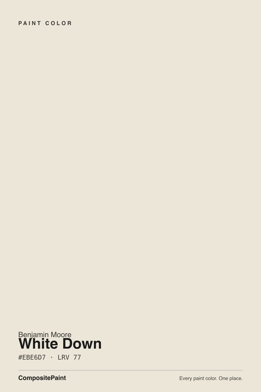
White Down is a genuine warm cream, not a marketing team's idea of one. Benjamin Moore's own description says it plainly: "the barest cream undertone gives this cozy white its feathery softness." It sits in the Classics Color Collection, filed among names most buyers already know — White Dove, Swiss Coffee, Cloud White — and gets almost none of their attention. Search its own number and you'll even find real confusion about what that number is (see the FAQ below); that's how far under the radar this color runs.
At LRV 77 it holds noticeably more visible cream than Benjamin Moore's marquee whites: White Dove and Cloud White both sit at LRV 85, Swiss Coffee at 84. That gap is the whole personality — White Down is not a barely-there off-white, it's a real cream color that happens to be light enough to still read as "white" in most rooms. Its closest sibling by the numbers is Navajo White at LRV 78: nearly identical on paper, different name, same warm-cream family.
Undertone in one line: warm cream first, a light gray second, muting the yellow just enough that it doesn't read candy-sweet. It doesn't carry pink or green in the base itself. If your sample looks too yellow, that's usually the room's own warm materials — beige stone, oak, brass — stacking on top of a color that was already warm to begin with, not the paint misbehaving.
Where It Shines
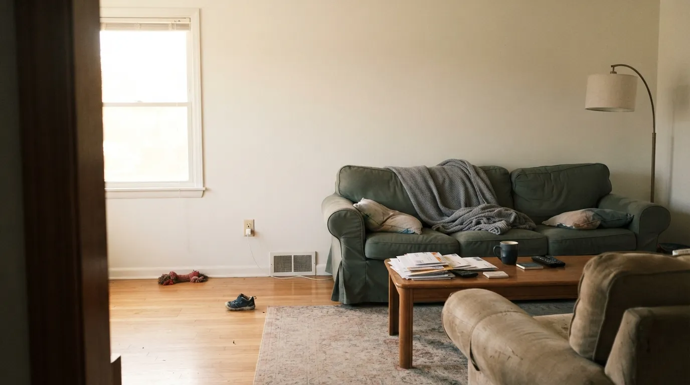
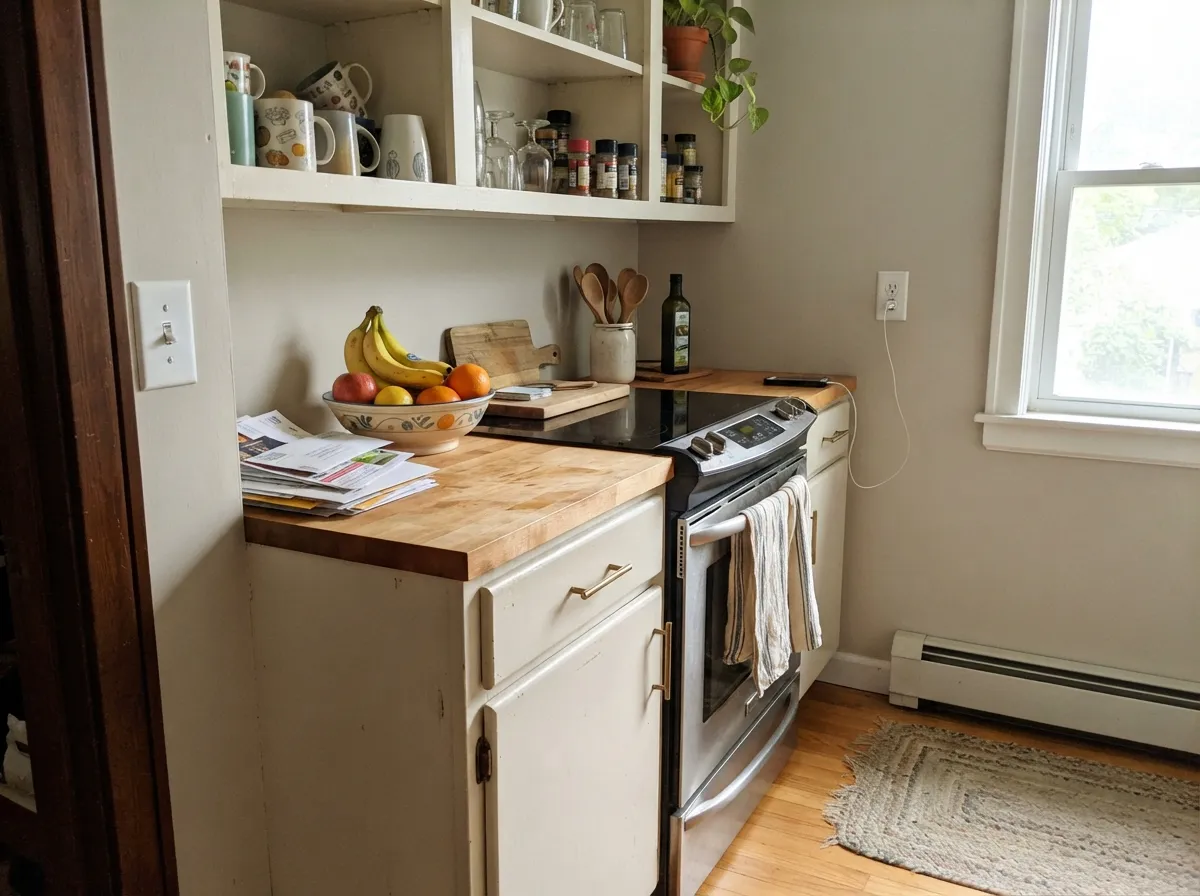
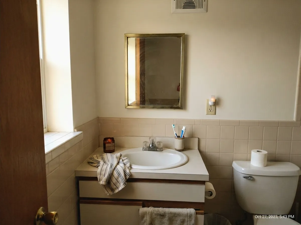
Give it real afternoon light and warm materials and this quiet color does real work. Real project reports single out kitchens with butcher block or warm stone, and bathrooms with beige fixtures and tile in west-facing rooms, as the places it performs best — the cream comes forward, the gray keeps it from tipping saccharine, and the whole room reads intentional rather than dated.
Where It Fails
Almost every regret story about White Down traces back to one of three situations, and all three show up in real project reports, not just theory. None of them are the paint's fault — but if your room matches one, this is not your white, and no amount of coats will fix it.
Cool north light strips the cream out fast and leaves the wall looking flat and dingy — the single most consistent complaint we found about this color. The paint isn't broken; the light is working against it. Go with White Dove instead, or commit to warm lamps and accept some flatness during the day.
Real project reports single this out by name: White Down next to cool white quartz counters reads noticeably too yellow. It needs warm-toned stone or wood underneath it to look intentional rather than dated.
The classic off-white mistake: pair White Down walls with a cooler, brighter trim and the walls read muddy by comparison — one real report called a cooler greige trim "too strong" beside it. Keep the trim in the same warm-cream family: Cloud White, or White Down itself.
Room by Room
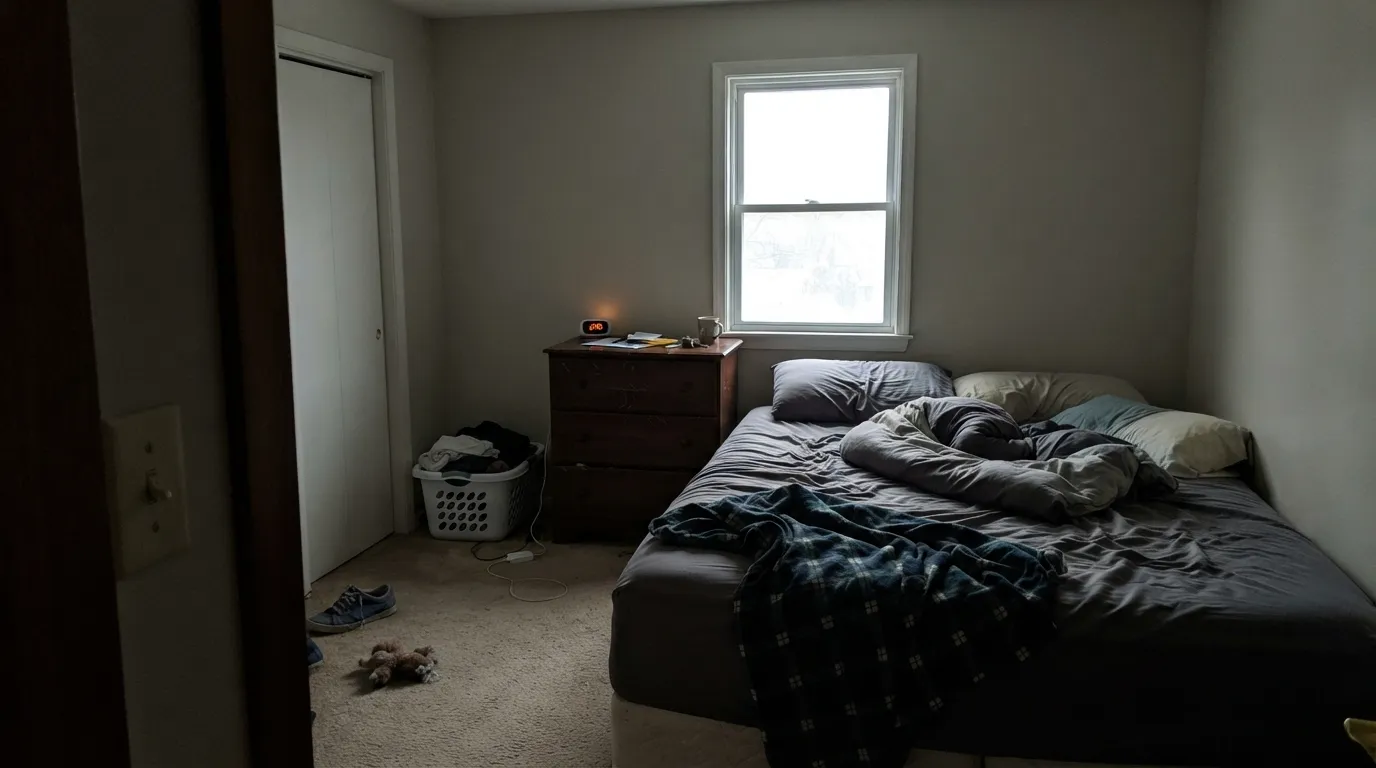
West or south windows keep the cream honest without letting it drift yellow. In a dim or north-facing living room, sample big before trusting it — that's the color's real weak spot, not a myth.
Warm wood, butcher block and beige stone bring out the color's real skill. The one surface to avoid is cool white quartz — real project reports call it out specifically as too yellow next to that particular cold-toned counter.
Warm 2700K lamps in the evening flatter it. If the room faces north and stays dim through the day, it can read flat and dingy long before the lamps go on.
With beige or warm-toned fixtures and tile, owners report it working well, especially in west-facing rooms. Cool grey tile is the mismatch to watch for.
Pair it with Cloud White or White Down itself, not a brighter or cooler trim white — one real report called a cooler greige trim too strong next to it, the same mismatch that makes any warm white look muddy by comparison.
We could not find meaningful exterior use or reviews for this color — unlike White Dove or Swiss Coffee, it doesn't have an outdoor reputation to lean on. If you want a proven warm exterior white, start with one of those instead, or sample this one on your own fascia before trusting it in full sun.
Your Light Is the Risk
Direct warm sun brings the cream forward without pushing it artificial — every real report about this color names this as its best light.
Cool north daylight drains the cream fast; owners describe the same wall going flat and dingy within the day. Test first.
Cooler and quieter at breakfast, visibly warmer by late afternoon. Sample across a full day before deciding — the color genuinely moves.
2700K lamps keep the cream cozy after dark. Cool white LEDs cancel the warmth and can tip it grey — swap the bulb before you blame the paint.
Most complaints about White Down are a light mismatch. Upload a photo of your actual room and see it on your walls — then ask for the same wall in north light or evening lamps before you buy a single sample.
Need It From Another Brand?
Any paint counter can custom-tint Benjamin Moore 970 directly. If you would rather stay in one brand's own deck, these are the closest stock matches, measured as ΔE2000. Under 2 is a difference you will not see on the wall.
| Brand | Closest color | ΔE | LRV | |
|---|---|---|---|---|
| Sherwin-Williams | Ivory LaceSW 7013 · Sherwin-Williams | 1.5 | 79 | Color page → |
| Behr | Quarried LimestonePPL-67 · Behr | 0.8 | 79 | Color page → |
| Valspar | Shania's Lace3006-10C · Valspar | 1.0 | 78.9 | Color page → |
| PPG / Glidden | Little LambPPG1112-1 · PPG / Glidden | 0.5 | 78 | Color page → |
| Glidden | Little LambPPG1112-1 · Glidden | 0.5 | 79 | Color page → |
| Dutch Boy | Antiquated Lace017W · Dutch Boy | 1.1 | 79 | Color page → |
Similar Benjamin Moore Colors
The nearest shades to White Down within Benjamin Moore's own range, ranked by perceptual color distance — useful when you want the same look a touch lighter, darker, or warmer.
WCAG 2.1: AA is 4.5 : 1 for normal text, 3 : 1 for large text, AAA is 7 : 1.
White Down vs the Colors You're Also Considering
Every White Down sample board has the same rivals on it. The numbers show the real lightness gap — then it comes down to which risk you would rather live with.
Pick this for a quieter, gray-muted cream that doesn't announce itself the way Creamy does.
Sherwin-Williams SW 7012 · LRV 81CreamyPick this if your painter works in Sherwin-Williams and you want the same visible cream — Creamy shows its color loudly, for better and worse.
Pick this for real, visible cream warmth — White Dove is calmer and cooler than most people expect from a "warm white."
Benjamin Moore OC-17 · LRV 85White DovePick this for the safer, more famous BM default — brighter, more grayed, and a color every painter has already rolled a hundred times.
Pick this for the same warm-room requirement, committed to walls, with more visible color than Cloud White alone gives you.
Benjamin Moore OC-130 · LRV 85Cloud WhitePick this as the trim partner, not the wall color — it's built for warm rooms exactly like the ones White Down wants.
Inside Benjamin Moore, Dove Wing 960 and Dove Wing OC-18 at LRV 78 are the usual alternatives. Their hex of #E9E6DB carries a touch less yellow, so Dove Wing reads slightly cooler and grayer while White Down stays creamier. Soft Chamois 969 and OC-13 at #E8E5D8 land between the two. At this lightness the gaps are small enough that you need brush-outs, not chips, to tell them apart.
Across brands, Dunn-Edwards Historic White DET653 shares the same hex at deltaE 0. Kompozit Bleached Meadow 0376 and Diamond Vogel Bleached Meadow 0376, both under deltaE 0.5, are the same story. Sherwin-Williams Ivory Lace SW 7013 at LRV 79 and deltaE 1.51 is visually identical in normal room light.
The real differences start further out. Backdrop Don't Eat the Yellow Snow BD-DS at LRV 84 and deltaE 3.36 is very close but worth sampling, and Rust-Oleum Chiffon Cream 329598 at LRV 92 and deltaE 4.19 is close but visibly lighter and more yellow side by side.
White Down Coordinating Colors
The rule for coordinating with White Down is the same one that works for any warm cream: stay warm, stay wood-toned, and keep the trim inside the same family. It pairs naturally with warm greiges, brass, walnut and deep near-blacks — and it argues with cool white quartz, blue-grey stone and any brighter, cooler trim white sitting right next to it. These are the partners that hold up in practice:
White Down's Story: A Quiet Color in a Loud Family
White Down has never had a Color of the Year run, a viral moment, or much of a design-blog footprint — search for it and you get a handful of color-consultant sites, not the wall of coverage White Dove or Swiss Coffee generates. Benjamin Moore's own listing describes it simply: "the barest cream undertone gives this cozy white its feathery softness." That's the whole marketing effort. It sits in the Classics Color Collection a few pages past three colors the company actively promotes, and most homeowners never scroll that far.
The low profile shows up in a small, telling way: search its number and you'll find White Down listed as 970 on some sites, OC-131 or CC-50 on others — genuine confusion about a paint most references barely bother to standardize. None of this makes it a worse color. It makes it an honest one: competent, warm, and genuinely under-discovered rather than secretly flawed.
White Down With Wood Tones and Floors
Warm wood is this color's natural company — real owner reports point to butcher block, oak cabinets and beige stone as the surfaces it flatters, and the same logic extends to walnut floors and trim. The cream in the paint and the warmth in the wood run in the same direction, so neither fights the other.
Cool-toned material is the one honest no: cool white quartz counters and blue-grey stone have been the specific complaint in real project reports, where the warmth in White Down reads as yellow next to the cold in the stone. If your countertop or floor already leans cool, sample big before committing — this is not the white for a Carrara-marble kitchen.
Three Ready Palettes Built on White Down
A color is never alone on the wall. These are complete combinations in the 60-30-10 pattern, with the reason each one holds together. Every one opens in the visualizer.
Edgecomb Gray's warm greige shares White Down's cream base, so the wall-to-cabinet handoff stays seamless; Kendall Charcoal grounds the room and lets the brass hardware White Down was built for do the rest.
Try this palette in your roomWest afternoon sun is the light White Down was built for; Cloud White keeps the trim in the same warm family instead of fighting it, and one navy wall gives the room a single confident note without crowding the cream.
Try this palette in your roomOne color at two sheens keeps a small room seamless instead of choppy; the near-black wood-tone frame gives it the single grounding note the cream needs — exactly the kind of confined room where this uncrowded color gets to be the whole idea.
Try this palette in your roomWhite Down FAQ
Is White Down warm or cool?
Warm — a real cream base with a touch of gray muting the yellow, per Benjamin Moore's own description ("the barest cream undertone gives this cozy white its feathery softness"). It carries more visible color than White Dove or Swiss Coffee; it doesn't read pink or green on its own, though a strongly warm-toned neighbor can make it look more yellow than it is.
Is White Down the same as Navajo White?
Not identical, but close enough to matter: both sit around LRV 77–78, and their hex values are within a shade of each other. If your store stocks one and not the other, either will land you in roughly the same warm-cream territory — Navajo is simply the more decoratively branded of the two names.
Is White Down 970 or OC-131?
You'll see it listed both ways online, plus CC-50 on some older references — genuine numbering confusion for a color that gets little standardized coverage. Benjamin Moore's current catalog number is 970; it's the same paint under every label.
Is it good for kitchen cabinets?
Yes, with the right countertop. Warm wood, butcher block and warm stone all flatter it. The one real mismatch reported is cool white quartz, where the cream reads distinctly too yellow next to the cold counter.
Does White Down work in a north-facing room?
Cautiously. Real reports describe it going drab or dingy in dim north light — the color needs some warmth to work with, whether that's afternoon sun or 2700K lamps. If your room is dark and stays that way, sample big before committing.
What trim color goes with White Down walls?
Stay in the same warm family — Cloud White, or White Down itself in a higher sheen. A brighter or cooler trim white makes the walls look muddy by comparison, the same mismatch that trips up most warm off-whites.
Have you painted with White Down?
Rate it — one tap helps the next reader decide.
Ask a Question