Ivory Lace
The off-white the kitchen-cabinet trade quietly defaults to, reviewed honestly: where it holds its ivory, the light that turns it pink-grey, and what to pick instead.

Jessica has spec'd whites and neutrals for more than 300 rooms and keeps a sample wall of painted drawdowns in her studio. Every color review is checked against real reader rooms in the comments and re-tested when a formula changes. About the testing process →
- 1Agreeable Gray60
- 2Pale Oak69
- 3Ivory Lace79
- 4Heavy Cream84
- 5Lightning White92
The Fast Verdict
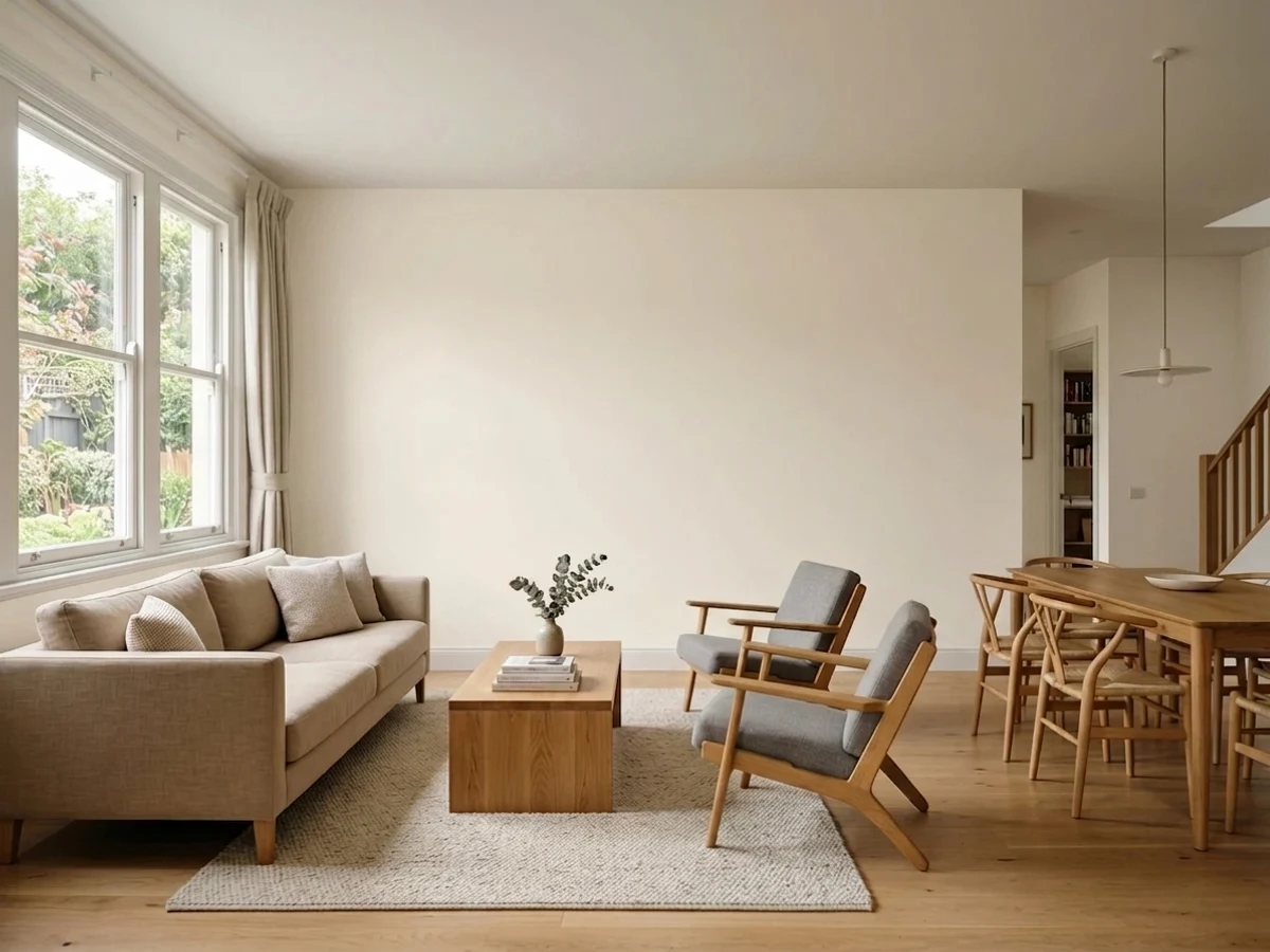
Ivory Lace is the off-white that never had a marketing moment and doesn't need one. It sits in the narrow gap between Sherwin-Williams's two famous whites — warmer than Alabaster, quieter than Creamy — with a barely-there hint of pink under the cream that most reviewers never even mention. It is not a color you'll see named in a design magazine. It is a color kitchen-cabinet shops reorder without thinking twice.
Kitchen cabinets and shaker fronts · whole-house warm off-white walls + trim · farmhouse exteriors with dark trim · anyone who wants Alabaster's calm without its starkness
Your room is north-facing and stays dim · you want an icy, true-white brightness · you're pairing with cool grey stone · you want a color people will recognize by name
- Genuinely occupies the middle ground: warmer than Alabaster, quieter than Creamy
- LRV 79 keeps rooms bright without a stark, clinical look
- A trade favorite for shaker cabinets — works with brass, nickel, and matte black equally well
- Reliable enough for a whole-house one-color wall-and-trim scheme
- No hype markup or trend timestamp — a dependable, unglamorous off-white
- Cool, north-facing light exposes a pink-grey cast most warm off-whites don't show
- Almost no real-room photo coverage online — you're sampling mostly blind
- Reads dingy next to a brighter white trim, like every color in this family
- Not a distinctive or memorable color if that is what you're after
What Color Is Ivory Lace, Really?
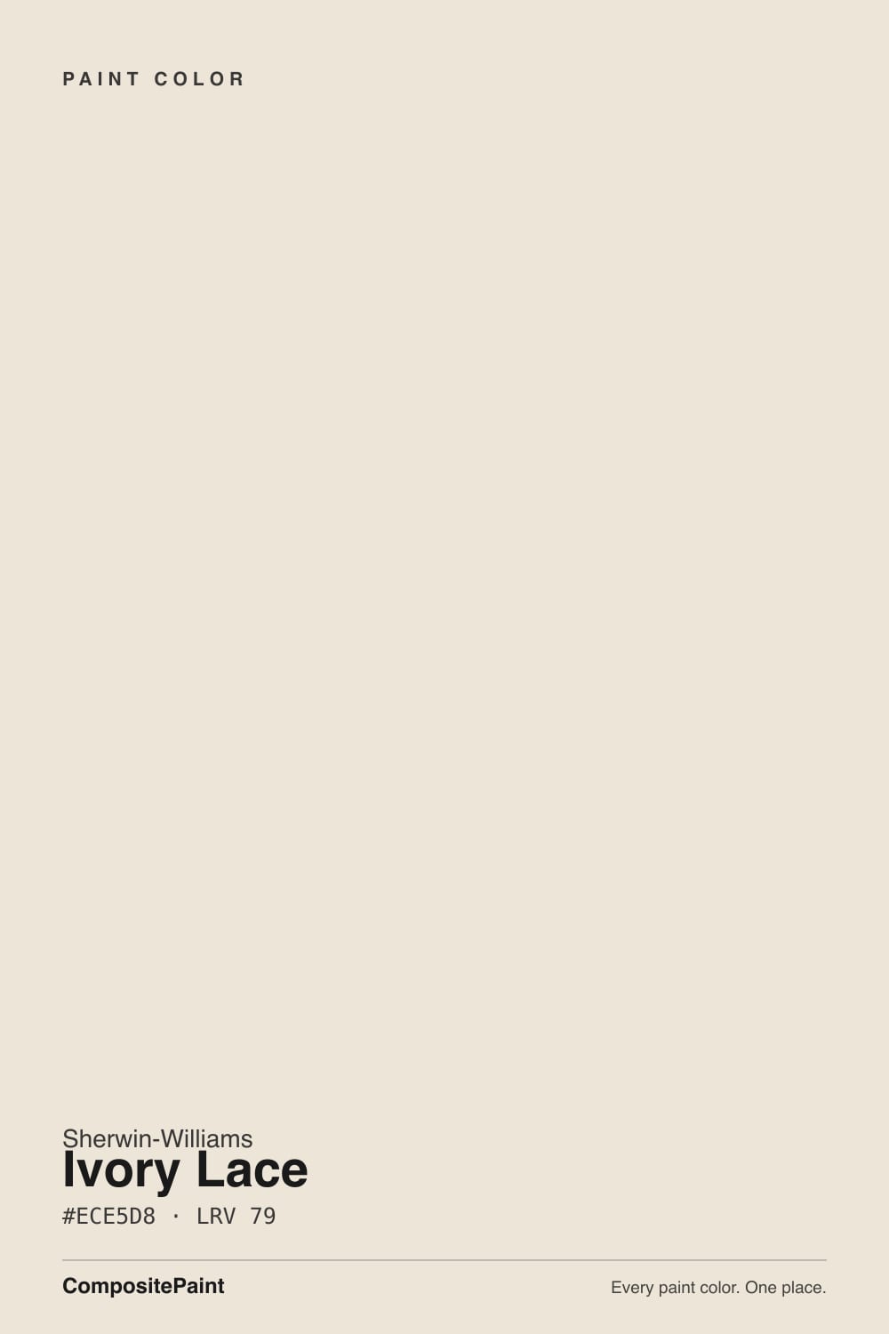
A warm off-white built on a gentle yellow-beige base with a whisper of pink underneath — pink, not the grey most warm whites lean on. That is the detail that separates it from its own family: put it next to Alabaster and Ivory Lace reads visibly softer and creamier; put it next to Creamy and Ivory Lace pulls back from the yellow Creamy commits to. It occupies the exact middle ground between Sherwin-Williams's two most-discussed whites, which is probably why it gets discussed so much less than either.
At LRV 79 it reflects a lot of light but is not a bright white — it sits below Alabaster (82) and well below White Dove (85) or Chantilly Lace (92). On the wall that shows up as a genuine two-sided undertone: strong daylight pulls the cream forward and it reads airy and warm; flat, cool daylight lets the pink underneath surface instead, and the color can drift toward a dusty, slightly cool cast rather than staying ivory. Most off-whites just go grey and flat in bad light — Ivory Lace goes pink-grey, which is a more specific, less obvious failure mode.
The honest part of this review: Ivory Lace has almost no public track record. It has never been a Color of the Year, it rarely headlines a paint blog, and one Houzz thread about it is literally a homeowner asking for opinions because there was so little else to find. Where it does show up is trade listings — cabinet shops and kitchen suppliers name it by SKU as a stock shaker-cabinet color, the kind of quiet, repeat-order popularity that never shows up in a "most popular colors" ranking.
Where It Shines
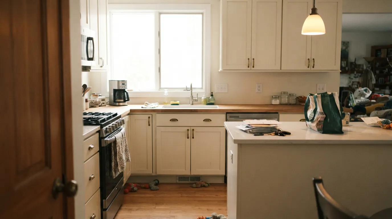
Its best job is exactly the one the trade already gives it: kitchen cabinets. On shaker or slab fronts it reads elegant without going stark, and it sits comfortably under brushed brass, polished nickel, or matte black hardware alike — few colors are that flexible with metal finishes. It pairs easily with marble, white quartz, and butcher block counters because none of those fight its warmth. Give it real daylight on a whole-house wall-and-trim scheme and it holds the same calm, unhyped competence.

Where It Fails
Almost every disappointing Ivory Lace story comes from one of three situations, and all three are predictable before the first coat. None of them are the paint's fault — but if your room matches one, this is not your off-white.
This is not the usual "goes flat and grey" story. Cool, flat daylight lets the color's underlying pink surface instead of the cream — real reports describe it reading faintly dusty-pink or cool-grey rather than ivory, which surprises anyone expecting the warm cream the fan deck shows. Test a real sample in your actual room before committing a whole kitchen to it.
Like every warm off-white, Ivory Lace loses this fight. A stark white trim or ceiling makes the wall read dingy by comparison. Keep trim in Ivory Lace itself, one step up in sheen, rather than jumping to a brighter white.
The warm-plus-pink base argues with cool blue-grey quartz, cool grey tile, and cool-toned adjacent rooms — the contrast can push Ivory Lace toward muddy or dated instead of soft. Pair it with warm-veined marble, butcher block, or a warm neutral next door instead.
Room by Room
In a bright room it is a calm, unhyped backdrop for furniture and art. Eggshell on the walls, the same color on trim in semi-gloss.
The trade's quiet default: a shaker-cabinet color that flatters brass, nickel, or matte black hardware and sits easily against marble, quartz, or butcher block. Satin cabinet enamel wipes clean and hides handle marks.
Under 2700K bulbs it turns gently cozy at night. A north-facing bedroom that stays dim all day is the one case to sample carefully first.
Warm marble, wood vanities, and brass hardware: excellent. Cool grey tile or blue-grey stone: it starts to look muddy — pick a cooler, more neutral off-white instead.
Semi-gloss Ivory Lace trim under a warm greige or neutral wall color reads soft and finished, without the harder cut a bright white trim gives.
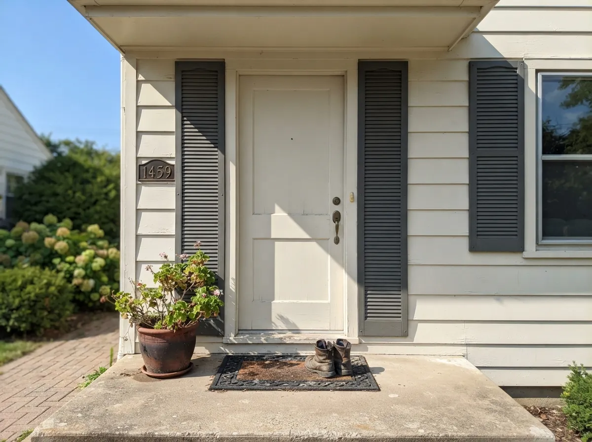
Full sun reads it cleaner and brighter than it does indoors, and paired with charcoal or navy trim it lands as a classic farmhouse exterior without feeling stark.
Your Light Is the Risk
Strong, warm daylight pulls the cream forward and the color reads its most balanced ivory self — closest to the fan deck chip.
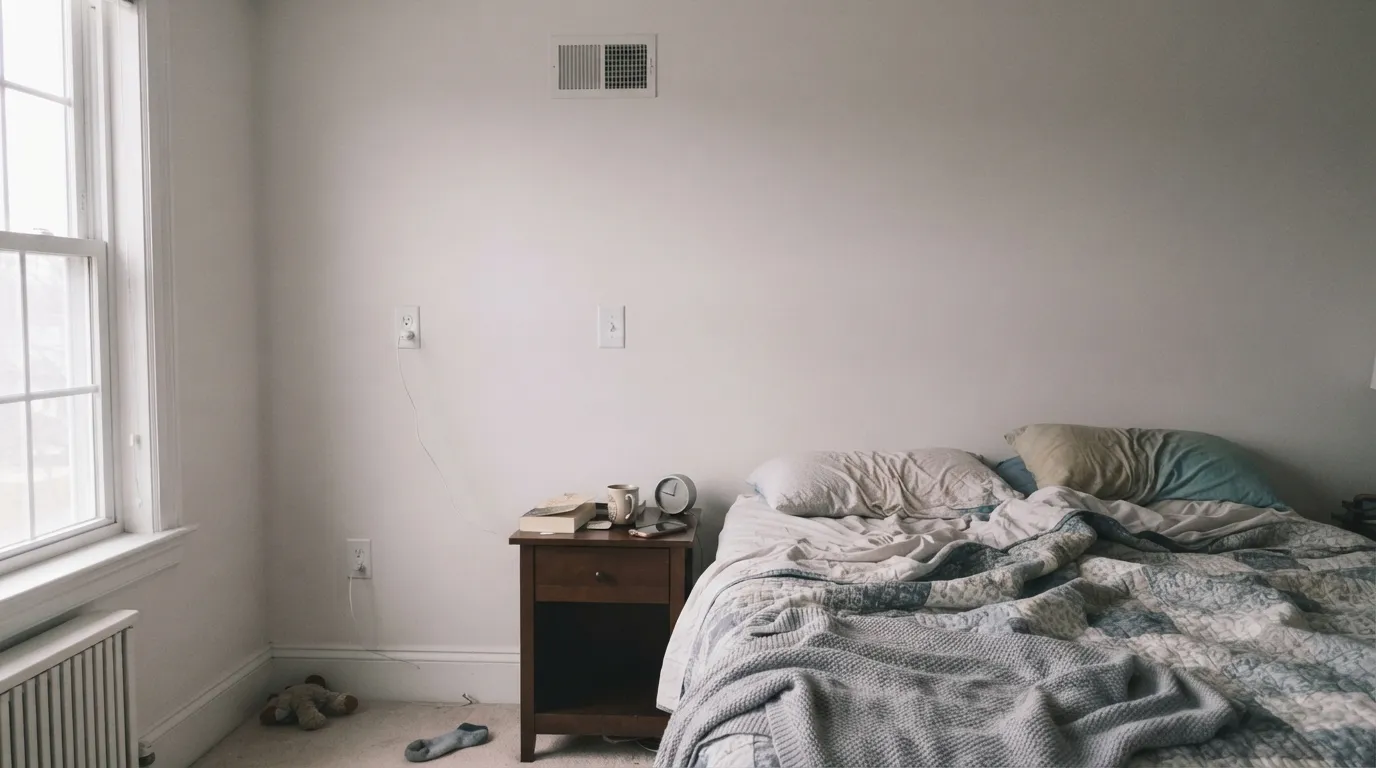
Flat, cool daylight suppresses the cream and lets the underlying pink surface instead, reading closer to dusty grey-pink than ivory. Sample before committing.
Warm and golden at the sun hours, settling back toward balanced ivory the rest of the day — a gentle shift, not a dramatic one.
2700K bulbs deepen the cream and keep it cozy at night. Cool white LEDs flatten it toward the same grey-pink cast north light gives it — change the bulbs before you consider repainting.
Most complaints about Ivory Lace are a light mismatch. Upload a photo of your actual room and see it on your walls — then ask for the same wall in north light or evening lamps before you buy a single sample.
Need It From Another Brand?
Any paint counter can custom-tint Sherwin-Williams SW 7013 directly. If you would rather stay in one brand's own deck, these are the closest stock matches, measured as ΔE2000. Under 2 is a difference you will not see on the wall.
| Brand | Closest color | ΔE | LRV | |
|---|---|---|---|---|
| Behr | Sail ClothN300-1 · Behr | 0.4 | 79 | Color page → |
| Benjamin Moore | White Down970 · Benjamin Moore | 1.5 | 77 | Color page → |
| Valspar | Bubble BathV154 · Valspar | 0.5 | 78.6 | Color page → |
| PPG / Glidden | China WhitePPG1101-1 · PPG / Glidden | 1.0 | 78 | Color page → |
| Glidden | China WhitePPG1101-1 · Glidden | 1.5 | 79 | Color page → |
| Dutch Boy | Antiquated Lace017W · Dutch Boy | 0.5 | 79 | Color page → |
Similar Sherwin-Williams Colors
The nearest shades to Ivory Lace within Sherwin-Williams's own range, ranked by perceptual color distance — useful when you want the same look a touch lighter, darker, or warmer.
WCAG 2.1: AA is 4.5 : 1 for normal text, 3 : 1 for large text, AAA is 7 : 1.
Ivory Lace vs the Colors You're Also Considering
Every Ivory Lace sample board has the same rivals on it. The numbers show the real lightness gap — then it comes down to which risk you would rather live with.
Pick this for the softer, more visibly warm version — Alabaster can feel flat where Ivory Lace feels ivory.
Sherwin-Williams SW 7008 · LRV 82AlabasterPick this if you want it crisper and more neutral — Alabaster reads as an off-white, not a cream.
Pick this for the toned-down version — the same warmth without Creamy's visible yellow.
Sherwin-Williams SW 7012 · LRV 81CreamyPick this if you want the full cream, unapologetically — Creamy leans yellow where Ivory Lace only hints at warmth.
Creamy SW 7012 at LRV 81 and hex #EFE8DB is the closest well-known alternative. It is slightly brighter and pushes further toward true cream, so in south light it reads more yellow than Ivory Lace does. Pearly White SW 7009 at LRV 77 and hex #E8E3D9 goes the other way: a bit deeper and a shade less warm, which makes it the safer choice if you fear yellow.
Across brands, Rodda Gesso CA016 at deltaE 0.48, Dutch Boy Antiquated Lace 017W at deltaE 0.5, Behr Natural Linen W-F-120 at deltaE 0.52, and Valspar Bubble Bath V154 at deltaE 0.53 are all effectively the same color. Farrow and Ball Farrow's White No. 9812 at deltaE 1.25, Benjamin Moore White Down 970 at deltaE 1.51, and Dunn-Edwards Historic White DET653 at deltaE 1.51 are visually identical in normal room light.
Magnolia Home Carter Creme JG-16 at deltaE 2.1 is very close, so sample first. Backdrop Don't Eat the Yellow Snow BD-DS at deltaE 4.27 and LRV 84 is close but visibly different side by side, and lighter.
Ivory Lace Coordinating Colors
The rule for coordinating with Ivory Lace: stay warm, and keep true cool-grey at arm's length. It sits easily next to warm greiges, dark near-blacks, and deep navies — the same partners that flatter most warm off-whites — because none of them fight its pink-tinted cream base.
Why Ivory Lace Flies Under the Radar
Every famous paint color has a story: a Color of the Year run, a celebrity kitchen, a viral before-and-after. Ivory Lace has none of that. Search for it and you'll find product listings and a handful of thin reviews — one homeowner even posted to a design forum specifically because there was so little else written about it. That's unusual for a Sherwin-Williams color with an LRV this friendly and a use case this broad.
The likely explanation is where its reputation actually lives: not in design media, but in cabinet shops and contractor spec sheets, where it gets ordered by SKU as a stock shaker-cabinet color, over and over, without anyone writing a blog post about it. That's a quieter kind of popularity than a Color of the Year — untracked by search trends, but real in a way repeat trade orders usually are.
Ivory Lace With Wood Tones and Floors
Warm wood is the easy pairing. Oak, walnut, and butcher block all sit comfortably against Ivory Lace's cream-and-pink base, and it's a common choice over honey-toned floors specifically because it doesn't fight the orange the way a true gray would.
Cool-toned floors are the one situation worth a sample first: cool grey LVP or grey-washed wood can make the pink undertone more noticeable, especially in anything less than bright daylight. It isn't a hard no — warm rugs and brass fixtures usually settle the argument — but test a large sample above the actual floor before committing a whole room.
Three Ready Palettes Built on Ivory Lace
A color is never alone on the wall. These are complete combinations in the 60-30-10 pattern, with the reason each one holds together. Every one opens in the visualizer.
Ivory Lace's warmth softens Agreeable Gray's cooler edge instead of fighting it, and the navy island supplies the single dark note the kitchen needs — brass hardware ties all three together.
Try this palette in your roomOne color at two sheens keeps hallways flowing without hard contrast lines, and the near-black door supplies the single dark accent a warm off-white house needs.
Try this palette in your roomWarm ivory siding keeps the exterior from feeling stark or cold; charcoal trim and a navy door supply the classic farmhouse contrast without going full black-and-white.
Try this palette in your roomIvory Lace FAQ
Is Ivory Lace warm or cool?
Warm, with a genuine split personality. In strong daylight the cream base comes forward and it reads a soft, warm ivory. In flat, cool daylight the underlying pink surfaces instead, and it can drift toward a dusty grey-pink. Both are the same paint being honest about the light.
Ivory Lace vs Alabaster — which one should I pick?
Alabaster is crisper and more neutral, the safer pick if you want an off-white that barely reads as a color. Ivory Lace is visibly softer and creamier — pick it when Alabaster feels flat or clinical and you want more warmth without going as far as Creamy.
Is it good for kitchen cabinets?
Yes — this is where it earns its reputation. It's a stock shaker-cabinet color at plenty of cabinet shops for a reason: it flatters brass, nickel, and matte black hardware equally, and it doesn't fight marble, quartz, or butcher block counters.
What trim color goes with Ivory Lace walls?
Ivory Lace itself, one step up in sheen. A brighter white trim will make the walls look dingy by comparison — the same trap every warm off-white falls into.
Does it work on exteriors?
Yes. It reads cleaner and brighter in full sun than it does indoors, and it pairs well with charcoal or navy trim for a classic farmhouse look. Avoid cool blue-grey accents next to it outdoors, same as inside.
Why is there so little written about Ivory Lace online?
Because it never had a moment — no Color of the Year run, no viral room. It built its reputation quietly through cabinet shops and contractors who kept reordering it by SKU rather than through design blogs. That makes it harder to research before you buy, but it doesn't make it a worse color; it makes it an unadvertised one.
Have you painted with Ivory Lace?
Rate it — one tap helps the next reader decide.
Ask a Question