Heavy Cream
Behr's orange-family vanilla cream, reviewed honestly: the rooms where it looks like ice cream, the brighter white that makes it dingy, and why it is not a white.

Jessica has spec'd whites and neutrals for more than 300 rooms and keeps a sample wall of painted drawdowns in her studio. Every color review is checked against real reader rooms in the comments and re-tested when a formula changes. About the testing process →
- 1Agreeable Gray60
- 2Pale Oak69
- 3Heavy Cream84
- 4Lightning White92
The Fast Verdict
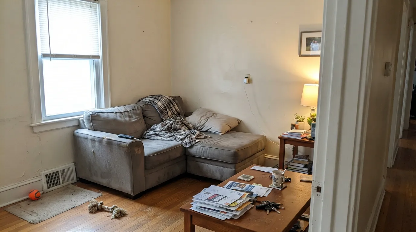
Heavy Cream is the Home Depot gallon you pick when a true white feels stark and beige feels heavy. At LRV 84 it still bounces light, but Behr files PPU5-10 in the orange family, not the white family, and the wall agrees: yellow-beige with a red-orange lean, like vanilla that actually has fat in it. In south light with oak and brass it looks decided and expensive. Next to Polar Bear trim, on cool gray floors, or in a north cave, the same paint looks like leftover builder cream. Do not buy it hoping it will stay white.
South- and east-facing living rooms · kitchens with oak, brass, and travertine · cream cabinets that should look like cream · one-color walls + trim in a warm house
You want a white that stays white · trim stays Polar Bear or Ultra Pure White · floors or counters are cool gray · the room faces north and stays dim
- Vanilla cream with real body — warmer and deeper than a true white, on purpose
- LRV 84 still bounces light in living rooms, halls, and small rooms
- One-color walls + trim + ceiling works if you keep brighter whites away
- Flatters oak, brass, travertine, and honey oak instead of turning them orange
- Already sold as cabinet enamel — that job is real
- Not a white — buyers expecting white see yellow-cream by the second wall
- Looks dingy the moment Polar Bear, Ultra Pure White, or Chantilly Lace sits next to it
- West sun and 2700K lamps can pull a peach-orange flash from the PPU5 family
- Fights cool gray floors, gray LVP, and Carrara-type stone
What Color Is Heavy Cream, Really?
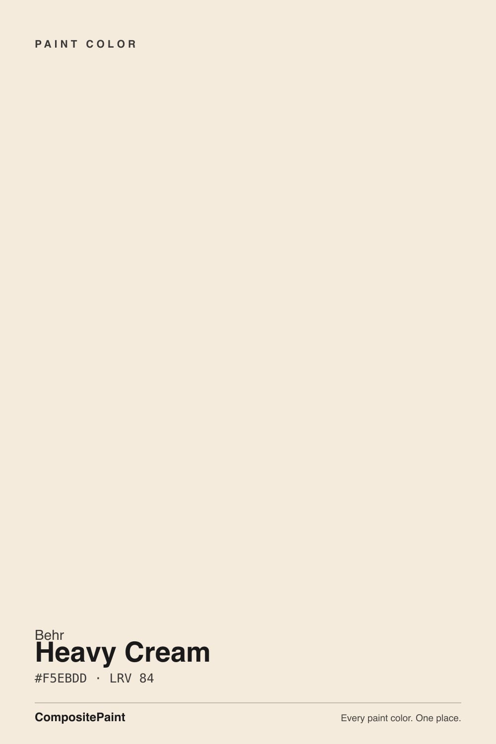
A pale vanilla cream with a yellow-red base — not a grayed off-white, not butter-yellow, and not the white the name lets you pretend it is. Behr files PPU5-10 in the orange family, on the same PPU5 strip as Delicate Lace, Almond Wisp, and Mesa Taupe, which is the honest filing. Independent reads call it a very light cream with a warm yellow-beige undertone that sits as off-white rather than bright white. That is the entire personality: the color you pull when white walls feel too stark and beige feels too heavy, and the color cabinet shoppers keep mistaking for a white enamel.
At LRV 84 it sits on the same number as Greek Villa and one point under White Dove (LRV 85). That gap versus Polar Bear (LRV 94) or Ultra Pure White (LRV 97) is the useful part and the trap. On a wall it holds just enough color to soften shadows and flatter wood; on cabinets it reads as painted furniture rather than plastic-bright. Put a real white next to it and Heavy Cream suddenly shows its body — cream, not white. Behr staff have recommended it as a cream tone, not a white, which is the right job description.
Undertone in one line: yellow-beige first, a red-orange lean second — never gray, never green. In south light it reads vanilla. In west sun and under 2700K lamps the orange family comes forward and the wall can flash peach. If the sample looks dingy, look at the trim next to it before you blame the gallon. If it looks pink-apricot at 5pm, that is PPU5 telling the truth.
Where It Shines
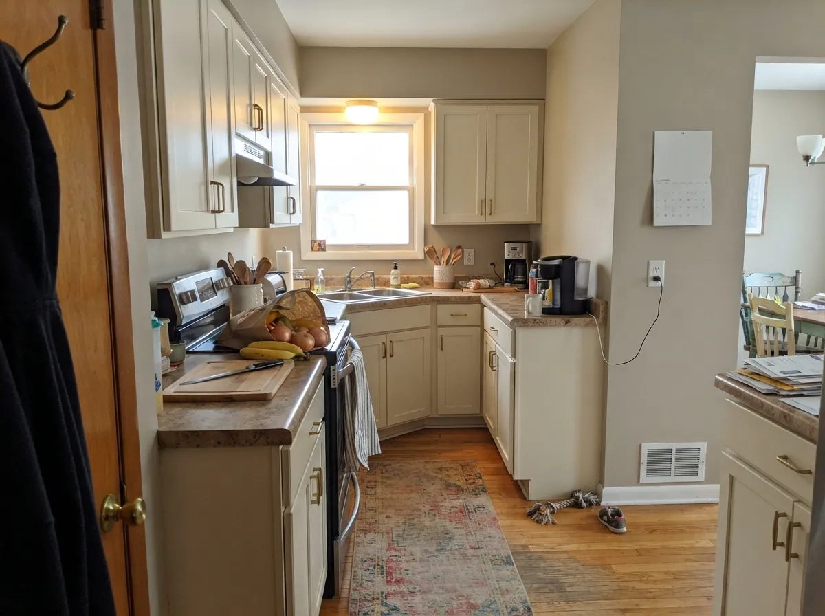
Give it real daylight, oak, and no brighter white nearby, and it does the rare thing a cream is supposed to do: look finished instead of leftover. South and east rooms are its home turf. Kitchens are the second job — Home Depot already mixes this SKU as cabinet, door, and trim enamel, and a Houzz kitchen pulled it as the lightest chip in the travertine. The one-color room — walls, trim, and ceiling all Heavy Cream with only sheen changes — is the version that actually works, because a brighter white on the woodwork is the fastest way to make the walls look yellowed.
Where It Fails
Almost every unhappy Heavy Cream story is someone who bought a white, parked a white next to it, or gave the orange undertone nothing warm to land on. The paint is consistent. What changes is the room.
On the chip it can pass as a creamy off-white. On four walls it is vanilla — yellow-beige with a red-orange lean — and cabinet buyers who grabbed the Home Depot enamel as a white have watched the doors go cream-yellow. If white is what you actually want, this is the wrong can. White Dove or Greek Villa will keep the warmth without the ice-cream body.
Polar Bear (LRV 94) or Ultra Pure White (LRV 97) on trim, ceiling, or a door is the classic pairing mistake. The bright white wins and Heavy Cream looks dingy, yellowed, and slightly dirty. Chantilly Lace (LRV 90) does the same trick on temperature: it is a crisp, cool-neutral white, and this cream looks stained next to it. The fix is the one-color rule — walls, trim, and ceiling all PPU5-10. If you want contrast, go darker, never brighter.
Gray LVP, gray-washed oak, and blue-gray marble sit at the opposite temperature and shove the yellow-red into the open until the wall reads peachy or sour. Warm rugs will not rescue a whole-room clash. With cool floors, pick a true white for the walls and keep cream off the job.
Room by Room
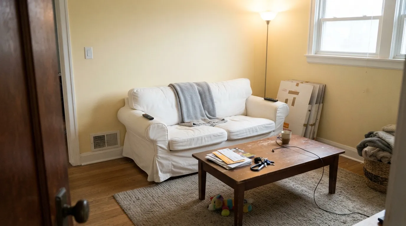
South or east light, oak floors, and stained furniture are where 84-LRV cream looks like a decision. Eggshell on the walls; same color on trim in semi-gloss. A west living room needs a 5pm sample — the orange lean can go peach in late sun. A new build with gray floors and Polar Bear casing is the wrong living room.
Satin Heavy Cream on cabinets is the reason Home Depot stocks this SKU as enamel: it flatters butcher block, honey oak, brass, and warm stone, and at LRV 84 it hides knuckle marks a gallery white would broadcast. Travertine and cream-veined quartz are home turf — that is a real Houzz pairing, not a mood board. Cool white quartz or gray tile argues with it. Keep the walls the same cream or a quieter beige; a bright backsplash will make the doors look yellow.
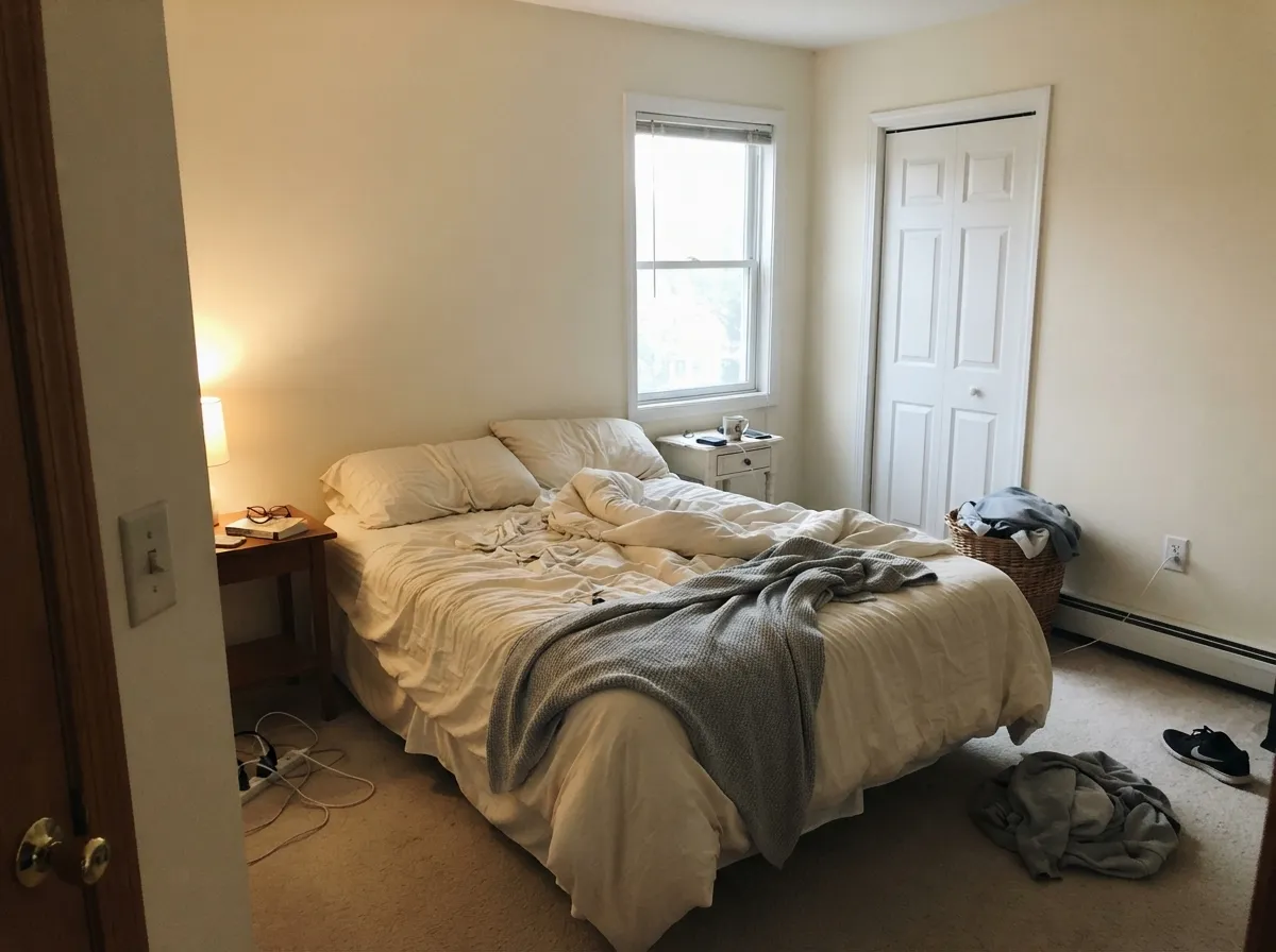
Under 2700K bulbs it turns properly creamy at night, which most people want in a bedroom. Keep the bedding on the warm side; hotel-white linens will make the walls look more yellow than they are. A north cave with cool LEDs is where it goes dingy — step up to Behr Swiss Coffee for glow, or skip cream.
This is the use the LRV was built for: 84 is bright enough to carry a hall, deep enough that adjoining rooms do not suddenly go stark. Eggshell on walls, same color in semi-gloss on the doors. It will not make a 1990s house look current. It will make it look finished, warm, and easy to touch up.
Travertine, cream tile, wood vanities, and brass: fine, including satin on a vanity. Gray porcelain, cool marble, and chrome: it argues, and the yellow-red reads like old enamel. If the stone is staying cool, use a cleaner white.
Semi-gloss Heavy Cream on casings and doors under Heavy Cream walls is the pairing that actually works. It reads as painted woodwork rather than plastic-bright, and it is kind to oak. Do not park Polar Bear or Ultra Pure White next to it. If you want contrast, go darker on the door — Cracked Pepper, Hale Navy — never brighter on the casing.
Your Light Is the Risk
Warm daylight is where the vanilla looks intentional — cream in a good way, not dingy. This is the light the color was mixed for.
Cool gray daylight strips the glow and leaves a dingy beige. Dim north rooms with no lamps are the leftover-cream look people regret.
Morning holds it to quiet cream; west afternoon and golden hour push the yellow-red until it can flash peach. Sample the sunny wall at 5pm before committing.
2700K lamps: creamier, cozier, more apricot. Cool 4000K LEDs: sour beige-gray. Swap the bulbs, not the paint.
Most complaints about Heavy Cream are a light mismatch. Upload a photo of your actual room and see it on your walls — then ask for the same wall in north light or evening lamps before you buy a single sample.
Need It From Another Brand?
Any paint counter can custom-tint Behr PPU5-10 directly. If you would rather stay in one brand's own deck, these are the closest stock matches, measured as ΔE2000. Under 2 is a difference you will not see on the wall.
| Brand | Closest color | ΔE | LRV | |
|---|---|---|---|---|
| Sherwin-Williams | A La ModeSW 7116 · Sherwin-Williams | 0.2 | 85 | Color page → |
| Benjamin Moore | Winter Sky2163-70 · Benjamin Moore | 0.8 | 82 | Color page → |
| Valspar | Candle LightT545 · Valspar | 1.3 | 84.8 | Color page → |
| PPG / Glidden | Spun CottonPPG1203-1 · PPG / Glidden | 1.5 | 84 | Color page → |
| Glidden | Shell White45YY 83/094 · Glidden | 1.1 | 83 | Color page → |
| Dutch Boy | White Linen007W · Dutch Boy | 1.6 | 83 | Color page → |
Similar Behr Colors
The nearest shades to Heavy Cream within Behr's own range, ranked by perceptual color distance — useful when you want the same look a touch lighter, darker, or warmer.
WCAG 2.1: AA is 4.5 : 1 for normal text, 3 : 1 for large text, AAA is 7 : 1.
Heavy Cream vs the Colors You're Also Considering
Every Heavy Cream sample board has the same rivals on it. The numbers show the real lightness gap — then it comes down to which risk you would rather live with.
Pick this when you mean cream, not a warm white. Dove will look too clean and too new in a house that wanted vanilla.
Benjamin Moore PM-19 · LRV 85White DovePick this if you want the safest warm white in that deck — grayed, quiet, and actually usable as a whole-house white.
Pick this when you want real ice-cream body at LRV 84, not a brighter off-white that still reads as white from across the room.
Behr W-B-700 · LRV 87Swiss CoffeePick this for a lighter Home Depot cream that is still openly warm — the warmest of the safe off-whites, and it shows, without going as vanilla.
Pick this when you still want the wall to bounce at LRV 84, with vanilla cream rather than a full farmhouse pour.
Behr 13 · LRV 82Cottage WhitePick this if you want the farmhouse white that never learned to be neutral — deeper, more committed, less bounce.
Pick this when the cream is the point. Same number, orange-family vanilla instead of a white that happens to be warm.
Sherwin-Williams SW 7551 · LRV 84Greek VillaPick this if you want the same LRV as a warm white that still tries to stay white — beautiful, and it punishes the wrong trim the same way.
Sherwin-Williams A La Mode (SW 7116, #F6ECDE, LRV 85) differs by only 0.21, which is a true match no one would separate on a wall. Benjamin Moore Winter Sky (2163-70, LRV 82) at 0.82 and Diamond Vogel Kiara (0005, LRV 84) at 0.97 are effectively the same color as well, though Winter Sky sits two points lower in reflectance. Glidden Shell White (45YY 83/094, LRV 83) at 1.15 and Valspar Candle Light (T545, LRV 84.8) at 1.3 are visually identical in normal room light. Dunn-Edwards Modern Ivory (DE6197) matches in hue at 1.15 but reads at LRV 78, noticeably less bright. Farrow and Ball Pointing (No. 2003, #F3EFE3, LRV 86) at 2.82 is very close but leans less yellow and slightly cooler, so sample it if that distinction matters. Inside Behr, Citrus Mist (PPL-11, LRV 86) is the yellower option and Vanilla Frost (BWC-23, LRV 85) the cleaner one.
Heavy Cream Coordinating Colors
The rule for coordinating with PPU5-10 is simple: stay on the warm side, and never put a brighter white next to it. It flatters warm beiges, oak, brass, deep navies, and near-blacks — and it argues with icy whites, cool greys, and blue-gray stone. These are the partners that keep showing up in rooms that work:
Orange Family, Not a White: The PPU5 Strip
Heavy Cream is not a Color of the Year and it has no viral kitchen. It is a Premium Plus Ultra chip, PPU5-10, on a strip that steps from pale cream into almond and taupe. Behr files the family as orange. That is the color: yellow-red cream, airy at LRV 84, peachy when the light goes warm. In 2017 Behr's own color staff listed it next to Delicate Lace and Bleached Linen as a cream tone, which is still the honest job — not a stand-in for Polar Bear.
Home Depot already tells you one of the jobs it does: the SKU is mixed as satin and semi-gloss enamel for cabinets, doors, and trim. A 2014 Houzz kitchen pulled it as the lightest color in the travertine. That is the fame: not a magazine cover, just a long-running vanilla cream that every Home Depot still mixes. If you arrived hoping it would still look like gallery white at 5pm, sample Greek Villa or White Dove instead.
Heavy Cream With Wood Tones and Floors
Warm wood is the easy yes. Oak — red, white, honey — walnut, butcher block, and cedar all sit comfortably against it because the yellow-red in the paint meets the yellow in the wood halfway. Icy whites make honey oak look aggressively orange; Heavy Cream absorbs that orange instead of amplifying it, which is why it is kinder to a 1990s trim-and-floor package than Polar Bear will ever be. Travertine and cream stone are the pairing a real kitchen already used.
The floor that needs a sample first is cool gray LVP or gray-washed oak. Gray plank pulls the yellow-red into relief, and the wall can read peachy or faintly nicotine against it. It is not always a dealbreaker — a large warm rug and brass lamps pull it back — but tape a big sample above the actual floor and look at 5pm before you paint the room. White oak and natural maple are safe; orange builder oak is safer here than it is next to a true bright white.
Metals are straightforward: unlacquered brass, antique bronze, and matte black all agree with it. Polished chrome and stainless are the ones that lean cold and make the yellow show, which is why a stainless-heavy kitchen is a skip unless the cabinets stay cream on purpose.
Three Ready Palettes Built on Heavy Cream
A color is never alone on the wall. These are complete combinations in the 60-30-10 pattern, with the reason each one holds together. Every one opens in the visualizer.
One cream at three sheens is how you use LRV 84 without inventing a dingy halo around the trim. Cracked Pepper on the door is the single dark note the scheme needs — the chameleon black behind Behr's 2024 Color of the Year, not a second white.
Try this palette in your roomAccessible Beige is the safest warm neutral next to a vanilla cabinet — deeper, so the doors stay the lightest thing in the room, and it holds until the light goes cool. Hale Navy on the island is the one dark note brass hardware loves. Keep the counters warm; cool quartz will push the cream yellow.
Try this palette in your roomThe PPU5 strip is the pairing: Heavy Cream is the vanilla wall, Mesa Taupe is the mid-taupe four steps down the same warm family, so the handoff is a depth change, not a temperature fight. Sample Mesa Taupe in your actual light — it can flash mauve when the light goes cool. Cracked Pepper is the near-black so the scheme does not float.
Try this palette in your roomHeavy Cream FAQ
Is Heavy Cream warm or cool?
Warm — openly. Behr files it in the orange family, and the undertone is yellow-beige with a red-orange lean. In south light it reads vanilla cream; in north light it goes dingy beige; in west sun it can flash peach. If you wanted a white that stays quiet, look at White Dove or Greek Villa instead.
Is it a white or a cream?
A cream. At LRV 84 it is pale enough to bounce light and deep enough that four walls do not look white. Cabinet shoppers who grabbed the Home Depot enamel as a white have watched it go yellow-cream. If the brief is white, this is the wrong can.
What trim color goes with Heavy Cream walls?
Heavy Cream itself, in semi-gloss. Polar Bear and Ultra Pure White are the usual suggestions and the usual mistake: both are so much brighter that the walls look yellowed and dirty. Chantilly Lace is a crisp, cool-neutral white and will make this cream look stained. If you want contrast, go darker — Cracked Pepper, Hale Navy — never brighter.
Is it good for kitchen cabinets?
In a traditional kitchen with wood counters, brass, travertine, and warm floors, yes — satin hides scuffs and the cream looks like painted furniture rather than plastic. Next to cool white quartz or gray tile it reads yellow. Sample it against the actual counters. Use a urethane-fortified cabinet enamel.
Will it look yellow or peach?
In west afternoon sun and under 2700K lamps, it can — that is the orange-family red-yellow doing what it does. Next to a cooler white, it will look cream even if the light is fine. In south or east daylight on its own, most people call it vanilla, not yellow. Sample a big board at 5pm in the actual room before you buy gallons.
How is it different from Swiss Coffee or Cottage White?
Behr Swiss Coffee (W-B-700, LRV 87) is lighter and still the warmest of the safe off-whites — cream that can pass as white from across the room. Cottage White (13, LRV 82) is the deeper farmhouse pour that never learned to be neutral. Heavy Cream sits between them: more body than Swiss Coffee, more bounce than Cottage White, and more orange-vanilla than either.
Have you painted with Heavy Cream?
Rate it — one tap helps the next reader decide.
Ask a Question