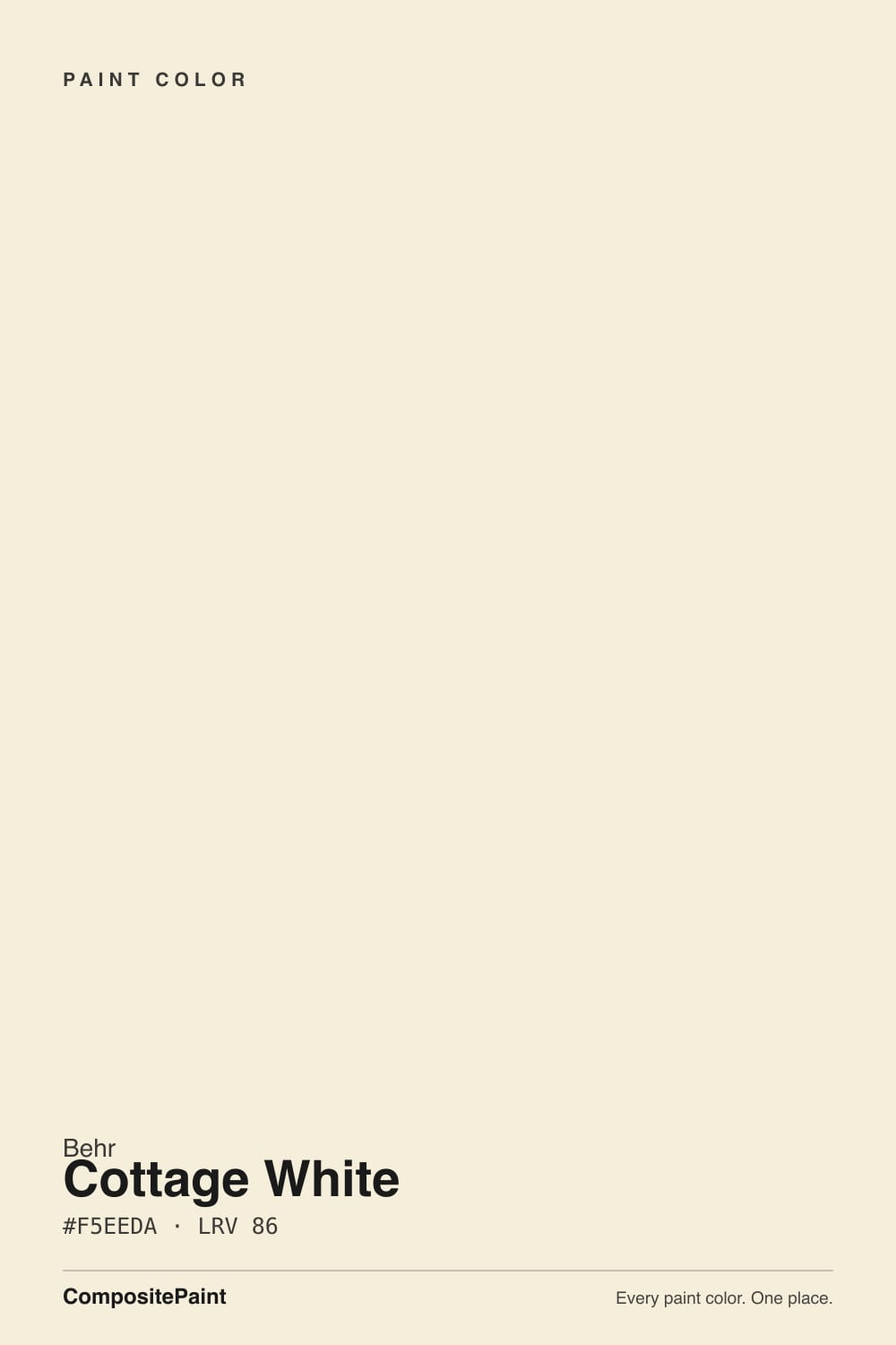
Cottage White
Behr's honey-warm cottage trim white, reviewed honestly: the farmhouse rooms where it glows, the bright white pairings that expose it, and what to pick instead.

Jessica has spec'd whites and neutrals for more than 300 rooms and keeps a sample wall of painted drawdowns in her studio. Every color review is checked against real reader rooms in the comments and re-tested when a formula changes. About the testing process →
- 1First Star69
- 2Classic Gray74
- 3Cottage White82
- 4Chantilly Lace91
- 5Ultra Pure White97
The Fast Verdict
Cottage White is Behr's country cousin to a plain off-white: a warm cream with an honest, unhidden honey-gold undertone. It does not try to pass for a neutral the way Swiss Coffee or Linen White do — it leans into the warmth, which is exactly why it has become the default trim white in older farmhouse and cottage-style homes sold through Home Depot. Put it with oak, pine, wicker and brass and it looks deliberate. Put it next to a brighter white anything and it looks tired.
Farmhouse and cottage-style rooms with real wood · trim and doors under a deeper wall color · kitchens with butcher block, brass, or open wood shelving · anyone who wants a white that reads warm on purpose
You want a clean, gallery-white look · your appliances, tile, or fixtures are already bright white · your countertops are cool gray quartz or marble · you're pairing it with a cooler gray wall color
- Genuinely warm honey-cream white that never drifts pink or green
- The default farmhouse/cottage trim white at Home Depot — proven, dependable warmth
- Flatters oak, pine, wicker and brass without a fight
- High LRV (82) keeps rooms bright even with the warmth
- One-color rooms (walls + trim) read calm and deliberate, not builder-basic
- Visibly yellow next to any brighter white — tile, appliances, ceiling paint
- Too warm for anyone who wants a clean, gallery-white look
- Clashes with cool gray quartz, marble, or blue-gray tile
- Fights a cooler gray or greige wall color in an adjoining room
What Color Is Cottage White, Really?
A pale cream with a clear yellow-gold lean — not a grayed-down warm white like Swiss Coffee, but a more straightforward honey tone. Behr markets it around a country, picket-fence feel, and the paint backs that up: it does not try to hide its warmth behind a gray base the way most "safe" whites do. That honesty is the whole appeal for a farmhouse look, and the whole risk everywhere else.
At LRV 82 it reflects most of the light that hits it, so rooms stay bright, but it is clearly not a crisp white — set it beside Behr White (LRV 83) or any bright white trim and Cottage White immediately reads creamier and more yellow by comparison. That gap is fine when it is the only white in the room; it becomes the problem the moment a whiter white shows up next to it, which is exactly what happens when new owners add white tile or stainless appliances to a house where Cottage White was already the trim.
Undertone in one line: warm honey-gold, plain and unmistakable — never pink, never green. If it reads dull or muddy on your wall, that is cool north daylight or cool LED bulbs fighting the warmth, not a defect in the paint.
Where It Shines
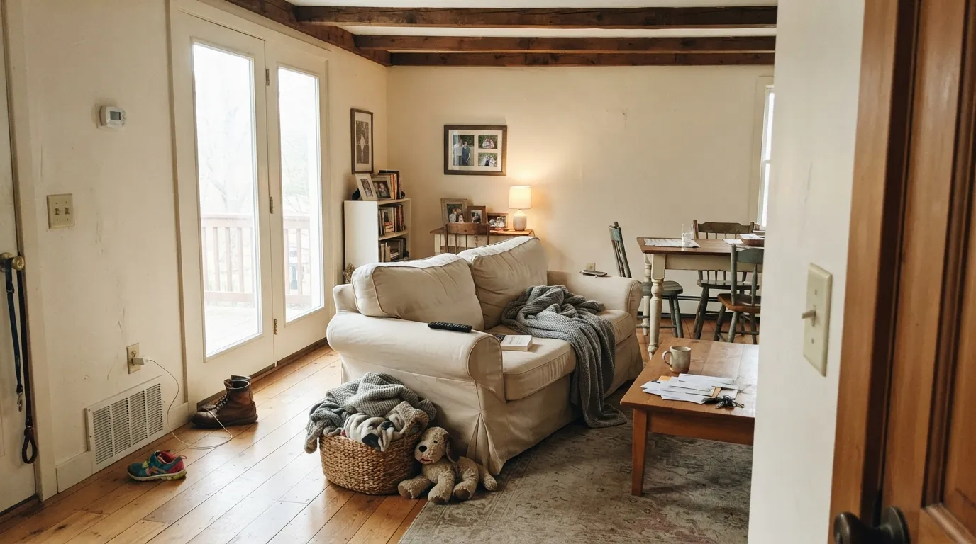
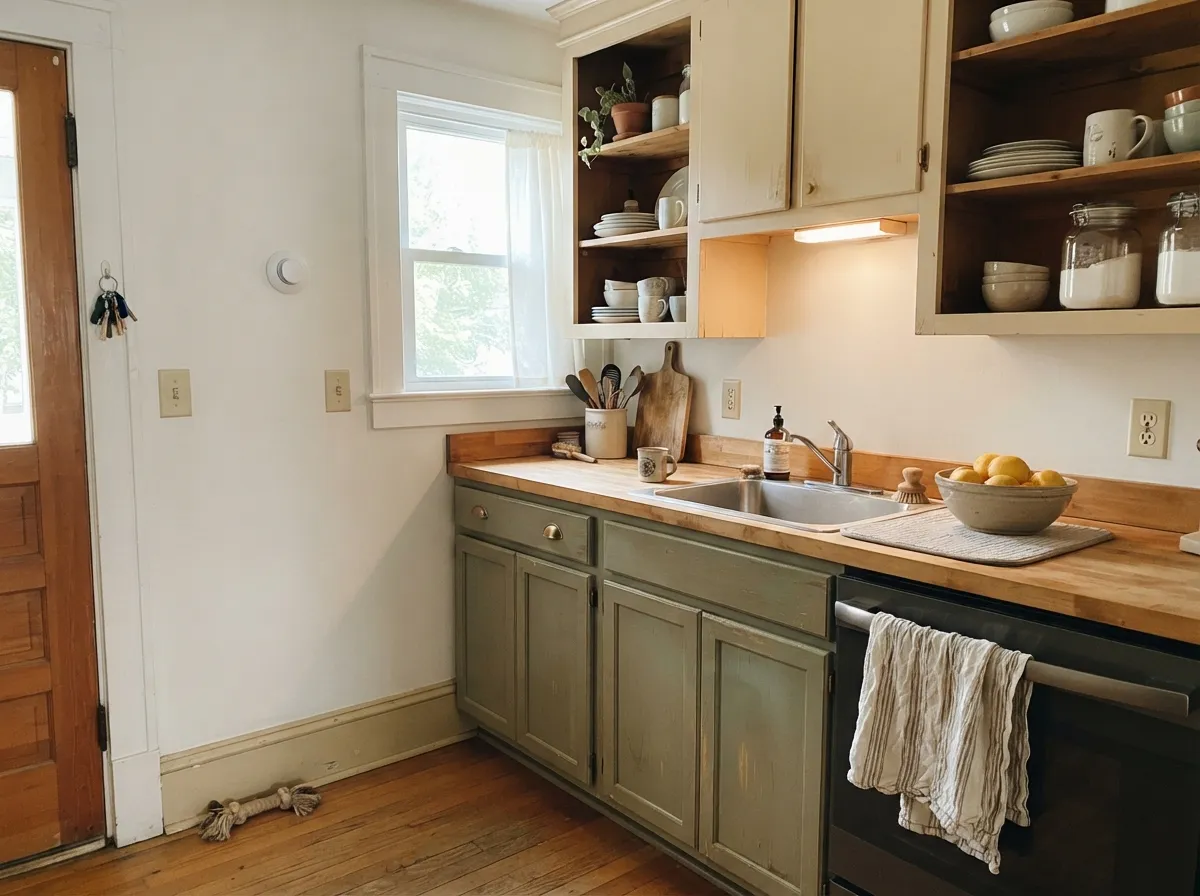
Give it real wood — oak beams, pine trim, butcher block, wicker — and warm metal, and it looks like it was chosen on purpose for a farmhouse or cottage room. It is Behr's most common go-to for whole-house trim in country-style homes, which is why so many buyers inherit it from a previous owner without ever picking it themselves. Under warm daylight and lamps it glows gently instead of glaring, and because the undertone never wavers toward pink or green, it is one of the more predictable warm whites to live with once you accept what it is.
Where It Fails
Nearly every complaint about Cottage White comes down to what it is standing next to, not the paint itself. Owners who inherit it as trim — a very common situation, judging by the forum threads asking "what do I pair with this yellow trim" — are usually the ones who end up unhappy, because they are comparing it to something brighter rather than choosing it fresh.
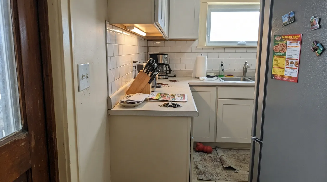
White subway tile, stainless appliances, a bright white ceiling — any of them will make Cottage White trim look dingy and yellow by comparison. This is the single most common regret, especially for buyers who inherited the trim from a previous owner and only noticed the clash after a kitchen update. The fix is either committing to warm-white appliances and fixtures nearby, or repainting the trim to something cooler like Behr White.
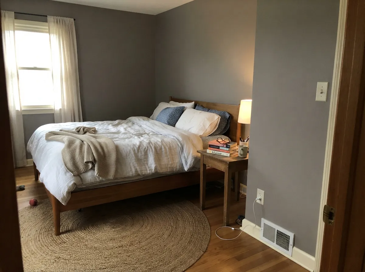
Gray quartz, cool marble, and blue-gray tile sit at the opposite temperature and make the honey undertone look more yellow than intended, almost dated. With cool stone, pick a grayer white instead.
Open floor plans that mix Cottage White trim with a cool gray wall color in the next room create visible clashing at the doorway. Keep the house on one temperature — warm trim wants warm or neutral wall colors, not cool grays.
Room by Room
With oak floors, a wood mantel, or exposed beams it reads finished and cozy rather than plain. Eggshell on walls, same color or semi-gloss on trim.
Butcher block, open wood shelving, brass hardware — Cottage White cabinets look intentional in exactly that setting. Satin cabinet paint wipes clean and hides fingerprints better than a brighter white would.
Under 2700K lamps it turns gently golden and cozy. If the room runs on cool LEDs or stays dim, it can look flatter and less charming than in a sunlit room.
With warm wood vanities and brass it works. With cool gray tile or marble it fights the room — test a sample against your actual stone before committing.
This is where most homes actually have it: as the whole-house trim white under deeper wall colors. It softens contrast the way a bright white would not, but it demands warm or neutral walls, not cool grays.
It is a common farmhouse exterior trim white — window frames, porch columns, fascia — paired with darker siding or black shutters. Full sun reads it brighter and slightly more golden than indoors.
Your Light Is the Risk
Gentle indirect light lets the honey warmth glow without tipping into overt gold — the color at its most "just a nice warm white."
Strong late-day sun pushes the undertone toward a more obvious butter-yellow that can read dated rather than soft. Sample on the actual wall before committing a whole room.
Bright and clean at midday, noticeably warmer as the light lowers toward evening. The shift is gradual, not jarring.
2700K lamps amplify the gold further — cozy, but can look dated in large doses. Cool white LEDs mute the warmth and keep it closer to a plain soft white.
Most complaints about Cottage White are a light mismatch. Upload a photo of your actual room and see it on your walls — then ask for the same wall in north light or evening lamps before you buy a single sample.
Need It From Another Brand?
Any paint counter can custom-tint Behr 13 directly. If you would rather stay in one brand's own deck, these are the closest stock matches, measured as ΔE2000. Under 2 is a difference you will not see on the wall.
| Brand | Closest color | ΔE | LRV | |
|---|---|---|---|---|
| Sherwin-Williams | Medici IvorySW 7558 · Sherwin-Williams | 0.4 | 82 | Color page → |
| Benjamin Moore | Sandy Beaches946 · Benjamin Moore | 0.5 | 82 | Color page → |
| Valspar | Lemon MeringueM321 · Valspar | 0.8 | 81.7 | Color page → |
| PPG / Glidden | MimosaPPG1203-2 · PPG / Glidden | 0.9 | 82 | Color page → |
| Glidden | MimosaPPG1203-2 · Glidden | 0.9 | 82 | Color page → |
| Dutch Boy | White Linen007W · Dutch Boy | 1.2 | 83 | Color page → |
Similar Behr Colors
The nearest shades to Cottage White within Behr's own range, ranked by perceptual color distance — useful when you want the same look a touch lighter, darker, or warmer.
WCAG 2.1: AA is 4.5 : 1 for normal text, 3 : 1 for large text, AAA is 7 : 1.
Cottage White vs the Colors You're Also Considering
Every Cottage White sample board has the same rivals on it. The numbers show the real lightness gap — then it comes down to which risk you would rather live with.
Pick this when you actually want the honey-cream farmhouse look — Swiss Coffee reads flatter and less charming for that job.
Behr W-B-700 · LRV 87Swiss CoffeePick this for a cleaner, less overtly golden warm white in the same Behr deck.
Pick this if you're already buying Behr and don't want to special-order a second brand for one color.
Benjamin Moore PM-28 · LRV 83Linen WhitePick this if your painter works in Benjamin Moore — a nearly identical cream with the same narrow lane.
Within Behr, the closest neighbors barely separate. Apple Core PPU7-14 at #F4EEDA and LRV 85 and Moonstruck ECC-64-2 at #F3EDDA and LRV 85 are a hair less bright, while Water Chestnut BXC-14 at #F7EED9 and LRV 86 is a touch more golden. Seaside Sand 740C-1 at #F4EFDD is very slightly greener. None of these are decision-changing differences on a wall. Across brands, Benjamin Moore White Rock 918 at LRV 86 has a deltaE of 0.74 and Glidden Spice Ivory PPG1204-1 at LRV 86 sits at 0.76, so both are effectively the same color. Dutch Boy Split Banana 118-1DB at deltaE 1.1 and Sherwin-Williams Venetian Lace SW 7119 at deltaE 1.62 are visually identical in normal room light. Farrow and Ball Tallow No. 203 at LRV 84 and deltaE 1.84 is a little deeper. Rust-Oleum Chiffon Cream 329598 at LRV 92 and deltaE 2.04 is clearly brighter, so sample it first.
Cottage White Coordinating Colors
The rule with Cottage White is simple: everything it touches should be warm or neutral, never cool. It pairs easily with warm woods, brass, muted sage greens, and warm near-blacks — and it argues with cool grays, blue-white tile, and anything meant to look crisp and modern. These are the partners that keep it looking deliberate:
The Everywhere Trim: Why So Many Buyers Inherit This Color
Cottage White has quietly become one of Home Depot's default trim whites in country and farmhouse-style homes — enough that a common forum situation is a new owner asking what to do about the warm, unmistakably yellow trim a previous owner already painted throughout the house. It was never a trend color in the viral sense; it built its reputation the slow way, one farmhouse-flip and one contractor default at a time.
That history explains most of its complaints. People who pick it fresh, on purpose, for a warm cottage room tend to like it. People who inherit it as trim and then add cool gray countertops or bright white appliances are the ones writing the confused Houzz threads — the color did not change; the room around it did.
Cottage White With Wood Tones and Floors
This is where the color does its best work. Golden oak, pine, and wicker all sit comfortably with Cottage White because the paint's warmth meets theirs halfway instead of fighting it — a rare case where a warm white actually flatters honey-toned wood rather than clashing with it. Butcher block counters and open wood shelving are its natural home.
The one flooring to sample first is cool gray-washed LVP or gray-stained wood. Against a cool floor, Cottage White's honey undertone shows up more strongly and can look mismatched rather than intentional. Warm rugs and brass fixtures help bridge the gap, but test a large sample above the actual floor before committing a whole room.
Three Ready Palettes Built on Cottage White
A color is never alone on the wall. These are complete combinations in the 60-30-10 pattern, with the reason each one holds together. Every one opens in the visualizer.
This is the trim-plus-cabinet handoff Cottage White already does in thousands of farmhouse kitchens: warm cream trim, a muted sage on the cabinets, and one near-black accent so the room reads composed instead of just cottagecore.
Try this palette in your roomCottage White and Linen White share the same honey-cream base, so the cabinet-to-wall handoff is seamless — no fighting undertones. Chelsea Gray on the island supplies the one grounded, mid-depth note the scheme needs, and it loves brass hardware as much as the whites do.
Try this palette in your roomStaying on the warm side of the fence top to bottom is the whole trick with Cottage White. Even Better Beige is warm enough to sit next to it without a seam, and Kendall Charcoal on the door supplies the one dark note without introducing any cool gray to argue with the trim.
Try this palette in your roomCottage White FAQ
Is Cottage White warm or cool?
Warm, plainly — a honey-gold cream with no gray base to soften it. It never drifts pink or green, but it will always read as a warm off-white, never a neutral or a cool white.
Is it good for a whole house, or just trim?
Most homes that have it use it as the whole-house trim white under deeper wall colors, and that is its most reliable job. As a wall color on its own it works too, especially with wood and brass, but it is a stronger statement than a grayed-down white like Swiss Coffee.
What do I pair with Cottage White trim if I don't want a yellow house?
Stay warm or neutral: warm woods, brass, warm grays like Chelsea Gray or Kendall Charcoal, warm beiges. Avoid cool blue-grays, cool white tile, and bright white appliances nearby — those are what expose the yellow.
How does it compare to Swiss Coffee?
Both are warm Behr off-whites, but Cottage White is the more honestly golden of the two. Swiss Coffee is grayed down slightly, so it reads calmer and more neutral; Cottage White commits fully to the cream-honey look, which is exactly the farmhouse effect some buyers want and others discover they inherited.
Does it work with gray or greige walls in the next room?
Cool grays are the one real clash — the doorway between a Cottage White-trimmed room and a cool gray room can look visibly mismatched. Warm greiges are fine; cool, blue-leaning grays are not.
Does it work on exteriors?
Yes — it is a common farmhouse exterior trim white for window frames, porch columns, and fascia, usually paired with darker siding or black shutters. Full sun makes it read brighter and a touch more golden than it does indoors.
Have you painted with Cottage White?
Rate it — one tap helps the next reader decide.
Ask a Question