Linen White
The classic vintage-home cream, reviewed honestly: the rooms where it glows, the afternoon light that turns it butter, and what to buy instead.

Jessica has spec'd whites and neutrals for more than 300 rooms and keeps a sample wall of painted drawdowns in her studio. Every color review is checked against real reader rooms in the comments and re-tested when a formula changes. About the testing process →
- 1First Star69
- 2Classic Gray74
- 3Linen White81
- 4Extra White86
- 5Chantilly Lace91
The Fast Verdict
Linen White is a cream that gets filed under white, and that one fact explains every good and every bad review it gets. In an older house — stained oak trim, plaster walls, north windows — it does something no modern white can: it makes the woodwork look intentional instead of orange. In a bright new build with gray floors and crisp builder trim, the same paint reads butter yellow and dated. It is not a safe default. It is a specialist, and inside its lane it is excellent.
Older homes with stained wood trim and plaster · North-facing rooms that need warmth · Traditional kitchens with wood floors and brass · Ceilings and millwork in vintage houses
Hard south or west afternoon sun · Cool gray floors, LVP or Carrara · Your trim is a new bright builder white · You want a crisp modern look
- Makes stained oak and orange-toned wood trim look deliberate
- LRV 83 lifts dim north rooms without going cold or clinical
- Hides plaster patches, old texture and scuffs better than bright white
- The one white that never fights antique brass or aged hardware
- Glows under 2700K lamps instead of turning gray at night
- Tips to butter yellow in strong south or west afternoon sun
- Reads yellowed and dated beside any new cool white
- Cream trim and cabinets limit every wall color you pick later
- Sold in more than one tint formula, so cans bought years or stores apart can differ
What Color Is Linen White, Really?
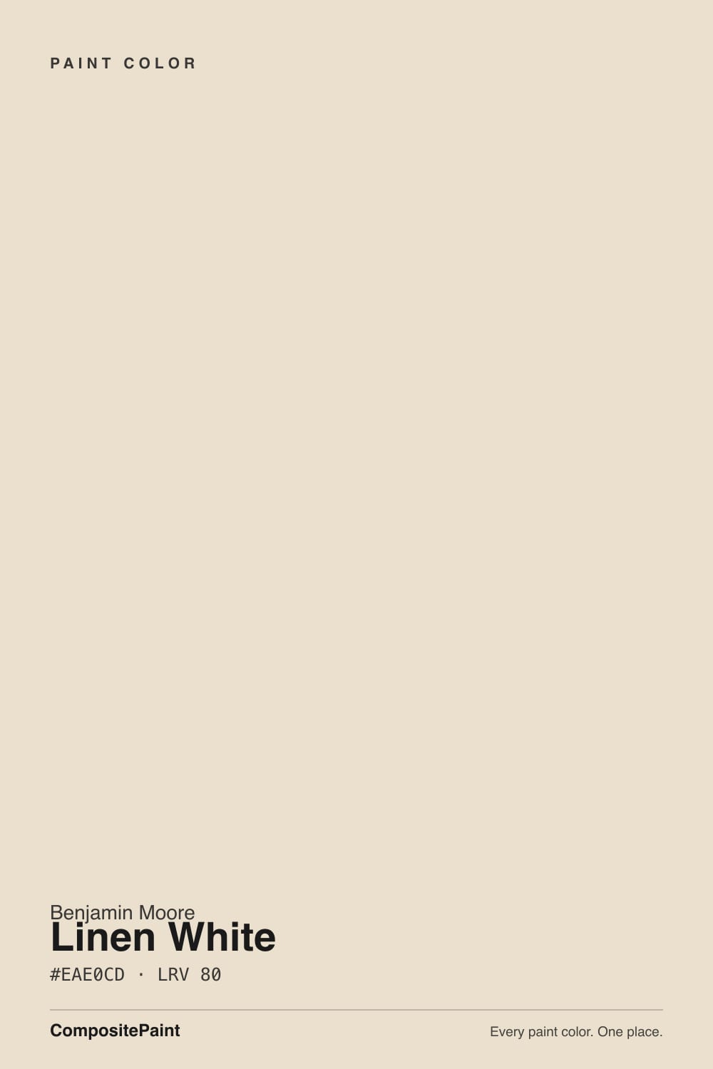
A cream, not a white — and the sooner you accept that, the better your room turns out. Linen White is built on a yellow-gold base carrying roughly 40 percent saturation, which is a real amount of color; most colors sold as "warm whites" carry a fraction of that. Benjamin Moore grays the yellow just enough that it lands on unbleached linen instead of custard, but the warmth is visible from across the room. Against a sheet of printer paper it looks plainly ivory, with a faint peachy edge from its red-orange lean.
At LRV 83 it reflects most of the light that hits it — enough to lift a dim hallway or a north bedroom — but it is nowhere near a bright white. Chantilly Lace OC-65 sits at LRV 92, and beside it Linen White stops looking like a white and starts looking like a color. Even White Dove OC-17 at LRV 85 reads cleaner and cooler next to it. That gap is small on paper and obvious on a wall, which is why most people only notice the yellow after the trim goes up.
Undertone in one line: warm yellow-cream with a faint red-orange edge — never green, never pink, and never grayed enough to pass as a neutral.
Where It Shines
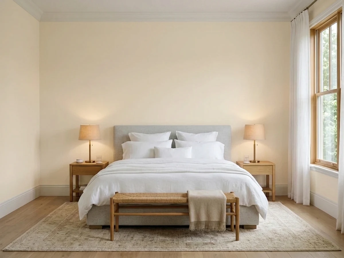
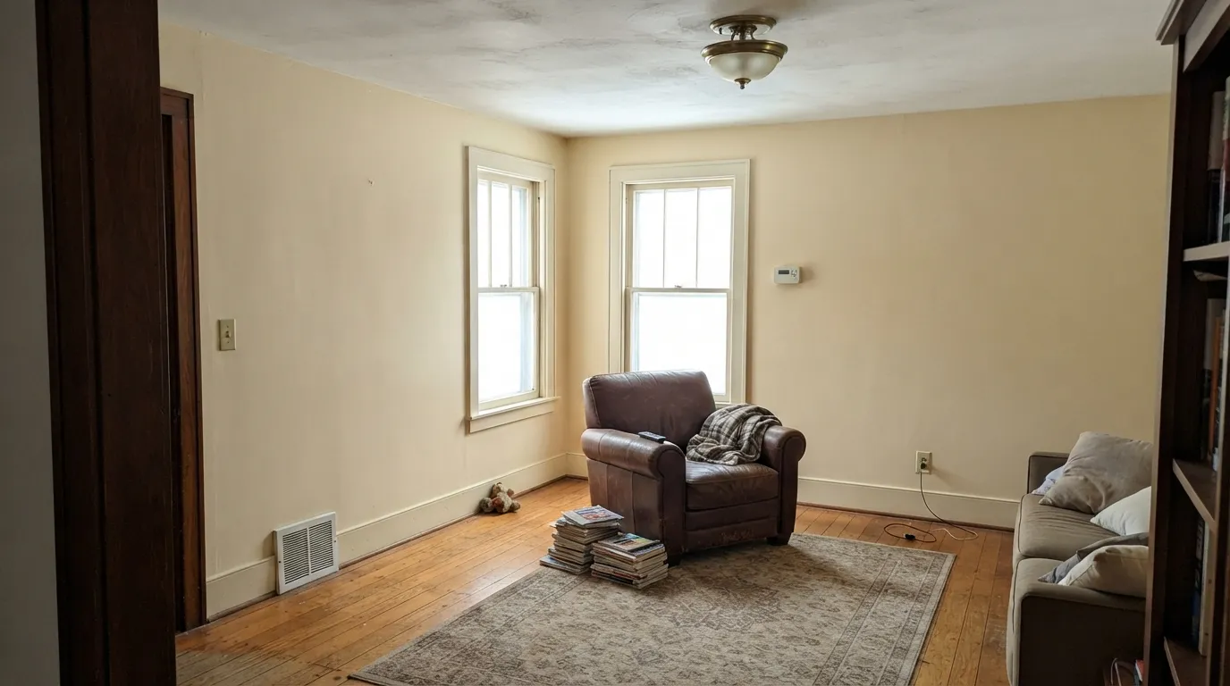
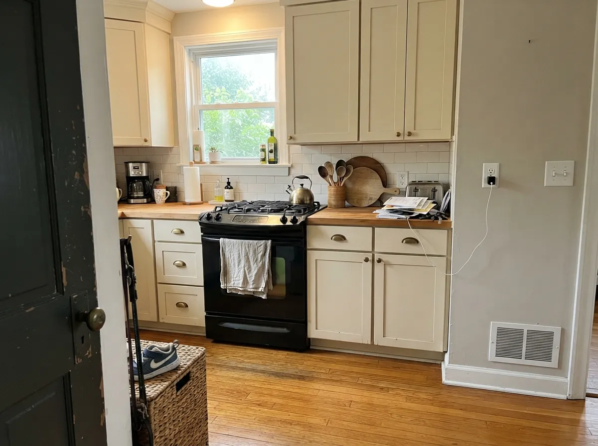
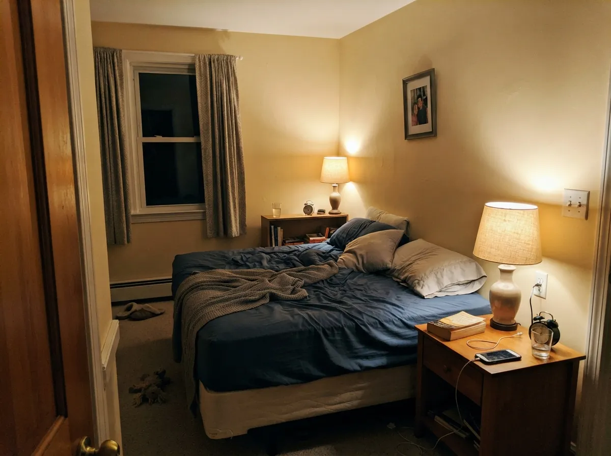
Its home turf is the old house: plaster walls, stained oak trim, north windows, and daylight that never quite feels warm enough. In those rooms the cream stops reading as a decision and simply reads as how the house has always looked.
Where It Fails
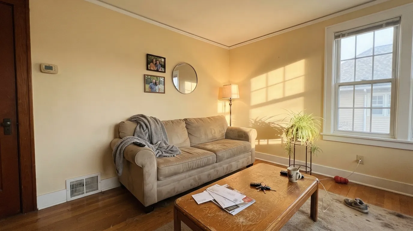
Nearly every bad Linen White story is one story told three ways: the light was too strong, or the whites around it were too new. The paint is consistent. What changes is everything next to it.
Strong afternoon sun multiplies the yellow instead of washing it out, and the walls tip from cream to butter — people describe the result as dingy rather than bright. No sheen or extra coat fixes this. In sun-flooded rooms use Cloud White OC-130, which keeps the warmth with far less yellow.
Linen White walls beside modern builder trim, new white cabinets, or a Chantilly Lace OC-65 ceiling instantly read yellowed and dated — this is the "why does my paint look dirty" complaint. Either keep every white in the warm family, with Simply White 2143-70 as the standard trim partner, or skip the cream and use White Dove OC-17.
Gray LVP, blue-gray tile and cool marble sit at the opposite temperature and shove Linen White toward yellow-green. Warm rugs and brass will not rescue this one. With cool gray flooring, pick a neutral white like Chantilly Lace OC-65 and let the floor be the star.
Room by Room
With north or filtered light and original stained trim, this is the cream those rooms were built around. Eggshell on the walls. Leave the woodwork stained, or run Simply White 2143-70 in semi-gloss if it was painted years ago.
On cabinets it flatters butcher block, honey oak floors and unlacquered brass, and satin wipes clean around the handles. The catch is that cream cabinets lock in every later decision — counters, backsplash, wall color all have to follow. With cool quartz or gray tile, use Cloud White OC-130.
LRV 83 keeps a low-light bedroom from feeling closed in, and under 2700K lamps it turns genuinely cozy at night. If plain cream feels bare, put October Mist 1495 on the headboard wall in matte.
It is the classic East Coast trim cream and it looks correct in a period house next to stained doors and old hardware. The catch is commitment: cream trim narrows every wall color you can choose later. Sample it against the colors you might want in five years, not just today's walls.
Flat Linen White overhead warms the whole room without the glare of standard ceiling white, and it forgives old plaster texture and patch work that a bright white would spotlight. Use it above warm wall colors like Edgecomb Gray HC-173, not below cool grays.
In full sun it reads as warm cream clapboard rather than white, which is right on a farmhouse, a shingled cottage or a stucco bungalow. Frame it with Kendall Charcoal HC-166 or a Hunter Green 2041-10 door, and keep cool gray accents off the house.
Your Light Is the Risk
Cool north daylight cancels the yellow and leaves a calm, balanced cream. The room it was made for.
Midday and afternoon sun push it to butter gold. Sample on the sunny wall before you buy gallons.
2700K bulbs deepen the cream and it glows. Cool 4000K LEDs turn it sour — change bulbs, not paint.
Windowless halls, landings and finished basements: LRV 83 plus real warmth beats any gray-white here.
Most complaints about Linen White are a light mismatch. Upload a photo of your actual room and see it on your walls — then ask for the same wall in north light or evening lamps before you buy a single sample.
Need It From Another Brand?
Any paint counter can custom-tint Benjamin Moore 912 directly. If you would rather stay in one brand's own deck, these are the closest stock matches, measured as ΔE2000. Under 2 is a difference you will not see on the wall.
| Brand | Closest color | ΔE | LRV | |
|---|---|---|---|---|
| Sherwin-Williams | Classic Light BuffSW 50 · Sherwin-Williams | 1.2 | 83 | Color page → |
| Behr | Cotton RidgeECC-42-2 · Behr | 0.5 | 83 | Color page → |
| Valspar | Statuesque7002-5 · Valspar | 1.3 | 84 | Color page → |
| PPG / Glidden | Spun CottonPPG1203-1 · PPG / Glidden | 0.7 | 84 | Color page → |
| Glidden | Shell White45YY 83/094 · Glidden | 1.2 | 83 | Color page → |
| Dutch Boy | White Linen007W · Dutch Boy | 0.8 | 83 | Color page → |
Similar Benjamin Moore Colors
The nearest shades to Linen White within Benjamin Moore's own range, ranked by perceptual color distance — useful when you want the same look a touch lighter, darker, or warmer.
WCAG 2.1: AA is 4.5 : 1 for normal text, 3 : 1 for large text, AAA is 7 : 1.
Linen White vs the Colors You're Also Considering
Every Linen White sample board has the same rivals on it. The numbers show the real lightness gap — then it comes down to which risk you would rather live with.
Pick this when stained oak trim and plaster need real warmth.
Benjamin Moore OC-17 · LRV 85White DovePick this for anything modern — White Dove is far more forgiving.
Pick this when you want the creamier, more old-house version.
Benjamin Moore OC-130 · LRV 85Cloud WhitePick this in sunny rooms — same warmth, much less yellow.
Linen White's closest Benjamin Moore neighbors are all soft creams, but small differences show on the wall. Cake Batter CSP-215 (LRV 75) is a touch deeper and reads slightly more yellow, so it feels cozier but reflects a little less light. French White 1093 (LRV 74) leans marginally warmer and more antique, good when you want the cream to feel aged rather than fresh.
Prentis Cream CW-100 (LRV 74) sits close in tone but a shade softer and grayer, which calms the yellow if Linen White looks too golden in your light.
In practice, choose Linen White when you want the lightest, most reflective of the group. Step to Cake Batter or French White when you want a warmer, more enveloping cream in a larger or brighter room.
Linen White Coordinating Colors
The rule with Linen White is stricter than with most whites: everything in the room has to stay on the warm side. It partners beautifully with warm greiges, tans, deep navies, muted greens and every honey-toned wood, and it argues with cool grays, icy blues and blue-gray stone. The other white in the room matters most — a warm bright white keeps the cream looking intentional, while a cool white makes it look aged.
These are the partners that work again and again, whether you are carrying Linen White through a whole floor or using it as the trim and ceiling color under something deeper.
Linen White on Trim, Cabinets and Millwork
This is the oldest use of Linen White and still the most common one in the Northeast: cream trim, cream doors, cream crown molding, running through an entire pre-war house. Against stained wood and old plaster it looks correct in a way that a modern bright white never does, and it hides the small imperfections of hundred-year-old millwork instead of highlighting every crack.
The honest warning is about the future. Cream trim is a commitment — it narrows the wall colors you can use later to warm ones, because a cool gray or a clean blue beside cream trim looks like a mistake. It also means new interior doors, factory-white windows and a builder-white ceiling will all read wrong until they are repainted. If you are trimming out a new or renovated house rather than restoring an old one, Simply White 2143-70 or White Dove OC-17 will give you the same soft look with far more freedom.
Linen White With Wood Floors and Stained Trim
Wood is where this color earns its score. Red oak, honey oak, pine, cherry and old shellacked trim all carry an orange cast that most whites amplify — you paint the walls a clean white and suddenly the floors look aggressively orange. Linen White does the opposite: its own warmth absorbs some of that orange, and the floor settles back into the room. If you have builder oak you cannot afford to refinish, this is one of the few whites that makes peace with it.
The pairing to test carefully is the cool one. Gray-washed wood, cool LVP, and white oak with a smoky finish push against Linen White's yellow, and the wall can read sallow above them. Warm greige floors are fine. If your flooring is genuinely cool-toned, step to Cloud White OC-130 for the same soft feeling with less yellow, or to a neutral like Chantilly Lace OC-65 if the floor is the thing you want people to notice.
Three Ready Palettes Built on Linen White
A color is never alone on the wall. These are complete combinations in the 60-30-10 pattern, with the reason each one holds together. Every one opens in the visualizer.
Simply White is bright enough to frame the cream cleanly but still warm, so the trim never makes the walls look dirty the way a cool white does. The navy door supplies the single dark note that keeps 80-LRV walls from floating.
Try this palette in your roomEdgecomb Gray shares Linen White's warmth and sits about 17 LRV points lower, so the wall-to-cabinet step reads soft instead of striped. The green island takes the 10 percent slot and gives brass hardware something to sit against.
Try this palette in your roomOne color at two sheens keeps a small bedroom from getting cut up by contrast lines, and October Mist is a grayed sage that meets the cream halfway instead of arguing with it. Charcoal doors add weight without turning the room dark.
Try this palette in your roomLinen White FAQ
Is Linen White too yellow?
In a north-facing or filtered-light room, no — it reads as a calm cream. In a south or west room with hard afternoon sun, yes, most people see butter yellow by mid-afternoon. The color does not change; the amount of warm light hitting it does. Paint a big board and stand it on the sunniest wall at 4 p.m. before you decide.
Does Linen White look dated?
It can, and it depends entirely on the house. In a period home with stained trim, wood floors and plaster it reads timeless. In a 2015 build with gray floors and cool builder white trim it reads like leftover 1990s builder cream. The house decides, not the paint.
Linen White or Swiss Coffee?
Linen White OC-146 is the more golden, sunnier cream; Swiss Coffee OC-45 is grayer and softer at a similar LRV. If your room already gets warm light, Swiss Coffee will stay calmer. If the room is cool and flat, Linen White gives you the warmth Swiss Coffee holds back.
Why don't my two cans of Linen White match?
Linen White has existed in more than one formula and base over the years, including a ready-mixed version, so a can bought at a different store or a few years apart can be slightly off. Buy all your gallons at once, have them boxed (mixed together in one bucket), and keep the tint formula from the lid for touch-ups.
Does Linen White work with gray floors?
Usually not. Cool gray LVP and gray-washed wood sit at the opposite temperature and pull the yellow forward, so the walls look sallow against the floor. With warm gray or greige flooring it can work — sample a large board standing directly on the floor before you commit.
Is Linen White good for kitchen cabinets?
Only in a fully warm kitchen — wood floors, warm counters, brass or oil-rubbed bronze. Cream cabinets are a long-term commitment because every wall color, counter and backsplash afterward has to stay warm too. With cool quartz or gray tile, use Cloud White OC-130 instead.
Have you painted with Linen White?
Rate it — one tap helps the next reader decide.
Ask a Question