Natural Choice
The off-white half the new houses in America already wear, reviewed honestly: where it looks expensive, the trim mistake that makes it look dirty, and what to pick instead.

Jessica has spec'd whites and neutrals for more than 300 rooms and keeps a sample wall of painted drawdowns in her studio. Every color review is checked against real reader rooms in the comments and re-tested when a formula changes. About the testing process →
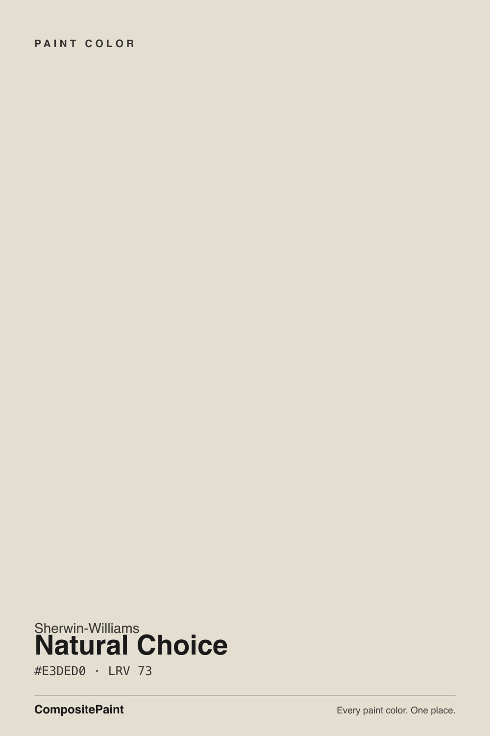
- 1Agreeable Gray60
- 2Balboa Mist66
- 3Natural Choice73
- 4Shoelace78
- 5Dover White83
The Fast Verdict
Natural Choice is the color builders reach for when they need one paint to cover an entire house without offending anyone, and it does that job well. It is warm enough that cool rooms stop feeling cold, and light enough at LRV 73 that no room goes dim.
The catch is that it is an off-white, not a white, and the moment you put it beside crisp white trim or gray flooring the tan in it shows up. Get those two neighbors right and it looks calm and expensive; get them wrong and people call it dirty.
Whole-house walls in a new build with warm wood and beige tile · north-facing rooms that feel cold in a true white · ceilings over off-white walls · anyone who finds pure white clinical
Your trim is a bright builder white · your floors are gray LVP or gray-washed oak · you want a crisp modern gallery look · the room bakes in west afternoon sun
- Warm enough to stop north-facing rooms from feeling cold
- LRV 73 carries a whole house without any room going dim
- Hides drywall seams, patches and scuffs a bright white broadcasts
- Makes builder oak, beige tile and warm granite look deliberate
- Quiet enough that no doorway reads as a color change
- Reads tan and dirty next to bright white trim
- Turns pink-beige against gray floors and cool gray tile
- Late west sun pushes it into dated builder beige
- Too soft for a crisp, modern, high-contrast look
What Color Is Natural Choice, Really?
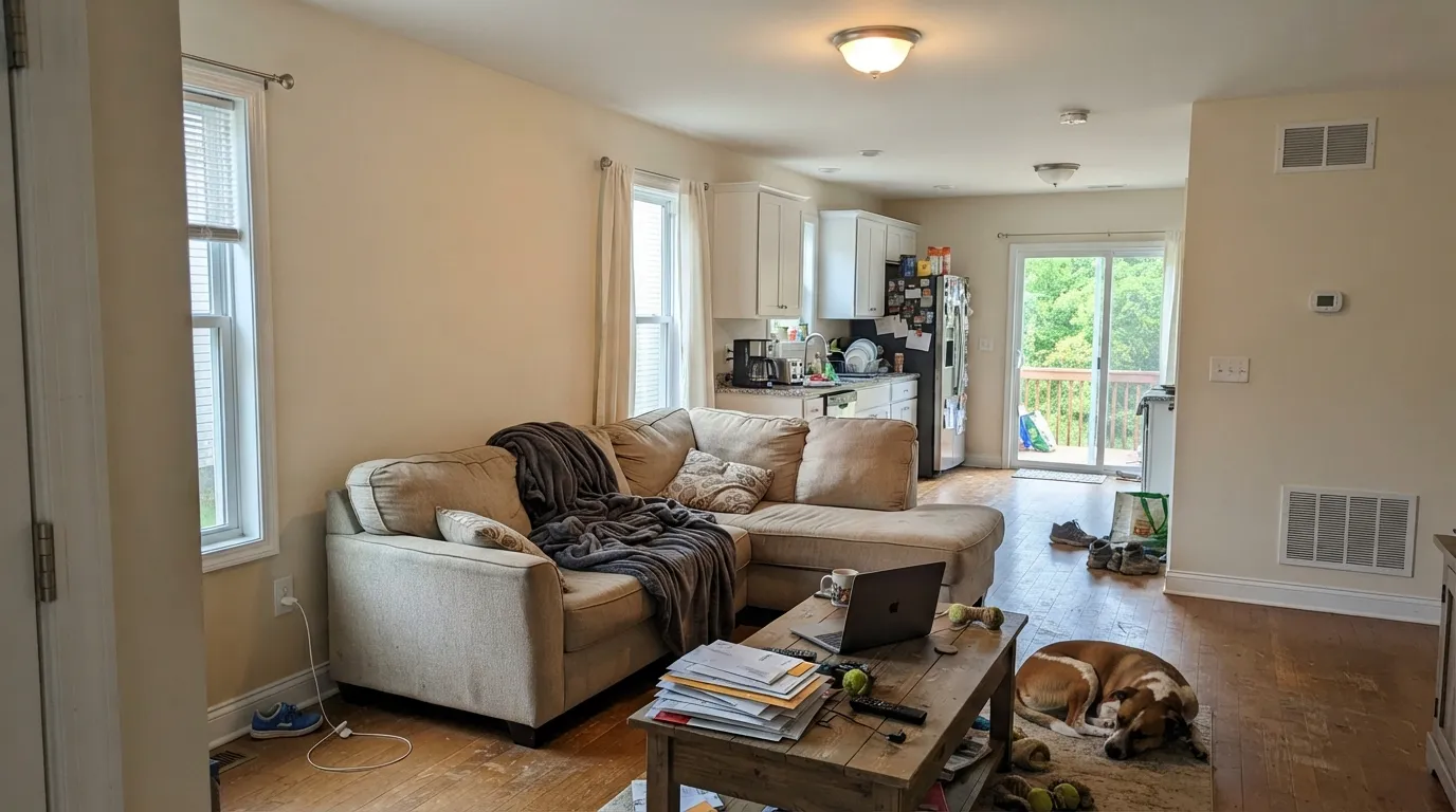
A warm off-white built on a red-orange base rather than a yellow one, which is the detail that decides how you will feel about it. Yellow-based off-whites go buttery in sun; Natural Choice goes tan. On a big wall that reads as soft, sandy warmth — the reason it looks settled instead of sharp — but it also means the color has a beige in it that never fully disappears. Anyone who tells you it is a white is describing the chip, not the wall.
At LRV 73 it sits a clear step below the whites people compare it to. Put it next to Alabaster (SW 7008) at LRV 82 and Natural Choice suddenly looks like it has body and shadow; Alabaster looks like paper. That gap is not a flaw — it is the whole reason the color hides drywall seams, roller marks and hallway scuffs that a brighter white would put on display. It is a color that forgives a house.
Undertone in one line: warm, grayed-out tan on the red side — never yellow, never green. If your sample looks pink, that is a gray floor or gray tile next to it pushing the red base forward, not a bad can of paint.
Where It Shines
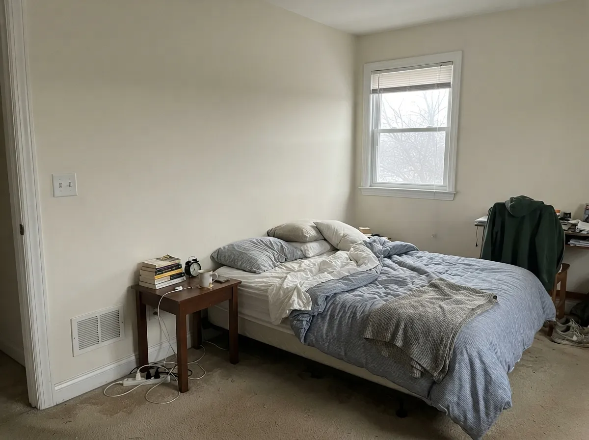
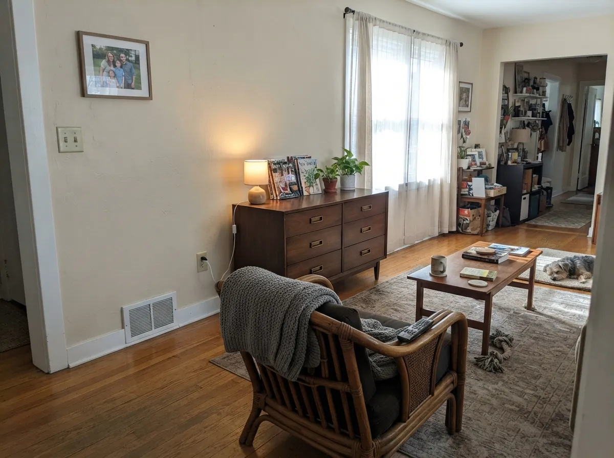
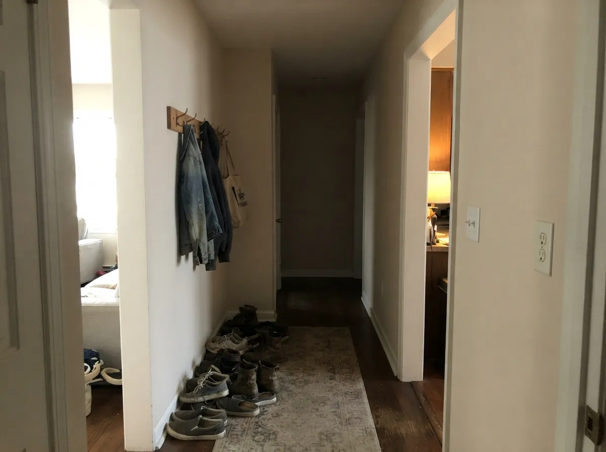
Give it warm wood, beige-toned tile and any amount of daylight and it stops looking like builder paint and starts looking like a decision. It is at its best running through a whole floor — living room to hallway to bedrooms — because it is quiet enough that no doorway feels like a color change, and warm enough that a north-facing room at the end of the hall still feels lived-in.
Where It Fails
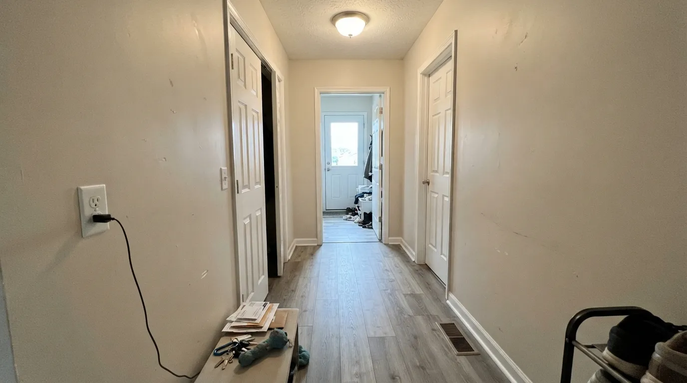
The bad stories about Natural Choice almost never say the color is ugly. They say it looks dirty, or beige, or pink — and in every case something next to it caused that. Here are the three neighbors that do it.
This is the number one complaint, and it is a pairing mistake, not a paint problem. Extra White (SW 7006) at LRV 86 or a builder-grade bright white trim beats Natural Choice by more than ten points of lightness, so the trim reads clean and the wall reads dingy by comparison. Either soften the trim to Alabaster (SW 7008), or if the bright trim is staying, put Alabaster on the walls too.
Gray LVP, gray-washed oak and blue-gray porcelain are everywhere in new construction, and they sit at the opposite temperature. Set against them the red-orange base gets pushed forward and people see pink or muddy beige on the wall. With cool gray flooring, go to a cleaner white like Pure White (SW 7005) or move the walls to a true greige like Agreeable Gray (SW 7029) so the floor has something to agree with.
Strong low sun amplifies everything warm in a color. From about four o'clock a west room can turn Natural Choice into full 1990s builder beige, and it stays there until the light drops. If that is your main living space and you want it to stay reading white, step up in brightness to Greek Villa (SW 7551) at LRV 84 — same warmth, enough lightness to survive the sun.
Room by Room
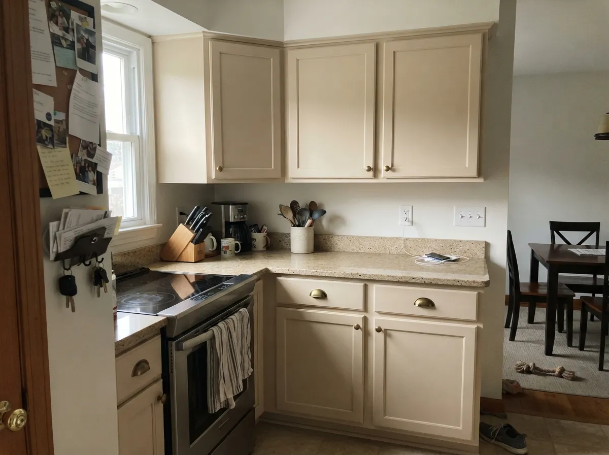
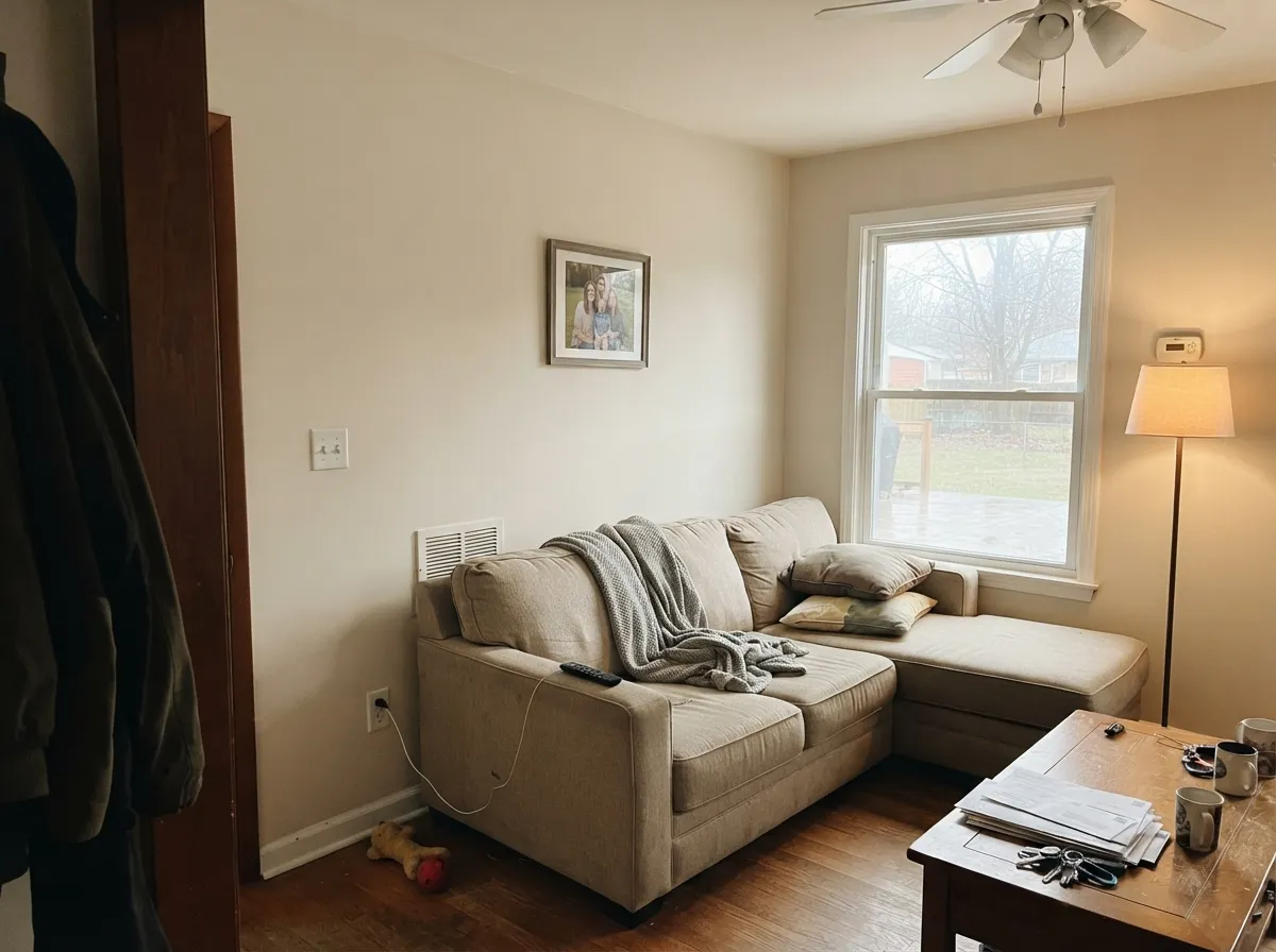
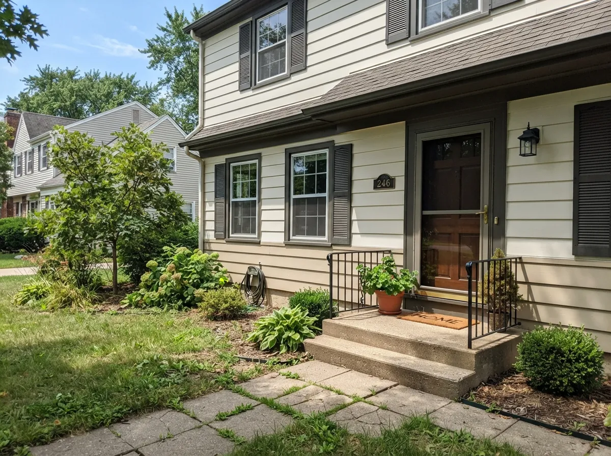
Your Light Is the Risk
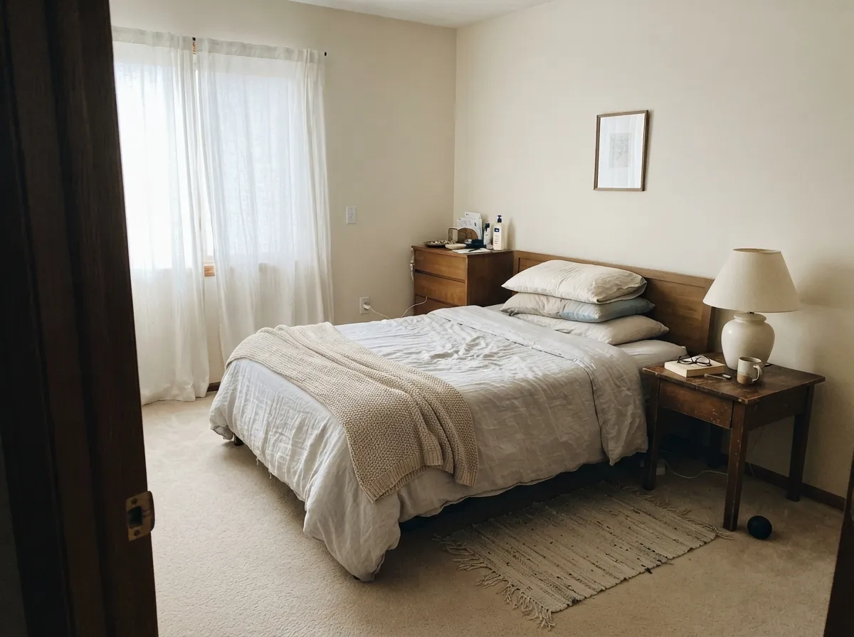
Cool daylight cancels the tan and it reads as a clean, soft off-white. Its best exposure.
Strong warm sun brings the red-orange base out and walls read creamy tan by afternoon.
East rooms warm in the morning then settle. West rooms turn beige after four o'clock.
2700K lamps push it to cream — cozy, but obvious under bright trim. 3500K holds it neutral.
Most complaints about Natural Choice are a light mismatch. Upload a photo of your actual room and see it on your walls — then ask for the same wall in north light or evening lamps before you buy a single sample.
Need It From Another Brand?
Any paint counter can custom-tint Sherwin-Williams SW 7011 directly. If you would rather stay in one brand's own deck, these are the closest stock matches, measured as ΔE2000. Under 2 is a difference you will not see on the wall.
| Brand | Closest color | ΔE | LRV | |
|---|---|---|---|---|
| Behr | Light GraniteN340-1 · Behr | 0.2 | 72 | Color page → |
| Benjamin Moore | Strand of PearlsCSP-395 · Benjamin Moore | 0.0 | 72 | Color page → |
| Valspar | Salute7006-12 · Valspar | 0.9 | 72.4 | Color page → |
| PPG / Glidden | Southern BreezePPG1097-2 · PPG / Glidden | 0.8 | 73 | Color page → |
| Glidden | Southern BreezePPG1097-2 · Glidden | 0.2 | 74 | Color page → |
| Dutch Boy | Canvased015W · Dutch Boy | 1.5 | 73 | Color page → |
Similar Sherwin-Williams Colors
The nearest shades to Natural Choice within Sherwin-Williams's own range, ranked by perceptual color distance — useful when you want the same look a touch lighter, darker, or warmer.
WCAG 2.1: AA is 4.5 : 1 for normal text, 3 : 1 for large text, AAA is 7 : 1.
Natural Choice vs the Colors You're Also Considering
Every Natural Choice sample board has the same rivals on it. The numbers show the real lightness gap — then it comes down to which risk you would rather live with.
Pick this when you want more warmth and softer light than Alabaster gives.
Sherwin-Williams SW 7008 · LRV 82AlabasterPick this when bright trim or gray floors would make this one look dingy.
Pick this for the cleaner off-white with less yellow-beige in it.
Sherwin-Williams SW 7042 · LRV 74Shoji WhitePick this when the room is cold and you want obvious, cozy warmth.
Side-by-side comparison →The most useful in-house comparison is Shoji White (SW 7042) at LRV 74. The two are nearly the same lightness, but Shoji's hex #E1DAC4 carries noticeably less blue than Natural Choice's #E3DED0, which makes Shoji the warmer and more clearly yellow-beige of the pair. Natural Choice stays softer and reads closer to a true off-white. If your room already runs warm, Natural Choice is the safer of the two.
White Duck (SW 7010) at LRV 74 and Divine White (SW 6105) at LRV 72 both lean warmer and slightly greiger. Oyster White (SW 7637) at LRV 72 is the closest sibling in feel.
Across brands, Benjamin Moore Strand of Pearls (CSP-395) at LRV 72 and Farrow and Ball School House White (No. 291) at LRV 73 both come in at deltaE 0, meaning the same color for practical purposes. Glidden Southern Breeze (PPG1097-2), Clare No Filter (PNT100-LT-19), and Valspar Salute (7006-12) all sit under deltaE 1. Behr Guesthouse (UL190-11) at deltaE 1.26 and Dutch Boy Canvased (015W) at deltaE 1.49 will look visually identical in normal room light. Backdrop Cookies and Cream (BD-CC) at deltaE 3.75 is close but visibly different side by side.
Natural Choice Coordinating Colors
The rule with Natural Choice is to keep its partners warm and keep the trim close in lightness. It gets along with warm greiges, muted greens, bronzes and true blacks, and it argues with icy blues, cool grays and blue-gray stone. These are the partners that actually get used with it:
Natural Choice With Gray Floors and Wood Tones
This is the question that decides most Natural Choice regrets, so answer it before you buy paint. Warm wood is the easy win: red oak, white oak, honey-toned engineered plank, walnut and rattan all share the color's warm base, and the wall meets them halfway instead of fighting. If your floors lean orange, Natural Choice is one of the few light colors that calms the orange rather than amplifying it.
Gray flooring is where it goes wrong. Gray LVP, gray-washed oak and cool concrete-look tile sit at the opposite temperature, and the contrast drags the red-orange base of the paint into view. That is where the pink and muddy-beige reports come from. It is not always fatal — warm rugs, wood furniture and brass lighting pull it back — but tape a big sample board directly above the real floor and look at it at three in the afternoon before you commit. If it still looks pink, move to Agreeable Gray (SW 7029) or Pure White (SW 7005).
Natural Choice on Exteriors
Outside, the color behaves better than its indoor reputation suggests. Full daylight is much brighter than any room, so at LRV 73 it reads as a soft light body color rather than a beige, and it avoids the blue glare that cheap bright whites give a facade. It sits well on siding, stucco and fiber cement.
The trim decides the result. With Iron Ore (SW 7069) or Tricorn Black (SW 6258) you get sharp modern-farmhouse contrast that makes the body read almost white. With Urbane Bronze (SW 7048) it goes warmer and more traditional. What it will not do is carry a house on its own — without a dark frame it looks washed out from the curb. Also walk the whole house with your sample: the shaded north elevation will read a full step creamier than the sunny south side.
Three Ready Palettes Built on Natural Choice
A color is never alone on the wall. These are complete combinations in the 60-30-10 pattern, with the reason each one holds together. Every one opens in the visualizer.
Alabaster is only nine LRV points brighter, so the trim reads crisp without making the walls look dirty the way a bright builder white does. The bronze door gives the scheme its one dark anchor and stays on the warm side of the fence.
Try this palette in your roomAccessible Beige at LRV 58 sits far enough below the cabinets to give real separation while sharing the same warm base, so nothing clashes. Iron Ore on the island supplies the contrast the two soft neutrals cannot provide on their own.
Try this palette in your roomEvergreen Fog is a muted, grayed green, so it reads restful next to a warm off-white instead of competing with it. Pure White is bright enough to frame both without the icy snap of a cooler trim white.
Try this palette in your roomNatural Choice FAQ
Is Natural Choice warm or cool?
Warm, on the red-orange side rather than yellow. It is never a cool or blue-based white. In north light the warmth calms down enough that it can pass for neutral, but put it beside a gray and the warm base is obvious.
Does Natural Choice look pink?
Not on its own, but it can against the wrong neighbor. Gray flooring, blue-gray tile and cool gray countertops push the red in its base forward, and that reads as pink on a big wall. With warm oak, beige tile or cream stone it goes the other direction and looks almost white.
What trim white goes with Natural Choice?
Alabaster (SW 7008) at LRV 82 is the safest — bright enough to read as trim, warm enough not to make the walls look dirty. Pure White (SW 7005) at LRV 84 also works and is slightly crisper. Skip Extra White (SW 7006): the contrast is big enough that the walls start reading beige.
Natural Choice or Alabaster for a whole house?
Alabaster if you want the house to read white and your trim is staying bright. Natural Choice if the house has a lot of north-facing rooms or warm wood and beige tile you are keeping. Alabaster is nine LRV points lighter, which is the entire difference in feel.
Is Natural Choice good for kitchen cabinets?
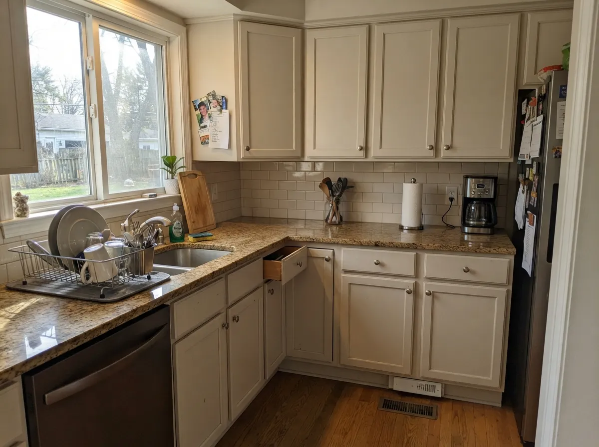
Yes, for a traditional or transitional kitchen. Its softness hides knuckle marks and minor door imperfections better than a stark white, and it flatters brass, wood and warm-flecked granite. Use a satin urethane-fortified cabinet enamel. Against cool white marble, choose Alabaster (SW 7008) instead.
Can I paint the ceiling Natural Choice too?
Yes, in flat, and it is one of the better uses of the color. Over Natural Choice walls it removes the hard bright line that a standard ceiling white draws. It also keeps the light bouncing down soft rather than clinical.
How many coats does it take?
Two over an existing light color. Over anything dark or saturated, prime first with a tinted primer — off-whites at this lightness have poor hiding power and you can burn three finish coats learning that the expensive way.
Have you painted with Natural Choice?
Rate it — one tap helps the next reader decide.
Ask a Question