Oyster White
A white in name only: Oyster White reviewed honestly — the rooms where its soft greige glows, the light that turns it drab, and what to pick instead.

Jessica has spec'd whites and neutrals for more than 300 rooms and keeps a sample wall of painted drawdowns in her studio. Every color review is checked against real reader rooms in the comments and re-tested when a formula changes. About the testing process →
- 1Agreeable Gray60
- 2Balboa Mist66
- 3Oyster White72
- 4Pearly White77
- 5Dover White83
The Fast Verdict
Oyster White is not a white — it is a soft, low-saturation greige that sits about ten points below a true off-white, and that gap is the whole story. In daylight it gives walls a quiet warmth that flatters oak, brass and stone without ever going buttery. In a dim north room, or next to bright white trim, that same restraint reads flat and slightly dingy. Sample it big, and judge it against the whitest thing already in the room.
Whole-house walls in rooms with real daylight · kitchen cabinets with wood and brass · exteriors with dark shutters · anyone who found Alabaster too creamy
Your room faces north and stays dim · you actually wanted a white · your floors are orange-red oak · your counters are cool gray quartz
- Warm without ever tipping into cream or butter
- Low saturation keeps it consistent room to room in an open plan
- Hides scuffs and handprints better than a bright white on cabinets
- Holds up in full exterior sun without glaring
- Flatters white oak, walnut, rattan, brass and limestone
- Reads flat and dingy in dim north-facing rooms
- The name promises white and the wall delivers greige
- Shows an olive cast next to red-orange oak and brick
- Too much color to work as trim under a brighter white
What Color Is Oyster White, Really?
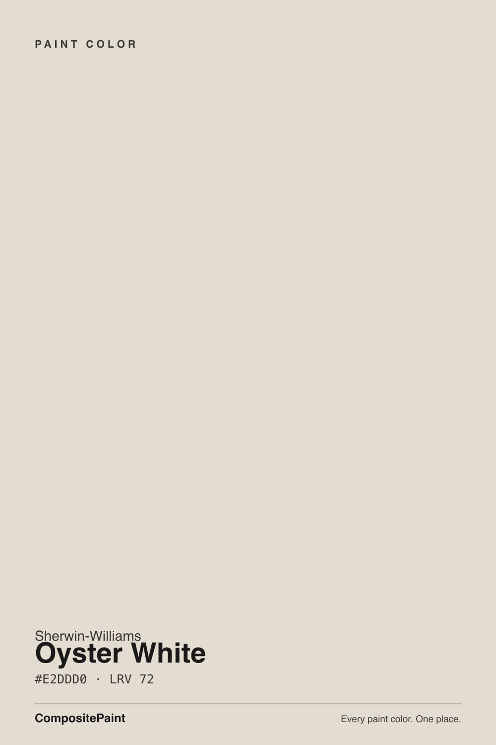
Warm greige with the volume turned almost all the way down. The hex #E2DDD0 sits at a hue of 43 degrees — that is tan territory, not gray — but the saturation is only about 24 percent, so the warmth never announces itself. Sherwin-Williams itself describes the undertone as green-beige, and both readings are true: the color is warm on paper, and in cool light the beige thins out enough that a soft green-gray cast shows through. That double life is why two people can paint the same color and describe it completely differently.
At LRV 72 it reflects a solid amount of light, but it is not a bright white and it will not behave like one. Put it beside Alabaster SW 7008 at LRV 82 and the ten-point gap is obvious across the room: Alabaster reads as a white, Oyster White reads as a color. On a big wall that extra body is what keeps the room from looking blank — and it is also why people who bought it expecting a creamy white say it came out darker and dirtier than the chip promised.
Undertone in one line: warm tan with a green-beige shadow — never pink, never yellow. If it looks green on your wall, look at your floor and your window; red-toned oak and cool north glass both pull that green forward.
Where It Shines
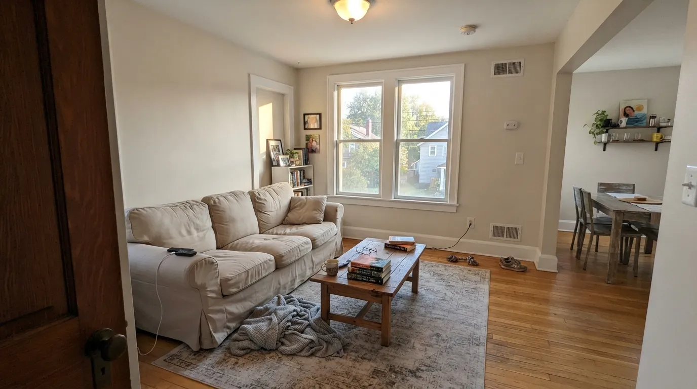
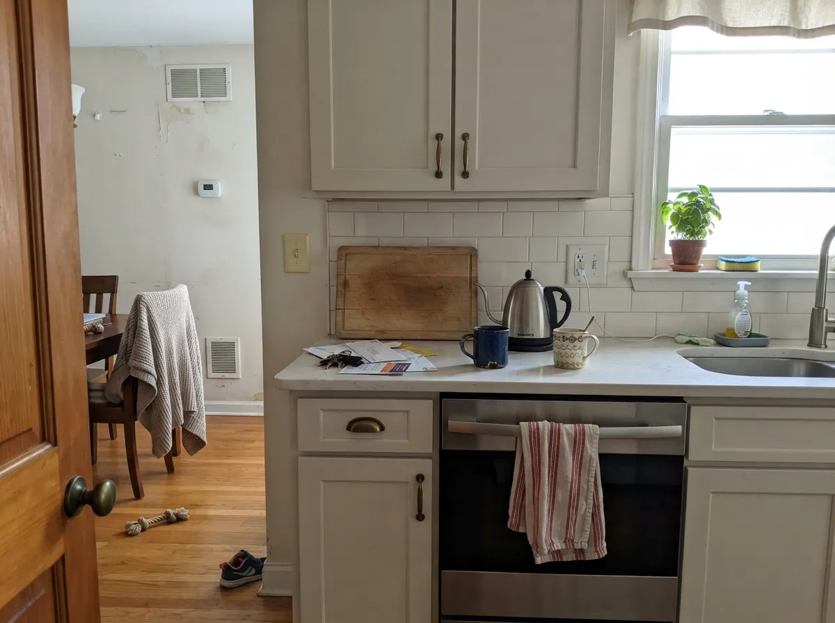
Give it daylight and warm materials and it does exactly what a good background color should do — disappear politely. Living rooms and open plans are its home turf, where the low saturation keeps it steady from one exposure to the next. Cabinets are its second act: at LRV 72 it hides fingerprints and cooking haze that a bright white broadcasts, and it makes brass hardware and butcher block look chosen rather than accidental.
Where It Fails
The unhappy stories about Oyster White are remarkably consistent, and every one of them comes down to expectation. Three situations produce almost all of them — and if your room is one of these, another coat will not save it.
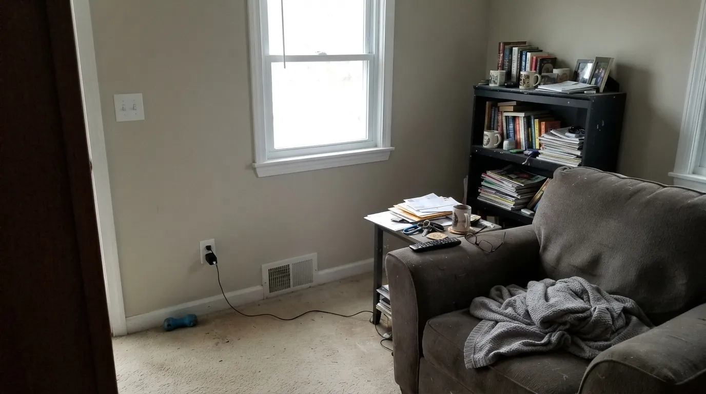
North light is cool and steady, and it drains the tan straight out. What is left is the green-beige shadow, and readers describe it as drab, dingy, or like dirty dishwater. Nothing is wrong with the paint — there is not enough warm light to activate it. Go warmer and lighter with Shoji White SW 7042, or step all the way up to Alabaster SW 7008.
Oyster White walls next to Pure White SW 7005 trim is fine — the contrast is the point. The mistake is the reverse: using Oyster White as trim under a bright white ceiling, or beside existing Extra White SW 7006 doors. It has too much color to win that fight and immediately looks unwashed. If you want soft trim, use Alabaster SW 7008 instead.
Honey oak, red oak floors, cherry cabinets and orange-toned brick sit opposite the green in this color, and opposites make each other louder. The wall picks up a distinctly olive cast that no lamp fixes. With strongly orange wood, Accessible Beige SW 7036 or Natural Choice SW 7011 stays on the same side of the fence.
Room by Room
With two exposures or a big south window it is the calm backdrop that makes art and wood furniture look deliberate. Eggshell on the walls, Pure White SW 7005 semi-gloss on the trim. One small north window and no lamps is the one setup to avoid.
Satin cabinet enamel, brass or bronze pulls, white oak floors — this is where the low saturation pays off. Pair with a warm-flecked quartz rather than cool gray, and give the island something dark like Urbane Bronze SW 7048 so the room has a floor to stand on.
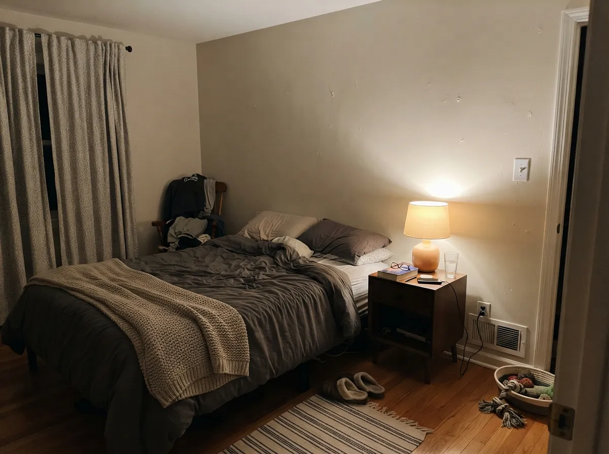
Under 2700K lamps the tan comes forward and the room warms up noticeably. Eggshell walls, Alabaster SW 7008 on trim and ceiling for a soft envelope. If the bedroom is north-facing and you never open the blinds, pick Shoji White SW 7042.
Excellent with travertine, warm marble, wood vanities and unlacquered brass. Against a cool gray quartz top or blue-gray floor tile it looks slightly muddy. Satin or semi-gloss for moisture, and keep the mirror lights at 3000K or warmer.
It works as trim only when the walls are Oyster White too, with semi-gloss doing the separating — that gives heavy millwork a quiet, slightly aged look. Under any brighter white ceiling it reads dirty. Do not mix it with Pure White SW 7005 trim on the same run of woodwork.
Full sun makes most soft whites glare; this one stays muted without going muddy, which is why it shows up on so many warm-toned facades. Pair it with Iron Ore SW 7069 shutters or an Urbane Bronze SW 7048 door, and it flatters limestone, cedar and buff brick.
Your Light Is the Risk
Cool, even daylight strips the tan and leaves a gray-green cast. Test big samples first.
Strong sun brings the beige forward and it glows as a soft warm neutral all day.
Warm and beige at the sun hours, closer to greige the rest of the day. Most people like the swing.
2700K lamps deepen the tan and make it cozy. Cool 4000K LEDs turn it gray — change bulbs, not paint.
Most complaints about Oyster White are a light mismatch. Upload a photo of your actual room and see it on your walls — then ask for the same wall in north light or evening lamps before you buy a single sample.
Need It From Another Brand?
Any paint counter can custom-tint Sherwin-Williams SW 7637 directly. If you would rather stay in one brand's own deck, these are the closest stock matches, measured as ΔE2000. Under 2 is a difference you will not see on the wall.
| Brand | Closest color | ΔE | LRV | |
|---|---|---|---|---|
| Behr | Light GraniteN340-1 · Behr | 0.4 | 72 | Color page → |
| Benjamin Moore | Olympic Mountains971 · Benjamin Moore | 0.0 | 70 | Color page → |
| Valspar | Salute7006-12 · Valspar | 0.6 | 72.4 | Color page → |
| PPG / Glidden | Southern BreezePPG1097-2 · PPG / Glidden | 0.6 | 73 | Color page → |
| Glidden | Fossil StonePPG1102-2 · Glidden | 1.6 | 72 | Color page → |
| Dutch Boy | Mousey Tint441-1DB · Dutch Boy | 1.5 | 73 | Color page → |
Similar Sherwin-Williams Colors
The nearest shades to Oyster White within Sherwin-Williams's own range, ranked by perceptual color distance — useful when you want the same look a touch lighter, darker, or warmer.
WCAG 2.1: AA is 4.5 : 1 for normal text, 3 : 1 for large text, AAA is 7 : 1.
Oyster White vs the Colors You're Also Considering
Every Oyster White sample board has the same rivals on it. The numbers show the real lightness gap — then it comes down to which risk you would rather live with.
Pick this when you want less cream and a steadier, quieter neutral.
Sherwin-Williams SW 7042 · LRV 74Shoji WhitePick this for dim or north rooms — the extra warmth keeps glowing where this goes flat.
Pick this when White Duck reads too beige on a big wall.
Sherwin-Williams SW 7010 · LRV 74White DuckPick this if you want two points more light and a touch more tan.
Natural Choice SW 7011 at LRV 73 and Pacer White SW 6098 at LRV 73 are one point lighter and very close in hex, so on a wall the difference is hard to call without a side-by-side sample. Arrowroote SW 9502, also at LRV 73, carries a little more yellow at #E4DECF. Aesthetic White SW 7035 at LRV 73 is the softest of the group at #E3DDD3, while Nonchalant White SW 6161 at LRV 72 is the least warm at #DEDDD1 and the one to choose if Oyster White reads too tan.
White Duck SW 7010 at LRV 74 is two points lighter and slightly stronger in warmth at #E5DFD2, so it reads a touch more beige on a big wall. White Sesame SW 9586 at LRV 71 goes deeper still.
Across brands, Benjamin Moore Olympic Mountains 971, Farrow and Ball School House White No. 291, Valspar Salute 7006-12, and Clare No Filter PNT100-LT-19 are all effectively the same color, and Behr Chocolate Froth 720C-2 is visually identical in normal room light.
Oyster White Coordinating Colors
The rule with Oyster White is to keep every partner on the muted, warm side. It agrees with soft greens, warm beiges, bronzes and near-blacks, and it argues with icy blues, cool gray stone and anything strongly orange. These are the partners that come up again and again in real Sherwin-Williams schemes:
Oyster White on Cabinets and Millwork
Cabinets are where this color earns its score. A bright white kitchen shows every knuckle mark around the pulls and every splash behind the range; at LRV 72 Oyster White absorbs just enough of that to stay presentable between deep cleans. The soft warmth also solves the most common cabinet problem, which is a white door that reads blue against warm wood floors.
Millwork is the opposite story. Painting trim in Oyster White only works if the walls are Oyster White too — one color, two sheens, and the shadow lines do the separating. Put it against a brighter ceiling or beside existing white doors and it looks like white paint that has yellowed with age. If you want trim softer than Pure White, use Alabaster SW 7008 and keep Oyster White on the walls where it belongs.
Oyster White on Exteriors
Outside, the quality that makes people nervous indoors becomes the reason to use it. Full sun blows out bright whites into glare, while Oyster White holds its shape and stays muted without ever looking dirty, which is why it sits comfortably on stucco, lap siding and shingle alike. It also flatters the materials most houses already have: buff brick, limestone, weathered cedar and warm stone veneer.
The frame does the work. Iron Ore SW 7069 shutters or an Urbane Bronze SW 7048 door give the facade the contrast the body color will never supply on its own. Walk the sample around the house before you commit — the shaded north elevation reads a full step grayer and greener than the sunny side, and that is the wall your neighbors see from the street.
Three Ready Palettes Built on Oyster White
A color is never alone on the wall. These are complete combinations in the 60-30-10 pattern, with the reason each one holds together. Every one opens in the visualizer.
Pure White sits ten points brighter, which is exactly the separation that keeps Oyster White walls reading intentional instead of dirty. The bronze door carries the whole scheme's one dark note and echoes the warmth in the walls.
Try this palette in your roomEvergreen Fog shares the same muted green-beige family, so the island reads as a deeper draw of the cabinet color rather than a contrast. Pure White walls keep the room from going soft all over and let the cabinets hold the warmth.
Try this palette in your roomIn full sun the body color needs a hard edge, and near-black Iron Ore gives it one without adding another undertone to manage. Accessible Beige on the garage doors is the same warmth two shades down, so the biggest flat panels stop competing with the front door.
Try this palette in your roomOyster White FAQ
Is Oyster White warm or gray?
Warm — the numbers put it at a hue of 43 degrees, which is tan, not gray. But the saturation is low enough that cool light thins the warmth out and a green-gray cast shows. On its own it reads soft and neutral; next to a bright white it reads clearly beige.
Does Oyster White look green?
Sometimes, and Sherwin-Williams admits it — their own description of the undertone is green-beige. The green shows most in north light, under cool LEDs, and next to red-orange wood or brick. In south or west light it stays beige.
Oyster White or Shoji White?
Shoji White SW 7042 is two points lighter and warmer, so it is the safer pick for dim rooms and north exposures. Oyster White is quieter and less creamy, which suits rooms with good daylight and a lot of wood. Sample both on the same wall — they are close enough that the room decides.
What white trim goes with Oyster White walls?
Pure White SW 7005 is the standard answer: about ten points brighter, clean but not icy. Extra White SW 7006 works if you want a sharper edge. Skip High Reflective White — that much contrast makes the walls look tired.
Is it good for kitchen cabinets?
One of its best uses. At LRV 72 it hides handprints and cooking haze far better than a bright white, and the soft warmth flatters brass, bronze and wood floors. Use a satin urethane-fortified cabinet enamel and keep the counter on the warm side of neutral.
Will it be too dark in a room with little light?
It can be. LRV 72 returns enough light for most rooms, but in a small north-facing space with one window it goes flat and slightly dingy rather than soft. Paint a two-foot sample board, look at it at midday and again at night, and if it dulls out choose Shoji White SW 7042 instead.
Does Oyster White work on exteriors?
Yes, and it is arguably stronger outside than in. Direct sun makes brighter whites glare; this one stays muted without turning muddy, so the facade keeps its shape. Pair it with Iron Ore SW 7069 or Urbane Bronze SW 7048 and check the shaded north wall, which will read a step grayer.
Have you painted with Oyster White?
Rate it — one tap helps the next reader decide.
Ask a Question