Aesthetic White
The quiet warm off-white designers reach for when Alabaster feels too plain, reviewed honestly: what it does with wood, and the trim mistake that ruins it.

Jessica has spec'd whites and neutrals for more than 300 rooms and keeps a sample wall of painted drawdowns in her studio. Every color review is checked against real reader rooms in the comments and re-tested when a formula changes. About the testing process →

- 1Agreeable Gray60
- 2Balboa Mist66
- 3Aesthetic White73
- 4Shoelace78
- 5Dover White83
The Fast Verdict
Aesthetic White is a cream-and-sand off-white that makes a room feel warm without going full beige. In north light it is genuinely lovely — soft, calm, never chilly.
But it is not a trim white and it does not pretend to be: put it beside a crisp white ceiling and the walls turn visibly tan. Pick your trim first, then pick this.
North-facing rooms that always look gray · homes with oak floors and brass · traditional kitchen cabinets · warm whole-house schemes
Your ceiling is a bright builder white · your counters are cool gray quartz · the room has no lamps and little daylight · you want a modern gallery look
- Warms a north-facing room without turning it beige
- Sand tone flatters oak, travertine, brass and rattan
- LRV 73 carries light into hallways and windowless spaces
- Reads soft and traditional on cabinets and built-ins
- Sits at the top of a real SW strip, so layering is easy
- Looks distinctly tan next to any bright white trim or ceiling
- Goes dingy and slightly mauve in dim rooms with no lamps
- Turns yellow-peach in strong afternoon south or west sun
- Clashes with cool gray quartz, marble and gray flooring
What Color Is Aesthetic White, Really?
This is a cream, not a white, and everything about living with it follows from that. The warmth is red-orange rather than yellow-green, which is why it reads as sand or oatmeal instead of buttermilk. That distinction matters more than it sounds: yellow-based off-whites flash acid-lemon in afternoon sun, while Aesthetic White goes peachy and soft instead. Some people see a faint gray-mauve cast on an overcast day in a dim room — that is the color's low-light behavior, not a mistint, and it is the one shift that surprises people.
At LRV 73 it is light but not bright. Stand it next to Alabaster SW 7008 at LRV 82 and the difference is obvious in a second — Alabaster still reads as a white, Aesthetic White reads as a very pale beige with a white name. That eleven-point gap is the whole story of this color. On a wall it gives you softness and body that a true white cannot; against anything whiter it loses, every time.
Undertone in one line: warm sand with a red-orange lean, gray enough to stay quiet, never green, never truly white.
Where It Shines
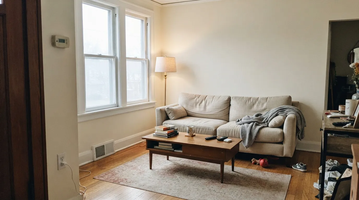
It earns its money in the rooms other warm whites go cold in. North-facing living rooms, hallways with borrowed light, bedrooms that need to feel calm at 9pm — this is where the sand tone stops a space from reading gray. It also flatters exactly the things older houses already have: oak floors, travertine, brass, linen.
Where It Fails
The complaints about this color are consistent and easy to predict. Almost none of them are about the paint itself — they are about what you put next to it. If your room matches one of these three, no number of coats will fix it.
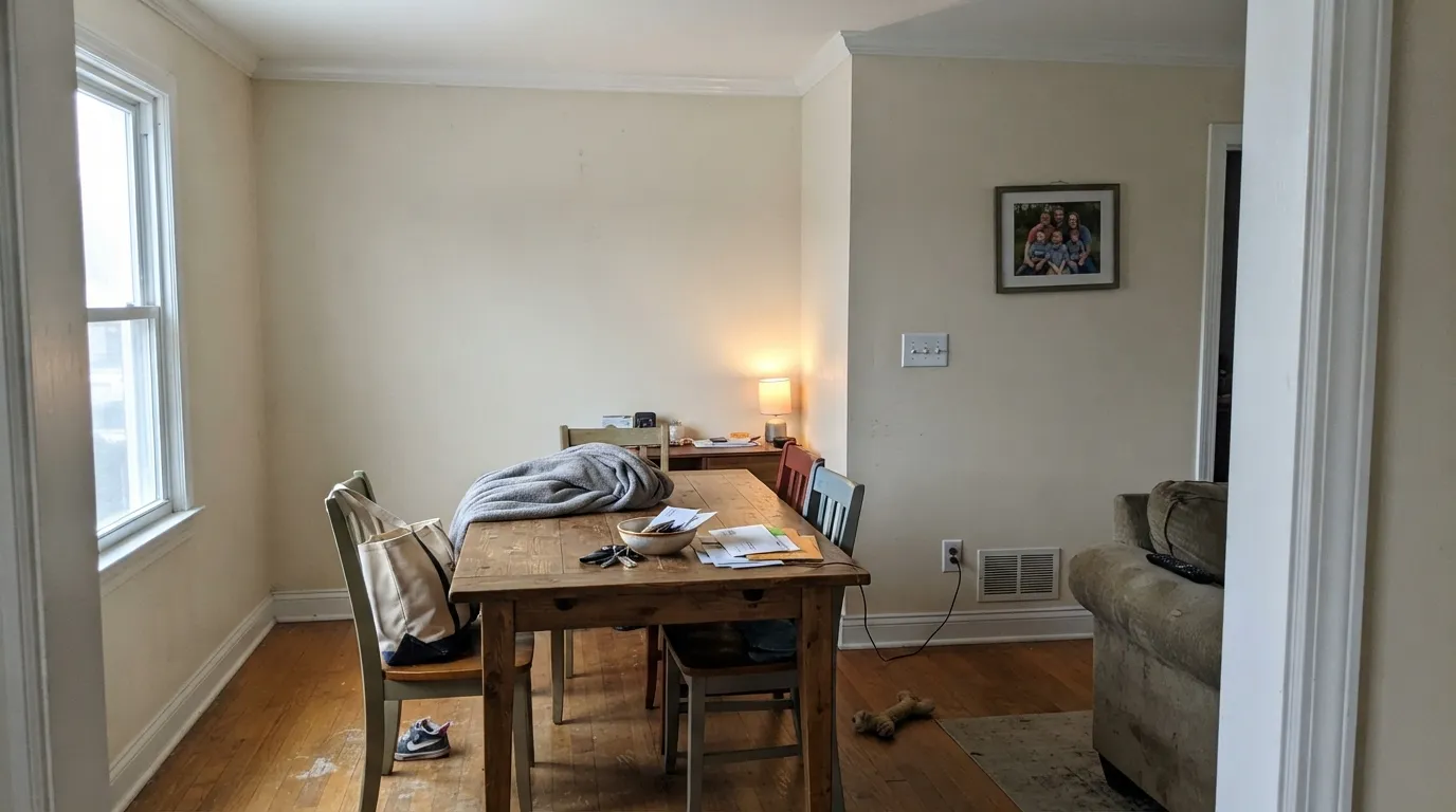
This is the number one regret story. Cool builder-white trim next to LRV 73 warmth makes the walls read tan or even dirty, and people assume the paint was mixed wrong. Use a warmer bright white like Pure White SW 7005, or if the trim is already icy, switch the walls to Natural Choice SW 7011.
With little light, the gray in the base takes over and readers describe it as dingy or drab, sometimes with a faint mauve cast. It needs either daylight or bulbs. For a genuinely dark room, step up to Alabaster SW 7008 — eleven more LRV points do the work no extra coat will.
Set a warm sand against a cool gray surface and the wall looks yellow by comparison — the same effect that ruins it beside white trim, just at floor level. If your fixed finishes are cool, go to a greige with green-gray in it, like Shoji White SW 7042.
Room by Room
In a north or east living room it stops the space feeling gray without turning it beige. Eggshell on walls, and keep the trim to Pure White SW 7005 so the edges stay clean. Brass lamps and oak furniture look deliberate against it.
Under 2700K lamps it gets softer and creamier at night, which is exactly what most people want in a bedroom. Pair with Accessible Beige SW 7036 on a headboard wall for a quiet layered look. Avoid cool 4000K bulbs here — they flatten it.
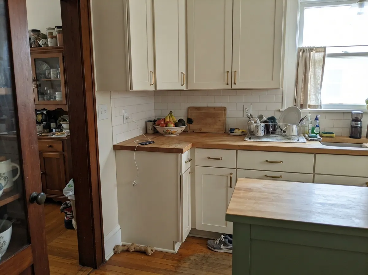
On cabinets it gives a soft, older, hand-painted feel rather than a crisp one. Use satin. It sits beautifully with butcher block, honed limestone and unlacquered brass, and badly with bright white quartz — check your counter sample before you commit.
With warm marble, wood vanities or beige tile it is excellent. With blue-gray porcelain or cool gray tile it goes yellow and looks like a mistake. Semi-gloss or satin for moisture.
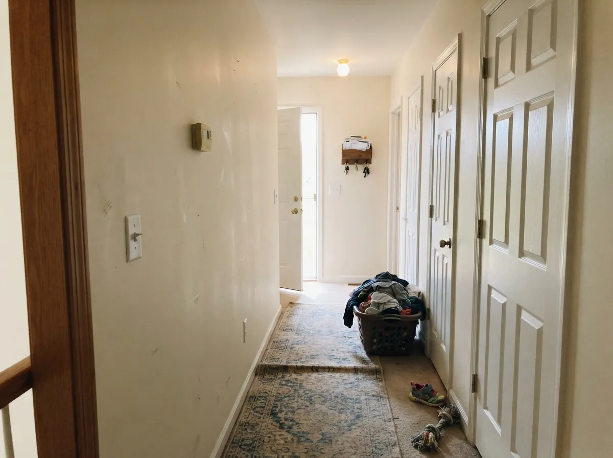
At LRV 73 it carries light down a windowless hallway better than any mid-tone greige. It is a good whole-floor color because it never argues with itself from room to room. Just commit to one trim white everywhere.
As a body color it suits stone, cedar and brick, and full sun reads it much crisper than it looks indoors. Frame it with Urbane Bronze SW 7048 or Peppercorn SW 7674 so it does not go flat. More on this in the exterior notes below.
Your Light Is the Risk
Cool daylight cancels the warmth and it lands as a soft, gentle white. This is the room it was made for.
Strong afternoon sun amplifies the sand and the walls read yellow-peach for a few hours. Test a big sample at 4pm.
2700K lamps deepen the cream and make it cozy. 3500K to 4000K holds it closer to a soft white.
Without daylight or lamps the gray base surfaces and it can look drab, sometimes faintly mauve. Add light, not coats.
Most complaints about Aesthetic White are a light mismatch. Upload a photo of your actual room and see it on your walls — then ask for the same wall in north light or evening lamps before you buy a single sample.
Need It From Another Brand?
Any paint counter can custom-tint Sherwin-Williams SW 7035 directly. If you would rather stay in one brand's own deck, these are the closest stock matches, measured as ΔE2000. Under 2 is a difference you will not see on the wall.
| Brand | Closest color | ΔE | LRV | |
|---|---|---|---|---|
| Behr | Spun WoolN220-1 · Behr | 0.5 | 73 | Color page → |
| Benjamin Moore | Olympic Mountains971 · Benjamin Moore | 1.6 | 70 | Color page → |
| Valspar | Asiago6005-1A · Valspar | 0.9 | 72.3 | Color page → |
| PPG / Glidden | AshPPG1076-2 · PPG / Glidden | 0.2 | 73 | Color page → |
| Glidden | AshPPG1076-2 · Glidden | 0.5 | 74 | Color page → |
| Dutch Boy | Blanched Fuchsia347-1DB · Dutch Boy | 1.6 | 72 | Color page → |
Similar Sherwin-Williams Colors
The nearest shades to Aesthetic White within Sherwin-Williams's own range, ranked by perceptual color distance — useful when you want the same look a touch lighter, darker, or warmer.
WCAG 2.1: AA is 4.5 : 1 for normal text, 3 : 1 for large text, AAA is 7 : 1.
Aesthetic White vs the Colors You're Also Considering
Every Aesthetic White sample board has the same rivals on it. The numbers show the real lightness gap — then it comes down to which risk you would rather live with.
Pick this when you want visible warmth and body on the wall.
Sherwin-Williams SW 7008 · LRV 82AlabasterPick this for a dim room, or when it still needs to read white.
Pick this if the room has warm wood and you want it emphasized.
Sherwin-Williams SW 7010 · LRV 74White DuckPick this when the space has cool finishes — it is grayer and greener.
Agreeable Gray SW 7029 (#D1CABC, LRV 60) is the comparison most people run. It is eleven LRV points darker and clearly grayer, a greige rather than a cream. Agreeable Gray gives walls more weight and behaves like a neutral in almost any light, while Aesthetic White stays lighter and openly warm. Use Aesthetic White when you want warmth and lift, and Agreeable Gray when you want a color that disappears into the background.
Within the line, Warm Winter SW 9506 (#E1D9C6, LRV 70) is nearly the same color, and Oat Milk SW 9501 (#DEDACD, LRV 70) is the cooler, greener alternative if the cream is too much.
Across brands, Diamond Vogel Illusive Dream 0335 measures a deltaE of 0. Glidden Navajo Sand 40YY 69/112 (deltaE 0.55), Benjamin Moore White Sand 964 (LRV 67, deltaE 0.91), and Behr Sand Castle ECC-51-2 (LRV 70, deltaE 1.02) are all matches you would not separate in a normal room.
Aesthetic White Coordinating Colors
The rule with Aesthetic White is to stay warm or go deep — anything cool and light next to it will make it look tan. Its own strip gives you the easiest layering, and the deep browns and muted greens in the Sherwin-Williams deck give you the contrast the color cannot provide on its own. These are the partners that actually get used:
Aesthetic White on Cabinets and Built-Ins
On cabinetry this color does something a bright white cannot: it looks like painted wood rather than painted plastic. That reads as traditional, farmhouse, or English kitchen — it does not read modern. If you want flat-front doors and a crisp handleless look, this is the wrong white and Extra White SW 7006 is the right one.
Two practical notes. First, at LRV 73 it hides handprints and knuckle marks around handles far better than any bright white, which is a genuine daily advantage. Second, check it against the counter before you spray anything — warm quartz, butcher block and honed limestone are perfect, while a cool white quartz with gray veining will make the doors look yellowed. Use a urethane-fortified satin cabinet enamel.
Aesthetic White Outside
Full sun changes this color more than most. Indoors it is a soft sand; on a south-facing facade it flattens out and reads much closer to a plain warm white, which is why exterior samples so often disappoint people who fell in love with the interior chip. Plan for it to look lighter and less interesting outside than it does in the store.
That washing-out is fixable with the frame. Dark trim gives it back the definition it loses in sun — Urbane Bronze SW 7048 for a warm modern look, Peppercorn SW 7674 for a cooler charcoal edge. It sits naturally with limestone, tan brick, cedar and terracotta roof tile. Avoid cool gray hardscaping and blue-gray stone, where the body color reads distinctly yellow. And check the shaded north elevation separately: it will always look a full step creamier there than on the sunny side.
Three Ready Palettes Built on Aesthetic White
A color is never alone on the wall. These are complete combinations in the 60-30-10 pattern, with the reason each one holds together. Every one opens in the visualizer.
Pure White is bright enough to read as trim but still warm-leaning, so the walls never look tan beside it — the single most important decision with this color. Urbane Bronze supplies the one dark note a soft scheme needs without introducing a cool undertone.
Try this palette in your roomAll three sit on the same Sherwin-Williams strip, so they share a base and step down cleanly from LRV 73 to a mid beige to a deep taupe. Use the lightest for 60 percent of the visible surface, the beige for the connected room, and the taupe only on cabinetry.
Try this palette in your roomCream cabinets against a beige wall keep the contrast low, which is what makes a traditional kitchen feel settled rather than striped. Pewter Green is muted enough to read as a neutral from across the room and it loves the brass hardware this palette asks for.
Try this palette in your roomAesthetic White FAQ
Does Aesthetic White look pink or purple?
Not usually, but it can. In a dim room on a gray day, the gray part of the base surfaces and some people read it as a faint mauve. Turn a lamp on and it goes straight back to sand. If you see purple in full daylight, that is reflection off a red brick wall or a rug, not the paint.
Aesthetic White or Alabaster?
Alabaster SW 7008 is eleven LRV points lighter and much less saturated, so it still reads as a white in most rooms. Aesthetic White reads as a pale beige. Choose Alabaster if the room is dark or the trim is staying bright white; choose Aesthetic White if the room feels gray and you want visible warmth.
Will it look dingy in a dark room?
Yes, if that room has no lamps on. LRV 73 needs something to reflect. In a basement or an interior room with one small window, add warm 2700K lighting or move up to Alabaster SW 7008. A second coat does not make a color brighter.
Can I paint the ceiling Aesthetic White too?
Yes, and it is often the better answer. Aesthetic White walls under a bright white ceiling is the exact pairing that makes the walls look tan. Take the same color across the ceiling in flat, and the room reads soft and continuous instead of two-tone.
Does it work with gray floors?
It is the hardest pairing for this color. Cool gray LVP or gray-washed wood pulls the warmth forward and the walls can look yellow. Warm rugs and wood furniture help, but if the floor is a strong blue-gray, Shoji White SW 7042 is the safer warm neutral.
Is it a good whole-house color?
It is, as long as the house has warm fixed elements and you use one trim white throughout. It carries well down hallways at LRV 73 and never fights itself room to room. It fails as a whole-house color in homes with cool gray tile, cool quartz, and chrome everywhere.
Have you painted with Aesthetic White?
Rate it — one tap helps the next reader decide.
Ask a Question