CP
COLOR COMPARISON

Sherwin-Williams Aesthetic WhitevsSherwin-Williams Agreeable Gray

Why this comparison. Aesthetic White is the “almost white” answer when Agreeable Gray turns too dark in a low-light room. Aesthetic White and Agreeable Gray are very close (ΔE 4.22). The difference shows up most in side-by-side comparison and under specific light.

Jessica Williams
Jessica Williams· Color Editor · Updated August 8, 2026

Built from our full reviews of both colors — same measured data, same real-room photos. About the testing process →

SHERWIN-WILLIAMS · SW 7035
Aesthetic White
#E3DDD3 · LRV 73
Undertone: red-orange / warm
SHERWIN-WILLIAMS · SW 7029
Agreeable Gray
#D1CBC1 · LRV 60
Undertone: red-orange / warm

The Numbers

ΔE2000
4.22
A little different
Perceptual color distance — lower = more similar
LRV DELTA
13
Aesthetic White is lighter
Light reflectance: how bright on a wall
UNDERTONE
Same
Aesthetic White: red-orange / warm
Agreeable Gray: red-orange / warm

Aesthetic White is meaningfully lighter (LRV 73 vs 60). On a wall, Aesthetic White reads light, airy; Agreeable Gray reads light, airy.

What Each Color Really Is

Aesthetic White
SW 7035 · LRV 73

This is a cream, not a white, and everything about living with it follows from that. The warmth is red-orange rather than yellow-green, which is why it reads as sand or oatmeal instead of buttermilk. That distinction matters more than it sounds: yellow-based off-whites flash acid-lemon in afternoon sun, while Aesthetic White goes peachy and soft instead. Some people see a faint gray-mauve cast on an overcast day in a dim room — that is the color's low-light behavior, not a mistint, and it is the one shift that surprises people.

At LRV 73 it is light but not bright. Stand it next to Alabaster SW 7008 at LRV 82 and the difference is obvious in a second — Alabaster still reads as a white, Aesthetic White reads as a very pale beige with a white name. That eleven-point gap is the whole story of this color. On a wall it gives you softness and body that a true white cannot; against anything whiter it loses, every time.

Full Aesthetic White review
Agreeable Gray
SW 7029 · LRV 60

A warm gray built on a taupe base, not a beige one — and that distinction explains almost everything about how it behaves. Beige-based neutrals carry yellow, so they stay warm no matter what the light does. Agreeable Gray carries a soft brown-violet instead, which is why it reads gray first and warm second, and why the warmth can switch off when the light turns cool. Sherwin-Williams sells it as the agreeable one because it refuses to commit to an undertone, and that refusal is both the reason it goes on more American walls than almost any other color and the reason a small share of people hate it.

At LRV 60 it reflects a bit more than half the light that lands on it, which puts it in the mid-light band — light enough to open a room, not light enough to act as a bright neutral. The number looks close to Revere Pewter (HC-172) at 56, but on a wall the gap feels bigger than four points because Revere Pewter also carries green and reads a full step heavier and more traditional. Put Agreeable Gray beside a real off-white like Alabaster (SW 7008) at LRV 82 and the comparison is honest: this is a color, not a pale wash, and it will hold visible shadow in corners and behind furniture.

Full Agreeable Gray review

Specs Side by Side

SpecAesthetic WhiteAgreeable Gray
BrandSherwin-WilliamsSherwin-Williams
SKUSW 7035SW 7029
Hex#E3DDD3#D1CBC1
RGB227, 221, 211209, 203, 193
LRV7360
Undertonered-orange / warmred-orange / warm
FamilyNeutralNeutral

How Light Changes Them

Aesthetic White

BESTNorth lightCool daylight cancels the warmth and it lands as a soft, gentle white. This is the room it was made for.
GOES YELLOWSouth lightStrong afternoon sun amplifies the sand and the walls read yellow-peach for a few hours. Test a big sample at 4pm.
BULBSEvening light2700K lamps deepen the cream and make it cozy. 3500K to 4000K holds it closer to a soft white.
GOES DINGYDim, unlit roomsWithout daylight or lamps the gray base surfaces and it can look drab, sometimes faintly mauve. Add light, not coats.

Agreeable Gray

BESTSouth lightWarms up and looks its softest and lightest. Can wash toward a pale beige at midday — most people love it anyway.
THE RISKNorth lightThe warmth drains out. Gray, sometimes violet, often just dingy. Sample this room first — or go warmer.
BULBSEvening light2700K lamps push it cozy and beige. 4000K daylight bulbs pull the gray out and can trigger the violet. Swap bulbs before you repaint.
SHIFTSOpen-plan mixed lightOne color, two rooms, two looks: warm and beige by the south windows, gray and cool in the shaded corner. Fine if you expect it, jarring if you don't.

Both Colors in Real Rooms

Photos from our full reviews — the same rooms and captions, so you can judge each color where it actually lives, not on a chip.
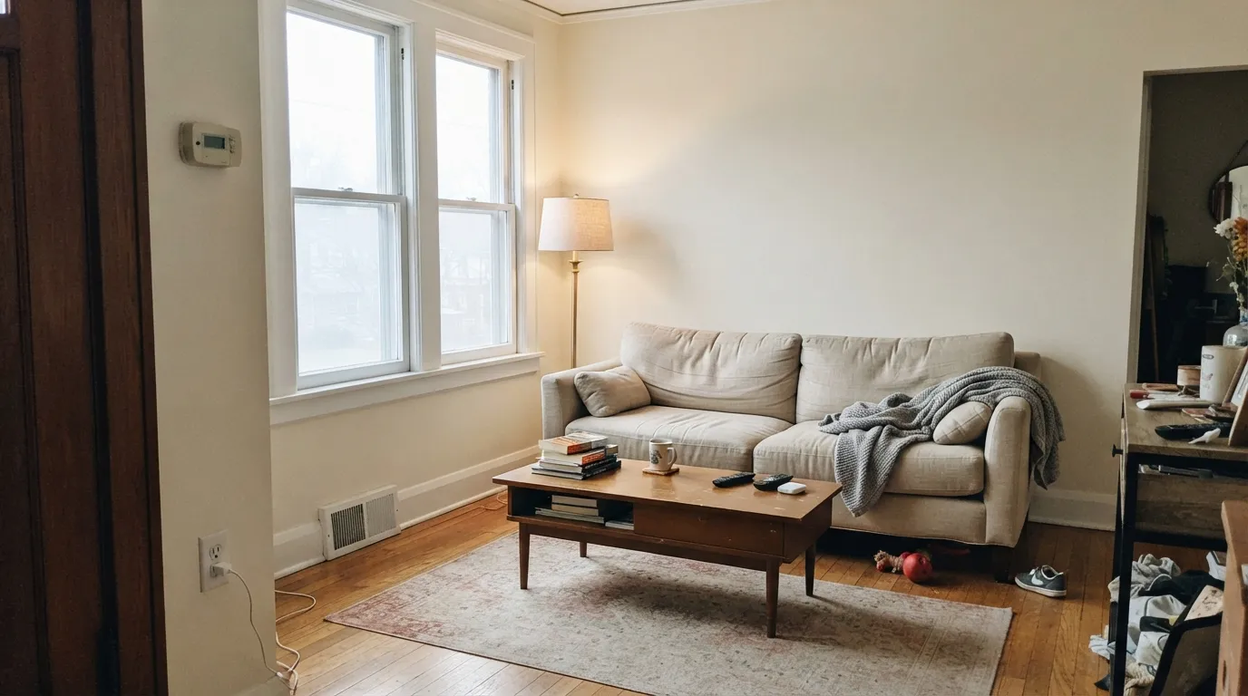
North light is where Aesthetic White is at its best — the cool daylight cancels the sand tone and the walls read soft rather than beige.
Walls
Aesthetic White
#E2D8C5 · SW 7035
Sherwin-Williams
Trim
Pure White
#EDECE6 · SW 7005
Sherwin-Williams
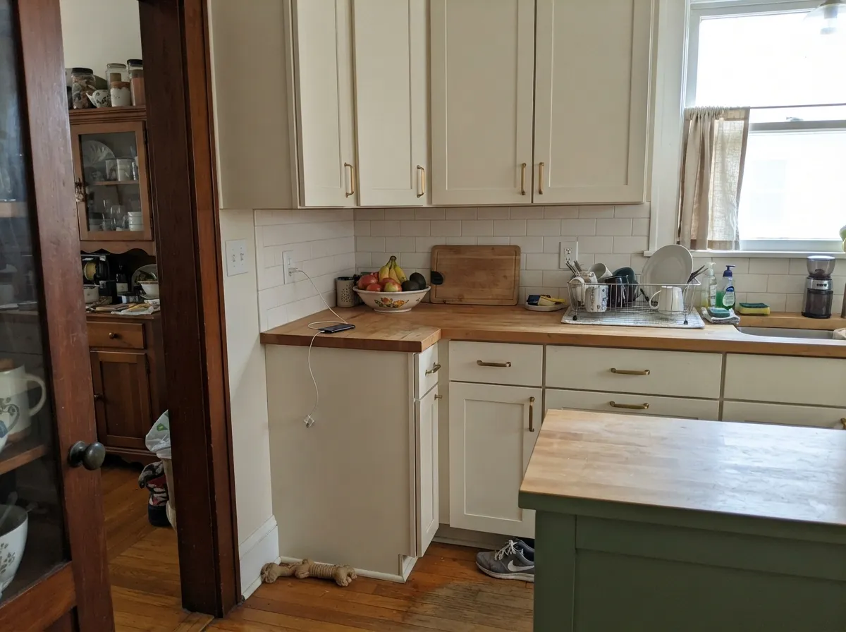
On cabinets the warmth reads as painted wood, not bright white — soft against butcher block and brass.
Cabinets
Aesthetic White
#E2D8C5 · SW 7035
Sherwin-Williams
Island
Pewter Green
#5C615A · SW 6208
Sherwin-Williams
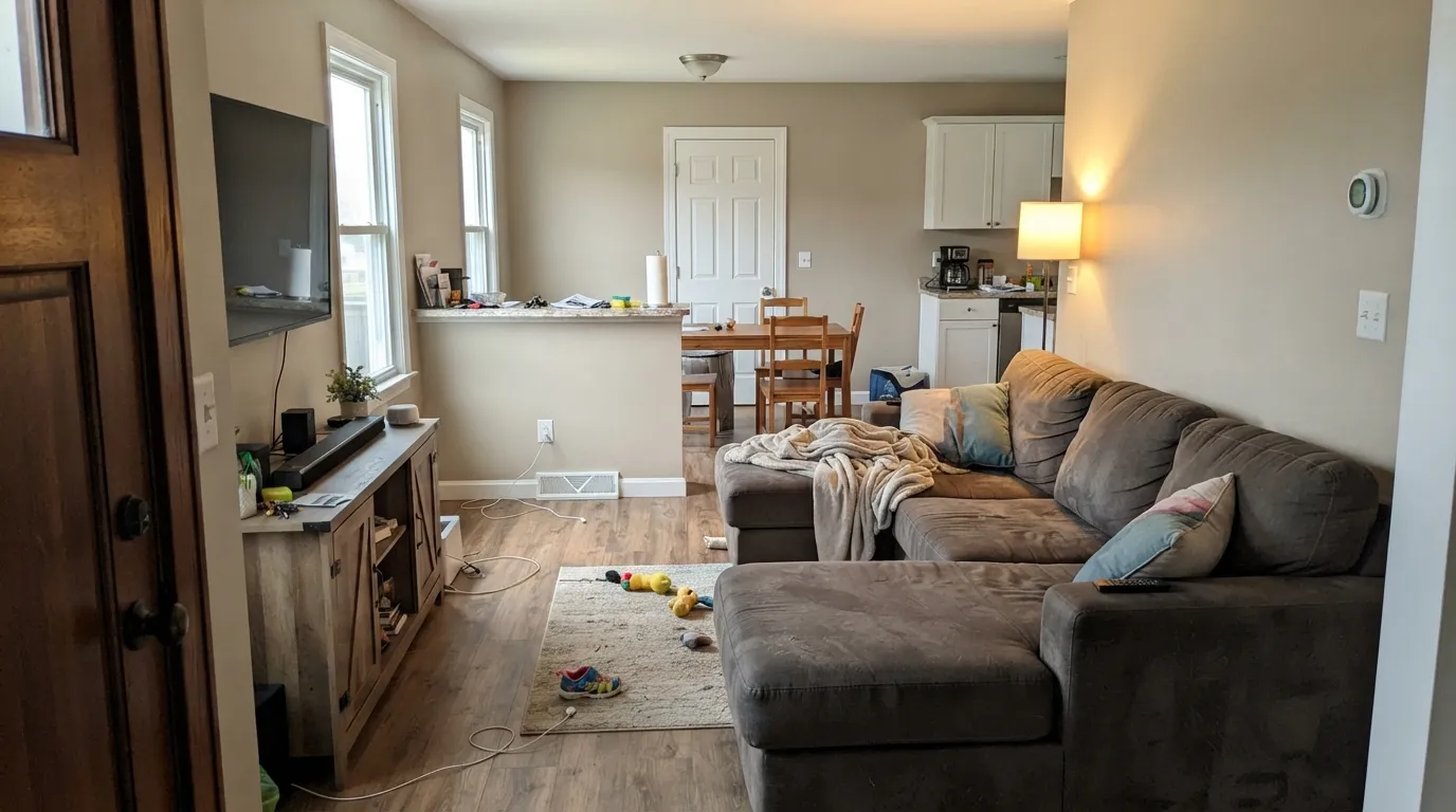
Agreeable Gray running an open main floor in real afternoon light — warm enough to feel finished, gray enough to stay clean against Pure White trim.
Walls
Agreeable Gray
#D1CABC · SW 7029
Sherwin-Williams
Trim
Pure White
#EDECE6 · SW 7005
Sherwin-Williams
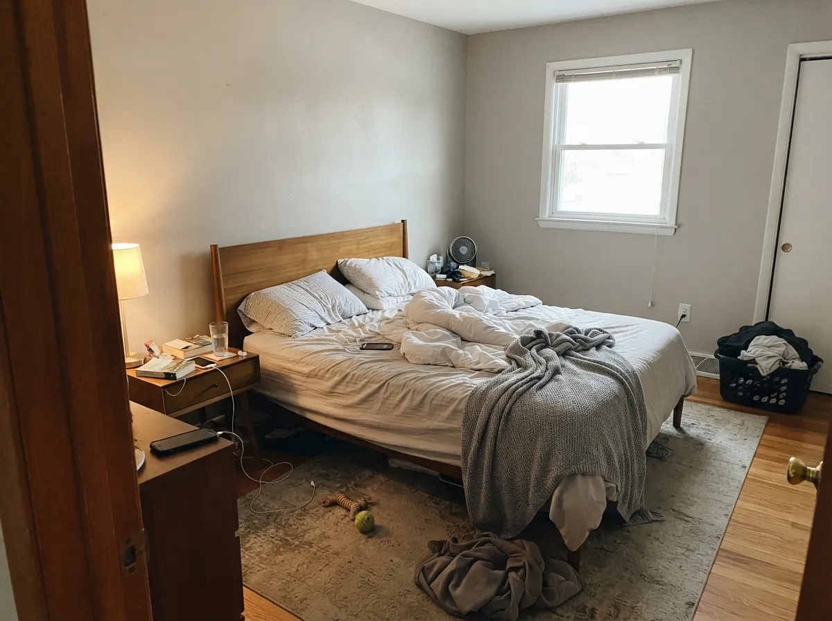
In a morning-lit bedroom the greige stays soft — no cold gray, no yellow beige.
Walls
Agreeable Gray
#D1CABC · SW 7029
Sherwin-Williams
Trim
Pure White
#EDECE6 · SW 7005
Sherwin-Williams

When to Pick Which

PICK AESTHETIC WHITE
Sherwin-Williams Aesthetic White
BEST FORNorth-facing rooms that always look gray · homes with oak floors and brass · traditional kitchen cabinets · warm whole-house schemes
SKIP IFYour ceiling is a bright builder white · your counters are cool gray quartz · the room has no lamps and little daylight · you want a modern gallery look
PICK AGREEABLE GRAY
Sherwin-Williams Agreeable Gray
BEST FORWhole-house flow in rooms with real daylight · open-plan main floors · kitchen and bath cabinets with brass or matte black · anyone who thinks beige is too yellow and gray is too cold
SKIP IFYour room is north-facing and dim · your trim or cabinets are cream · your tile, counters or flooring lean cool violet-gray · you want a wall color with an actual opinion

The Questions Everyone Asks

Which is lighter, Aesthetic White or Agreeable Gray?

Aesthetic White is lighter: LRV 73 vs 60. Aesthetic White is meaningfully lighter (LRV 73 vs 60). On a wall, Aesthetic White reads light, airy; Agreeable Gray reads light, airy.

Which is warmer, Aesthetic White or Agreeable Gray?

They share the same undertone family — both read red-orange / warm. The difference between them is lightness and depth, not temperature.

How similar are Aesthetic White and Agreeable Gray?

Aesthetic White and Agreeable Gray are very close (ΔE 4.22). The difference shows up most in side-by-side comparison and under specific light. The only reliable test is seeing both in your own room and light — a side-by-side on a screen or chip flattens the difference.

Can I use Aesthetic White and Agreeable Gray together in one house?

Not in the same room, and be careful in the same house. At ΔE 4.22 they are so close that two walls in each will read as a tinting mistake, not a design choice. Pick one, or keep them on different floors where they are never seen together.

Still Torn? Let Your Room Decide

No comparison page can see your light. Upload one photo of your room and try both colors on the same walls, seconds apart — the difference is obvious immediately.

EXPLORE MORE

Ask a Question

Jessica Williams

Torn between Aesthetic White and Agreeable Gray?

Ask Jessica below — every question gets a real reply, usually within a day. Tell her which room, which direction your windows face, and what stays in the room (floor, sofa, countertop).