Peppercorn
Sherwin-Williams' most-searched dark charcoal, reviewed honestly: where it looks expensive, where it flashes purple, and when to buy Iron Ore instead.

Jessica has spec'd whites and neutrals for more than 300 rooms and keeps a sample wall of painted drawdowns in her studio. Every color review is checked against real reader rooms in the comments and re-tested when a formula changes. About the testing process →
- 1Fired Bronze5
- 2Peppercorn10
- 3Kendall Charcoal15
- 4Retreat21
The Fast Verdict
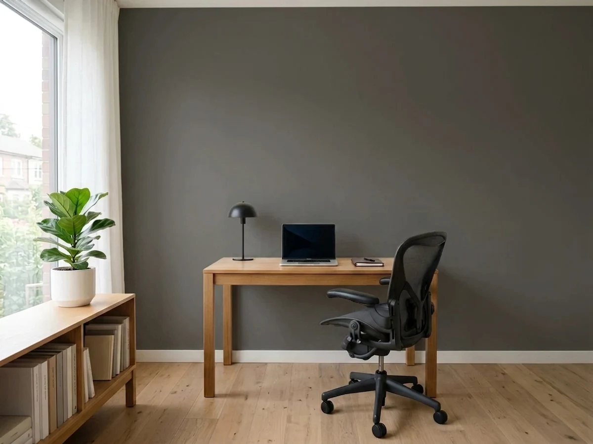
Peppercorn is the dark gray people pick when black feels like too much. It is deep enough to look intentional on cabinets, built-ins and a front door, and it still reads as gray rather than black when there is daylight in the room.
The catch is that it is almost a true neutral, so it has no strong opinion of its own — it picks up whatever is around it, and in the wrong room that shows up as a purple or blue-slate flash. Sample it big, on two walls, before you commit.
Home offices, studies and built-ins with real daylight · kitchen islands and lower cabinets · exterior body, shutters and front doors · anyone who wants dark without going black
Your room is small, north-facing and dim · your trim is a creamy warm white · your floors are cool gray LVP or blue-gray tile · you want a dark that stays obviously warm
- Dark and dramatic without the hard edge of a true black
- Reads clearly as gray in daylight, unlike Iron Ore or Tricorn Black
- Excellent on cabinets, built-ins and interior doors — hides handprints
- One of the safest dark exterior body and front-door colors in the SW deck
- Sits comfortably with both brass and matte black hardware
- Almost no pigment of its own — it flashes purple or blue in cool rooms
- Goes flat, featureless black in small or dim north-facing rooms
- Argues with creamy warm trim whites like Alabaster
- Dark walls need two coats over a gray-tinted primer, so it is not a cheap repaint
What Color Is Peppercorn, Really?
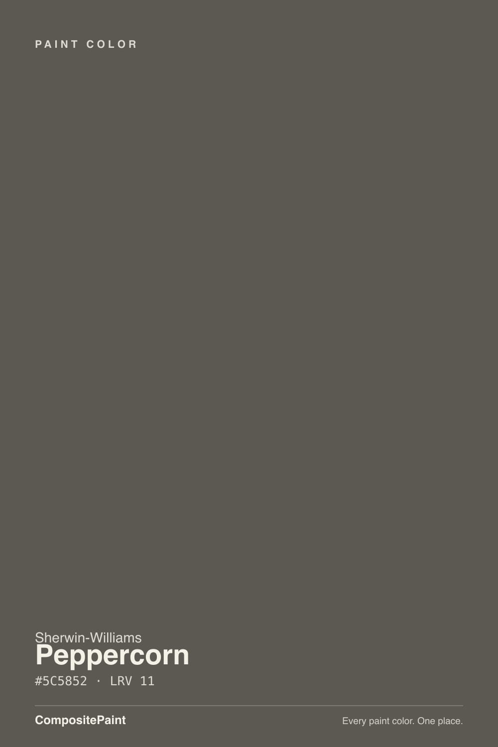
On paper Peppercorn is a warm charcoal — the base is a soft red-orange — but the saturation is only about 6 percent, which is barely any color at all. That number is the whole story of this paint. There is not enough pigment in it to hold a position, so the room decides. Warm oak floors and 2700K bulbs pull the warmth forward and it looks like a soft, expensive charcoal. Cool tile, gray-washed floors or a creamy white trim next to it push the other way, and that is when people say it flashed purple or went blue-slate on them. It is the single most common complaint about this color, and it is not a mistint — it is a near-neutral doing what near-neutrals do.
At LRV 11 it absorbs most of the light that lands on it. Put it next to Iron Ore (SW 7069, LRV 6) and the difference is obvious and useful: Iron Ore reads as a soft black, Peppercorn still reads as a dark gray. That five-point gap is why people choose it. In a bright room you can see it is gray. In a dim room that gap disappears and both colors look the same — plain black. Daylight is not a nice-to-have with this one, it is the reason to buy it.
Undertone in one line: a technically warm charcoal with almost no color in it — so it is neutral in a good room and a chameleon in a bad one.
Where It Shines
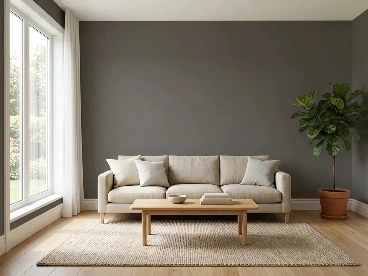
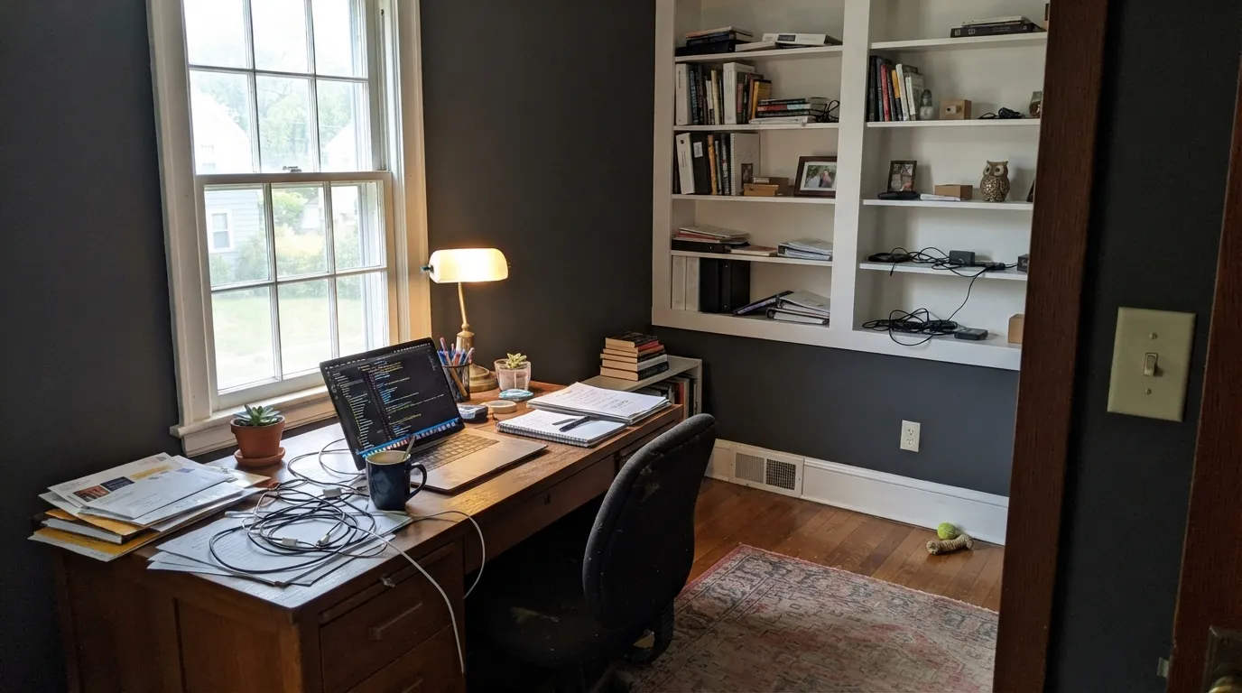
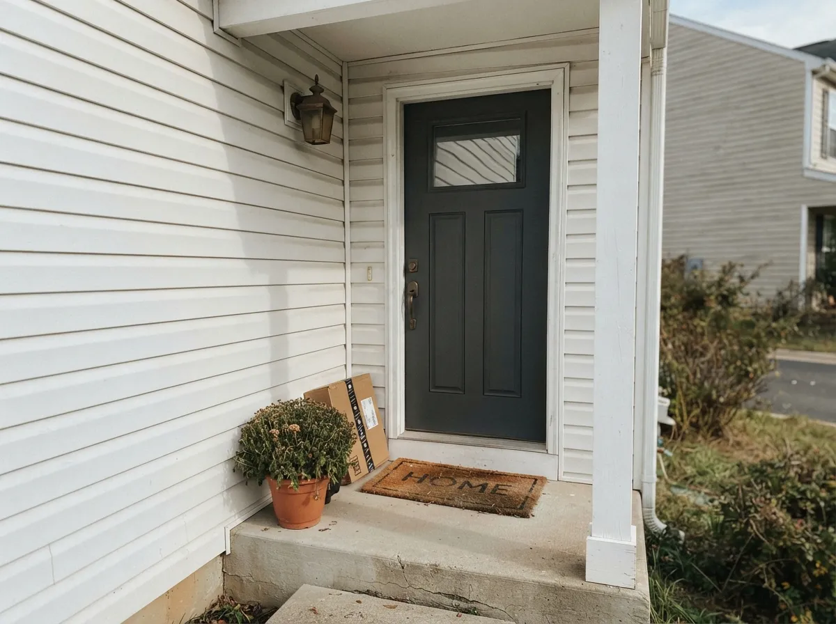
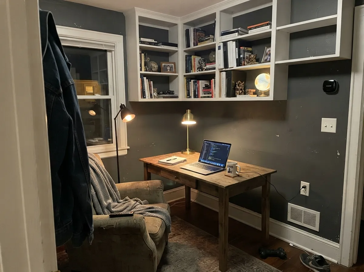
Give it daylight and something light to push against and Peppercorn looks like money. Studies and offices with built-ins are its best room, kitchen islands are second, and outside it is one of the safest dark body colors Sherwin-Williams makes.
Where It Fails
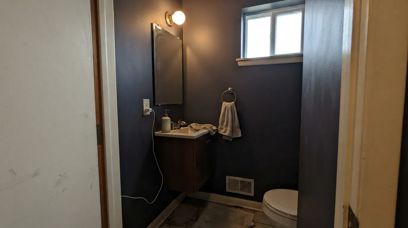
The bad reviews on this color are consistent and they all come down to three rooms. None of them are mixing errors, and none of them get better with a third coat — if your room matches one of these, buy a different dark.
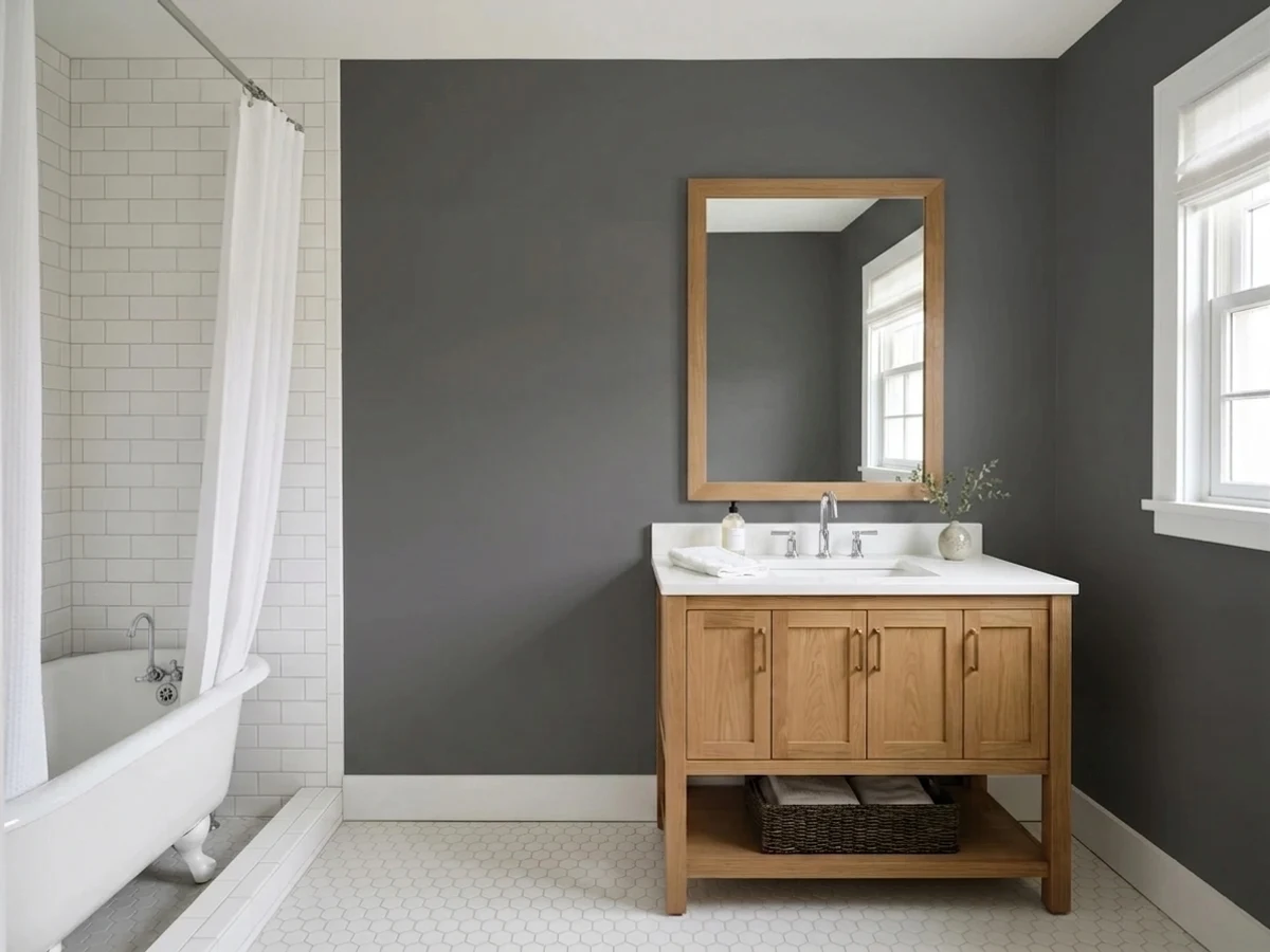
At LRV 11 there is nothing left to reflect. The gray character disappears and the walls read as flat black, which is exactly the "cave" complaint people post after painting a powder room or a small den. If you want dark but still want to see that it is gray, go up the ladder to Gauntlet Gray (SW 7019, LRV 17).
This is the purple story. A soft cream like Alabaster (SW 7008) sits far enough on the warm side that your eye reads Peppercorn as its opposite, and a faintly warm gray tips visually violet along the trim line. Use a cleaner trim white — Pure White (SW 7005) or Extra White (SW 7006) — and the flash goes away.
Gray LVP, blue-gray porcelain and cool quartz all bounce cool light up the wall, and Peppercorn has no warmth to spare. It turns slate blue and stops looking like the chip. If the room is committed to cool finishes and you still want a warm dark, Urbane Bronze (SW 7048) holds its ground where Peppercorn folds.
Room by Room
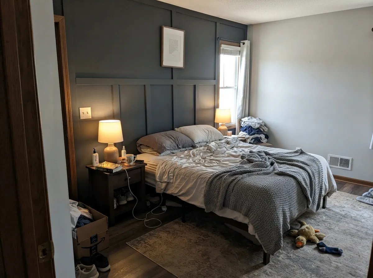
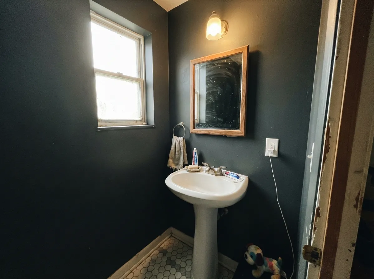
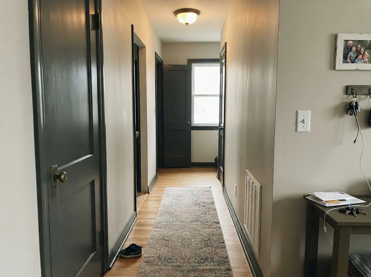
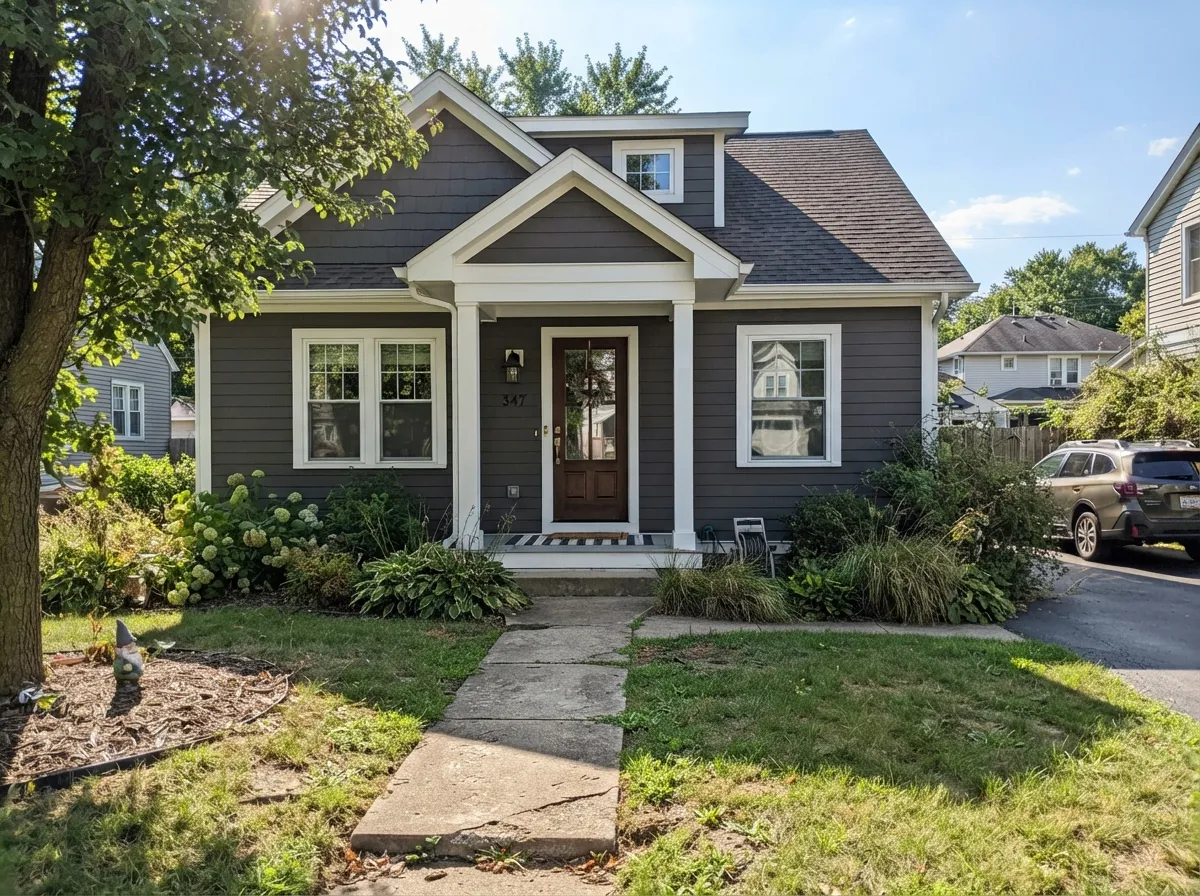
Your Light Is the Risk
Strong sun lifts the warm base and you actually see charcoal, not black. This is the room to buy it for.
Cool, steady light drains the little warmth it has. Fine in a big north room, heavy and dead in a small one.
2700K bulbs make it warm and cocooning. 4000K LEDs push it cold and slightly blue — change bulbs, not paint.
Backlit walls read near-black while the facing wall reads gray. On dark colors that split is normal, not a bad job.
Most complaints about Peppercorn are a light mismatch. Upload a photo of your actual room and see it on your walls — then ask for the same wall in north light or evening lamps before you buy a single sample.
Need It From Another Brand?
Any paint counter can custom-tint Sherwin-Williams SW 7674 directly. If you would rather stay in one brand's own deck, these are the closest stock matches, measured as ΔE2000. Under 2 is a difference you will not see on the wall.
| Brand | Closest color | ΔE | LRV | |
|---|---|---|---|---|
| Behr | Shadow MountainPPU24-22 · Behr | 0.0 | 10 | Color page → |
| Benjamin Moore | Gray2121-10 · Benjamin Moore | 0.0 | 12 | Color page → |
| Valspar | Sable Evening5006-2C · Valspar | 3.8 | 9.9 | Color page → |
| PPG / Glidden | Black WidowPPG0997-7 · PPG / Glidden | 2.0 | 10 | Color page → |
| Glidden | Black WidowPPG0997-7 · Glidden | 1.5 | 10 | Color page → |
| Dutch Boy | Ship's Anchor437-6DB · Dutch Boy | 0.0 | 10 | Color page → |
Similar Sherwin-Williams Colors
The nearest shades to Peppercorn within Sherwin-Williams's own range, ranked by perceptual color distance — useful when you want the same look a touch lighter, darker, or warmer.
WCAG 2.1: AA is 4.5 : 1 for normal text, 3 : 1 for large text, AAA is 7 : 1.
Peppercorn vs the Colors You're Also Considering
Every Peppercorn sample board has the same rivals on it. The numbers show the real lightness gap — then it comes down to which risk you would rather live with.
Pick this when you want to still see gray, not a soft black.
Sherwin-Williams SW 7069 · LRV 6Iron OrePick this for maximum depth and a cooler, more decisive dark that never wobbles.
Side-by-side comparison →Pick this when you want a true charcoal with no brown in it.
Sherwin-Williams SW 7048 · LRV 8Urbane BronzePick this when the room is cool and you need a dark that stays warm anyway.
Side-by-side comparison →The most common comparison is Iron Ore (SW 7069), LRV 6. Iron Ore is darker and cooler, reading closer to soft black with a gray-blue edge. Peppercorn is a step lighter at LRV 11 and warmer, so it feels softer and less severe. Choose Iron Ore when you want maximum depth and a cooler tone; choose Peppercorn for a warmer, slightly more forgiving dark.
Urbane Bronze (SW 7048), LRV 8, is another close option but leans distinctly brown. Next to it, Peppercorn looks more neutral and gray, while Urbane Bronze feels earthier.
Within the same charcoal band, Forged Steel (SW 9565), LRV 10, is a more neutral, cooler gray with almost no warm lean. If your room has cool north light and you want it to stay truly gray, Forged Steel holds that better; Peppercorn will show its warmth more.
Peppercorn Coordinating Colors
The rule with Peppercorn is that its partners have to do the work, because the color itself is nearly neutral. Clean whites keep it honest, warm greiges keep it from going cold, and one muted color note stops the whole scheme from reading gray-on-gray. These are the pairings that hold up in real rooms:
Peppercorn on Cabinets and Built-Ins
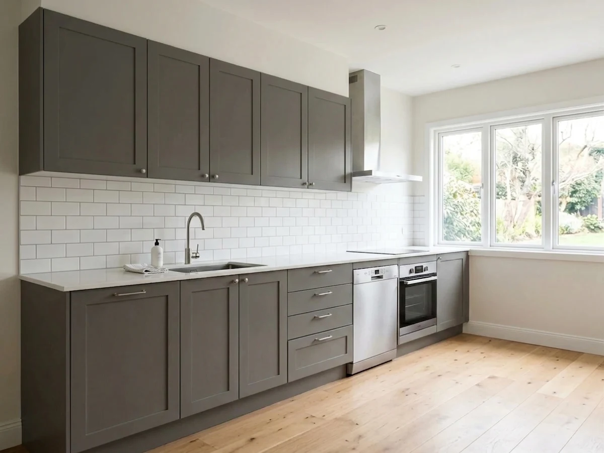
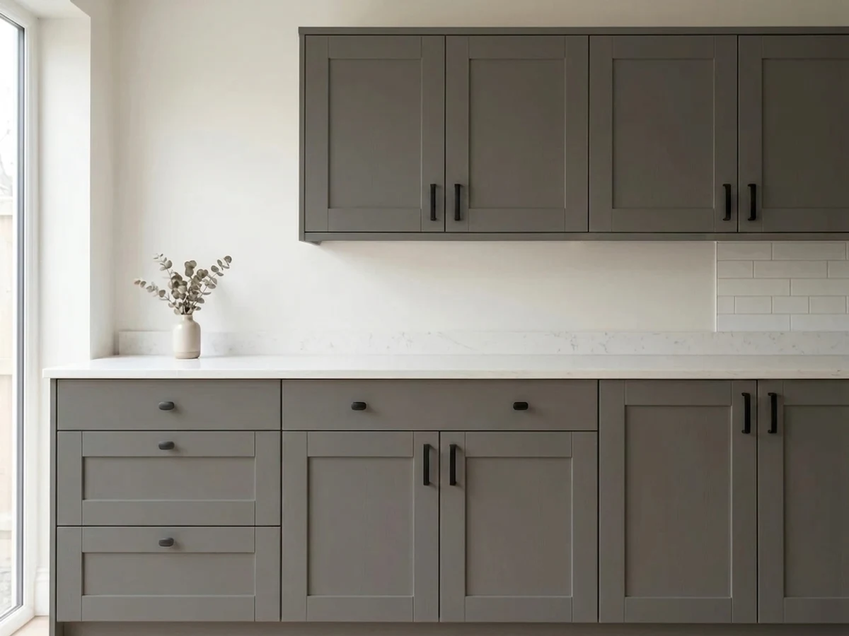
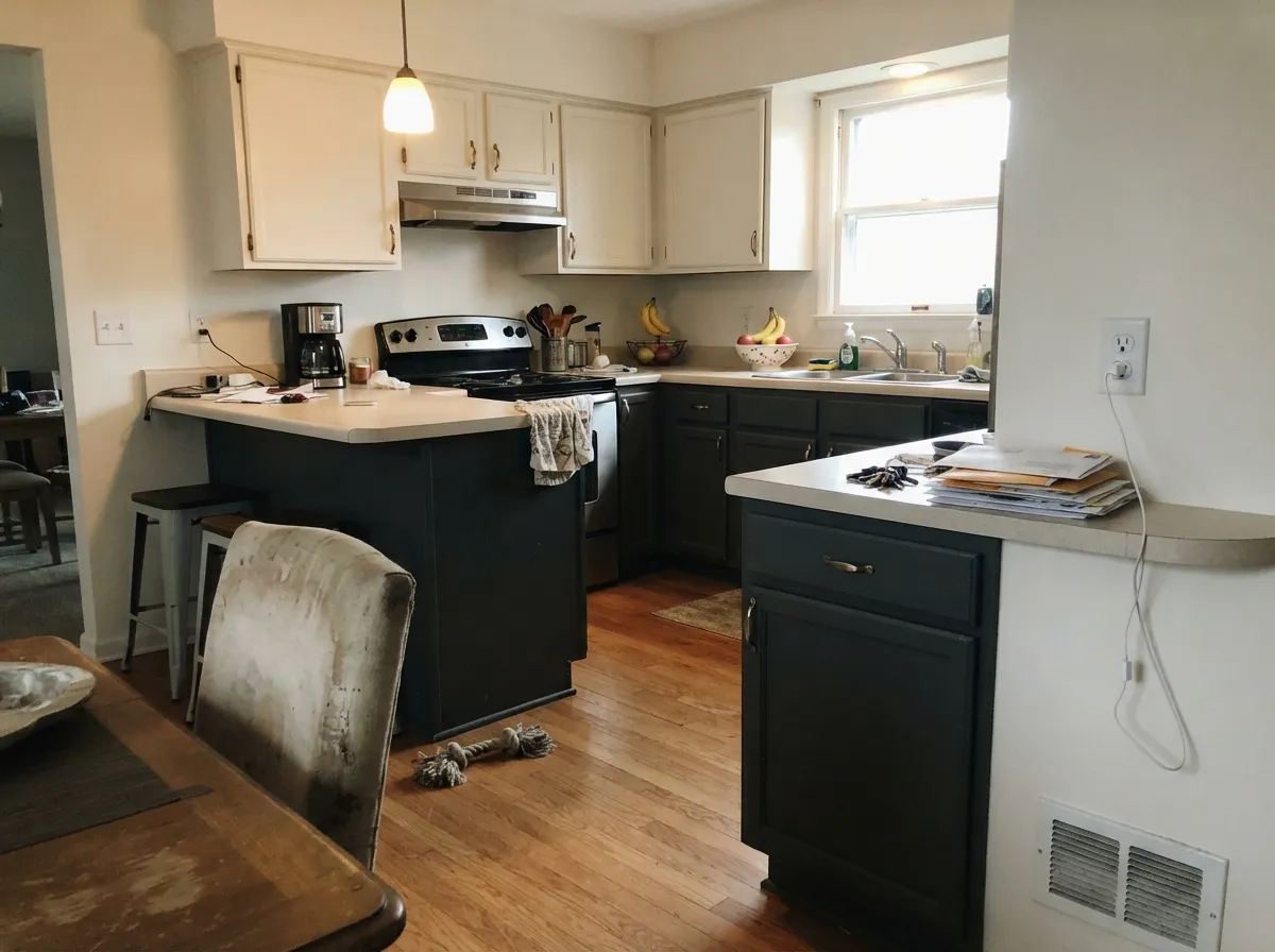
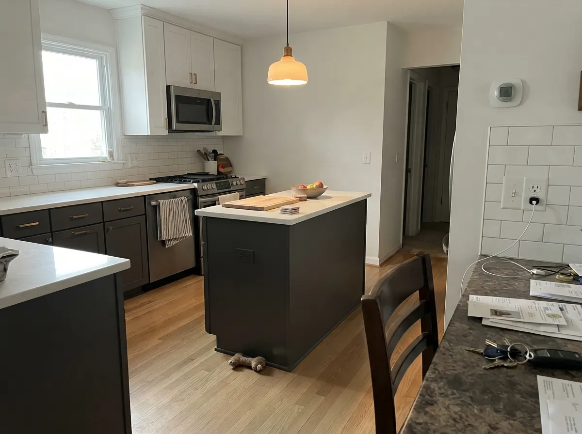
Cabinets are where Peppercorn is at its most reliable, and the reason is simple: a cabinet door is a small surface surrounded by light walls and counters, so the color never has to carry a room on its own. It stays a clear dark gray instead of collapsing into black, and it hides the smudges around handles that a mid-tone gray would put on display. Use a urethane-fortified cabinet enamel in satin — flat and eggshell will not survive a kitchen.
Two-tone is the safest way in. Peppercorn on the island and lowers with a white perimeter above gives you the drama without the weight, and it costs less to change your mind about later. On built-ins and bookcases, paint the case and the shelves the same Peppercorn and leave the surrounding trim white — the depth inside the shelves makes books and objects look staged. The one thing to check first is your counter: cool white quartz with gray veining will pull Peppercorn toward blue, so tape a door sample against the actual slab before you order.
Peppercorn on Exteriors
Outside, Peppercorn behaves better than its indoor reputation suggests. Full sun is the one condition that reliably brings out its warm base, so a south or west elevation reads as a rich, soft charcoal rather than the flat near-black it can become in a dim room. That is why it shows up so often on siding, garage doors and shutters — it gives you the modern dark house without the harshness of a true black.
Trim decides the result. Extra White (SW 7006) is the pairing that makes it look crisp and current; a creamy exterior white will do the same violet trick it does indoors, only across a whole facade. Keep the roof and stone in mind too, since brown-toned roofs will make Peppercorn look cooler by comparison and gray roofs will let it read warmer. The honest warning: walk around the house at two different times of day with a large sample board. The north elevation is always a shade heavier, and on a fully shaded lot Peppercorn body color loses the gray entirely.
Three Ready Palettes Built on Peppercorn
A color is never alone on the wall. These are complete combinations in the 60-30-10 pattern, with the reason each one holds together. Every one opens in the visualizer.
Peppercorn takes the 60 percent as the walls, Pure White takes 30 as trim and shelving, and the clean white is what stops the charcoal from flashing violet. Evergreen Fog is the 10 percent — a muted sage sits close to Peppercorn's warmth so it reads calm rather than decorated.
Try this palette in your roomThe dark base cabinets carry the visual weight of the room while Snowbound keeps the uppers light enough that the kitchen never closes in. Accessible Beige feeds warmth back into the palette from the next room, which is what keeps Peppercorn on the warm side of neutral.
Try this palette in your roomDark body with crisp white trim is the modern-traditional exterior formula, and Extra White is bright enough to hold its own against full sun without going gray. The navy door is the single saturated note — deep enough to read as a color, close enough in value that it does not shout.
Try this palette in your roomPeppercorn FAQ
Is Peppercorn warm or cool?
Technically warm — the base is a faint red-orange — but the saturation is only about 6 percent, so there is almost nothing there. In a warm room with wood floors and 2700K bulbs you will see the warmth. In a cool room it reads as a straight neutral charcoal, and sometimes cooler than that.
Does Peppercorn look purple?
It can, and this is the number-one complaint about it. The flash shows up most where Peppercorn meets a creamy white like Alabaster (SW 7008), because your eye reads the two as opposites. Switch the trim to Pure White (SW 7005) or Extra White (SW 7006) and it usually disappears completely.
Peppercorn or Iron Ore for kitchen cabinets?
Iron Ore (SW 7069, LRV 6) if you want cabinets that read as soft black, Peppercorn if you want them to read as dark gray. In a kitchen with good windows the difference is easy to see. In a galley kitchen with one small window they will look nearly identical, so save yourself the debate and pick Iron Ore for the cleaner result.
What white trim goes with Peppercorn?
Pure White (SW 7005, LRV 84) is the default and the safest — clean without being icy. Extra White (SW 7006, LRV 86) is the choice if you want maximum crispness, especially outside. Avoid creamy whites like Alabaster unless the room is warm and well lit, because that pairing is what makes Peppercorn look violet.
Can I paint a whole small room Peppercorn?
Only if it has a real window. At LRV 11 the color has to borrow light to stay interesting, and a small windowless room turns it into flat black. If the room is small but bright, four walls of Peppercorn with white trim looks intentional and expensive. If it is small and dim, use Gauntlet Gray (SW 7019) instead.
Does Peppercorn work on exteriors and front doors?
Yes — it is one of the more forgiving dark exterior colors because sunlight opens it up instead of flattening it. As a front door against a light facade it is close to foolproof. For full-body use, check the shaded side of the house with a large sample first, since north elevations lose the gray and go near-black.
How many coats does Peppercorn need?
Two, over a gray-tinted primer. Going straight over white drywall or an old light color, dark grays streak badly and you can end up doing three or four coats chasing coverage. Ask the store to tint the primer to about 50 percent Peppercorn — it costs almost nothing and saves a gallon.
Have you painted with Peppercorn?
Rate it — one tap helps the next reader decide.
Ask a Question