Sherwin-Williams PeppercornvsSherwin-Williams Urbane Bronze
Why this comparison: Gray-black vs brown-black: SW’s two trending dark neutrals. Peppercorn and Urbane Bronze are very close (ΔE 4.64). The difference shows up most in side-by-side comparison and under specific light.

Built from our full reviews of both colors — same measured data, same real-room photos. About the testing process →
The Numbers
LRV is essentially equal (10 vs 8) — both reflect light the same.
What Each Color Really Is
On paper Peppercorn is a warm charcoal — the base is a soft red-orange — but the saturation is only about 6 percent, which is barely any color at all. That number is the whole story of this paint. There is not enough pigment in it to hold a position, so the room decides. Warm oak floors and 2700K bulbs pull the warmth forward and it looks like a soft, expensive charcoal. Cool tile, gray-washed floors or a creamy white trim next to it push the other way, and that is when people say it flashed purple or went blue-slate on them. It is the single most common complaint about this color, and it is not a mistint — it is a near-neutral doing what near-neutrals do.
At LRV 11 it absorbs most of the light that lands on it. Put it next to Iron Ore (SW 7069, LRV 6) and the difference is obvious and useful: Iron Ore reads as a soft black, Peppercorn still reads as a dark gray. That five-point gap is why people choose it. In a bright room you can see it is gray. In a dim room that gap disappears and both colors look the same — plain black. Daylight is not a nice-to-have with this one, it is the reason to buy it.
A very dark warm neutral that sits in the yellow-red family — technically a dark yellow with the color drained almost all the way out. That last part is the part nobody warns you about. When a yellow-based color is this low in saturation, it does not simply look brown; it can swing greenish or olive depending on what light it gets and what sits next to it. Most of the time you see bronze. Sometimes, under low light or bouncing off warm wood, you see a soft olive-charcoal instead. Both are the same paint.
At LRV 8 it reflects almost nothing. Put it beside Tricorn Black (SW 6258) at LRV 3 and you will finally see the brown — Urbane Bronze looks soft and slightly warm, Tricorn looks like a hole in the wall. Put it beside Peppercorn (SW 7674) at LRV 11 and the gap runs the other way: Peppercorn still reads as dark gray on a wall, while Urbane Bronze reads as almost-black. That three-point difference is small on paper and enormous in a room.
Specs Side by Side
| Spec | Peppercorn | Urbane Bronze |
|---|---|---|
| Brand | Sherwin-Williams | Sherwin-Williams |
| SKU | SW 7674 | SW 7048 |
| Hex | #585858 | #54504A |
| RGB | 88, 88, 88 | 84, 80, 74 |
| LRV | 10 | 8 |
| Undertone | true neutral | red-orange / warm |
| Family | Gray | Gray |
How Light Changes Them
Strong sun lifts the warm base and you actually see charcoal, not black. This is the room to buy it for.
Cool, steady light drains the little warmth it has. Fine in a big north room, heavy and dead in a small one.
2700K bulbs make it warm and cocooning. 4000K LEDs push it cold and slightly blue — change bulbs, not paint.
Backlit walls read near-black while the facing wall reads gray. On dark colors that split is normal, not a bad job.
Direct sun pulls the bronze and brown right out. This is the color you were sold.
Cool indirect light kills the warmth. Flat near-black all day. Test before you buy.
Rich and bronzy at the sun hours, plain dark charcoal the rest of the day.
2700K keeps it warm. Cool 4000K LEDs strip it out and can push it olive.
Both Colors in Real Rooms
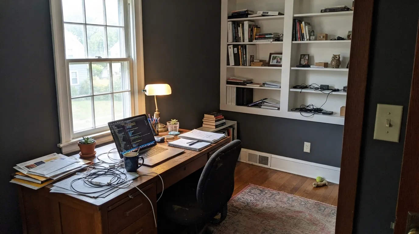
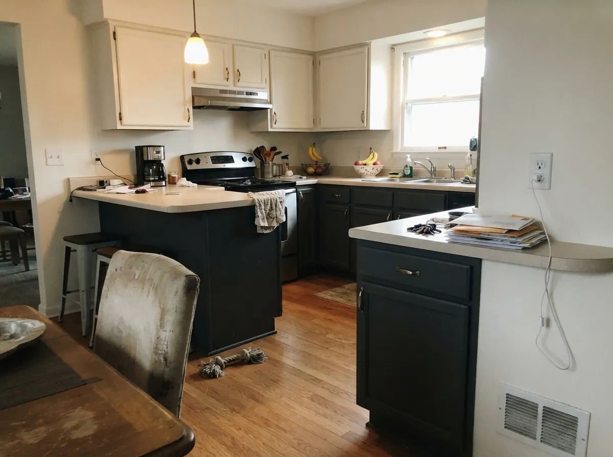
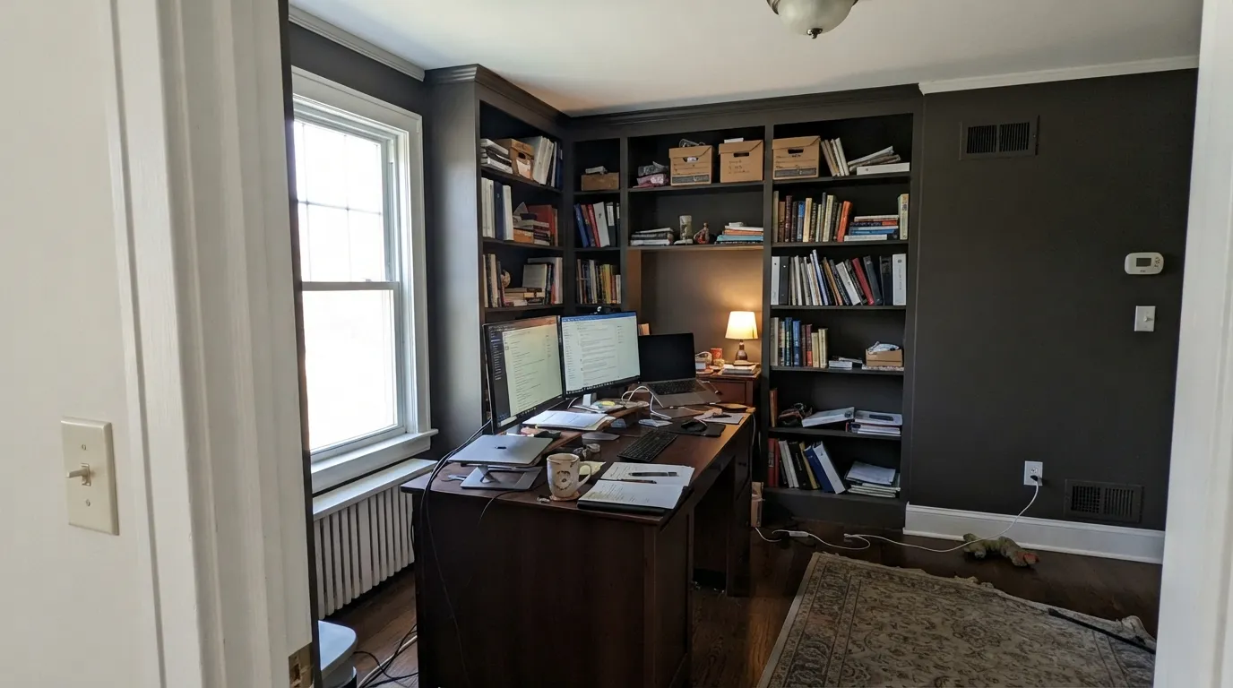
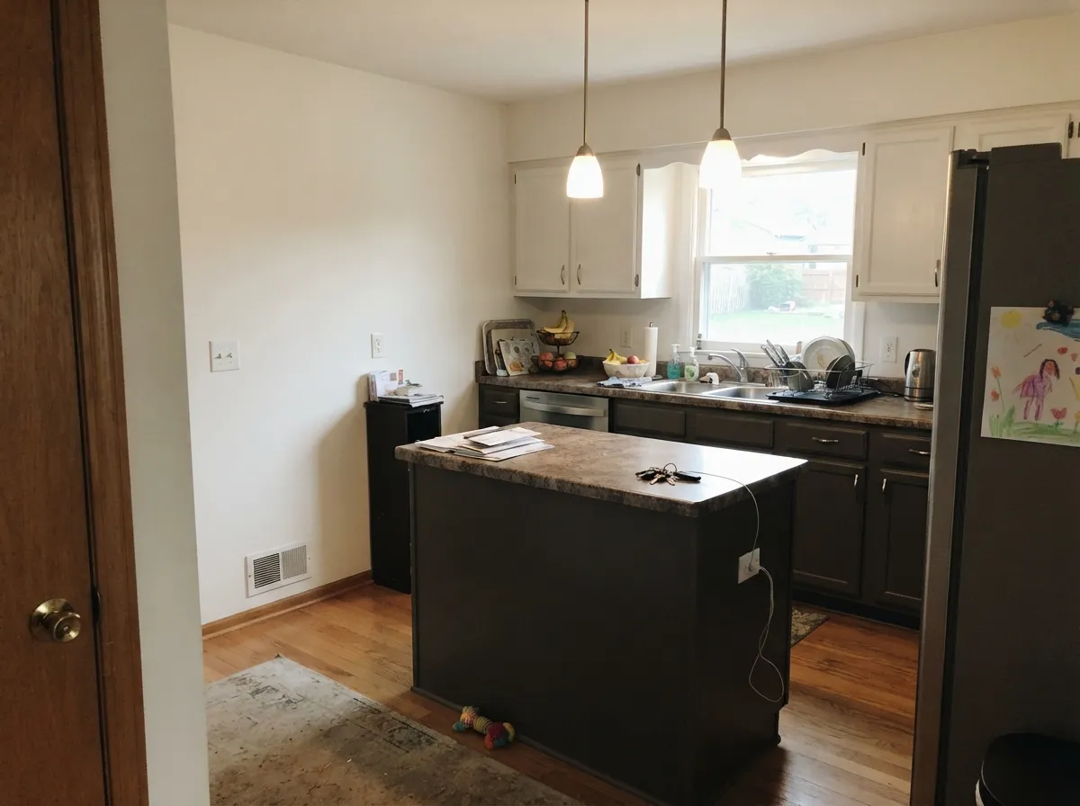
Photos from our full reviews — the same rooms and captions, so you can judge each color where it actually lives, not on a chip.
When to Pick Which
Home offices, studies and built-ins with real daylight · kitchen islands and lower cabinets · exterior body, shutters and front doors · anyone who wants dark without going black
Your room is small, north-facing and dim · your trim is a creamy warm white · your floors are cool gray LVP or blue-gray tile · you want a dark that stays obviously warm
Accent walls and studies with real daylight · kitchen islands and lower cabinets · front doors on almost any siding · modern and craftsman exterior bodies
The room is small, north-facing and dim · your floors are orange honey oak · you want a true cold near-black · you will not add lamps and layered light
No comparison page can see your light. Upload one photo of your room and try both colors on the same walls, seconds apart.
Peppercorn vs Urbane Bronze FAQ
Which is lighter, Peppercorn or Urbane Bronze?
They are practically the same lightness — LRV 10 vs 8. Neither will make the room brighter than the other.
Which is warmer, Peppercorn or Urbane Bronze?
Urbane Bronze is the warmer of the two (red-orange / warm); Peppercorn reads true neutral.
How similar are Peppercorn and Urbane Bronze?
Peppercorn and Urbane Bronze are very close (ΔE 4.64). The difference shows up most in side-by-side comparison and under specific light. The only reliable test is seeing both in your own room and light — a side-by-side on a screen or chip flattens the difference.
Can I use Peppercorn and Urbane Bronze together in one house?
Not in the same room, and be careful in the same house. At ΔE 4.64 they are so close that two walls in each will read as a tinting mistake, not a design choice. Pick one, or keep them on different floors where they are never seen together.
Ask a Question