Pale Pink
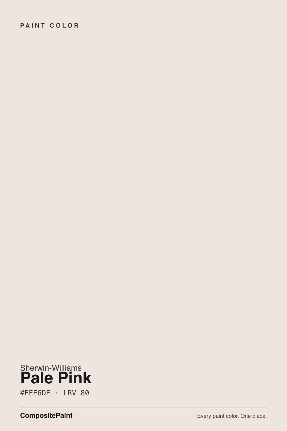
SW 9696 · #EEE6DE · LRV 80 — warm red-orange tone, very light — near-white, broadens small spaces.
- 1Agreeable Gray60
- 2Pale Oak69
- 3Pale Pink80
- 4Moonlit Beach88
- 5Crème Fraiche93
What Color Is Pale Pink, Really?
Pale Pink SW 9696 is a near-white warm neutral, hex #EEE6DE, with an LRV of 80. The name promises more than the color delivers: Sherwin-Williams itself files it in the neutral family. The hue sits at 30 degrees in the red-orange range at 32 percent saturation, but at 90 percent lightness that warmth is diluted into a very soft blush white. LRV 80 puts it in the very light band, so it broadens small rooms and keeps corners from going dim.
People choose it when they want a warm white that is not creamy. Most warm whites lean yellow; this one leans faintly pink instead, which reads as gentle rather than buttery and keeps a room from looking dated or golden. On big open walls it holds just enough color to avoid the flatness of a plain white.
The honest catch is expectation. Anyone hoping for visible pink will be disappointed, because at LRV 80 the blush only appears in comparison or in strong warm light. Under 2700K bulbs or in late south-facing sun it can look clearly rosy, while in cool north light it settles into an ordinary soft white. Beside a gray-based white it looks warm and pink; beside a cream it looks almost neutral. Sample it large, on more than one wall.
The undertone is warm red-orange, sitting at a hue of 30 degrees with 32 percent saturation. In the hex #EEE6DE the red channel leads and the blue channel trails, which is exactly what puts a blush rather than a cream into the color. At LRV 80 that lean is very quiet, and the family listing of neutral is a fair description of how it behaves on a wall.
Comparison is what reveals it. Beside a cool gray-white it looks warm and clearly pink-leaning. Beside a yellow-based cream it looks cleaner and cooler. Beside a real pink it reads as plain white.
The useful test is to put it up next to the whites you are already living with, especially existing trim and cabinets. If the blush shows and you like it, the color is doing its job. If it looks dirty against your trim, you either want a brighter white or you need to repaint the trim too.
Best Rooms and Uses for Pale Pink
This is a whole-house near-white with a soft edge. At LRV 80 it works on walls in bedrooms, living rooms, hallways, and small bathrooms, brightening them without the glare of a bright white. It is especially good in rooms that need warmth but where a yellow cream would feel heavy or dated.
It also handles ceilings well, either matched to the walls or used above a slightly deeper color. On trim it can work against mid-tone or darker walls, though against pale walls the contrast may be too small to look deliberate.
Cabinets and built-ins take it comfortably in a warm room with wood floors, where the faint blush reads as softness rather than color. Outdoors it serves as a light exterior body or trim color, but expect direct sun to bring the warm lean forward much more clearly than any indoor sample suggested.
How Lighting Changes Pale Pink
At LRV 80 the color stays bright everywhere, so light changes its temperature more than its value. North-facing rooms give cool, flat daylight that neutralizes the red-orange lean, and there Pale Pink usually reads as a simple soft white with a little warmth in reserve. That makes it a safe choice for rooms that tend to feel cold.
South-facing rooms are where the blush appears. Strong warm light pushes the 30-degree hue forward and large walls can look openly rosy by late afternoon. East rooms show it in the morning, west rooms at the end of the day.
Bulbs matter as much as windows. Warm 2700K lamps deepen the pink noticeably, which is lovely in a bedroom and less so in a kitchen. Cooler 3500K to 4000K light strips it back to a clean near-white. Look at the sample after dark under your own fixtures, since that is when the blush is most likely to surprise you.
Most complaints about Pale Pink are a light mismatch. Upload a photo of your actual room and see it on your walls — then ask for the same wall in north light or evening lamps before you buy a single sample.
Need It From Another Brand?
Any paint counter can custom-tint Sherwin-Williams SW 9696 directly. If you would rather stay in one brand's own deck, these are the closest stock matches, measured as ΔE2000. Under 2 is a difference you will not see on the wall.
| Brand | Closest color | ΔE | LRV | |
|---|---|---|---|---|
| Behr | Tailors ChalkN170-1 · Behr | 0.9 | 81 | Color page → |
| Benjamin Moore | Early Sunset2096-70 · Benjamin Moore | 1.9 | 77 | Color page → |
| Valspar | Cozy White3008-10C · Valspar | 2.1 | 79.8 | Color page → |
| PPG / Glidden | Irish CreamPPG1061-1 · PPG / Glidden | 0.8 | 81 | Color page → |
| Glidden | Irish CreamPPG1061-1 · Glidden | 0.2 | 81 | Color page → |
| Dutch Boy | Tender Cloud023W · Dutch Boy | 2.5 | 80 | Color page → |
Similar Sherwin-Williams Colors
The nearest shades to Pale Pink within Sherwin-Williams's own range, ranked by perceptual color distance — useful when you want the same look a touch lighter, darker, or warmer.
WCAG 2.1: AA is 4.5 : 1 for normal text, 3 : 1 for large text, AAA is 7 : 1.
Pale Pink vs Similar Colors
Alabaster SW 7008 (#EDEAE0, LRV 82) is the obvious comparison. It is slightly lighter and its warmth leans soft yellow, where Pale Pink leans red-orange, so Alabaster reads creamier and Pale Pink reads gentler and pinker. Marshmallow SW 7001 (#EEE9E0, LRV 82) is cleaner and closer to neutral. Creamy SW 7012 (#EFE8DB, LRV 81) and Ivory Lace SW 7013 (#ECE5D8, LRV 79) are both openly yellow by comparison, while Futon SW 7101 (#EDE6DB, LRV 80) matches the lightness with a more golden cast.
Across brands, Glidden Irish Cream PPG1061-1 (deltaE 0.22), C2 Barely There C2-532 (deltaE 0.54), and Diamond Vogel White Meadow 1055 (deltaE 0.99) are all close enough to call matches. Portola Paints Kashmir (deltaE 1.0), Behr Exclusive Ivory HDC-MD-11 (deltaE 1.43), and Benjamin Moore Early Sunset 2096-70 (deltaE 1.88) are visually identical in normal room light. Valspar Cozy White 3008-10C (deltaE 2.12) and Farrow and Ball Au Lait No. CB9 (deltaE 2.82) are very close, so sample first. Backdrop Jane BD-JA (deltaE 3.63, LRV 86) is close but visibly different, reading noticeably lighter.
Colors That Go With Pale Pink
Because it is a near-white, the pairing question is mostly about which other whites sit near it. Its Sherwin-Williams relatives cover the range. Marshmallow SW 7001 at LRV 82 is cleaner and cooler, useful as a brighter trim or ceiling white above Pale Pink walls. Alabaster SW 7008 at LRV 82 is lighter with a soft yellow warmth instead of a blush, which makes it a good trim partner if you want warmth on both surfaces. Creamy SW 7012 at LRV 81 and Ivory Lace SW 7013 at LRV 79 both lean clearly yellow, so use them only if you want the next room noticeably creamier. Downy SW 7002 at LRV 81 and Futon SW 7101 at LRV 80 sit close enough to serve as alternates rather than partners.
Everything with weight has to come from elsewhere. Warm wood floors, oak or walnut furniture, natural linen, terracotta, and unglazed stone all sit well against it, and matte black or aged brass hardware gives the contrast an LRV 80 wall cannot supply.
Coordinated palette
Generated by hue-rotating #EEE6DE in HSL space. Pair Pale Pink with one accent and one neutral — the swatches below are starting points, not final picks.
Pale Pink FAQ
Is Pale Pink actually pink?
Barely. Sherwin-Williams lists it in the neutral family, and at LRV 80 with 32 percent saturation the warm red-orange undertone reads as a faint blush rather than a pink anyone would name. You will see it against a cool gray-white or under warm 2700K bulbs, and you will lose it almost entirely in cool north daylight.
What LRV is Pale Pink?
Pale Pink has an LRV of 80. On the 0 to 100 light reflectance scale that is very light, so it reflects most of the light in a room, opens up small spaces, and keeps hallways and corners from feeling dim. It sits just below the brightest whites, which is why it reads soft rather than sharp.
Does Pale Pink work in a dark room?
Yes. LRV 80 gives back a lot of light, and the warm red-orange lean keeps a low-light or north-facing room from feeling cold, which is a common problem with brighter blue-based whites. In that kind of light the blush largely disappears and the color reads as a plain soft white with a little warmth underneath.
What white trim goes with Pale Pink?
For visible contrast, step up to a cleaner white such as Marshmallow SW 7001 at LRV 82, which reads crisper against the blush. For a warmer, softer edge, Alabaster SW 7008 at LRV 82 pairs warmth with warmth. Running the walls and trim both in Pale Pink also works if you want a seamless, quiet room and let sheen separate the surfaces.
Is Pale Pink good for cabinets and exteriors?
It can be. On cabinets and built-ins the faint warmth at LRV 80 looks soft rather than clinical, and it suits rooms with wood floors and warm counters. Outdoors it works as a light body or trim color, but direct sun exaggerates the warm red-orange lean, so test a large exterior sample before committing to a full elevation.
How is Pale Pink different from Alabaster?
Alabaster SW 7008 (#EDEAE0) sits at LRV 82, slightly lighter than Pale Pink at LRV 80, and its warmth leans soft yellow rather than red-orange. In practice Alabaster reads creamier and Pale Pink reads faintly pinker and a touch quieter. The difference is subtle until both are on the wall, so sample them side by side.
Have you painted with Pale Pink?
Rate it — one tap helps the next reader decide.
Ask a Question