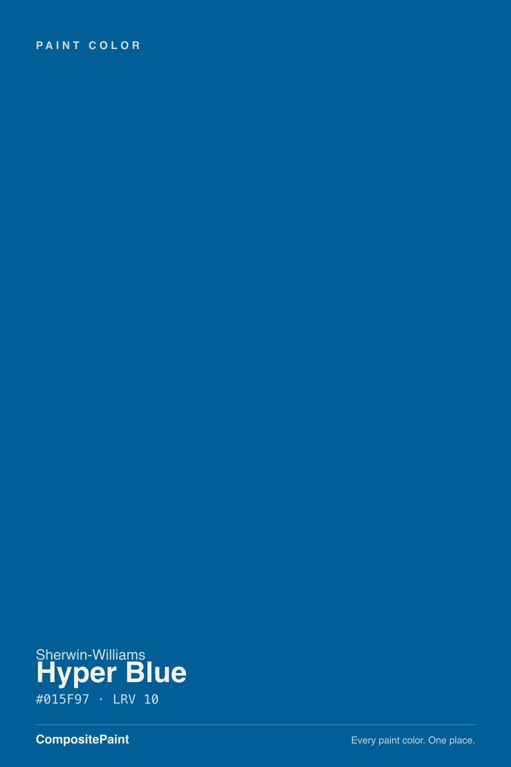
Hyper Blue
The loud cobalt from the SW deck, reviewed honestly: where the energy pays off, why LRV 10 punishes dim rooms, and the navy most buyers actually wanted.

Jessica has spec'd whites and neutrals for more than 300 rooms and keeps a sample wall of painted drawdowns in her studio. Every color review is checked against real reader rooms in the comments and re-tested when a formula changes. About the testing process →
- 1Naval4
- 2Hyper Blue10
- 3Smoky Blue15
- 4Wolf Gray21
The Fast Verdict
Hyper Blue is a real cobalt — a clean, hard-saturated true blue sitting at LRV 10, which is navy depth with none of navy's manners. In a bright room it looks like stained glass; in a one-window room it collapses into a dark, murky blue-black by mid-afternoon. It is the right call for a playroom wall, a teen's room, a study nook or a front door, and the wrong call for anyone who typed navy into a search bar and landed here.
Playrooms and older kids' rooms · teen bedrooms that should not read babyish · accent walls in bright rooms · offices, study nooks and built-ins · powder rooms and front doors that want to be noticed
You actually want navy · the room has one small window and no lamps · you want a color the next owner will call neutral · you hate repainting deep colors
- A real, uncompromised cobalt — vivid where most deck blues are grayed
- Bold enough for a teen room without reading like a nursery
- Dark enough (LRV 10) to feel like a designed choice, not a paint-chip whim
- Excellent on cabinets, built-ins, small rooms and front doors
- Pairs cleanly with white, warm wood, brass and matte black
- Not navy — buyers looking for a quiet dark blue are the unhappy ones
- Dim or single-window rooms flatten it into dark blue-black
- Deep base: thin hide, visible touch-ups, and a hard repaint later
- Warm bulbs and low sun mute it and pull the violet forward
What Color Is Hyper Blue, Really?
A saturated cobalt, not a navy. The hue sits around 202 degrees — that is squarely on the cyan side of true blue, so it reads clean and slightly electric rather than inky. Sherwin-Williams files it in the blue family and lists it for interior and exterior use, including walls, cabinets and ceilings, but the number that matters is the saturation: this is one of the most fully committed blues in the deck. It does not soften itself, and it does not pretend to be a neutral.
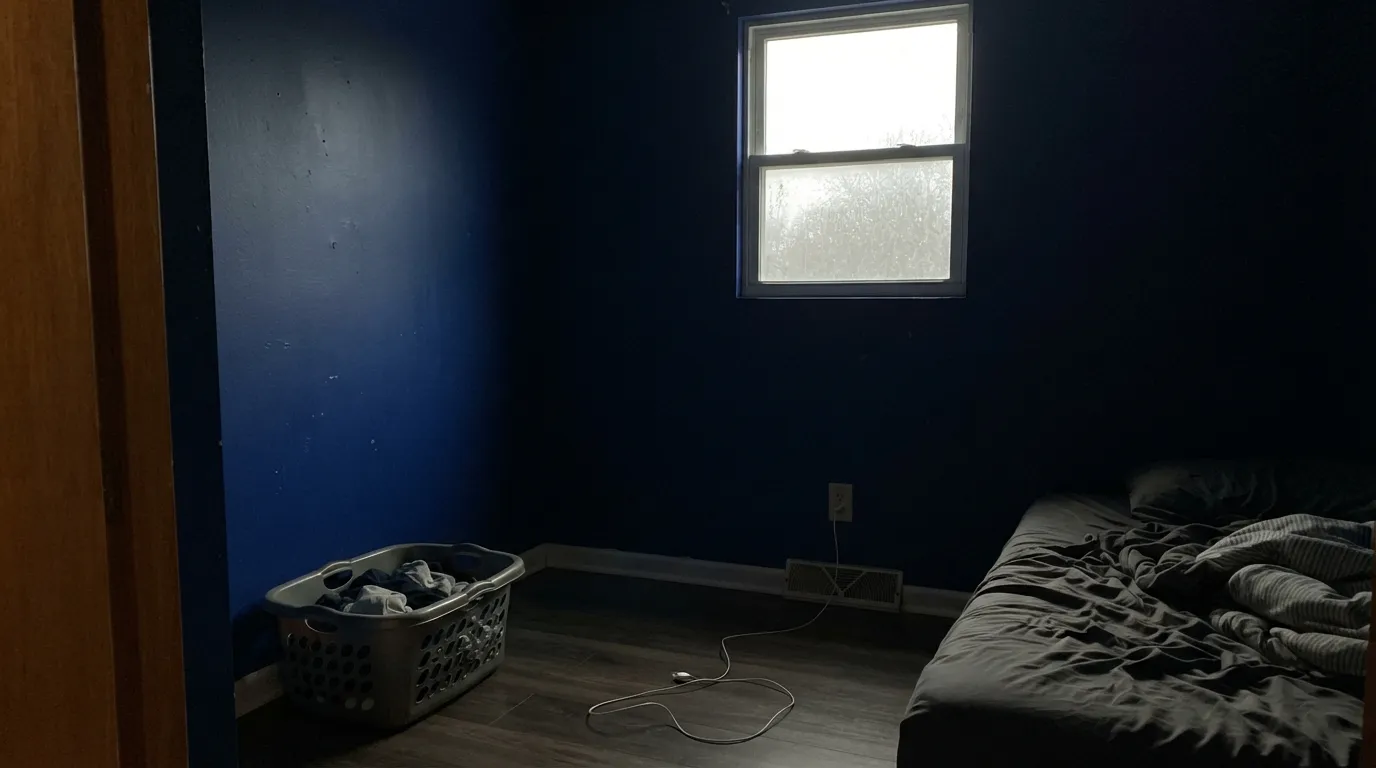
At LRV 10 it is dark. That combination — very saturated and very dark — is what surprises people. A bright, sunny room shows you the color you fell for: vivid, jewel-like, almost backlit. A dim room shows you depth only, and the vividness disappears into something closer to a blue-black. Same paint, two completely different rooms, and the deciding factor is how much daylight the walls get.
Undertone in one line: cool blue first, a faint violet second — never green, never teal. The violet only shows up when the light goes warm or low, which is why the same wall can look electric at noon and slightly purple-ish under evening lamps. Both readings are honest; plan for the second one before you paint all four walls.
Where It Shines
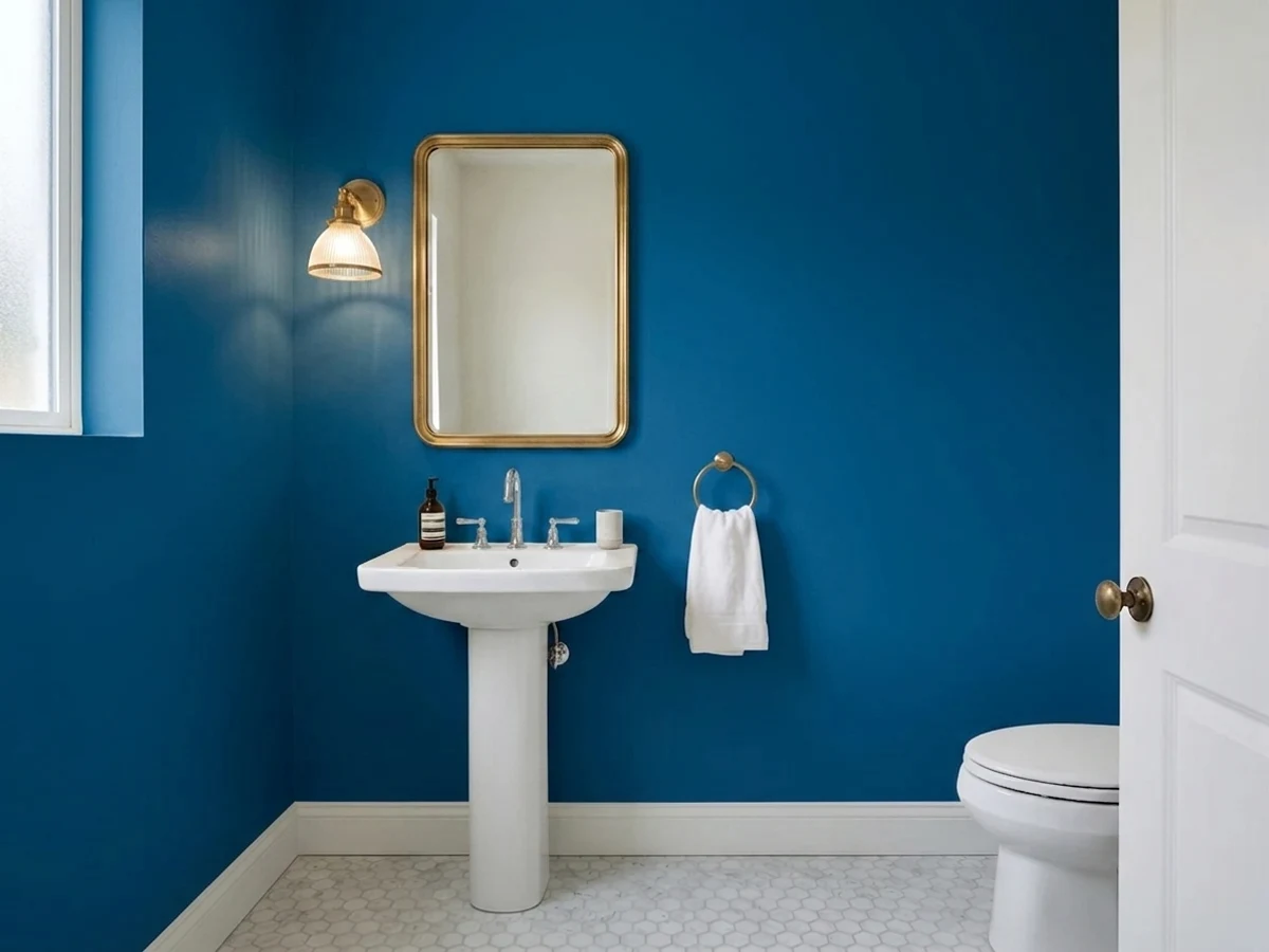
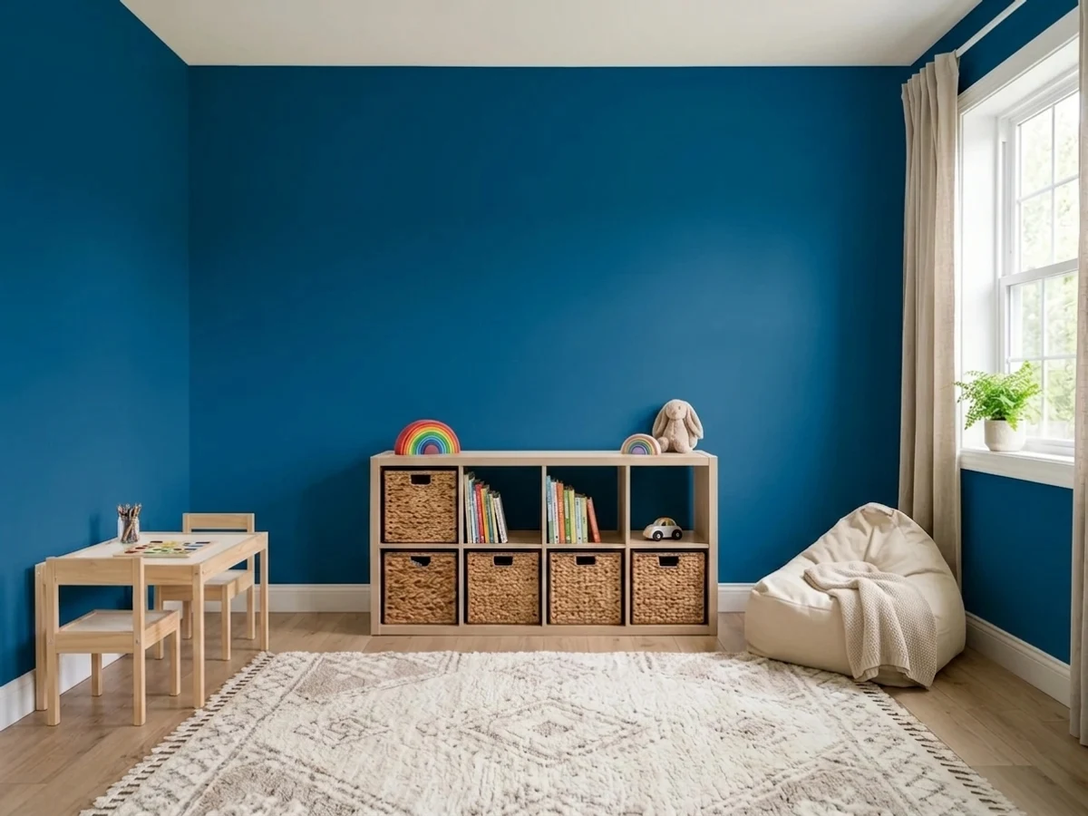
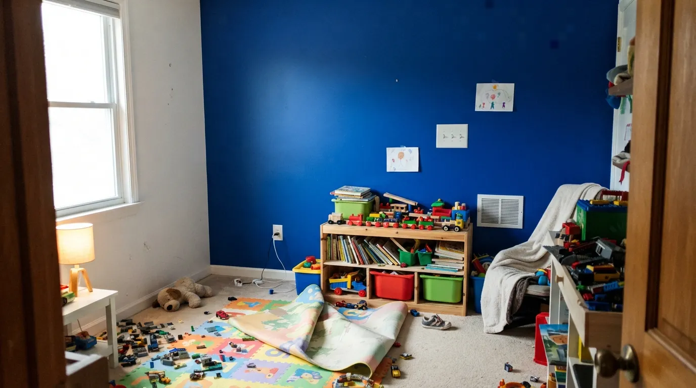
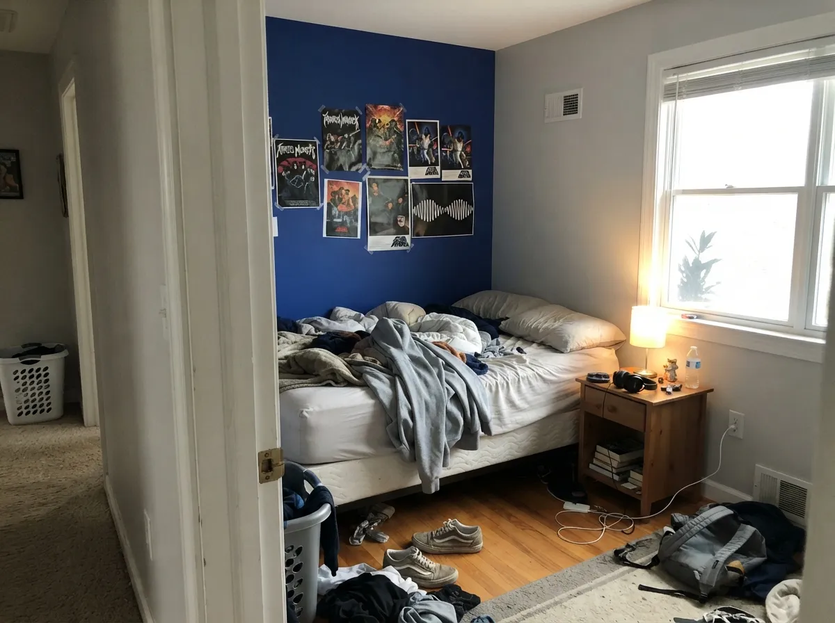
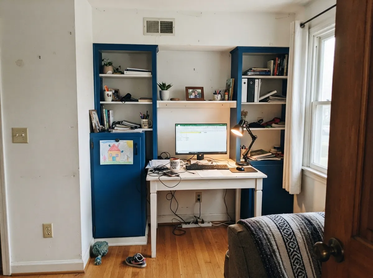
This color earns its name in rooms that are supposed to have energy. On a playroom wall against white trim it is genuinely joyful, and unlike a pastel it does not look outgrown by age nine. In a teen's room it does the same work in a more grown-up register — deep and saturated instead of cute. Its other home is the small dose: a study-nook wall, a set of built-ins, a laundry or powder room, an island, a front door. Give it crisp white, warm wood and either brass or matte black, and it looks deliberate rather than random.
Where It Fails
The complaints about Hyper Blue follow three predictable scripts, and all three are visible before you open the can. None of them are the paint's fault, but if your room fits one, sampling a bigger square will only confirm the bad news.
This is the number-one mismatch. Navy is grayed and dulled down so it behaves like a dark neutral; Hyper Blue is a full-strength cobalt that stays loudly blue in every light. If your mental image is a moody, quiet dark blue, look at Naval — same depth register, none of the shout. Buying this hoping it will calm down after two coats is how the regret starts.
Ten percent of the light comes back off these walls. In a north-facing box room, a basement, or any space lit by one small window, all the saturation you paid for goes flat and the room reads dark blue-black by 4pm. Bright rooms, accent walls, or a serious lamp plan are the price of admission. Nothing about the paint fixes a light problem.
Saturated blues are mixed into a deep base with little to no white pigment, so hide is thin — expect two coats minimum over a gray-tinted primer, and three if you skip the primer or roll it over a light wall. Touch-ups flash more visibly than they do in a pale neutral, so keep the same roller and finish the wall wet-edge to wet-edge. And when the teen moves out, covering it takes primer plus two coats, not a quick refresh.
Room by Room
This is the color designers reach for when a playroom is supposed to feel awake. One cobalt wall behind the toy storage, Pure White on the rest and on the trim, and the room reads bright and organized instead of chaotic. Use eggshell or satin so crayon and sticky hands wipe off; matte in a playroom is a losing bet.
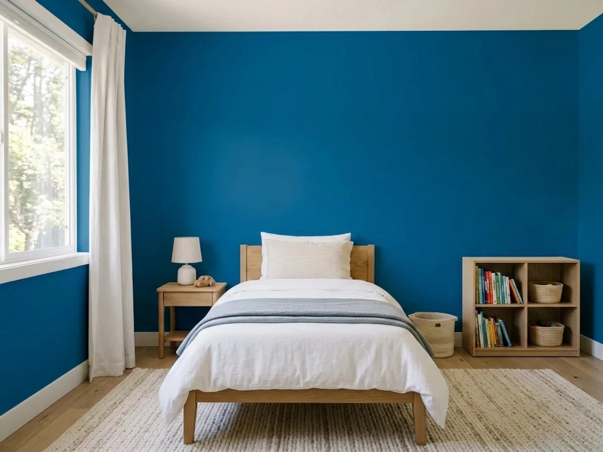
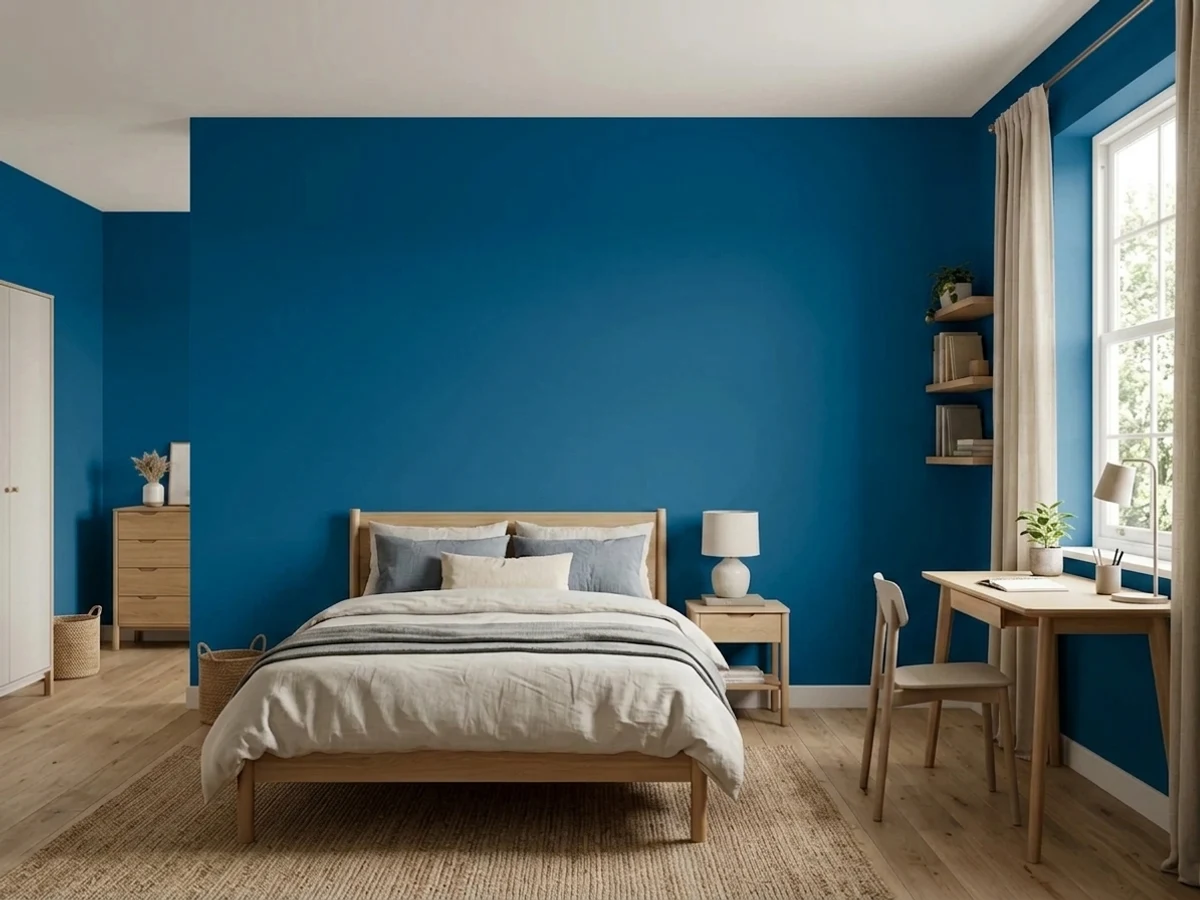
It is one of the few blues that reads bold without reading childish, which is exactly the brief for an eleven-to-seventeen-year-old. Full four-wall treatment works only if the room has real daylight; otherwise paint the bed wall and keep the other three light. Add lamps regardless — teenagers keep the overhead off.
For a smaller child it is best in a dose: one wall, a closet interior, a bookcase back, a painted headboard shape. Whole rooms at LRV 10 get dark and stimulating at once, which is the wrong combination at bedtime. If you want the fun without the depth, Honolulu Blue at LRV 62 does the playful job in a room that stays light.
Saturated blue behind a desk is a good video-call background and a genuinely focused wall to sit in front of. Built-ins and shelf backs in satin Hyper Blue with white shelving look custom for a weekend's work. Keep the bulbs around 3000K so the color stays clean rather than either muddy or clinical.
Small rooms are the cheapest place to be brave, and this color rewards it: four cobalt walls in a windowless powder room read like a jewel box rather than a mistake, because nobody stays long enough to need light. Crisp white trim and a white ceiling keep it from feeling closed in. Satin or eggshell for splash resistance.
Sherwin-Williams lists it for cabinets and exterior use, and both work. An island or laundry cabinet run in satin cabinet enamel gives you the color with white counters doing the balancing. A cobalt front door on a white or pale-gray house is a straightforwardly good look — just accept that fully saturated blues are among the harder colors to keep looking new on a south- or west-facing wall of full sun, so budget for a refresh sooner than you would with a navy.
Your Light Is the Risk
A south-facing room or a big window is where the saturation actually shows — the wall glows and the blue looks lit from inside. This is the light the color was designed to be seen in, and the only one that justifies four walls of it.
Cool, weak light plus LRV 10 gives you depth without vividness — a heavy blue-black that reads as a dark room, not a blue room. If your only window is small and north-facing, use this on one wall or not at all.
East morning light gives the truest, cleanest read of the color. As the day turns and low west sun comes in warm, the blue dulls a step and the faint violet side comes forward — an hour of looking slightly grayer and moodier before dark. Sample on the wall you actually plan to paint and look at it at 8am and at 6pm.
Warm 2700K lamps mute the saturation and push it toward a dusky violet-blue; cool 4000K LEDs keep it electric but can make the room feel like a waiting area. 3000K is the compromise most people end up happy with, and this is a color worth buying bulbs for.
Most complaints about Hyper Blue are a light mismatch. Upload a photo of your actual room and see it on your walls — then ask for the same wall in north light or evening lamps before you buy a single sample.
Need It From Another Brand?
Any paint counter can custom-tint Sherwin-Williams SW 6965 directly. If you would rather stay in one brand's own deck, these are the closest stock matches, measured as ΔE2000. Under 2 is a difference you will not see on the wall.
| Brand | Closest color | ΔE | LRV | |
|---|---|---|---|---|
| Behr | Beacon BlueP510-7 · Behr | 3.7 | 10 | Color page → |
| Benjamin Moore | Ol' Blue Eyes2064-30 · Benjamin Moore | 1.5 | 14 | Color page → |
| Valspar | BlueprintV035-3 · Valspar | 0.6 | 9.5 | Color page → |
| PPG / Glidden | Rave RegattaPPG1239-7 · PPG / Glidden | 1.0 | 11 | Color page → |
| Glidden | Rave RegattaPPG1239-7 · Glidden | 1.0 | 11 | Color page → |
| HGTV Home by Sherwin-Williams | Jay BlueHGSW 1361 · HGTV Home by Sherwin-Williams | 3.4 | 9 | Color page → |
Similar Sherwin-Williams Colors
The nearest shades to Hyper Blue within Sherwin-Williams's own range, ranked by perceptual color distance — useful when you want the same look a touch lighter, darker, or warmer.
WCAG 2.1: AA is 4.5 : 1 for normal text, 3 : 1 for large text, AAA is 7 : 1.
Hyper Blue vs the Colors You're Also Considering
Every Hyper Blue sample board has the same rivals on it. The numbers show the real lightness gap — then it comes down to which risk you would rather live with.
Pick this when the point is that the blue is blue, not a stand-in for charcoal.
Sherwin-Williams SW 6244 · LRV 4NavalPick this if what you actually wanted was navy — it behaves like a dark neutral and never shouts.
Pick this when you want the deeper, denser version that holds up as a full-wall color in real daylight.
Benjamin Moore 2065-30 · LRV 15Brilliant BluePick this for the same electric cobalt idea five LRV points lighter — a bit more forgiving in an average room.
Hyper Blue Coordinating Colors
The rule with a color this saturated is simple: one loud voice per room. Everything else should be clean, light and quiet, with at most one small warm accent to keep the scheme from going cold. Crisp whites beat creamy whites, true grays beat beiges, and warm metals do more work than another color would. These are the partners that keep showing up in rooms that work:
What Deep-Base Cobalt Means For The Actual Paint Job
Every complaint about a saturated blue looking streaky comes down to the same chemistry. Pale colors are mostly white pigment, which is what does the hiding; a color like this is mixed into a deep or ultra-deep base that contains almost none of it, so the first coat can look transparent and blotchy over a light wall. That is normal, not a defect in the can, and rolling a third coat is the expensive way to solve it.
The cheap way is a primer tinted to a matching gray. Sherwin-Williams builds this into its own contractor guidance — a gray-shaded basecoat gives the color something to sit on and brings most deep shades home in two coats instead of three. Do that, keep a wet edge, and roll each wall corner to corner in one session; on dark saturated walls a touch-up done a day later with a different roller will show as a patch in raking light.
One more practical note for kid rooms: put it in eggshell or satin, not matte. Matte deepens the color beautifully and then records every fingerprint, and scrubbing a flat deep blue burnishes shiny spots you cannot undo without repainting the wall.
Hyper Blue With Wood, Metal, And Floors
Wood is the easy part of this decision. White oak and pale Scandinavian floors give the cleanest modern read; walnut and other dark browns make the blue look richer and more expensive. Honey oak and orange-stained trim are the high-contrast case — blue and orange sit opposite each other, so the two amplify one another. On a single accent wall that reads deliberate and even sporty; across a whole room of golden oak it starts to look like a team's colors, so keep the blue to one surface or lay a large neutral rug between them.
Metals: brass and unlacquered brass are the best partners, matte black is the safe modern one, and polished chrome is fine in a bathroom where everything is already cool. Nickel is the only finish that tends to disappear against it.
Textiles do the rest of the balancing. Cream, camel, oatmeal linen and natural cane keep a cobalt room from feeling cold; adding gray fabric on top of gray-blue walls is how these rooms end up looking like a corporate lobby. In kids' rooms, a wool or jute rug in a warm neutral is the single most useful thing you can put on the floor under this color.
Three Ready Palettes Built on Hyper Blue
A color is never alone on the wall. These are complete combinations in the 60-30-10 pattern, with the reason each one holds together. Every one opens in the visualizer.
Yellow sits opposite blue on the wheel, which is why this pairing reads as cheerful rather than random — and keeping the yellow pale at LRV 79 means only one color in the room is loud. Pure White on the remaining walls is what stops LRV 10 from taking the whole room down.
Try this palette in your roomA true gray at LRV 53 is the right neighbor for a cobalt — it keeps the room bright without adding a second opinion about temperature, the way a beige would. Extra White is the sharpest trim white in the SW deck, and against this much saturation sharp is what you want.
Try this palette in your roomFor a powder room or a laundry, drenching all four walls is the move — the room is small, nobody lingers, and the color reads intentional. Chantilly Lace at LRV 92 gives the crispest possible edge, and a terracotta accent is the warm complement that keeps the scheme from going cold-corporate.
Try this palette in your roomHyper Blue FAQ
Is Hyper Blue a navy?
No. It is the same depth as a navy — LRV 10 — but it is fully saturated cobalt, so it stays loudly blue in every light instead of settling into a dark neutral. If you searched for navy and landed here, Naval is the color you are actually describing.
Will it make a room feel dark?
Yes, unless the room has good daylight. At LRV 10 the walls send back about a tenth of the light that hits them. In a bright, big-windowed room that is fine and the color looks jewel-like; in a dim north room or a basement it turns into a dark blue-black box. One wall is the safe version of this decision.
Is it a good playroom or kids' room color?
It is one of the better ones for older kids. It is energetic without being babyish, so it survives a child growing up — the same wall works at seven and at fifteen. For a toddler's room or a nursery, keep it to an accent wall or furniture: four walls of saturated dark blue is a lot of stimulation and a lot of lost light at bedtime.
What white trim goes with Hyper Blue?
A clean, crisp one. Pure White is the easy default, Extra White if you want the sharpest possible line, Chantilly Lace when you want the trim to look almost lit. Creamy whites are the mistake here — against this much cool saturation they read yellow and slightly dirty.
How many coats does it need?
Plan on two over a gray-tinted primer, and be ready for three if you roll it straight over a light wall. Deep saturated blues are mixed into a base with very little white pigment, so they hide poorly on their own — Sherwin-Williams sells a tinted-primer system for exactly this reason, and it is cheaper than a third coat of color.
Can I use it outside or on a front door?
Yes — Sherwin-Williams lists it for exterior use and a cobalt front door on a white or pale-gray house looks great. Just go in knowing that fully saturated blues have a harder life in direct sun than muted colors do, so a door in full south or west exposure will want a refresh sooner than a navy would.
Have you painted with Hyper Blue?
Rate it — one tap helps the next reader decide.
Ask a Question