Honolulu Blue
A clean, cyan-leaning sky blue reviewed honestly: the playroom it was built for, the grown-up room where it reads too young, and what to pick instead.

Jessica has spec'd whites and neutrals for more than 300 rooms and keeps a sample wall of painted drawdowns in her studio. Every color review is checked against real reader rooms in the comments and re-tested when a formula changes. About the testing process →
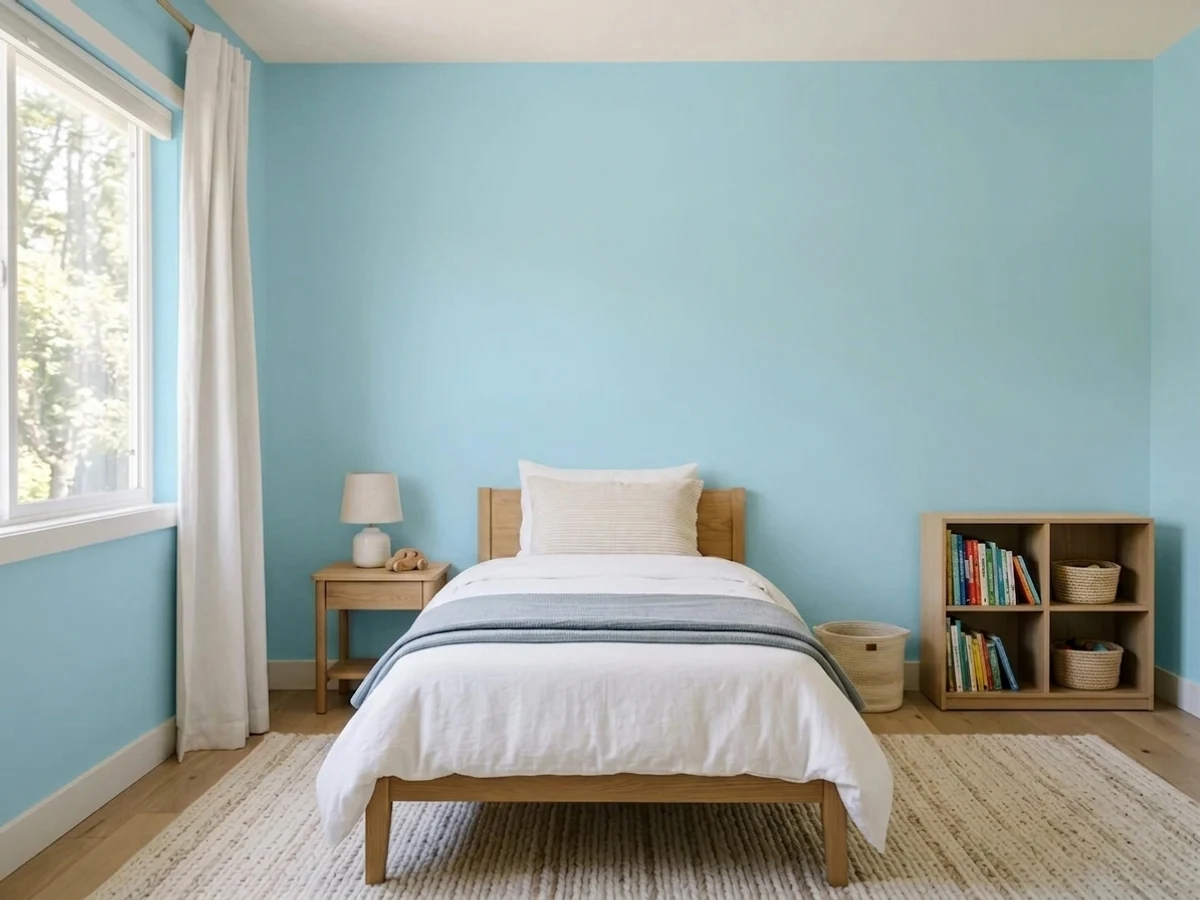
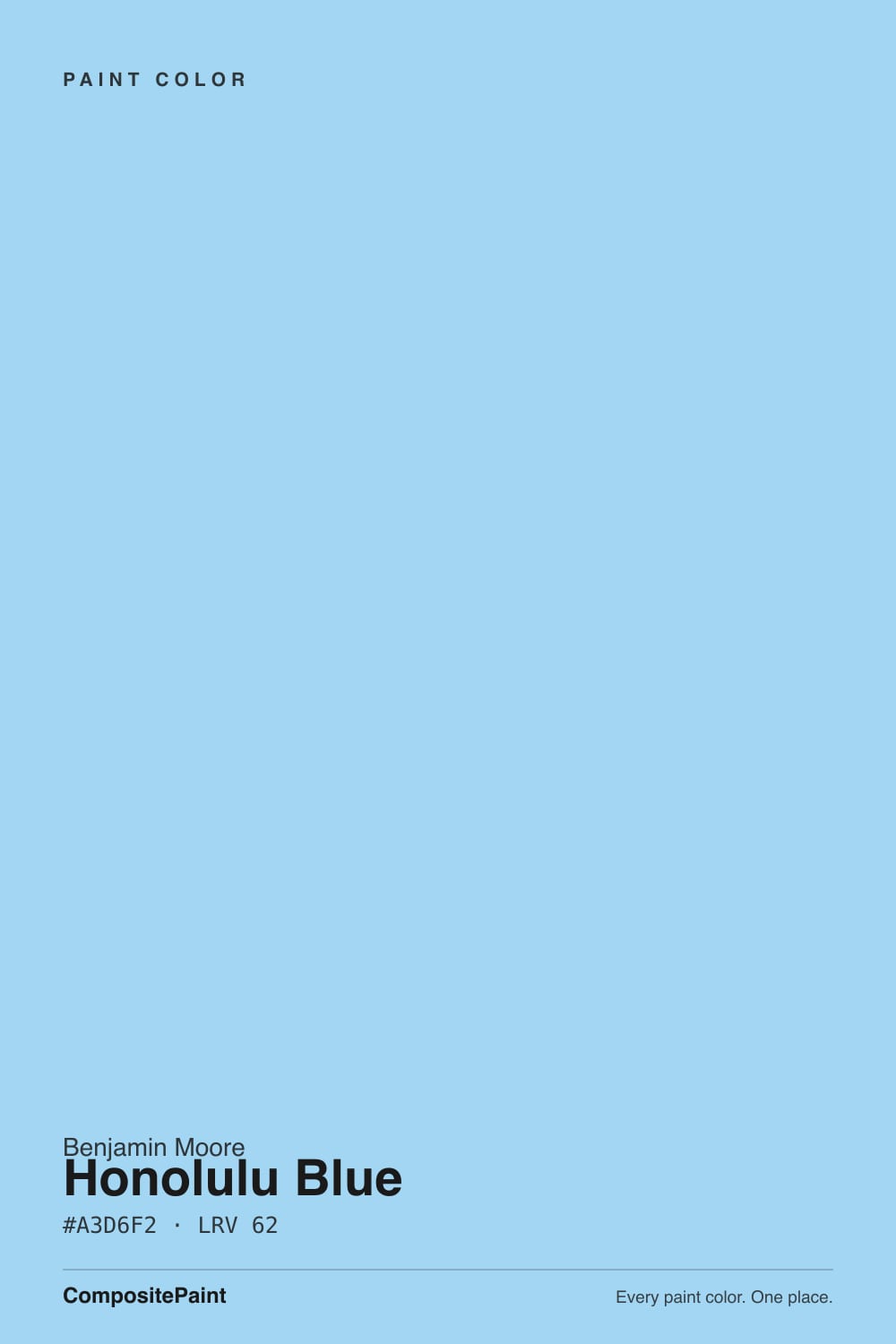
- 1Resolute Blue40
- 2Lost in the 80s51
- 3Honolulu Blue62
- 4After Rain68
- 5Bashful Blue74
The Fast Verdict
Honolulu Blue is a genuinely clear sky blue — no green wash, no gray dilution, just cheerful cyan-blue at a light-but-real LRV 62. It comes out of Benjamin Moore's Color Preview collection, a 1,232-color grid built by hue and value rather than a curated "best of" line, and it wears that honestly: this is a solid, dependable pastel blue, not an era-defining bestseller. Give it a kids' room, a powder room, or a set of shutters and it earns its keep; ask it to carry a whole grown-up living room and it starts to feel like a toddler's bedroom.
Kids' rooms, playrooms and nurseries · powder rooms and vanities · exterior shutters, trim and doors · anyone who wants an honest sky blue with no green or gray hiding in it
You want it in a primary bedroom or formal living room · your room is dim and north-facing · you're painting all four walls of a small room · you want a color with design-press pedigree, not just a good grid pick
- A genuinely clean sky blue — no green murk, no gray dilution
- Confident enough to survive scuffs, fingerprints and crayon marks
- Reads cheerful without going neon or candy-colored
- Excellent on shutters, doors and small commitments (vanities, accents)
- Photographs and holds up well from a distance — great for exteriors
- Reads young — the top complaint in any grown-up room
- No warm undertone to rescue it in cool, dim light
- At LRV 62 it's real color, not a safe pastel-neutral
- Comes from a huge grid collection, not a curated or famous line — little design-press pedigree to lean on
What Color Is Honolulu Blue, Really?
Honolulu Blue is a clear, cyan-leaning sky blue with moderate chroma — clean and noticeable without tipping into neon. It comes from Benjamin Moore's Color Preview collection, a 1,232-color deck arranged mathematically by hue and value rather than curated the way Aura's Off-White or the Historical Colors collections are. That matters for what kind of color this is: it is not a Color-of-the-Year pick, not a color a design blog built a feature around, and not a shade with a famous room behind it. It is simply a well-made, honest sky blue sitting in a very large grid — the paint equivalent of a reliable crayon, not a limited-edition art print.
At LRV 62 it reads as genuinely light but not remotely neutral — this is real color, not a pastel-tinted white. That sets it apart from grayed coastal blues like Palladian Blue, which soften toward green-gray and can pass for a neutral in the wrong light. Honolulu Blue does not soften; put it on a wall and it stays recognizably, cheerfully blue in almost any daylight. That directness is the whole appeal — and the whole limitation.
Undertone in one line: clear cyan-blue, no green wash, no gray dilution. If your sample looks murky or gray, your room's light is simply too cool or too dim for this color today — not a flaw in the paint. If it looks faintly greenish, that's a plant, lawn, or green curtain reflecting into the sample, not the undertone itself.
Where It Shines
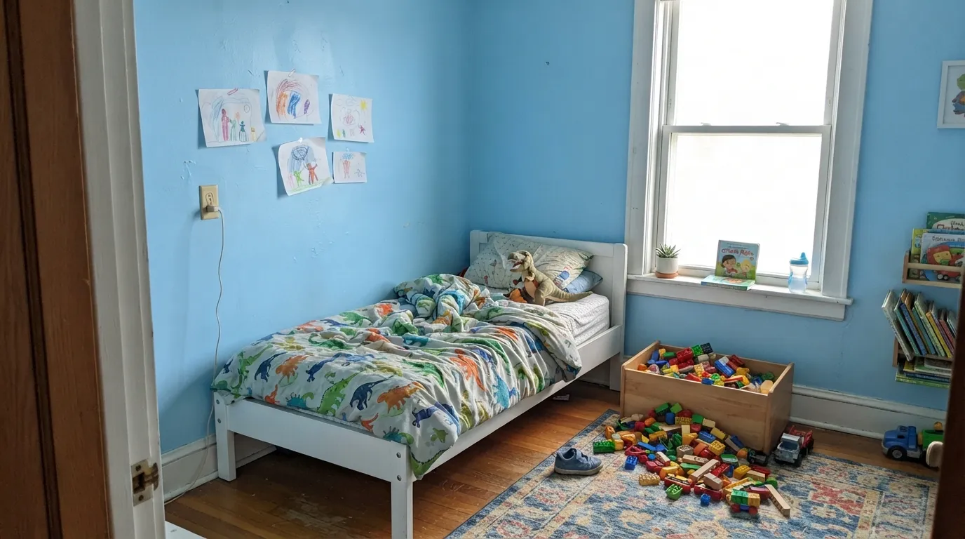
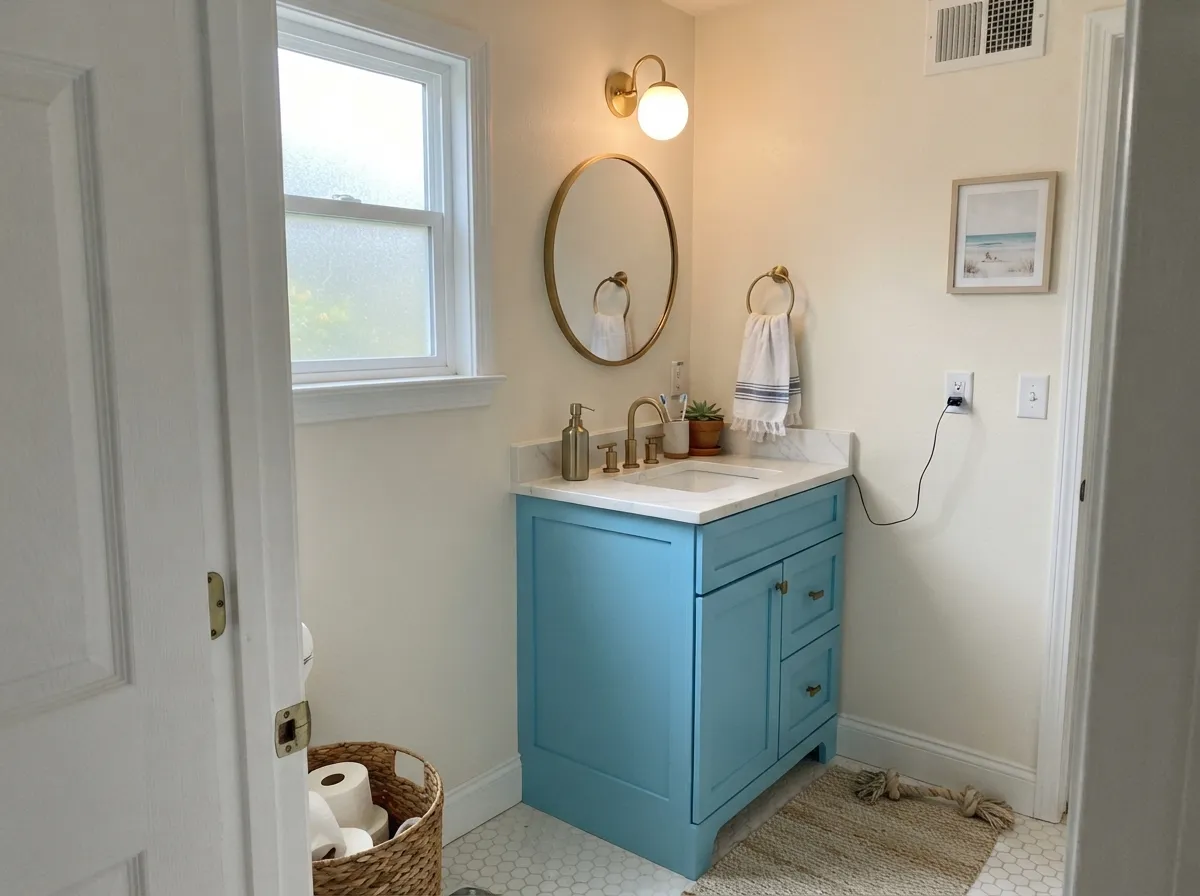
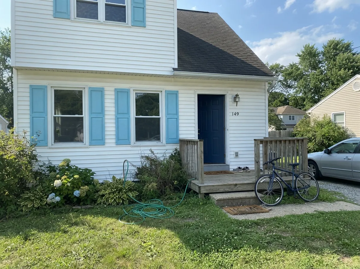
Give it a room built for cheer — a kid's bedroom, a playroom, a laundry nook, a set of exterior shutters — and Honolulu Blue does exactly the job the name promises. It reads clean and happy without irony, and because it carries real chroma at a livable LRV, it photographs well and holds its color from across the yard. Its second home is the small commitment: a powder-room vanity, a mudroom bench, a front door, where the color gets to be the whole personality of one object instead of negotiating with a houseful of neighbors.
Where It Fails
Almost every regret with Honolulu Blue comes down to asking a playful color to do a sophisticated color's job. None of the three scripts below are the paint's fault — but if your plan matches one, this is not your blue, and a bigger sample will only confirm it.
The same clarity that makes it perfect for a nursery reads as juvenile in a primary bedroom or formal living room — guests will clock it as "kid's color" before they clock it as "coastal." If you want this level of clean blue in an adult space, use it as an accent (door, vanity, shutters) instead of drenching the whole room.
Honolulu Blue has no warm undertone to fall back on — no gray, no green cushion the way Palladian Blue has. Cool north daylight flattens the cyan into a chalky, almost sterile pool-blue. Test it in your actual room before committing; this is not a color that improves in shade.
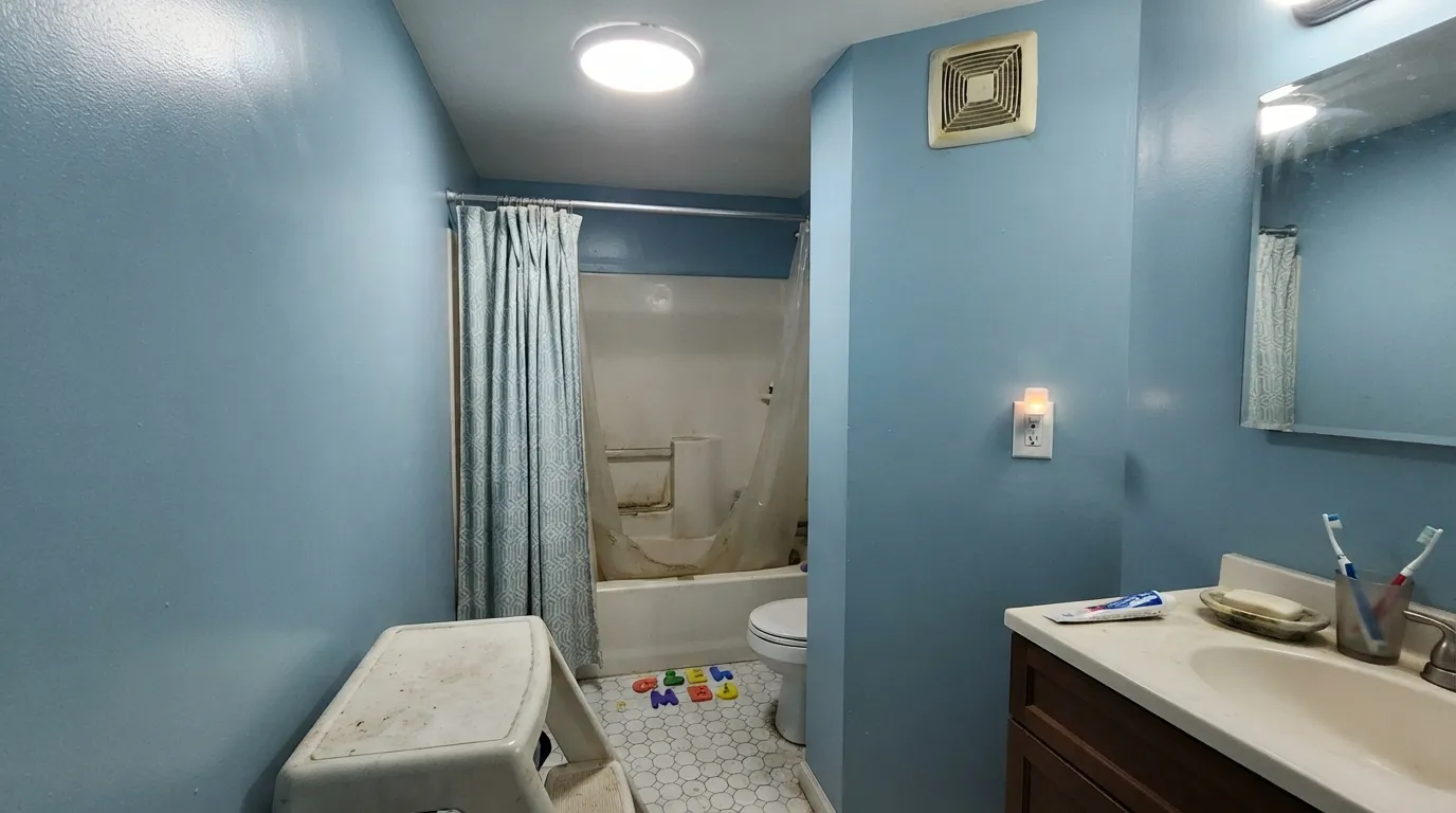
At LRV 62 this still counts as real color, not a pale neutral. Painted on all four walls of a small bathroom or closet with no other break, it can start to feel like standing inside a swimming pool. Break it up with white trim, a different ceiling color, or keep it to one wall.
Room by Room
This is the color's home turf. Eggshell on the walls, White Dove trim, and it reads cheerful and clean without being cutesy. It's saturated enough to survive scuffed baseboards and crayon marks without looking washed out.
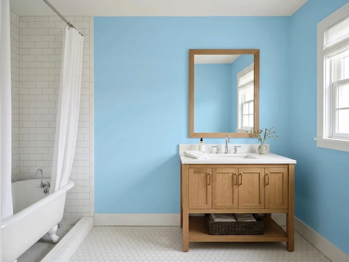
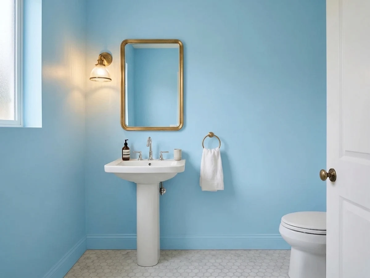
Satin Honolulu Blue on a vanity or a small powder room's four walls is a weekend project that reads intentional, not accidental. Small rooms take confident color well; brass or nickel hardware both work against it.
A kids' bath or hall bath in Honolulu Blue works well with warm-white bulbs and a white or cream vanity top. Skip it in a windowless bathroom lit only by cool LEDs — see the fails section.
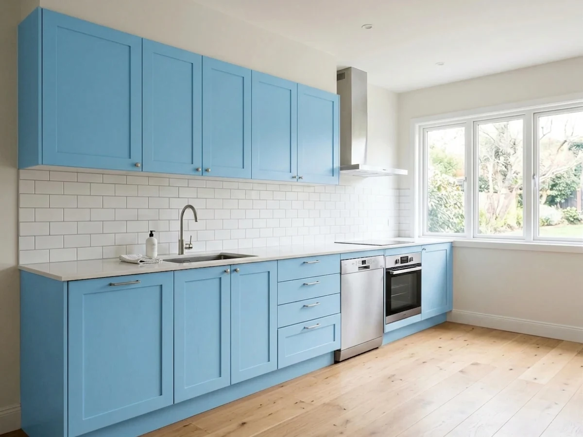
On an island or a run of open shelving under white uppers it's a genuine showpiece. A full kitchen of Honolulu Blue cabinets is a much bigger bet, and it fights honey-oak floors more than it flatters them.
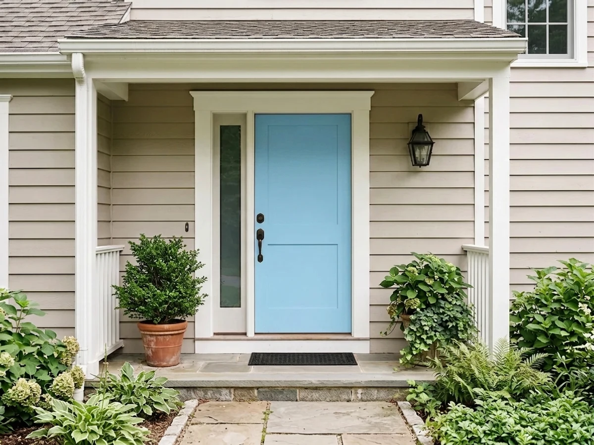
This is where the color earns real design credibility: crisp against a white or light-gray body, it reads coastal and considered rather than playful. Save the wide-open, saturated version for shutters and trim; a full-body exterior in this much clear blue is a rare, bold choice.
It can work as one accent wall behind a bed or sofa with mature, grown-up company (walnut, brass, cream linen) — but on all four walls it tends to read younger than the rest of the room. Most readers are happier using it in doses.
Your Light Is the Risk
South sun or bright east light keeps it a true, clean sky blue with real cheer — no murk, no drift. This is the light it was made for.
Cool, flat north daylight strips the cyan down to something closer to sterile pool-blue. Overcast days make it worse. Test first.
Crisp and almost electric in morning east light; it settles into a calmer, softer mid-blue as the sun moves off through the afternoon.
2700K warm bulbs pull it toward a dustier, cozier blue at night. Cool white LEDs sharpen the cyan into something closer to an aquarium.
Most complaints about Honolulu Blue are a light mismatch. Upload a photo of your actual room and see it on your walls — then ask for the same wall in north light or evening lamps before you buy a single sample.
Need It From Another Brand?
Any paint counter can custom-tint Benjamin Moore 2066-60 directly. If you would rather stay in one brand's own deck, these are the closest stock matches, measured as ΔE2000. Under 2 is a difference you will not see on the wall.
| Brand | Closest color | ΔE | LRV | |
|---|---|---|---|---|
| Sherwin-Williams | BluebellSW 6793 · Sherwin-Williams | 3.7 | 61 | Color page → |
| Behr | Skysail Blue580D-4 · Behr | 2.7 | 63 | Color page → |
| Valspar | Sonic Sky4008-9B · Valspar | 2.1 | 61.1 | Color page → |
| PPG / Glidden | SongbirdPPG1240-3 · PPG / Glidden | 1.5 | 59 | Color page → |
| Glidden | Wild Blue Yonder74BG 61/206 · Glidden | 1.4 | 61 | Color page → |
| Dutch Boy | Breezeway137-4DB · Dutch Boy | 2.0 | 61 | Color page → |
Similar Benjamin Moore Colors
The nearest shades to Honolulu Blue within Benjamin Moore's own range, ranked by perceptual color distance — useful when you want the same look a touch lighter, darker, or warmer.
WCAG 2.1: AA is 4.5 : 1 for normal text, 3 : 1 for large text, AAA is 7 : 1.
Honolulu Blue vs the Colors You're Also Considering
Every Honolulu Blue sample board has the same rivals on it. The numbers show the real lightness gap — then it comes down to which risk you would rather live with.
Pick this when you want clean, unambiguous sky blue with none of Palladian's green cast.
Benjamin Moore HC-144 · LRV 53Palladian BluePick this for a softer, grayer coastal blue that behaves in more rooms and reads sophisticated instead of playful.
Pick this for confident, saturated color instead of Upward's quieter, more neutral read.
Sherwin-Williams SW 6239 · LRV 39UpwardPick this for a muted, grown-up blue-gray that works on a primary bedroom's four walls without reading young.
Caribbean Coast 2065-60 at #A3D4F0 and LRV 61 is the closest sibling, one point darker and a shade less bright. On a wall the two are hard to separate, so choose by chip. Bluebelle 2064-60 at #A8D5EF and Highland Breeze 786 at #A4D4EC both sit at LRV 61 to 62 with slightly less cyan, which reads a little softer. Little Boy Blue 2061-60 at #ACD5E9 and Fairview Blue 779 at #A9D4E7 are quieter still, since they carry more gray in the mix. Turquoise Haze 2060-60 at LRV 65 is the lightest of the group and pulls toward turquoise.
Across brands, Glidden Wild Blue Yonder 74BG 61/206 at LRV 61 and PPG Songbird PPG1240-3 at LRV 59 are both within a difference of 1.5, so they look visually identical in normal room light. Valspar Sonic Sky 4008-9B at LRV 61.1 and Behr Skysail Blue 580D-4 at LRV 63 are very close, worth sampling first. Sherwin-Williams Bluebell SW 6793 at LRV 61 is close but visibly different side by side.
Honolulu Blue Coordinating Colors
The rule for coordinating with Honolulu Blue is simple: let a warm neutral do the grounding, and use one dark note instead of trying to match its intensity. It pairs best with warm whites and creams, brass or unlacquered hardware, and a single deep navy or charcoal accent — these are the partners that keep it feeling considered instead of accidental:
Where Honolulu Blue Actually Comes From
Honolulu Blue isn't a Color of the Year, and it has never anchored a magazine feature the way Hale Navy or Palladian Blue have. It comes out of Benjamin Moore's Color Preview collection — a 1,232-color deck built mathematically, graded by hue and value, rather than curated the way the Historical Colors or Aura Signature collections are. That's not a knock; it's context. Some retailer listings describe it as "a favorite among homeowners and designers," but that exact phrase turns up across dozens of unrelated colors in the same catalog — boilerplate, not a real popularity signal, and this review does not lean on it.
What that means in practice: there's no viral room, no celebrity kitchen, no case study to point to when deciding whether to trust it. What there is instead is a genuinely well-made, honest sky blue that does exactly what its numbers promise — clean cyan, moderate saturation, no surprises once it's on the wall. For a nursery, a powder room or a set of shutters, that's a perfectly good reason to buy a color: not fame, just honesty.
Honolulu Blue With Wood Tones and Floors
Cool clear blues and warm wood are natural opposites, and the pairing works best when the wood is dark or neutral rather than orange. Walnut, espresso stain and pale white oak all sit comfortably next to Honolulu Blue — the wood's depth balances the blue's clarity instead of fighting it.
The floor that struggles is classic honey-oak or golden pine: the orange in the wood and the clear cyan in the paint pull in opposite directions, and both can end up looking slightly off next to each other. If honey oak is staying, keep Honolulu Blue to an accent — a vanity, shutters, one wall — rather than a full room, or bridge the two with a warm rug and white trim.
Three Ready Palettes Built on Honolulu Blue
A color is never alone on the wall. These are complete combinations in the 60-30-10 pattern, with the reason each one holds together. Every one opens in the visualizer.
White Dove trim keeps the room from feeling like a swim cap, and the warm cream shelving gives the cool blue one warm note to lean on so it never turns clinical.
Try this palette in your roomSwiss Coffee keeps the little room warm and airy while the vanity carries the color; Hale Navy adds the one dark, grounding note that keeps the palette from tipping into a nursery.
Try this palette in your roomA warm white body lets the sky-blue shutters stay crisp instead of pastel-washed, and the deeper Van Deusen door gives the facade one confident dark note without going full navy trim.
Try this palette in your roomHonolulu Blue FAQ
Is Honolulu Blue too bright for a bedroom?
For a kid's room or nursery, no — that clarity is the whole appeal. For a primary bedroom, it can read younger than most adults want on all four walls; use it on one wall or a headboard nook instead, with warm wood and cream bedding to age it up.
Is Honolulu Blue warm or cool?
Cool — it's a clear cyan-blue with no warm undertone to fall back on. In north light or under cool LEDs it can go flat and chalky; in real daylight or under warm 2700K bulbs it stays cheerful and clean.
What trim white goes with Honolulu Blue?
A warm off-white like White Dove or Swiss Coffee keeps the room from feeling clinical. A stark, cool white sharpens the contrast for a crisper, more nautical look — better outdoors on shutters than on four interior walls.
Can I use it on kitchen cabinets or an island?
Yes, and it's one of its better jobs — satin or semi-gloss cabinet enamel on an island reads like a real design choice. A full kitchen of it is a bigger commitment, and it argues with honey-oak floors more than most blues.
Does Honolulu Blue work on exteriors?
Very well, especially on shutters, trim and doors against a white or light-gray body — this is arguably its strongest use. A full-body exterior in this much clear blue is bold but workable in bright, sunny climates; expect it to read a step brighter in full sun than on the chip.
Is Honolulu Blue good for a nursery?
It's a strong pick if you want a genuine sky blue rather than a grayed-down color that only flashes blue sometimes. Just confirm the room gets real daylight — in a dim, north-facing nursery it can go flatter and colder than the chip promises, so sample it in the actual room first.
Have you painted with Honolulu Blue?
Rate it — one tap helps the next reader decide.
Ask a Question