Cream
An honest look at Benjamin Moore's buttery near-white: the rooms where it saves old woodwork, and the sunny rooms where it turns plainly yellow.

Jessica has spec'd whites and neutrals for more than 300 rooms and keeps a sample wall of painted drawdowns in her studio. Every color review is checked against real reader rooms in the comments and re-tested when a formula changes. About the testing process →
- 1Agreeable Gray60
- 2Pale Oak69
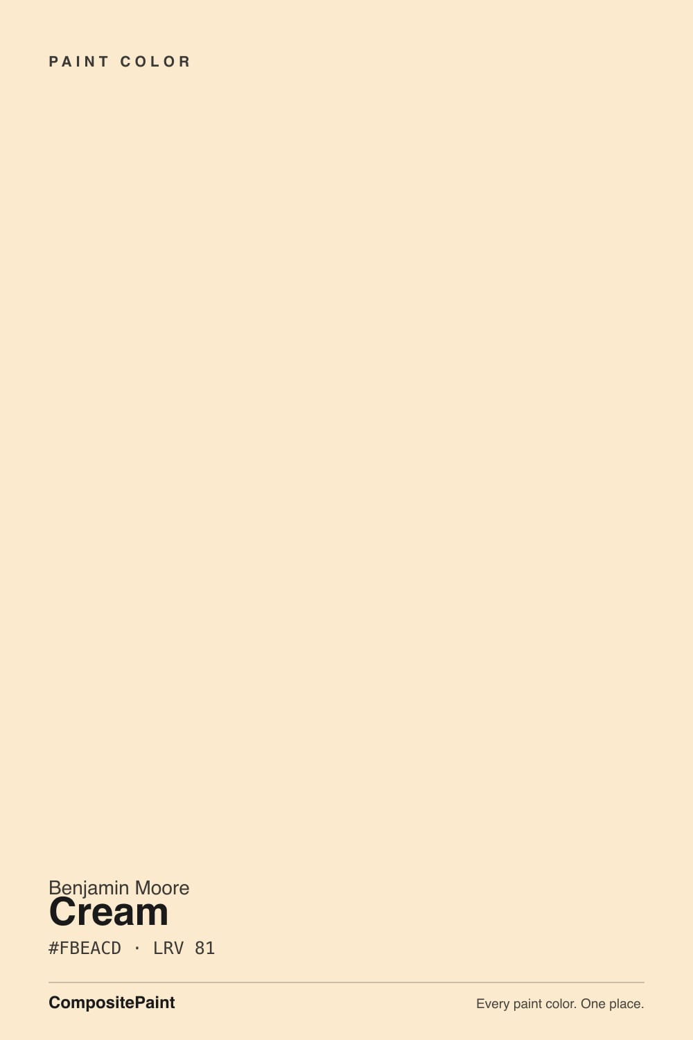
- 3Cream81
- 4Moonlit Beach88
- 5Crème Fraiche93
The Fast Verdict
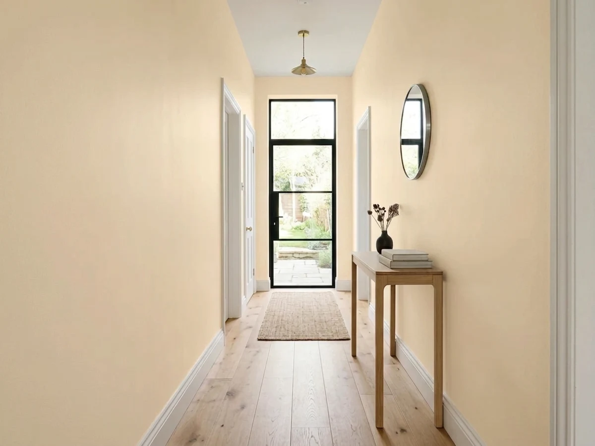
Cream 2159-60 is what you pick when a plain white makes the room feel cold and unfriendly. It is bright — LRV 81, it behaves like a white — but the warmth is right there in the open, not hidden, so it flatters stained wood, plaster, brick and brass instead of fighting them. In cool north light that is exactly what you want. In a sunny south or west room, or beside a new bright-white kitchen, the same warmth turns into visible yellow and people stop calling it cream.
North-facing rooms that feel cold and grey · houses with original stained woodwork · trim and ceilings under strong warm wall colors · traditional or country kitchen cabinets
Your room takes hard south or west sun · you are keeping bright white cabinets or quartz · your floors are grey LVP or cool marble · you want a crisp modern look
- Warms up cold north rooms without losing brightness
- The best neighbor in the deck for original stained woodwork
- Softens the edge under deep warm wall colors on trim and ceilings
- LRV 81 keeps dark halls and small rooms feeling open
- Reads as painted furniture on traditional cabinets, not plastic
- Turns visibly yellow in strong south or west sun
- Looks dingy against bright white cabinets or cool quartz
- Goes peachy next to grey floors and cool marble
- Too warm to pass as a neutral in a modern room
What Color Is Cream, Really?
This is a white with the warmth left switched on. Most off-whites that get called creamy have had a drop of grey or green added to hold the yellow back — that is the trick behind White Dove and Swiss Coffee. Cream skips that step. What you get is a soft butter tone with a faint red edge to it, clean and pretty on a chip, and honest about being warm on a wall. That honesty is the whole review: it is not a color that hides what it is.
At LRV 81 it reflects nearly as much light as White Dove (83) and puts a real gap between itself and a bright white like Chantilly Lace (90). In plain terms: it will brighten a dark hallway just fine, but stand it next to true white trim and you will see body, not brightness. That gap is useful on purpose — it is why Cream reads like painted woodwork and old plaster instead of like a fresh drywall patch.
Undertone in one line: warm butter with a trace of peach — never green, never grey. If it looks pink to you on the wall, that is a cool grey floor or a cool tile pushing the red side of it forward.
Where It Shines
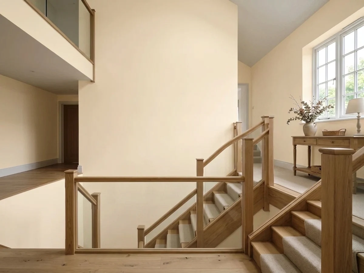
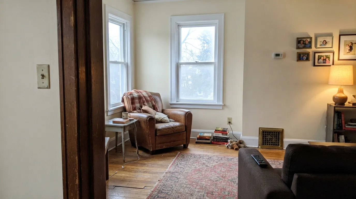
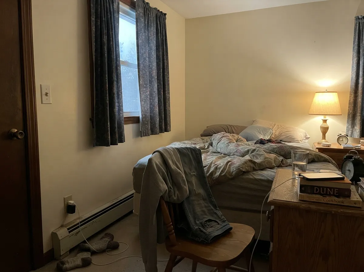
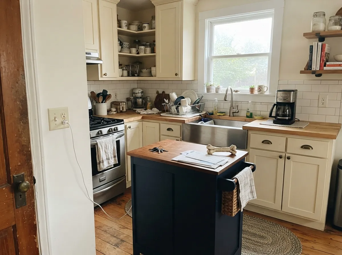
Give it cool daylight and warm materials and it does something no crisp white can: it makes an older house look cared for rather than corrected. North rooms, stained trim, brass, brick, worn wood floors — Cream meets all of it halfway, and at LRV 81 the room still feels open.
Where It Fails
The bad stories about this color are all the same three stories, and every one of them is predictable before you open the can. If your room matches one of these, more coats will not save it — a different color will.
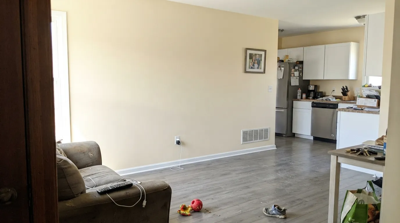
Direct sun stacks onto warmth that was already there, and by midday a big uninterrupted wall stops reading cream and starts reading lemon. Homeowners describe rooms that looked perfect on the sample card turning into "lemon chiffon" once the sun swung around. For sunny rooms, use a cream that has been greyed down — Benjamin Moore Swiss Coffee OC-45 — or drop the color out entirely with White Dove OC-17.
White shaker cabinets, a cool white quartz counter, a white farmhouse sink — put Cream walls behind any of that and the wall looks aged and slightly dirty, not warm. Thin white trim is fine because it is a line, not a field. A big white surface is a field, and it wins. If the cabinets are staying, paint the walls Benjamin Moore Ballet White OC-9 or Manchester Tan HC-81 instead.
Grey LVP, grey-washed oak and Carrara-type stone all sit at the opposite temperature, and they pull the red side of Cream to the surface — the wall reads faintly peachy and the floor reads blue. Nothing in the room looks wrong on its own; together they argue. With cool floors, go to Benjamin Moore Pale Oak OC-20 or Edgecomb Gray HC-173.
Room by Room
Cool daylight cancels the butter and leaves a soft, believable off-white that still bounces plenty of light. Eggshell on the walls. If the same room takes strong afternoon sun through a west window, sample it at 3pm before you commit.
Dining rooms are used at night, and warm lamps make Cream look intentional instead of yellow. It is the classic partner for a deep warm accent wall like Benjamin Moore Caliente AF-290 or a green like Saybrook Sage HC-114. Eggshell, or matte if the walls are old plaster.
At LRV 81 it never goes dim, and under 2700K bulbs it turns genuinely cozy. Keep bedding and rugs on the warm side; crisp white linens will make the walls look more yellow than they are.
On doors it gives a soft, aged, painted-furniture look that suits country and older kitchens, especially with brass or unlacquered hardware and butcher block. Use satin. It is the wrong choice for a modern flat-panel kitchen with cool stone.
Under strong warm walls — deep red, olive, gold, mustard — a bright white edge cuts too hard, and Cream softens it without going muddy. Semi-gloss on trim, flat on the ceiling. This is where it earns its keep in houses with heavy millwork.
Windowless halls are exactly where a cool white goes grey and tunnel-like. Cream keeps them feeling lit. Pair it with the same color on the doors and let a semi-gloss sheen do the separating.
Your Light Is the Risk
Cool flat daylight cancels the butter. This is where Cream reads as a proper soft white.
Direct sun doubles the warmth — big walls read plainly yellow at midday. Judge it then.
Buttery during its sun hours, calm and creamy the rest of the day. Most people like the swing.
2700K lamps push it toward butter; 3500K–4000K holds it back to a white. Change bulbs before paint.
Most complaints about Cream are a light mismatch. Upload a photo of your actual room and see it on your walls — then ask for the same wall in north light or evening lamps before you buy a single sample.
Need It From Another Brand?
Any paint counter can custom-tint Benjamin Moore 2159-60 directly. If you would rather stay in one brand's own deck, these are the closest stock matches, measured as ΔE2000. Under 2 is a difference you will not see on the wall.
| Brand | Closest color | ΔE | LRV | |
|---|---|---|---|---|
| Sherwin-Williams | CoronaSW 7121 · Sherwin-Williams | 2.1 | 85 | Color page → |
| Behr | RisottoM270-2 · Behr | 0.7 | 84 | Color page → |
| Valspar | SundropT549 · Valspar | 1.1 | 82.5 | Color page → |
| PPG / Glidden | Shiny SilkPPG1206-3 · PPG / Glidden | 3.5 | 83 | Color page → |
| Glidden | Popcorn White46YY 86/166 · Glidden | 2.2 | 86 | Color page → |
| Dutch Boy | Warm Sunlight118-2DB · Dutch Boy | 2.5 | 82 | Color page → |
Similar Benjamin Moore Colors
The nearest shades to Cream within Benjamin Moore's own range, ranked by perceptual color distance — useful when you want the same look a touch lighter, darker, or warmer.
WCAG 2.1: AA is 4.5 : 1 for normal text, 3 : 1 for large text, AAA is 7 : 1.
Cream vs the Colors You're Also Considering
Every Cream sample board has the same rivals on it. The numbers show the real lightness gap — then it comes down to which risk you would rather live with.
Pick this for real warmth against stained wood and brass.
Benjamin Moore OC-45 · LRV 84Swiss CoffeePick this for sunny rooms — the grey in it keeps yellow off the wall.
Pick this when a plain white still feels cold in the room.
Benjamin Moore OC-17 · LRV 85White DovePick this when anything bright white or cool stone is staying.
Inside the brand the differences are mostly a point or two of LRV and a slight shift in warmth. Filtered Sunlight 2154-60 at #FAEBCC and LRV 81 is the closest sibling and reads a hair cleaner. Calcite CW-110 at #F7EBCD and LRV 82 is a touch lighter and quieter. Devon Cream 914 at LRV 84 and OC-102 at LRV 82 are brighter and read more like an off-white than a cream. Lion Yellow 2158-60 at #FAE8CE and LRV 80 is the warmest of the group.
Across brands, Behr Spanish Lace YL-W2 at #FCEACC has a deltaE of 0.42 and Kompozit Capetown Cream 0964 at #FBEBCF is 0.47, both true matches. Diamond Vogel's version of Capetown Cream at 0.77 and Valspar Sundrop T549 at 1.08 are visually identical in normal room light. Sherwin-Williams Corona SW 7121 at 2.06 and Farrow and Ball Tallow No. 203 at 2.84 are very close but should be sampled first. PPG Shiny Silk PPG1206-3 at 3.54 is close but visibly different side by side.
Cream Coordinating Colors
The rule with Cream is to stay in the warm lane. It sits comfortably with warm tans, muted greens, deep navies and earthy reds, and it argues with icy blues, cool greys and blue-grey stone. These are the partners that actually work in real rooms:
Cream With Wood Tones, Stone and Floors
This is the question that decides whether Cream is right for you, because it is far more sensitive to what is on the floor than most whites. Honey oak, red oak, pine, cherry, walnut and old refinished floors all sit happily against it — the warmth in the paint meets the warmth in the wood and neither one has to win. It is one of the few near-whites that makes orange-toned builder oak look like a choice rather than a leftover.
Cool floors are the other story. Grey LVP, grey-washed engineered wood, and blue-grey porcelain tile push Cream toward peach, and the contrast reads as a mismatch rather than a contrast. Carrara-type marble does the same thing on a countertop. If any of that is staying, sample a large board flat against the floor and the stone at the same time before you paint a whole room.
Metals and stone are easier. Aged brass, unlacquered hardware, terracotta, brick and limestone all suit it. Polished chrome and brushed nickel are neutral enough to live with, but a room built entirely on cool chrome and grey tile will make the walls look yellower than they are.
Cream on Cabinets and Millwork
On cabinet doors Cream behaves like painted furniture — softer and older-looking than any bright white, which is exactly why it belongs in country, farmhouse and pre-war kitchens rather than modern ones. Use a satin urethane-fortified cabinet enamel. The warmth also does practical work: at LRV 81 it hides handprints and cooking film around handles better than a crisp white, which shows every mark.
On heavy millwork — paneling, wainscot, deep casings, coffered ceilings — Cream is at its best when the walls are the same color. Painting trim and walls Cream and letting semi-gloss against eggshell do the separating gives depth without a hard line, and it stops a room full of woodwork from looking like a chart of white samples. If you want visible contrast on trim instead, go up to a genuinely clean white; going up only slightly reads as a mistake.
One warning worth repeating: if new bright-white cabinets, appliance panels or a cool quartz counter are already in the room, do not put Cream on the walls behind them. The white will look fresh and the wall will look aged, and no sheen or second coat changes that.
Three Ready Palettes Built on Cream
A color is never alone on the wall. These are complete combinations in the 60-30-10 pattern, with the reason each one holds together. Every one opens in the visualizer.
Cream carries about 60 percent of the house and lets original stained trim look intentional instead of dated. Saybrook Sage is the muted green that sits on the same warm base, and the charcoal door gives the scheme its one dark note.
Try this palette in your roomThere is only so much brightness left above LRV 81, so trim has to be a genuinely clean white to read as contrast — Simply White does it without going icy. The navy door keeps the warm walls from looking soft all the way through.
Try this palette in your roomCabinets are the biggest painted surface in a kitchen, so Cream is the 60 percent here and Manchester Tan sits just below it in the same warm family, which keeps the wall-to-door handoff soft. The navy island supplies the contrast that a bright white counter would otherwise have to provide.
Try this palette in your roomCream FAQ
Will Cream look dated in a newer house?
In a builder-modern room with grey floors, white quartz and flat-panel doors, yes — it will read as leftover 1990s beige. In an older house with stained trim, plaster and warm floors it reads traditional, not dated. The materials around it decide, not the paint.
Cream or White Dove?
White Dove is the safer whole-house answer because a drop of grey stops the yellow from showing. Pick Cream when White Dove has already looked flat or chilly in your room, which usually happens in dim north-facing spaces. In a sunny room, White Dove wins almost every time.
Does Cream work with grey floors?
It is the one pairing to sample properly. Grey LVP and grey-washed oak pull the red side of Cream forward and the wall can read faintly peachy over them. Warm rugs and brass hardware fix it in many rooms, but tape a large sample right above the actual floor first.
Can I paint the ceiling Cream too?
Yes, and in rooms with warm wall colors it is better than stark ceiling white, which tends to look like a hole in the room. Use flat sheen. Over Cream walls, one color top to bottom is the softest result and hides ceiling-line imperfections in old houses.
Is Cream the same as Navajo White?
No. Navajo White OC-95 is darker and more tan — it sits closer to a pale beige than a white. Cream is much lighter at LRV 81 and keeps behaving like a white on the wall. If people have told you your walls look beige, Navajo White is usually the culprit, not this.
How many coats does it take?
Two over any existing light or beige wall. Going over a strong red, gold or navy, prime with a white primer first — warm near-whites hide poorly, and you can burn three finish coats learning that. Roll a full test patch, not a stripe, because the yellow only shows at scale.
Is Cream good on exteriors?
Yes, especially as a body color with brick, stone or wood, where a bright white looks harsh. Full sun will read it warmer outside than in, so pair it with a dark trim — charcoal, black or a deep green — to keep it crisp. Walk a sample board around all four sides of the house before you buy the gallons.
Have you painted with Cream?
Rate it — one tap helps the next reader decide.
Ask a Question