Lemon Chiffon
Sherwin-Williams' trend-forecast yellow, reviewed honestly: the light that makes it glow, the light that makes it sickly, and where it actually earns a wall.

Jessica has spec'd whites and neutrals for more than 300 rooms and keeps a sample wall of painted drawdowns in her studio. Every color review is checked against real reader rooms in the comments and re-tested when a formula changes. About the testing process →
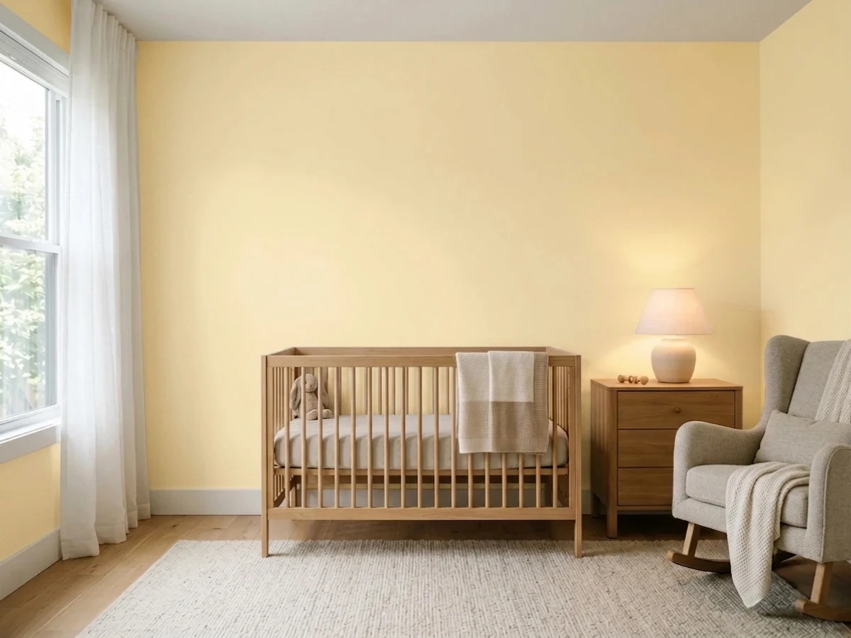
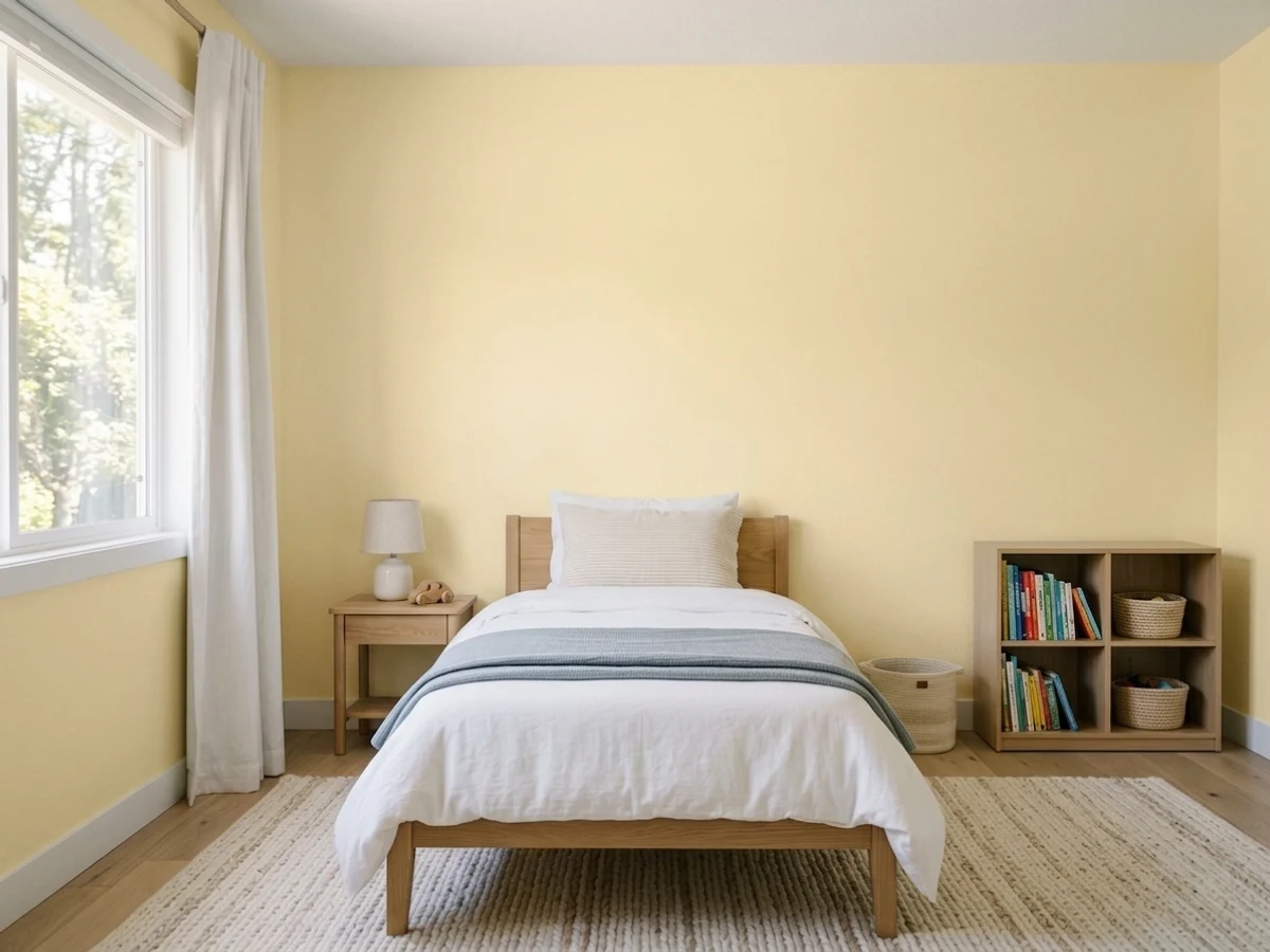
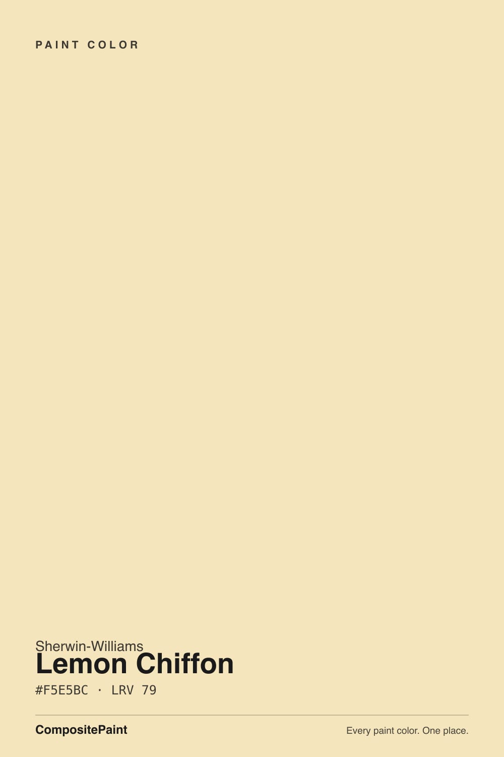
- 1Honey Tea52
- 2Jackfruit62
- 3Lemon Chiffon79
- 4Frittata86
- 5Barely Yellow92
The Fast Verdict
Lemon Chiffon is a soft, creamy pale yellow with the volume turned down just enough to avoid candy or neon territory. It is not Sherwin-Williams' 2026 Color of the Year — Universal Khaki is — but it is the yellow SW itself picked to pair with it, and that trend-forecast pedigree is the real story here. It is genuinely cheerful in daylight and genuinely risky in cool light, which makes it a much better door or accent than a whole-house commitment.
Nurseries and kids' rooms · a kitchen island, breakfast nook, or accent wall · powder rooms and mudrooms · a front door with real personality
You want one color for the whole house · your room runs on cool LEDs with little daylight · you're pairing it with the brightest, coolest white trim you own · you want a yellow that reads gold, not pastel
- A pale yellow that skips the neon or candy note — grayed just enough to feel current, not childish
- Real trend pedigree: SW's own 2026 Colormix companion to Universal Khaki, not a random yellow
- LRV 79 keeps a room bright without going stark or clinical white
- Genuinely cheerful in real daylight — nurseries, kitchens, breakfast nooks all suit it
- Small commitments (a door, an island, one wall) deliver real personality with low repaint risk
- Cool LEDs and dim rooms turn it flat and slightly sickly instead of cheerful
- A whole room soaked in it tends to read nursery, not sophisticated
- Stark, cool-white trim washes it out rather than framing it
- A trend color, not a deck classic — carries more repaint risk than a true neutral
What Color Is Lemon Chiffon, Really?
A soft, creamy pale yellow with a warm golden undertone — grayed down just enough that it reads cheerful rather than candy-bright or neon. Sherwin-Williams put it in Colormix Forecast 2026, Anthology: Volume Two, as one of the companion colors to Universal Khaki, the 2026 Color of the Year — SW's own marketing calls it the palette's "ray of brightness." That is the honest version of its fame: not the headline color, but the one the headline color's own forecast reaches for when a room needs a lift.
At LRV 79 it sits close to the pale end of the deck — noticeably deeper and more golden than Behr's Butter Yellow (LRV 86), which reads almost as an off-white. That extra body is what lets Lemon Chiffon actually register as yellow instead of a suggestion of one, but it also means the color depends more on real light to hold its warmth. In bright, direct daylight it glows; in a dim or cool-lit room, pale yellows are notorious for going flat and slightly sickly, and this one is no exception.
Undertone in one line: warm golden yellow, never green, never neon. If your sample looks flat, dull, or faintly sickly-pale on the wall, that is cool daylight or a cool-white LED bulb talking — not a defect in the paint.
Where It Shines
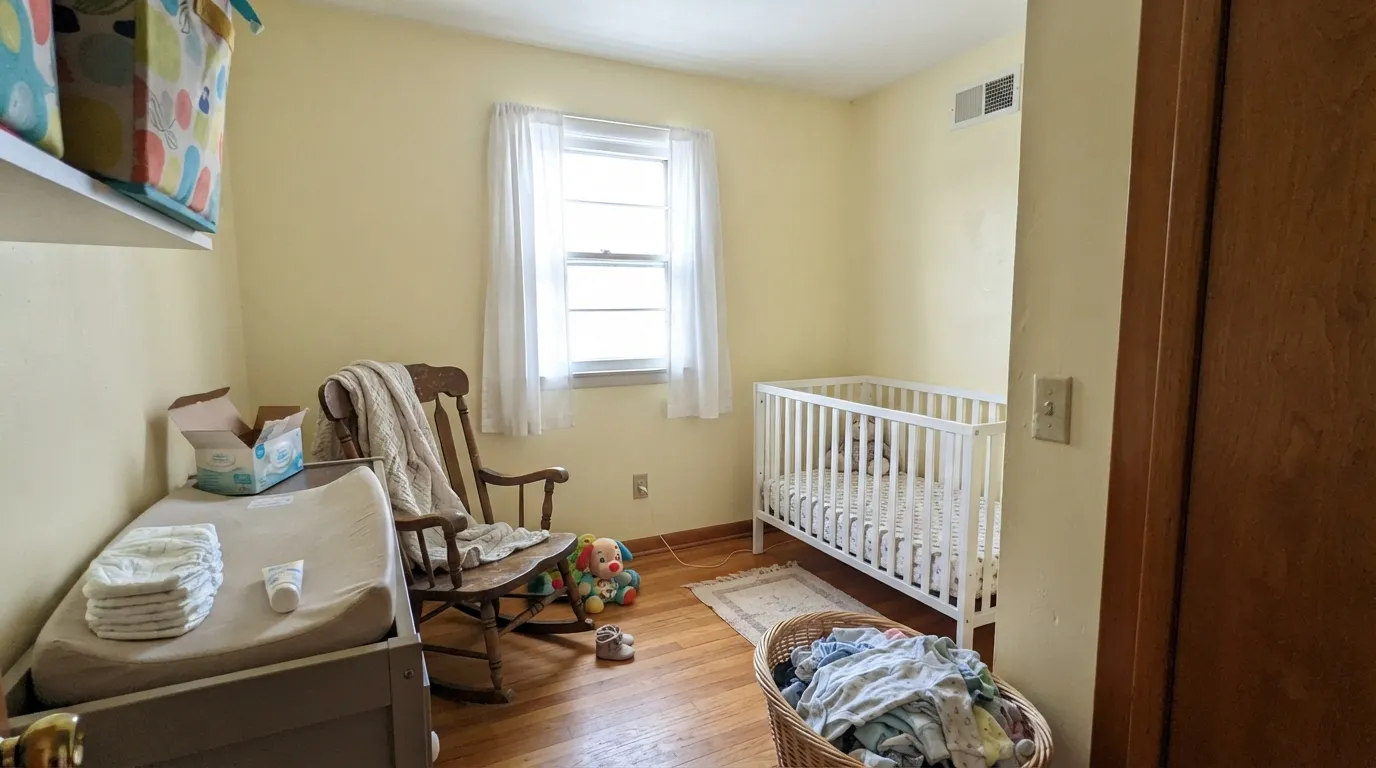
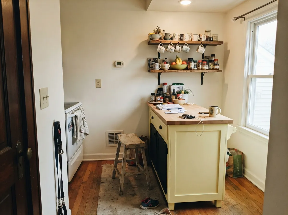
Give it real daylight — south or east exposure, or just a bright window — and it turns into a genuine buttery glow instead of a pastel suggestion. It is at its best as a deliberate, contained dose of color: a nursery, a kitchen island or breakfast nook, a powder room, a front door. Small rooms and small surfaces let the yellow read as a confident design choice rather than a color that took over the house by accident.
Where It Fails
Almost every regret story with a pale yellow like this one follows one of three scripts, and all three are predictable before the first coat goes on. None of them are the paint's fault — but if your plan matches one of these, sample it big before you commit.
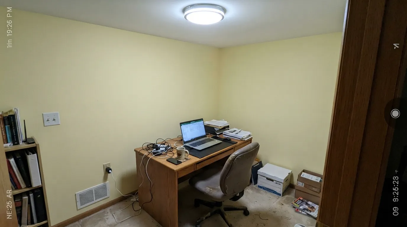
Pale yellows have a well-earned reputation for going sickly under cool-white bulbs or in rooms with weak daylight — the golden warmth drains out and what is left reads flat, slightly greenish-pale, almost dingy instead of cheerful. Swap to 2700K warm bulbs before you swap the paint, and if the room genuinely has no daylight, this is not the color for it.
SW itself uses Lemon Chiffon as the accent to a neutral, not the main event — that is a real signal. A full living room or primary bedroom soaked in it tends to read more nursery than sophisticated. It earns its keep in doses: one wall, a door, cabinets, a small room.
Pair it with an ultra-bright, blue-leaning white and the yellow reads washed-out and indecisive instead of confident — the two compete rather than the trim framing the color. A warmer, creamier trim white lets it read as intentional; if you want contrast instead, go dark, not bright-white.
Room by Room
Cheerful without being loud, gender-neutral, and calm enough for a room meant for sleep. Eggshell walls, a warm white trim, one soft accent color keeps it from feeling like a candy shop.
Genuinely charming on an island, a breakfast nook, or lower cabinets under a neutral like Alabaster on the main walls. A full kitchen in it is a bigger bet, and cool overhead lighting is the thing to test first.
It can work, but pale yellow reads sweeter than most adults want in a primary suite. If you love it, keep it to one wall or soften it with deeper, grown-up neighbors rather than an all-yellow box.
A small, contained room takes the color well and the low commitment removes the whole-house risk. Satin finish for the wipe-down durability these rooms need.
East or south light is exactly the situation this color wants — the golden glow reads intentional and warm all morning. A north-facing sunroom is a harder sell.
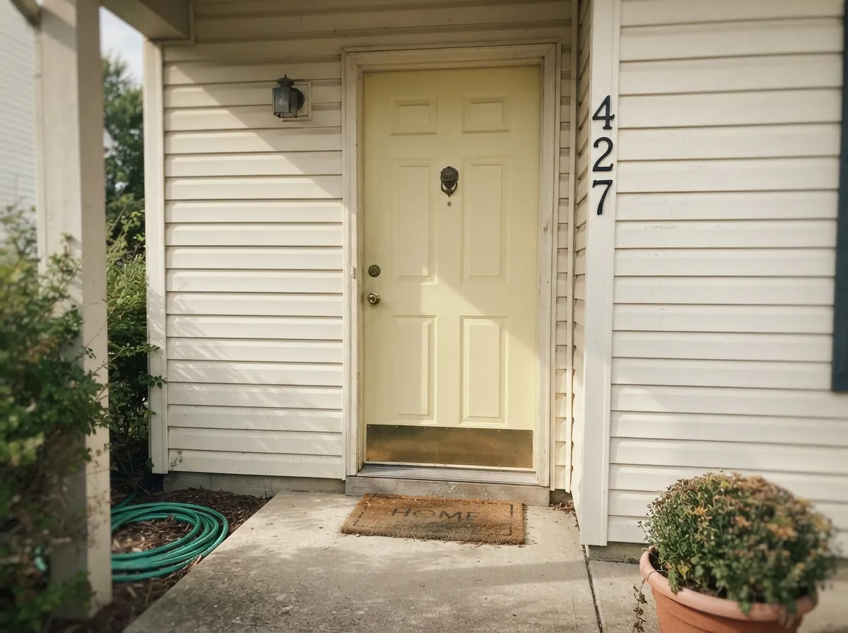
Sherwin-Williams itself suggests it for a front-door pop of color, and that is the honest use case — a single door reads playful and current. It is not a siding color; full sun on that much pale yellow washes out fast.
Your Light Is the Risk
Direct daylight brings the golden undertone forward as a genuine buttery glow — cheerful, not candy-bright. This is the light the color was chosen for.
Cool light strips the gold out and leaves a flat, slightly sickly pale yellow that reads dated rather than happy — the single most common regret with colors like this one.
Bright and warm at morning sun, it settles into a soft buttery cream through the day, then flushes noticeably richer for an hour at golden hour.
2700K warm bulbs keep it cozy and golden after dark. Cool-white LEDs flatten it toward a dull beige-yellow — change the bulb before you blame the paint.
Most complaints about Lemon Chiffon are a light mismatch. Upload a photo of your actual room and see it on your walls — then ask for the same wall in north light or evening lamps before you buy a single sample.
Need It From Another Brand?
Any paint counter can custom-tint Sherwin-Williams SW 6686 directly. If you would rather stay in one brand's own deck, these are the closest stock matches, measured as ΔE2000. Under 2 is a difference you will not see on the wall.
| Brand | Closest color | ΔE | LRV | |
|---|---|---|---|---|
| Behr | Oklahoma Wheat350E-3 · Behr | 0.9 | 79 | Color page → |
| Benjamin Moore | Weston FlaxHC-5 · Benjamin Moore | 1.4 | 76 | Color page → |
| Valspar | Pale Maize3005-8C · Valspar | 0.8 | 79.1 | Color page → |
| PPG / Glidden | Gentle GlowPPG1210-2 · PPG / Glidden | 0.8 | 79 | Color page → |
| Glidden | Gentle GlowPPG1210-2 · Glidden | 0.8 | 79 | Color page → |
| Dutch Boy | White Whimsy218-1DB · Dutch Boy | 0.0 | 79 | Color page → |
Similar Sherwin-Williams Colors
The nearest shades to Lemon Chiffon within Sherwin-Williams's own range, ranked by perceptual color distance — useful when you want the same look a touch lighter, darker, or warmer.
WCAG 2.1: AA is 4.5 : 1 for normal text, 3 : 1 for large text, AAA is 7 : 1.
Lemon Chiffon vs the Colors You're Also Considering
Every Lemon Chiffon sample board has the same rivals on it. The numbers show the real lightness gap — then it comes down to which risk you would rather live with.
Pick this when you actually want people to notice it's yellow, not just guess at it.
Behr ICC-90 · LRV 86Butter YellowPick this for a paler, almost-white version of the same sunny idea — safer for a whole room, quieter yellow.
Pick this for actual cheerful color, not just warmth.
Sherwin-Williams SW 7012 · LRV 81CreamyPick this for the same warm glow with none of the "is that a kid's room" risk — a whole-house-safe cream.
Lemon Chiffon Coordinating Colors
The rule for coordinating with Lemon Chiffon: warm, creamy whites for trim (never the coolest white you own), a quiet neutral for the rest of the room if it's carrying the color, and either a soft muted accent or a near-black for contrast. These are the partners that keep showing up in rooms that work:
The Story: Sherwin-Williams' 2026 Colormix Forecast
Lemon Chiffon's real claim to relevance is not a Color of the Year title — that went to Universal Khaki, a midtone neutral from the same Colormix Forecast 2026, Anthology: Volume Two. Lemon Chiffon is one of the forecast's companion colors, the one Sherwin-Williams itself describes as the palette's ray of brightness: the color you reach for when a room full of grounded neutrals needs one note of genuine cheer.
That positioning is the honest way to read it. It is not a decades-old bestseller like White Dove or Agreeable Gray, and it has not been independently famous the way a Color of the Year is. It is a current, deliberately chosen trend color with real backing behind it — worth using with intention, in a contained dose, rather than betting a whole house on it outlasting the trend.
Lemon Chiffon With Wood Tones and Kitchens
Warm wood is this color's best friend: oak, butcher block, rattan and cane furniture all sit comfortably against it because the warmth meets warmth. In a kitchen, it is genuinely at home on an island or a breakfast-nook wall under warm wood open shelving, brass or unlacquered hardware, and a neutral like Alabaster carrying the main walls and cabinets.
Where it gets harder is a cool, stainless-heavy, gray-washed modern kitchen — the pale yellow can feel like an odd note in an otherwise cold room rather than a deliberate warm accent. If your kitchen already leans cool and modern, keep Lemon Chiffon to a very small dose (a single lower cabinet run, a pantry door) and sample it under your actual overhead lighting before committing.
Three Ready Palettes Built on Lemon Chiffon
A color is never alone on the wall. These are complete combinations in the 60-30-10 pattern, with the reason each one holds together. Every one opens in the visualizer.
Westhighland White is warm enough to frame the yellow instead of washing it out, and Clary Sage adds one calm, grown-up note so the room reads cheerful rather than sugary.
Try this palette in your roomAlabaster keeps the main kitchen a safe, sellable neutral while the island or nook carries the color; Iron Ore hardware grounds the whole room so the yellow reads deliberate, not accidental.
Try this palette in your roomA cream house body lets one yellow door do all the talking, and Tricorn Black shutters give the pale yellow the contrast it needs to read confident in full sun instead of washed-out.
Try this palette in your roomLemon Chiffon FAQ
Is Lemon Chiffon warm or cool?
Warm — a golden yellow undertone with no green or neon in it. In cool light it can look flat and pale rather than actually cool-toned; it never reads gray or blue.
Is Lemon Chiffon the Sherwin-Williams Color of the Year?
No — Universal Khaki is the 2026 Color of the Year. Lemon Chiffon is one of the companion colors in the same Colormix Forecast 2026 palette, positioned by Sherwin-Williams as the collection's bright accent alongside the neutral.
Will it look sickly in a dim room?
It can. Pale yellows are the family most prone to going flat and slightly sickly under cool light or weak daylight, and this one is no exception. Test a large sample in your actual room before committing, especially north-facing or lamp-only spaces.
What trim white goes with Lemon Chiffon walls?
A warm, creamy white — Dover White or Westhighland White — rather than the coolest, brightest white you own. A stark cool trim makes the yellow look washed-out instead of confident.
Can I paint a whole room or house in it?
One contained room works well — a nursery, a powder room, a mudroom. A full living room or a whole house tends to read more nursery than sophisticated; most rooms that use it well treat it as an accent (a door, an island, one wall).
Does it work on an exterior?
As a front door, yes — Sherwin-Williams itself suggests it for exactly that. As full exterior siding it is a much bigger, riskier bet; full sun on that much pale yellow washes it out fast.
Have you painted with Lemon Chiffon?
Rate it — one tap helps the next reader decide.
Ask a Question