Frittata
Behr's palest yellow, reviewed honestly: the light where it glows like a good egg-cream, the light where it goes sickly, and what to pick instead.

Jessica has spec'd whites and neutrals for more than 300 rooms and keeps a sample wall of painted drawdowns in her studio. Every color review is checked against real reader rooms in the comments and re-tested when a formula changes. About the testing process →
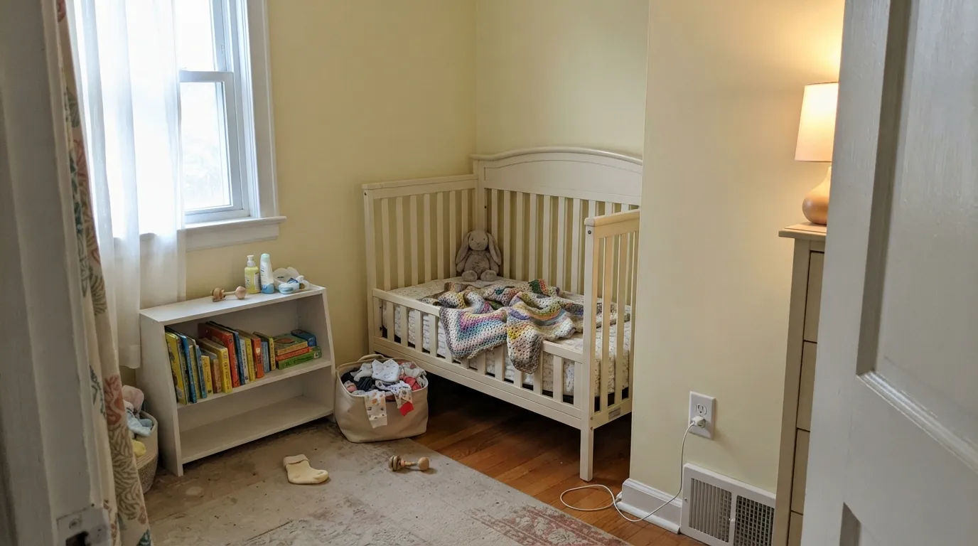
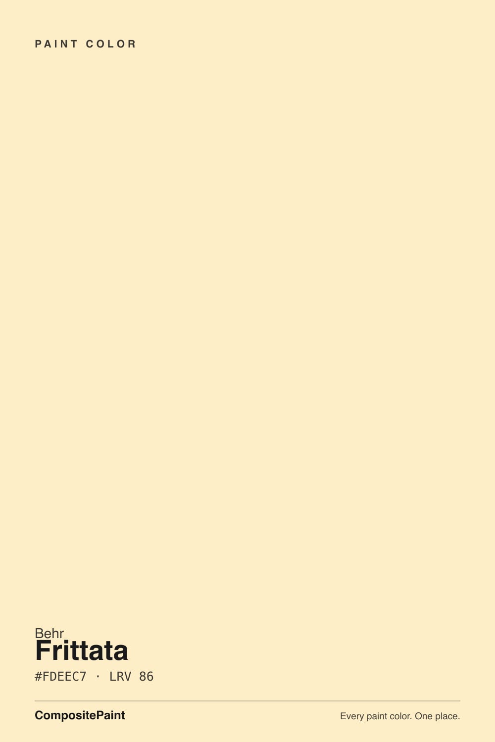
- 1Jackfruit62
- 2Lemon Chiffon79
- 3Frittata86
- 4Barely Yellow92
The Fast Verdict
Frittata is barely a yellow. At LRV 86 it sits almost as light-reflective as a true white in Behr's own deck, and only a whisper of pale egg-yolk warmth tells you it isn't one. That whisper is the whole appeal — a soft, cheerful cream instead of a full yellow commitment — but it is also the whole risk: in the wrong light the color goes so quiet it can read sickly rather than sunny. Give it real daylight and warm wood and it is a genuinely likable near-neutral. Put it under cool bulbs in a dim room and it disappoints fast.
Nurseries and kids' rooms wanting soft cheer, not a full yellow room · kitchens and breakfast nooks with warm wood and brass · hallways and entryways that need a gentle welcome · anyone who wants "a little yellow" without committing to a real yellow wall
You want a true, visibly yellow room — this reads almost white · your fixtures are cool LEDs or fluorescent tubes · you're chasing a crisp gallery-white look · your countertops and hardware are all cool-toned
- Soft, cheerful warmth without committing to a full yellow room
- Nearly as light-reflective as a true white — a genuinely quiet near-neutral
- Flatters warm wood, brass, and cream trim
- Sold across Behr's full product line, interior and exterior stucco/masonry
- Rides the current pale "butter yellow" mood without leaning on any one trend name
- Barely reads as yellow in bright light — disappointing if you wanted a sunny, visible color
- Cool LEDs or fluorescent light can turn it sickly rather than cheerful
- Loses definition next to a stark, cool white trim
- Near-twin to Behr's own Butter Yellow — easy to grab the wrong chip
What Color Is Frittata, Really?
A very light warm cream with a pale yellow-peach cast and low saturation — closer in spirit to the pale part of a fried egg than to a bright yolk, which is presumably where the name came from. It reads soft and muted rather than crisp, with gentle warmth instead of a strong orange or gold bias. Nothing about it shouts; it is built to be the paint version of a whisper.
At LRV 86 it belongs on the near-white end of Behr's yellow family, several steps paler than deck-mates like Lemon Lily (LRV 75) or Jackfruit (LRV 62), and it sits almost on top of Behr's own Butter Yellow (LRV 86, filed under neutral rather than yellow) — the two are close enough that it is easy to grab the wrong chip. Frittata carries slightly more visible yellow-peach in the mix; Butter Yellow reads a touch cooler and paler beside it.
Undertone in one line: warm yellow-peach, never green, never gray. If it reads flat, dull, or faintly sickly on your wall, that is cool artificial light doing it — not the paint switching undertones on you.
Where It Shines
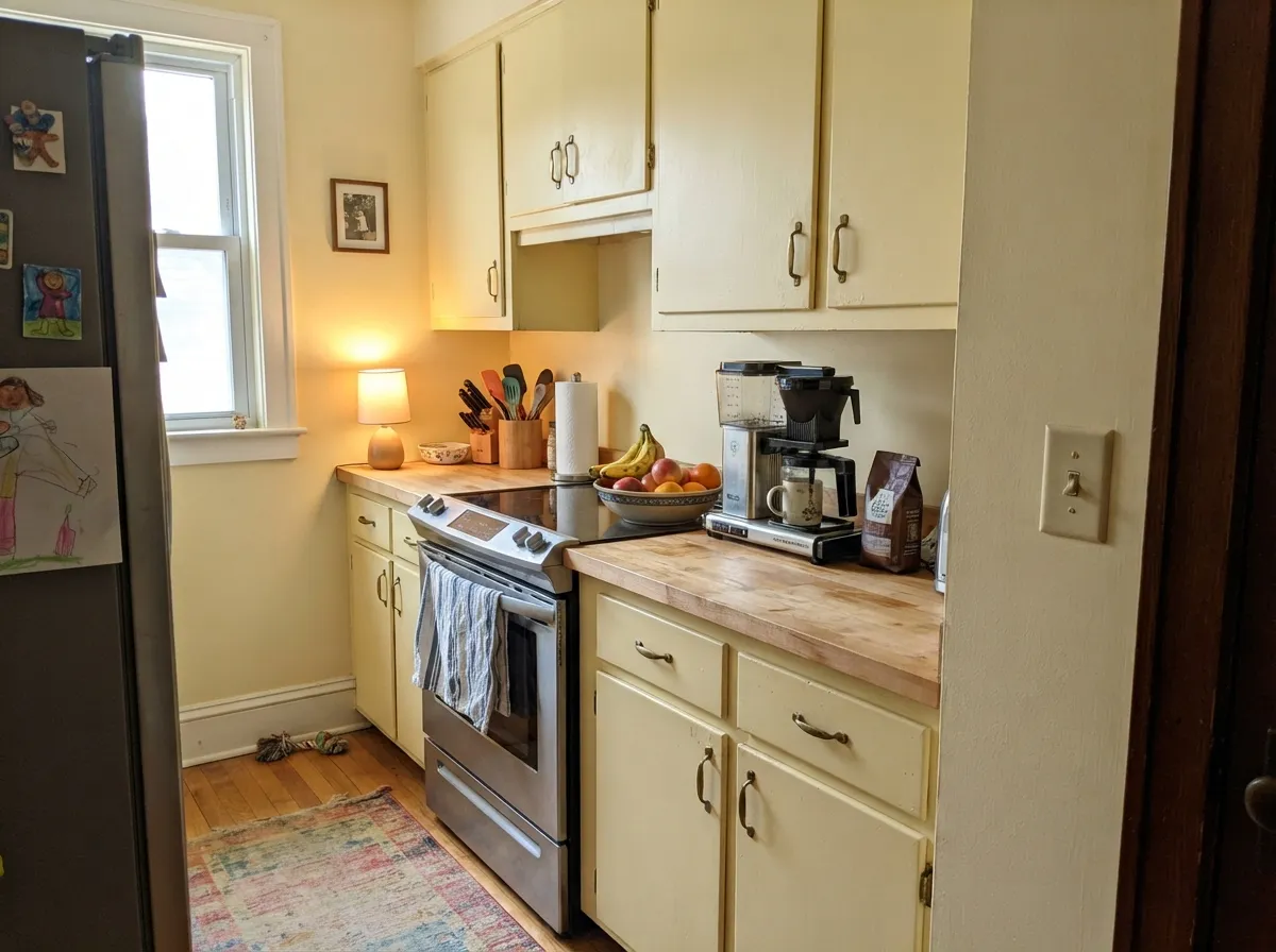
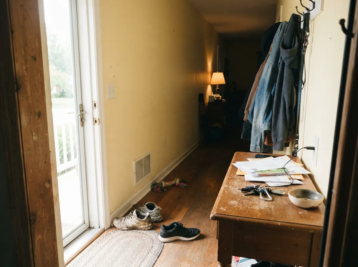
Give it real daylight, warm wood, and brass, and it does exactly the quiet-cheer job the name promises. It is at its best as a nursery or kids'-room color for parents who want warmth without a saturated yellow statement, and it works the same trick in a kitchen or breakfast nook — enough color to feel considered, little enough that it never competes with cabinets, counters, or a busy morning. In a hallway or entryway it makes a genuinely gentle first impression, softer than a stark white and friendlier than a beige.
Where It Fails
Almost every disappointed reaction to Frittata comes from one of three situations, and all three are predictable before the first coat goes on. None of them are the paint misbehaving — they are what happens when a color this pale meets the wrong light or the wrong neighbor.
Pale yellows are the shade family most likely to go sickly under cool white light — the warmth that makes Frittata pleasant drains out and what is left can read like an institutional off-white with a faint greenish cast. Warm 2700K bulbs fix this instantly; cool 4000K+ LEDs and fluorescent tubes are the actual problem, not the paint.
At LRV 86 this is one of the palest colors in Behr's yellow family, and in bright daylight it can look close to plain white until you set a true white swatch beside it. If you want a room that reads unmistakably yellow, step down to Lemon Lily or Friendly Yellow — Frittata was never built to be loud.
Pair it with a cool, bright white and the trim wins — Frittata starts to look dingy or faintly dirty by comparison, the same trap warm off-whites always fall into next to a colder white. Match the trim to a warm near-white like Behr's Milk Paint or Swiss Coffee instead, or keep walls and trim the same color at different sheens.
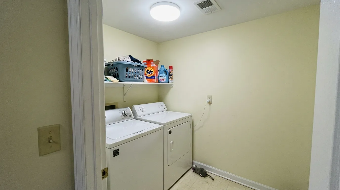
Room by Room
Soft, gender-neutral cheer without a saturated wall. Eggshell finish, warm 2700K bulbs, and a pastel accent (blue, sage, or a deeper Behr yellow on one wall) is the reliable formula.
On walls or cabinets it flatters butcher block, oak, and brass without pushing the room toward full "yellow kitchen" territory. Satin on cabinets for wipeability; keep countertops warm-toned, not cool grey stone.
Warmer than a plain white, calmer than a real yellow. Works especially well as the color that greets you before rooms branch off into bolder choices.
With warm-toned tile, brass fixtures, and a wood vanity it is genuinely pretty. With cool grey tile or chrome it can look washed-out and slightly off; test a sample against your actual fixtures first.
Too pale to carry a primary bedroom's mood on its own, but as a calm, undemanding guest-room neutral with cream bedding it works well and photographs softly under lamp light.
Behr sells Frittata across its exterior stucco and masonry lines, and full outdoor sun reads it brighter and a little more visibly yellow than it looks indoors. Pair with white or warm-toned trim; avoid cool grey shutters or a north-facing shaded elevation, where it can look flat.
Your Light Is the Risk
Real warm daylight brings out the soft egg-yolk cast without overdoing it. The most honest, most flattering read of the color.
The yellow drains out and the color can look flat, pale, even faintly sickly. Sample it in your actual room before committing.
Warms noticeably at golden hour, goes quieter and paler at flat midday light. The shift is gentle, not dramatic.
2700K warm bulbs deepen the cream nicely. Cool LEDs push it toward a dull, slightly greenish pale — swap the bulbs, not the paint.
Most complaints about Frittata are a light mismatch. Upload a photo of your actual room and see it on your walls — then ask for the same wall in north light or evening lamps before you buy a single sample.
Need It From Another Brand?
Any paint counter can custom-tint Behr M290-2 directly. If you would rather stay in one brand's own deck, these are the closest stock matches, measured as ΔE2000. Under 2 is a difference you will not see on the wall.
| Brand | Closest color | ΔE | LRV | |
|---|---|---|---|---|
| Sherwin-Williams | Glittery YellowSW 7125 · Sherwin-Williams | 2.0 | 85 | Color page → |
| Benjamin Moore | Candlelit Dinner295 · Benjamin Moore | 1.4 | 86 | Color page → |
| Valspar | Summer Morning3007-2C · Valspar | 1.4 | 86.6 | Color page → |
| PPG / Glidden | Silk SailsPPG1206-2 · PPG / Glidden | 2.6 | 85 | Color page → |
| Glidden | Yellow Acacia Bloom50YY 83/200 · Glidden | 0.7 | 83 | Color page → |
| Dutch Boy | Limon Sorbet116-2DB · Dutch Boy | 1.9 | 82 | Color page → |
Similar Behr Colors
The nearest shades to Frittata within Behr's own range, ranked by perceptual color distance — useful when you want the same look a touch lighter, darker, or warmer.
WCAG 2.1: AA is 4.5 : 1 for normal text, 3 : 1 for large text, AAA is 7 : 1.
Frittata vs the Colors You're Also Considering
Every Frittata sample board has the same rivals on it. The numbers show the real lightness gap — then it comes down to which risk you would rather live with.
Pick this if you want the slightly more visible egg-yolk warmth — side by side, Butter Yellow reads flatter and cooler.
Behr ICC-90 · LRV 86Butter YellowPick this if you want an almost identical pale cream that Behr filed as a neutral instead of a yellow — same softness, marketed as the safer trend color.
Pick this for the quieter version — Frittata's peach-cream cast never gets as loud as Butter does.
Benjamin Moore 2023-60 · LRV 90ButterPick this for a brighter, more citrus-lemon nursery yellow — Butter reads truer yellow once it's on four walls than its chip suggests.
Frittata Coordinating Colors
The rule for coordinating with Frittata: stay warm and stay pale, or commit to one clear dark note. It flatters warm whites, brass, and warm wood, and it goes quiet and slightly dingy next to anything cold — bright white trim, chrome, or blue-grey stone. These are the partners that keep it looking deliberate rather than accidental:
Frittata and the Pale-Yellow Moment
Pale, buttery yellow has had a real moment: designers and outlets from Vogue to Forbes have called "butter yellow" one of the standout color trends of the past year, KitchenAid named it a color of the year, and the shade has shown up everywhere from fashion to kitchen appliances to home exteriors. Frittata isn't marketed under that trend name, but it is Behr's own version of the same idea — a pale, warm, low-saturation cream-yellow rather than a bright statement color.
That is worth knowing both ways. It means Frittata will feel current right now, and it also means a color this closely tied to a broad, fast-moving trend carries more repaint risk than a true neutral does if the trend cools off. The upside: because it is so pale and close to white already, repainting away from it later is a much smaller job than reversing a bold, saturated yellow would be.
Frittata With Wood Tones and Floors
Warm wood is the easy pairing: oak, butcher block, and honey-toned floors sit comfortably next to Frittata because both are working the same warm side of the color wheel. It does not fight golden or orange-leaning wood the way a true gray or a cooler off-white would.
Cool, grey-washed floors are the one combination worth sampling first. Grey LVP or ashy stained wood can make Frittata's warmth look slightly out of step, in the same way any warm color drifts against a cold floor — not a hard clash, but not the seamless pairing it has with honey oak or walnut.
Three Ready Palettes Built on Frittata
A color is never alone on the wall. These are complete combinations in the 60-30-10 pattern, with the reason each one holds together. Every one opens in the visualizer.
Two pale near-neutrals plus one real pastel keeps the room gender-neutral and calm without going stark. The blue on doors or furniture gives the eye one clear accent instead of a wash of yellow.
Try this palette in your roomMilk Paint is close enough in temperature to Frittata that the wall-to-trim handoff stays seamless, so the one dark note — a navy island — reads deliberate instead of like a mismatch. Brass hardware ties it together.
Try this palette in your roomBoth trim and hallway neighbor are warm and close in value, so Frittata never has to fight a cooler white — the whole run from door to hallway stays soft and continuous.
Try this palette in your roomFrittata FAQ
Is frittata actually yellow, or basically white?
It is a real yellow on the chip, but at LRV 86 it is one of the palest yellows Behr sells — in bright daylight it can read close to a warm white until you set a true white next to it. If you want a room that unmistakably reads as yellow, size up to Lemon Lily or Friendly Yellow instead.
Is it good for a nursery?
Yes — it's arguably its best use. Soft, gender-neutral, cheerful without being saturated. Pair with warm 2700K bulbs and a pastel accent color so the room has one clear focal point instead of an all-over wash.
What white trim goes with frittata?
A warm near-white — Behr's Milk Paint or Swiss Coffee — rather than a stark, cool bright white. A cold trim white makes the walls look dingy by comparison, the same trap every soft warm color falls into next to a colder white.
Does it work in a room with no direct sun?
Carefully. In a dim, north-facing, or cool-LED-lit room the yellow can drain out and read flat or slightly sickly. Sample it on the actual wall first, and stick to warm 2700K bulbs if the room doesn't get real daylight.
Can I use it on kitchen cabinets?
Yes, in doses — an island or a hutch under white or Frittata-matched walls looks considered rather than themed. A full kitchen of pale-yellow cabinets is a bigger commitment; test a large sample against your actual countertop and hardware first.
Can I use frittata outside?
Yes — Behr offers it in exterior stucco and masonry lines, and full sun reads it brighter and more visibly yellow than it looks indoors. Pair with white or warm trim and avoid a shaded north elevation, where it can look flat.
Have you painted with Frittata?
Rate it — one tap helps the next reader decide.
Ask a Question