Butter
The pale yellow people mean when they say butter yellow, reviewed honestly: the light that keeps it soft, the afternoon that makes it loud, and what to pick instead.

Jessica has spec'd whites and neutrals for more than 300 rooms and keeps a sample wall of painted drawdowns in her studio. Every color review is checked against real reader rooms in the comments and re-tested when a formula changes. About the testing process →
- 1Jackfruit62
- 2Lemon Chiffon79
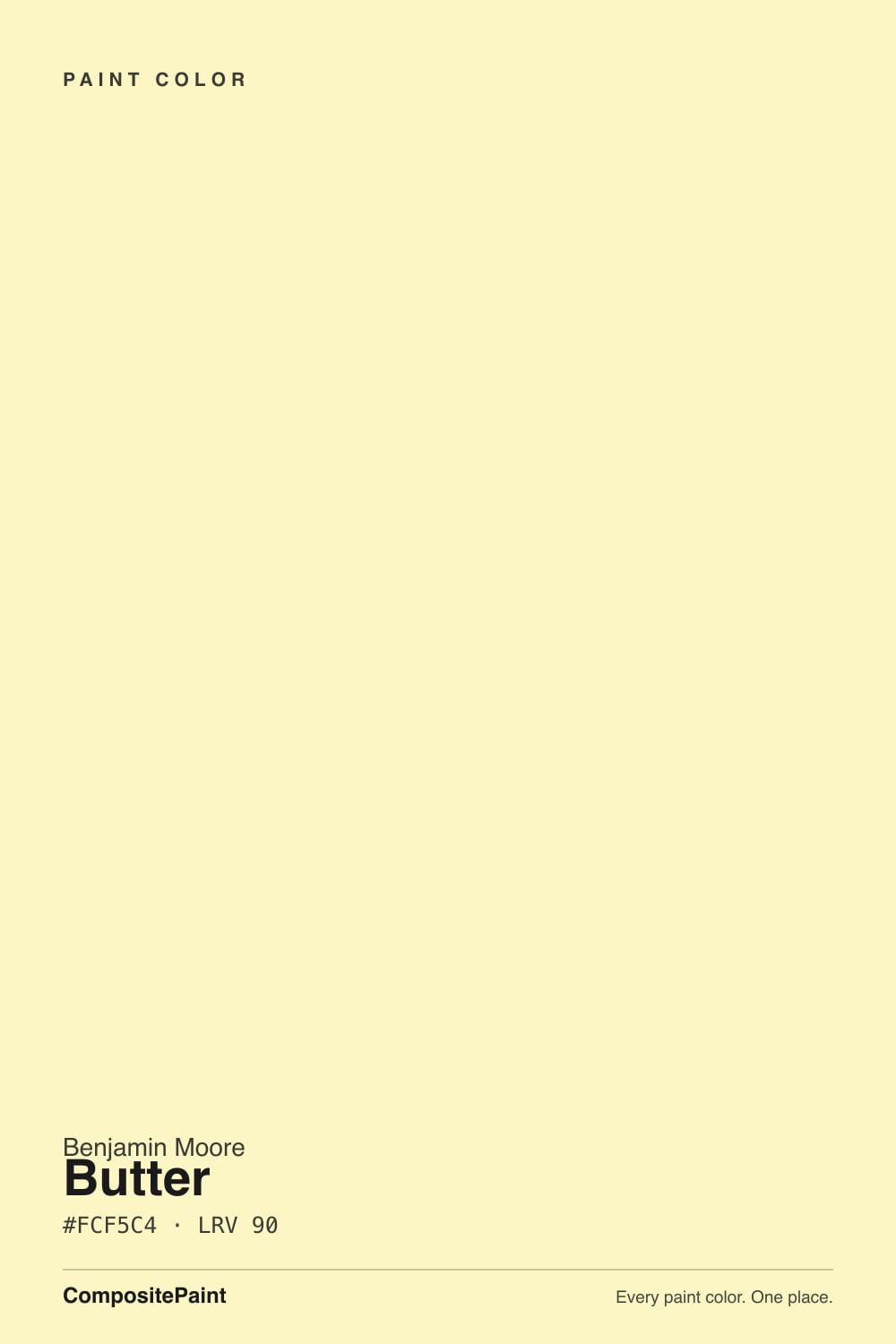
- 3Butter90
- 4Magnolia Blossom96
The Fast Verdict
Butter is the color most people are picturing when they say butter yellow: pale, warm, faintly creamy, with the golden side of yellow rather than the citrus side. At LRV 90 it is as light-reflective as a bright white, so in flat or dim light it behaves like a tinted white — and the moment direct sun lands on it, it behaves like an actual yellow. In a nursery or a north-facing room that is exactly the trick you want. In a west-facing room at four o'clock it is a different, louder color, and that surprise is behind most of its bad reviews.
Nurseries and kids' rooms that should read sunny, not sugary · north-facing rooms that need warming · kitchens with white cabinets and brass · powder rooms, laundry rooms and other small spaces with no view to lose
Your room takes hard west afternoon sun · you have honey oak trim or golden builder-beige carpet · the room runs on cool white LEDs · you actually want a neutral that reads as white
- Behaves like a warm tinted white in flat light — color without a commitment
- One of the few colors that genuinely warms a cool north-facing room
- Nursery-safe: pale enough to skip the over-stimulating bright-yellow problem
- LRV 90 keeps small and windowless rooms bright
- Loves white trim, brass, pale oak and one navy or sage note
- Afternoon sun turns it into a much louder yellow than the chip
- Cool white LEDs pull it toward celery green
- Fights honey oak trim and golden builder carpet
- Weak-hiding pale yellow — two coats minimum, and it shows roller marks
What Color Is Butter, Really?
A very light yellow with a warm, slightly golden cast and low chroma — soft rather than sharp. That warm-golden lean is the important part: it separates Butter from the citrus-side pale yellows like Light Daffodil (LRV 86), which carry a green tint you can see the moment they go up. Butter has no green in it at all. Benjamin Moore files it in the Color Preview deck, which is worth knowing given how much butter-yellow trend noise there is right now: this is a standing deck color, not a limited trend release.
At LRV 90 it is as reflective as many bright whites — Simply White sits at 91 — and that number explains almost everything people report about it. In flat daylight, in a north room, or on a cloudy day, Butter reads like a warm white with a hint of something in it; that is why some owners open the can, roll two walls and say it barely showed up. Then the sun swings around, and large areas plus direct light multiply the chroma into an unmistakable yellow room. Same paint, two different colors, and the chip only ever shows you the quiet one.
Undertone in one line: warm golden yellow — never acid green, never orange. If your wall reads celery, that is cool bulbs or green reflected off the lawn and the trees outside; if it reads gold, that is the afternoon sun. Both are the paint being honest about the room it is in.
Where It Shines
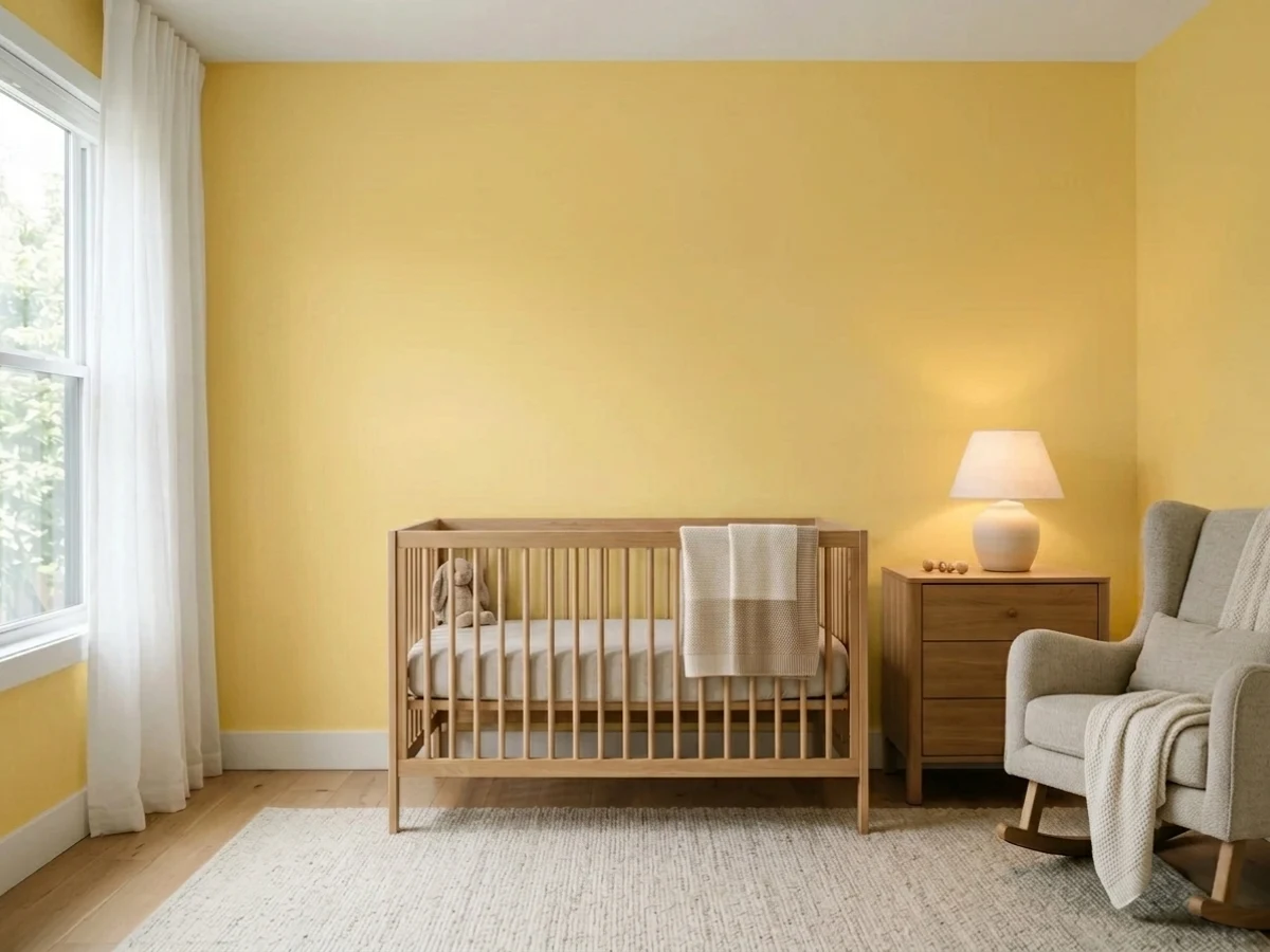
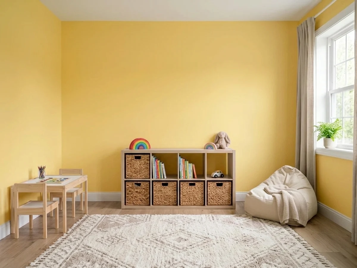
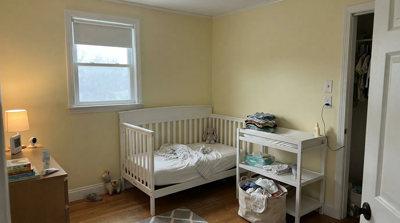
Nurseries are where this color earns its reputation, and for a good reason: it is pale enough to be a warm background instead of a stimulant, and warm enough that the room still feels sunny at seven in the morning in February. Its second home is any room that runs cool or dark — north-facing bedrooms, interior hallways, a windowless laundry room — because yellow is the one family that actively pushes back against gray light instead of surrendering to it. Give it white trim, pale oak, brass and one navy or sage note, and it looks like a decision rather than a default.
Where It Fails
Almost every regret story about Butter follows one of three scripts, and all three are predictable before the first coat. None of them are the paint's fault — but if your room matches one, sampling a bigger square will only confirm it.
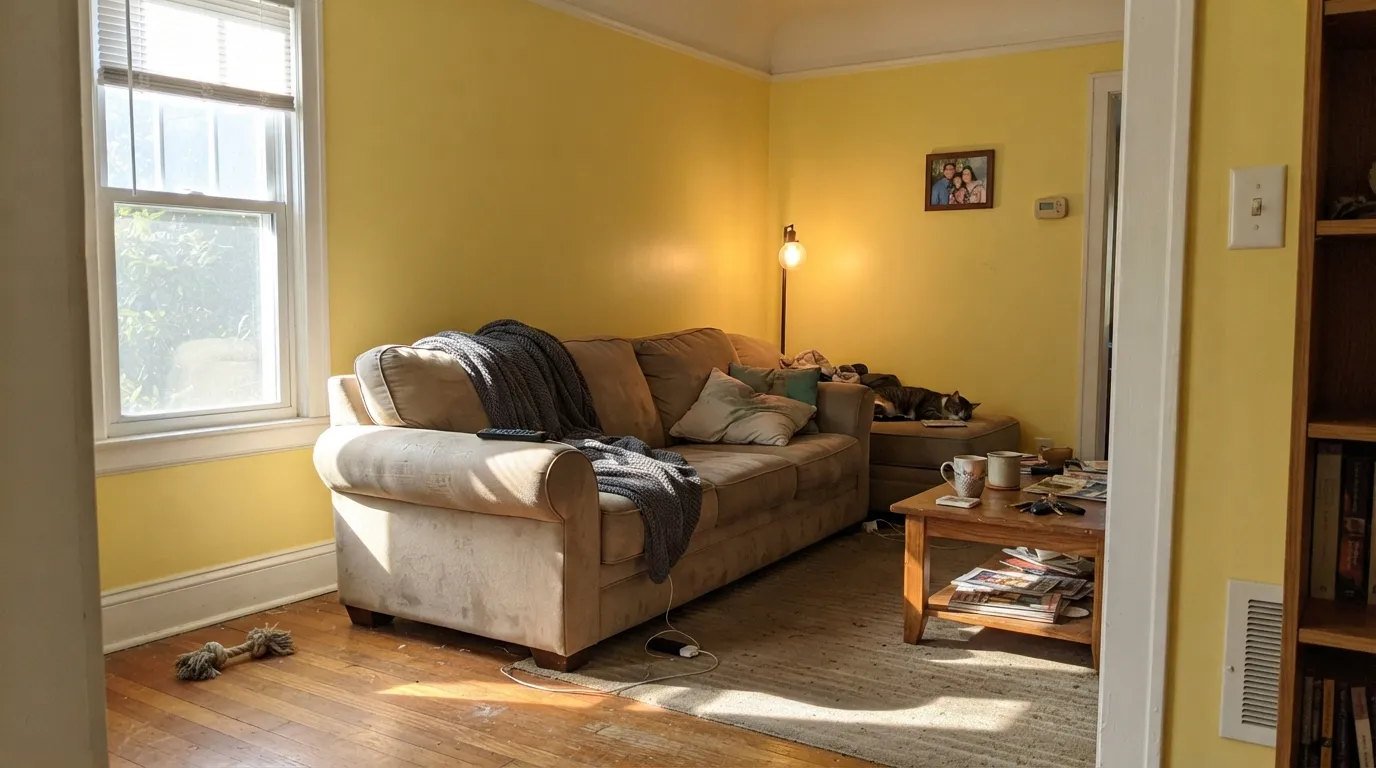
This is the number-one complaint about every pale yellow, and Butter is not exempt. A west- or strong south-facing room at 4pm takes the soft chip color and doubles it: the walls glow full lemon, and the yellow bounces onto the white trim and ceiling so the whole room reads tinted. If that room is your living room, sample it at 4pm before you buy gallons — or move the color to a room that never gets that light.
Yellow is the family most damaged by cheap 4000K and 5000K bulbs. Cool light strips the warm gold out and leaves the green edge behind, and readers describe the result as celery or hospital-green. Big rooms with green surfaces outside the window get the same effect from bounced light. Warm 2700K bulbs are part of this paint job, not an optional upgrade.
Yellow walls plus orange-golden oak trim, honey-stained doors and builder-beige carpet is the exact combination that dated a decade of houses. There is no contrast left anywhere — everything in the room is the same warm hue at a different value, and the whole thing reads Tuscan-era. Butter needs white trim and either pale, cool-toned or dark flooring to stay current.
Room by Room
Soft enough to stay a background, warm enough to make a north-facing baby room feel sunny. Use a scrubbable matte, keep the trim and ceiling a warm white, and add one calm partner — a pale blue, a sage, a blush — rather than more yellow. This is the room the color was practically written for.
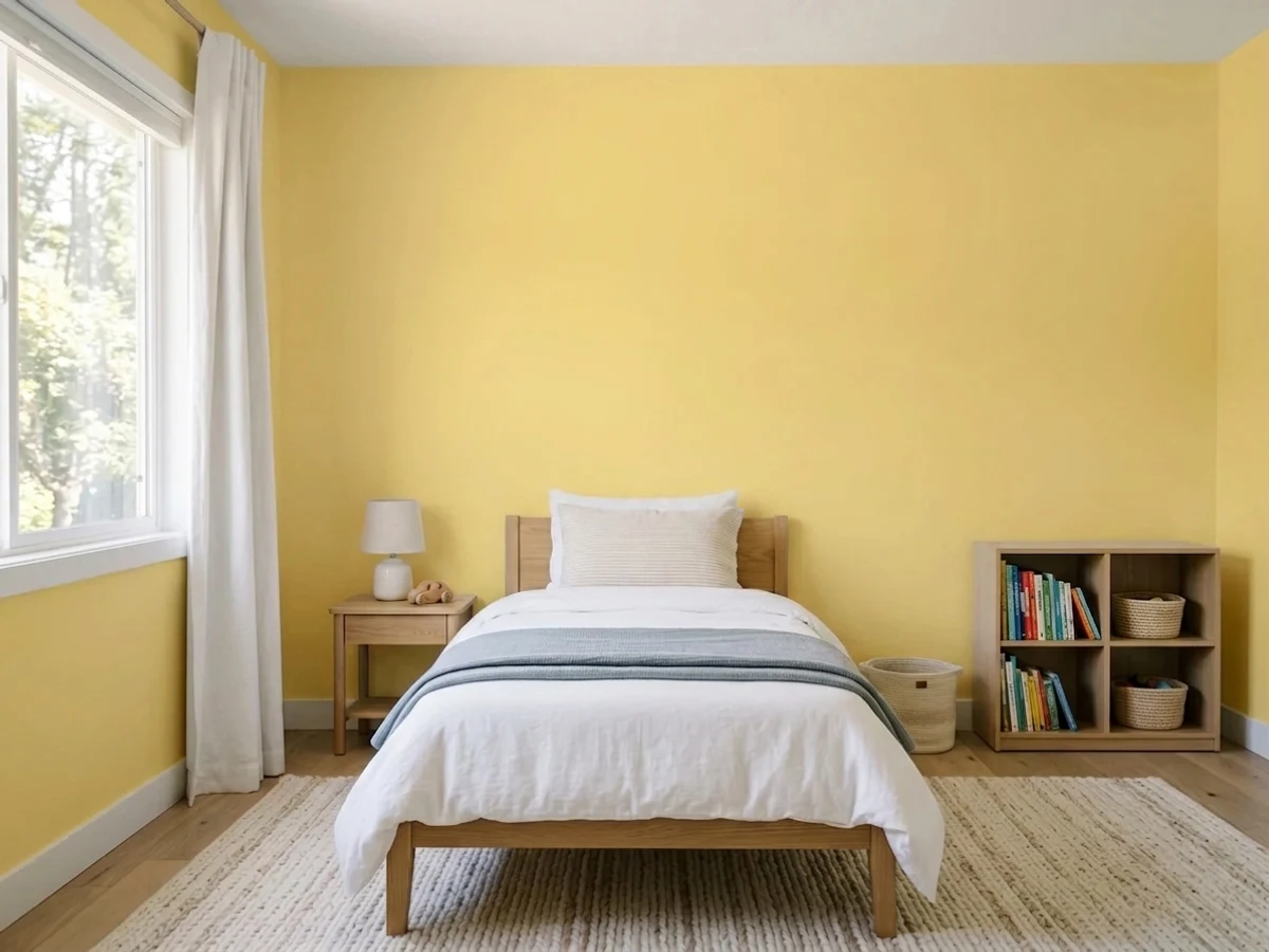
It reads cheerful without going primary-color loud, and it survives the jump from toddler to eight-year-old better than any bright yellow. In a playroom with big windows expect the afternoon version to be genuinely bright; that is usually fine in a play space and a problem in a bedroom that also has to work at bedtime.
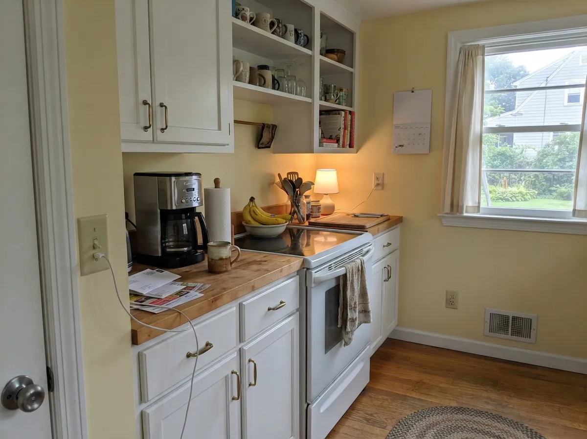
Butter walls against crisp white cabinets, brass pulls and butcher block is the classic cottage kitchen and it still works. Keep the cabinets a clean white rather than another cream, or the two warm tones will read as one muddled color. Skip it if your counters are cool gray marble — yellow and gray-blue stone argue.
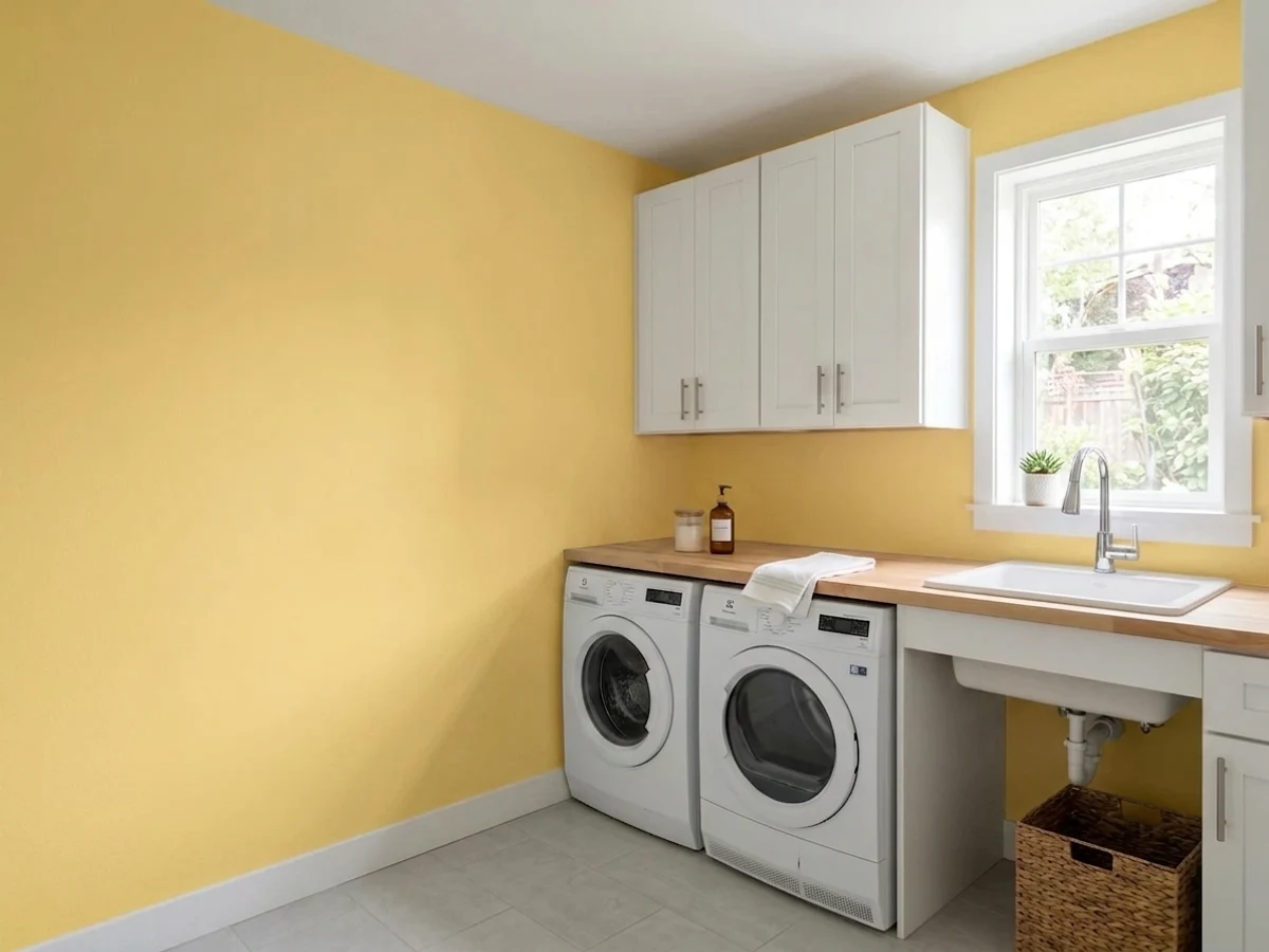
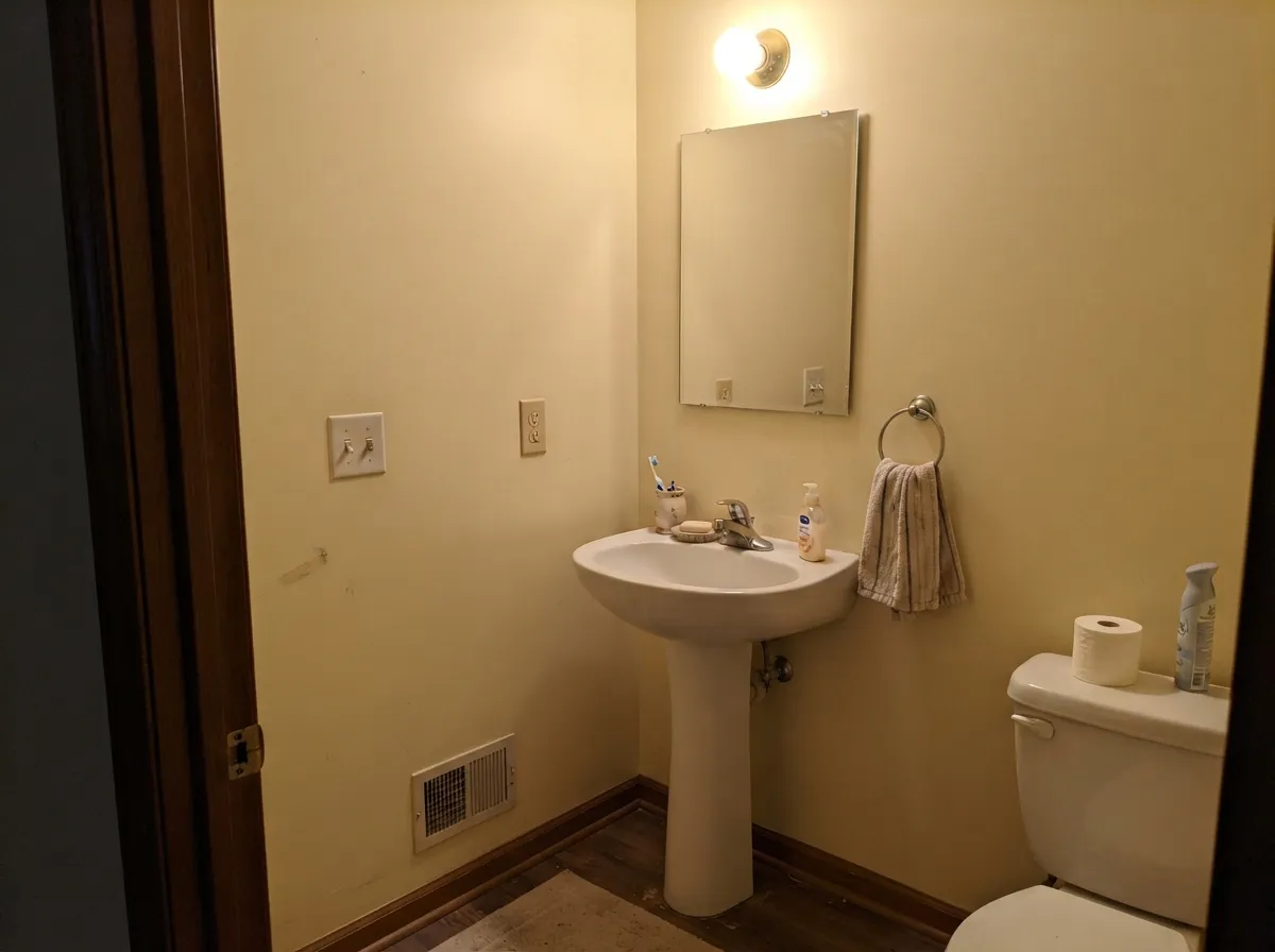
Small rooms with no view to protect are where a color like this costs nothing to try. A windowless powder room in Butter under warm bulbs feels lit rather than closed in, and a laundry room in it is simply a nicer place to fold clothes. Satin or eggshell for the wipe-downs.
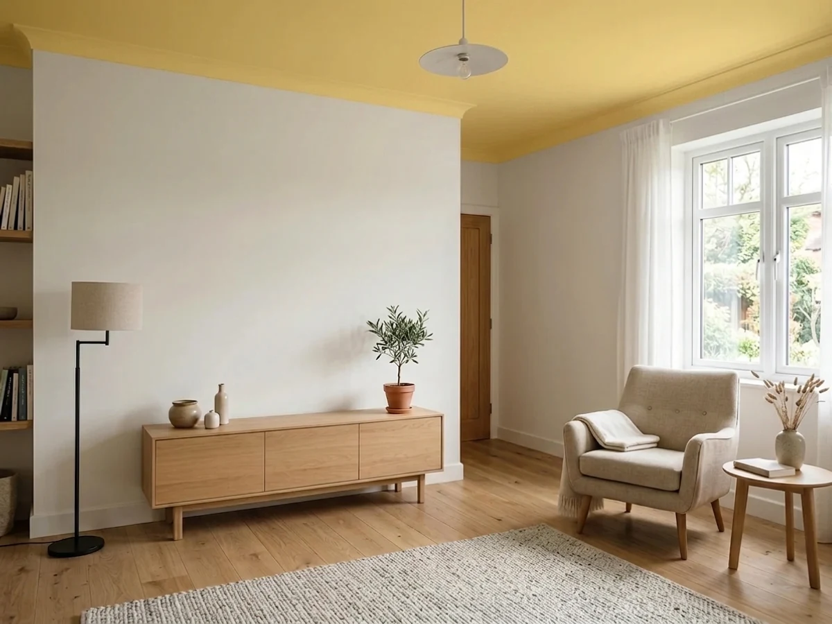
In a north- or east-facing living room it is warm and quietly old-fashioned in a good way. In a west-facing one it becomes the loudest thing in the house every afternoon. The floors matter as much as the light here: white oak, walnut, or a big rug over honey oak.
Benjamin Moore does not offer Butter as an exterior color; it is an interior formula. A pale yellow this light also chalks out to near-white in full sun from the street, which is not what anyone buying a yellow house wants. Pick from the exterior deck instead.
Your Light Is the Risk
Cool gray daylight cancels the loud side and leaves a soft glow. The room yellow was invented for.
From about 3pm it goes full lemon and casts yellow onto white trim. Sample at that hour, not at noon.
Warm butter at breakfast, near-white by midday, gold again at golden hour. It moves more than most pale colors.
2700K deepens it to a cozy cream. Cool 4000K LEDs drain the gold and leave a green edge — change bulbs, not paint.
Most complaints about Butter are a light mismatch. Upload a photo of your actual room and see it on your walls — then ask for the same wall in north light or evening lamps before you buy a single sample.
Need It From Another Brand?
Any paint counter can custom-tint Benjamin Moore 2023-60 directly. If you would rather stay in one brand's own deck, these are the closest stock matches, measured as ΔE2000. Under 2 is a difference you will not see on the wall.
| Brand | Closest color | ΔE | LRV | |
|---|---|---|---|---|
| Sherwin-Williams | Glittery YellowSW 7125 · Sherwin-Williams | 4.9 | 85 | Color page → |
| Behr | Natural LightP310-2 · Behr | 1.2 | 89 | Color page → |
| Valspar | Summer Morning3007-2C · Valspar | 3.0 | 86.6 | Color page → |
| PPG / Glidden | JoyfulPPG1107-2 · PPG / Glidden | 1.9 | 84 | Color page → |
| Glidden | Lemon Ice56YY 86/241 · Glidden | 2.5 | 86 | Color page → |
| HGTV Home by Sherwin-Williams | Lemon Mint LeafHGSW 1227 · HGTV Home by Sherwin-Williams | 3.3 | 82 | Color page → |
Similar Benjamin Moore Colors
The nearest shades to Butter within Benjamin Moore's own range, ranked by perceptual color distance — useful when you want the same look a touch lighter, darker, or warmer.
WCAG 2.1: AA is 4.5 : 1 for normal text, 3 : 1 for large text, AAA is 7 : 1.
Butter vs the Colors You're Also Considering
Every Butter sample board has the same rivals on it. The numbers show the real lightness gap — then it comes down to which risk you would rather live with.
Pick this when you want the yellow to actually show up, and you shop Benjamin Moore.
Behr ICC-90 · LRV 86Butter YellowPick this if you want the trend without the color — Behr's version is pale enough to pass for a warm white on most walls.
Pick this for a nursery or any room where you want the yellow to stay a whisper in flat light.
Benjamin Moore HC-4 · LRV 71Hawthorne YellowPick this for a deeper, more historic yellow that still reads as color at night and in dim rooms.
Butter Coordinating Colors
The rule for coordinating with Butter: one warm white on the trim, one calm partner, and nothing else warm-golden. It has plenty of warmth on its own, so a second cream or a beige next to it just muddies both. What it wants is either a quiet cool note to balance it or a genuine dark to anchor it. These are the partners that keep showing up in rooms that work:
The Butter Yellow Trend, and What Is Left of It
Butter yellow was the color story of 2025. It ran through fashion first, then appliances — KitchenAid named a butter shade its 2025 color of the year — and by that summer every paint brand had a butter-yellow edit and every design magazine had a butter-yellow feature. Then it did what trend colors do: designer surveys for 2026 moved on to deeper, moodier golds and ochres, and the trend pieces started running headlines about butter yellow being over.
The useful version of that story is narrower than the headlines. What ran its course was butter yellow wall-to-wall in kitchens and big open living spaces — the peak-trend application. What survived, and still shows up in 2026 designer palettes, is exactly the placement this review recommends: a nursery, a kids' room, a powder room, a study, one alcove, paired with a richer color rather than left to carry a whole floor.
Butter itself is not really a trend product. It sits in Benjamin Moore's standing Color Preview deck rather than in a limited trend palette, which is the practical reason to prefer it over a color launched into the moment: it will still be mixable at the store in ten years when you need a touch-up quart.
Yellow in a Nursery: The Myth, and the Part That Is True
If you have searched nursery colors at all, you have hit the claim that babies cry more in yellow rooms. It is worth knowing where that came from: a color consultant said it in 1989, the line got repeated in decorating columns for thirty years, and no study ever supported it. It is folklore, not research, and it should not decide your nursery.
There is a real observation buried under it, though. Saturated, high-chroma yellow is genuinely tiring to look at — it is the brightest hue on the wheel, and a small room painted in a strong one is visually loud whether you are eight weeks old or forty. That is an argument against Banana Yellow, not against a pale, low-chroma yellow like this one.
So the practical nursery advice: keep the yellow pale, keep the trim a warm white, use a scrubbable matte on the walls, and put 2700K bulbs in the lamps so the color stays golden at 2am feedings instead of going green. Then check the room at the hour it gets the most sun. If a west window turns those walls lemon-bright every afternoon during naptime, that is the one real reason to choose a different room or a different color.
Three Ready Palettes Built on Butter
A color is never alone on the wall. These are complete combinations in the 60-30-10 pattern, with the reason each one holds together. Every one opens in the visualizer.
Yellow and sky blue is the oldest nursery pairing there is, and it works here because the yellow is pale enough to stay a background. White Dove matters: a bright cold trim white would make the walls look tinted, while a warm white keeps the whole room in one temperature. Keep the blue to furniture or a single alcove, not a second wall.
Try this palette in your roomCabinets need to be clearly whiter than the walls or the kitchen turns into one soft yellow blur — Simply White at LRV 91 reads as white next to Butter at 90 because it has no color in it, not because it is lighter. The navy island supplies the one dark note the scheme needs, and both ends of it love brass.
Try this palette in your roomThe reason this outlasts a themed room: neither color is childish on its own. Deep slate blue on the built-ins gives the yellow something adult to lean on, so at fourteen the room needs new bedding, not new paint.
Try this palette in your roomButter FAQ
Is Butter too yellow for a nursery?
No — this is the pale end of the family, and the old warning about yellow nurseries was aimed at bright, saturated yellow, not this. The claim that babies cry more in yellow rooms traces back to a single color consultant's statement in 1989 and has never been backed by real research. What is true is that a strong yellow is visually busy in a small room. Butter is not strong; the only thing to watch is the afternoon-sun version of it in a west-facing room.
What trim white goes with Butter?
A warm white — White Dove or Cloud White (LRV 85) in semi-gloss. A bright, cool white like Chantilly Lace (LRV 92) makes the walls read distinctly tinted next to it, which is fine in a kitchen where you want cabinets to pop, and wrong in a bedroom or nursery where you want the room to feel like one temperature.
Will Butter look green on my walls?
Only in cool light. The paint itself has no green in it — it leans golden. The green appears when 4000K or 5000K LEDs strip the warmth out, or when a big window bounces summer lawn and tree light back onto the wall. Warm 2700K bulbs fix the first cause; a sample board held near the window in the afternoon tells you about the second.
Does Butter work with honey oak floors?
It is the one real clash. Golden oak, orange-stained trim and beige carpet sit in the same warm hue family as the paint, so nothing in the room has any contrast and the whole thing reads dated. If the oak is only on the floor, white trim and a large light rug carry it. If the trim and doors are oak too, pick a color from another family.
How many coats does Butter need?
Two, and be honest about your prep. Pale yellows are weak-hiding — there is no depth in the color to disguise patched drywall, roller lap marks or a previous color bleeding through — so a tinted primer over anything patchy is cheaper than a third finish coat. Keep a wet edge; light yellows show flashing more than any neutral.
Can I paint the outside of my house Butter?
No. Benjamin Moore does not offer it as an exterior color, and a yellow this pale washes out to near-white in full sun anyway. If you want a buttery exterior, choose from the exterior deck at a deeper value — outside, colors read a full step lighter than they do on your wall at home.
Have you painted with Butter?
Rate it — one tap helps the next reader decide.
Ask a Question