Butter Yellow
Butter Yellow, reviewed honestly: how pale a "yellow" trend color can get before it disappears, the light where it glows, and what to pick instead.

Jessica has spec'd whites and neutrals for more than 300 rooms and keeps a sample wall of painted drawdowns in her studio. Every color review is checked against real reader rooms in the comments and re-tested when a formula changes. About the testing process →
- 1Agreeable Gray60
- 2Pale Oak69
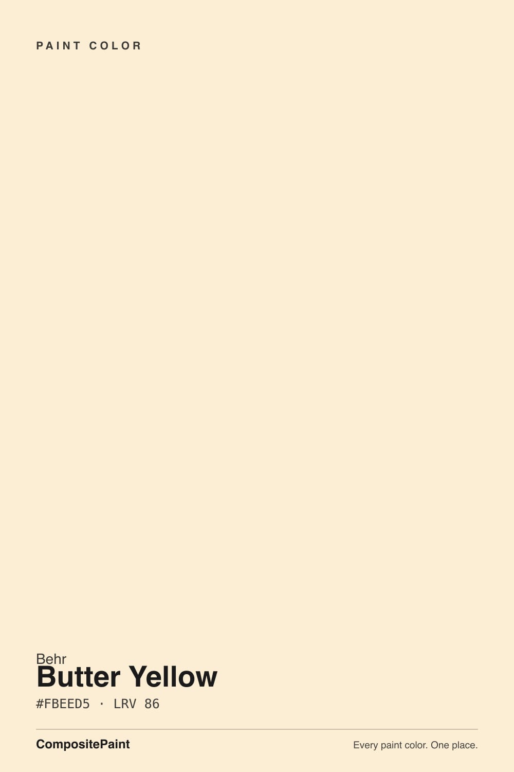
- 3Butter Yellow86
- 4Lightning White92
The Fast Verdict
Butter Yellow is Behr's answer to the biggest kitchen-and-nursery color trend of the last two years, and the honest surprise is how quiet it actually is. At LRV 86, Behr itself files ICC-90 under its White color family, not Yellow — that alone tells you the whole story. Give it warm daylight or a 2700K bulb and it glows gently golden on cabinets and walls; put it under cool LEDs or in a shaded north room and it settles into something close to a plain warm white. If you came from Pinterest expecting a saturated golden kitchen, sample it first — this is the pale end of the trend, not the loud end.
Kitchen cabinets riding the butter-yellow trend · nurseries and kids' rooms · warm, sunlit breakfast nooks · anyone who wants yellow's warmth without yellow's commitment
You pictured the saturated golden kitchens from Pinterest · your room runs on cool LEDs with little daylight · you want real visible color, not a whisper of it · your trim is a true cool white you don't want to repaint
- Warm, welcoming yellow without a bold color's commitment
- Rides a real, still-strong 2025–2026 design trend in kitchens and nurseries
- High LRV (86) bounces light well in small or dim rooms
- Genuinely harmonious with honey oak and warm wood — rare for a trend color
- Easy to use in doses (island, accent wall) as well as whole-room
- So pale it can read as plain off-white in cool light — Behr itself files it as White, not Yellow
- Nowhere near the saturated golden kitchens most buyers picture from Pinterest
- Needs warm bulbs or real daylight to show its identity; cool LEDs flatten it
- Reads dirty, not deliberate, next to a true cool white trim
What Color Is Butter Yellow, Really?
A warm, creamy pale yellow — but the word "pale" is doing more work here than in most reviews. Behr's own color library files ICC-90 under the White family, not Yellow, and the restraint is the whole design idea: instead of a saturated golden shade, Butter Yellow is built to read as a soft warm white with a whisper of butter, the same way a good greige reads as gray with a whisper of warmth. That restraint is exactly why it fits so easily into the current trend — it behaves like a safe neutral that happens to have a name.
At LRV 86 it reflects almost as much light as a true white, and it shows in practice: put it beside Benjamin Moore Cream (LRV 81, hex #FBEACD — nearly identical to Butter Yellow's own #FBEED5) and the two brands have essentially converged on the same idea independently. On a wall or cabinet, that paleness means it brightens a dim room the way a white would, but keeps just enough warm cast to avoid feeling sterile or clinical.
Undertone in one line: warm yellow, zero green, zero orange. If your sample looks beige, gray, or plain off-white, that is your room's light flattening it out — not the paint failing. This color needs warmth to show up at all.
Where It Shines
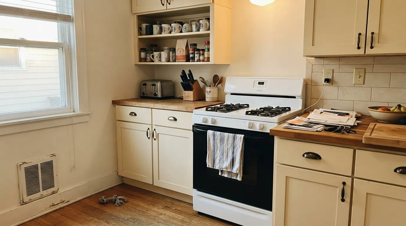
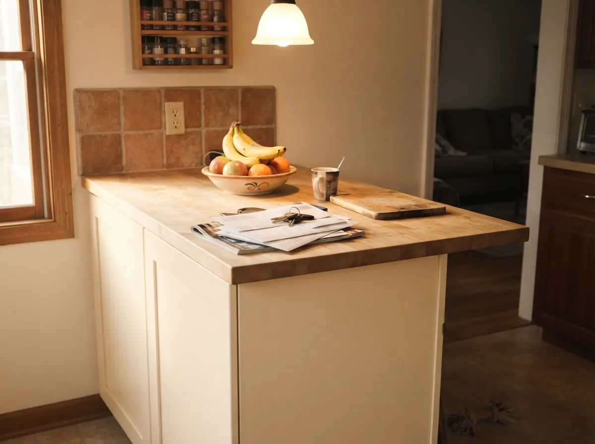
Butter Yellow is riding a real cultural moment, not a manufactured one: buttercream-toned dresses were everywhere at the 2025 Met Gala, KitchenAid named an appliance color "Butter," and design writers are now calling the shade a settled kitchen-cabinet staple heading into 2026 rather than a passing fad. In its own best light — south or west daylight, or a warm lamp at night — the color earns that reputation, glowing gently golden against brass hardware, wicker baskets, and walnut without ever feeling loud. Its second-best job is the small commitment: an island, open shelving, or a nursery accent wall, where the paleness that limits it as a bold statement becomes an asset.
Where It Fails
Almost every disappointed review of Butter Yellow comes down to the same mismatch: expecting more color than an LRV 86 paint can deliver. None of these are the paint's fault — but if your plan matches one of them, sample big before you commit a whole kitchen.
At LRV 86 this is one of the palest colors marketed as "yellow" that we've reviewed — closer in strength to a cream white than the saturated golden cabinets filling up mood boards. If you want that loud, unmistakably-yellow kitchen, Butter Yellow reads too restrained; you need a deeper, more chroma-heavy yellow instead.
North daylight or 4000K-plus bulbs cancel exactly the warmth that makes this color read as yellow, and what's left is a flat, faintly dingy off-white. Readers who sample it under a warm showroom light and then paint a cool-lit kitchen report the color "vanishing" on the wall. Fix: warm 2700K bulbs, or test the actual room before buying five gallons.
Pair Butter Yellow cabinets or walls with a crisp cool white trim and the trim wins the contrast, making the yellow look faintly dirty instead of deliberate — the same mismatch White Dove owners hit when they trim in a brighter white. Keep the trim warm, or paint the trim the same color in a higher sheen.
Room by Room
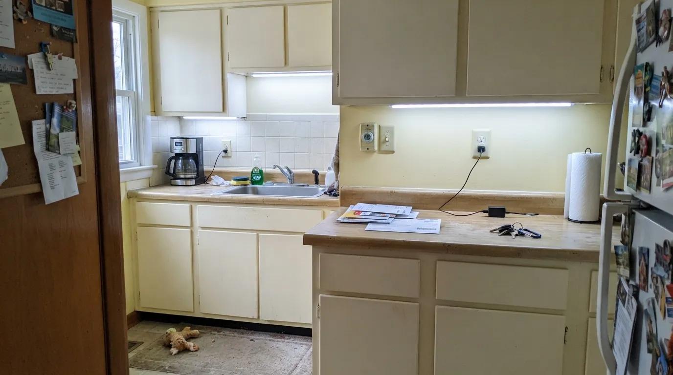
Cabinets in Marquee satin, brass hardware, walnut or butcher-block counters: this is the trend photo. Warm white walls keep the contrast gentle rather than crisp.
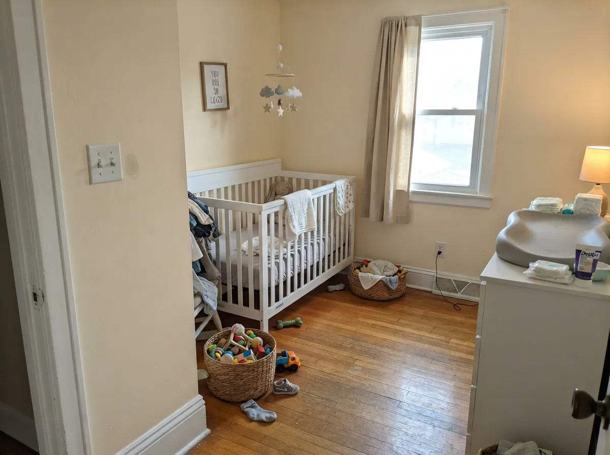
Soft enough to be gender-neutral, warm enough to feel cheerful without the intensity of a bolder yellow. Eggshell for durability against handprints.
East-facing morning sun is one of this color's best moments; it turns genuinely buttery for a couple of hours and settles into a soft warm neutral the rest of the day.
With warm stone, wood vanities, and brass it is charming and cottage-like. With cool gray tile or marble it argues the same way any warm-white-adjacent color would — sample first.
Because it sits so close to a warm white, Butter Yellow trim under sage, taupe, or pale-oak walls reads as a soft, deliberate warmth instead of stark white. Semi-gloss, and keep it consistent with any nearby whites.
Strong direct sun brings out a gentle cottage-yellow on siding and trim; the shaded side of the same house can read almost plain white. Walk the whole exterior with a sample before committing.
Your Light Is the Risk
Warm sun brings the butter forward without pushing it toward orange. The color's best, most honest moment.
Cool gray daylight cancels the yellow almost entirely, leaving a flat, faintly dingy near-white. Test here first if this is your room.
Buttery and warm at the sun hours, quiet near-white the rest of the day. The swing is bigger than most colors this pale.
2700K bulbs: soft golden glow, the color at its most "butter." Cool white LEDs: flat and washed-out — swap the bulb before you blame the paint.
Most complaints about Butter Yellow are a light mismatch. Upload a photo of your actual room and see it on your walls — then ask for the same wall in north light or evening lamps before you buy a single sample.
Need It From Another Brand?
Any paint counter can custom-tint Behr ICC-90 directly. If you would rather stay in one brand's own deck, these are the closest stock matches, measured as ΔE2000. Under 2 is a difference you will not see on the wall.
| Brand | Closest color | ΔE | LRV | |
|---|---|---|---|---|
| Sherwin-Williams | Lemon DropSW 7122 · Sherwin-Williams | 2.2 | 87 | Color page → |
| Benjamin Moore | Pearly Gates190 · Benjamin Moore | 1.3 | 82 | Color page → |
| Valspar | Milk and HoneyT546 · Valspar | 1.9 | 86 | Color page → |
| PPG / Glidden | Soft CreamPPG1205-2 · PPG / Glidden | 3.2 | 85 | Color page → |
| Glidden | Summer Haze Light44YY 87/118 · Glidden | 1.6 | 87 | Color page → |
| Dutch Boy | Carnival Crème111-1DB · Dutch Boy | 2.2 | 86 | Color page → |
Similar Behr Colors
The nearest shades to Butter Yellow within Behr's own range, ranked by perceptual color distance — useful when you want the same look a touch lighter, darker, or warmer.
WCAG 2.1: AA is 4.5 : 1 for normal text, 3 : 1 for large text, AAA is 7 : 1.
Butter Yellow vs the Colors You're Also Considering
Every Butter Yellow sample board has the same rivals on it. The numbers show the real lightness gap — then it comes down to which risk you would rather live with.
Pick this if you're already committed to Behr, or want the slightly higher LRV, whiter-leaning version.
Benjamin Moore 2159-60 · LRV 81CreamPick this if your painter works in Benjamin Moore — the two colors are nearly identical twins across brands.
Pick this for the palest, quietest version of the same warm family.
Sherwin-Williams SW 7012 · LRV 81CreamyPick this for visibly more warmth and body — it won't wash out as easily in cool light.
Nice Cream OR-W4 at #FBEED2 and LRV 86 is the closest Behr neighbor and is effectively interchangeable on a wall. Honied White YL-W03 at #FCEFD2 and LRV 87 is a touch brighter and slightly more yellow. Popcorn Ball 320E-1 at LRV 88 is the lightest of the group and reads a little less saturated. Antique Ivory ICC-40 at #F9ECD3 and LRV 85 is a shade deeper and quieter, which suits a room where the sun is already doing the work. Frosty Melon P220-1 at #FCEFD8 leans faintly pink-cream rather than yellow.
Across brands, Diamond Vogel Capetown Cream 0964 at deltaE 1.28, Farrow and Ball Tallow No. 203 at deltaE 1.3, and Benjamin Moore Pearly Gates 190 at deltaE 1.33 are all visually identical in normal room light. Sherwin-Williams Lemon Drop SW 7122 at deltaE 2.17 is very close, sample first. PPG Soft Cream PPG1205-2 at deltaE 3.23 is close but visibly different side by side.
Butter Yellow Coordinating Colors
Because it behaves like a warm white more than a bold yellow, Butter Yellow pairs with nearly the same list a cream white would: brass, wicker, walnut, and warm neutrals. Keep trim warm, and let one saturated accent — terracotta, sage, or navy — do the color work Butter Yellow is too gentle to do alone. These are the partners that keep showing up in real rooms:
The Butter Yellow Trend — And Why This Is Its Palest Version
Butter yellow had a real cultural moment, not just a paint-store one: buttercream-toned dresses were everywhere at the 2025 Met Gala, KitchenAid named an appliance color "Butter," and by 2026 design writers were describing the shade as a settled kitchen-cabinet staple rather than a passing fad — coverage flagged it as a color that keeps showing up in 2026 kitchens and beyond. Behr did not make it the brand's official Color of the Year; that title went to Rumors, a deep ruby red, for 2025. ICC-90 rode the wave anyway, and its Home Depot ratings — 4.8 out of 5 across several product lines — show real buyers are happy with what they got.
What's worth knowing before you buy: this is the quietest version of the trend that exists. Most of the styled butter-yellow kitchens circulating online use a noticeably more saturated, golden yellow — Behr's own ICC-90 sits pale enough that the brand classifies it under White, not Yellow, in its own color library. That's not a flaw so much as a different promise: this is warmth with training wheels, not a color commitment.
Butter Yellow With Wood Tones and Floors
This is one of the rare trend colors that actually gets along with honey oak. Yellow and orange sit next to each other on the color wheel, so golden or honey-toned oak floors and trim read as a family with Butter Yellow walls or cabinets instead of fighting them — the opposite of what happens when a cooler trend color like gray or mauve meets the same floor. Walnut and darker woods work too, giving the pale yellow something to contrast against instead of blending straight into it.
The one floor combination worth sampling first is cool white oak or gray-washed wood: the temperature mismatch can make the yellow read slightly muddy rather than fresh. It is rarely a dealbreaker — warm hardware and a jute or wicker accent usually settle it — but a small test board next to the actual floor is worth the five minutes before committing a whole kitchen.
Three Ready Palettes Built on Butter Yellow
A color is never alone on the wall. These are complete combinations in the 60-30-10 pattern, with the reason each one holds together. Every one opens in the visualizer.
The trend photo in three colors: a warm white wall keeps the cabinets from having to fight for contrast, and one terracotta accent gives the room the depth Butter Yellow is too pale to provide on its own.
Try this palette in your roomGender-neutral and gentle: two soft warm neutrals plus one muted green accent reads botanical, not themed, and none of the three colors is loud enough to feel like a decorating choice a five-year-old will outgrow.
Try this palette in your roomUses Butter Yellow the way its own White-family listing suggests it wants to be used: as a warm, buttery alternative to bright trim white under a taupe wall. The navy door supplies the one dark note the scheme needs.
Try this palette in your roomButter Yellow FAQ
Is Butter Yellow actually yellow, or basically an off-white?
Both, depending on the light. At LRV 86, Behr itself files ICC-90 under its White color family rather than Yellow — that alone tells you how pale it is. In warm daylight or under 2700K bulbs it reads as a soft, buttery warmth; in cool north light or under cool LEDs, most of that yellow washes out and it settles close to a plain warm white.
Should I paint a whole kitchen in it, or just the island?
Either works, and both are common. Whole cabinets in Marquee satin give the full trend look; an island-only or open-shelving treatment under cream or white walls is the lower-commitment version, and it is genuinely charming — the paleness that limits it as a bold statement makes it easy to use in doses.
What trim white goes with Butter Yellow?
A warm white — White Dove or Swiss Coffee — not a bright, cool white like Chantilly Lace. A cool trim white wins the contrast and makes the yellow look faintly dirty instead of deliberate. Painting the trim the same color in semi-gloss is the safest move of all.
Will it look different in a north-facing room?
Yes, more than most colors this pale. North daylight and cool bulbs cancel the warmth that makes it read as "butter" in the first place, leaving something closer to a flat off-white. Sample it in that actual room before buying, and plan on warm 2700K bulbs if you commit.
Is butter yellow going out of style?
Every color trend eventually cools off, and this one has held on for two-plus years now — long enough that design writers are calling it a settled kitchen-cabinet staple rather than a passing fad heading into 2026. Because Behr's version is this restrained (basically a warm white with a yellow whisper), it carries less repaint risk than a saturated golden yellow would if the trend does fade.
Does it work with honey oak floors?
Better than almost any other trend color right now. Yellow and orange sit next to each other on the color wheel, so honey or golden oak floors and trim read as a family with Butter Yellow rather than a clash — the opposite problem colors like gray or mauve run into over the same floor. Cool white oak or gray-washed floors are the one pairing worth sampling first.
Have you painted with Butter Yellow?
Rate it — one tap helps the next reader decide.
Ask a Question