Hawthorne Yellow
The historic gold that keeps outliving trendier yellows, reviewed honestly: the light it needs, the light that turns it mustard, and the ceiling trick nobody talks about.

Jessica has spec'd whites and neutrals for more than 300 rooms and keeps a sample wall of painted drawdowns in her studio. Every color review is checked against real reader rooms in the comments and re-tested when a formula changes. About the testing process →
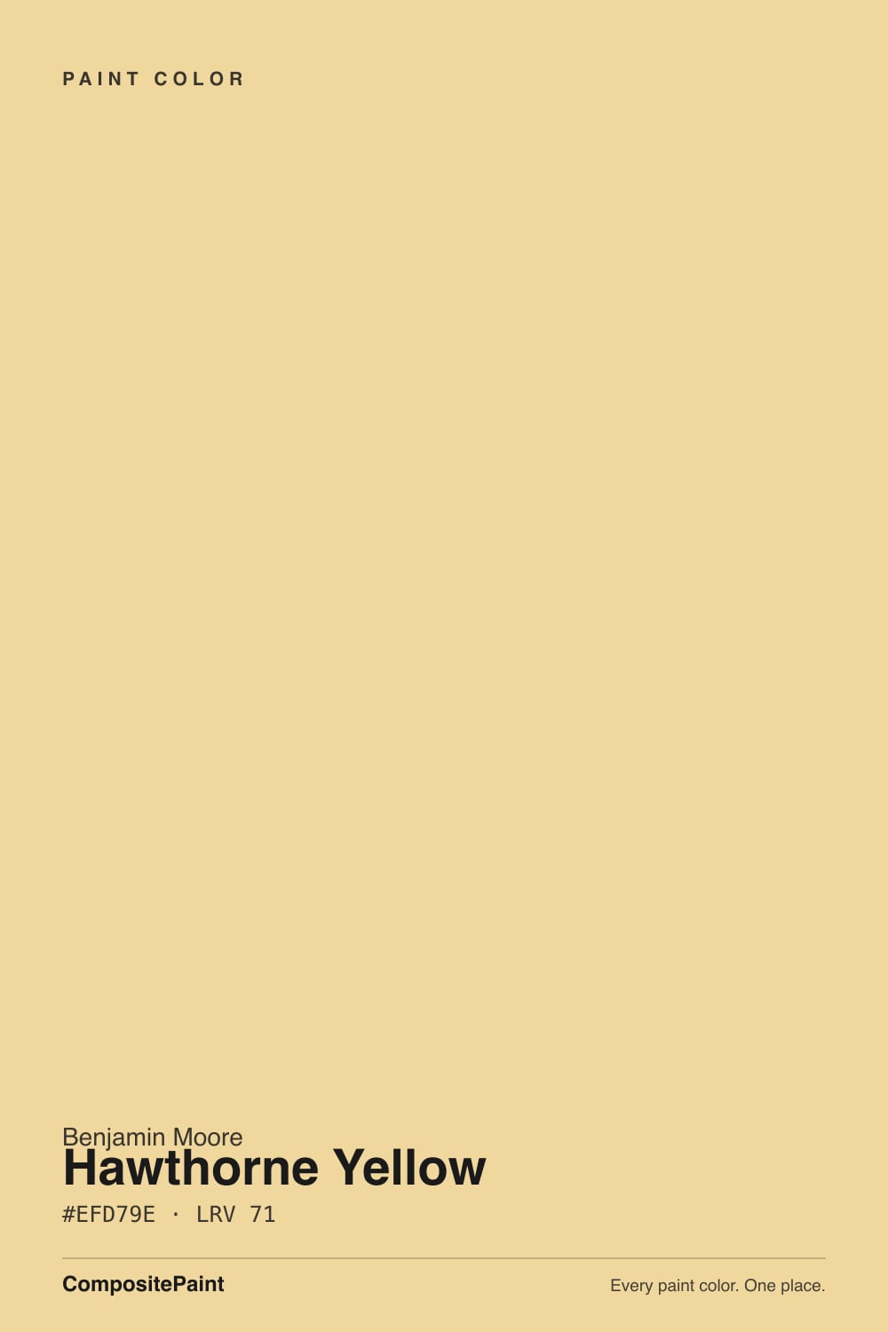
- 1Honey Tea52
- 2Jackfruit62
- 3Hawthorne Yellow71
- 4Lemon Chiffon79
- 5Frittata86
The Fast Verdict
Hawthorne Yellow is what people mean when they say they want a yellow room and not a nursery. It is a warm, dusty gold with a gray-green softener underneath, so it lands closer to late-afternoon sun on old plaster than to a highlighter. Give it south or east light and it is one of the happiest colors Benjamin Moore makes. Give it a dim north room and cool LED bulbs and that same softener turns sour — this is a color that lives or dies by your windows.
South- and east-facing kitchens · dining rooms used at night · ceilings that should glow instead of glare · entry halls with real daylight · colonial and farmhouse exteriors
Your room faces north and stays dim · your bulbs are 4000K or cooler · you want yellow you can barely see · your floors and trim are already honey oak
- Historic gold that reads grown-up, not crayon-bright
- Turns a south or east room into permanent morning
- One of the few yellows that actually behaves on a ceiling
- Deepens to a flattering amber under warm bulbs and candlelight
- Proven outside — the classic colonial yellow house
- Cool north light and 4000K LEDs push it toward mustard
- Reads a full step stronger on four walls than on the chip
- Direct noon sun can spike it close to neon
- Honey oak floors and oak trim turn the whole room into one gold blur
What Color Is Hawthorne Yellow, Really?
A warm golden yellow from Benjamin Moore's Historical Colors collection — the deck drawn from the colors of America's historic landmarks — and it behaves like it. Straight yellows are pure and loud; Hawthorne Yellow has a faint gray-green softener sitting under the gold, which is what keeps it from reading crayon-bright. That softener is the whole reason the color has survived decades of trendier yellows coming and going, and it is also the whole reason it fails when it fails.
At LRV 71 it is a light-to-mid tone: bright enough to lift a room, saturated enough that nobody will mistake it for a cream. Here is the part the chip cannot tell you — yellow is the most light-amplifying color on the wheel. Four walls of it bounce light into each other, so the finished room reads a full step stronger than the 2-inch sample in your hand. Every honest review of this color starts there. Plan for more yellow than you sampled, not less.
Undertone in one line: gold first, a gray-green softener second — never orange, never lemon. If your sample looks mustard, that is cool light pulling the green forward. If it looks neon, that is direct sun. Both are the same paint telling the truth about your room.
Where It Shines
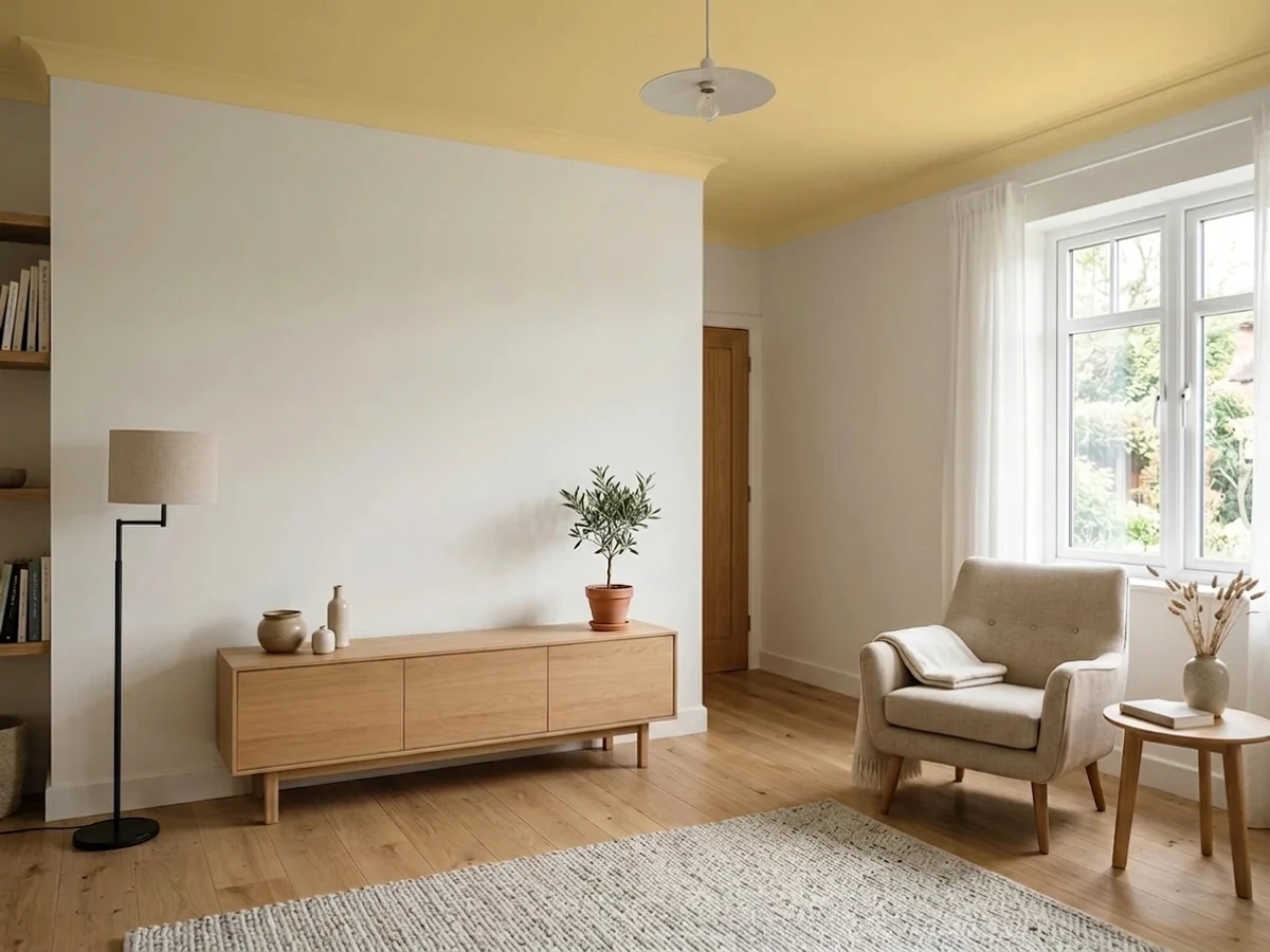
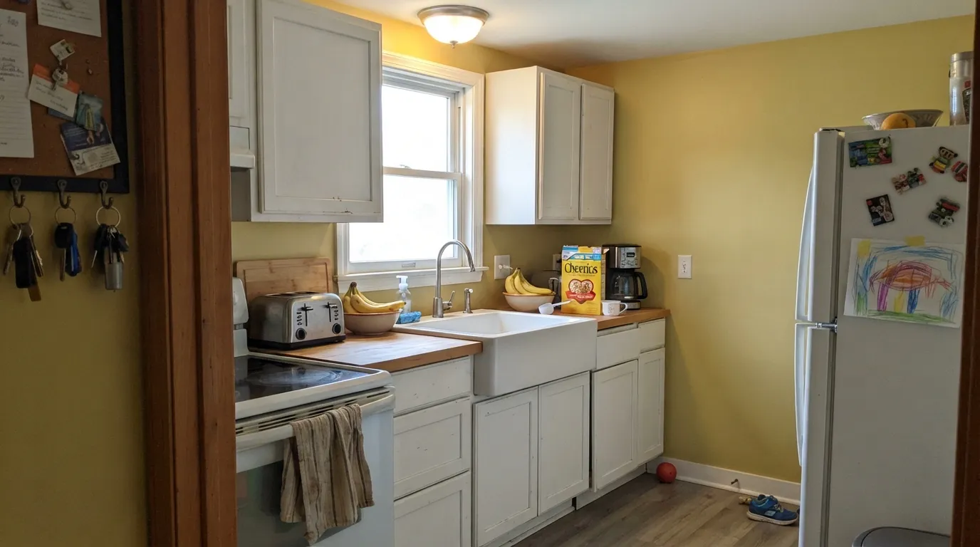
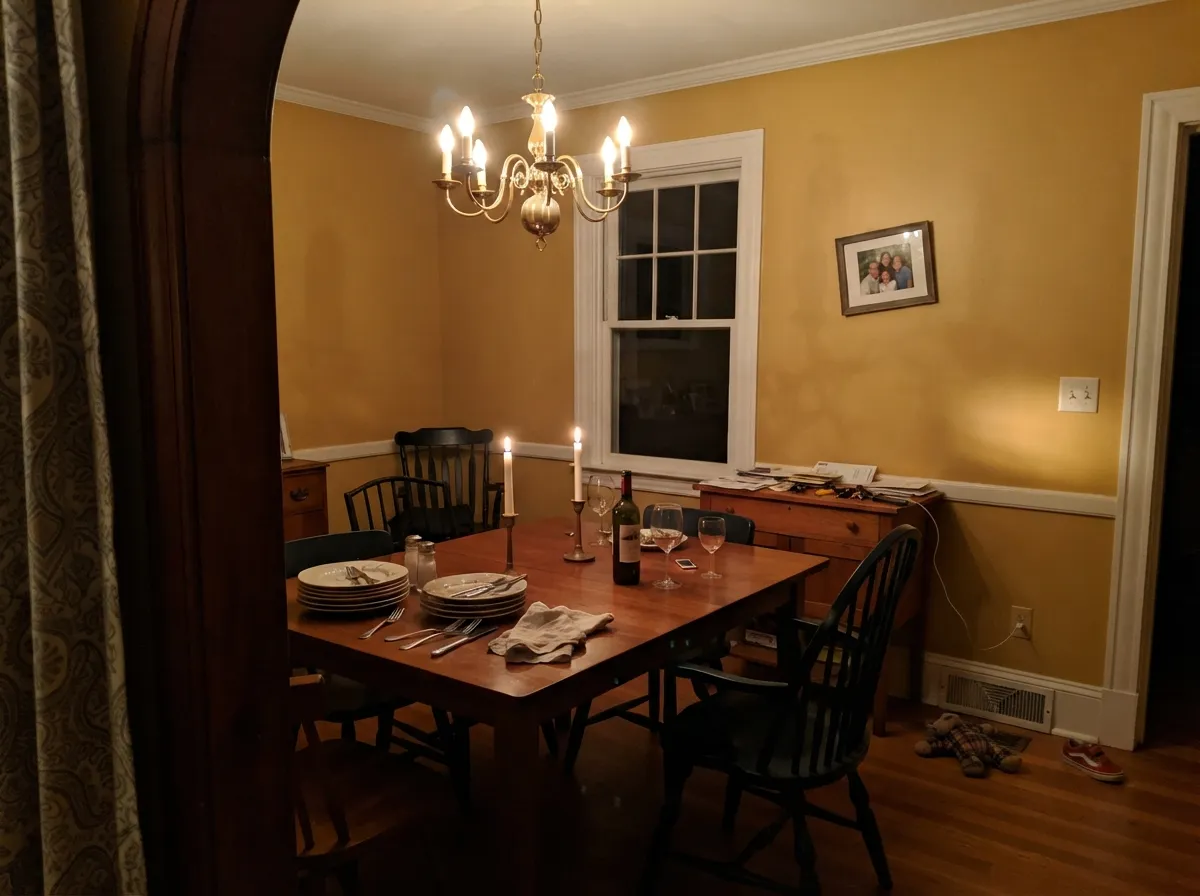
This color wants morning. In a south- or east-facing kitchen it turns the room into a permanent 9am, and it does it behind white or cream cabinets better than any other yellow in the deck. Its second home is the dining room used after dark: under 2700K bulbs and candles the gold deepens to an amber that flatters food and faces, which is why traditional dining rooms have worn this color for forty years. And the sleeper use is overhead — a Hawthorne Yellow ceiling above quiet white walls pushes warm light down into the room without ever sitting at eye level.
Where It Fails
The regret stories about Hawthorne Yellow are remarkably consistent, and all three are predictable before the first coat. None of them are the paint's fault — but if your room matches one, sampling a bigger square will only confirm it faster.
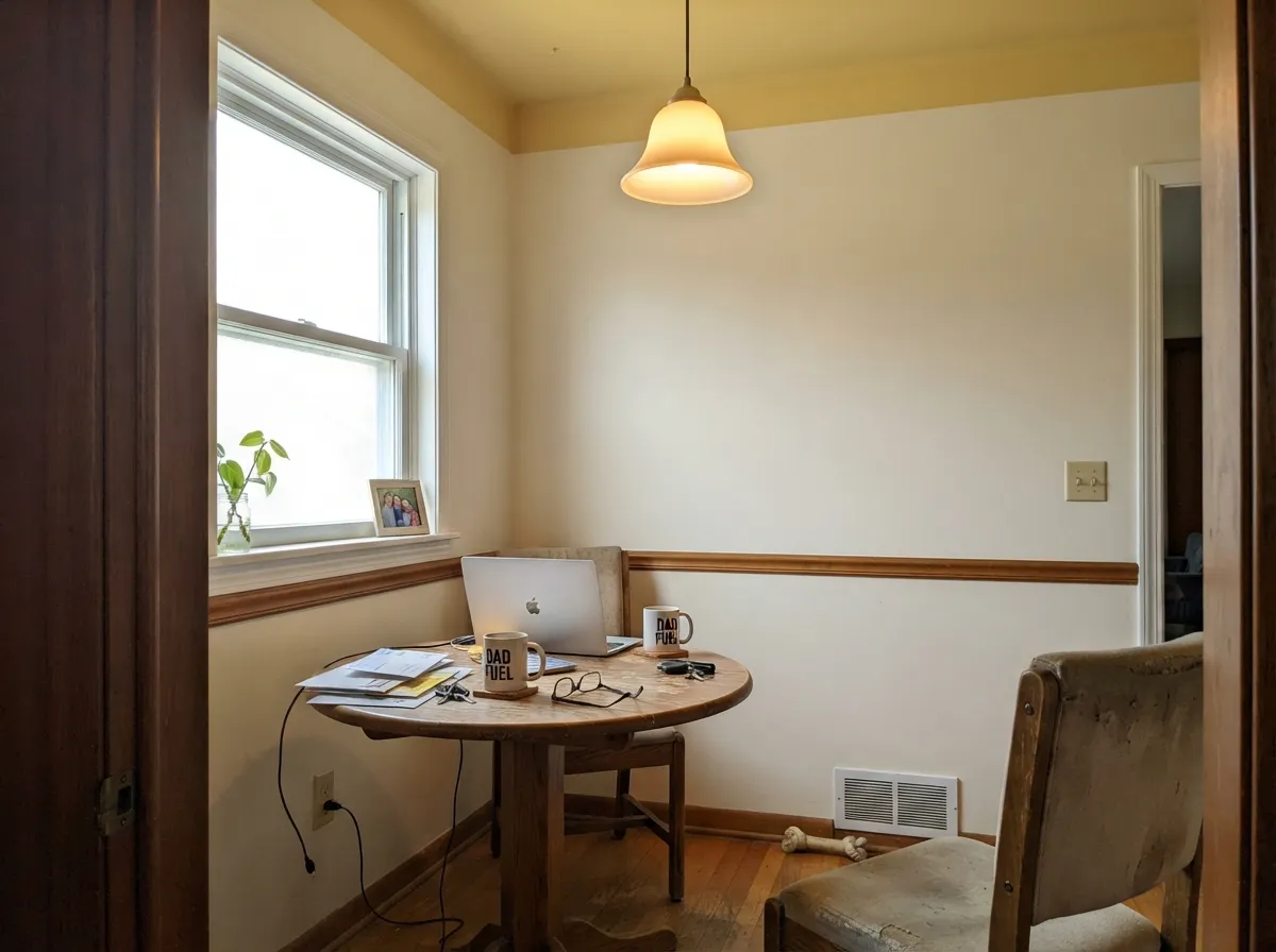
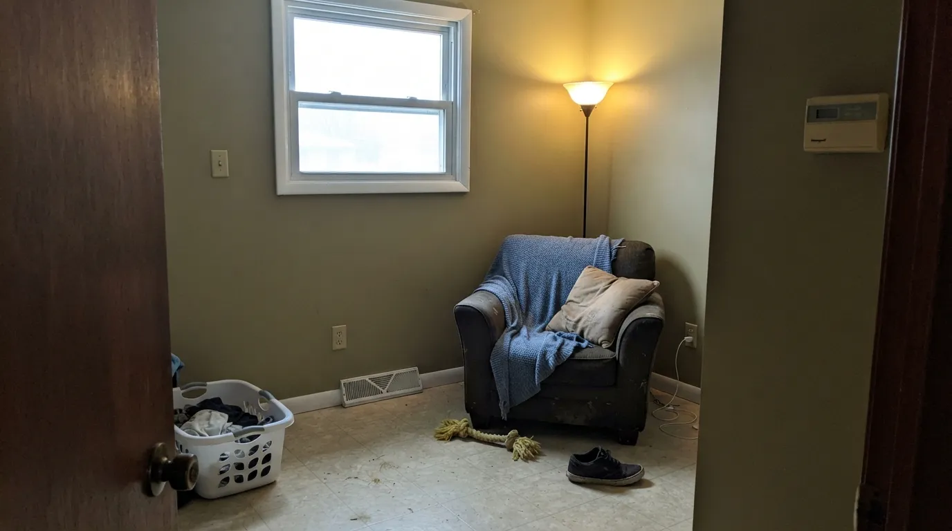
Cool, indirect light drains the warm wavelengths and leaves the gray-green softener exposed — the gold tips toward mustard, and owners describe the room as sour, heavy or drab. Swap to 2700K bulbs before you blame the paint; if the room is genuinely dark and north-facing, this is not your yellow.
The single most common surprise: the sample looked like a gentle gold in your hand, and the finished room feels a full step bolder. Yellow amplifies itself across four walls. If the chip already feels like your limit, you have overshot — go to Fresh Air (LRV 85) and keep the room at a whisper.
A crisp, cool white beside Hawthorne Yellow makes the wall look sharper and cheaper — this pairing is what makes people call yellow rooms dated. Indoors it wants a warm white: White Dove or Cotton Balls, which Benjamin Moore itself pairs with it. Outdoors, in full sun, a crisp white is fine and traditional.
Room by Room
South or east exposure, white or cream cabinets, butcher block or warm counters: this is the room the color was made for. It reads cheerful rather than sweet next to brass and old wood. Eggshell on the walls, satin if the yellow goes on an island or a hutch.
Warm bulbs and candlelight deepen the gold into amber, which is why the color has lived in traditional dining rooms for decades. It is one of the few paints that genuinely looks better at 8pm than at noon. Keep the trim warm white.
Above pale walls it bounces a warm glow down without ever being at eye level, and it does not have the sharp glare a bright white ceiling gives a sunny kitchen. Flat sheen, and be honest about height: at 8 feet a saturated yellow overhead visually lowers the room. Full details in the ceiling section below.
An entry that gets real daylight wears this beautifully, and the color makes the arrival feel warm before anyone takes their coat off. A windowless hall lit by cool downlights is the one to avoid — that is exactly the mustard scenario.
A small bath with a real window and warm bulbs is charming in Hawthorne Yellow, especially with white subway tile and chrome or brass. A windowless powder room running on cool LEDs will go sallow, and yellow is unkind to skin in a mirror when the light is wrong.
Full sun handles the saturation better than any interior, and the yellow-house-with-white-trim look is colonial and Federal architecture's default for a reason. Dark green or near-black shutters are the traditional finish. A Hawthorne Yellow front door on a white or pale gray house does the same job in one afternoon.
Your Light Is the Risk
Clean morning sun is where the gold is happiest — warm, awake, and not yet glaring. Sample here and you will like what you buy.
Cool, indirect daylight pulls the gray-green forward and the wall drifts toward mustard or olive. The most common bad review starts in a north room.
Flat noon sun can spike it close to neon for an hour or two, then late west light settles it into deep amber. Big swing — watch it at 1pm and again at 6pm.
2700K bulbs and candles are its best artificial light, turning it rich and amber. 4000K or cooler LEDs flatten it and bring the green out — bulbs are part of this paint job.
Most complaints about Hawthorne Yellow are a light mismatch. Upload a photo of your actual room and see it on your walls — then ask for the same wall in north light or evening lamps before you buy a single sample.
Need It From Another Brand?
Any paint counter can custom-tint Benjamin Moore HC-4 directly. If you would rather stay in one brand's own deck, these are the closest stock matches, measured as ΔE2000. Under 2 is a difference you will not see on the wall.
| Brand | Closest color | ΔE | LRV | |
|---|---|---|---|---|
| Sherwin-Williams | Optimistic YellowSW 6900 · Sherwin-Williams | 0.4 | 76 | Color page → |
| Behr | Lily BulbP320-3 · Behr | 1.6 | 77 | Color page → |
| Valspar | Dainty DaisyV018-1 · Valspar | 0.5 | 77.1 | Color page → |
| PPG / Glidden | Butterfly BushPPG1214-4 · PPG / Glidden | 1.6 | 77 | Color page → |
| Glidden | Butterfly BushPPG1214-4 · Glidden | 1.6 | 77 | Color page → |
| Dutch Boy | Spritely Green122-4DB · Dutch Boy | 1.5 | 76 | Color page → |
Similar Benjamin Moore Colors
The nearest shades to Hawthorne Yellow within Benjamin Moore's own range, ranked by perceptual color distance — useful when you want the same look a touch lighter, darker, or warmer.
WCAG 2.1: AA is 4.5 : 1 for normal text, 3 : 1 for large text, AAA is 7 : 1.
Hawthorne Yellow vs the Colors You're Also Considering
Every Hawthorne Yellow sample board has the same rivals on it. The numbers show the real lightness gap — then it comes down to which risk you would rather live with.
Pick this when you want the yellow to read as an actual color and hold its own in daylight.
Benjamin Moore 211 · LRV 85Fresh AirPick this for a whisper of yellow instead of a yellow room — the safer choice for ceilings and for anyone nervous about the chip.
Pick this for the grayer, dustier gold that reads historic rather than sunny-side-up.
Sherwin-Williams SW 6686 · LRV 79Lemon ChiffonPick this if your painter works in Sherwin-Williams and you want the cheerful, citrus-leaning version.
Pick this when you want yellow you can see from across the room, not just in the corner by the window.
Behr ICC-90 · LRV 86Butter YellowPick this to join the butter-yellow moment without committing to a yellow room — it is pale enough to pass for a warm white.
Pick this when the room needs cheer and light, not just warmth; Shaker Beige is calm, this one is glad to see you.
Benjamin Moore HC-45 · LRV 58Shaker BeigePick this for the same colonial warmth with the yellow taken out — the escape hatch when the samples feel like too much.
Hawthorne Yellow Coordinating Colors
The rule for coordinating with Hawthorne Yellow: warm whites next to it, one cool note somewhere in the room, and something dark to anchor it. Cream and gold together with nothing cool or dark in the mix is how a yellow room turns saccharine — the gray-blues, deep navies and near-blacks are not decoration here, they are the brakes. These are the partners that keep showing up in rooms that work:
Hawthorne Yellow on the Ceiling
Painting a ceiling yellow sounds like a dare, and then people do it and stop painting ceilings white. The reason it works is geometry: overhead, the color is never in your eyeline, so you get the warmth reflected down into the room without the four-wall saturation that makes some people tire of yellow by month three. In a sunny kitchen it also solves a problem nobody names — a bright white ceiling over a sunlit room throws a slightly cold glare, and a warm gold ceiling does not.
The setup that works: pale, quiet walls and Hawthorne Yellow overhead in flat sheen. White Dove walls are the easy version, because they share the gold's warmth and the transition at the wall-ceiling line reads soft instead of like a mistake. Flat matters — any sheen on a ceiling telegraphs every roller lap and drywall seam, and a color ceiling shows them twice as clearly as white does. Cut in carefully; there is nowhere to hide a wobbly line between a white wall and a colored ceiling.
Two honest limits. First, ceiling height: a saturated color overhead visually pulls the plane down, so this is a move for 9-foot ceilings, a sloped nook, or a room where cozy is the goal — in a low 8-foot room, use Fresh Air (LRV 85) instead and keep the glow without the weight. Second, exposure still rules. A ceiling in a north-facing room gets the coolest, most indirect light in the house, which is exactly the light that turns this color mustard. Tape a large sample to the ceiling and look at it at noon and at night before you commit.
Hawthorne Yellow With Wood Tones and Floors
The floor decides more of this than the paint does. Walnut, espresso and other dark woods are the color's best company — the depth underneath gives the gold somewhere to land and the room reads collected instead of washed. Pale white oak and unstained pine are fine and give the whole thing a farmhouse cast. Painted floors and dark tile both work.
The one real clash is orange honey oak: 1990s builder oak floors, oak trim, oak cabinets. Those woods are already carrying a strong gold-orange, and Hawthorne Yellow does not contrast with them, it joins them — the room turns into one continuous amber blur with no edges, which is the exact look people are usually trying to escape when they repaint. If the honey oak is staying, put a large rug down and paint the trim a warm white, or step over to Shaker Beige and let the walls stay quiet.
Cool gray floors and gray-washed LVP are the opposite problem: they sit at the far end of the temperature scale and make the yellow look more saturated by comparison. It is not a dealbreaker, but sample against the actual floor. Metals are easy — brass and unlacquered bronze melt into it, matte black and pewter give it a needed edge; polished chrome is the only one that reads cold, and even that is fine in a bathroom.
Three Ready Palettes Built on Hawthorne Yellow
A color is never alone on the wall. These are complete combinations in the 60-30-10 pattern, with the reason each one holds together. Every one opens in the visualizer.
This is Benjamin Moore's own pairing for HC-4, and it works because of the counterweight: Cotton Balls is a bright white that stayed warm, so the trim never turns hard against the gold, while Wickham Gray's cool blue-green lean is the one cool note that keeps the room from going sweet.
Try this palette in your roomQuiet walls let the ceiling be the only color in the room, which is the whole point — the yellow reflects warm light down instead of glaring back at you from eye level. White Dove shares the gold's warmth so the wall-to-ceiling handoff is soft, and the near-black sash stops the scheme from reading like a child's room.
Try this palette in your roomThe rule that flips outdoors: indoors a crisp white makes Hawthorne Yellow look sharp, but in full sun Chantilly Lace is exactly the clean edge the siding needs. Essex Green is the historically correct shutter color for a yellow Federal or colonial house, and at near-black depth it gives the facade the one dark note that keeps cheerful from becoming cute.
Try this palette in your roomHawthorne Yellow FAQ
Is Hawthorne Yellow too much for a whole room?
It depends entirely on your light, and the honest warning is that it will be stronger than your sample suggested — yellow amplifies itself across four walls. In a south or east room with warm bulbs, most people are delighted. In a dim room, or if the chip already felt near your limit, drop to Fresh Air (LRV 85) or use Hawthorne Yellow on one plane only: a ceiling, an island, a hutch.
What trim white goes with Hawthorne Yellow?
A warm white. White Dove is the default, Cotton Balls if you want the trim brighter — Benjamin Moore pairs HC-4 with Cotton Balls itself. Avoid a cool blue-white indoors: the hard edge is what makes yellow walls look dated. Semi-gloss on the trim, eggshell on the walls.
Can I paint a ceiling Hawthorne Yellow?
Yes, and it is one of the better yellows for it. Overhead the color never sits at eye level, so you get the warm glow without the saturation fatigue — and it avoids the cold glare a bright white ceiling throws into a sunny kitchen. Use flat sheen, keep the walls pale, and remember a saturated ceiling color visually lowers an 8-foot room. See the ceiling section above for the full rules.
Will Hawthorne Yellow look green or mustard?
It can. There is a faint gray-green softener under the gold, and cool north daylight or 4000K LED bulbs pull it forward — that is when owners describe the walls as mustard, olive or sour. Warm 2700K bulbs fix it in most rooms. In a genuinely dark north-facing room, no bulb will.
Does it work on kitchen cabinets?
In doses. Yellow cabinets on an island, a hutch or a pantry door under white or cream uppers look vintage in the good way, and satin urethane-fortified cabinet enamel is the right product. A full kitchen of Hawthorne Yellow cabinets is a much bigger bet — most rooms are better off with the yellow on the walls and white cabinets in front of it.
Is it a good exterior color?
It is a long-standing exterior yellow and Benjamin Moore lists HC-4 for outdoor use. Full sun handles the saturation far better than an interior does, and the classic finish is crisp white trim with dark green or near-black shutters. Two cautions: the shaded north side of the house will read noticeably deeper and duller than the sunny side, and yellow siding shows chalking and dirt sooner than a mid-tone neutral, so plan on washing it.
Have you painted with Hawthorne Yellow?
Rate it — one tap helps the next reader decide.
Ask a Question