Blue Hydrangea
The powder blue designers actually keep in the deck, reviewed honestly: where it stays fresh, the light that turns it icy, and how to keep it out of nursery territory.

Jessica has spec'd whites and neutrals for more than 300 rooms and keeps a sample wall of painted drawdowns in her studio. Every color review is checked against real reader rooms in the comments and re-tested when a formula changes. About the testing process →
- 1Resolute Blue40
- 2Lost in the 80s51
- 3Blue Hydrangea62
- 4After Rain68
- 5Bashful Blue74
The Fast Verdict
Blue Hydrangea is a clean, cheerful powder blue that never chickens out. Most of the popular light blues — Palladian Blue, Woodlawn Blue, the whole spa shelf — hedge toward green or gray so nobody has to commit. This one does not: at LRV 62 it stays unmistakably blue on all four walls. That is the reason to buy it and the reason to sample it, because "unmistakably blue" in a room with honey oak trim reads 1994, and in a dim north room it reads cold.
Kids' rooms and nurseries that should feel calm, not themed · bathrooms with real daylight · guest bedrooms · vanities, laundry cabinets and islands · a Southern-style porch ceiling
Your trim and floors are honey oak · the room is north-facing and dim · you wanted a gray-blue that reads neutral · you are painting a formal main floor · your bulbs are 4000K daylight LEDs and staying that way
- A light blue that stays blue — no green drift, no gray hedge
- LRV 62 keeps small rooms open without bleaching out in sun
- Kids' rooms and nurseries that read calm instead of themed
- Hides fingerprints and scuffs far better than a white on cabinets
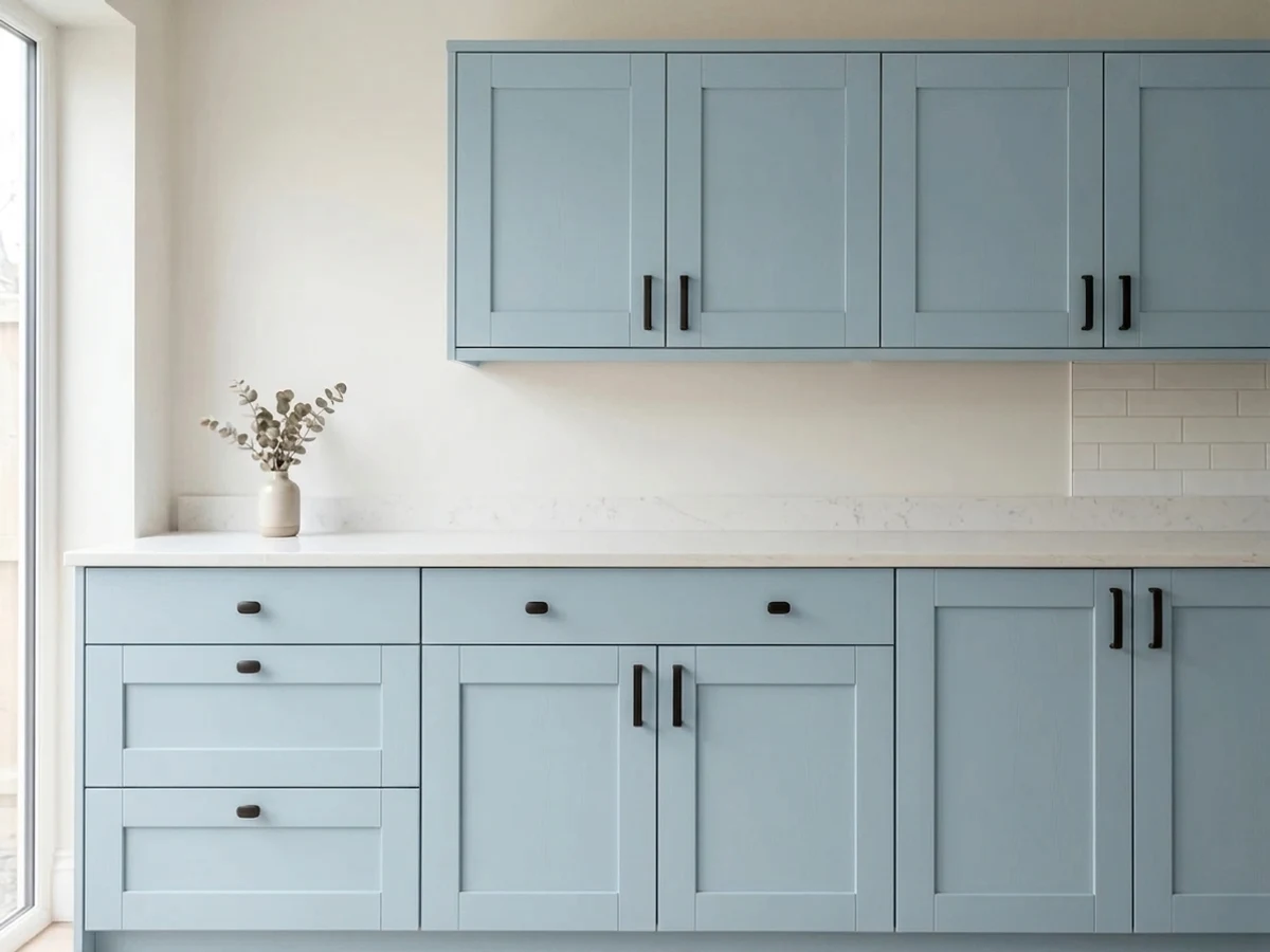
- Works in doses — vanity, island, laundry cabinets, porch ceiling
- Fights honey oak trim, floors and golden-beige carpet
- Goes icy and clinical in dim north light with cool bulbs
- Reads sweet on four walls unless warm materials balance it
- Not a neutral — too colorful for open main floors
What Color Is Blue Hydrangea, Really?
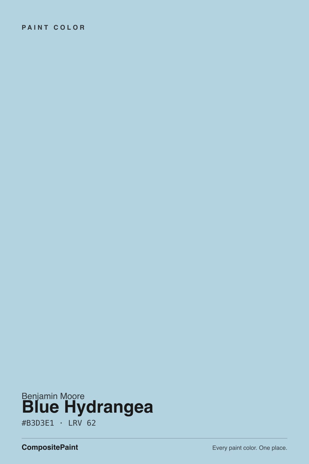
A true powder blue — soft, light, slightly on the sky-and-water side of blue rather than the periwinkle side. Benjamin Moore files it in Color Preview, the collection built from clear, saturated pigment rather than the grayed historical palettes, and you can see that lineage on the wall: there is enough gray in it to keep it from looking like a crayon, but not nearly enough to let it pass for a neutral. Put a chip of it beside Woodlawn Blue and the difference is the whole review — Woodlawn drifts green-gray and hides, Blue Hydrangea stays blue and announces itself.
At LRV 62 it sits in the light-but-not-pale band, roughly where a mid greige lives. That matters more than people expect. It is light enough to keep a small bathroom or a kid's bedroom feeling open, but it holds enough pigment that a bright south room will not bleach it to white the way it bleaches the LRV 69–70 spa blues. Expect the finished wall to look a shade deeper and noticeably more colorful than the little chip — four walls of any blue multiply the effect.
Undertone in one line: blue first, a faint aqua lean second — never green, never gray-brown. Some reviewers describe a periwinkle or violet flicker under evening lamps; the color's own data sits on the cyan side of blue, so if you see violet, it is warm bulbs adding red to a cool wall, not a hidden purple base. Either way, test at night before you decide.
Where It Shines
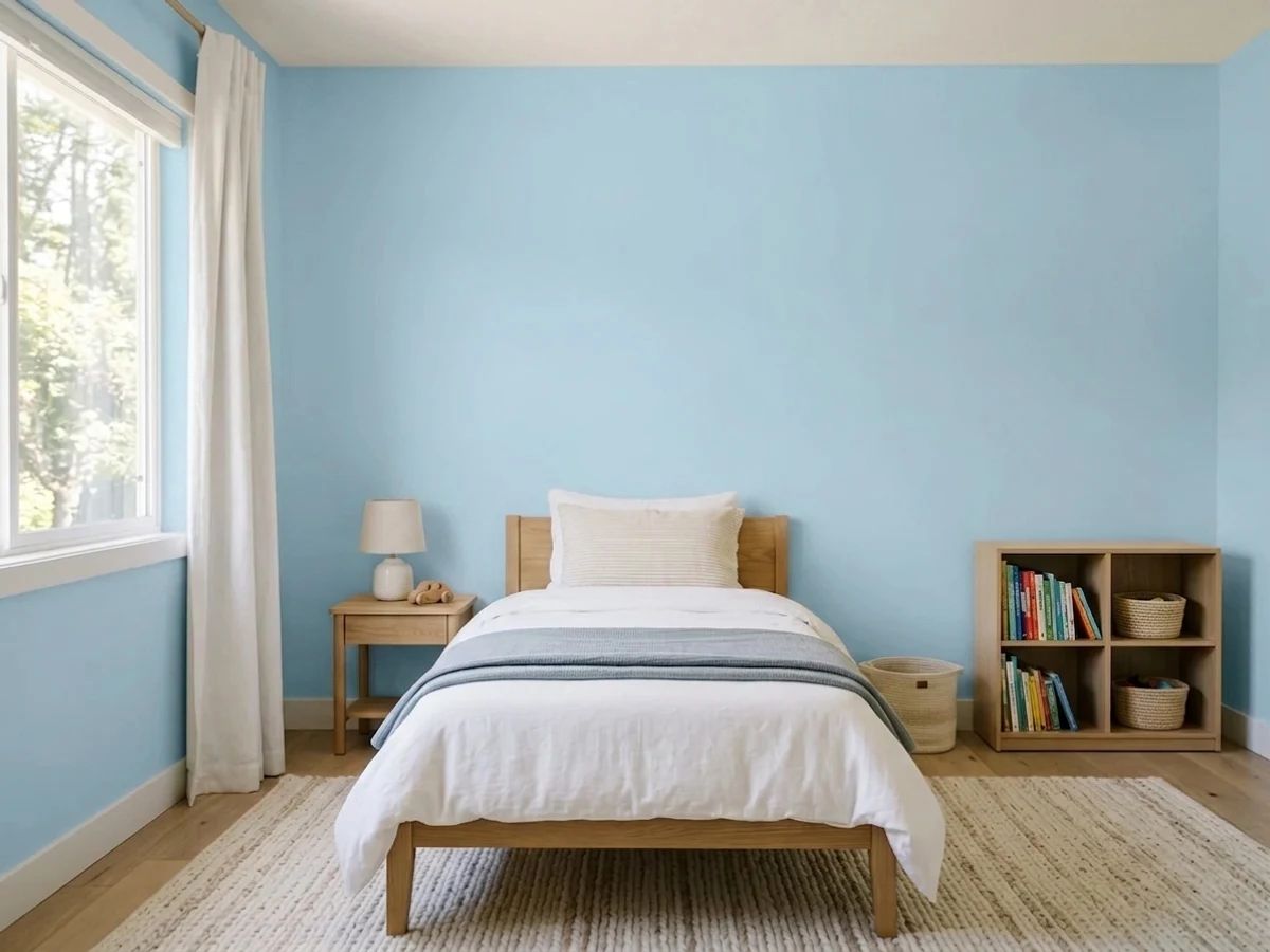
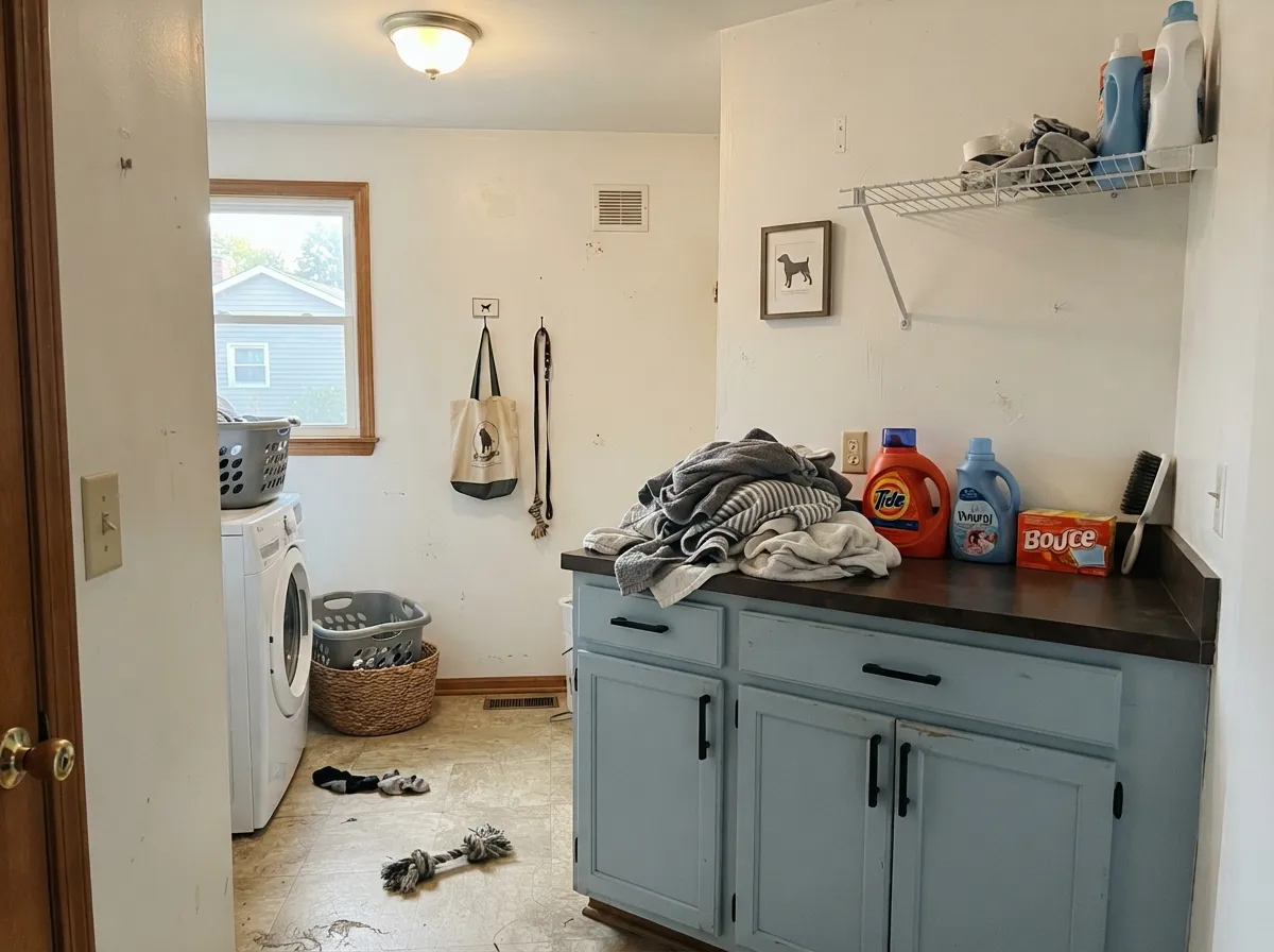
This color earns its living in rooms where blue is supposed to read as blue: a child's bedroom, a nursery, a hall bath, a guest room. It is cheerful without being a cartoon, and unlike the gray-blues it does not collapse into nothing when the sky clouds over. Give it daylight, a soft white trim, warm wood and a little brass or rattan, and it looks fresh rather than sweet. Its second life is in doses — a vanity, laundry cabinets, an island, a porch ceiling — where a small area of honest blue does more work than a whole room of it.
Where It Fails
The bad reviews of Blue Hydrangea are remarkably consistent, and every one of them is predictable from the room before a can is opened. None of these are defects in the paint. If your room matches one, buy something else — a bigger sample will only confirm it.
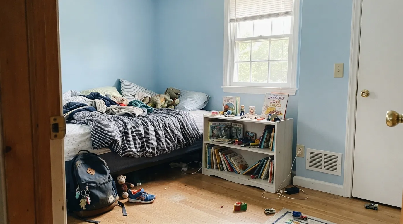
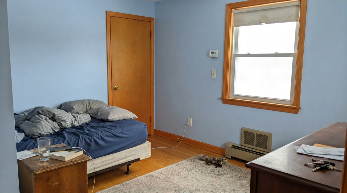
Orange sits directly opposite blue on the wheel, so golden oak and this color exaggerate each other: the oak goes more orange, the walls go more blue, and the room lands squarely in 1994 country blue. This is the single most common regret. White-painted trim rescues it; a whole room of golden oak does not.
North light is already blue. Add a blue wall and 4000K LEDs and the room goes icy — readers use words like hospital, dentist's office, cold. The color is not dingy here, it is chilly, which is a different and harder problem. Warm 2700K bulbs and warm textiles fix most of it; if the room stays dim and lamp-free, pick a warmer color.
People shop light blues hoping for "a blue nobody would call blue." That is Woodlawn Blue or a blue-gray. Blue Hydrangea is the opposite bet — it is the one that still looks like a color at 4pm on a gray day. Lovely if that is what you wanted; a surprise if you were quietly hoping for gray.
Room by Room
Calm without being babyish, and it survives the child growing up better than any primary-color blue. Keep the trim and ceiling a soft white, add warm wood and one strong accent — a navy bunk, a rust rug — and it stops reading nursery. Scrubbable eggshell, because crayons happen.
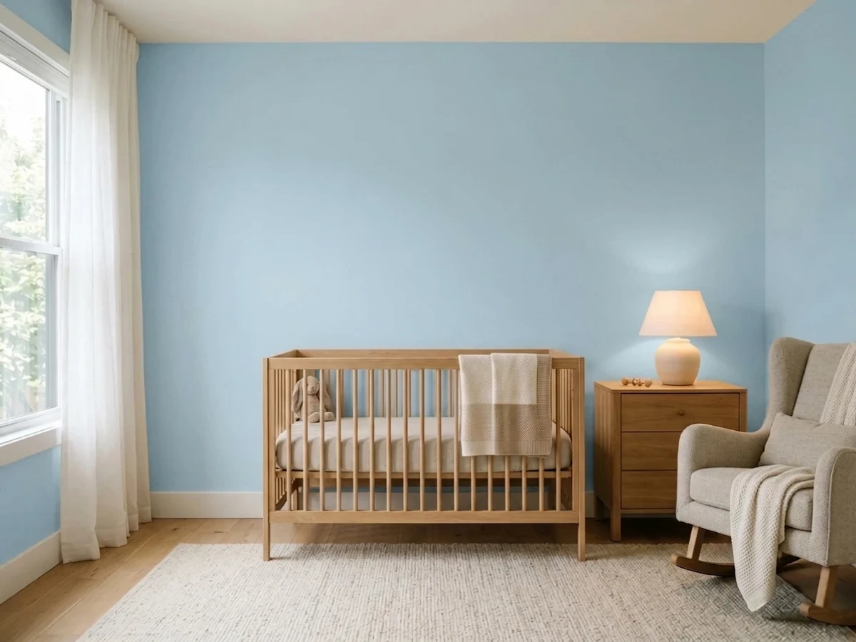
The classic soft-blue nursery, done with a color that will not look chalky in photos. The rule from every nursery that works: balance the cool with something warm — oak crib, cream curtains, a rust or mustard accent — or the room photographs cold.
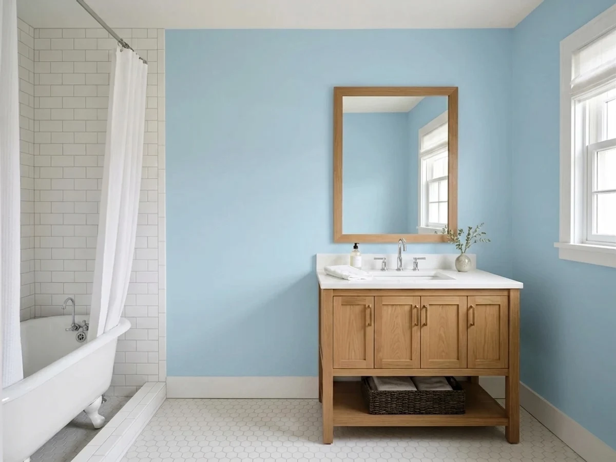
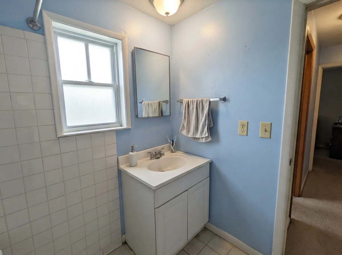
Fresh and spa-like against white subway tile and chrome or brushed nickel; a small bath drenched in it looks intentional. A windowless bath needs warm bulbs and a warm vanity, or it reads clinical. Eggshell walls, satin on the vanity.
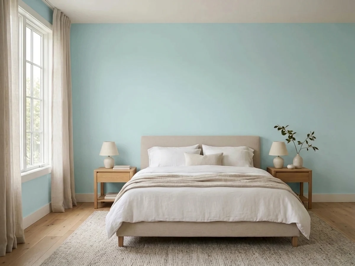
Light enough for a small room, colorful enough that the room feels decorated with only paint. Blue reads restful to most people, and guests are not living with your color choices long enough for the sweetness to wear.
In an open plan it has to negotiate with kitchen wood, flooring and every adjacent wall, and a saturated powder blue rarely wins that negotiation. If you want blue on a main floor, use it in one closed room or on cabinetry and keep the shared walls neutral.
This is the Southern haint-blue tradition, and Blue Hydrangea's slight aqua lean is exactly right for it. Overhead in shade it reads as sky rather than as paint, and it makes a white or gray-sided porch look finished. Have it tinted into an exterior or porch-and-floor product, not interior paint.
Your Light Is the Risk
Generous daylight is where it looks like the chip promised: clean, fresh, clearly blue with no muddiness. Sample here and you will like what you see.
Cool gray daylight stacks onto an already cool color and the wall goes icy and flat. Not dingy — chilly, which warm textiles and lamps have to fight all day.
Crisp and bright in the morning, quieter and slightly grayer by mid-afternoon, then warmed and softened by low western sun at golden hour. The daily swing is real but gentle.
2700K warm bulbs soften it and can give it a faint violet cast; 4000K daylight LEDs push it cold and slightly gray. Bulb temperature changes this color more than the paint sheen does.
Most complaints about Blue Hydrangea are a light mismatch. Upload a photo of your actual room and see it on your walls — then ask for the same wall in north light or evening lamps before you buy a single sample.
Need It From Another Brand?
Any paint counter can custom-tint Benjamin Moore 2062-60 directly. If you would rather stay in one brand's own deck, these are the closest stock matches, measured as ΔE2000. Under 2 is a difference you will not see on the wall.
| Brand | Closest color | ΔE | LRV | |
|---|---|---|---|---|
| Sherwin-Williams | Something BlueSW 6800 · Sherwin-Williams | 1.5 | 63 | Color page → |
| Behr | MillstreamPPU14-16 · Behr | 1.2 | 63 | Color page → |
| Valspar | Sailing on the BayV106-2 · Valspar | 1.4 | 60.3 | Color page → |
| PPG / Glidden | Flemish BluePPG1238-3 · PPG / Glidden | 1.5 | 59 | Color page → |
| Glidden | Flemish BluePPG1238-3 · Glidden | 1.2 | 59 | Color page → |
| Dutch Boy | Sailing Club136-3DB · Dutch Boy | 2.0 | 61 | Color page → |
Similar Benjamin Moore Colors
The nearest shades to Blue Hydrangea within Benjamin Moore's own range, ranked by perceptual color distance — useful when you want the same look a touch lighter, darker, or warmer.
WCAG 2.1: AA is 4.5 : 1 for normal text, 3 : 1 for large text, AAA is 7 : 1.
Blue Hydrangea vs the Colors You're Also Considering
Every Blue Hydrangea sample board has the same rivals on it. The numbers show the real lightness gap — then it comes down to which risk you would rather live with.
Pick this when you want the softer version that a ten-year-old will still accept.
Benjamin Moore 2066-60 · LRV 62Honolulu BluePick this for a brighter, sunnier sky blue at the same LRV 62 — more play, less calm, unmistakably a kid's color.
Pick this for the cleaner, slightly aqua blue that stays crisp in daylight.
Benjamin Moore 2067-60 · LRV 63Windmill WingsPick this if you actually want the periwinkle lean — it sits on the violet side of blue and turns cozier under lamps.
Blue Hydrangea Coordinating Colors
The rule for coordinating with Blue Hydrangea: soft warm whites for the edges, warm neutrals for the rooms next door, and deep blues when you need weight. What it does not want is a true yellow cream beside it, and it does not want a second cool pastel in the same room — two soft cool colors together is how a room starts looking like a baby shower. These are the partners that keep showing up in rooms that work:
Powder Blue Came Back — How to Keep It Out of the 1990s
Light blue never left the fan deck; it left the conversation. Through the beige years and then the gray decade, a color like Blue Hydrangea was something you painted a nursery and nothing else, because the last time powder blue ran the house it came packaged with golden oak trim, dusty-rose borders and a duck stencil. That association is still the biggest thing standing between this color and a good room.
What brought it back is the coastal and quiet-cottage swing — blue as the calm alternative to another greige bedroom. The version that looks current is not the version from 1994: white or soft-white painted trim instead of orange oak, natural wood and rattan instead of country cream, matte black or brass instead of brass-and-oak, and one warm accent color doing the balancing. Blue Hydrangea sits in Benjamin Moore's Color Preview collection, which is a clue about how to treat it — these are clear pigment colors, meant to be used deliberately, not to disappear into a neutral scheme.
Blue Hydrangea With Wood Tones, Floors, and Porch Ceilings
Floors decide this color. Pale white oak, natural maple and gray-washed wood are all easy — they leave the blue alone. Walnut and other dark red-browns are excellent and make the room look older and more deliberate. Cool gray LVP is fine but doubles down on the coolness, so bring in warm textiles. The problem case is orange-toned honey oak, which sits opposite blue on the wheel and makes both sides louder; the same warning applies to golden-beige wall-to-wall carpet, the pairing behind most of the dated rooms you will find when you search this color.
Metals are easy: brushed nickel and chrome read crisp and bathroom-appropriate, brass and black warm it up and keep it from feeling clinical. Skip polished-brass-plus-oak unless you want the vintage read on purpose.
One outdoor use worth knowing about: porch ceilings. The Southern haint-blue tradition calls for a pale blue with a slight green-aqua lean, and that is exactly where Blue Hydrangea sits. Overhead in shade it reads as sky, not as a painted surface, and it flatters white, gray and even brick houses. Have it tinted into an exterior or porch-and-floor product rather than interior paint — the color is available across Benjamin Moore's lines, and the ceiling is the one place outdoors where this soft a blue is a classic instead of an experiment.
Three Ready Palettes Built on Blue Hydrangea
A color is never alone on the wall. These are complete combinations in the 60-30-10 pattern, with the reason each one holds together. Every one opens in the visualizer.
Two blues at opposite ends of the deck plus a soft white is what keeps a kid's room from reading like a theme. White Dove is doing real work here — its warmth takes the chill off the walls, where a stark bright trim white would sharpen the blue and make the room feel colder.
Try this palette in your roomTonal blue — pale walls, deep vanity — is the move that makes a small bath look designed rather than painted. Mountain Peak White stays bright even in the mediocre light most bathrooms get, so the trim keeps its edge instead of graying out against the walls.
Try this palette in your roomEdgecomb Gray at LRV 63 and Blue Hydrangea at LRV 62 are practically the same brightness, so the doorway between them reads as a change of mood, not a change of house. One trim white running through both keeps the handoff clean — this is how you get a blue room without committing the whole floor plan to blue.
Try this palette in your roomBlue Hydrangea FAQ
Is Blue Hydrangea too babyish for a grown-up room?
On its own, in a room full of white furniture, yes — it can tip sweet. The fix is materials, not a different blue: warm wood, rattan, brass or black hardware, a rust or camel textile, and a soft white trim rather than a bright one. Done that way it reads coastal-calm. If the room is a formal living or dining room, this is still the wrong color.
What white trim goes with Blue Hydrangea?
A soft warm white is the safest partner — White Dove is the default, and its warmth balances the wall's coolness. Mountain Peak White works when you want more brightness without much yellow. Avoid a true cream like Linen White; cream against powder blue is the exact 1990s country pairing most people are trying to avoid.
Does it work in a north-facing room?
It is the riskiest room for it. North light is cool and blue already, so the wall can go icy instead of fresh. It is not a hard no — warm 2700K bulbs, a wood floor, and warm textiles pull it back — but if the room is both north-facing and dim, a warmer color will make you happier.
Blue Hydrangea or Honolulu Blue for a kid's room?
Both are LRV 62, so they are equally light — the difference is volume. Honolulu Blue is the brighter, sunnier sky blue that reads clearly as a kid's color. Blue Hydrangea is softer and calmer, which is why it is the one to pick if you want the room to survive into the teen years without a repaint.
Can I use it on cabinets or a vanity?
Yes, and it is one of its best uses. A blue vanity, laundry cabinet run or kitchen island in this color looks custom, and a mid-tone blue hides fingerprints far better than a white does. Use a satin cabinet enamel — Benjamin Moore's Advance is the usual choice for this color — and expect two coats over a properly primed door.
Does Blue Hydrangea go with honey oak floors and trim?
This is the one honest no. Orange-toned oak is blue's complement, so each side pushes the other further: the floor looks more orange, the walls look more blue, and the result reads dated rather than fresh. A large rug and painted white trim can save a room with honey oak floors only. With honey oak trim as well, pick a different color.
Have you painted with Blue Hydrangea?
Rate it — one tap helps the next reader decide.
Ask a Question