Windmill Wings
Benjamin Moore calls it a crisp periwinkle. Here is what it actually does on four walls: the kids' rooms it nails, the light that turns it clinical, and what to pick instead.

Jessica has spec'd whites and neutrals for more than 300 rooms and keeps a sample wall of painted drawdowns in her studio. Every color review is checked against real reader rooms in the comments and re-tested when a formula changes. About the testing process →
- 1Resolute Blue40
- 2Lost in the 80s51
- 3Windmill Wings63
- 4After Rain68
- 5Bashful Blue74
The Fast Verdict
Windmill Wings is Benjamin Moore's playful periwinkle, and it is more blue than that word suggests: a clean, cheerful, genuinely colorful light blue with only a small violet lean. In a kid's room with soft white trim and warm wood it is close to perfect. In a cold room with stark white trim, gray floors and daylight LEDs it turns clinical in an afternoon. Buy it because you want a blue room — not because you want a neutral with a hint of blue in it.
Children's rooms, nurseries and playrooms · bathrooms and powder rooms with black-and-white fixtures · laundry rooms, built-ins and cabinet fronts · anyone who wants a light blue that still reads blue after two coats
You want a barely-there whisper of blue · the room is dim, north-facing and lit by cool LEDs · the only other colors in it are stark white and gray · the word periwinkle made you picture lavender
- A light blue that still reads blue — no evaporating into gray at noon
- LRV 63 keeps small rooms, nurseries and windowless baths feeling open
- The violet lean keeps it out of flat, dated baby-blue territory
- Hides scuffs and handprints far better than a white in a kids' room
- Works on cabinets, built-ins and vanities, not just walls
- Too much color for anyone wanting a barely-there blue
- Goes cold and clinical under north light, cool LEDs and stark white trim
- The periwinkle promised by the name is subtle — most rooms just read blue
- Hard to run through an open main floor without it taking over
What Color Is Windmill Wings, Really?
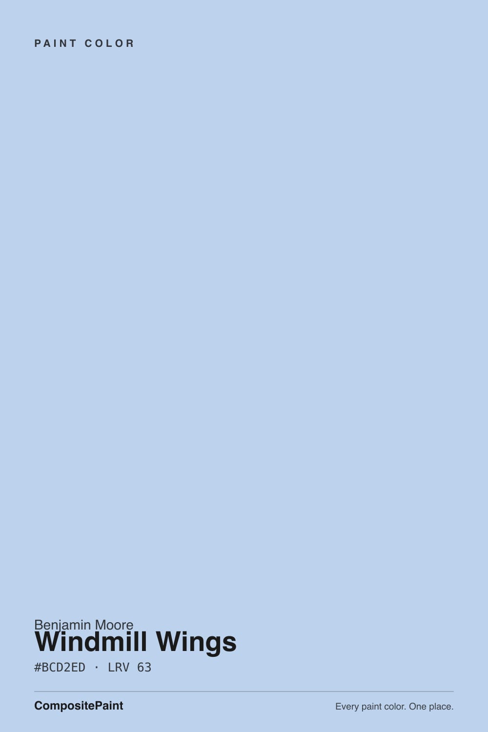
A clean light blue with a small violet lean, from Benjamin Moore's Color Preview collection. The brand's own line is that it is a crisp, playful periwinkle, and periwinkle is the right neighborhood — but the mix sits much closer to cornflower than to lavender. Blue comes first and it comes clearly; the violet is a second note that only steps forward when the light or the room is warm. Color Preview arranges its colors by hue and value, and the -60 step tells you where this one sits: light, but deliberately not the palest version of its hue. That one step is the whole personality.
At LRV 63 it is genuinely light — it bounces back more light than it swallows, so a small bedroom or a windowless powder room still feels open. But lightness is not the same as quietness, and this is where most people misjudge it. Windmill Wings carries a lot of chroma for a pastel: far more color per square foot than a gray-blue at the same LRV. The chip that looks gentle in your hand becomes an unmistakably blue room across four walls. Almost every surprised owner is reacting to chroma, not to how light or dark it turned out.
Undertone in one line: blue first, a whisper of violet second — never green, never teal. If your sample looks steely and gray-blue, your light is cold. If it looks faintly lilac in the late afternoon, that is west sun or a warm bulb pulling the violet out. Both are the same paint telling the truth about the room.
Where It Shines
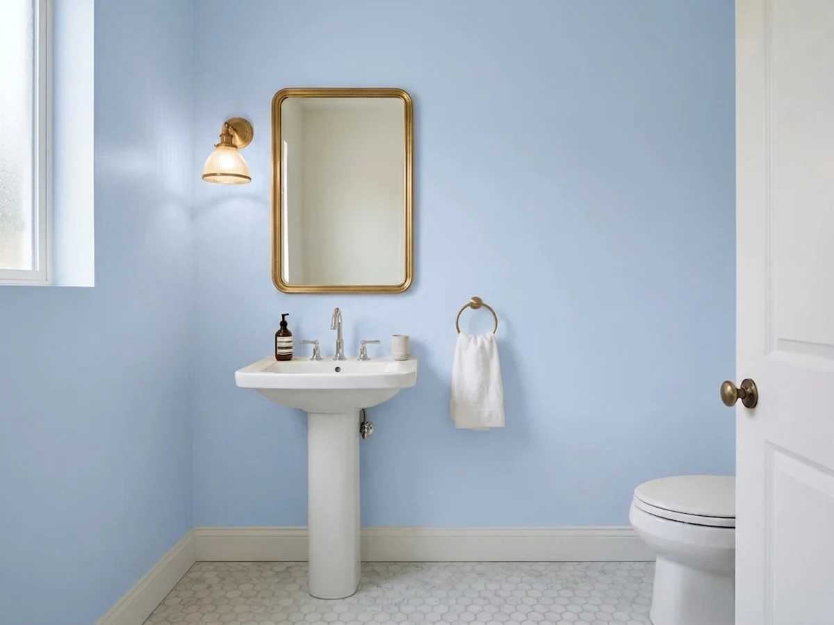
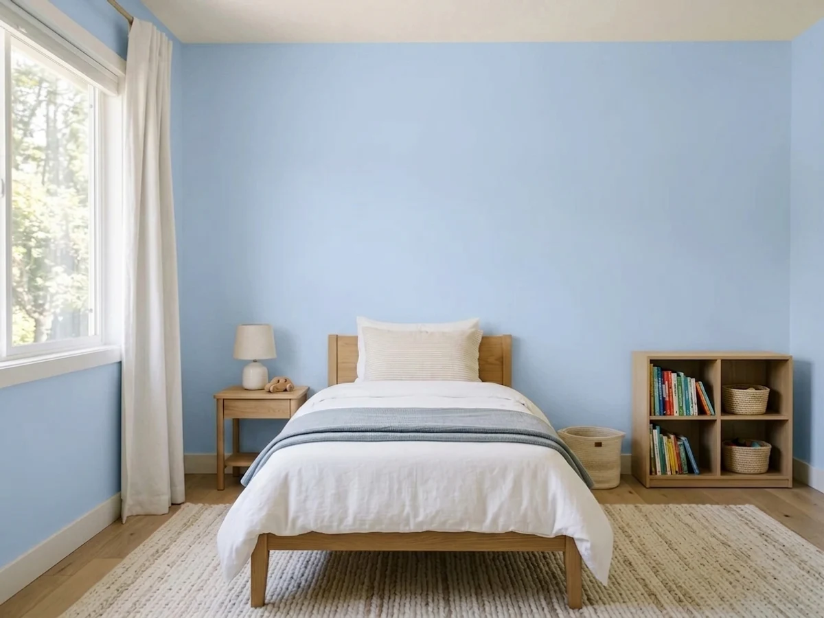
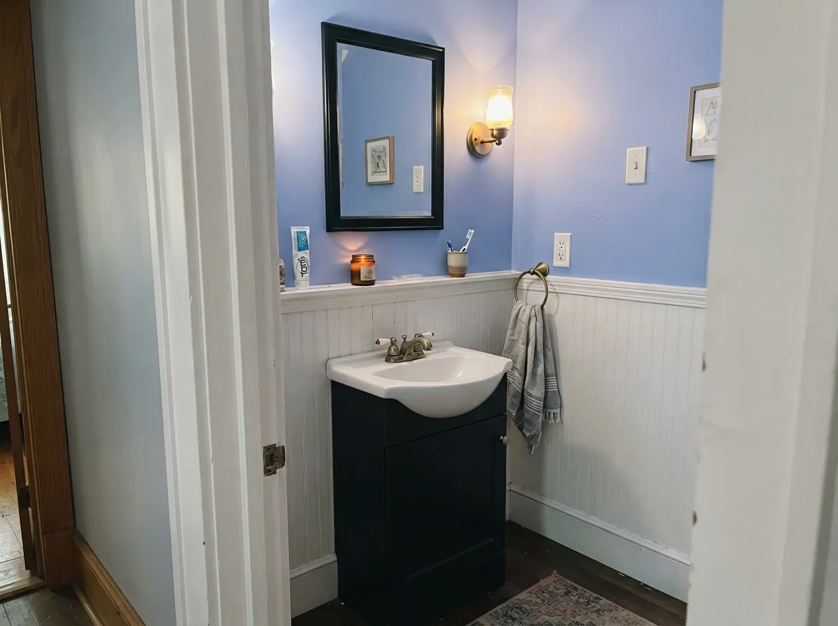
This color is at its best in rooms that are allowed to be happy. A children's room is the obvious one and it deserves the reputation: at LRV 63 it keeps the room bright enough to play and read in, and the violet edge keeps it out of flat baby-blue territory the way a plain sky blue cannot. Its second home is the small, hardworking room — a powder room, a laundry, a bank of built-ins — where a clean blue against white beadboard and black or brass hardware reads deliberate and slightly old-fashioned in the good way. Give it soft white trim, warm wood, cane or rattan, natural jute and cream textiles, and it looks charming instead of sweet.
Where It Fails
The complaints about Windmill Wings are remarkably consistent, and all three are predictable from your room before you open the can. None of them are the paint's fault — but if your room matches one, sampling a bigger square will only prove the point faster.
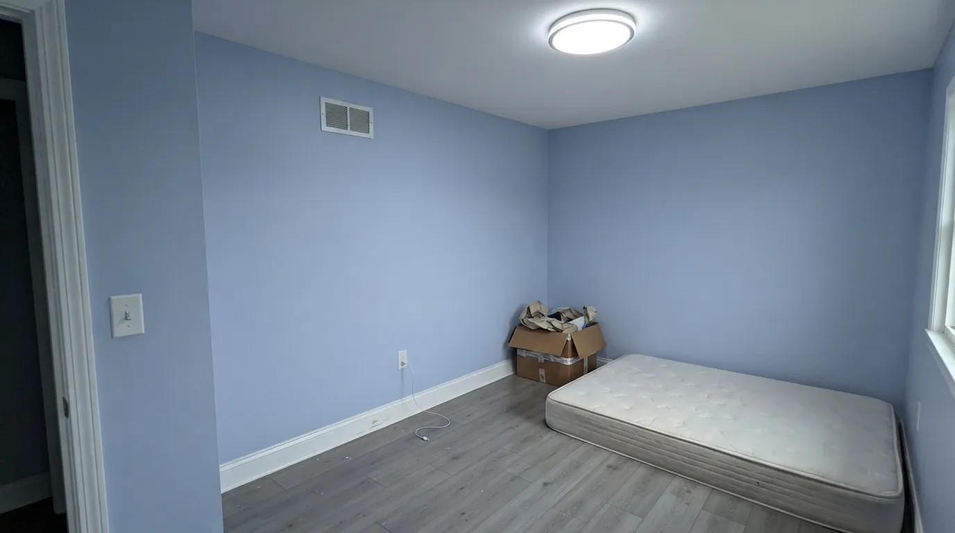
This is the number-one regret and it is a whole-room problem, not a paint problem. Take a clean blue, put it under gray north light or 4000K LEDs, frame it in a bright cool white, and stand it on gray plank flooring, and you have built a dentist's waiting room. Nothing in that list is warm enough to hold the violet up. The fix is cheap: 2700K bulbs, a warm white on the trim, and one real wood or rattan piece in the room.
People shopping light blues often want the wall to read "almost white, just cooler." That is not this color. Windmill Wings holds a lot of color for a pastel, so four walls read as a blue room — visitors will describe it by its color, not by its calm. If you want the wall to disappear, step down to a grayed-out blue like SW Sky High and keep the same lightness with a third of the punch.
The name and the marketing word set an expectation the paint does not meet. On the wall the violet is a lean, not a color: you will see it under warm lamps, at golden hour, and beside warm greige, and you will barely see it at noon. If you actually want the lilac side of periwinkle, BM Lavender Mist sits at the identical LRV 63 with the hue tipped the other way — and buy it knowing it is a much softer, easier-to-lose color.
Room by Room
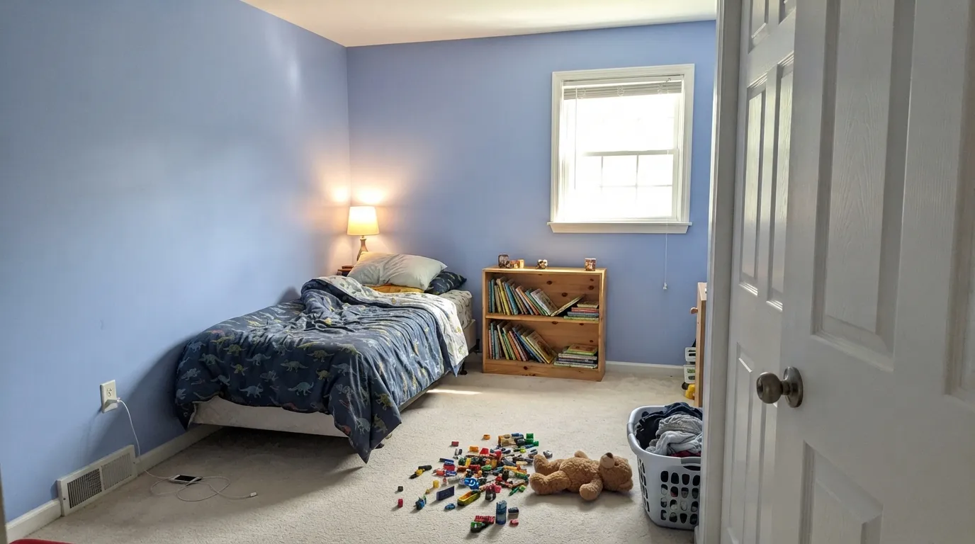
This is the room the color was built for. It is bright enough to keep a small room feeling open, colorful enough that a child registers it as "my blue room," and grown-up enough that you are not repainting the day the dinosaur phase ends. Scrubbable matte or eggshell so crayon and sticky handprints wipe off; White Heron on the trim and ceiling.
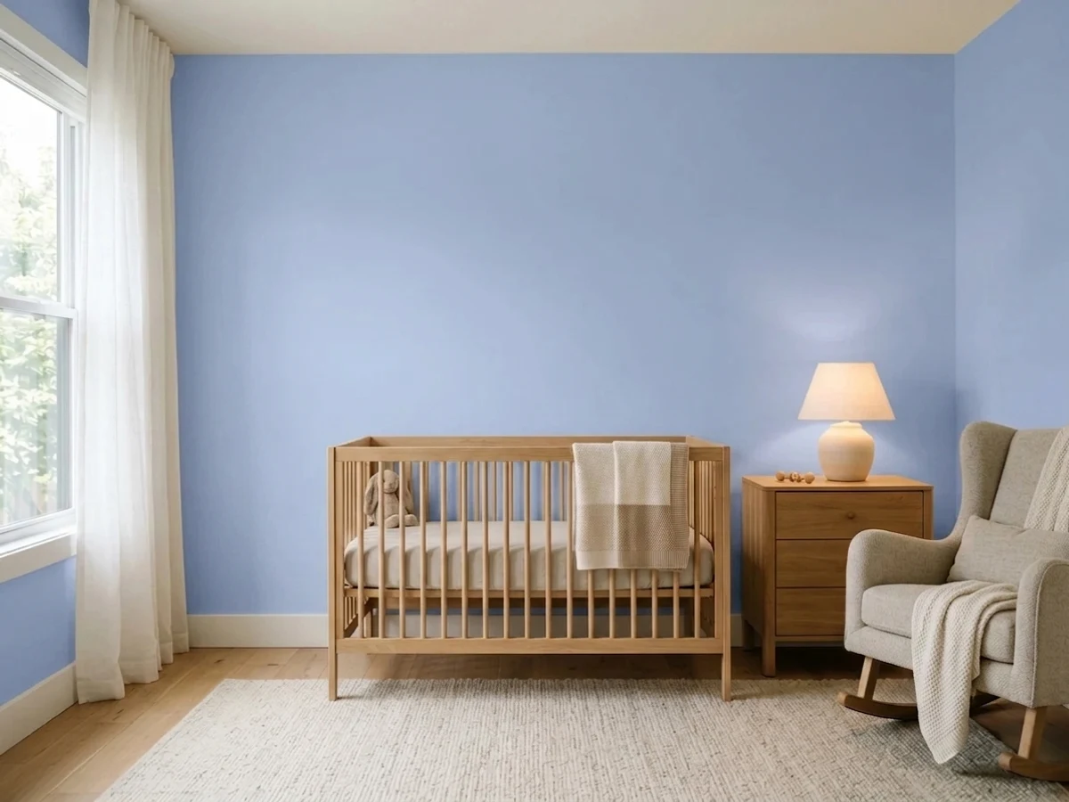
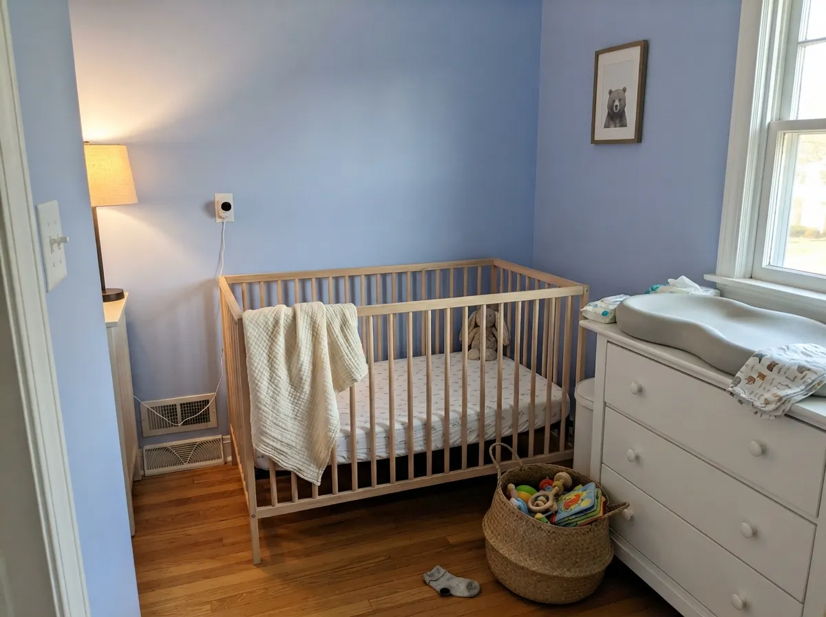
A gentle, non-babyish blue that photographs well and does not read as pale-blue-by-default. The one condition is warmth: a natural wood crib, a cream rug, a woven basket and 2700K lamps. A nursery of this blue with white furniture, gray flooring and daylight LEDs is the cold version everyone regrets.
Cheerful blue is a great answer for rooms that get used hard and never get admired. It hides scuffs better than white, it survives being the only decision you make in the room, and on laundry cabinets or a run of built-ins in satin it looks like someone actually planned the space. Small windowless rooms take it especially well — the LRV keeps them from feeling closed in.
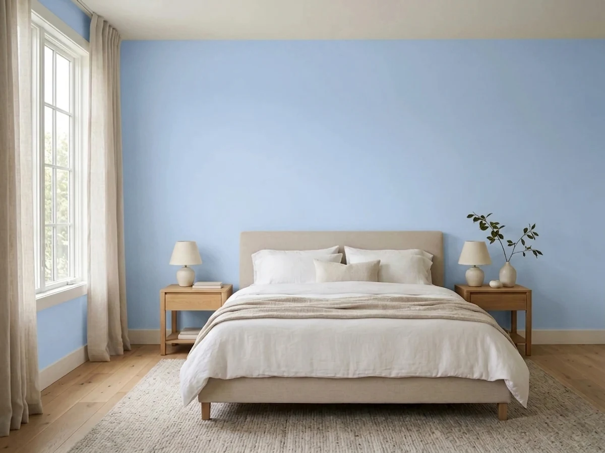
An adult bedroom in this blue works, but it is a color choice, not a background. It settles down beautifully under evening lamps, where the violet comes forward and the walls go softer and dustier than they look at noon. Pair it with warm white bedding, oak or walnut, and brass; skip it if you want a bedroom that reads neutral.
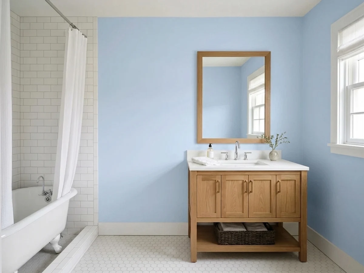
Periwinkle against black-and-white fixtures is a genuinely good bathroom formula, and this is the light-enough version of it. The graphic black-and-white frame is what keeps the blue from reading clinical, and unlacquered brass or aged bronze warms it the rest of the way. Eggshell on the walls, satin on the vanity.
In an open main floor this much clean blue has to negotiate with the kitchen, the flooring and every adjacent wall, and it usually loses — it reads as a decorated room rather than a background. If you love it here, use it on one built-in wall or a bank of cabinets and let a warm greige like Thunder run the actual walls.
Your Light Is the Risk
Warm, abundant sun is where it looks like the chip: crisp, clean, cheerful, with the violet just visible in the corners. This is the light that keeps it charming instead of chilly.
Cool gray daylight strips the violet out and leaves a steely, slightly institutional blue. Owners describe it as cold, or as a hospital corridor. Test here before anywhere else.
Morning east light reads it at its cleanest and crispest. By late afternoon, west sun and golden hour warm it noticeably softer and dustier, and that is the hour when it finally looks periwinkle.
2700K warm bulbs are the right call: they bring the violet forward and settle the color down. Cool 4000K-plus LEDs do the opposite and turn it icy — swap the bulbs before you blame the paint.
Most complaints about Windmill Wings are a light mismatch. Upload a photo of your actual room and see it on your walls — then ask for the same wall in north light or evening lamps before you buy a single sample.
Need It From Another Brand?
Any paint counter can custom-tint Benjamin Moore 2067-60 directly. If you would rather stay in one brand's own deck, these are the closest stock matches, measured as ΔE2000. Under 2 is a difference you will not see on the wall.
| Brand | Closest color | ΔE | LRV | |
|---|---|---|---|---|
| Sherwin-Williams | Bewitching BlueSW 6960 · Sherwin-Williams | 3.1 | 61 | Color page → |
| Behr | Hyacinth Tint590E-3 · Behr | 2.0 | 63 | Color page → |
| Valspar | Twilight Mist4004-9B · Valspar | 4.5 | 61.5 | Color page → |
| PPG / Glidden | Globe ThistlePPG1246-3 · PPG / Glidden | 4.7 | 64 | Color page → |
| Glidden | Pale Wildflower Blue11BB 64/135 · Glidden | 1.3 | 64 | Color page → |
| Dutch Boy | Wipeout139-3DB · Dutch Boy | 3.8 | 64 | Color page → |
Similar Benjamin Moore Colors
The nearest shades to Windmill Wings within Benjamin Moore's own range, ranked by perceptual color distance — useful when you want the same look a touch lighter, darker, or warmer.
WCAG 2.1: AA is 4.5 : 1 for normal text, 3 : 1 for large text, AAA is 7 : 1.
Windmill Wings vs the Colors You're Also Considering
Every Windmill Wings sample board has the same rivals on it. The numbers show the real lightness gap — then it comes down to which risk you would rather live with.
Pick this when you want the same brightness with a slightly more grown-up edge that survives past kindergarten.
Benjamin Moore 2066-60 · LRV 62Honolulu BluePick this for the purer, brighter sky-blue version with no violet in it at all — more pool water, more openly playful.
Pick this when you want a blue that leans violet rather than a violet that barely holds on in daylight.
Benjamin Moore 2070-60 · LRV 63Lavender MistPick this if periwinkle meant lavender to you — identical LRV, hue tipped to the violet side, and far gentler.
Windmill Wings Coordinating Colors
The rule with Windmill Wings is that it needs one warm thing in the room, always. Soft whites keep it friendly, warm greiges keep it from looking juvenile, and a near-black gives it the structure that stops a pastel from reading unfinished. These are the partners that keep showing up in rooms that work:
Where This Color Came From, and Why Periwinkle Is Back
Windmill Wings is not a new color, but it got its moment in 2019, when Benjamin Moore named it to the Color Trends 2020 palette alongside the Color of the Year, First Light. That palette was pitched as an optimistic set for a new decade, and it grouped this blue with White Heron, Thunder, Cushing Green and a handful of others — which is a useful thing to know, because those colors were selected to live together and still do.
Six years later the periwinkle family is having a second run. Designers keep reaching for it as the alternative to another sage or another greige, and it turns up most in bathrooms, kids' rooms and small utility spaces rather than living rooms — the same places it has always worked. Windmill Wings is the mainstream, easy-to-buy version of that idea: a periwinkle mild enough for a nursery, saturated enough that nobody calls it beige with a mood.
Windmill Wings With Wood Tones, Floors and Metals
Blue and warm wood is one of the oldest safe pairings there is, and this color benefits from it more than most because the wood supplies the warmth the paint is short on. White oak, maple, birch plywood, rattan, cane and natural jute are its best company — light warm materials that keep the room feeling airy while cutting the coolness. Walnut works too, and gives an adult bedroom the weight it needs.
Two floors need a real sample before you commit. Strongly orange honey oak is not a clash the way it is with a violet, but it does push the blue colder by contrast, so the room can end up feeling split; a large cream or jute rug settles it. Gray LVP is the more common problem — gray floor, cool white trim and this blue is exactly the three-part recipe for the clinical look, and it is worth breaking with wood furniture or a warm rug even if you love all three individually.
Metals are simple: unlacquered brass, aged bronze and matte black all warm it or frame it. Polished chrome and brushed nickel are the two that push it further toward cold, which is fine in a bright south-facing bathroom and a mistake in a dim north-facing one.
Three Ready Palettes Built on Windmill Wings
A color is never alone on the wall. These are complete combinations in the 60-30-10 pattern, with the reason each one holds together. Every one opens in the visualizer.
These three were shown together by Benjamin Moore itself: Windmill Wings, White Heron and First Light all belong to the Color Trends 2020 palette, so the blue, the white and the pink were mixed to sit in the same light. White Heron is the important one — it is clean enough to look crisp against the blue without the cold snap a bright builder white delivers.
Try this palette in your roomThe graphic black-and-white frame is what stops a clean blue from reading like a clinic. Chantilly Lace is crisp and cool-blooded, which is exactly right here — it keeps the beadboard sharp — and Wrought Iron gives the little room a dark anchor. Add unlacquered brass and one wood or woven element for the warmth the paint cannot supply on its own.
Try this palette in your roomThe answer to "how do I use this without the room looking like a nursery." Thunder is a balanced greige with its own faint violet streak, so it warms the blue and quietly agrees with it instead of fighting; the blue then does its work on built-ins and doors where it reads like a decision rather than a theme.
Try this palette in your roomWindmill Wings FAQ
Is Windmill Wings blue or purple?
Blue, with a violet lean. Benjamin Moore describes it as a crisp periwinkle, and the family is right, but on a wall the blue dominates and the violet only shows up in warm light — evening lamps, west sun, or next to a warm greige. Nobody walking into the room will call it purple.
Is it good for a nursery or a kids' room?
It is one of the better choices in the deck for both. At LRV 63 the room stays bright, the color is cheerful without being candy, and the slight violet keeps it from looking like default baby blue. The one requirement is warmth in the room: natural wood, cream textiles and 2700K bulbs. With white furniture, gray floors and cool LEDs it goes cold.
What trim white goes with Windmill Wings?
A soft white with just enough crispness — White Heron is the natural partner, and Benjamin Moore pairs the two itself. Chantilly Lace works when you want a sharp graphic edge, which is the right call in a black-and-white bathroom. What to avoid is a bright cool builder white in a room that already runs cold; that combination is behind most of the "it looks like a hospital" complaints.
Will it look cold in a north-facing room?
Yes, that is its real weakness. North light is cool and gray, and it cancels the violet that keeps this blue friendly, leaving something steely and a bit institutional. If the room faces north, either commit to warm bulbs and warm wood, or pick a blue with more gray in it so the coldness reads as intentional.
Is it too much color for a whole room?
For a bedroom, kids' room, laundry or powder room, no — small and single-purpose rooms carry it well. For an open main floor, usually yes: it holds more chroma than its lightness suggests, and across a connected living-dining-kitchen it stops being a backdrop. Use it on built-ins or one wall there instead.
Can I use it on cabinets, and how many coats?
Yes — laundry cabinets, built-ins, a bathroom vanity and interior doors all suit it, in a satin urethane-fortified cabinet enamel. On walls, plan on two full coats over any light existing color; light-but-colorful blues show lap marks and thin spots more than a neutral, so keep a wet edge and do not stretch the second coat.
Have you painted with Windmill Wings?
Rate it — one tap helps the next reader decide.
Ask a Question