Lavender Mist
The gentle bedroom lavender everyone samples, reviewed honestly: the light that keeps it lavender, the light that erases it, and what to pick instead.

Jessica has spec'd whites and neutrals for more than 300 rooms and keeps a sample wall of painted drawdowns in her studio. Every color review is checked against real reader rooms in the comments and re-tested when a formula changes. About the testing process →
- 1Wisteria48
- 2French Lilac56
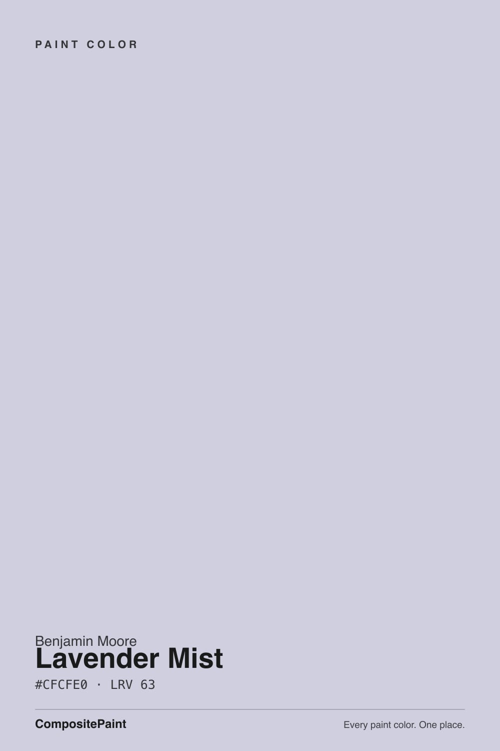
- 3Lavender Mist63
- 4Silver Peony68
- 5White Lavender76
The Fast Verdict
Lavender Mist is purple with the volume turned almost all the way down: a pale violet built on blue rather than pink, grayed enough that it reads like a tinted neutral instead of a color statement. In real daylight it is unmistakably lavender and genuinely restful. In a dim room, or under warm bulbs, the violet drains out and you are left with a cool off-white that cost you a gallon of purple. Sample it in the actual room before you commit — this color's whole personality is borrowed from your light.
Bedrooms that want calm without going gray · nurseries and kids' rooms that should still work in ten years · bathrooms with white tile and nickel · home offices · anyone who wants purple nobody has to be brave about
Your room is dim and north-facing · your trim and floors are warm cream and honey oak · you want the purple to be obvious · you are painting an exterior
- Purple mild enough to live with — no bravery required
- Genuinely restful in a bedroom without going cold gray
- LRV 63 keeps small and mid-size rooms feeling open
- A nursery color that still works for a teenager
- No pink in it, so it never drifts toward dusty mauve
- Loses its violet in dim rooms and under warm bulbs
- Reads juvenile if the whole room is pale and matching
- Fights cream trim, honey oak and golden carpet
- Not an exterior color — BM says so outright
What Color Is Lavender Mist, Really?
A pale violet built on blue, not on red — and that is the entire character of the color. Benjamin Moore's own description calls it a gentle shade of violet with a hint of blue-violet undertone, and the word hint is doing real work: the chroma is low enough that on four walls it behaves like a tinted neutral rather than a purple. There is no pink in it, no mauve, no dusty rose. Next to a warm lilac it looks almost cold. It sits in BM's Color Preview collection, the saturated fan deck, at the pale end of the 2070 violet strip, which is why the chip looks so mild while its neighbors two steps down look like grape juice.
At LRV 63 it is a mid-light color — the exact same brightness as Edgecomb Gray and BM's Sea Salt, it just spends its light budget on violet instead of beige. That number is the honest expectation-setter. It reflects enough light that a small bedroom still feels open, but it is nowhere near a near-white: on the wall you will see color, and the people who describe it as an off-white are describing what happens to it in bad light, not what the paint is.
Undertone in one line: violet resting on blue — never red, never green. If your sample reads faintly pink, that is a 2700K bulb or a west-facing sunset doing it. If it reads pale blue, the room's light is cold and the violet has nothing to lean on. Both versions are the same paint telling the truth about the room.
Where It Shines
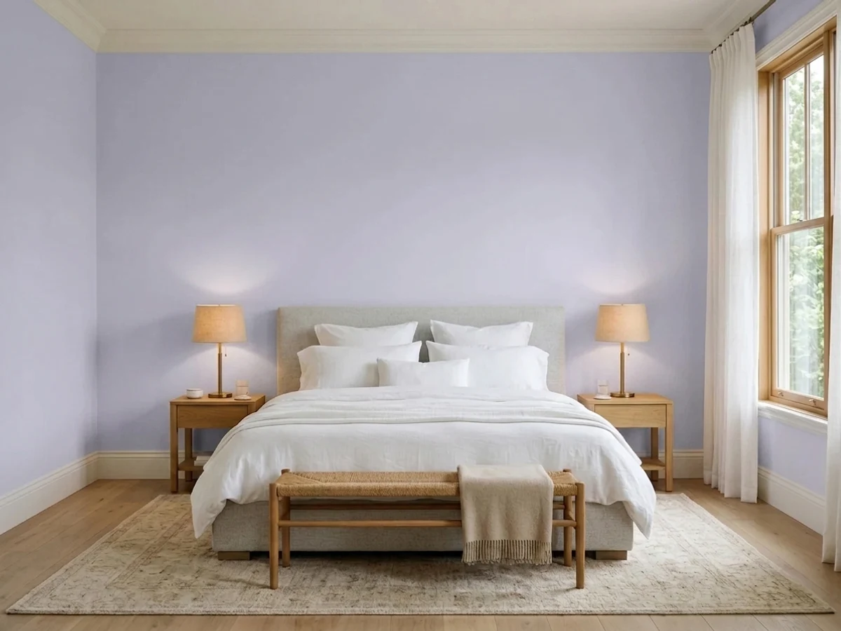
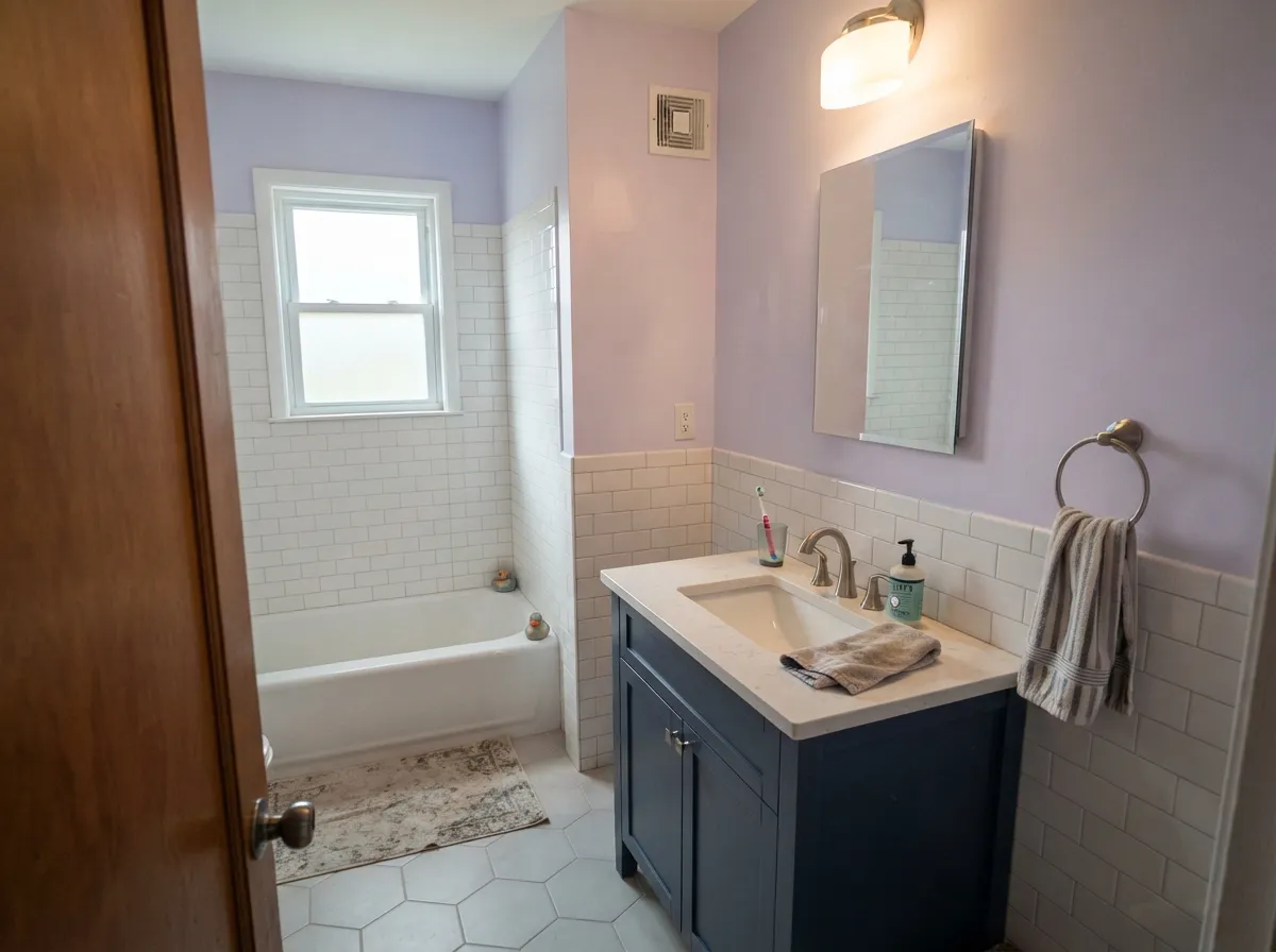
It is at its best in a bedroom with real windows and no pressure to be dramatic. Daylight brings the violet forward, the low chroma keeps it from ever feeling loud, and the room reads calm the way a good gray reads calm — except with a temperature and a mood a gray cannot give you. Its second home is any room you want soft but not sweet: a nursery that will not need repainting when the baby turns eight, a bathroom with white tile and brushed nickel, a home office where a saturated color would be exhausting by 3pm. Give it crisp white trim, pale white oak or gray-washed floors, linen, and silver-toned metal, and it looks deliberate rather than pastel.
Where It Fails
The complaints about Lavender Mist are remarkably consistent, and they come from two opposite directions: half the disappointed owners could not see the color at all, and the other half could see nothing but the color. Both are predictable from the room before you open the can.
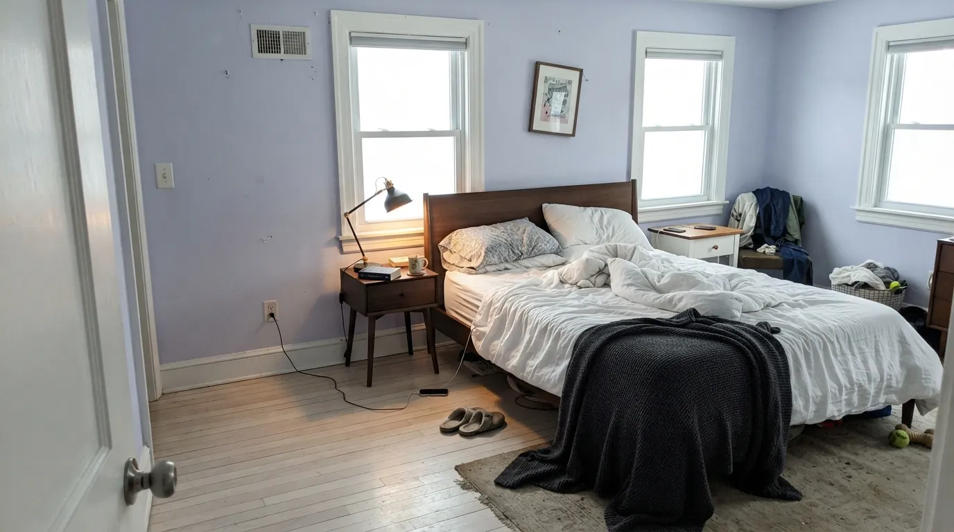
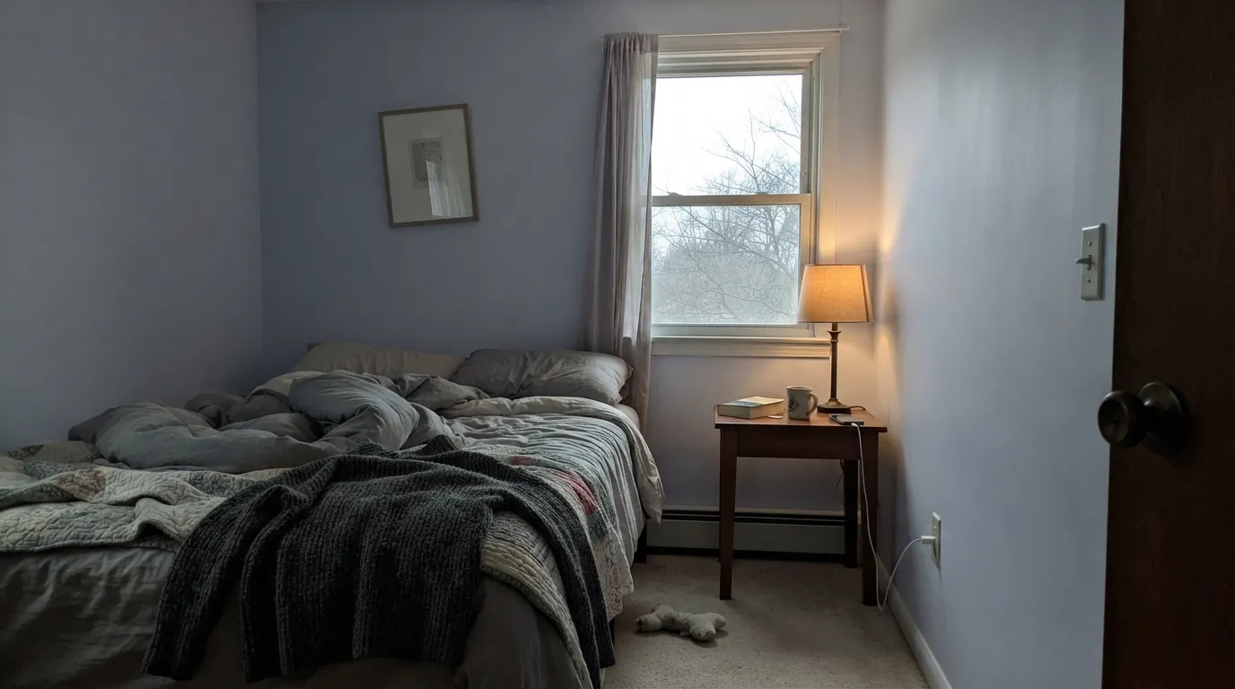
This is the number-one regret. In a dim room, or under warm 2700K lamps, the violet loses its footing and the wall settles into a pale, slightly cool gray-white. Owners describe it as "nice, but I can't tell I painted." At LRV 63 with this little chroma, the color has no reserve to spend in low light. If you want the lavender to be visible after dark, this is not the color — go a full step deeper, toward French Lilac.
The opposite failure, and it is real: bright even daylight, white trim, pale bedding and light wood, and the room reads like a nursery whether or not there is a baby in it. Nothing about the paint is wrong — the styling is. Adult materials fix it faster than a repaint: walnut or black metal, charcoal or navy textiles, linen instead of pastel cotton, one genuinely dark note somewhere in the room.
Put warm cream woodwork next to a cool blue-violet and the trim looks yellowed and slightly dirty — this is why a warm white like White Dove is the wrong partner here, however safe it is everywhere else. Floors are the same argument: yellow-orange sits opposite violet on the wheel, so honey oak and golden builder carpet push the walls purpler while the walls push the floor oranger. White oak, gray-wash, walnut and pale carpet all behave.
Room by Room
The color's natural home, and the reason most people search for it. Matte finish, crisp white trim, one dark anchor (a charcoal headboard, black lamps, a navy throw) so it reads adult rather than pastel. Keep the bulbs at 3000K if you want the violet to survive after sunset — 2700K flattens it toward gray.
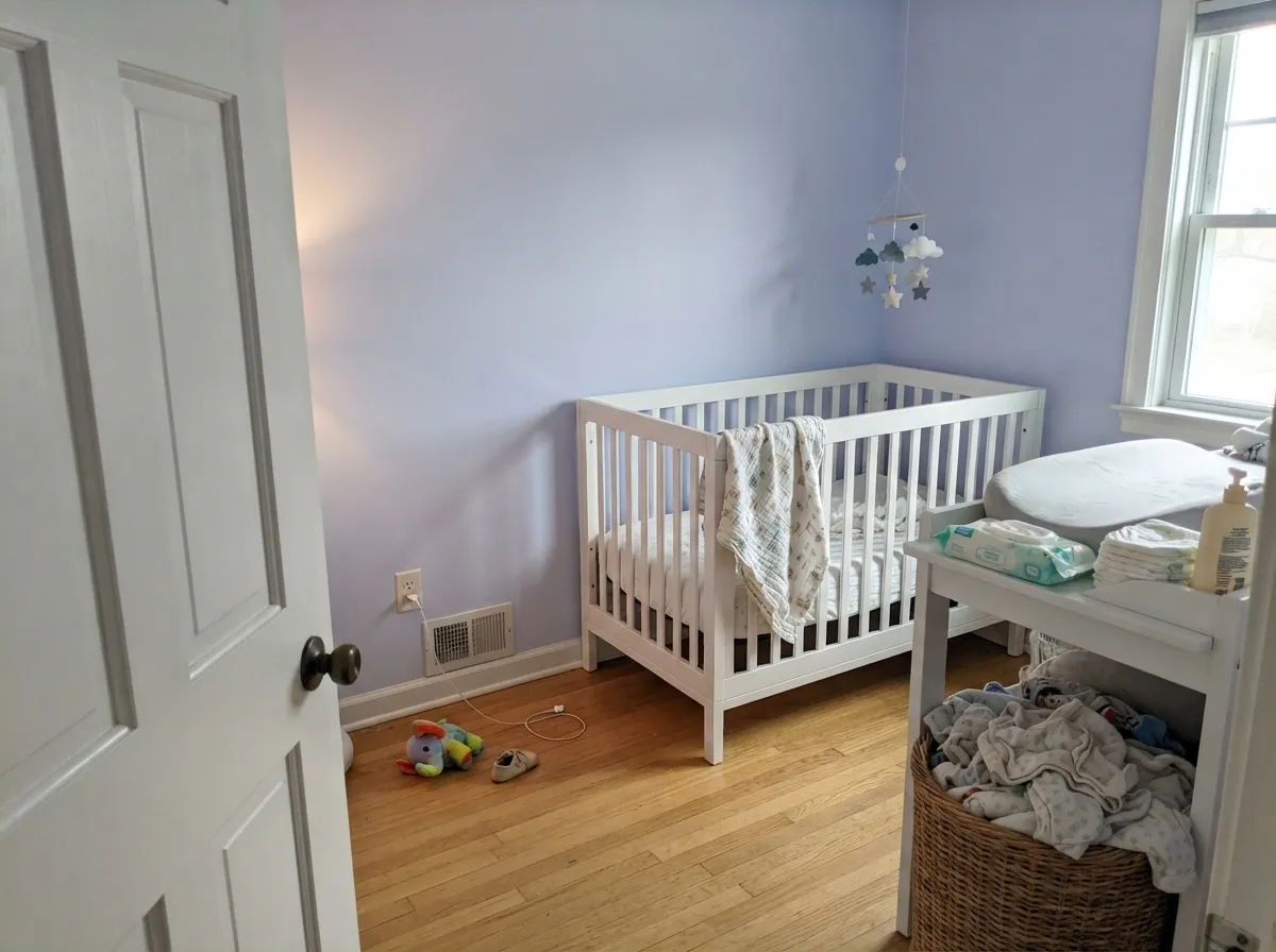
This is a nursery color that does not lock you into a nursery. It is soft enough for a crib room, gender-neutral enough for a shared one, and quiet enough that a nine-year-old's posters and a teenager's desk both look fine against it. Eggshell so you can wipe it, and skip the matching pastel bedding — that is what makes it look babyish.
White subway tile, chrome or brushed nickel, a white quartz top: Lavender Mist looks clean and slightly spa-like in that company, and it beats a cold gray for a windowless bath because it at least has a temperature. Satin on the walls, and be honest that brass hardware pulls against it — nickel is the easier win here.
Low-chroma color is easier to sit inside for eight hours than a saturated one, and this reads calm on camera without turning your face green the way a mid-green wall does. Eggshell, and put the desk where the window is not directly behind you, or the wall goes flat gray in every video call.
It can work in a bright, closed living room with white trim and pale wood, but in an open plan it has to negotiate with kitchen wood tones and every adjacent wall color, and a pale violet loses those arguments. If you want the color to carry a main floor, Balboa Mist next door is the safer handoff — it is a neutral that already leans violet.
Benjamin Moore does not recommend 2070-60 as an exterior color, and outdoor light backs that up: full sun bleaches the little chroma it has, and from the curb a pale violet facade reads as sun-faded gray or as a mistake. Keep this one indoors.
Your Light Is the Risk
A south-facing or well-windowed room is where you actually get lavender: the violet is clean, present and unmistakable, and the gray base keeps it from ever going sweet.
Cool, weak daylight keeps the blue and drops the violet. The wall flattens into a pale blue-gray that reads more corridor than bedroom — the exact "I can't tell I painted" complaint.
East rooms are clearly lilac all morning, then go quiet and gray by mid-afternoon. West rooms do the reverse and flush faintly pink-gray for the golden hour. Sample on both walls, at both times.
2700K warm bulbs cancel the blue and leave a soft warm gray; cool 4000K LEDs push it firmly toward blue-lilac. 3000K is the compromise that keeps it recognizably lavender at night.
Most complaints about Lavender Mist are a light mismatch. Upload a photo of your actual room and see it on your walls — then ask for the same wall in north light or evening lamps before you buy a single sample.
Need It From Another Brand?
Any paint counter can custom-tint Benjamin Moore 2070-60 directly. If you would rather stay in one brand's own deck, these are the closest stock matches, measured as ΔE2000. Under 2 is a difference you will not see on the wall.
| Brand | Closest color | ΔE | LRV | |
|---|---|---|---|---|
| Sherwin-Williams | Potentially PurpleSW 6821 · Sherwin-Williams | 3.1 | 62 | Color page → |
| Behr | FancifulM560-2 · Behr | 3.1 | 65 | Color page → |
| Valspar | Daybreak Beckons8003-48A · Valspar | 1.9 | 64 | Color page → |
| PPG / Glidden | Lavender HazePPG1175-3 · PPG / Glidden | 1.7 | 64 | Color page → |
| Glidden | Smokey Violet50BB 63/066 · Glidden | 2.5 | 63 | Color page → |
| Dutch Boy | Subtle Purple344-1DB · Dutch Boy | 2.5 | 62 | Color page → |
Similar Benjamin Moore Colors
The nearest shades to Lavender Mist within Benjamin Moore's own range, ranked by perceptual color distance — useful when you want the same look a touch lighter, darker, or warmer.
WCAG 2.1: AA is 4.5 : 1 for normal text, 3 : 1 for large text, AAA is 7 : 1.
Lavender Mist vs the Colors You're Also Considering
Every Lavender Mist sample board has the same rivals on it. The numbers show the real lightness gap — then it comes down to which risk you would rather live with.
Pick this when you want the softer, airier version that keeps a small room feeling open.
Benjamin Moore 1403 · LRV 56French LilacPick this if you want the lavender to still be visible at night — it is a step deeper and a touch warmer, so it holds its color in low light.
Pick this when you want the room to stay light; Sleepy Hollow at LRV 28 is a mood, not a background.
Benjamin Moore 1454 · LRV 28Sleepy HollowPick this for purple with real weight — a dusty violet with a whisper of red that turns velvety under lamps.
Lavender Mist Coordinating Colors
The rule for coordinating with Lavender Mist is the opposite of the usual advice: stay on the cool side. It wants crisp whites, blue-violets and true darks, and it argues with every cream and every warm off-white. Benjamin Moore's own suggested pairing for this chip is a clean white plus a deep, moody blue-gray, which is exactly the structure that works in real rooms. These are the partners worth having on the sample board:
Why Pale Lavender Stopped Being a Punchline
Violet spent two decades as the color nobody would admit to liking. It carried the memory of 1990s guest rooms and dusty-plum borders, and through the entire gray era the paint decks quietly kept colors like this one on the shelf while nobody bought them. What changed is that the industry's own headline colors drifted this way: Benjamin Moore named Blue Nova, a deep blue-violet, its Color of the Year for 2024, then followed with Cinnamon Slate, a purple-brown, for 2025. Two years in a row, the color of the moment was some version of purple pretending to be a neutral.
Lavender Mist is the pale, low-risk end of that same idea, and it has an advantage over the trend colors it now sits next to: it was never a trend color. It is a plain Color Preview chip that has been in the deck for years, grayed enough to read as atmosphere rather than as a statement. If violet cools off again, a wall this quiet ages roughly the way a light gray ages — it stops being noticed rather than starting to look dated.
Lavender Mist With Wood Tones, Floors and Metals
Floors decide this one more than the paint chip does. Pale white oak and gray-washed wood are the easiest match — both are cool or neutral enough to leave the violet alone, and the Scandinavian-adjacent result is the look most people picture when they search for this color. Walnut and espresso work too, and they do the review a favor: a dark, serious floor is the fastest way to stop a pale lavender room reading juvenile. Light gray and greige carpet are safe; pale linen-colored carpet is fine.
The honest no is anything golden. Honey oak floors, orange-stained trim and yellow-beige carpet sit opposite violet on the wheel, so each side exaggerates the other and the room ends up looking like an argument. A large pale rug is a genuine fix if the floor is staying; a second coat is not.
Metals are simpler than usual here. Brushed nickel, chrome and polished silver all sit naturally against a cool violet, and matte black gives it the one hard edge it needs. Unlacquered brass is the risky one — it can look beautiful in a warm-lamplit bedroom and distinctly yellow against the same wall at noon, so hold the sample against the actual wall in daylight before you buy the light fixtures.
Three Ready Palettes Built on Lavender Mist
A color is never alone on the wall. These are complete combinations in the 60-30-10 pattern, with the reason each one holds together. Every one opens in the visualizer.
Blue Nova is the same blue-violet family four steps deeper, so the accent reads as the room getting serious rather than as a second color. Chantilly Lace is the trim that matters here — its clean, cool edge keeps the walls looking intentional, where a warm cream would look yellowed against them.
Try this palette in your roomA softer navy under a pale violet is the pairing that stops a lavender bathroom reading like a birthday cake: same cool side of the wheel, wildly different depth. White subway tile, a white quartz top and brushed nickel finish it — this is the one scheme where nickel beats brass outright.
Try this palette in your roomBalboa Mist is the light neutral that already carries a violet lean, so walking from the hall into a Lavender Mist bedroom reads as the same house turning up the color, not as a color change. Super White on the trim and doors keeps both sides crisp; a cream trim would sour against the lavender half.
Try this palette in your roomLavender Mist FAQ
Is Lavender Mist too purple for a bedroom?
For most rooms, no — the risk runs the other way. It is a low-chroma violet at LRV 63, so in normal daylight it reads as a soft, restful lavender and in dim light it barely reads as color at all. If you want a purple that announces itself, this is not it; if you want a bedroom that feels calm and slightly cool without going gray, it is close to ideal.
What trim white goes with Lavender Mist?
A crisp, cool-clean white. Chantilly Lace is the default and Super White is the equally good alternative — both keep a clean edge against the violet. Avoid warm creams: a warm white like White Dove will look yellowed and slightly grubby next to it, which is the most common pairing mistake with this color. Semi-gloss on the trim, matte or eggshell on the walls.
Will Lavender Mist look blue or gray on my walls?
Both, depending on the hour. It is built on blue, so cold north light and cool 4000K LEDs push it toward pale blue-gray, while warm 2700K bulbs cancel the blue and leave a soft warm gray. The only light where it is reliably, obviously lavender is bright even daylight. Tape a large sample on two different walls and look at it at 10am, 4pm and 9pm before you buy.
Is it a good nursery color?
It is one of the better ones, precisely because it does not commit to being a nursery. It is soft, gender-neutral and light enough to keep a small room open, and it still looks reasonable behind a nine-year-old's desk. Use eggshell so you can wipe it, and avoid matching everything else in the room to it — an all-pastel nursery is what makes this color look babyish.
Does Lavender Mist work with oak floors?
White oak, gray-washed and walnut floors all work well; pale carpet is fine. Honey oak is the genuine clash — yellow-orange sits directly opposite violet on the wheel, so the floor goes more orange and the walls go more purple, and no extra coat fixes geometry. With wall-to-wall golden oak, either put a large pale rug between the two or choose a neutral like Balboa Mist and keep the violet lean without the fight.
Can I use Lavender Mist on an exterior?
No. Benjamin Moore does not recommend 2070-60 as an exterior color, and full sun would work against it anyway: outdoor light washes out the small amount of chroma it has, so from the street the house reads sun-faded gray rather than lavender. Keep it for interior walls, and pick a purpose-built exterior color outside.
Have you painted with Lavender Mist?
Rate it — one tap helps the next reader decide.
Ask a Question