Sleepy Hollow
The dusty mauve everyone scrolls past, reviewed honestly: the rooms where it turns velvety, the light that turns it purple, and what to pick instead.

Jessica has spec'd whites and neutrals for more than 300 rooms and keeps a sample wall of painted drawdowns in her studio. Every color review is checked against real reader rooms in the comments and re-tested when a formula changes. About the testing process →
- 1Black Fox7
- 2Pewter Green12
- 3Sleepy Hollow28
- 4Stardew43
- 5Upward57
The Fast Verdict
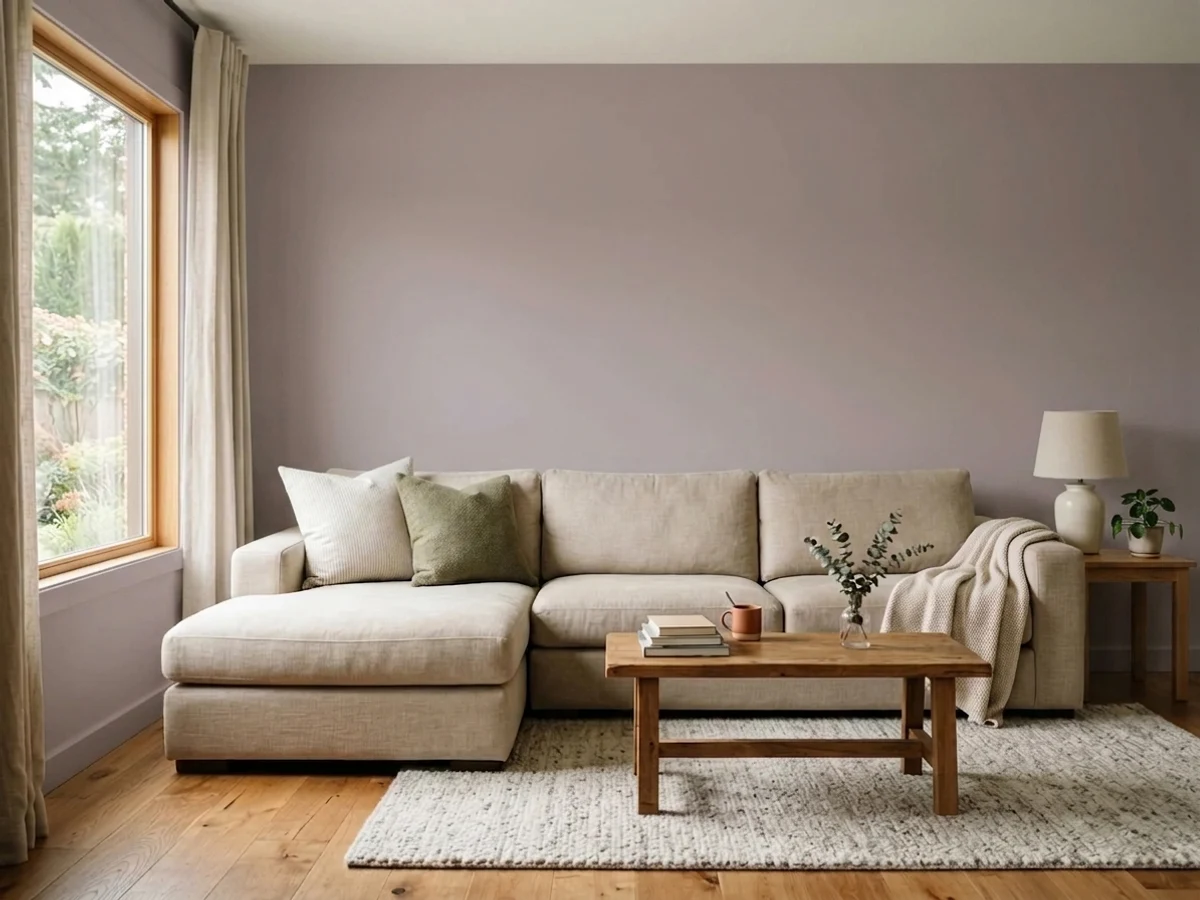
Sleepy Hollow is what happens when purple grows up: a violet grayed down so far it almost passes for a neutral, with a whisper of red that keeps it warm-blooded. Under evening lamps it turns velvety and rose-tinged; in flat daylight it steps back into smoky gray. If you want a bedroom that feels like dusk all day, this is the color — just never buy it hoping for gray.
Bedrooms and snug dens · powder rooms and vanities · lamplit rooms that should feel like evening · anyone circling the mauve trend but afraid of pink
You actually want gray · your floors are honey oak or golden builder beige · the room runs on cool white LEDs · you repaint rarely and want zero trend risk
- Purple that behaves like a neutral — mauve without the candy
- Turns velvety, rose-warm and expensive under evening lamps
- Bedrooms and powder rooms feel finished with one coat color decision
- Deep enough (LRV 28) to hold its color in bright rooms
- Riding the mauve revival, but grayed enough to outlast it
- Not gray — buyers expecting gray see purple by the second wall
- Fights honey oak, golden beige and everything yellow-warm
- Cool LEDs and dim north light turn it dull concrete-lilac
- More repaint risk than a greige if mauve dates itself
What Color Is Sleepy Hollow, Really?
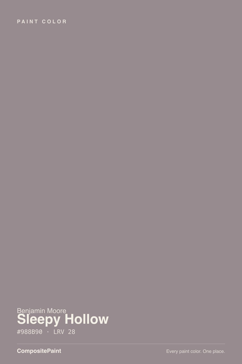
A dusty violet with a drop of red — and the red is the whole trick. Straight gray-violets go cold on a wall and read like a bruise; the touch of red in Sleepy Hollow pulls it toward rose and mauve, so it lands soft instead of somber. Benjamin Moore files it in the Classics collection, which tells you something: this is not a color invented for the current mauve moment. It has sat quietly in the deck for decades, and the trend finally circled back to it.
At LRV 28 it is a genuine mid-to-deep tone. That depth is what makes it usable: a paler mauve washes out to baby-lilac in a bright room, but Sleepy Hollow holds its smoky color in full daylight and then sinks toward a charcoal-plum after dark. Plan for the wall to read a step deeper and noticeably more purple than the chip — every muted violet does this, and it is the number-one surprise in reader photos.
Undertone in one line: violet first, a whisper of red second — never blue. If your sample reads flat gray, your light is cold; if it reads pink, that is west sun or warm bulbs doing it. Both versions are the same paint being honest about the room.
Where It Shines
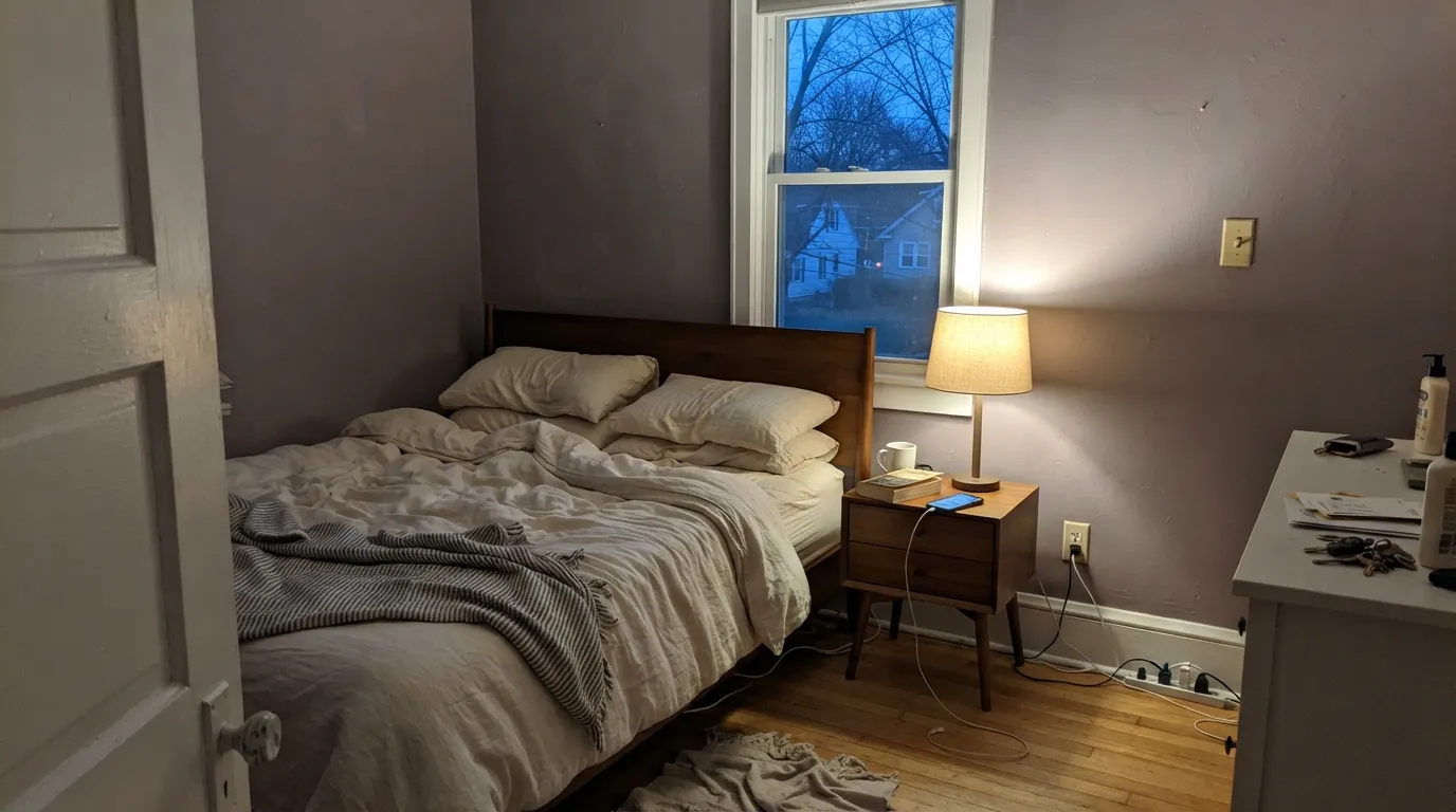
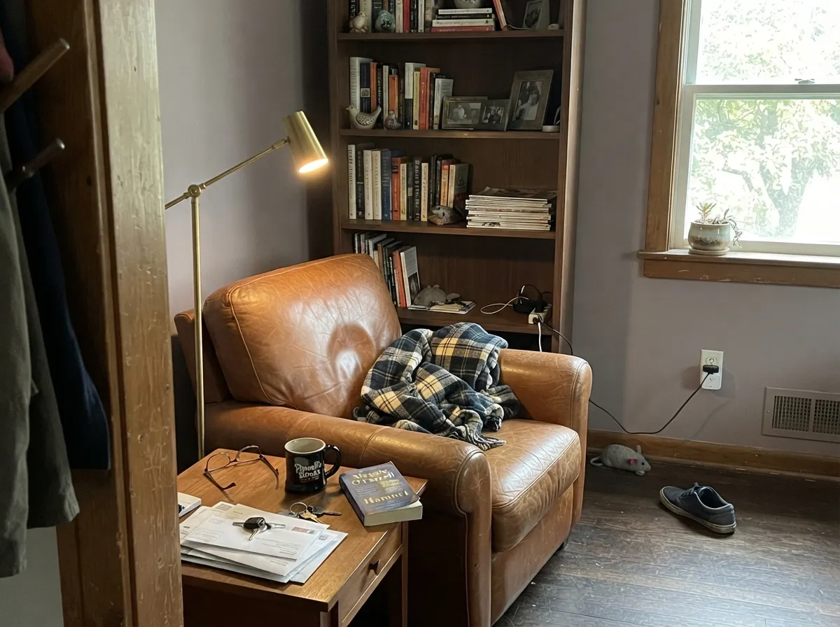
This color is built for rooms you use at night. Under 2700K lamplight the red comes forward and the walls go velvety — the exact dusk-like calm the name promises — which makes it one of the deck's best bedroom colors. Its second home is the small commitment: a powder room, a vanity, an interior door, where the color reads custom and expensive without betting the whole house on mauve. Give it cream linen, walnut, aged leather and brass, and it looks like it was always there.
Where It Fails
Almost every regret story about Sleepy Hollow follows one of three scripts, and all three are predictable before the first coat. None of them are the paint's fault — but if your room matches one, this is not your color, and sampling bigger will only confirm it.
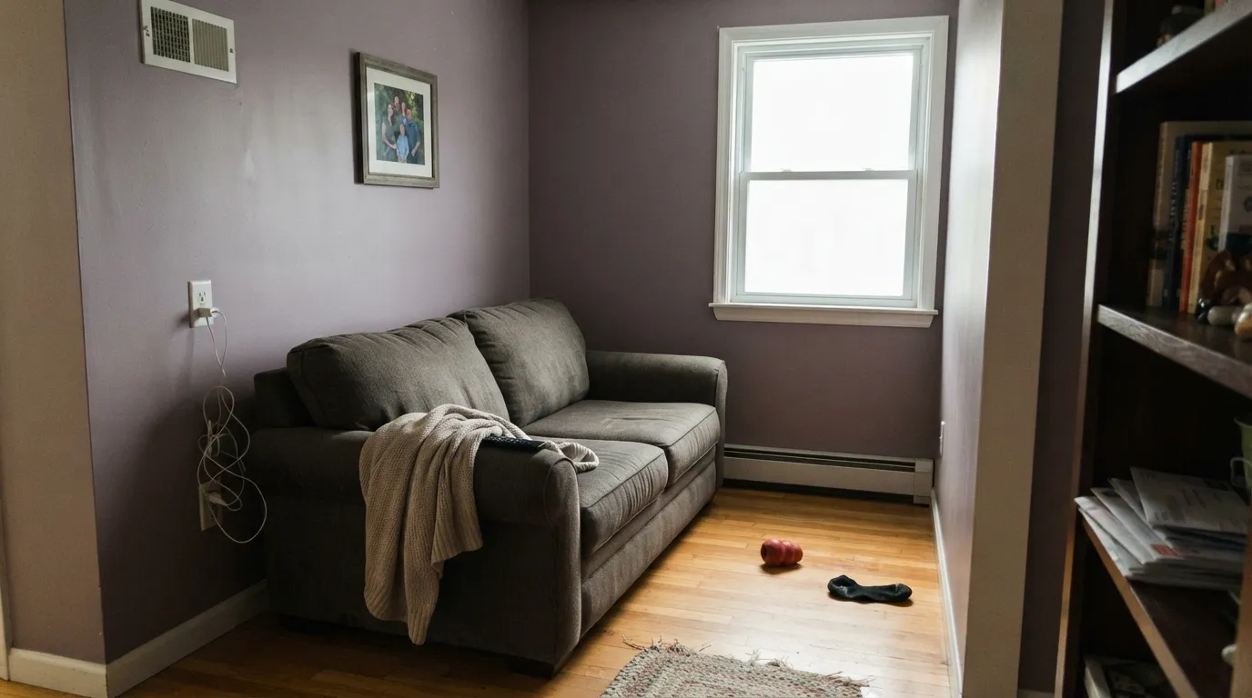
On the chip it passes for a moody warm gray. On four walls the violet is unmistakable — depth multiplies undertone. If your goal is "gray with a little personality," this is too much personality; look at SW Light French Gray instead and let it merely flash violet.
Yellow-orange is violet's complement, so golden oak floors, oak trim and builder-beige carpet all amplify the purple while the walls push the floor toward orange. Both sides lose. Sleepy Hollow needs walnut, espresso, pale white oak or a big rug between it and anything golden.
Cold light kills the red and leaves a dull concrete-lilac that readers describe as dingy. The fix costs less than repainting: warm 2700K bulbs are part of this paint job. If the room is dim and you refuse lamps, pick a color that doesn't depend on warmth.
Room by Room
Dusk on the walls all day, velvet at night. Matte finish hides wall texture and deepens the color; White Dove trim keeps the edges soft. With cream bedding and warm lamps it is the rare "moody" color that still reads restful.
Low light flatters it, which makes it perfect for rooms that never see noon. Leather, walnut shelves and brass lamp light are its natural company. Eggshell for durability where chairs scuff.
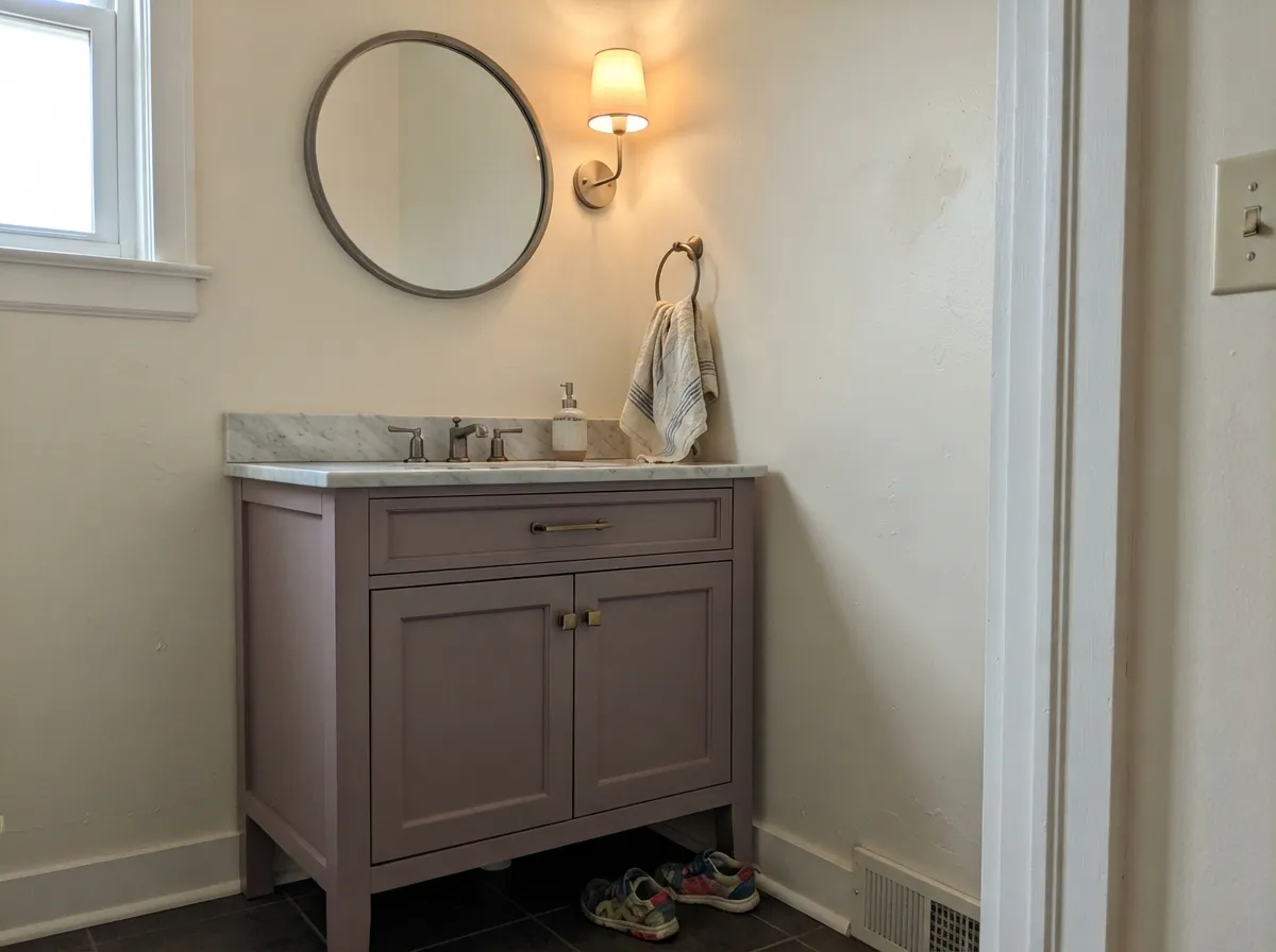
Benjamin Moore itself lists it for bath vanities, and it earns the listing: satin Sleepy Hollow on a vanity under a marble top and brass pulls is a weekend project that looks like a design fee. Drenching all four powder-room walls works too — small rooms take deep color well.
Beautiful in a closed, lamplit living room with cream and walnut. Riskier in open plans, where it has to negotiate with kitchen wood tones and whatever color the adjacent rooms wear. Pale Oak next door is the safe handoff — it shares the violet-taupe lean.
On an island or a coffee hutch under Swiss Coffee walls it is genuinely charming, vintage without being cute. A full kitchen of mauve cabinets is a bold bet, and a losing one over honey-oak floors. Satin cabinet enamel either way.
Full outdoor sun grays it toward wet concrete and the violet reads as discoloration from the street. The exception is a shaded, north-facing front door on a white or pale-gray house, where the dusty violet reads intentional and quietly odd in a good way.
Your Light Is the Risk
2700K bulbs wake the red and the walls go velvet-rose. This is the light the color was made for — the reason to buy it.
Cool gray daylight mutes the red and pushes it toward flat concrete-lilac. Fine if you half-wanted gray; disappointing if you wanted mauve.
The brightest, most honest read: clearly a dusty violet at midday, softening warmer through the afternoon. Sample here first.
Low warm sun flushes it distinctly pink for an hour. Most owners love the shift; if pink is your dealbreaker, test at 6pm before committing.
Most complaints about Sleepy Hollow are a light mismatch. Upload a photo of your actual room and see it on your walls — then ask for the same wall in north light or evening lamps before you buy a single sample.
Need It From Another Brand?
Any paint counter can custom-tint Benjamin Moore 1454 directly. If you would rather stay in one brand's own deck, these are the closest stock matches, measured as ΔE2000. Under 2 is a difference you will not see on the wall.
| Brand | Closest color | ΔE | LRV | |
|---|---|---|---|---|
| Sherwin-Williams | CoquinaSW 9158 · Sherwin-Williams | 2.4 | 28 | Color page → |
| Behr | ContessaUL250-6 · Behr | 0.9 | 27 | Color page → |
| Valspar | Sunrise Over Tahiti8004-2D · Valspar | 1.7 | 27 | Color page → |
| PPG / Glidden | Gray VioletPPG1014-5 · PPG / Glidden | 2.7 | 28 | Color page → |
| Glidden | Greyed Rose Quartz50RR 27/033 · Glidden | 1.5 | 27 | Color page → |
| Dutch Boy | Castle Wood445-4DB · Dutch Boy | 1.8 | 27 | Color page → |
Similar Benjamin Moore Colors
The nearest shades to Sleepy Hollow within Benjamin Moore's own range, ranked by perceptual color distance — useful when you want the same look a touch lighter, darker, or warmer.
WCAG 2.1: AA is 4.5 : 1 for normal text, 3 : 1 for large text, AAA is 7 : 1.
Sleepy Hollow vs the Colors You're Also Considering
Every Sleepy Hollow sample board has the same rivals on it. The numbers show the real lightness gap — then it comes down to which risk you would rather live with.
Pick this for the lighter, airier, more clearly violet version of the same mood.
Benjamin Moore 2113-40 · LRV 19Cinnamon SlatePick this if you want it deeper and browner — the 2025 Color of the Year grounds a room like a wool coat.
Pick this when the violet is the point, not an accident.
Sherwin-Williams SW 55 · LRV 53Light French GrayPick this if you truly want gray — it only flashes violet in cool light; Sleepy Hollow lives there.
Sleepy Hollow Coordinating Colors
The rule for coordinating with Sleepy Hollow: warm whites, tonal plums, and near-blacks — and keep everything yellow at arm's length. It pairs with cream far better than with beige, loves walnut and brass, and layers beautifully with deeper members of its own family. These are the partners that keep showing up in rooms that work:
The Mauve Revival: Why a Decades-Old Classic Is Suddenly Everywhere
Sleepy Hollow sat in the Benjamin Moore deck through the entire gray decade without anyone asking for it. Then the pendulum swung: Cinnamon Slate — a deeper, browner cousin — was named Color of the Year 2025, and BM's 2026 Color Trends palette leans the same way with Batik, a dusty pink-purple. Muted violet went from "grandma's guest room" to the color designers reach for when a client says beige is boring and green is everywhere.
Here is why the old Classic beats the trend colors it inspired: Sleepy Hollow is grayer than both, which means it reads as atmosphere rather than as A Purple Wall. You get the current mood without the timestamp — and if the trend passes, a smoky violet-gray ages the way greige does, not the way accent colors do.
Sleepy Hollow With Wood Tones and Floors
This decision gets made at the floor, not the paint store. Walnut and espresso are the color's best friends — the dark red-brown depth makes the violet read smoky and deliberate. Pale white oak and gray-washed floors are safe and give the room a softer Scandinavian-vintage cast. Cream carpet is fine; true gray carpet is fine.
The one honest no is golden: honey oak floors, orange-stained trim, yellow-beige carpet. Yellow-orange sits directly opposite violet on the wheel, so each side exaggerates the other — the floor reads more orange, the walls read more purple, and no amount of coats fixes geometry. If the golden floor is staying, put a large rug between it and this paint, or choose Pashmina and keep the mood without the fight.
Metals are the easy part: unlacquered brass, antique bronze and matte black all work; polished chrome is the only one that leans cold against it.
Three Ready Palettes Built on Sleepy Hollow
A color is never alone on the wall. These are complete combinations in the 60-30-10 pattern, with the reason each one holds together. Every one opens in the visualizer.
Tonal mauve layering is what keeps this sophisticated instead of themed: two depths of the same family, separated by a warm white. White Dove matters here — a stark bright trim white would make the walls read dusty by comparison.
Try this palette in your roomCream and mauve is the classic vintage pairing — Swiss Coffee keeps the little room airy while the vanity carries the color. Wrought Iron gives one near-black note so the scheme reads deliberate; brass hardware and a marble top finish the argument.
Try this palette in your roomPale Oak is the rare light neutral with the same violet-taupe lean, so Sleepy Hollow doors and a Sleepy Hollow den read like the same house getting quieter, not a color change. White Dove trim ties both back together.
Try this palette in your roomSleepy Hollow FAQ
Is Sleepy Hollow purple or gray?
Purple — quietly, but unmistakably. In cool or dim light it can pass for a smoky gray, and under warm lamps it turns rosy mauve, but on four walls nobody will call it gray. If gray is what you actually want, this is the wrong color; that mismatch is behind most of its bad reviews.
What trim white goes with Sleepy Hollow?
A warm, soft white — White Dove is the default, Swiss Coffee if you want the vintage cream-and-mauve look. A stark bright white (Chantilly Lace territory) makes the walls read dusty and tired next to the crisp edge. Semi-gloss on the trim, matte on the walls.
Is it good for a bedroom?
It is arguably the best room for it. The color is calmest in low, warm light — exactly a bedroom's operating conditions. Use matte, keep the bulbs at 2700K, and pair with cream or white bedding rather than beige, which reads yellow against it.
Does Sleepy Hollow work with oak floors?
Depends entirely on the oak. Walnut, espresso and pale unstained white oak are excellent. Golden honey oak is the one genuine clash: yellow-orange is violet's complement, so the floor goes more orange and the walls go more purple. A large rug helps, but with wall-to-wall honey tones pick a different color.
Can I use it on kitchen cabinets?
Yes — Benjamin Moore lists it for cabinets — but it works best in doses: an island, a hutch, a bathroom vanity, under cream walls. A whole kitchen of mauve cabinets is a strong commitment, and satin urethane-fortified cabinet enamel is non-negotiable either way.
Is mauve going to date itself?
Some version of this question sank the color for twenty years, and here is the honest answer: saturated trend-mauves will date; Sleepy Hollow is grayed down far enough to sit closer to a neutral, and it predates the trend by decades — it is in BM's Classics collection. It carries more repaint risk than a greige, less than almost any other color this interesting.
Have you painted with Sleepy Hollow?
Rate it — one tap helps the next reader decide.
Ask a Question