Hazy Lilac
The mid-tone lilac Benjamin Moore put in its 2024 Color Trends palette, reviewed honestly: where the purple glows, where cool light flattens it, and what to pick instead.

Jessica has spec'd whites and neutrals for more than 300 rooms and keeps a sample wall of painted drawdowns in her studio. Every color review is checked against real reader rooms in the comments and re-tested when a formula changes. About the testing process →
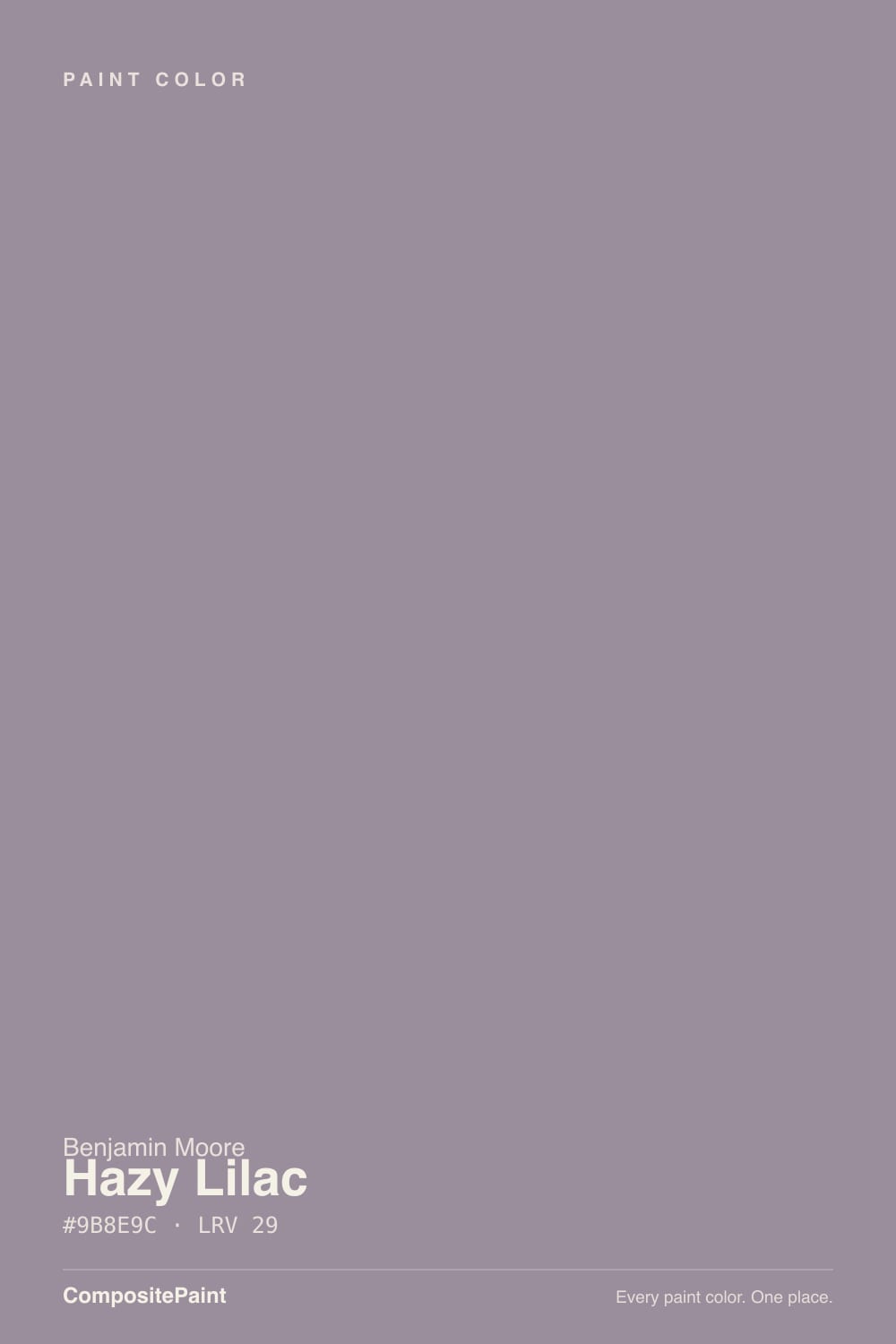
- 1Blue Nova17
- 2Gothic Purple24
- 3Hazy Lilac29
- 4Wisteria48
- 5French Lilac56
The Fast Verdict
Benjamin Moore's own line on Hazy Lilac is "a hint of gray brings moody allure to this medium purple" — and the purple wins. Where a color like Sleepy Hollow disguises itself as a warm neutral, Hazy Lilac owns its color: a cooler, blue-leaning lilac with just enough gray veil to read sophisticated instead of sweet. Benjamin Moore put it in the 2024 Color Trends palette for exactly that reason — it is confident, current color, not a pastel accident.
Bedrooms and reading nooks · powder rooms and small baths · dining rooms and dens under warm light · anyone who wants real purple, not an accidental one
You actually want a neutral gray · your room runs on cool white LEDs with little daylight · you're painting a large open-plan floor wall to wall · you want zero-risk resale safety
- Confidently purple without tipping into pastel or candy-sweet
- A real, verifiable pick in Benjamin Moore's 2024 Color Trends palette — current, not random
- LRV 29 holds its dusty violet color through the day instead of washing out
- Small rooms — powder rooms, dens, reading nooks — feel finished in one coat
- Warm lamp light at night turns it soft and inviting, never spooky
- Not a substitute for gray — the violet shows on four walls even to buyers who "don't like purple"
- Cool LEDs and dim north light flatten it to a dull, cold gray-violet
- An entire open-plan floor in this color reads heavy, not sophisticated
- More repaint risk than a greige if the mood-purple trend fades
What Color Is Hazy Lilac, Really?
A cooler, blue-leaning lilac with a veil of gray over it — Benjamin Moore's own copy calls it "a hint of gray" on "medium purple," and that is the honest order of operations: this is a purple first, softened second. Most lilacs on the market lean warm and pink; Hazy Lilac leans the other way, toward blue-violet, which is what keeps it from reading like a nursery pastel or a candy-shop color. It sits in Benjamin Moore's Color Preview collection and made the cut for the brand's 2024 Color Trends palette alongside White Dove and Blue Nova — a real, verifiable sign designers were reaching for it as a fresh alternative to another beige-greige wall.
At LRV 29 it is a genuine mid-depth color, not a pale wash — it holds its dusty violet character through the day instead of fading to baby-lilac the way pale purples do. Light changes its temperature more than its depth: in bright, warm south or west exposure it reads as a clear, confident purple; in cooler north daylight it grays down further, closer to a smoky violet-gray than a colorful lilac. Both are honest readings of the same paint — plan for the shift rather than being surprised by it.
Undertone in one line: blue-violet with a gray veil — never warm or pink like a rosy mauve. If your sample reads flat gray with barely any color, that is cold light doing its work; if it reads distinctly more purple than the chip, that is normal — depth intensifies undertone on real walls.
Where It Shines
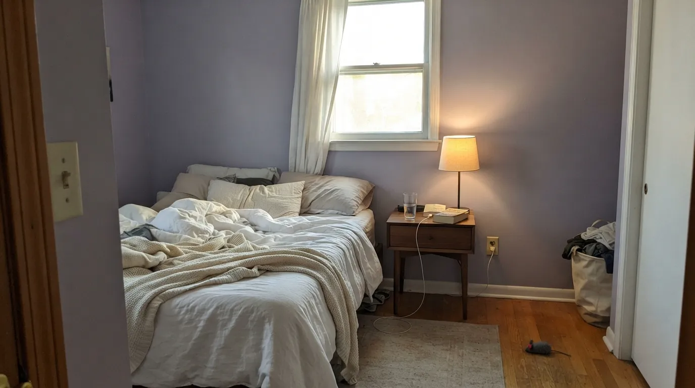
Give it a contained room and real light and it looks deliberate, not decorative. Bedrooms are its home base — under a warm lamp at night the color turns soft and dusty rather than sharp — and its second-best job is the small commitment: a powder room, a den, a dining room lit by a chandelier, where the color reads like a design decision rather than a bet on the whole house. It photographs best with walnut wood, brass hardware and cream linens, the same warm-metal, dark-wood company that flatters every muted purple in the deck.
Where It Fails
Almost every disappointed review of Hazy Lilac traces back to one of three predictable situations. None of them are the paint's fault — but if your room matches one, this is not your color, and a bigger sample will only confirm it.
North-facing daylight and cool white LEDs both drain the violet out of Hazy Lilac and leave a flat, slightly cold gray behind. Readers expecting the lively lilac from the swatch call it dingy. The fix is warm 2700K bulbs and, ideally, a room that sees some real daylight — if neither is possible, this color will disappoint.
On the paper chip the gray veil can read as a moody neutral. On four walls, depth intensifies undertone and the violet is unmistakable — Benjamin Moore's own name for it is "medium purple." If your goal was gray with a hint of personality, this has too much personality; a true gray like SW Light French Gray will behave the way you're picturing.
This is a real, clearly-colored purple at a real mid-depth — beautiful in a bedroom or den with edges to stop at, heavy and costume-y across an uninterrupted great room. It is built to be a contained decision, not a whole-house neutral. Use it in one room or on one wall, not wall-to-wall through an open main floor.
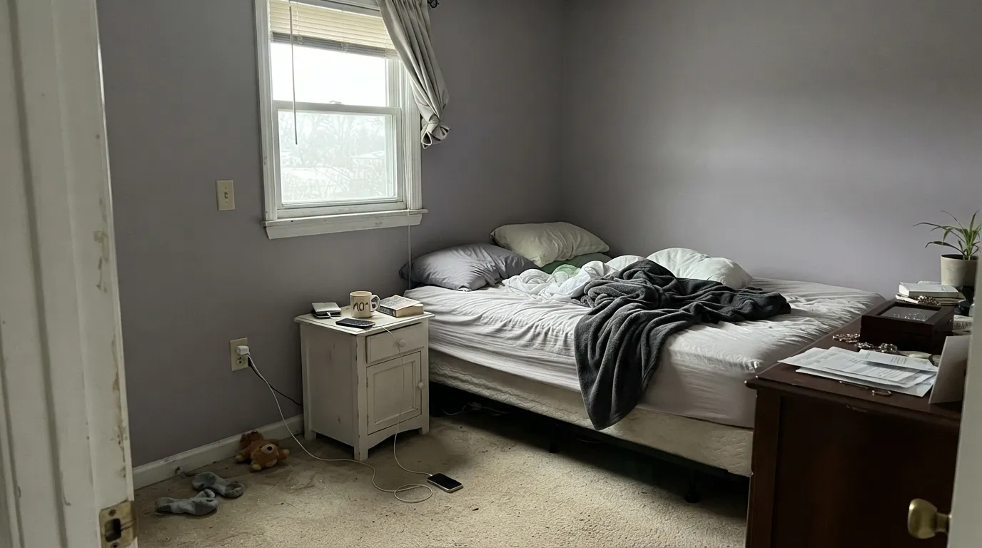
Room by Room
Warm lamplight turns it soft and dusty at night; daylight keeps it clearly, confidently violet. Matte hides wall texture and deepens the color; White Dove trim keeps the edges clean instead of stark.
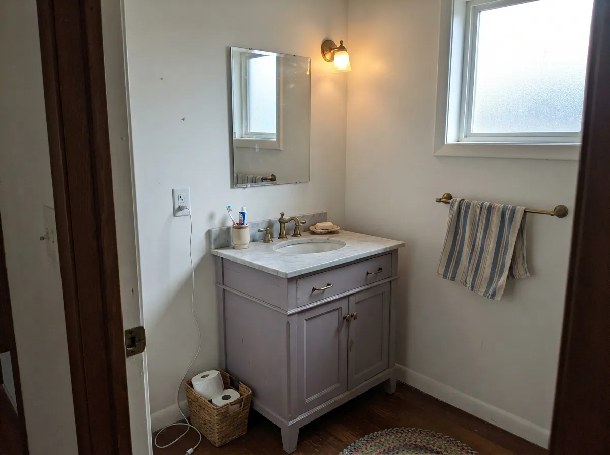
A small, enclosed room lets the color read as intentional rather than overwhelming — exactly why Benjamin Moore recommends it for small spaces. Satin on a vanity under a marble top and brass pulls is a weekend project that looks custom.
A chandelier or sconces at night flatter it the same way bedroom lamps do — soft and dusty rather than cold. Skip it in a dining room that only gets flat overhead fluorescent light.
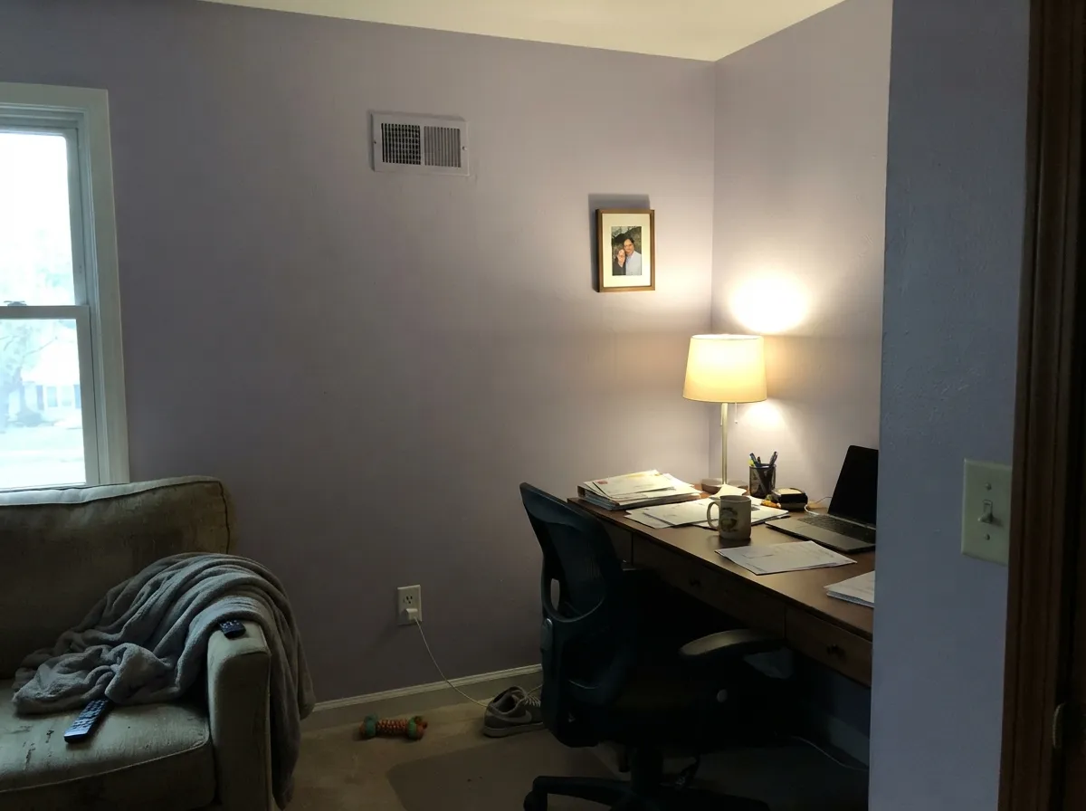
A closed-door room with walnut furniture, brass task lighting and a reading lamp is exactly the company this color wants. It makes a small home office feel considered instead of leftover.
Works well as a single accent wall in an open-plan space; painting the whole open floor in it risks feeling heavy rather than sophisticated, especially where it has to negotiate with a kitchen's different light and wood tones.
Kitchens usually want more reflected light than LRV 29 gives them for the whole room; save Hazy Lilac for an island in a very bright kitchen at most. Outdoors, full sun either grays it out or reads as an odd faded lavender — this is an indoor color.
Your Light Is the Risk
Direct warm sun brings the violet fully forward — the wall reads confidently purple, close to Benjamin Moore's own swatch, not gray.
Cool, overcast north daylight drains the violet and leaves a flat, slightly cold gray behind. Sample big before committing in a dim north room.
Cooler and grayer in the morning, more clearly purple as warmer afternoon light arrives — expect the wall's character to change, not just its brightness.
2700K lamps push it warm and dusty-rose. Cool white LEDs read cold and slightly muddy — swap the bulbs before you consider repainting.
Most complaints about Hazy Lilac are a light mismatch. Upload a photo of your actual room and see it on your walls — then ask for the same wall in north light or evening lamps before you buy a single sample.
Need It From Another Brand?
Any paint counter can custom-tint Benjamin Moore 2116-40 directly. If you would rather stay in one brand's own deck, these are the closest stock matches, measured as ΔE2000. Under 2 is a difference you will not see on the wall.
| Brand | Closest color | ΔE | LRV | |
|---|---|---|---|---|
| Sherwin-Williams | Berry CreamSW 9075 · Sherwin-Williams | 3.2 | 28 | Color page → |
| Behr | Duchess LilacPPU16-13 · Behr | 1.3 | 29 | Color page → |
| PPG / Glidden | Wright MurasakiFLLW771 · PPG / Glidden | 2.2 | 28 | Color page → |
| Glidden | Smoky GrapePPG1174-5 · Glidden | 3.5 | 29 | Color page → |
| Dutch Boy | Pouty Purple345-4DB · Dutch Boy | 1.4 | 30 | Color page → |
| HGTV Home by Sherwin-Williams | Berry CrèmeHGSW 2424 · HGTV Home by Sherwin-Williams | 3.2 | 28 | Color page → |
Similar Benjamin Moore Colors
The nearest shades to Hazy Lilac within Benjamin Moore's own range, ranked by perceptual color distance — useful when you want the same look a touch lighter, darker, or warmer.
WCAG 2.1: AA is 4.5 : 1 for normal text, 3 : 1 for large text, AAA is 7 : 1.
Hazy Lilac vs the Colors You're Also Considering
Every Hazy Lilac sample board has the same rivals on it. The numbers show the real lightness gap — then it comes down to which risk you would rather live with.
Pick this for the cooler, more clearly blue-violet version — Hazy Lilac stays lilac instead of drifting toward mauve.
Benjamin Moore 1454 · LRV 28Sleepy HollowPick this for the warmer, rosier version of muted purple — Sleepy Hollow carries a whisper of red and turns velvety at night.
Pick this when the purple is the whole point, not a risk you're hoping to avoid.
Sherwin-Williams SW 55 · LRV 53Light French GrayPick this if you actually want gray — it only flashes violet in cool light, where Hazy Lilac lives full-time.
Hazy Lilac Coordinating Colors
The rule for coordinating with Hazy Lilac: warm soft whites, walnut-toned neutrals, and near-blacks — keep it away from icy blue-whites, which push the cool violet colder instead of grounding it. These are the partners that keep it looking deliberate rather than accidental:
Why Benjamin Moore Put Hazy Lilac In Its 2024 Color Trends Palette
Hazy Lilac was one of ten colors in Benjamin Moore's 2024 Color Trends palette, alongside White Dove and the year's Color of the Year, Blue Nova. That is a real, checkable fact — not a marketing claim we're repeating on its behalf — and it explains why the color turns up in so many 2024-2025 design features: brands don't put a purple in a flagship trend palette unless they think buyers are ready for real color again after a decade of gray and greige.
What separates Hazy Lilac from a passing trend color is the gray veil built into it. A saturated, high-chroma lilac dates fast; Hazy Lilac's grayed-down mix means it sits closer to a sophisticated neutral than a costume-y accent, which is the same logic that keeps older Classics-collection purples like Sleepy Hollow relevant decades after they were mixed.
Hazy Lilac With Wood Tones and Fabrics
Walnut, espresso and pale white oak are the safe, flattering floor and furniture choices — their coolness or neutrality doesn't fight the blue-violet undertone. Cream linen, brushed brass and blackened iron hardware all read well against it, the same warm-metal, dark-wood combination that flatters most muted purples.
Honey oak floors and warm golden-beige carpet are the one real risk: yellow-orange sits opposite violet on the color wheel, so a golden floor pulls the walls more purple while the walls push the floor more orange — neither side wins. If the golden wood is staying, keep Hazy Lilac to a smaller dose (a door, a vanity, one wall) rather than a full room.
Three Ready Palettes Built on Hazy Lilac
A color is never alone on the wall. These are complete combinations in the 60-30-10 pattern, with the reason each one holds together. Every one opens in the visualizer.
A warm white trim keeps the edges clean instead of stark, and one near-black note anchors the room so the purple reads sophisticated rather than sugary. Walnut furniture and brass lamp light finish the look.
Try this palette in your roomSwiss Coffee keeps a small powder room or nook airy while the vanity or one wall carries the color; Chelsea Gray gives the room a defined edge without competing with the purple. Brass hardware and a marble top finish the argument.
Try this palette in your roomPashmina and Hazy Lilac sit at a similar grayed-down depth, so a Hazy Lilac door or den off Pashmina walls reads like the same house shifting mood, not clashing with it. White Dove trim ties both back together.
Try this palette in your roomHazy Lilac FAQ
Is hazy lilac gray or purple?
Purple. Benjamin Moore's own description calls it "medium purple" with just "a hint of gray." On the paper chip the gray veil can look like a moody neutral, but on four walls it reads unmistakably violet — cooler and bluer than a warm mauve like Sleepy Hollow.
What is the difference between hazy lilac and sleepy hollow?
Temperature. Sleepy Hollow carries a whisper of red and leans warm mauve, turning rosy under lamp light. Hazy Lilac leans blue-violet and stays cooler and more clearly lilac in the same light. Both are grayed-down purples from the same family, but they read differently on a wall.
What trim white goes with hazy lilac walls?
A warm, soft white — White Dove or Swiss Coffee — keeps the trim from fighting the cool violet. A stark, blue-white trim pushes the walls colder and can make them look washed out rather than moody.
Does hazy lilac work in a small bathroom or powder room?
Yes — it is one of its best jobs. Benjamin Moore itself recommends it for small spaces: an enclosed room lets the color read as a deliberate design choice instead of overwhelming the space the way a large open room would.
Will hazy lilac look too purple in a north-facing room?
Cooler north light mutes the violet rather than eliminating it — expect a grayer, more subdued version of the color, not a clash. If you want the fuller, more obviously purple character, test it in a room that gets warmer daylight first.
How many coats does hazy lilac need?
Two coats over a similarly light color. Going over white or a very different color, use a tinted primer first — standard practice for any mid-depth color at LRV 29, and cheaper than discovering you need a third finish coat.
Have you painted with Hazy Lilac?
Rate it — one tap helps the next reader decide.
Ask a Question