Blue Nova
Benjamin Moore's 2024 Color of the Year, reviewed honestly: the light that keeps it blue, the light that turns it violet, and where a two-year-old pick actually belongs in a house.

Jessica has spec'd whites and neutrals for more than 300 rooms and keeps a sample wall of painted drawdowns in her studio. Every color review is checked against real reader rooms in the comments and re-tested when a formula changes. About the testing process →
- 1Nocturne Shade5
- 2Ripe Berry10
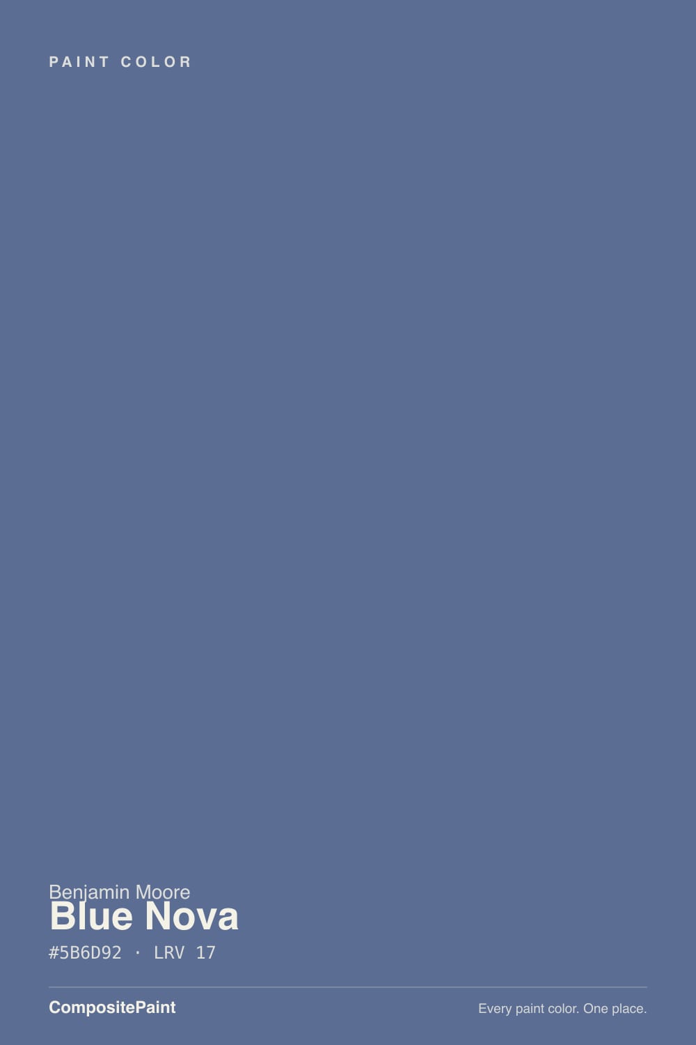
- 3Blue Nova17
- 4Gothic Purple24
- 5Hazy Lilac29
The Fast Verdict
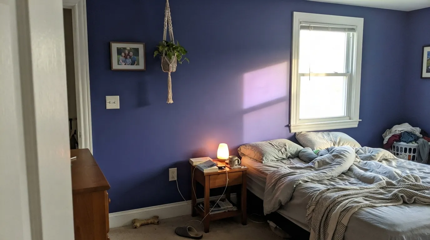
Blue Nova is Benjamin Moore's 2024 Color of the Year, and it is a deliberately quiet one — a blue-violet mid-tone built for a single confident move, not a whole house. In cool daylight it reads as a clean, grounded blue; under warm afternoon sun or evening lamps the violet comes forward and it turns closer to a soft, moody plum-navy. That range is the whole appeal, and also the whole catch: sample it in your actual room before you commit, because the chip in the store and the wall at 4pm can look like two different colors.
Accent walls and small secondary bedrooms · kitchen islands and cabinetry · front doors · bathroom vanities · anyone who wants a Color of the Year pick that won't feel loud in five years
You want a pure, unambiguous blue with zero violet in it · your room runs cool and dim with no warm lamps · you're painting an open-plan main floor top to bottom · you want the decade of forum history a proven classic already has
- Genuinely two colors in one — a clean blue in cool light, a soft violet-navy under warm lamps
- 2024 Color of the Year pedigree, from a brand collection, not a one-season gimmick
- LRV 17 gives real depth without reading near-black or flat-dark in a dim room
- Earns its keep in small, contained doses — islands, doors, vanities, one bedroom
- Coordinates cleanly with warm off-whites, brass, and dark wood
- Not a whole-house color — four walls of it in a large open room reads heavy
- The violet drift in warm light is a real surprise for buyers expecting a straightforward blue
- Needs warm light or lamps to show its best side; cool, dim rooms flatten it
- Only two years old — the real-world before-and-after track record is still thin
What Color Is Blue Nova, Really?
Blue Nova 825 is Benjamin Moore's 2024 Color of the Year, cataloged in the brand's Classics Color Collection. Benjamin Moore's own framing ties it to the glow of a newly formed star and pitches its 2024 trend palette around duality — pairing a cool, moody color like this one against warm, reassuring neutrals rather than building a whole room out of drama. By the brand's own description, it is where blue and violet meet: not a pure navy, not a true purple, but the mid-tone blend of both.
At LRV 17 it sits well above a true near-black navy — Hale Navy and Sherwin-Williams Naval both come in under LRV 10 — so Blue Nova reads as a clear, saturated blue-violet rather than a color that goes flat-dark in a dim room. That depth is exactly why the design writers who've reviewed it steer it toward accent walls, cabinetry, doors, and smaller secondary bedrooms instead of an open floor plan: it has enough presence that four full walls of it in a large connected space is a bigger commitment than the chip suggests.
Undertone in one line: blue first, violet close behind — and warm light pulls the violet forward, most noticeably in a south-facing room at midday. That is not a flaw; it is a blue-violet blend doing exactly what it's built to do. It does mean the color can look meaningfully different in your house than it did on the paint counter, so treat the sample-and-wait step as non-negotiable, not optional.
Where It Shines
This color is built for one deliberate move, not the whole house. Give it a secondary bedroom, a kitchen island, a front door, or a bathroom vanity and it does exactly what a Color of the Year is supposed to do: enough depth to feel considered, enough blue to stay grounded, and just enough violet under warm lamplight to feel a step more expensive than a plain navy. Pair it with warm neutrals, brass, and dark wood and it plays the cool note against a warm one — the same pairing logic Benjamin Moore itself leads with.
Where It Fails
Blue Nova doesn't have the decade of forum threads a Hale Navy or a White Dove has built up — it's a two-year-old pick, and the real-world regret stories are still thin online. But the pattern already visible in how design writers and Benjamin Moore's own guidance talk about it is consistent, and worth taking seriously before the gallon is mixed.
Sample it in a warm, south-facing room and the color visibly leans purple by early afternoon — the shift is specific enough that color consultants call it out by name. If the goal was an unambiguous blue with no violet drift at all, this isn't that color; Van Deusen Blue or Naval hold their blue in every light.
Every real recommendation for Blue Nova is small: an accent wall, an island, a door, one secondary bedroom — never a great room. At LRV 17 it's assertive enough that four walls of it across a large, connected space reads heavy rather than considered. Save the full commitment for a room with a door you can close.
Benjamin Moore's own team pitched this pick as balancing depth with reassurance, not as a jewel-tone or a love-it-or-hate-it viral color the way some past Colors of the Year were. If the plan was a saturated statement wall people gasp at, Blue Nova is more restrained than that headline suggests — it's a genuinely wearable mid-tone, not a stunt color.
Room by Room
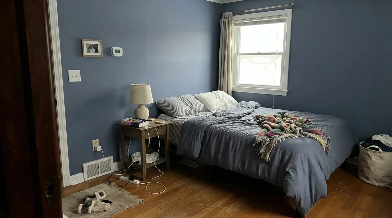
Small and medium secondary bedrooms are the use nearly every design write-up points to first. Under warm 2700K lamps it turns toward a soft, cozy violet-navy at night. Keep your primary bedroom in something with more track record if you want zero risk.
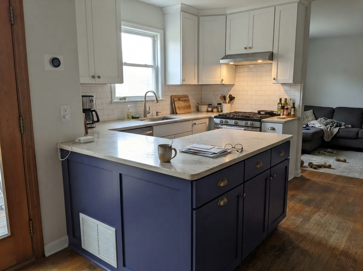
On an island under white perimeter cabinets it reads as one confident, contained decision. A full kitchen of it is a bigger bet, especially over warm oak floors that pull the violet forward. Satin cabinet enamel either way.
Benjamin Moore lists it specifically for bathroom cabinetry. A Blue Nova vanity under white or cream walls with brass fixtures is the way to try the color without repainting four walls first.
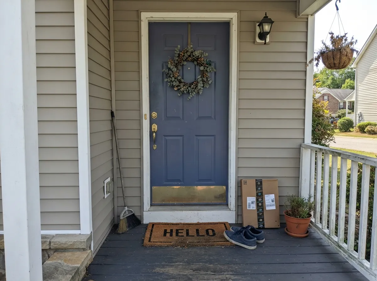
Outside, the door gets full daylight instead of one warm lamp, which tempers the violet drift and keeps it reading blue for most of the day. Pair with a warm white or greige body color.
Its own fan base steers it toward accent walls for a reason. In a large, light-flooded open plan it can take over; in a smaller, closed living room with warm furnishings it settles down and reads sophisticated instead.
This isn't a whole-house neutral, and nothing about how Benjamin Moore markets it claims otherwise. Use it the way the brand itself suggests: one deliberate move set against warm, quiet neutrals.
Your Light Is the Risk
Cool, even light keeps it reading as a clean, confident blue-violet — the read closest to what the name promises.
Warm midday sun pulls the violet forward and the color visibly leans purple. Sample on a south wall before you decide.
Cooler and bluer in the morning, warmer and more violet by late afternoon. Look at your sample at both ends of the day.
2700K bulbs deepen it toward a soft plum-navy at night. Cool LEDs hold it closer to a flat blue-gray — pick your bulb on purpose.
Most complaints about Blue Nova are a light mismatch. Upload a photo of your actual room and see it on your walls — then ask for the same wall in north light or evening lamps before you buy a single sample.
Need It From Another Brand?
Any paint counter can custom-tint Benjamin Moore 825 directly. If you would rather stay in one brand's own deck, these are the closest stock matches, measured as ΔE2000. Under 2 is a difference you will not see on the wall.
| Brand | Closest color | ΔE | LRV | |
|---|---|---|---|---|
| Behr | Charter BlueM530-6 · Behr | 2.8 | 15 | Color page → |
| Valspar | Blue BatikV074-5 · Valspar | 2.6 | 16 | Color page → |
| PPG / Glidden | Grape HazePPG1168-6 · PPG / Glidden | 3.2 | 15 | Color page → |
| Glidden | Grape HazePPG1168-6 · Glidden | 3.3 | 15 | Color page → |
| Dutch Boy | Indigo Dreams240-6DB · Dutch Boy | 2.2 | 16 | Color page → |
| Dunn-Edwards | Clean SlateDE5880 · Dunn-Edwards | 3.9 | 16 | Color page → |
Similar Benjamin Moore Colors
The nearest shades to Blue Nova within Benjamin Moore's own range, ranked by perceptual color distance — useful when you want the same look a touch lighter, darker, or warmer.
WCAG 2.1: AA is 4.5 : 1 for normal text, 3 : 1 for large text, AAA is 7 : 1.
Blue Nova vs the Colors You're Also Considering
Every Blue Nova sample board has the same rivals on it. The numbers show the real lightness gap — then it comes down to which risk you would rather live with.
Pick this for the extra depth and the violet warmth Van Deusen doesn't have, especially after dark.
Benjamin Moore HC-156 · LRV 11Van Deusen BluePick this if you want a cooler, more classic blue-gray with none of the violet drift — it reads the same blue in every light.
Pick this for more presence and personality than a near-black navy, without going all the way dark.
Benjamin Moore HC-154 · LRV 6Hale NavyPick this for a true near-black navy that skips the violet question entirely — just give it real light.
One point of confusion first: Blue Nova appears under two codes, 825 and CC-860, with the same hex #5B6D92 and the same LRV 17. They are the same color in different decks, not two options.
Nile Blue CSP-560 at hex #4E719A and LRV 18 is the same depth but much more clearly blue, with no violet to speak of. Blue Heron 832 at #5C6A85 and LRV 14 is darker and grayer, closer to a slate. French Violet 1427 at #696D86 and LRV 18 pushes the purple further and reads dustier.
Across brands, Farrow and Ball Pitch Blue No. 220 at #606D8E and LRV 15 has a deltaE of 1.86, which is visually identical in normal room light. Valspar Blue Batik V074-5 at 2.6 and Kompozit Blue Jacket 0591 at 2.68 are very close but worth sampling first. Behr Porch Song PPF-47 at deltaE 4.13 and Clare Blue'd Up at 4.03 are close but visibly different side by side.
Blue Nova Coordinating Colors
The rule for coordinating with Blue Nova is the same duality Benjamin Moore built its trend palette around: pair the cool, moody wall or door against warm neutrals, brass, and dark wood, and let the violet-blue be the one confident note in the room rather than one of several competing colors.
The 2024 Color of the Year Story
Benjamin Moore named Blue Nova its Color of the Year for 2024, tying the name to the glow of a newly formed star and building its accompanying trend palette around duality — deliberately pairing contrasting temperatures, like this cool blue-violet against warm reassuring neutrals, rather than leaning on one dominant trend color. Compared to some of the brand's past, bolder winners, color writers who covered the launch described it as a comparatively quiet, almost surprising choice for the spotlight: a wearable mid-tone rather than a statement-making saturated hue.
Two years on, that restraint looks like the point rather than a shortcoming. Blue Nova hasn't become the kind of color that shows up on every renovation account the way a viral, love-it-or-hate-it pick would — but it hasn't disappeared either, and it keeps turning up in the same small, deliberate uses design writers pointed to from the start: an island, a door, a secondary bedroom. That is a fair trade for a color this dependent on light and undertone.
Blue Nova With Wood Tones and Metals
Dark, warm woods are the easy pairing: walnut, espresso, and aged leather all sit comfortably against Blue Nova and let the violet read as depth rather than an accident. Unlacquered brass is its best metal by a wide margin — the warmth in the brass balances the coolness in the paint the same way Benjamin Moore's own warm-neutral pairings do; matte black is a safe second choice for hardware and fixtures.
Warm, honey-toned oak floors are the one pairing to sample first. Because warm light already pulls this color's violet forward, a room with golden oak underfoot and afternoon sun through the window is exactly the combination most likely to read purple rather than blue. Pale white oak, walnut, or a cooler-toned floor keeps the color closer to its blue side; if the floor is staying and it's honey-warm, treat Blue Nova as a cabinet or door color rather than four walls of it.
Three Ready Palettes Built on Blue Nova
A color is never alone on the wall. These are complete combinations in the 60-30-10 pattern, with the reason each one holds together. Every one opens in the visualizer.
Blue Nova commits to one small bedroom while Edgecomb Gray carries the same warm-neutral logic through the hallway outside it, so the handoff never jars. White Dove trim keeps the violet from reading cold.
Try this palette in your roomWhite perimeter cabinets keep the kitchen bright while the island carries all the color — exactly the small, contained dose this paint wants. Swiss Coffee's warmth on the walls keeps the blue-violet from reading cold.
Try this palette in your roomA warm greige body and a warm white trim let the door carry the entire color statement. Full outdoor daylight also keeps the violet drift in check, so the door reads confidently blue most of the day.
Try this palette in your roomBlue Nova FAQ
Is Blue Nova blue or purple?
Both, by design — Benjamin Moore describes it as where blue and violet meet. In cool or overcast light it reads as a clear blue-violet; in warm afternoon sun or under 2700K lamps the violet comes forward and it leans closer to purple. If you need a color that stays unambiguously blue in every light, this isn't quite that.
Why was Blue Nova named Benjamin Moore's Color of the Year?
Benjamin Moore's 2024 pick, part of a trend palette built around duality — pairing a cool, moody color against warm, reassuring neutrals rather than leaning on one loud statement shade. It's a deliberately quieter, more wearable Color of the Year than some of the brand's past bolder picks, which is exactly the reputation it's earned since.
What rooms work best for Blue Nova?
Small and secondary bedrooms, kitchen islands, bathroom vanities, and front doors — the places design guides consistently point to. It's not recommended, by Benjamin Moore or anyone reviewing it, as a whole-house or whole-open-plan color.
What white trim goes with Blue Nova?
A warm white like White Dove keeps the blue-violet from reading cold and is the safest default. If you want more contrast and don't mind a crisper, cooler edge, Chantilly Lace works — just expect the pairing to read more graphic and less soft.
Is Blue Nova a good whole-house color?
No, and nobody selling it claims it is. It's built for one deliberate room or feature — a door, an island, a bedroom — not a main-floor neutral. Treat it as the accent it was designed to be.
Will Blue Nova feel dated in a few years?
Less than most Color of the Year picks, because it was deliberately chosen to be understated rather than trend-loud — but it's still only two years old, and any color tied to a specific year carries more repaint risk than a decades-proven classic like Hale Navy. If you want zero trend risk, pick the classic; if you like the blue-violet mood, Blue Nova is grayed and muted enough to age reasonably well.
Have you painted with Blue Nova?
Rate it — one tap helps the next reader decide.
Ask a Question