Nocturne Shade
Behr's near-black with a warm plum secret, reviewed honestly: the light that reveals it, the light that flattens it to plain black, and where it actually belongs in a house.

Jessica has spec'd whites and neutrals for more than 300 rooms and keeps a sample wall of painted drawdowns in her studio. Every color review is checked against real reader rooms in the comments and re-tested when a formula changes. About the testing process →
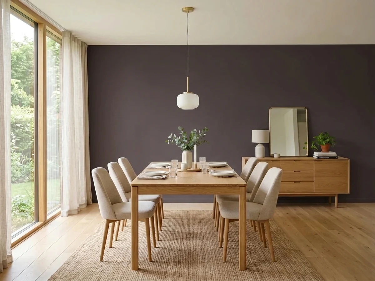
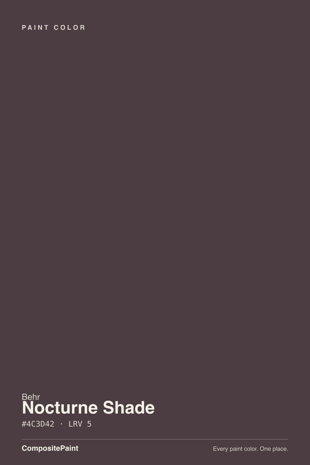
- 1Nocturne Shade5
- 2Blue Nova17
- 3Gothic Purple24
The Fast Verdict
Nocturne Shade is what Behr gets when it starts from black and adds the smallest possible amount of red-violet. On the chip it looks like any other near-black; on a door in real sun or under a warm lamp, a quiet plum-brown comes forward — Behr's own numbers put it at hue 340 with only 11 percent saturation, so the color is there, it is just whispering. In a dim room, on a cool bulb, or from across a parking lot, it reads as plain black, full stop. Buy it knowing which one you're going to get.
Front doors and shutters that get real sun · powder rooms and small dens under warm lamps · cabinets, built-ins and an island where you want black with a pulse · anyone who wants a near-black that isn't quite the same as everyone else's
You want a guaranteed-visible purple, not a secret one · the room is dim, north-facing, or lit by cool LEDs · you're painting more than one accent surface at LRV 5 · you want a true, undertone-free black — pick Carbon or Jet Black instead
- A near-black with a genuine warm secret, not just a flat void — hue 340, confirmed in our own colorimetry
- Sold across nearly every Behr line, interior and exterior, so the exact sheen and durability you need exists
- Warm red-violet undertone, never cold — plays well with warm wood and brass
- At LRV 5 it hides scuffs and shadows on high-touch surfaces like doors and cabinet fronts
- Reads as a considered, slightly unusual black rather than the default choice everyone else already picked
- In dim rooms or under cool LEDs it is completely indistinguishable from flat black
- Surface prep matters more than usual — every imperfection shows at this depth
- Needs multiple coats, often with a tinted primer, over any lighter existing color
- Not a safe four-wall color for most rooms — it wants either strong light or a small dose
What Color Is Nocturne Shade, Really?
Behr classifies Nocturne Shade as a Purple, and on paper that's true: our own colorimetry puts it at hue 340 — solidly in red-violet territory — with 11 percent saturation. What that number means in practice is the whole story: 11 percent is barely there. Most true purples run 30 to 50 percent saturation; Nocturne Shade has just enough chroma to tint the black, not enough to announce itself as a color family the way Eggplant or Mature Grape do. It's a black with a rumor of plum in it, not a purple that happens to be dark.
At LRV 5 it reflects almost no light — deep even by near-black standards, sitting alongside Behr's own Cracked Pepper and Jet Black rather than the LRV 15-20 range where most 'dark' colors live. That depth is what makes the undertone so light-dependent: a color this dark needs strong, direct light to bounce enough of its own hue back at you. Take that light away and there is nothing left to see but black.
Undertone in one line: warm red-violet, never blue, never green — but only visible in direct sun, strong task lighting, or warm 2700K bulbs at close range. In flat daylight, overcast skies, or from six feet back under a cool LED, it is indistinguishable from a plain, neutral black. Both readings are honest; they just depend on the light doing its job.
Where It Shines
Give it strong, direct light and something to reflect off — a glossy door, a lacquered cabinet, a lamp two feet away — and the plum comes forward, turning what would be a flat black into a color with real depth and warmth. It's sold across nearly every Behr line, from Premium Plus and Marquee to Dynasty and the contractor-grade PRO line, in both interior and exterior formulas, which tells you Behr treats this as a real workhorse color, not a limited specialty tint. That breadth means whichever surface you're painting — a front door in full sun, a powder-room vanity under a sconce, cabinetry under puck lights — there's a formula built for the job and the durability it needs.
Where It Fails
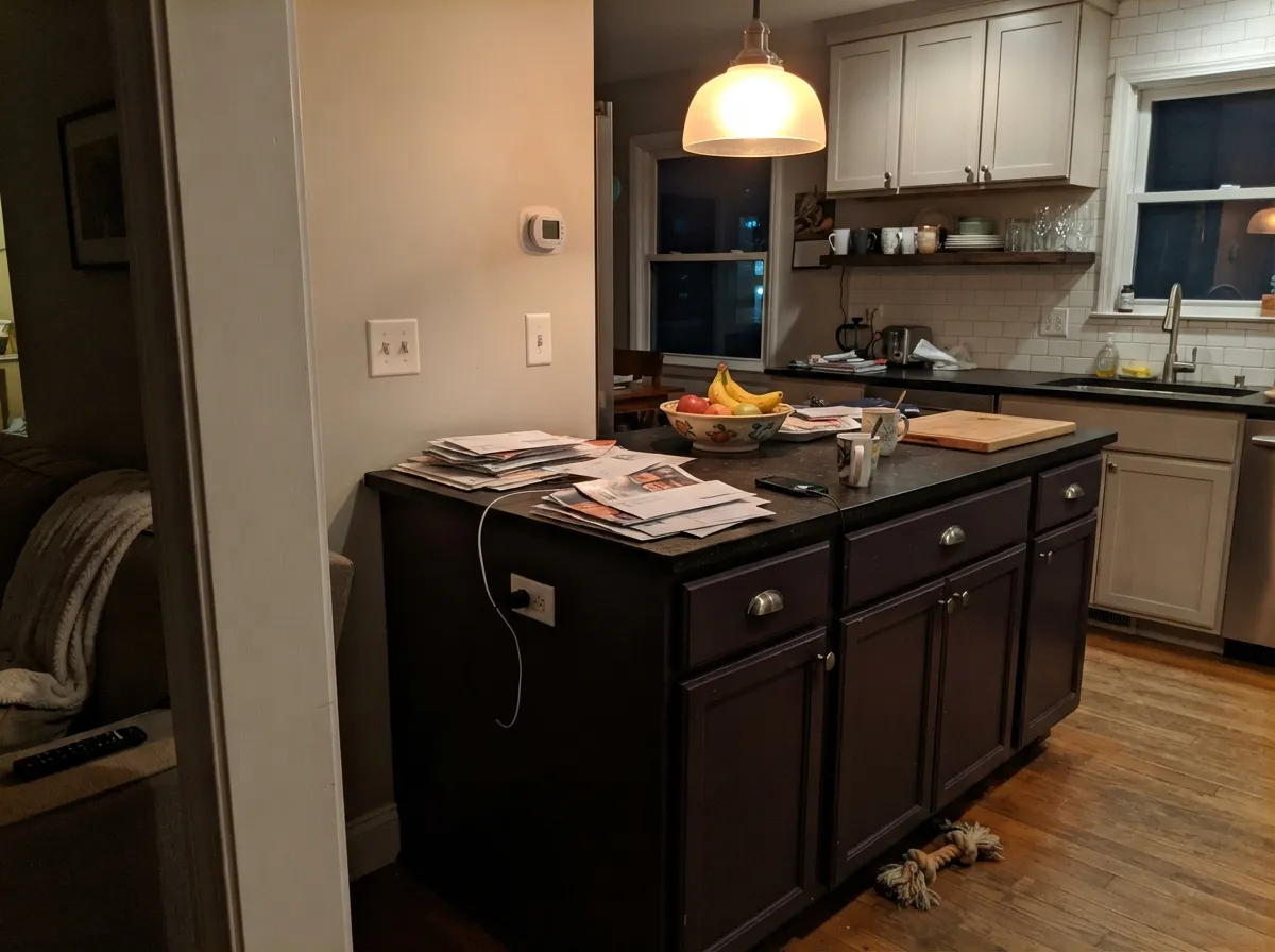
Almost every disappointing outcome with Nocturne Shade comes down to one of three predictable mismatches — buying the plum secret and getting flat black, painting a surface that shows every roller mark, or fighting the wrong light. None of them are the paint failing; they're the paint being exactly what its own numbers say it is.
At 11 percent saturation, the red-violet needs real light to bounce back at you. Overcast daylight, a north-facing wall, or a 5000K "daylight" bulb all read this color as plain, flat black — no plum, no depth. If you specifically wanted the aubergine-black look, that's a real letdown; if you just wanted a good black anyway, you got one. Test it with the lamp and daylight you'll actually live with before committing a whole door to it.
LRV 5 is dark enough that every imperfection — a roller stipple, a patched nail hole, a fingerprint — shows up as a visible shadow. Matte hides wall texture but also swallows the most light, which is exactly the light this color needs to show its undertone. On doors, trim and cabinets, step up to satin or semi-gloss: it wipes cleaner and is the sheen most likely to actually show the plum.
Going from a builder beige or white wall straight to LRV 5 usually means three coats, sometimes four, and the finish still looks patchy without a gray- or black-tinted primer underneath. This is true of any near-black, but it catches people who assume good paint alone can substitute for prep — it can't.
Room by Room
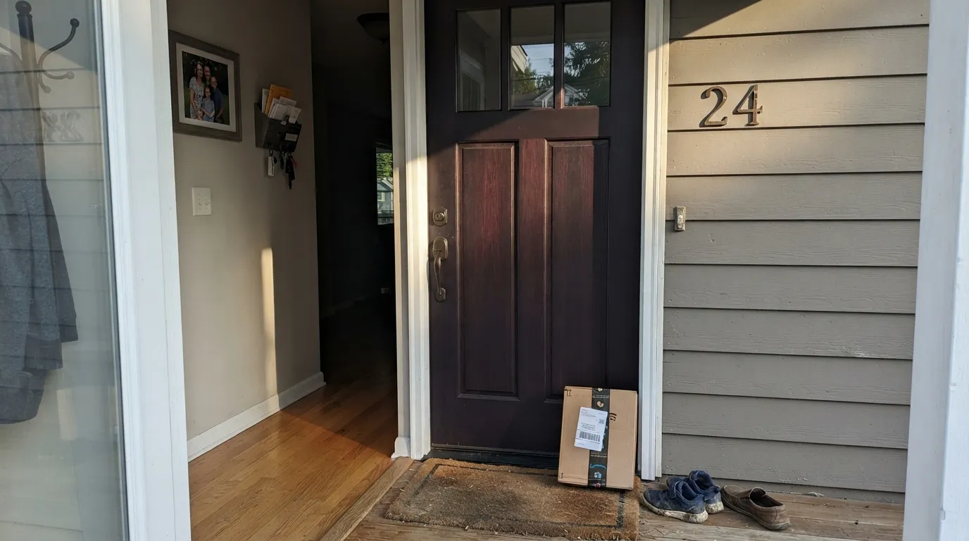
Full sun and a glossy exterior sheen are exactly what this color needs: the plum-brown comes forward against the black, and it reads as considered rather than default. On the shaded north side of a house, expect it to look like any other black door.
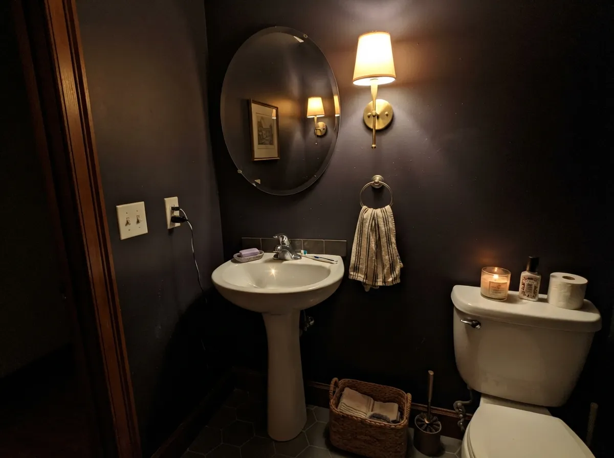
A small room plus one warm light source close to the wall turns Nocturne Shade into a genuinely rich near-black instead of a void. Skip the overhead cool-LED can light; a single warm sconce or a pair of wall lamps does the actual work here.
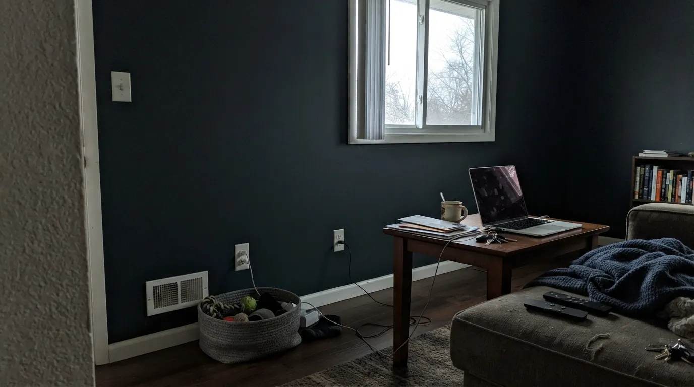
Walls and ceiling in one matte coat, with a couple of warm lamps instead of overheads, makes a small room feel intentionally enclosed rather than just dark. Add real wood — a walnut desk, a leather chair — and the warm undertone has something to agree with.
On an island or a run of lower cabinets under warm pendant lights, it reads as a deliberate near-black with personality. A full kitchen of Nocturne Shade cabinets under cool ceiling lights is a much bigger bet — sample it under your actual fixtures, not the showroom's.
Wainscoting, a single accent wall behind the sideboard, or the ceiling over the table catches candlelight and sconces well. Four full walls at LRV 5 in a room used mostly at dinner, under warm light, can work — but it's a bigger commitment than the accent version, and worth sampling both.
Shutters and trim against a lighter siding read crisp and a little unusual — darker and warmer than the charcoal-blacks everyone else uses. Confirm your siding color first: against cool white or gray siding the contrast is dramatic, against warm siding it's softer.
Your Light Is the Risk
The only light where the red-violet reliably shows. On a sunlit door or under a sconce two feet from the wall, the plum-brown comes forward and the color earns its name.
Flat, cool light gives the undertone nothing to bounce back. Expect plain, unremarkable black — fine if that's what you wanted, disappointing if it wasn't.
Under a high midday sun it can look almost neutral black; low, warm late-day light pulls the plum forward the same way a warm lamp does.
Warm bulbs close to the surface bring out the red-violet at night. Cool white or daylight LEDs flatten it straight back to black — the single biggest variable in how this color reads after dark.
Most complaints about Nocturne Shade are a light mismatch. Upload a photo of your actual room and see it on your walls — then ask for the same wall in north light or evening lamps before you buy a single sample.
Need It From Another Brand?
Any paint counter can custom-tint Behr T18-04 directly. If you would rather stay in one brand's own deck, these are the closest stock matches, measured as ΔE2000. Under 2 is a difference you will not see on the wall.
| Brand | Closest color | ΔE | LRV | |
|---|---|---|---|---|
| Sherwin-Williams | Bitter ChocolateSW 6013 · Sherwin-Williams | 2.9 | 5 | Color page → |
| Valspar | Christmas Pudding8004-5G · Valspar | 3.5 | 5 | Color page → |
| Glidden | Ranch House Brown85RR 05/082 · Glidden | 3.8 | 5 | Color page → |
| Dutch Boy | Blackened Walnut403-7DB · Dutch Boy | 2.9 | 5 | Color page → |
| HGTV Home by Sherwin-Williams | Fertile SoilHGSW 3421 · HGTV Home by Sherwin-Williams | 2.9 | 5 | Color page → |
| Dunn-Edwards | Cassel EarthDEBN22 · Dunn-Edwards | 2.8 | 5 | Color page → |
Similar Behr Colors
The nearest shades to Nocturne Shade within Behr's own range, ranked by perceptual color distance — useful when you want the same look a touch lighter, darker, or warmer.
WCAG 2.1: AA is 4.5 : 1 for normal text, 3 : 1 for large text, AAA is 7 : 1.
Nocturne Shade vs the Colors You're Also Considering
Every Nocturne Shade sample board has the same rivals on it. The numbers show the real lightness gap — then it comes down to which risk you would rather live with.
Pick this if you want the plum lean to show up more often, including under indoor lamp light, not just outdoor sun.
Behr PPU18-01 · LRV 5Cracked PepperPick this if you want Behr's most established near-black — same LRV, same brand, but its own violet secret mostly needs strong outdoor sun, not warm lamps.
Pick this if you want a fraction more light bouncing back — LRV 5 versus 3 makes a real difference on a door.
Sherwin-Williams SW 6989 · LRV 3DominoPick this if you're working in Sherwin-Williams — the closest cross-brand twin, an SW near-black with the same violet lean, just a shade darker at LRV 3.
Pick this for the same reads-black-until-light-finds-it trick, at a fraction of the cost and hassle.
Farrow & Ball No. 254 · LRV 7PeltPick this if you want the aubergine lean a little more obvious right on the chip, in exchange for Farrow & Ball's price and process.
Pick this when a secret is the point — Nocturne Shade for the door, Eggplant for the room where the purple should be obvious.
Benjamin Moore 1379 · LRV 11EggplantPick this if you actually want people to identify the wall as purple, not guess at it — Eggplant is undeniably aubergine, no direct light required.
Inside Behr, Polished Leather (UL110-23) at #4C3D3F is the same darkness with less purple and more brown. Eclectic Purple (PPU17-20) at #493E45 tips further toward plum. Spanish Raisin (720B-7) and Windsor (740B-6) both sit at LRV 6, a barely perceptible step lighter, with Windsor at #4E4147 reading the most violet. Sarsaparilla (HDC-AC-26) at #4A4143 is the closest to a straight warm black.
Across brands, the nearest matches are still not exact. Rodda Mulberry (R114) at deltaE 2.73, Dunn-Edwards Cassel Earth (DEBN22) at 2.75, and Sherwin-Williams Bitter Chocolate (SW 6013) at 2.85 are all very close, but sample first, since Bitter Chocolate at #4D3C3C carries more brown and less magenta. Valspar Christmas Pudding (8004-5G) at 3.5, Glidden Ranch House Brown (85RR 05/082) at 3.75, and Magnolia Home Plum Suede (JG-102) at 3.95 are close but visibly different side by side, with Plum Suede the most openly purple of the three.
Nocturne Shade Coordinating Colors
The pairing rule is simple: give it warm, light neutrals to bounce off of, and let one lighter plum note repeat the undertone somewhere the light can actually reach it. It's friendliest with warm whites and creams, real or warm-toned brass, and one member of its own color family in a lighter dose — not with cool grays or polished chrome, which flatten the red-violet back to plain black.
Where Nocturne Shade Sits In Behr's Own Family Of Near-Blacks
Behr sells more near-black colors than almost any other brand, and they are not interchangeable. Carbon and Jet Black are built to be neutral — no undertone to argue with, made for floors, fences and trim where you want zero surprises. Cracked Pepper is Behr's famous one, a violet secret that mostly needs strong outdoor sun to show. Black Mocha runs warm-brown instead of warm-violet. Nocturne Shade sits closest to Cracked Pepper's family — same LRV, same violet-secret idea — but its red-violet comes forward more readily, including under warm indoor lamp light, not just full sun.
If you've already tried Cracked Pepper on a door and wanted a version that shows its color indoors too, Nocturne Shade is the one to sample next.
Nocturne Shade With Wood Tones And Metals
Warm wood is this color's best company: walnut, wenge, dark stained oak and leather all sit at a similar temperature, so the near-black reads intentional instead of stark. Pale or gray-washed wood works too, just with less of a conversation between the two — the contrast does more of the work than the undertone match.
Metals follow the same warm-cool logic. Unlacquered or aged brass, bronze and matte black hardware all read as warm-adjacent and let the color's secret stay believable. Polished chrome and cool nickel are the one metal combination to test first — their cold glare next to a warm near-black can make Nocturne Shade look more gray than plum.
Three Ready Palettes Built on Nocturne Shade
A color is never alone on the wall. These are complete combinations in the 60-30-10 pattern, with the reason each one holds together. Every one opens in the visualizer.
White Dove keeps the facade calm enough that the door reads as the one confident decision on the house; Eggplant repeats the same red-violet lean somewhere lighter — a porch ceiling or planter boxes — so the whole entry looks planned instead of accidental.
Try this palette in your roomAlabaster's crisp edge keeps a small room from feeling like a cave, and the Eggplant vanity confirms in daylight what the near-black walls only hint at under lamp light — the two ends of the same undertone, in one room.
Try this palette in your roomDrenching a small den in one near-black color removes the trim lines that would otherwise cut the room in half; Rookwood Brown on the shelving ties in real wood and leather instead of competing with the color's own quiet warmth.
Try this palette in your roomNocturne Shade FAQ
is Nocturne Shade purple or black?
Technically purple — Behr files it in the Purple family, and our own colorimetry puts it at hue 340 with 11 percent saturation. In practice it reads as black most of the time; the red-violet only shows up in strong, direct light. Both readings are correct, just in different rooms.
what sheen shows the plum undertone best?
Satin or semi-gloss, on a surface that catches light — a door, trim, or cabinet fronts. Flat and matte hide wall texture nicely but also swallow the light this color needs to reveal its undertone, so expect flat walls to read closer to plain black.
can I use it on kitchen cabinets?
Yes, especially an island or a run of lower cabinets under warm pendant lighting, where it reads as a deliberate near-black. A full kitchen of it under cool overhead LEDs is a bigger bet — sample a door front under your actual fixtures first.
how many coats does it take over a lighter wall?
Plan on three, sometimes four, or use a gray- or black-tinted primer first. Going from a light beige or white straight to LRV 5 without help from a primer is the most common source of a patchy-looking finish.
is it good for a front door?
Genuinely one of its best jobs. Full sun and a glossy exterior sheen let the plum-brown come forward, so it reads as more considered than the charcoal-black everyone else's door already is. On a shaded, north-facing entry it will look like plain black.
how is it different from Behr's Cracked Pepper?
Both are near-black at the same LRV 5 with a violet secret, but they show it differently: Cracked Pepper's violet mostly needs strong outdoor sun, while Nocturne Shade's red-violet lean also comes forward under warm indoor lamp light. If you're deciding between the two, the light your surface actually gets should decide it.
Have you painted with Nocturne Shade?
Rate it — one tap helps the next reader decide.
Ask a Question