Pelt
The Farrow & Ball aubergine that reads near-black more often than purple, reviewed honestly: the light it needs, the archive catch, and what to buy instead.

Jessica has spec'd whites and neutrals for more than 300 rooms and keeps a sample wall of painted drawdowns in her studio. Every color review is checked against real reader rooms in the comments and re-tested when a formula changes. About the testing process →
- 1Liberty Blue1
- 2Pelt7
- 3Blue Nova17
- 4Gothic Purple24
The Fast Verdict
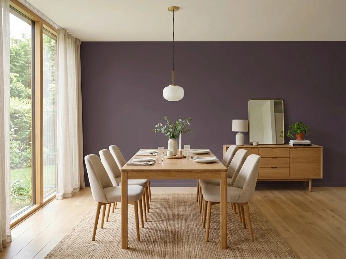
Pelt is purple for people who are done with purple being obvious. Farrow & Ball's own line is that it feels much bluer than Brinjal, and that is the useful comparison: next to Brinjal's wine-red, Pelt is the cooler, grayer, more aubergine one. Then there is LRV 7, which is black territory — Iron Ore is 6. In a bright room at two in the afternoon it is unmistakably plum and looks expensive. In a dim room at seven in the evening it is a very good near-black with a violet secret. Both outcomes are good; the trouble is most buyers only wanted the first one. Sample it in the actual room at the actual hour you use it, and know before you order that Pelt is an Archive colour — made to order and non-returnable.
Dining rooms you use after dark · powder rooms drenched floor to ceiling · studies, libraries and built-in shelving · front doors and joinery in Full Gloss · anyone who wants near-black with a pulse
You want a purple people can name from the doorway · the room is dim, north-facing or windowless · you need to see it on a store shelf first — it is Archive, made to order and non-returnable · honey oak floors and golden-stained trim run the room · you repaint on impulse
- Sophisticated aubergine that never reads bright, sweet or juvenile
- Reads as a near-black with a pulse — the drama of black, with a colour underneath
- Outstanding drenched: walls, trim and ceiling in one colour, especially in Full Gloss
- Dining rooms, powder rooms and studies are flattered by exactly the light it needs
- A genuinely good front-door colour, where daylight finally shows the purple
- LRV 7 means most rooms will read it as black, not purple
- Archive colour — made to order, slower to arrive, and non-returnable
- Deep base hides poorly; needs dark-tinted primer and careful, wet-edge cutting in
- Golden oak floors and yellow-warm trim fight it on sight
What Color Is Pelt, Really?
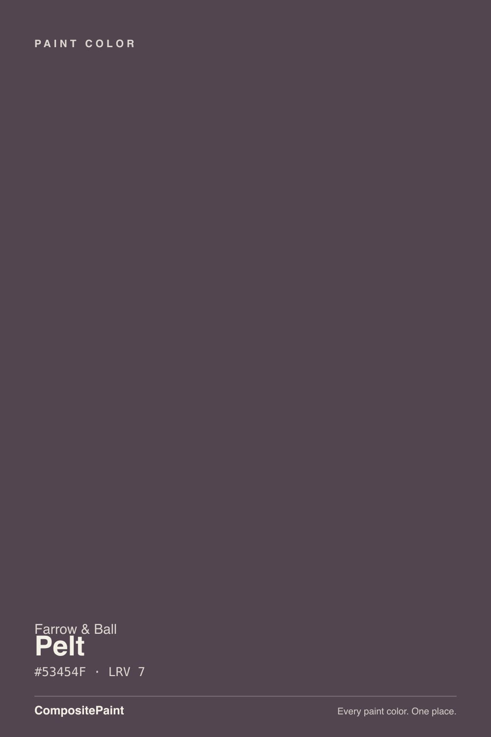
A deep, grayed aubergine named after untreated animal hides — which tells you the intent: leather and fur, not amethyst. Farrow & Ball's own description is the most useful thing anyone has written about it: Pelt feels much bluer than the similarly strong Brinjal. Read that as a relative statement, not an absolute one. Brinjal leans wine-red; Pelt steps back from red toward violet and gray. On the wall it is still a plum-aubergine with a soft mauve heart, not a blue-violet, but it is the cooler of the two by a clear margin.
Then the number that decides everything: LRV 7. That is not a dark purple, that is a black-adjacent colour that happens to be purple. For scale, Iron Ore sits at 6 and Domino at 3 — Pelt lives in their neighbourhood, not in a mid-tone one. Everything people love and everything people regret about this colour comes out of that single figure. Given real light it opens into plum; starved of light it closes to a soft, warm-edged black. It does not meet you halfway.
Undertone in one line: violet with a gray body and just enough red left in it to stay warm-blooded — never lilac, never navy, never true wine. If your sample board looks like black paint, the room is not giving it enough light. If it looks openly purple, you have good windows, and you are going to like this colour a great deal.
Where It Shines
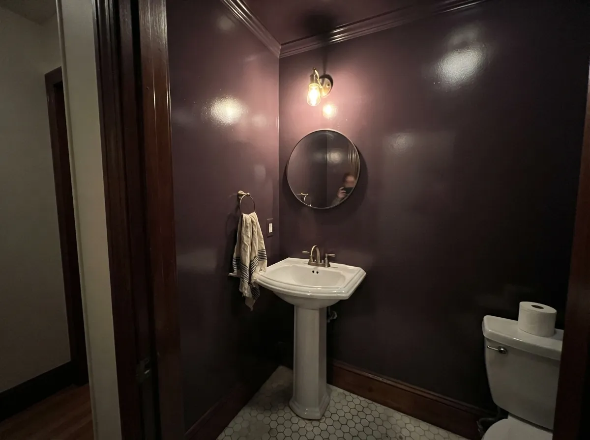
Pelt is at its best in rooms that are supposed to feel enclosed. A dining room where dinner starts at eight, a powder room with no window to defend, a study lined with books — places where you want the walls to stop being walls and become a background. Drench it: walls, trim, ceiling, the inside of the door, all the same colour, and the room reads deliberate rather than dark. Farrow & Ball says the colour is at its most sensational in Full Gloss, and on joinery and front doors that is not marketing — the shine turns the aubergine into something that catches every candle and every headlight, which is the one place a colour this deep gets to show off.
Where It Fails
Pelt's bad reviews are remarkably consistent, and every one of them is predictable before you open the tin. None are defects in the paint. If your room matches one of these three, a bigger sample will only confirm it faster.
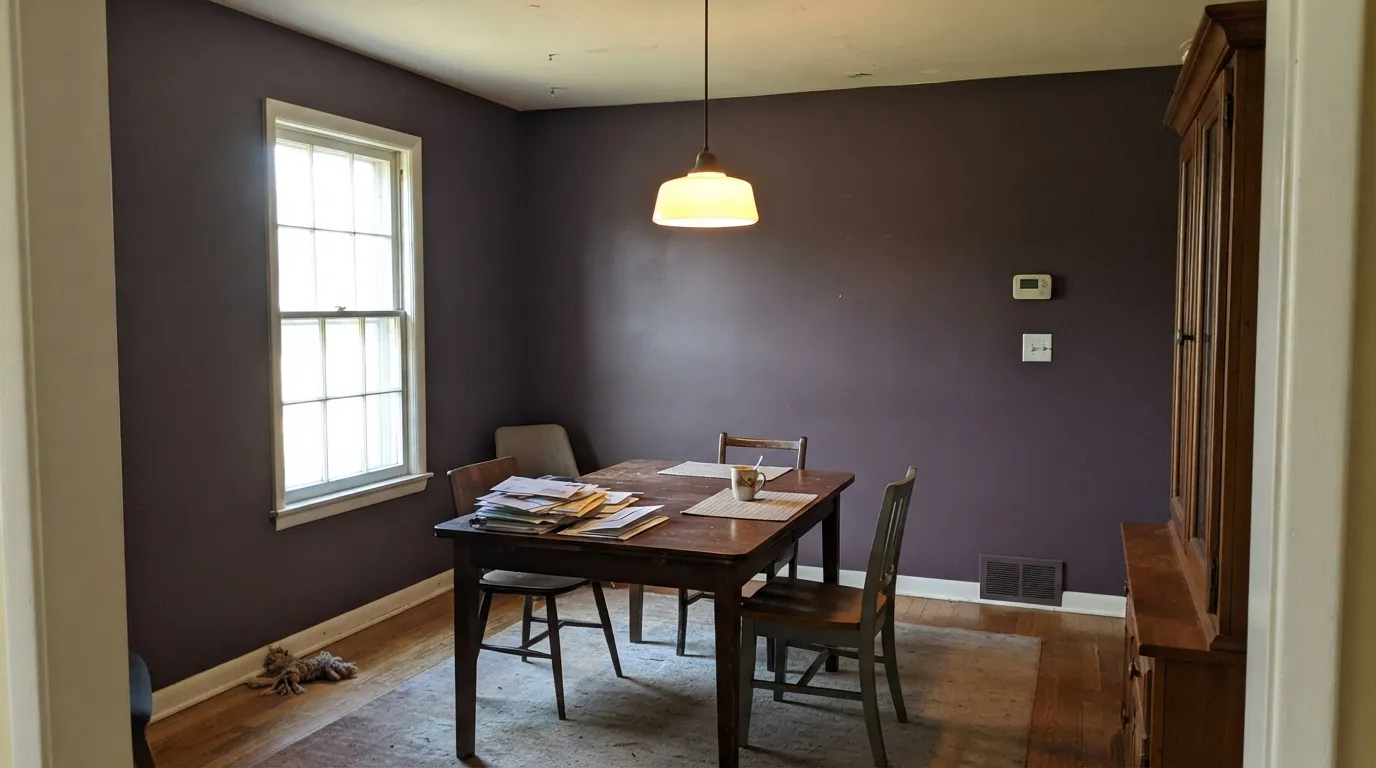
At LRV 7 the aubergine is conditional on light, and most rooms do not supply enough of it. In a north-facing dining room, or any room after sundown with a single overhead fixture, Pelt is simply a soft black and nobody will guess purple. If the point of the project was that guests notice the colour, this is the wrong depth — go up to Eggplant at LRV 11 or Mystical Grape at 12 and let the purple actually arrive.
Deep bases carry very little white pigment, so they hide badly. Going straight onto a pale wall with a standard white undercoat gives you patchy, streaky, roller-marked purple that needs a fourth coat to look like anything. Farrow & Ball specifies a dark-tone primer and undercoat under this colour for exactly this reason. Tint the primer, do two full coats, and cut in when the wall is still wet — deep flat purples flash badly where a dried edge is overlapped.
Pelt is not on the current Farrow & Ball colour card. It lives in the Archive, which means it is mixed to order, takes longer to arrive, and is non-returnable. There is no walking into a store, seeing it under the lights and changing your mind. Buy the sample pot first, live with a big board for a week, and only then order the tins — because if it turns out to read black in your room, that is your money.
Room by Room
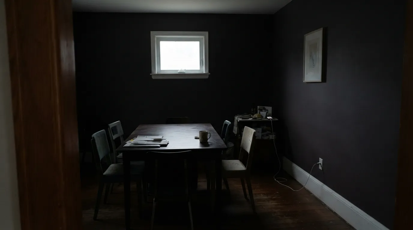
This is the room Pelt was made for. Dining rooms are used at night, at low light levels, with candles and a warm fixture — conditions that flatter a deep aubergine and forgive its depth. Drench the walls, trim and ceiling in flat emulsion, keep a warm cream on the ceiling only if the room is genuinely small, and let a walnut table and brass do the rest. It is the sophisticated purple that never turns bright or clownish, which is precisely why designers reach for it here instead of a true violet.
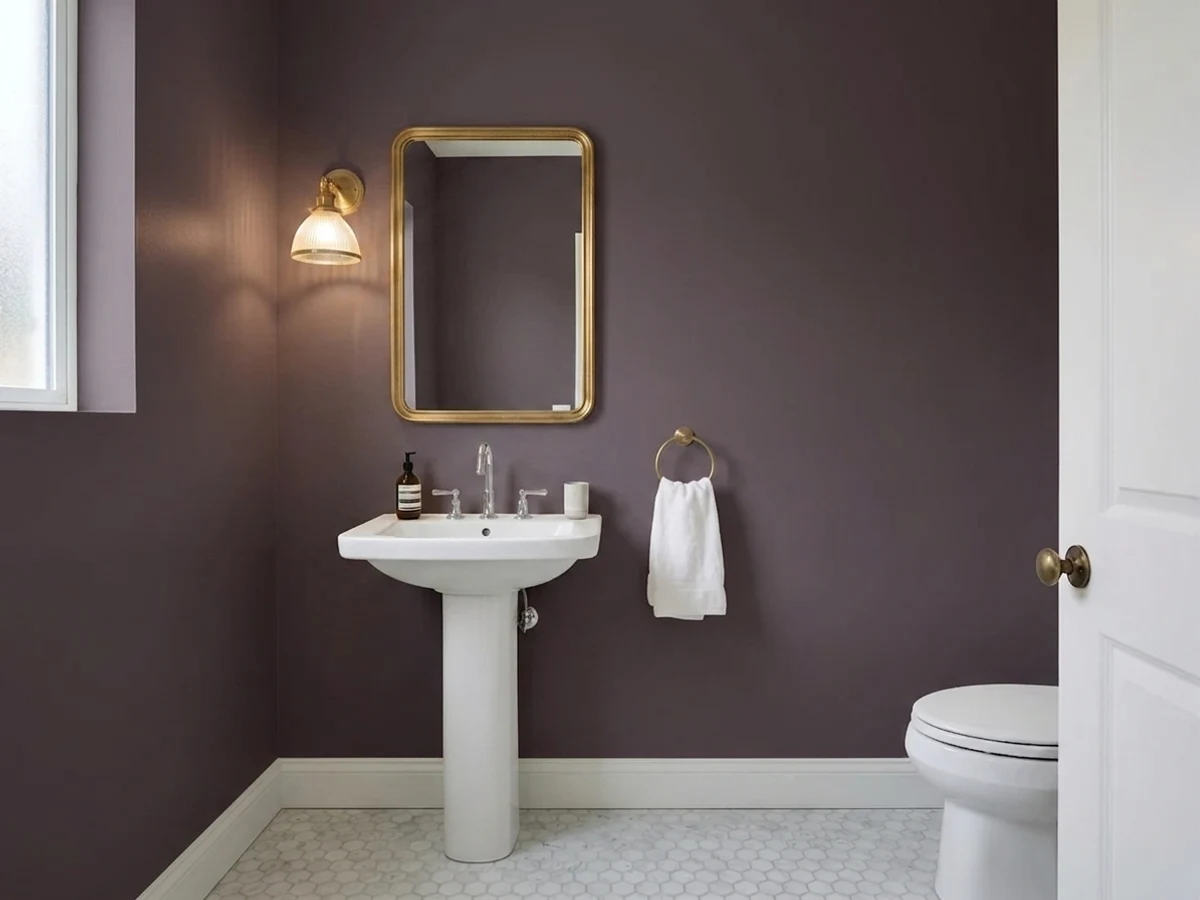
A windowless powder room is the one place where losing daylight does not matter, because there was none to lose. Take the colour over every surface including the ceiling, and if you have the nerve, do it in Full Gloss — the reflections bounce the little light there is and the room reads like a lacquer box rather than a cupboard. Brass or unlacquered bronze fittings, a white basin, one warm bulb. This is the cheapest high-end room in the house.
Bookshelves and panelling are where deep colours earn their keep, because the shadows are already there and the colour just joins them. Eggshell on the joinery, flat on the wall behind, and the shelves stop looking like furniture and start looking like architecture. Books in every colour look better against aubergine than against black — the violet gives them something to sit on.
A drenched Pelt bedroom is genuinely restful, since a bedroom's job is to be dark. The rule is lamps, plural, at 2700K — one ceiling light in a Pelt bedroom is a cave, three lamps in a Pelt bedroom is a hotel. Cream or white bedding rather than beige; beige goes yellow against it. If the room is your only bright room in the house, spend the light somewhere else.
Full-height Pelt kitchen walls in a room with task lighting and white counters will read as a dark, slightly bruised grey and fight everything on the worktop. Lower cabinets or an island in eggshell or gloss, under a pale wall, is the version that works — aubergine base units with a light stone top and brass pulls is a genuinely handsome kitchen. Avoid it entirely if the floor is honey oak.
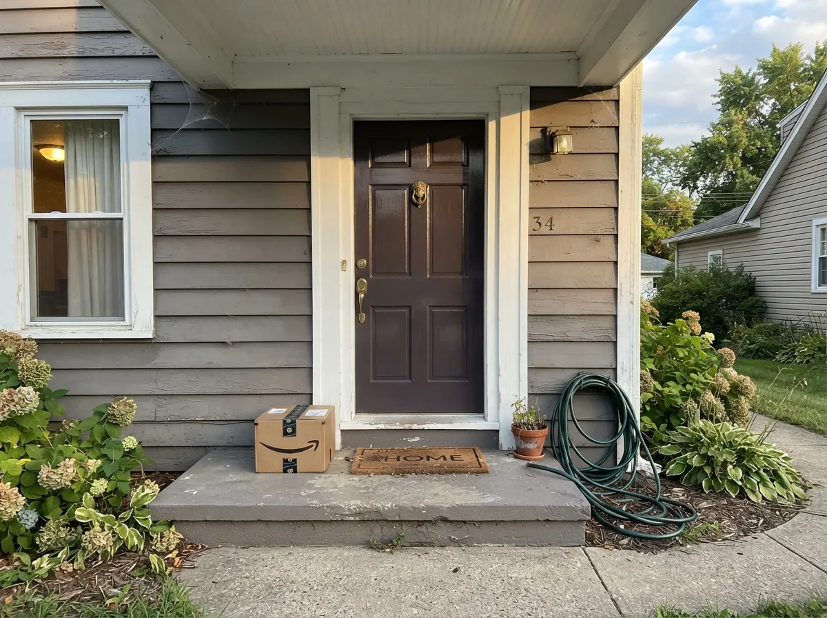
Farrow & Ball sells Pelt in Exterior Eggshell, and a Pelt front door is the best-value use of this colour. Outdoors there is finally enough light to reveal the plum, and against grey or white siding it reads as a considered near-black that turns purple as you walk up the path — exactly the trick a black door cannot do. Full Gloss on a sheltered door, exterior eggshell on an exposed one.
Your Light Is the Risk
Direct, generous daylight is the only condition that reliably shows the purple. In a sunny room at midday the walls read clearly aubergine, with the mauve heart visible where the light lands. If you want people to see a colour rather than a dark wall, this is the light you need.
Cool, weak light drains the last of the red and Pelt collapses into a flat, slightly cold black. Most of the disappointed reviews come from here. It is not ugly — it is a decent soft black — but the purple you paid for is simply not in the room.
East morning light is the coolest read of the day: bluest, most violet, most obviously not-black. Midday is the truest. Late west sun warms it toward a soft brown-plum for an hour before it shuts down completely at dusk. The colour effectively has two personalities and the switch happens around sunset.
2700K bulbs and candles pull it warm and velvety — the dining-room look, and the right choice. Cool 4000K LEDs push the violet forward and can leave it looking cold and bruised, especially in flat finish. Whatever you choose, more low lamps beat one bright ceiling fixture: a colour this deep needs light spread around the room, not dropped on it from above.
Most complaints about Pelt are a light mismatch. Upload a photo of your actual room and see it on your walls — then ask for the same wall in north light or evening lamps before you buy a single sample.
Need It From Another Brand?
Any paint counter can custom-tint Farrow & Ball No. 254 directly. If you would rather stay in one brand's own deck, these are the closest stock matches, measured as ΔE2000. Under 2 is a difference you will not see on the wall.
| Brand | Closest color | ΔE | LRV | |
|---|---|---|---|---|
| Sherwin-Williams | Quixotic PlumSW 6265 · Sherwin-Williams | 4.8 | 6 | Color page → |
| Behr | Napa HarvestECC-17-3 · Behr | 1.6 | 7 | Color page → |
| Benjamin Moore | ChambourdAF-645 · Benjamin Moore | 1.4 | 9 | Color page → |
| Valspar | Purple Fury4001-4C · Valspar | 1.9 | 6.9 | Color page → |
| PPG / Glidden | Black ElegancePPG1004-7 · PPG / Glidden | 4.5 | 7 | Color page → |
| Glidden | Nighttime Purple90RB 07/075 · Glidden | 0.0 | 7 | Color page → |
Similar Farrow & Ball Colors
The nearest shades to Pelt within Farrow & Ball's own range, ranked by perceptual color distance — useful when you want the same look a touch lighter, darker, or warmer.
WCAG 2.1: AA is 4.5 : 1 for normal text, 3 : 1 for large text, AAA is 7 : 1.
Pelt vs the Colors You're Also Considering
Every Pelt sample board has the same rivals on it. The numbers show the real lightness gap — then it comes down to which risk you would rather live with.
Pick this when you want the cooler, greyer, more aubergine version and you are willing to order ahead for it.
Sherwin-Williams SW 6286 · LRV 7Mature GrapePick this for the same depth with more red in it — and for the practical win of a colour you can have mixed at any Sherwin-Williams store today, returnable, no archive wait.
Pick this when you want the room to read dark first and purple second, which is the whole point of Pelt.
Benjamin Moore 1379 · LRV 11EggplantPick this if the purple has to be visible — at LRV 11 it stays plum in ordinary rooms instead of collapsing to black.
Pick this if that much violet makes you nervous; Pelt gives you the same family with the volume most of the way down.
Benjamin Moore 2071-30 · LRV 12Mystical GrapePick this for an unmistakable, saturated violet that announces itself — a real purple that only pays off if you commit.
Pick this when you want that same enveloping darkness but with a real colour underneath for the hours the sun is up.
Sherwin-Williams SW 6989 · LRV 3DominoPick this if what you actually want is a soft near-black with a violet lean and no expectation of colour — it is cheaper, easier to buy, and covers better.
Pelt Coordinating Colors
The rule with Pelt is warmth on the light side and jewel tones on the dark side, with everything yellow-golden kept at a distance. Warm off-whites stop it reading cold; a sheer blush is Farrow & Ball's own softener; a deep green is the classic jewel-tone partner. These are the colours that keep turning up in Pelt rooms that work:
The Archive Problem: What Buying a Retired Farrow & Ball Colour Actually Means
Pelt is no longer printed on the Farrow & Ball colour card. It sits in the Archive, the collection where every retired shade and limited-edition colour is kept available rather than killed off. That is genuinely good news — the colour is not gone, and it is still sold across the full range of finishes including Estate Emulsion, Modern Emulsion, Modern Eggshell, Full Gloss and Exterior Eggshell. But it changes how you have to buy it.
Archive colours are mixed to order. That means a lead time instead of a shelf, and, more importantly, no returns — an Archive tin is non-returnable because it was made for you specifically. There is no bringing back the extra gallon, and no changing your mind after the first wall. It also means a painter cannot pop out mid-job for another tin, so measure the job properly and order one more than you think you need, allowing for a deep base that may want three coats.
The practical order of operations: buy the sample pot first, paint two large boards rather than the wall itself, move them around the room over a full week, and look at them at the hour you actually use the room. Only then place the real order. That sequence costs you a week and about the price of a takeaway; skipping it on a non-returnable dark colour is how people end up with a black dining room they did not want.
Pelt With Wood, Metal and Fabric
Wood decides this more than paint does. Walnut, dark stained oak and antique mahogany are Pelt's natural company — the red-brown depth reads as a relative of the aubergine and the whole room settles. Pale unstained white oak and limed floors work too, in a cooler Scandinavian direction. The one real clash is golden: honey oak floors, orange-toned pine and yellow-stained trim sit close to violet's complement, so the floor goes more orange, the walls go more purple, and both look worse for it. A large rug helps; a whole floor of it does not.
Metals are easy and the usual rule applies to a deep purple more than most: unlacquered brass, antique bronze and aged nickel all warm it; matte black disappears into it, which can be the point on hardware you do not want to see; polished chrome is the only genuinely cold note. If you are doing Full Gloss joinery, brass against that shine is the combination the finish exists for.
For fabric, texture beats colour. Velvet, wool and heavy linen against a Pelt wall look expensive because they absorb light the same way the paint does. Cream and off-white read crisp against it; true beige and camel read yellow and slightly dirty. If you want one bright note in the room, a deep green or a burnt orange in a cushion or a piece of art will carry it — Farrow & Ball's own advice for purples is to reach for jewel tones rather than pastels.
Three Ready Palettes Built on Pelt
A color is never alone on the wall. These are complete combinations in the 60-30-10 pattern, with the reason each one holds together. Every one opens in the visualizer.
Deep purple and deep green is a jewel-tone pairing Farrow & Ball recommends for its own purples, and it is the reason this scheme reads opulent rather than gloomy. The cream ceiling is the release valve — at LRV 84 it keeps the room from closing over your head, and its warmth is what makes candlelight look right on the walls. Walnut, brass and unpolished bronze; skip chrome.
Try this palette in your roomFarrow & Ball's own advice for softening Pelt is a sheer pink, and Pink Bliss is the deck's thinnest blush — barely a colour, exactly enough to keep the room from being one note. Balboa Mist outside the door matters more than people expect: it carries a faint violet lean of its own, so the doorway reads as a dimmer switch rather than a colour change.
Try this palette in your roomStonington Gray is a true grey with no yellow in it, which is the whole trick here — a beige body would drag the door toward its complement and make the purple look accidental. Super White trim gives the door a hard bright edge so the depth registers as a decision. Outdoors there is finally enough light for the aubergine to show, and gloss makes it change as you walk up the path.
Try this palette in your roomPelt FAQ
Is Pelt purple or black?
Both, depending on the hour. At LRV 7 it is black-adjacent, so in weak or artificial light it reads as a soft warm black. Give it real daylight and it opens into a clear grayed aubergine. Farrow & Ball says it themselves — it can appear almost black in darker spaces. Assume black is the default and treat every purple hour as a bonus, and you will not be disappointed.
Can you still buy Pelt?
Yes, but not off the shelf. Pelt has retired from the main Farrow & Ball colour card into the Archive, where every discontinued shade is kept. Archive colours are mixed to order, take longer, and are non-returnable, so order a sample pot before you order tins. It is available in the usual finishes, including Full Gloss and Exterior Eggshell.
Pelt or Brinjal?
Farrow & Ball's own framing is the honest one: Pelt feels much bluer than Brinjal. Brinjal leans wine-red and warm; Pelt is the cooler, greyer, more aubergine of the two. In a warm-lit dining room Brinjal glows redder and Pelt stays sober. Pick Brinjal if you want the room to feel like a decanter, Pelt if you want it to feel like a library.
What white goes with Pelt?
A warm, soft white rather than a bright one — Swiss Coffee or White Dove are both safe against it, and the warmth is what keeps the aubergine from reading cold. Farrow & Ball's own suggestion is a warm grey-white on the trim. If you go the other way and use a crisp bright white, do it deliberately, on exterior trim or one hard edge, where the contrast is meant to be sharp.
Is Pelt too dark for a dining room?
Not if you use the room at night, which most people do. Dining rooms run on candles and low lamps, and that is a deep colour's best condition — the room feels enclosed and grown-up rather than gloomy. Where it goes wrong is a dining room that doubles as a daytime homework table in a north-facing corner. Test at the hour you actually eat.
Which finish should I use, and is Full Gloss really worth it?
Flat or matte on walls, eggshell where hands land, and Full Gloss on doors, joinery and front doors. The gloss is worth it for a colour this deep: with almost no light coming back off the pigment, the shine becomes the light, and a glossy Pelt door or panelled wall reads like lacquer instead of a dark surface. It is also less forgiving of bad prep, so fill and sand properly first.
Have you painted with Pelt?
Rate it — one tap helps the next reader decide.
Ask a Question