Mature Grape
The deep plum Sherwin-Williams files under purple, reviewed honestly: the small rooms where it turns to velvet, the light that flattens it to brown-black, and what to pick instead.

Jessica has spec'd whites and neutrals for more than 300 rooms and keeps a sample wall of painted drawdowns in her studio. Every color review is checked against real reader rooms in the comments and re-tested when a formula changes. About the testing process →
- 1Liberty Blue1
- 2Mature Grape7
- 3Blue Nova17
- 4Gothic Purple24
The Fast Verdict
Mature Grape is a grayed-down red-violet at near-black depth — plum, not lilac, and never bright. At LRV 7 it swallows light instead of bouncing it, which is exactly why it works in a powder room and exactly why it fails in a dim bedroom with one bulb. Give it lamps, warm white trim, brass and dark wood and it reads like a velvet jewel box. Give it a north window and nothing else and it reads like a brown-black hallway.
Powder rooms and small baths that should feel like a jewel box · dining rooms used after dark · a headboard wall or a study with real lamps · vanities, built-ins and front doors
The room is dim and you will not add lamps · your floors or trim are honey oak · you want a moody neutral rather than an obvious purple · you may repaint or sell within a year or two
- Small dark rooms finally have a color that makes the darkness look intentional
- Turns velvet and aubergine under 2700K lamps — the reason to buy it
- Grayed enough to read grown-up rather than teenage-purple
- Excellent on vanities, built-ins, islands and front doors, where the risk is small
- Near-black depth hides drywall flaws, scuffs and fingerprints better than any mid-tone
- LRV 7 punishes any room without lamps — the purple simply leaves
- Clashes hard with honey oak, golden beige and orange-stained trim
- Deep base, tinted primer and two to three coats going on, plus a full primer job coming off
- Purple is the family buyers react to most; it can cost you at resale in a main room
What Color Is Mature Grape, Really?
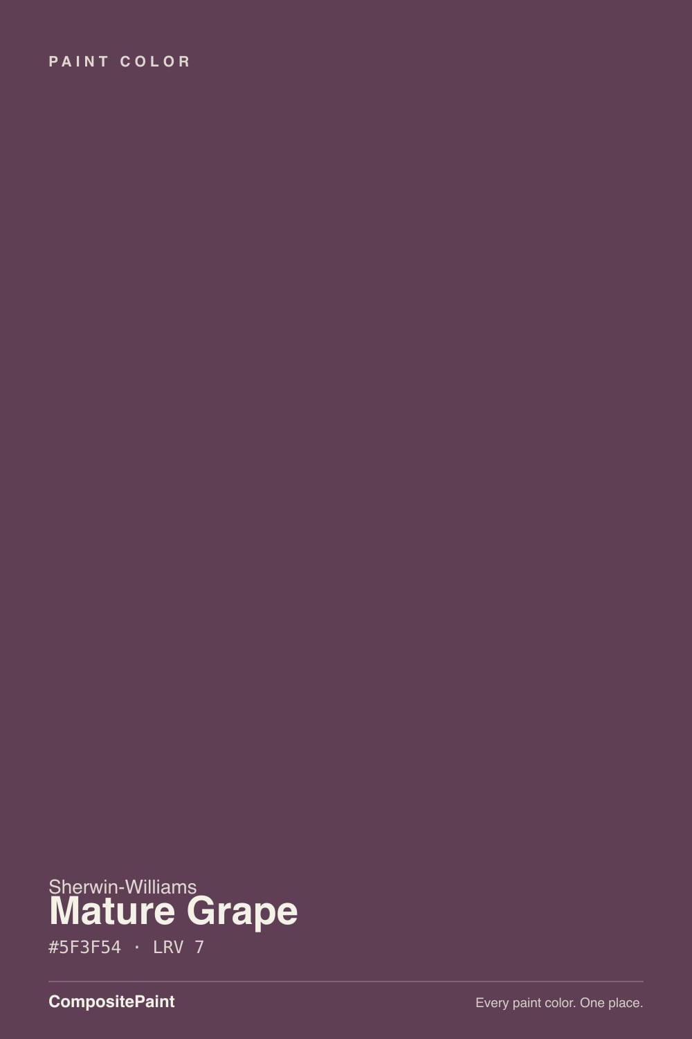
A deep plum built on red-violet, then grayed down hard. Look at the mix and the red channel leads, blue follows, green trails — that ordering is why it reads as berry and wine rather than the blue-violet most people picture when they hear purple. The gray cast on top is the part the name is trying to tell you: this is the mature version, the one that has had the candy taken out of it. Sherwin-Williams files it in the purple family, and on a wall it is unmistakably purple — just a purple with dust on it.
At LRV 7 it sits in near-black territory, one point off Iron Ore. That number governs everything. A 12-inch peel-and-stick sample looks like a lively berry because it is surrounded by white wall; four walls of it look far deeper and far grayer, and the corners of the room go almost black. The flip side is that near-black depth is what makes small rooms feel deliberate instead of cramped — you stop reading the walls as boundaries. Expect a deep tint base, a gray-tinted primer and two to three coats to get it on evenly, and budget the same effort in reverse if you ever take it off.
Undertone in one line: red-violet first, gray second — never blue-violet, never brown on its own. If your sample reads plain brown-black, the room is too dark for it; if it reads pink-berry, that is warm bulbs or low afternoon sun doing it. Both are the same paint reporting on your light.
Where It Shines
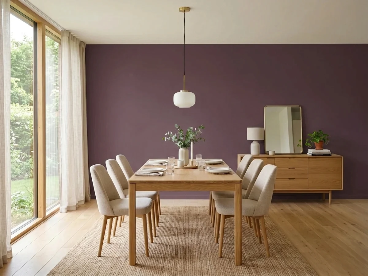
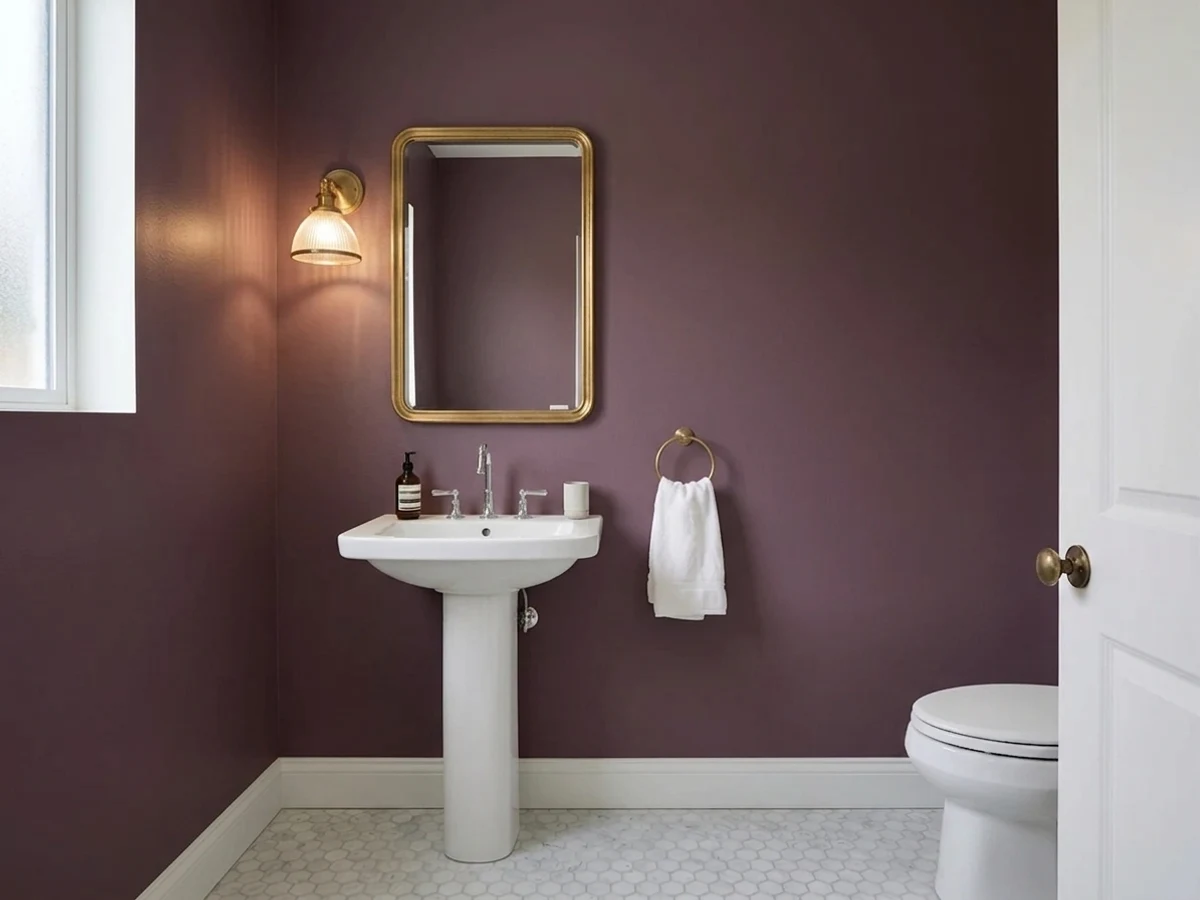
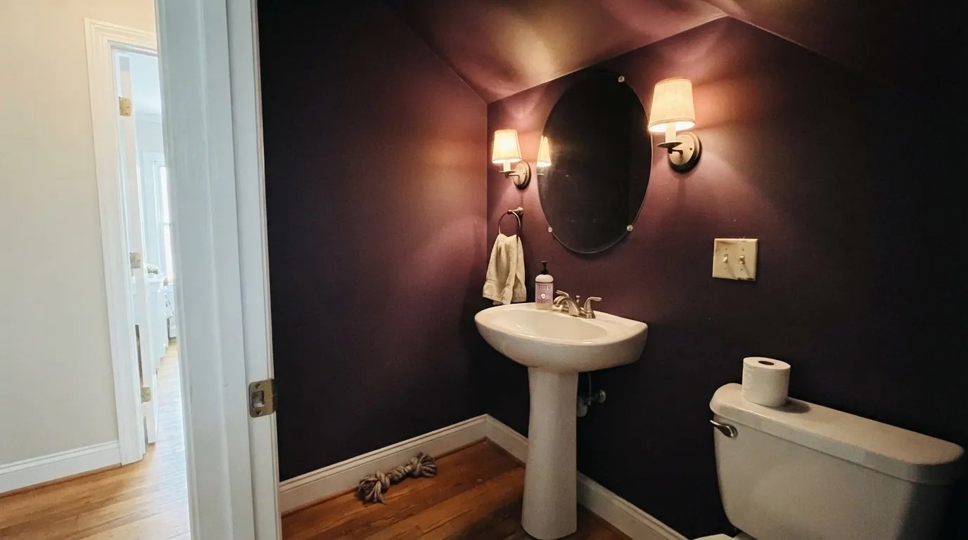
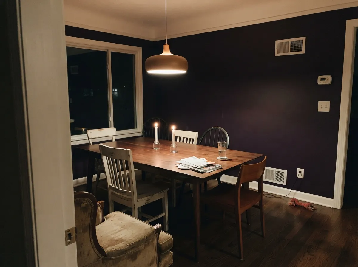
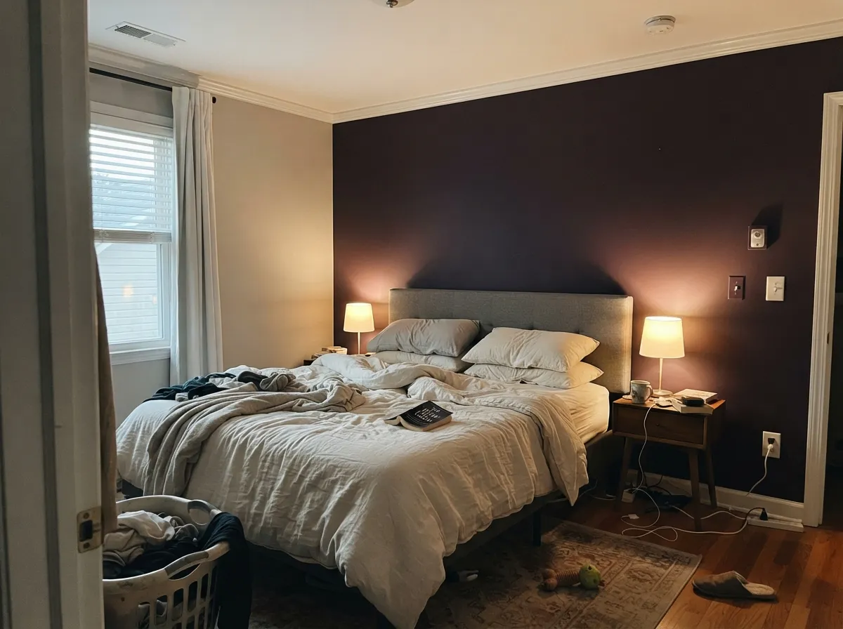
This is a small-room color. In a powder room, a bath with a single window or a dining room used mostly after sunset, the depth stops being a liability and becomes the entire point — the walls recede, the fixtures and art come forward, and the room reads considered rather than dark. It is at its absolute best under 2700K lamplight, where the red comes up through the gray and the whole surface goes to shadowed aubergine. Warm white trim, aged brass, walnut and dark floors are its natural company; that combination is what makes people describe a plum room as expensive instead of gloomy.
Where It Fails
The bad Mature Grape stories are boringly consistent, and every one of them is predictable from the room, not from the can. If your situation matches one of these three, sampling a bigger square will only prove the point sooner.
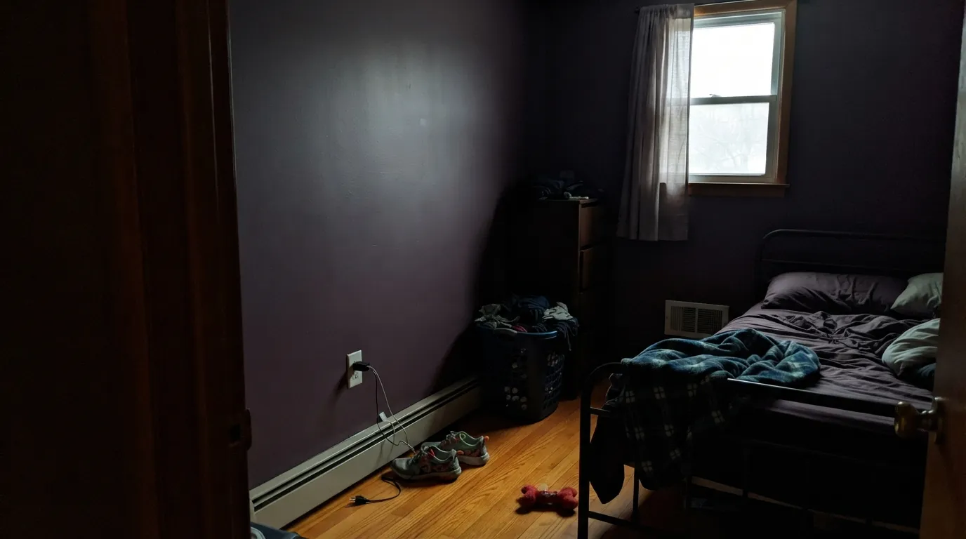
LRV 7 means the wall gives almost nothing back. In a dim north room, a windowless powder room with one weak overhead, or a basement, the purple drains out entirely and you get a flat brown-black box with dark corners. This is the number-one regret. Sconces at face height, a lamp or two and 2700K bulbs are not decoration here — they are part of the paint job.
Yellow-orange sits opposite violet on the wheel, so a golden oak floor and a plum wall exaggerate each other: the floor goes orange, the wall goes muddy maroon, and the room reads dated rather than moody. Walnut, espresso, black-stained wood, pale white oak, gray tile and white marble all work. Honey oak does not, and no extra coat fixes it.
This is a near-black tinted with a lot of pigment, and it is genuinely hard to bury. Going back to white means a full coat of stain-blocking primer and two to three finish coats, not a quick refresh — stagers routinely advise clients to keep colors this deep on removable things if a sale is coming. Commit to it in a powder room, not across a floor you might flip in eighteen months.
Room by Room
Drench all four walls, the ceiling and the door, keep the trim a warm white, and add a mirror-flanking pair of warm sconces. Small windowless rooms are the one place near-black depth costs you nothing, because nobody was reading the room as spacious anyway. Eggshell for wipeability behind the sink.
Sherwin-Williams lists it for dining rooms and the logic holds: candlelight and a low warm fixture pull the red forward and the walls turn velvet. In a dining room that mostly sees weekday lunches under a north window it just reads heavy. Test at 7pm before you decide.
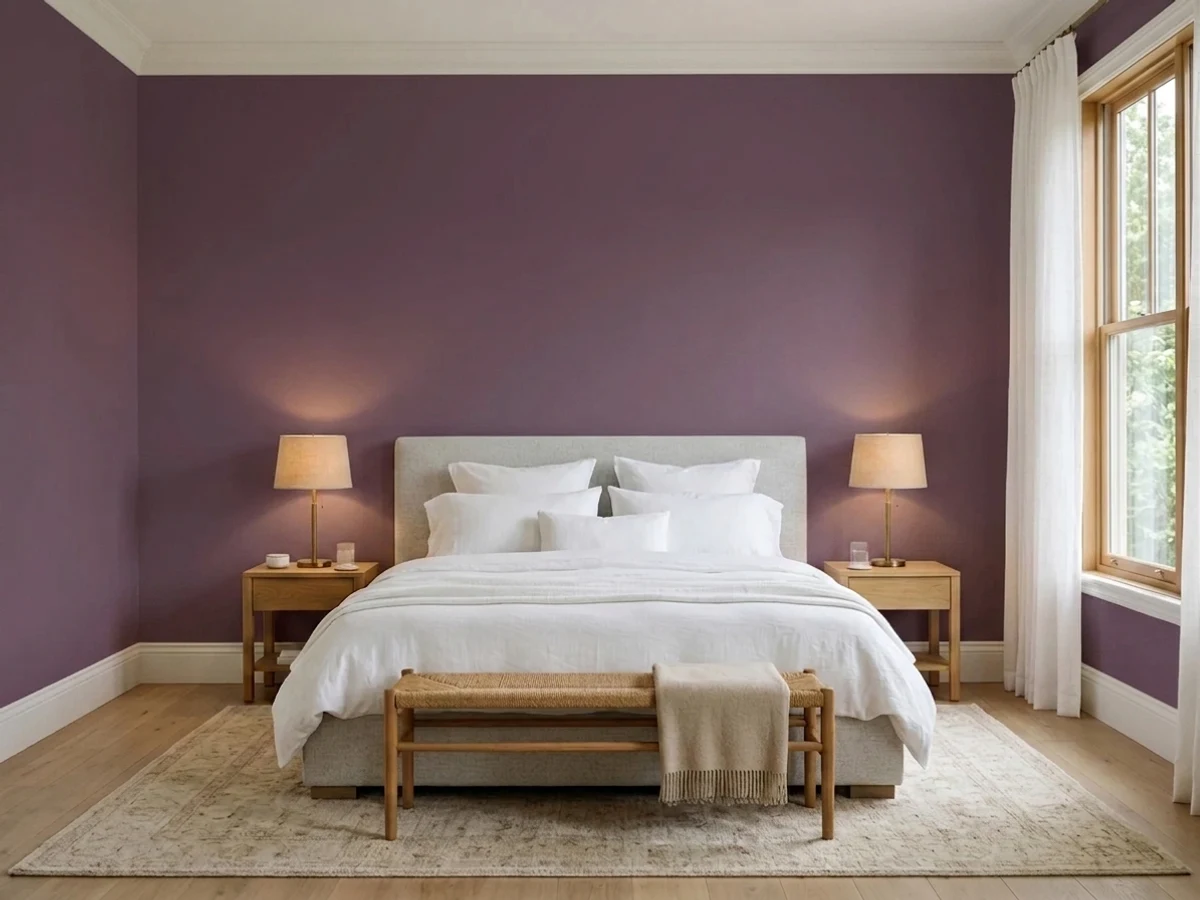
Full-drench works in a bedroom you use at night with two bedside lamps and cream or white bedding. If that is too much commitment, the headboard wall alone against a soft greige is the safer version of the same idea and the one most readers actually keep. Matte finish, 2700K bulbs.
The back of a bookshelf, a wall of built-ins or a study with real task lighting are excellent uses — books, brass and dark wood all read well against it. Satin on the cabinetry, eggshell on the walls, and put the light where you actually work rather than trusting one ceiling fixture.
As a kitchen wall color it is too dark for a room that needs to be seen in, and it fights warm wood counters. As an island, a pantry door or a coffee-bar hutch under warm white cabinets it is genuinely good — an unusual color in a place where unusual is low-risk. Satin cabinet enamel, and prime properly.
On a white, pale gray or warm greige house a plum front door reads like a deliberate choice rather than a mistake, and owners do buy it for exactly this. Do not take it onto siding: full sun over years is unkind to red-violet pigment, and a whole plum house reads as discoloration from the street. Door and shutters only, in an exterior satin or semi-gloss.
Your Light Is the Risk
2700K bulbs and a candle bring the red up through the gray and the walls turn shadowed aubergine with real depth. This is the light the color was built for, and the only one worth buying it for.
Cool, weak daylight has nothing to bounce off an LRV 7 wall. The plum drops out and you are left with flat brown-black and heavy corners — the exact room the regret posts describe.
In strong south or midday light the berry side shows and it reads clearly plum, almost wine. As the sun drops it sinks steadily toward aubergine and then near-black, so the same wall looks like two different colors at noon and at 8pm.
2700K is the setting: it warms the red and keeps the wall alive. Swap to 4000K or daylight LEDs and the red is cancelled, leaving a cold grape-gray that looks closer to black-blue — a common and cheap mistake in bathrooms, where builders default to cool bulbs.
Most complaints about Mature Grape are a light mismatch. Upload a photo of your actual room and see it on your walls — then ask for the same wall in north light or evening lamps before you buy a single sample.
Need It From Another Brand?
Any paint counter can custom-tint Sherwin-Williams SW 6286 directly. If you would rather stay in one brand's own deck, these are the closest stock matches, measured as ΔE2000. Under 2 is a difference you will not see on the wall.
| Brand | Closest color | ΔE | LRV | |
|---|---|---|---|---|
| Behr | VixenPPU17-03 · Behr | 2.0 | 6 | Color page → |
| Benjamin Moore | Autumn Purple2073-20 · Benjamin Moore | 1.0 | 6 | Color page → |
| Valspar | Ripe MulberryV076-6 · Valspar | 2.4 | 6.4 | Color page → |
| PPG / Glidden | Love PotionPPG1179-7 · PPG / Glidden | 1.3 | 7 | Color page → |
| Glidden | Love PotionPPG1179-7 · Glidden | 0.6 | 7 | Color page → |
| Dutch Boy | Antiqued Fuchsia246-7DB · Dutch Boy | 3.6 | 6 | Color page → |
Similar Sherwin-Williams Colors
The nearest shades to Mature Grape within Sherwin-Williams's own range, ranked by perceptual color distance — useful when you want the same look a touch lighter, darker, or warmer.
WCAG 2.1: AA is 4.5 : 1 for normal text, 3 : 1 for large text, AAA is 7 : 1.
Mature Grape vs the Colors You're Also Considering
Every Mature Grape sample board has the same rivals on it. The numbers show the real lightness gap — then it comes down to which risk you would rather live with.
Pick this when you want the purple to actually read as purple; Mature Grape is the more chromatic of the two at the same LRV 7.
Farrow & Ball No. 254 · LRV 7PeltPick this for the same depth with more gray and less red — a quieter, browner aubergine that behaves almost like a warm near-black.
Pick this for the grayer, more restrained version; Mature Grape is the one that passes for a dark neutral from across the room.
Benjamin Moore 1379 · LRV 11EggplantPick this if you want a step more light in the room and a more openly purple wall — LRV 11 keeps a little more life in a dim space.
Mature Grape Coordinating Colors
The rule with a near-black plum: warm whites at the edges, a violet-leaning neutral in the next room, and one warm dark to keep it company. Anything golden stays a small accent, never a floor or a whole adjacent wall. These are the partners that keep showing up in rooms that actually work:
Where Mature Grape Sits in the Purple Aisle
Sherwin-Williams keeps a full purple family, and Mature Grape is the deep, sober end of it. Directly above it on the same strip is Grape Harvest (SW 6285), a lighter and more saturated purple with a red-brown base — the two are close in hue, but Grape Harvest is the one that still reads as a color you notice, while Mature Grape has been grayed and darkened until it reads as atmosphere. Anyone who sampled Grape Harvest and found it too much is usually looking for this.
The name is doing honest work for once. Purple has an image problem in American houses — it is the family most associated with teenage bedrooms and 1990s accent walls — and the fix, every time, is depth plus gray. Take a berry violet down to LRV 7 and mute it, and people stop calling it purple and start calling it plum or aubergine. That is the entire strategy behind this color, and it is why deep plums quietly survived the gray decade in powder rooms while every mid-tone lavender disappeared.
One practical note: the color also exists in the HGTV Home by Sherwin-Williams line sold at Lowe's under the code HGSW6286, so if you are nowhere near a Sherwin-Williams store you can still get the shade — just not the same paint lines, and the sheens and formulas differ. Buy your final gallons from one place, because a touch-up in a different product on an LRV 7 wall will show.
Mature Grape With Wood, Stone and Metals
Wood decides this one. Walnut, espresso and black-stained wood are its best partners — the red-brown depth agrees with the plum and the room reads layered. Pale unstained white oak works too, in a cooler, more modern way. Honey oak, orange-stained trim and golden builder beige are the genuine no: yellow-orange is violet's complement, so each side exaggerates the other and the wall goes muddy maroon while the floor goes orange. A big rug helps a little; nothing fixes the geometry.
Stone is easier than people expect. White marble with gray veining is excellent against it, honed black granite and soapstone are excellent, and plain white subway tile in a powder room reads crisp rather than cheap next to that depth. Beige travertine and gold-flecked granite fight it for the same reason honey oak does.
Metals: aged brass and unlacquered brass are the obvious win, oil-rubbed bronze and matte black both work, and copper is surprisingly good in a small bath. Polished chrome is the one that reads cold and a little clinical against a warm plum — usable, but it will not do the color any favors.
Three Ready Palettes Built on Mature Grape
A color is never alone on the wall. These are complete combinations in the 60-30-10 pattern, with the reason each one holds together. Every one opens in the visualizer.
Drenching the little room is the whole move, so the only decisions left are the edges. White Flour is a warm near-white at LRV 87, which keeps the trim glowing rather than glaring against LRV 7 walls. Cocoa Berry is the bridge back to the rest of the house — a mauve-brown that shares the plum's red side without repeating its depth. Brass fixtures and a marble or honed dark stone top finish it.
Try this palette in your roomCaramel is the complement of plum, and complements are a dose rule: a small amount makes the purple sing, a whole floor of golden wood makes it muddy. Keep Caramelized to accents and it does the work of brass. Alabaster is the soft warm white that keeps the trim from cutting a hard white line around a near-black wall — and give Caramelized real light, since it goes muddy in dim rooms.
Try this palette in your roomThis is the low-risk way to own the color. Alpaca is a greige with a violet streak it does not hide, so the accent wall reads as the same family getting louder rather than as a random dark rectangle. White Dove keeps the trim warm on both sides of that jump. If the bedroom is dim, this version still works where a full drench would not.
Try this palette in your roomMature Grape FAQ
Is Mature Grape too dark for a small powder room?
No — a powder room is the one place its LRV 7 is an asset. You are not trying to make a windowless three-by-five-foot room feel big; you are trying to make it feel deliberate. Drench the walls, ceiling and door, keep the trim a warm white, and put two warm sconces beside the mirror. What ruins these rooms is a single cool overhead bulb, not the paint.
Is Mature Grape purple or brown?
Purple — specifically a red-violet plum with a heavy gray cast. It can look brown-black in a dark room or under cool LEDs, because that is what happens when a near-black color has no light to show its hue. Under a warm lamp the berry side comes straight back. If your sample never looks purple, the room is telling you it cannot support the color.
What trim white goes with Mature Grape?
A warm white is the default: White Flour at LRV 87 or Alabaster at LRV 82 both keep the edges glowing rather than glaring. A crisp cool white like Chantilly Lace is not wrong, but it makes the scheme graphic and modern instead of enveloping — a sharper white line around a near-black wall. Pick one look and commit; do not mix warm and cool whites in the same small room.
How many coats does Mature Grape need?
Plan on a gray-tinted primer plus two to three finish coats. It is mixed in a deep tint base, so the pigment load is high and thin spots show badly on a near-black wall, especially where a roller met a cut-in line. Cut and roll in the same session, keep a wet edge, and do not judge coverage until the second coat is fully dry.
Can I use it on cabinets or a front door?
Yes, and those are the smartest low-risk uses. A vanity, an island, a pantry door or a set of study built-ins in satin cabinet enamel gives you the color without betting a room on it. On a front door it reads intentional on a white, gray or greige house. Skip it on siding — sustained full sun is hard on red-violet pigment, and a whole plum house reads as discoloration from the curb.
Will Mature Grape hurt resale?
In a powder room, on a door or on built-ins, no — buyers read small doses of deep color as design. Across a main living space, honestly, it can. Purple is the family people react to most strongly, and this one takes a primer and two to three coats to bury. If a sale is on the horizon, keep it to the small rooms you would repaint in an afternoon.
Have you painted with Mature Grape?
Rate it — one tap helps the next reader decide.
Ask a Question