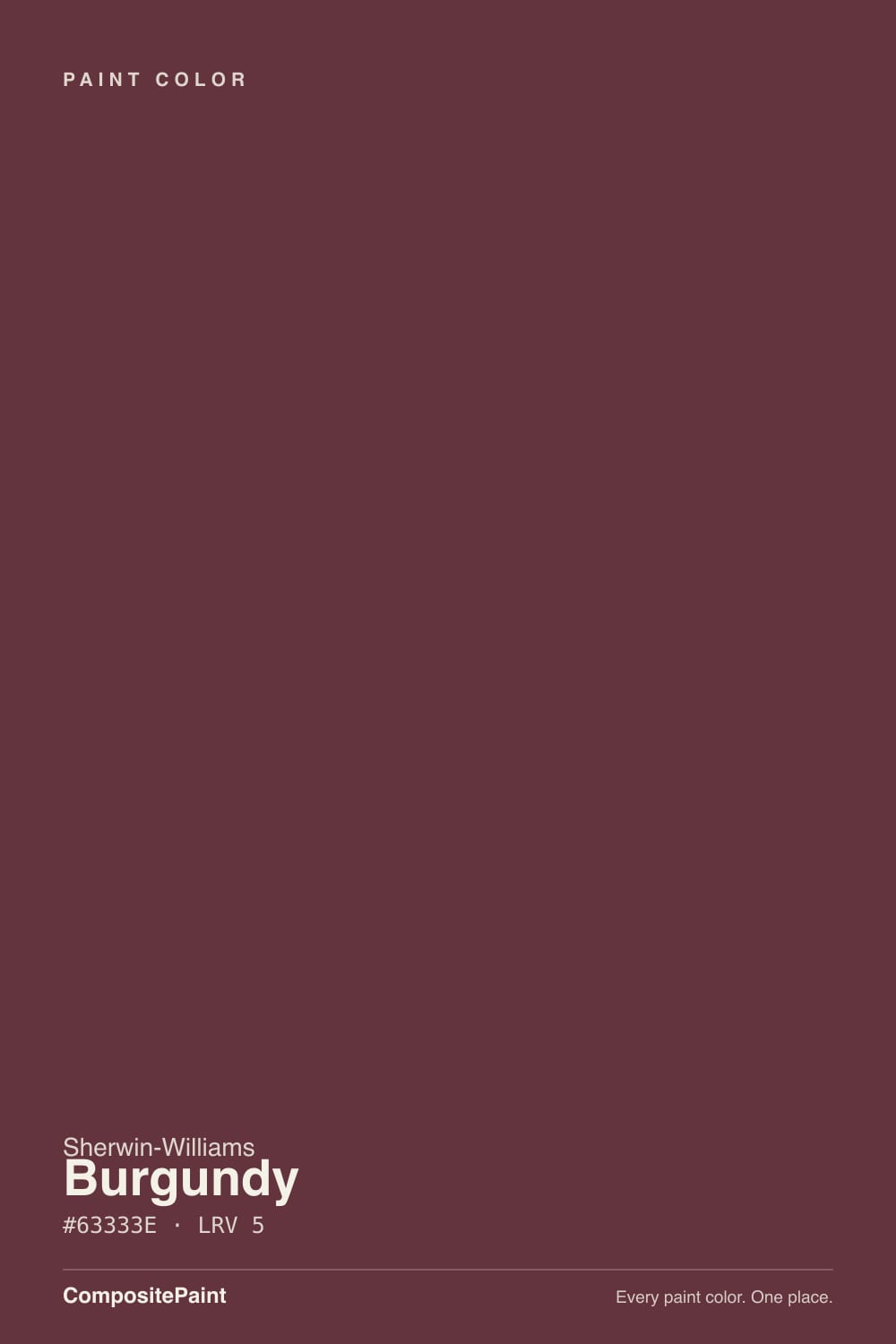
Burgundy
SW 6300 · #63333E · LRV 5 — warm red tone, very dark — reads black in most rooms.
- 1Redwood0
- 2Burgundy5
- 3Million Dollar Red13
- 4Cinnamon Slate19
What Color Is Burgundy, Really?
Burgundy SW 6300 is a deep wine red. Its hex value #63333E sits at hue 346 degrees, which is the plum side of red rather than the orange side, with about 32 percent saturation. The LRV is 5, near the bottom of the scale, so the color absorbs almost all the light that hits it and in most rooms reads close to black, with the red showing only where light lands directly.
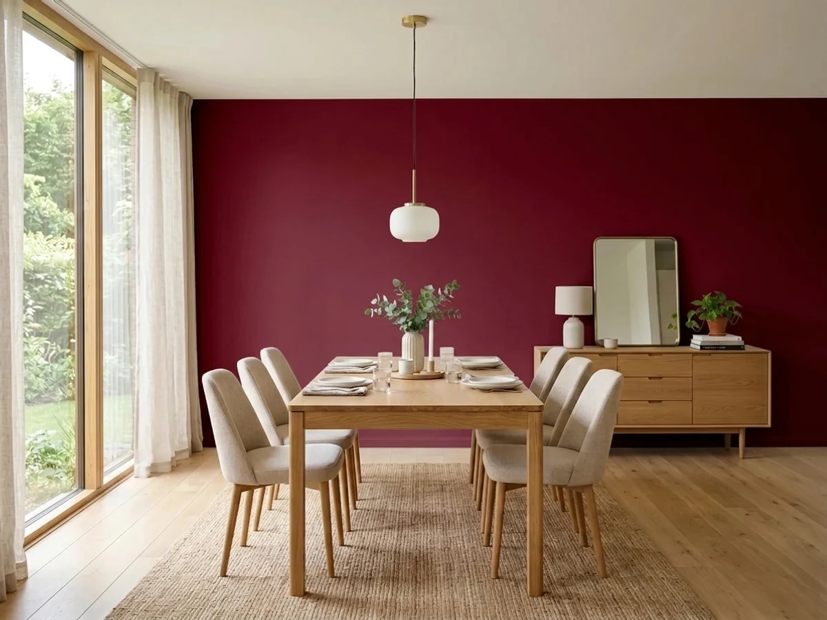
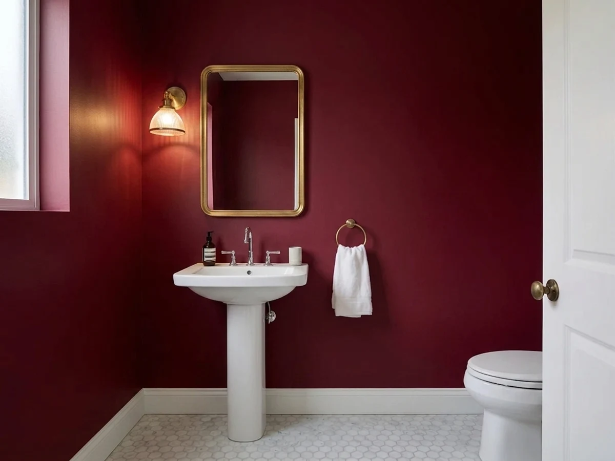
People choose it for depth. On a dining room wall, a library, a powder room, or a front door it gives the weight of black while keeping a warm, human color underneath. In lamplight and candlelight the wine comes forward, which is why it tends to be used in rooms that are lived in after dark.
The practical catch is light. At LRV 5 the color returns almost nothing, so a room with one small window will simply look dark, not rich. Dark finishes also show roller marks and touch-ups, and the plum lean can sit awkwardly next to orange-red brick or terracotta tile.
Burgundy is warm, but its warmth heads toward plum rather than rust. At hue 346 degrees it sits just on the pink side of pure red, and its 32 percent saturation is strong enough that the wine character survives even at this depth. In a can it looks nearly black. In direct light it is clearly red with a cool, berry edge.
That plum lean is what you have to watch. Against orange-red brick, terracotta, or a warm cherry stain it can look slightly cool and out of step. Against cream, natural linen, oak, and brass it settles in and reads as a proper wine.
The undertone shows most in glossy finishes and where a lamp or a picture light hits the surface. Paint a full sample board rather than a small patch, and stand it in the darkest corner of the room as well as under your lighting, because those two views of the color are very different.
Best Rooms and Uses for Burgundy
Burgundy suits rooms you use in the evening. Dining rooms, libraries, studies, and powder rooms are the classic cases, because low light and lamps are what bring the wine out. In those rooms the depth feels enveloping rather than gloomy.
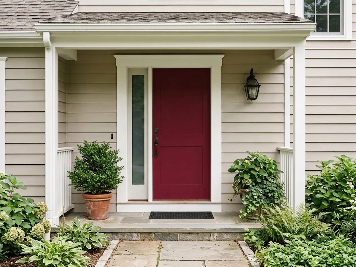
It is a strong front door color, especially on a light or neutral house body, and it works on shutters or an accent gable outdoors. On cabinetry it holds up as an island or a lower run under lighter uppers, where the weight sits at the bottom of the room.
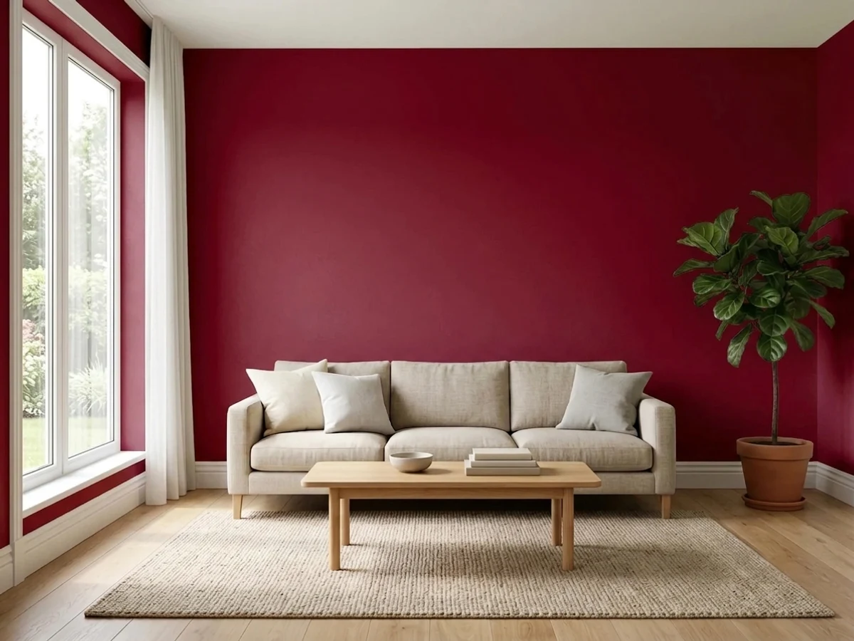
Where it disappoints is a large, dim, everyday room with one window. At LRV 5 it will make that space feel smaller and darker. It also asks for careful prep, since deep bases show every ridge and lap mark, and a satin or matte sheen usually looks better than flat, which can go chalky in a dark tone.
How Lighting Changes Burgundy
An LRV of 5 means Burgundy gives back almost no light. Whatever brightness the room has must come from windows, lamps, or reflective surfaces, because the walls will not help. That single fact matters more than window direction.
In north-facing rooms, with cool, flat daylight, it reads as a dark near-black and the red stays hidden most of the day. South and west rooms are where the wine actually appears, since direct sun is strong enough to reveal the hue on the walls it touches, usually late in the afternoon. East rooms get a brief window of that in the morning.
Bulbs do the real work. Warm 2700K lamps pull the red forward and make the color look intentional at night. Cooler bulbs near 4000K flatten it toward gray-black and lose most of the character you paid for. Wall sconces and picture lights help more than a single ceiling fixture.
Most complaints about Burgundy are a light mismatch. Upload a photo of your actual room and see it on your walls — then ask for the same wall in north light or evening lamps before you buy a single sample.
Need It From Another Brand?
Any paint counter can custom-tint Sherwin-Williams SW 6300 directly. If you would rather stay in one brand's own deck, these are the closest stock matches, measured as ΔE2000. Under 2 is a difference you will not see on the wall.
| Brand | Closest color | ΔE | LRV | |
|---|---|---|---|---|
| Behr | Leather Bound170F-7 · Behr | 0.9 | 6 | Color page → |
| Benjamin Moore | RadicchioCC-32 · Benjamin Moore | 1.4 | 6 | Color page → |
| Valspar | Pompeii RedM242 · Valspar | 3.0 | 4.9 | Color page → |
| Glidden | Old Mahogany98RR 06/206 · Glidden | 4.8 | 6 | Color page → |
| Dutch Boy | Tyrian Red301-7DB · Dutch Boy | 4.8 | 5 | Color page → |
| Dunn-Edwards | Wine GobletDET400 · Dunn-Edwards | 2.8 | 6 | Color page → |
Similar Sherwin-Williams Colors
The nearest shades to Burgundy within Sherwin-Williams's own range, ranked by perceptual color distance — useful when you want the same look a touch lighter, darker, or warmer.
WCAG 2.1: AA is 4.5 : 1 for normal text, 3 : 1 for large text, AAA is 7 : 1.
Burgundy vs Similar Colors
Sommelier SW 7595 at LRV 5 sits at the same depth but shifts brown, so it reads as a leathery oxblood where Burgundy holds its plum edge. Rookwood Red SW 2802 at LRV 5 and Sun Dried Tomato SW 7585 at LRV 5 both push toward orange-red, which makes them warmer and more clearly red in daylight. Dark Auburn SW 6034 at LRV 5 is browner again. Cordovan SW 6027 at LRV 6 and Red Theatre SW 7584 at LRV 6 are a point lighter, with Red Theatre the brighter of the two.
Across brands, Behr Leather Bound 170F-7 at LRV 6 and deltaE 0.89 is effectively the same color. Benjamin Moore Radicchio CC-32 at deltaE 1.43 is visually identical in normal room light. Valspar Pompeii Red M242 at deltaE 2.96 is very close, so sample first, and Glidden Old Mahogany 98RR 06/206 at deltaE 4.77 is close but visibly different side by side.
Colors That Go With Burgundy
Trim is the first decision, and a warm white or cream does the most for it, since a cool blue-white can make the plum lean look sour. Keep the trim clearly lighter so the wall reads as a deliberate dark color rather than a shadow.
Within its own family, Cordovan SW 6027 at LRV 6 is the natural partner for a ceiling or an adjoining surface when you want the depth to continue with a slightly softer, browner cast. Red Theatre SW 7584 at LRV 6 is the option if you want a neighboring surface with a little more life in it.
Materials carry the rest. Oak, walnut, and rattan warm it, brass and aged bronze hardware read better against it than chrome, and cream upholstery or natural linen keeps the room from going heavy. Green foliage and gold-framed art both look strong on a wall this dark.
Coordinated palette
Generated by hue-rotating #63333E in HSL space. Pair Burgundy with one accent and one neutral — the swatches below are starting points, not final picks.
Burgundy FAQ
What LRV is Burgundy and what does it mean?
Burgundy has an LRV of 5. Light reflectance value runs from 0 for black to 100 for pure white, so 5 is very near the bottom. The wall gives back almost none of the light that hits it, which is why the room's brightness has to come from windows and lamps rather than from the paint.
Is Burgundy more red or more brown?
More red, with a plum lean. It sits at hue 346 degrees, just on the pink side of pure red, and holds about 32 percent saturation. That keeps it a wine color rather than a brown, though at LRV 5 you only see the red where direct light or a lamp reaches the surface.
Does Burgundy work in a dark room?
It works in a room that is dark on purpose, like a dining room or study used in the evening, where lamplight brings the wine forward. It does not work well in a large everyday room with one small window, because at LRV 5 the paint returns almost no light and the space will simply read dim.
What white trim goes with Burgundy?
A warm white or cream is the safer choice, because a cool blue-white can make the plum side of the color look sour. Keep the trim clearly lighter than the walls so the contrast reads as a design decision. Sample the trim white next to a painted board of the wall color before buying either.
Is Burgundy good for a front door or cabinets?
Yes on both counts. A deep wine reads as a strong front door on a light or neutral house body, and it holds up on shutters and accent trim outdoors. On cabinetry it suits an island or lower run under lighter uppers, where the weight sits low. Prep matters, since deep colors show ridges and lap marks.
What is the closest match to Burgundy in other brands?
Behr Leather Bound 170F-7 at LRV 6 and deltaE 0.89 is effectively the same color. Benjamin Moore Radicchio CC-32 at LRV 6 and deltaE 1.43 is visually identical in normal room light. Dunn-Edwards Wine Goblet DET400 at deltaE 2.8 and Valspar Pompeii Red M242 at deltaE 2.96 are very close but worth sampling first.
Have you painted with Burgundy?
Rate it — one tap helps the next reader decide.
Ask a Question