Gothic Purple
The blue-violet Behr calls a neutral, reviewed honestly: where it earns the drama on a front door, the room that turns it flat, and why Behr's own color chart quietly disagrees with its name.

Jessica has spec'd whites and neutrals for more than 300 rooms and keeps a sample wall of painted drawdowns in her studio. Every color review is checked against real reader rooms in the comments and re-tested when a formula changes. About the testing process →
- 1Nocturne Shade5
- 2Blue Nova17
- 3Gothic Purple24
- 4Hazy Lilac29
- 5Wisteria48
The Fast Verdict
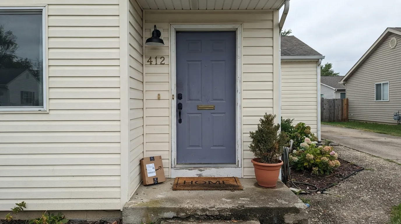
Gothic Purple is not the moody eggplant its name promises. Pull up the RGB and the story clarifies fast: blue edges out red by only a hair, which is why Behr's own site files this under the Neutral family instead of Purple. It reads as a cool, dusty blue-violet slate — closer to a fancy charcoal than a costume-purple — and most of the SKUs Behr actually sells it in are exterior paint and primer, not wall paint. This is a color that earns its keep on a front door and shutters, not necessarily on four walls.
Front doors and shutters on a neutral house · a small moody accent wall in a room with even, cool light · powder rooms and vanities · anyone who wants a purple that Behr itself calls a neutral
You want a true saturated plum or eggplant · your exterior wall bakes in direct afternoon sun · your floors and trim run honey oak with brass hardware · you're painting four walls hoping for a soft gray
- A genuinely sophisticated cool blue-violet, not a costume-purple
- LRV 24 holds its depth without demanding a bright room
- Reads as a deliberate, gothic accent on a front door or shutters
- Behr itself treats it as a neutral, so it pairs like a fancy charcoal, not a bold statement color
- One of the few purples in any deck that doesn't skew juvenile or theatrical
- Sold almost entirely as an exterior paint — thin interior track record and reviews
- Cool undertone clashes with honey oak, warm brass, and golden trim
- Full sun on an exterior wall bleaches it toward flat, chalky lavender-gray
- Not a whole-room color for most buyers — commit to a door or one wall, not four
What Color Is Gothic Purple, Really?
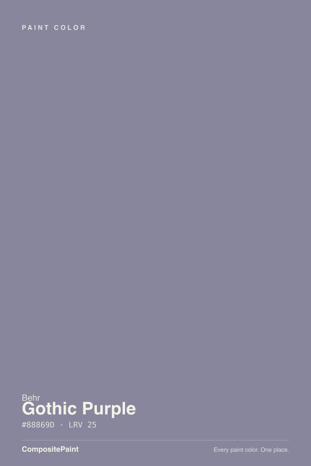
The name oversells it. RGB 136, 134, 157 is a near-even split between red and green with blue running just ahead — the textbook signature of a desaturated, grayed violet, not a saturated purple. Behr's own marketing copy calls it a "medium-to-dark purple hue" that "harnesses red's energy and blue's spirituality," but Behr's own color-detail page files N110-4 under the Neutral color family. Both things are true at once: on the chip it reads unmistakably violet-gray; on a wall in ordinary daylight, most people reach for "slate" or "charcoal-blue" before they'd say "purple."
At LRV 24 it sits in the same mid-dark band as a good charcoal-greige — deep enough to hold its color without needing a bright room to survive, but not a near-black. What's more telling than the LRV is where Behr actually sells it: the SKUs run Behr Ultra exterior paint and primer, Behr Premium Plus exterior flat and satin enamel, Behr Pro exterior flat — gallon after gallon positioned for siding, shutters, and doors. Interior/exterior 8-ounce samples exist too, but this is a color earning its living outside, on the one architectural element where a house is allowed one loud opinion.
Undertone in one line: cool, muted blue-violet — never warm, never leaning toward the reddish plum the marketing copy implies. That matters for pairing: this is not a color that wants honey wood or brass warming it up. It wants the cool, neutral, or near-black company Behr's own front-door guidance points toward — a quiet house body and a dark, grounded trim, so the door gets to be the one thing with an opinion.
Where It Shines
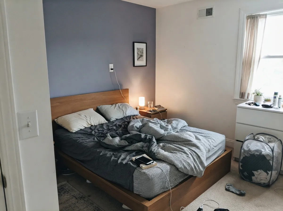
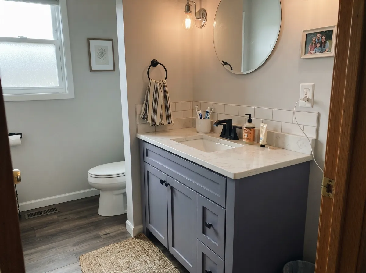
Give it a neutral exterior and a door-sized dose, and it does exactly what its marketing promises: sophisticated, a little mysterious, unmistakably a choice rather than an accident. Overcast, diffuse daylight is its best friend outdoors — the kind of even light that lets a deep, cool color hold its true hue instead of blowing out. Indoors it plays the same role in miniature: a powder room, a den, one accent wall in a room that runs cool light, where a small dose of gothic reads intentional instead of overwhelming.
Where It Fails
Almost every regret with Gothic Purple traces back to one of three mismatches, and all three are avoidable before the first coat. None of them are the paint failing — they're a cool, quiet color being asked to do a job it was never suited for.
This is a cool blue-violet with no red-warm reserve to fall back on, and honey oak, golden trim, and warm brass all fight it the way they fight any cool color — the wood looks more orange, the wall looks flatter and grayer, and neither side wins. Cooler woods (walnut, gray-washed oak), matte black, or pewter hardware are the partners that actually work.
The marketing copy talks like a saturated jewel tone; the RGB and Behr's own neutral filing tell a quieter story. On the wall this reads as a dusty violet-slate, not a vivid purple statement. If you want the vivid version, this specific chip is not it — sample it in your own room before you commit to "purple" in your head.
Direct afternoon sun bleaches any mid-depth cool color, and Gothic Purple is no exception — expect it to wash toward a flatter, chalkier lavender-gray on a south or west elevation in full sun. A shaded or north-facing wall, or a climate with more overcast days, keeps the depth this color is chosen for.
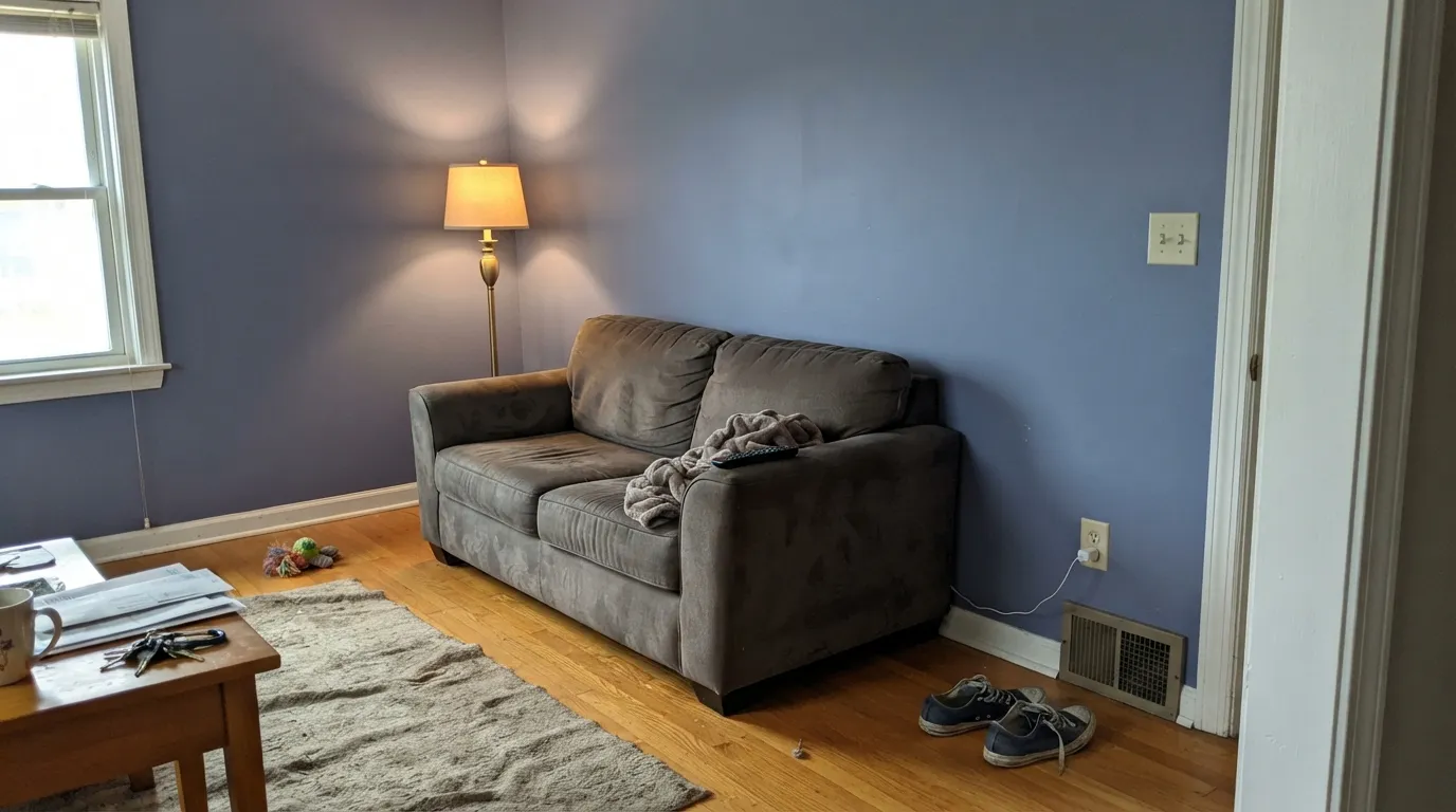
Room by Room
This is where the SKUs point and where the color makes the most sense: one door, painted in a satin or semi-gloss exterior enamel, against a quiet neutral siding. It reads as a deliberate, slightly gothic choice rather than a loud one — exactly the effect Behr's own front-door guidance describes.
A small room takes a cool, mid-dark color the same way a front door does: as one contained, confident decision. Satin on the vanity, matte or eggshell on the walls, and keep the fixtures cool-toned rather than brass.
One wall, not four, and lean toward cool-toned bulbs rather than warm 2700K — this color does not chase coziness the way a warm mauve does. Pair it with a genuinely neutral trim white so the temperature argument stays contained to one wall.
As a backdrop behind bookshelves, or in a room used mostly at night under overhead cool light, it holds its slate-violet character. Skip it if the room's main light is a warm desk lamp all evening — that fights the color's whole nature.
This is not a whole-room color for most homes; the real-world interior track record is thin because Behr sells it as an exterior color first. Use it on a fireplace surround, a built-in, or a single wall, not the whole box.
An island or a run of upper cabinets can work if the counters and floor are cool or neutral — pale stone, walnut, gray-washed oak. Over honey oak or warm butcher block, this is the fails-callout clash waiting to happen.
Your Light Is the Risk
Even, shadowless light lets the true cool violet-slate hold its depth without blowing out — the best light for judging this color, indoors or out.
Strong, direct sun bleaches the color toward a flatter, chalkier lavender-gray on an exterior wall — expect a visibly lighter, less gothic read on a south or west elevation.
North-facing keeps it cool and true to the chip all day; south-facing sun washes it out by midday and lets warmth creep in only at the very end of the day.
The opposite of most moody colors: cool white LEDs keep the blue-violet crisp and gothic at night, while warm 2700K lamps mute the blue and flatten it toward a duller brownish gray.
Most complaints about Gothic Purple are a light mismatch. Upload a photo of your actual room and see it on your walls — then ask for the same wall in north light or evening lamps before you buy a single sample.
Need It From Another Brand?
Any paint counter can custom-tint Behr N110-4 directly. If you would rather stay in one brand's own deck, these are the closest stock matches, measured as ΔE2000. Under 2 is a difference you will not see on the wall.
| Brand | Closest color | ΔE | LRV | |
|---|---|---|---|---|
| Sherwin-Williams | Gris MoradoSW 9156 · Sherwin-Williams | 4.8 | 26 | Color page → |
| Benjamin Moore | Frozen in Time1448 · Benjamin Moore | 1.1 | 24 | Color page → |
| PPG / Glidden | Pewter MugPPG1004-5 · PPG / Glidden | 4.3 | 23 | Color page → |
| Glidden | Pewter MugPPG1004-5 · Glidden | 4.3 | 23 | Color page → |
| HGTV Home by Sherwin-Williams | Great GreigeHGSW 3394 · HGTV Home by Sherwin-Williams | 4.8 | 26 | Color page → |
| Magnolia Home | Pashmina PlumJG-100 · Magnolia Home | 3.0 | 24 | Color page → |
Similar Behr Colors
The nearest shades to Gothic Purple within Behr's own range, ranked by perceptual color distance — useful when you want the same look a touch lighter, darker, or warmer.
WCAG 2.1: AA is 4.5 : 1 for normal text, 3 : 1 for large text, AAA is 7 : 1.
Gothic Purple vs the Colors You're Also Considering
Every Gothic Purple sample board has the same rivals on it. The numbers show the real lightness gap — then it comes down to which risk you would rather live with.
Pick this if you specifically want the cool, blue-leaning slate-violet instead of a warm mauve.
Benjamin Moore 1454 · LRV 28Sleepy HollowPick this if you want the warm, red-leaning version of a muted violet — it turns rosy under lamps instead of staying cool.
Pick this when the violet is the whole point, not an accident to avoid.
Sherwin-Williams SW 7604 · LRV 15Smoky BluePick this if you want the dependable blue-gray without any purple in it at all.
Within Behr, Gothic Amethyst (670F-5) at hex #8085A2 and LRV 24 is the more openly purple option, while Gray Heather (PPU16-15) at #868791 and LRV 24 is the same depth with the violet mostly removed. Applause Please (MQ5-12) at #83899A and LRV 25 sits between them, leaning bluer.
Across brands, Dunn-Edwards Soft Charcoal (DE5935) at #838298 and LRV 22 has a deltaE of 1.66, which is visually identical in normal room light, though its lower LRV makes it read slightly deeper. Glidden Greyed Amethyst (10RB 25/102) at LRV 25 is 2.39, and Sherwin-Williams Gentle Grape (SW 9074) at LRV 26 is 3.21. Both are very close and worth sampling first.
Further out, C2 Nightcap (C2-779) at 3.87, Valspar Intrigue (T522) at 4.28, and Benjamin Moore Irises (1440) at 4.62 are close but visibly different side by side, with Irises reading noticeably bluer.
Gothic Purple Coordinating Colors
The rule with Gothic Purple runs opposite to most purples: skip the warm partners and stay cool. It wants quiet off-whites for contrast, true grays and near-blacks for grounding, and metals that lean pewter or matte black rather than brass. These are the partners that keep showing up where it actually works:
Why Behr Files a "Purple" Under Neutral
Pull up N110-4 on Behr's own site and the color-family tag says Neutral, not Purple — a quiet admission that undercuts the marketing copy sitting right next to it. The RGB backs the tag more than the copy does: red (136) and green (134) are almost identical, and blue (157) only edges ahead by about 15 percent. A saturated purple needs a much bigger gap between blue and the other two channels; this one is grayed down close to a true neutral with just enough blue-violet left to notice.
That gap between the name and the filing is the whole story of this color. It is dramatic enough to earn "Gothic" in the name and quiet enough that Behr's own system calls it a neutral. Both readings are honest — which is exactly why it works on a front door, where you want one clear opinion, and struggles as a whole-room wall color, where "neutral enough to live with" and "purple enough to notice" start to argue with each other.
Gothic Purple on Exteriors
This is where the color actually lives: search the retail listings and Gothic Purple shows up mostly as Behr Ultra and Behr Premium Plus exterior paint and primer, in flat and satin-enamel finishes, sold by the gallon and five-gallon pail — the packaging of a color meant for siding, shutters, and doors, not a living-room accent wall. Behr's own front-door guidance recommends exactly this move: keep the body of the house a quiet neutral and let one door or one set of shutters carry the color.
The light rules above apply directly outside. An overcast climate or a shaded, north-facing elevation keeps the cool violet-slate honest; a south- or west-facing wall in strong afternoon sun bleaches it toward a flatter lavender-gray by midday. If your exterior gets hard, direct sun most of the day, sample a full quart on the actual wall before committing five gallons.
Three Ready Palettes Built on Gothic Purple
A color is never alone on the wall. These are complete combinations in the 60-30-10 pattern, with the reason each one holds together. Every one opens in the visualizer.
A warm, quiet siding and a plain white trim let the cool violet door read as the one intentional color note on the house — the exact move Behr's own front-door guidance recommends: keep the body neutral and let the door carry the drama.
Try this palette in your roomBM White's own no-opinion character keeps the trim from fighting a color this particular about temperature, and a quiet light gray in the next room means the accent wall doesn't have to negotiate with anything warmer nearby.
Try this palette in your roomAll three are Behr's own cool-leaning colors that read quieter than their names suggest — Cracked Pepper carries its own violet secret in strong sun — so the shutters land as a deliberate dark accent instead of a mismatched color family, and the near-black trim keeps the whole scheme grounded.
Try this palette in your roomGothic Purple FAQ
Is Gothic Purple actually purple, or is it more of a gray?
Both, honestly. Behr's own color-detail page files N110-4 under its Neutral family, and the RGB backs that up — the blue only edges out red and green by a little. On the chip and in good light it reads as a clear cool violet; in duller light it can pass for a fancy charcoal-blue. It is not a saturated, costume-purple in either case.
Is Gothic Purple good for a front door?
It's arguably the color's best real use — most of the actual product Behr sells in this shade is exterior paint and primer. Pair it with a quiet neutral siding and it reads as one deliberate, sophisticated statement rather than a loud one.
What undertone does Gothic Purple have?
Cool, muted blue-violet — never warm, never a red-leaning plum. That's the opposite direction from a warm mauve like Sleepy Hollow, which turns rosy under lamplight; Gothic Purple stays cool and can even flatten toward gray under very warm bulbs.
Can I use Gothic Purple on interior walls?
Yes, but go in with clear eyes: the real-world interior track record is thin because Behr sells it mostly as an exterior color. It works well as one accent wall, a powder room, or a vanity — a whole room of it is a bigger commitment than the sales history suggests other buyers have made.
What's the LRV of Gothic Purple, and does it need a bright room?
LRV 24 — a genuine mid-dark color. It holds its color without needing a flood of daylight to survive, but it does need even, diffuse light (overcast outdoors, indirect indoors) to read as intentional rather than muddy; harsh direct sun washes it out.
Does Gothic Purple work with honey oak floors or brass hardware?
No — this is the color's most predictable clash. Cool blue-violet and warm honey wood or brass pull against each other; the wood reads more orange, the wall reads flatter and grayer. Walnut, gray-washed floors, matte black, and pewter are the partners that actually work.
Have you painted with Gothic Purple?
Rate it — one tap helps the next reader decide.
Ask a Question